
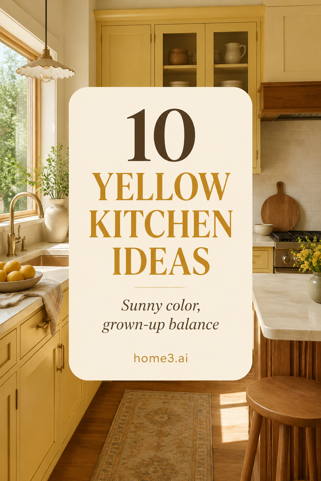
Yellow cabinets can bring warmth without making the kitchen feel sugary
The most livable yellow kitchens often borrow from butter, straw, mustard, ochre, and sun-warmed plaster instead of a bright primary hue. That still leaves plenty of room for personality. Begin with the light and materials already in your room, collect several large cabinet samples, and compare them beside the counter, floor, walls, and wood. You do not need perfect color vocabulary to make a thoughtful choice. Notice what feels calm, what turns green or orange, and what stays pleasant at breakfast and after dark. These ten checks will help you turn that observation into a clear plan.
1. Begin with butter instead of primary yellow
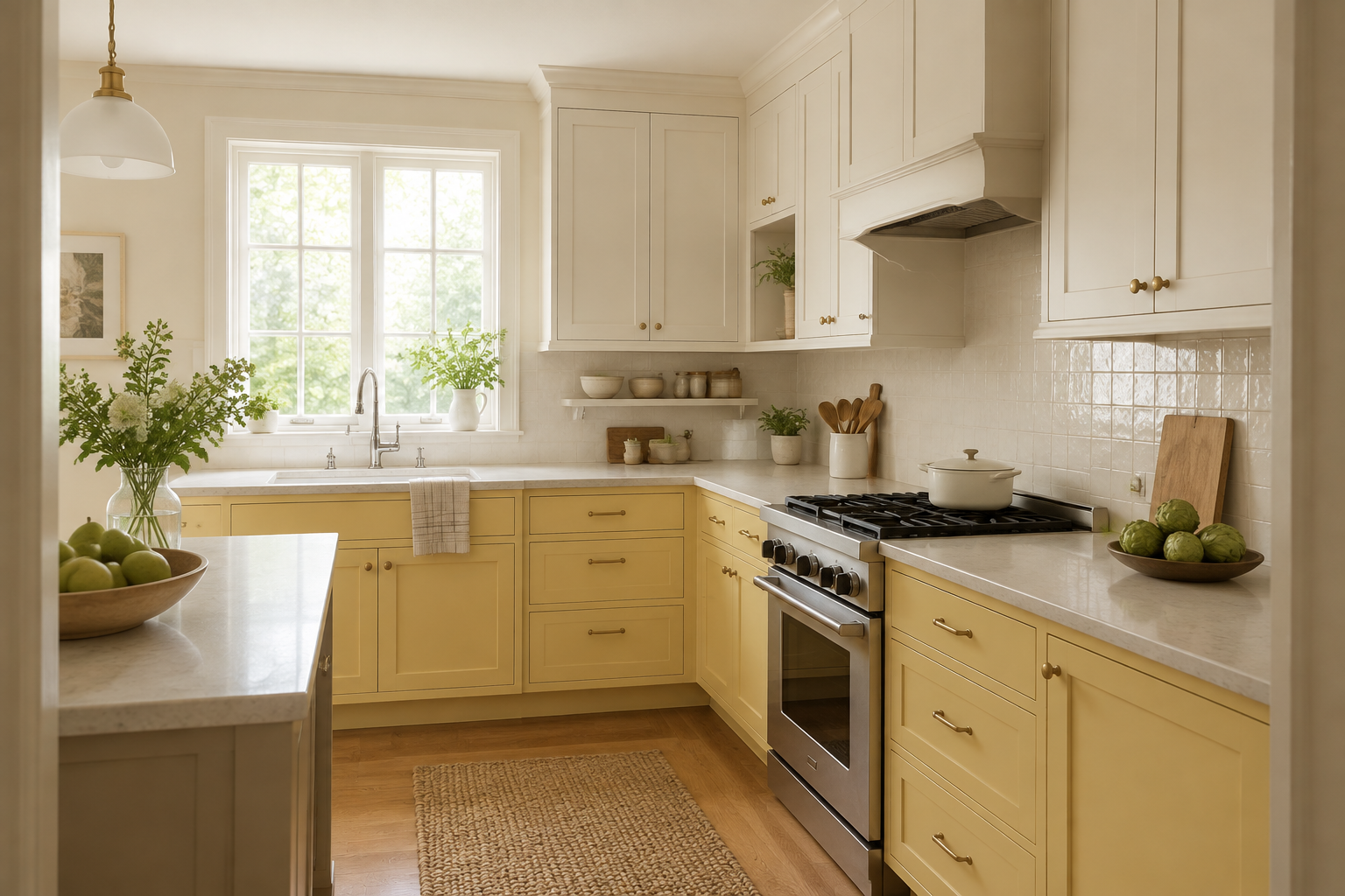
A creamy, slightly muted yellow can read as warm and welcoming across a full run of cabinets. Compare it with one clearer yellow and one earthier ochre so you can see the undertone in context. A common mistake is selecting the happiest small chip, then discovering that it becomes much brighter when repeated across doors, panels, and trim. Order or paint a generous sample in the intended sheen. If it feels too sweet, look for more cream, gray, or brown in the mix rather than giving up on yellow altogether.
2. Let mustard define the island
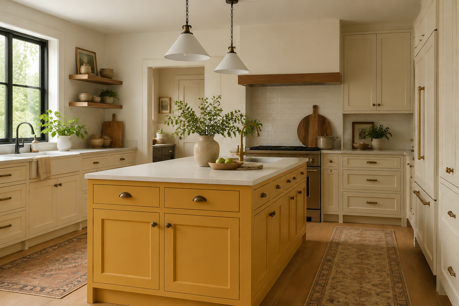
A mustard island can give a neutral kitchen a center without spreading saturated color across every wall. First decide what the island must do—preparation, cleanup, seating, storage, or a mix—then verify that the room can support it comfortably. The easy mistake is choosing the bold island in the inspiration stage and shrinking the surrounding aisle to make it fit. Draw the top, overhang, seats, doors, and drawers in their open positions. A focal color works best when the object underneath it is genuinely useful.
3. Use pale straw to lift a compact room
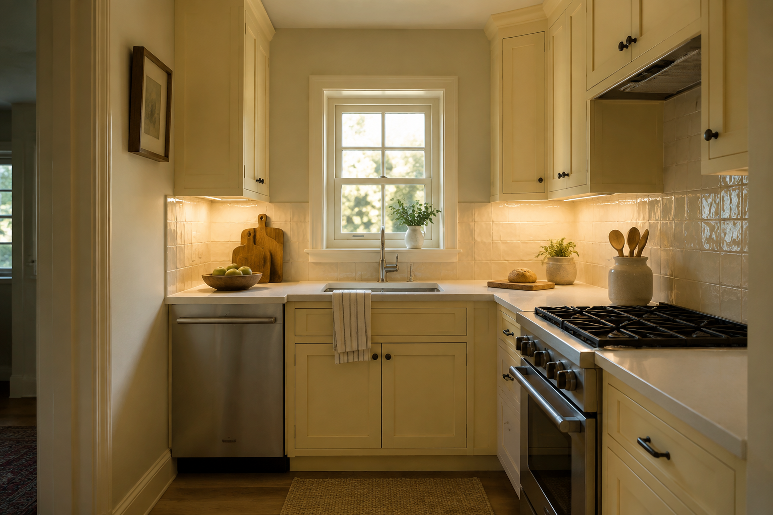
Pale straw adds more warmth than white without making a small kitchen feel closed in. Pair it with a clear lighting plan so the color does not become dull in the corners or overly orange under warm bulbs. People often assume yellow will create light on its own; paint reflects the light available but cannot replace good task lighting. Put a large sample near the darkest base cabinet and under the upper cabinets, then review it at the times you actually cook. The quiet shade should still feel intentional after sunset.
4. Ground ochre with natural oak
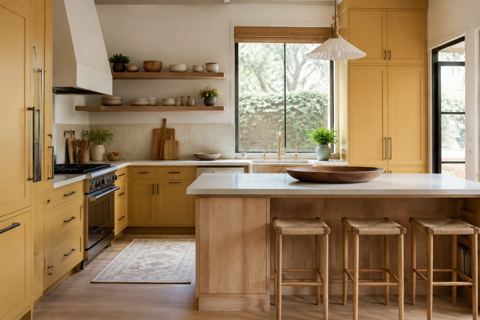
Natural oak shares yellow's warmth but adds grain and variation, which can make an ochre cabinet color feel grounded. Decide which material leads: painted perimeter with a wood island, or wood perimeter with one painted run. A common mistake is choosing the stain from memory and ending up with two yellow undertones that nearly match but feel slightly wrong together. View current samples from the cabinet supplier and flooring source in the same light. Contrast in value or grain is often more comfortable than forcing a close color match.
5. Keep the counter and backsplash restful
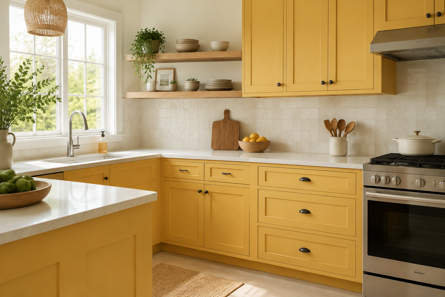
Warm white stone and low-contrast tile can give yellow cabinets space to glow without making the room visually busy. Bring the actual counter pattern into the decision because veining that looks subtle in a sample may become strong across a long run. The familiar mistake is adding a bold patterned backsplash to make an already colorful kitchen feel more designed. Pause before adding another feature. Photograph the full sample group in approximate proportions and remove one competing material at a time; the palette often gets stronger as the background gets quieter.
6. Use slate gray as a calm counterweight
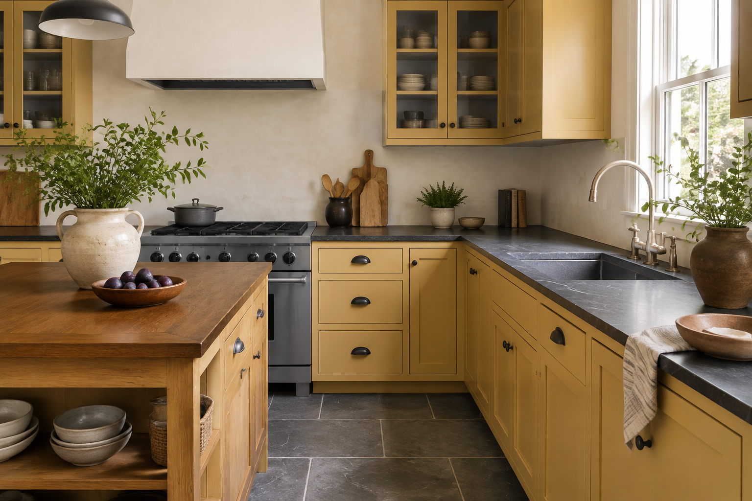
Slate, soapstone, and blue-gray can temper yellow without removing its warmth. Use the cooler tone on a surface that makes sense for the room—a durable floor, counter, or small backsplash field—then keep the walls and wood from becoming too cold. A common mistake is choosing a nearly black counter to make the yellow pop and overlooking how much light that surface absorbs. Look at the combination near the sink and preparation area, where shadows already gather, and make sure the work surface remains comfortable to use.
7. Add plum as a small complementary note
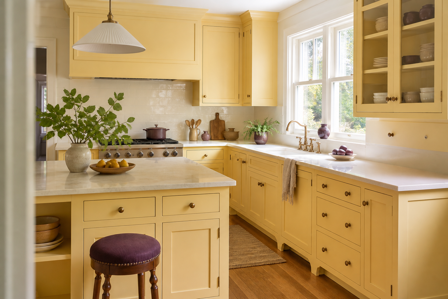
A plum stool, ceramic, or line in a textile can make yellow feel more deliberate because the colors bring out depth in each other. Keep the second color easy to move until you know you enjoy the relationship. The mistake is turning a useful accent into a second full cabinet color before testing it. Start with one or two small notes, live with them, and only expand the idea if the room still feels calm. Complementary does not mean equal; the yellow cabinetry can remain the clear lead.
8. Pair olive and yellow through a shared wood tone
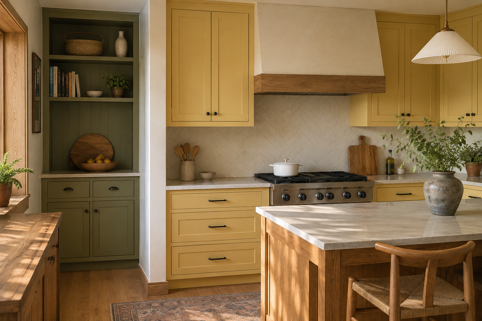
Muted olive can sit beside ochre or mustard comfortably when both colors share an earthy quality. Natural oak between them can act as a bridge. Assign each color to a distinct architectural area, such as the kitchen run and a recessed pantry, so the change looks purposeful. A common mistake is alternating colored doors within one continuous elevation and breaking the cabinet rhythm. Sketch the color boundaries on a simple elevation or printed photo. Strong palettes become easier to trust when every transition has a reason.
9. Test yellow in more than one kind of light
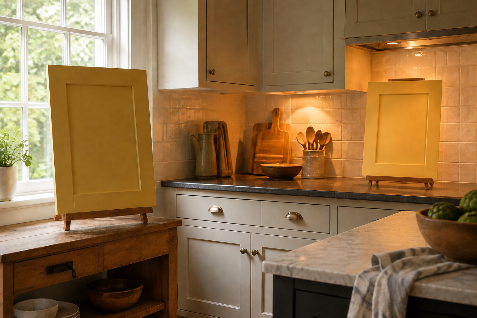
Yellow is especially responsive to light. The same sample may look creamy on a gray morning, bright at noon, and orange under a warm evening bulb. Move large boards between the upper and lower cabinet zones and give your eyes a few minutes to adjust. One common mistake is comparing several yellows edge to edge; each sample changes how its neighbor appears. Separate them with a neutral board and take notes at set times. A short, patient test is much easier than correcting a full cabinet order.
10. Make the layout work before the sunshine arrives
A beautiful butter-yellow kitchen still needs usable preparation space, sensible storage, safe movement, and appliance doors that can open without trapping anyone. Draw the room and cabinet runs first, then mark exactly which surfaces receive the color. The mistake is adding more cabinetry simply to create a bigger yellow moment. Let function determine how much cabinet the room needs. After the plan is stable, confirm paint availability, door material, sheen, cleaning guidance, and color approval with the cabinet supplier using current physical samples.
Compare warm color with deeper color
If yellow gives you the lift you want, keep it in the running. If you want more depth, compare the same room materials with purple or burgundy. Seeing the alternatives side by side can clarify whether you are drawn to brightness, warmth, drama, or simply a kitchen that feels personal.
Explore Purple Kitchen Ideas Explore Red and Burgundy KitchensPlan the useful kitchen first
Use StilePath to arrange the cabinet runs, appliances, and circulation before committing to the yellow finish. Keep your sample observations beside the plan so the cheerful color belongs to a kitchen that works on an ordinary day.
Start Planning Free