
Purple kitchen cabinets can be calm, warm, and surprisingly easy to live with
Purple does not have to mean a bright violet room. Lavender can feel soft, plum can feel grounded, and aubergine can behave almost like a warm neutral when the surrounding materials give it room to breathe. Start with the cabinet locations and daylight you already have, then gather real paint, wood, counter, and backsplash samples. You do not need a designer's eye to begin. Move the samples around the room, write down what changes, and use these ten checks to build a palette you can explain—not just one that looked beautiful in a saved image.
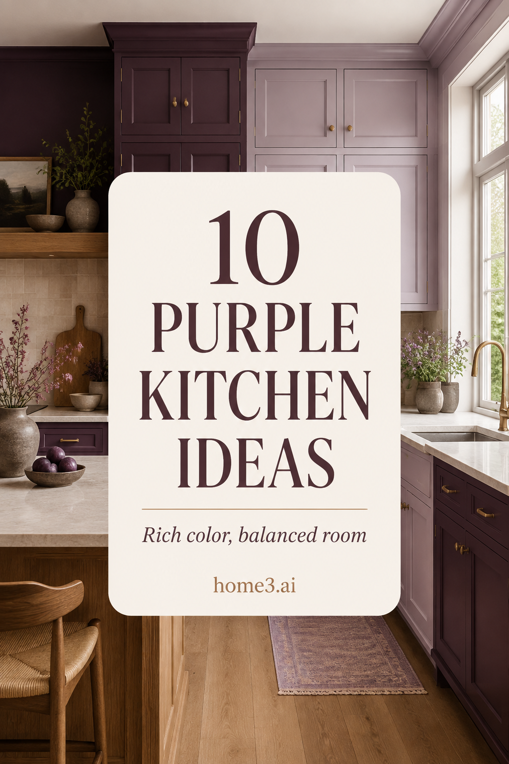
1. Start with a muted undertone
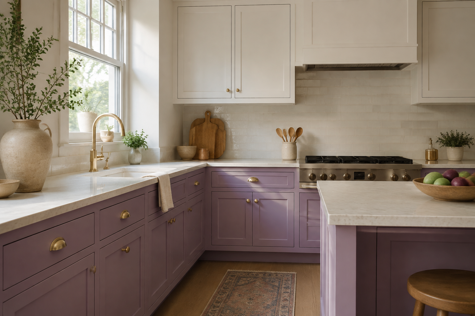
A purple with gray, brown, or red in it often settles into a kitchen more easily than a sharp blue-violet. Compare several large samples beside the floor, trim, and counter instead of choosing from a tiny chip under store lighting. A common mistake is naming the color first—lavender, mauve, plum—and assuming every paint with that label will behave the same. Look at the actual undertone. If the color becomes electric beside your stone or strangely muddy beside the wood, that is useful information, not a failed attempt.
2. Give deep plum one clear job
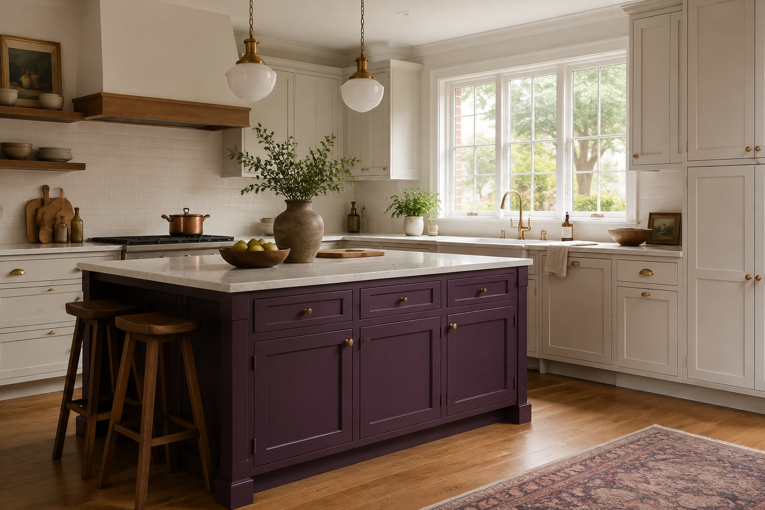
If full-room purple feels like too much, let one island, pantry wall, or beverage station carry the strongest shade. The eye understands bold color better when it has a clear beginning and end. People sometimes scatter the accent across several unrelated cabinet doors because they are afraid of committing; the result can feel busier than one confident block. Mark the focal run on your plan, then check what you see from the entry, dining area, and main work zone. The location should support the layout, not interrupt it.
3. Pair purple with natural wood
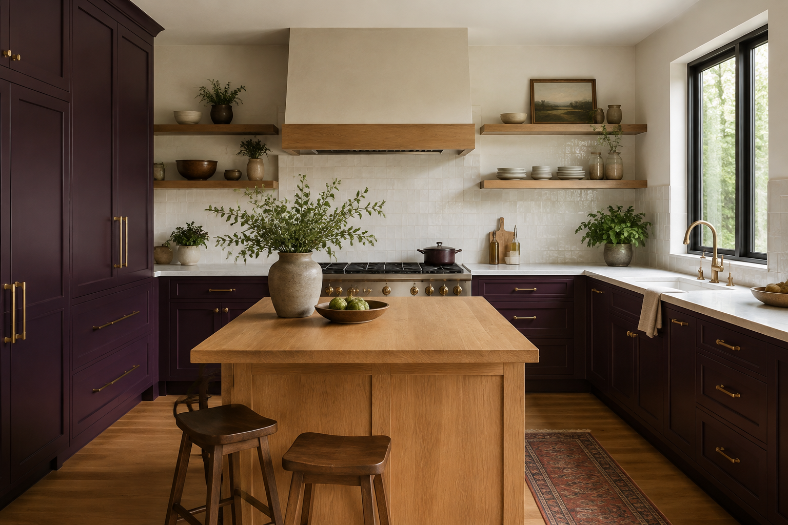
Oak, walnut, and other visible wood grains can warm purple and keep a painted kitchen from feeling flat. Choose the wood and paint together because a pinker wood may amplify red undertones while a pale oak may make the same paint look cooler. One frequent mistake is approving the cabinet color, floor, and island stain in separate meetings. Bring the samples into one group and view them vertically as well as flat. You are looking for a conversation between materials, not a perfect match.
4. Let the largest surfaces be quiet
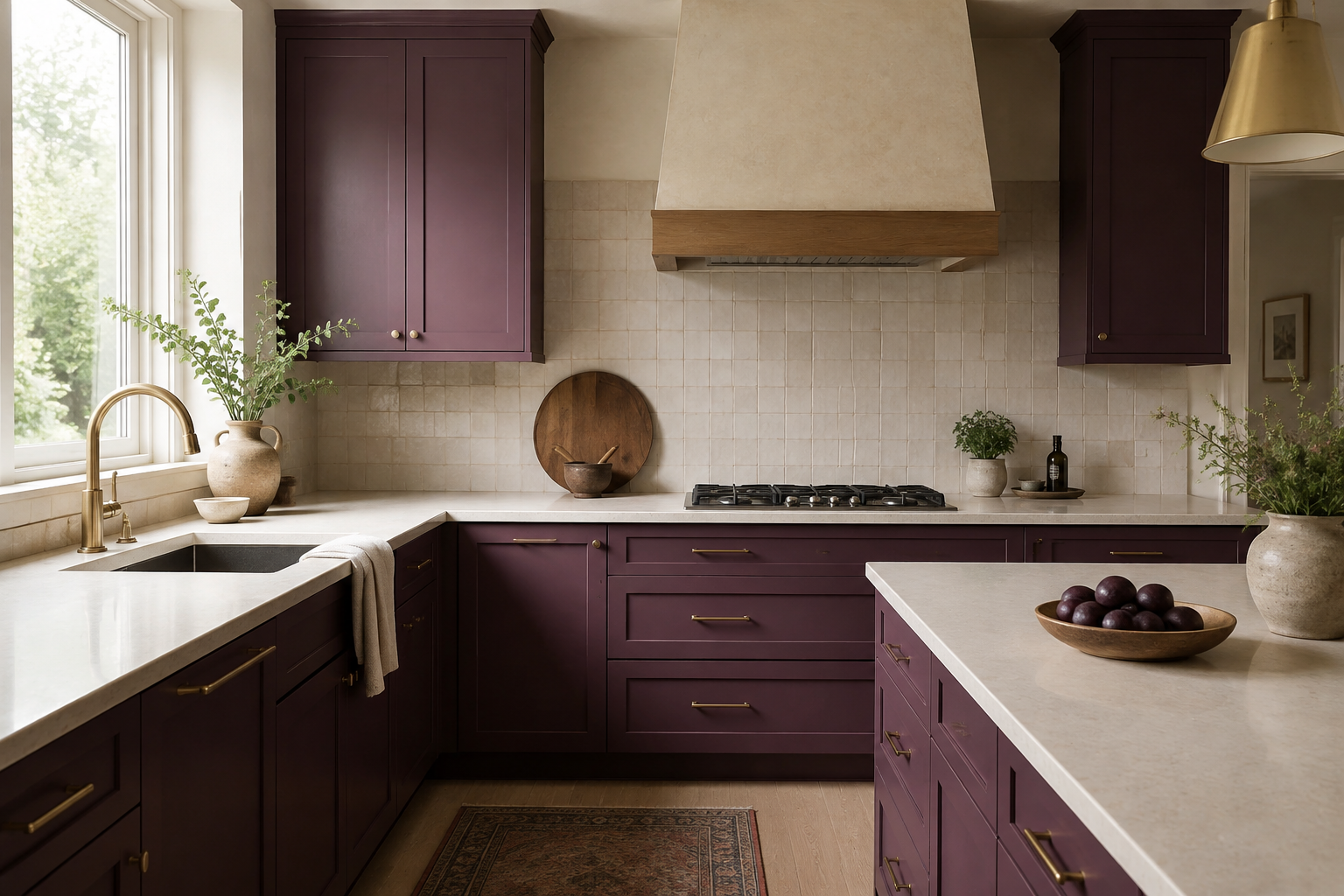
Cabinet color already occupies a large visual area, so the counter, backsplash, walls, and floor do not all need their own headline. A warm white stone, softly varied tile, or restrained floor can give plum room to look intentional. The common mistake is selecting every finish because it is exciting on its own. Put the full palette on a table, squint at it, and notice which pieces compete first. If three surfaces are shouting, quieting one or two usually makes the purple look richer rather than less interesting.
5. Use pale lilac where the room needs lift
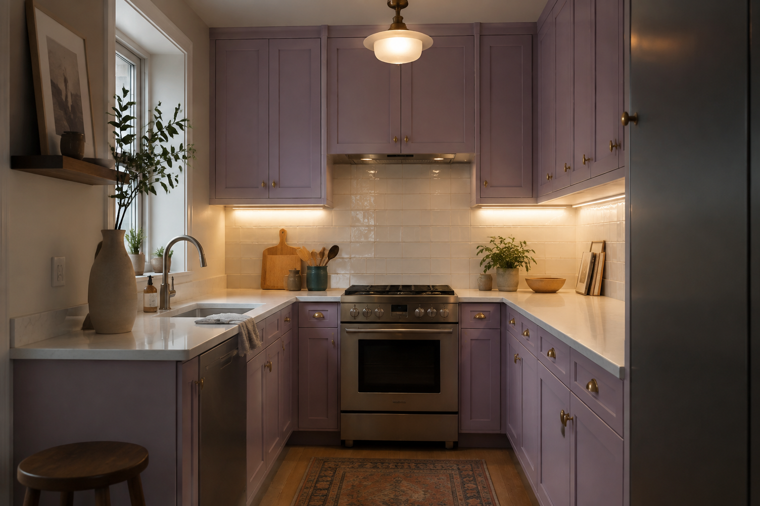
A soft lilac can keep a compact or north-facing kitchen feeling open while still giving it personality. It is not automatically a solution for low light, though. Test it beside the actual bulbs, under-cabinet lighting, and evening shadows because pale purple can drift gray or pink as the light changes. A typical mistake is choosing the color at noon and being surprised after dinner. Tape a large sample to more than one cabinet plane and live with it for several days before committing.
6. Contain pattern inside a defined area
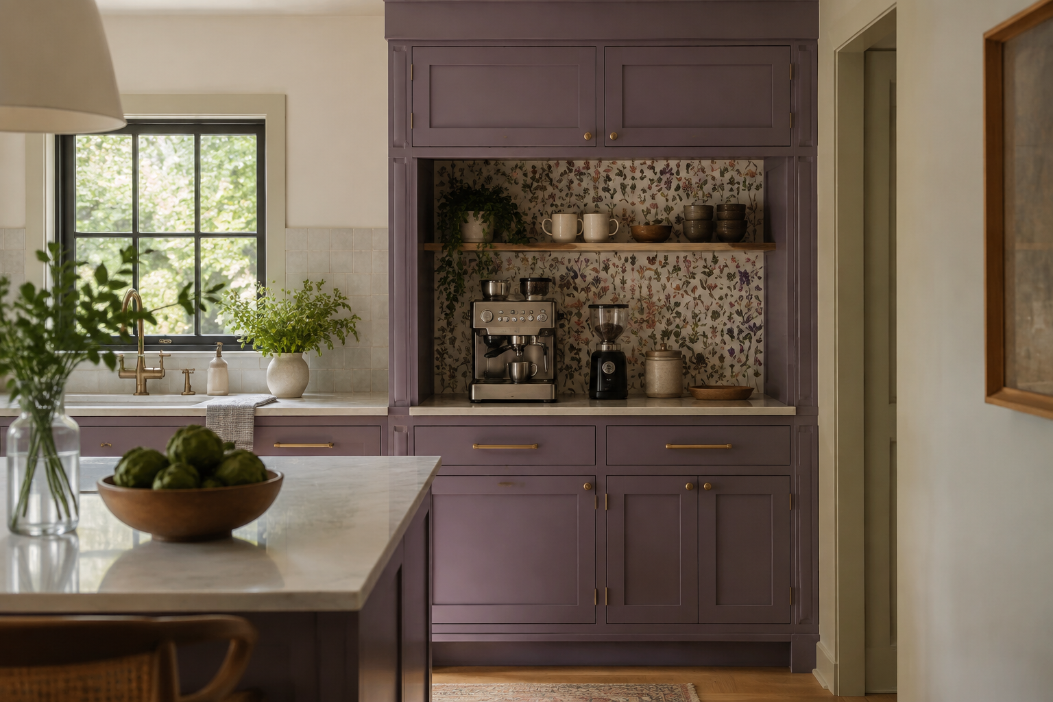
Purple and pattern can work beautifully when the pattern is framed by a pantry niche, coffee station, or one visible wall. The cabinet edges create a natural stopping point and the rest of the room can remain calm. Covering every wall because one wallpaper sample looks good beside one door is an easy mistake. Mock up the full visible repeat with paper or digital tiles, then stand at the room's main entrances. Check seams, outlets, corners, and what the pattern competes with before ordering material.
7. Test hardware as part of the palette
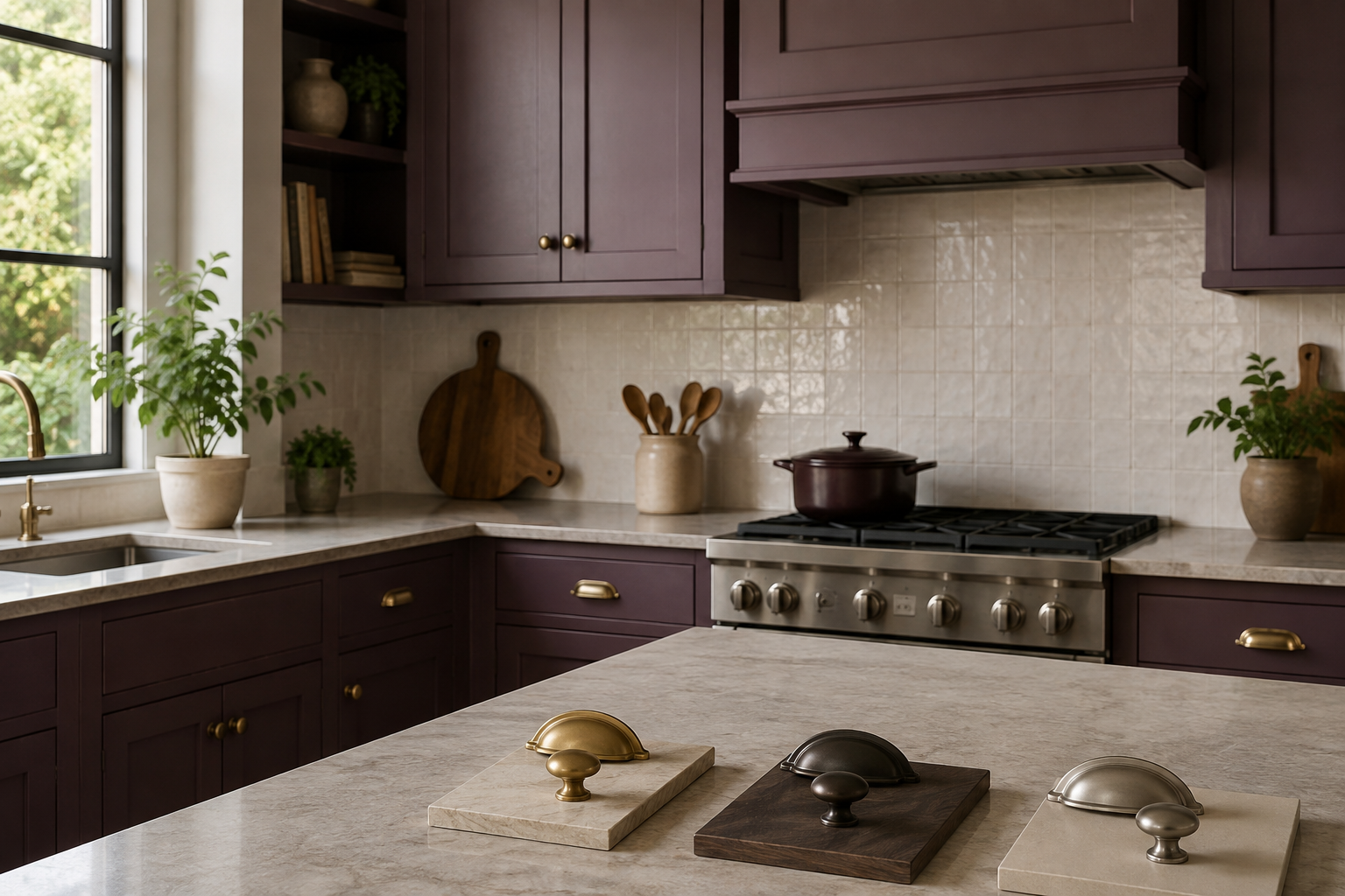
Aged brass can emphasize warmth, dark bronze can make plum feel deeper, and satin nickel may cool the combination. None is automatically correct. Borrow or buy a few real pieces and hold them against the painted door beside the faucet, lighting, and appliances. A common mistake is choosing hardware from a close-up photograph without considering how often it repeats across the whole room. Count the pulls and knobs on an elevation; a small finish decision can become one of the strongest repeated notes in the kitchen.
8. Repeat the color in small echoes
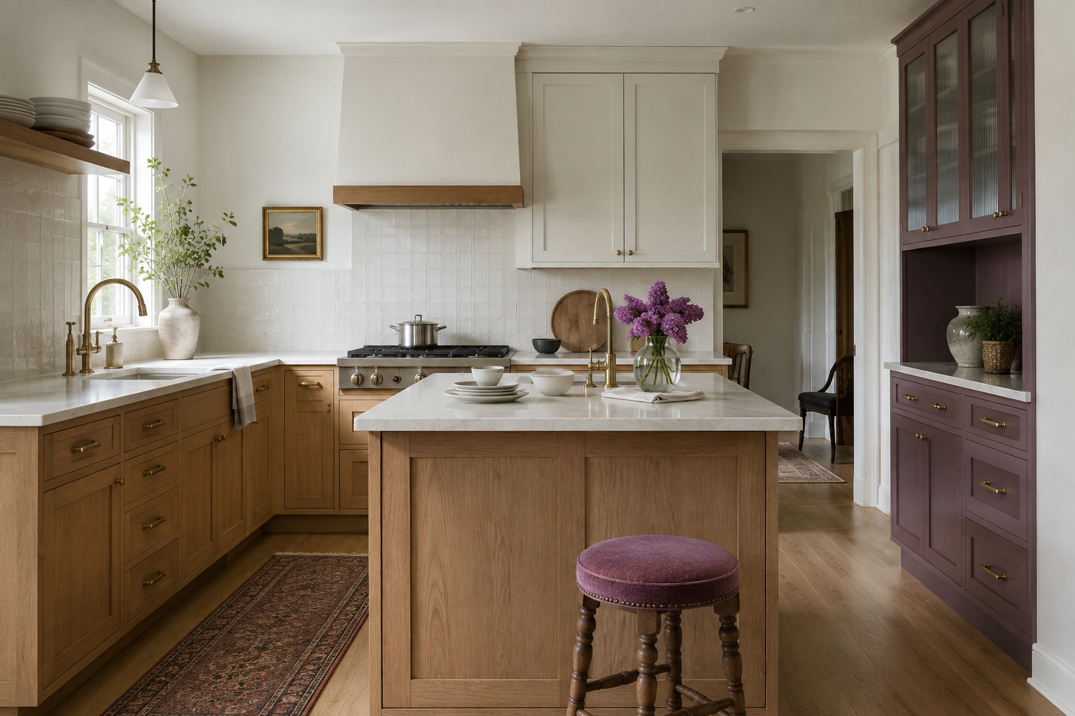
One or two quiet echoes—a stool fabric, a vase, a line in a runner—can help purple belong without turning the room into a theme. Start with objects you already own before buying coordinating accessories. The mistake is trying to match every purple exactly; slight variation usually feels more natural, while too many matching pieces can make the palette look staged. Keep the cabinetry as the anchor and let the smaller notes be easy to change as your taste and the seasons move.
9. Move samples through the day's light
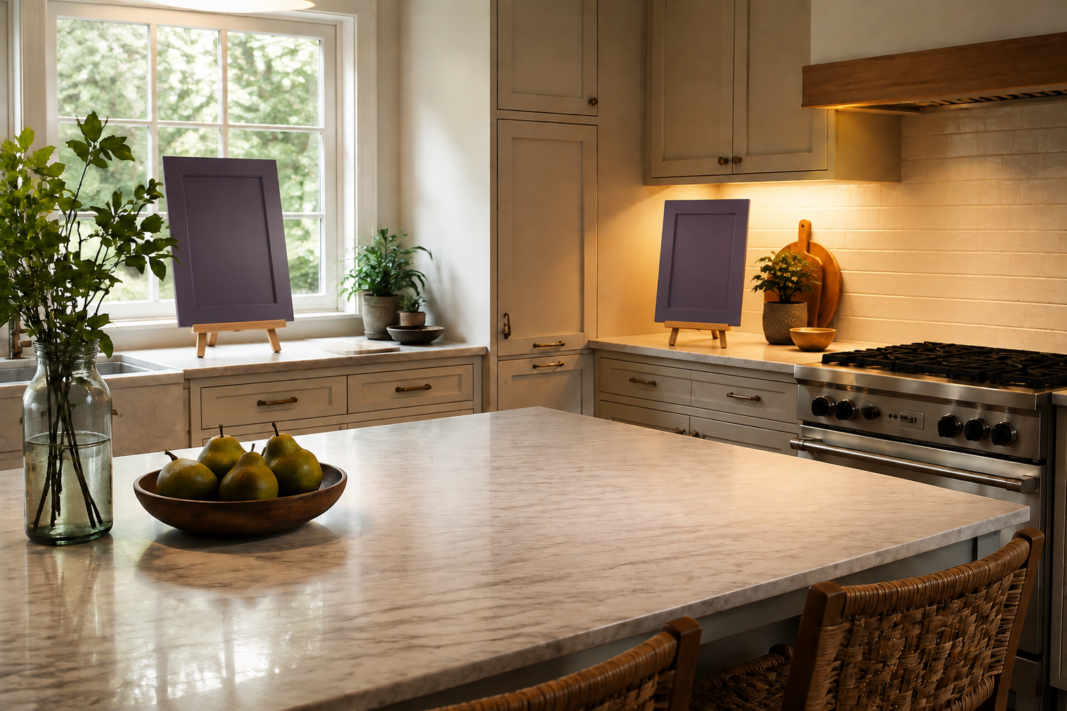
Place large painted samples near the window, range wall, island, and any darker corner, then look again in the morning, afternoon, and evening. Photographing the samples can help you compare, but trust the room more than the phone because cameras change color. A very common mistake is painting several swatches directly beside each other; neighboring colors influence what you see and the final cabinet sheen may differ from the wall. Use movable boards with the intended finish and leave space around each one.
10. Decide the layout before ordering the color
A purple island that looks perfect in an inspiration photo still needs safe circulation, useful storage, workable appliance doors, and enough landing space in your kitchen. Sketch the room, place the cabinet runs, and label which faces receive the bold finish. The mistake is letting a color concept lock in an island or extra cabinet wall that the room cannot comfortably support. Settle the functional footprint first, then price and specify the finish with your cabinet supplier using current samples and the correct door material.
Compare the bold-color paths
If purple helped you see the room differently, compare its warmth and visual weight with the red, burgundy, and yellow approaches. The useful question is not which color is most fashionable; it is which palette still supports the light, materials, layout, and feeling you want every day.
Explore Red and Burgundy Kitchens Explore Yellow Kitchen IdeasGive the bold color a kitchen that works
Use StilePath to place the cabinet runs, appliances, and circulation first. Keep your purple sample notes beside the plan so the exciting finish is attached to a layout you have already thought through.
Start Planning Free