
A red kitchen can feel grounded instead of flashy
Burgundy, oxblood, brick, and terracotta bring warmth that bright primary red does not. The secret is not a special design rule; it is looking at the color as part of the whole room. Put real cabinet samples beside the wood, counter, floor, backsplash, metal, and light you plan to use. Anyone can start this process with a few sample boards, a phone camera, and honest notes about what changes during the day. These ten checks will help you make the bold choice carefully without sanding away the personality that attracted you to it.

1. Choose wine, brown, or earth in the undertone
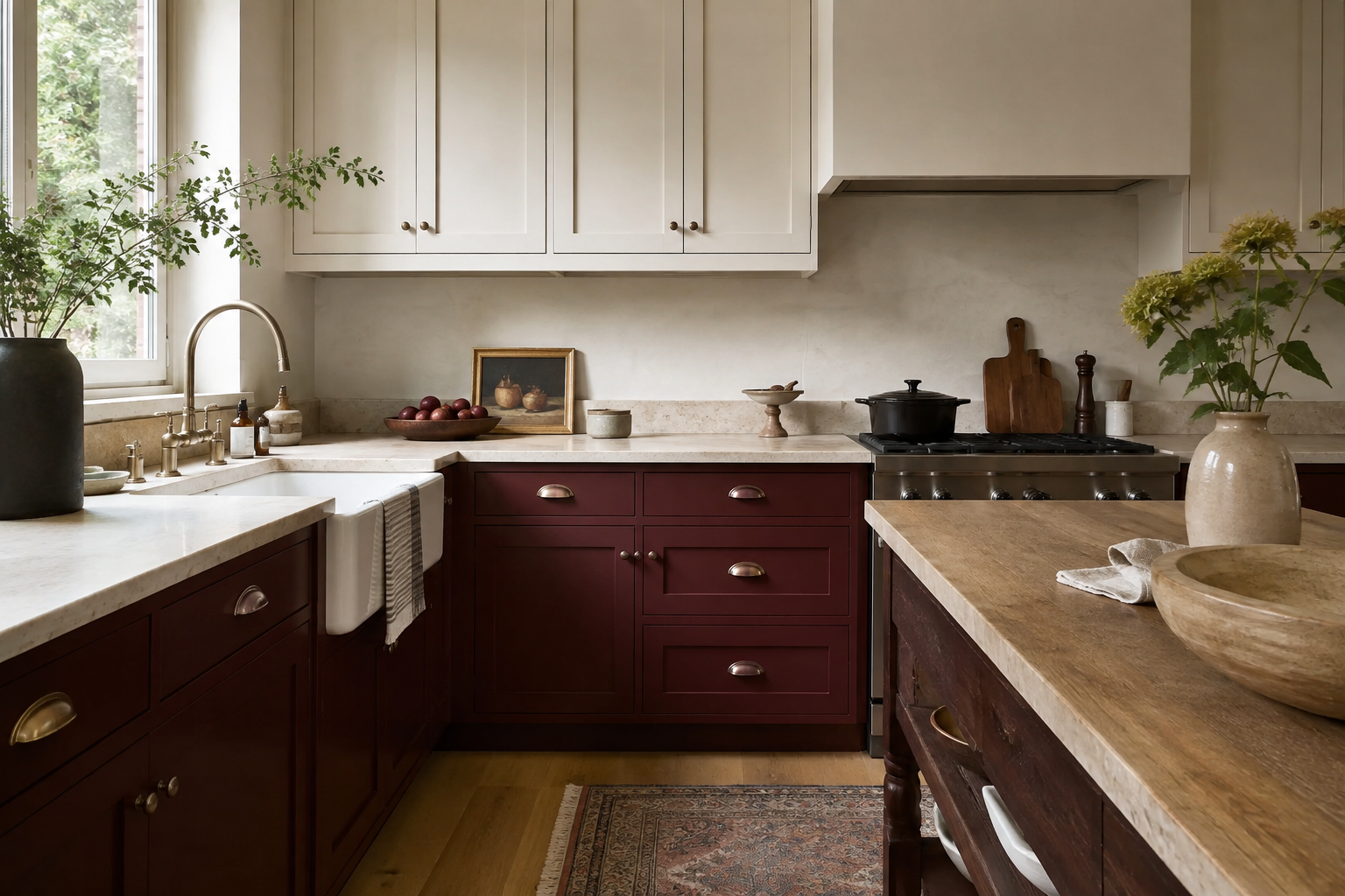
A red with wine, brown, or clay underneath it tends to feel more settled across a large bank of cabinets. Set a clear red sample beside muted burgundy and brick so you can see the difference rather than relying on a color name. The common mistake is choosing the richest chip in the fan deck without imagining it repeated across twenty doors and drawers. Use a large sample in the intended sheen. If it looks too bright, do not abandon red immediately; move one step earthier or deeper and compare again.
2. Concentrate oxblood on one focal element
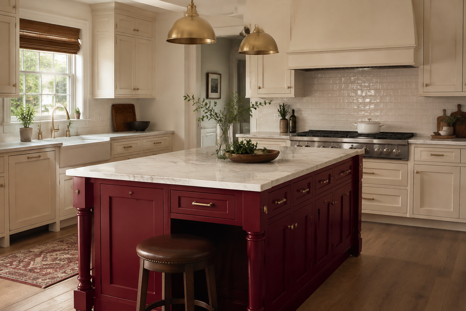
An island can carry a deep oxblood finish while the perimeter remains cream, wood, or another restrained tone. This works best when the island already has a strong role in the plan, not when color is being used to justify squeezing one into the room. A familiar mistake is approving a dramatic island before testing seats, open appliance doors, and the paths around it. Draw the island to scale, include the overhang and stools, and make sure the focal point earns its floor space before you fall in love with the paint.
3. Let walnut absorb some of the visual weight
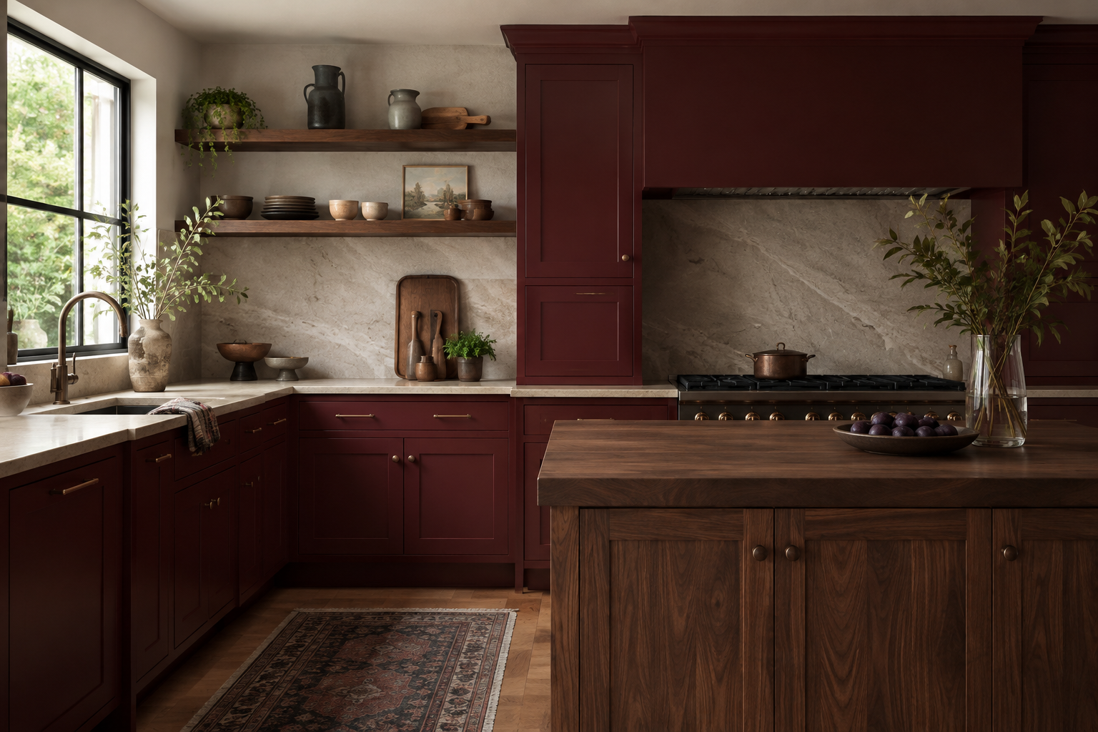
Walnut and other medium-to-dark woods share some of burgundy's warmth, so the transition can feel natural instead of high contrast. Use wood where hands and eyes already expect it—an island, shelf, hood detail, or furniture piece—then compare the grain and stain with the painted door. The mistake is ordering a reddish stain from a small catalog image and discovering that it competes with the cabinets. Ask for current samples on the actual species and finish, because wood variation is part of the palette.
4. Consider terracotta when burgundy feels too formal
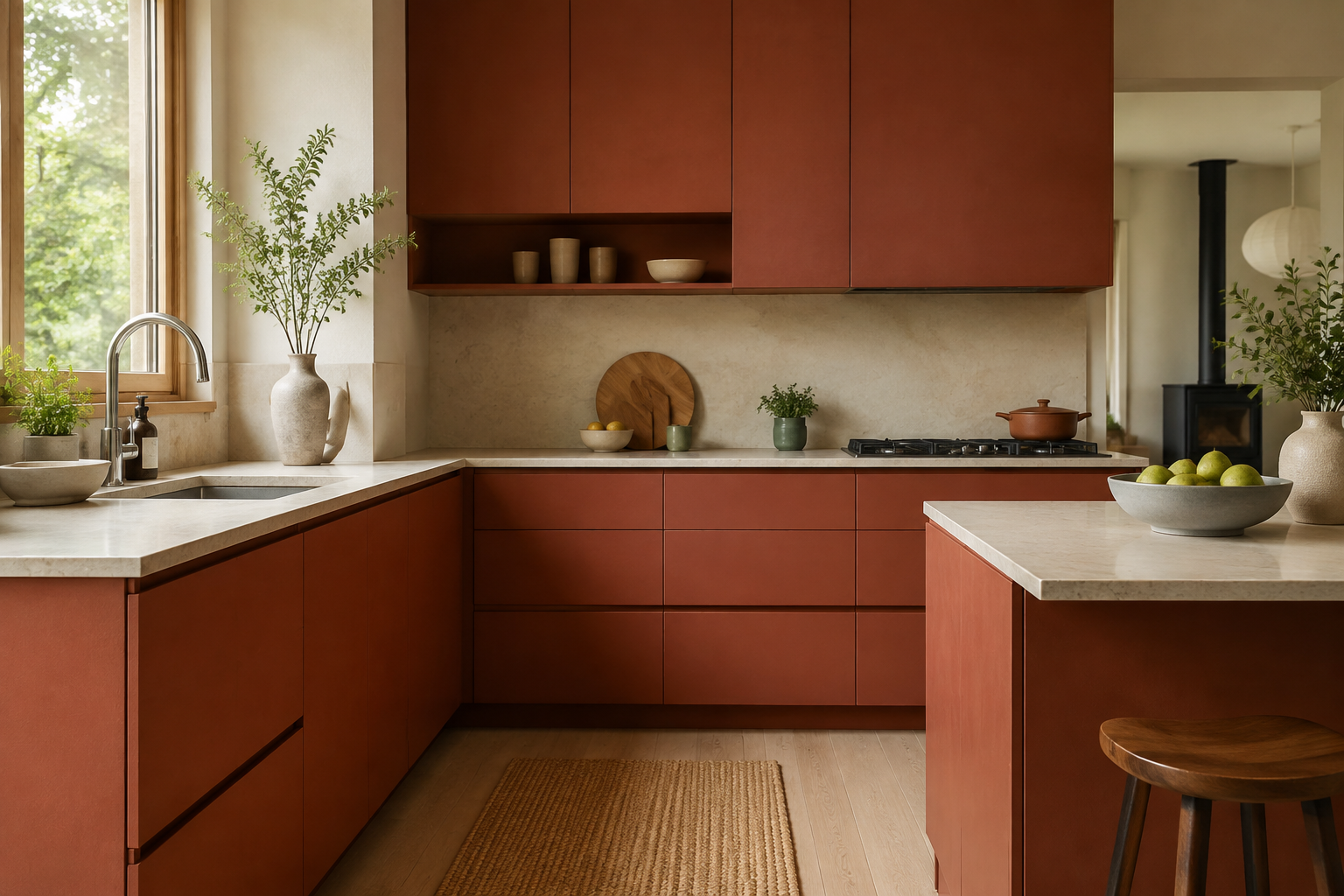
Terracotta, paprika, and brick can create a relaxed, sun-warmed version of red, especially with simple cabinet fronts and matte mineral finishes. They still change dramatically with light, so test them against your wall color and flooring. A common mistake is treating every warm red as interchangeable; an orange-leaning clay can make a pink stone look different, while a blue-red can cool the same room. Put the choices side by side, remove the labels, and notice the relationships before deciding what the color should be called.
5. Give red a calm background
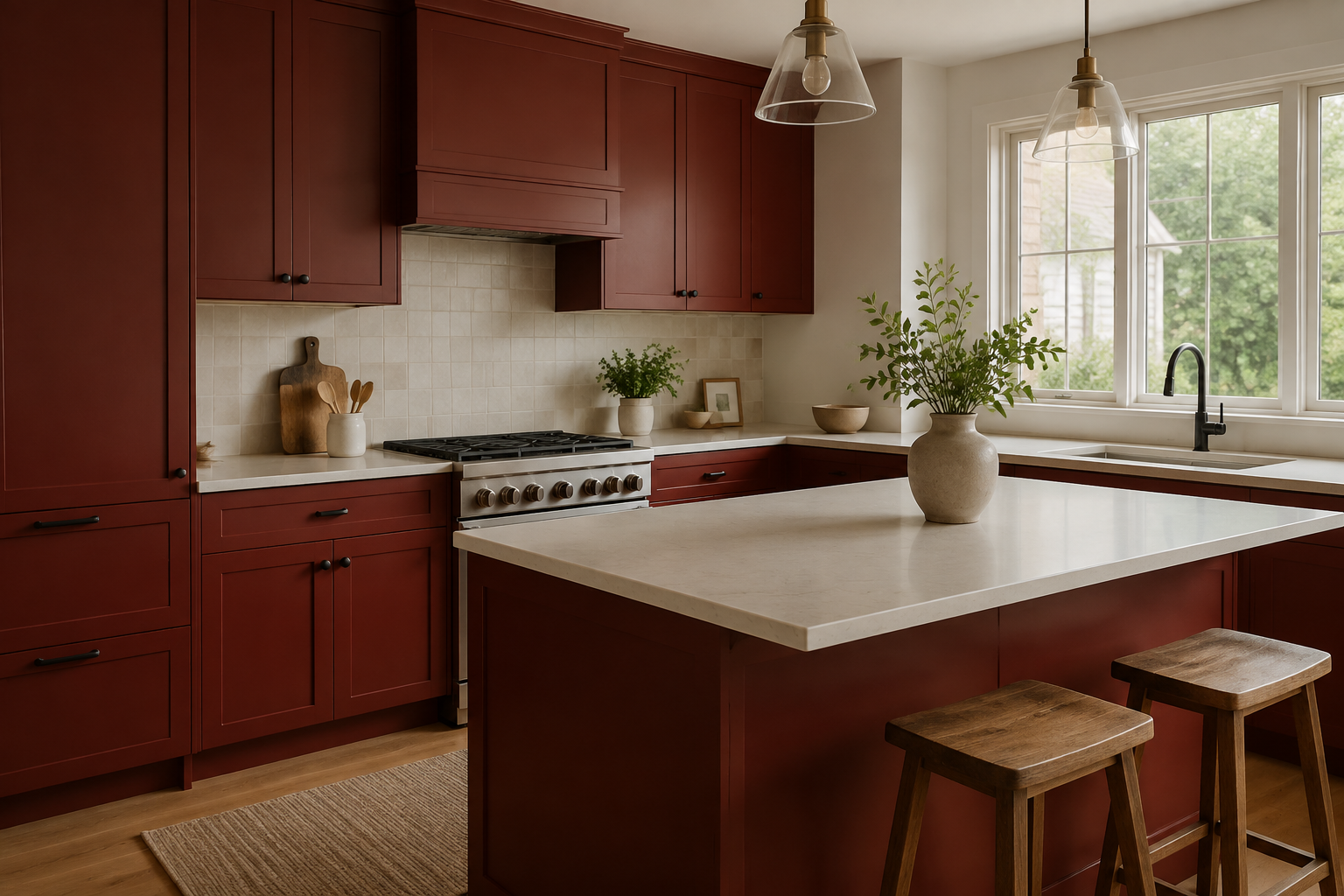
A low-contrast counter and backsplash let the cabinetry provide the room's rhythm. Warm white, cream, or softly veined stone often gives deep red enough breathing room, but the right neutral depends on the cabinet undertone. The usual mistake is collecting a dramatic slab, patterned tile, strong floor, and saturated cabinet color because each one looks impressive alone. Arrange every major sample in approximate proportion. The counter and floor occupy much more space than a two-inch square suggests, so let them support the red instead of competing with it.
6. Frame pattern in a pantry or coffee station
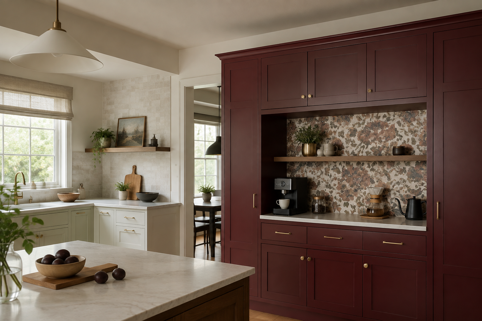
A floral, geometric, or scenic pattern can make burgundy feel layered when it sits inside a defined cabinet niche. The edges contain the energy and turn the area into a destination. People often choose a small repeat without checking where switches, shelves, and counter items will interrupt it. Print or tape up enough of the pattern to show its true scale, then place paper shapes for the objects that live there. The backdrop should still make sense after the coffee maker, jars, and outlets arrive.
7. Check the sample in daylight and task light
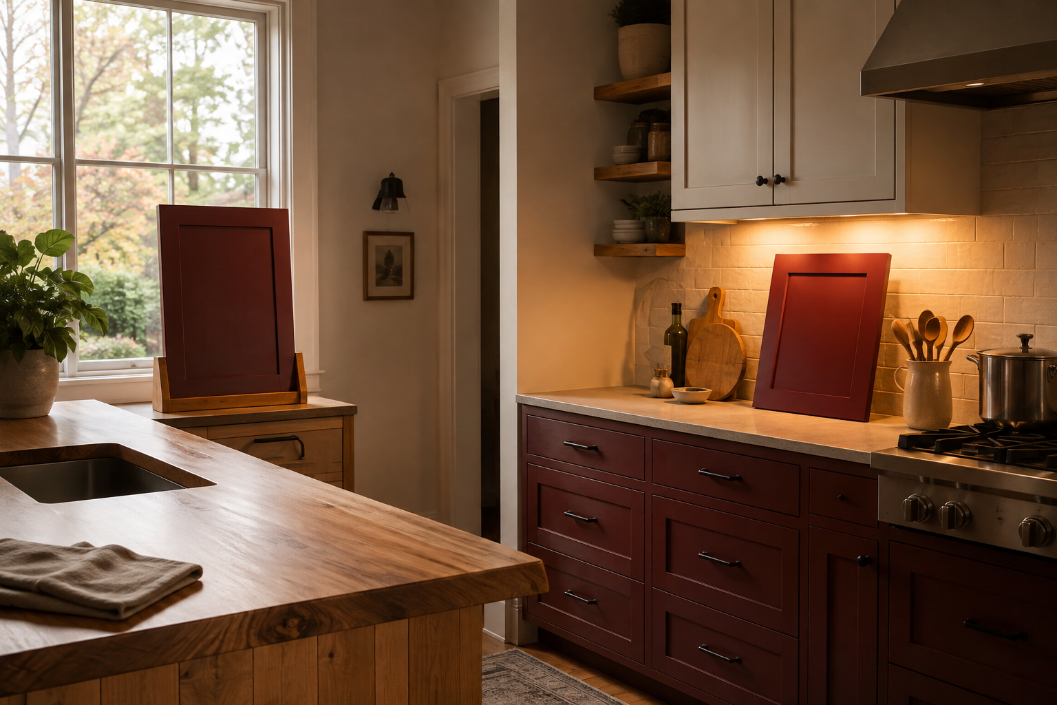
Deep red can move from berry to brown as the light changes. Put separate large sample boards near the brightest window and under the evening lights you actually use, then trade their positions. A phone photo is useful for remembering the comparison, but it may exaggerate or flatten the hue. The common mistake is approving the color under one showroom bulb. Give yourself several ordinary days with the samples. You are not being indecisive; you are learning how a large permanent surface will behave in your room.
8. Add cool contrast in a measured amount
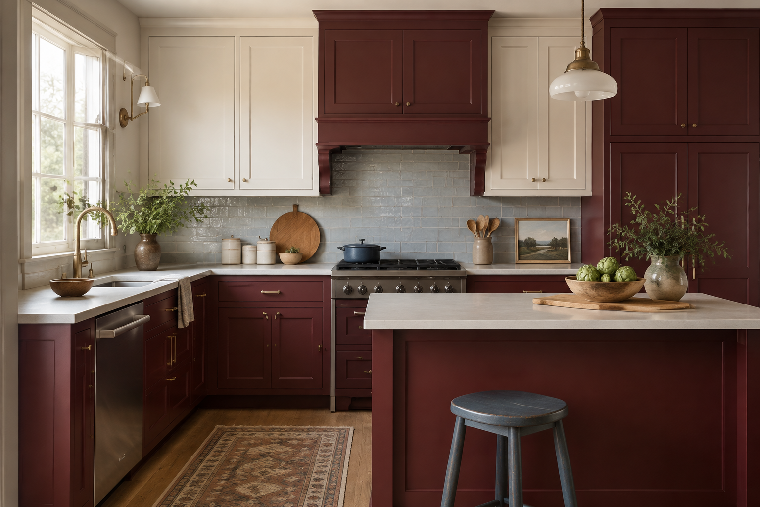
Dusty blue, blue-gray, or muted green can sharpen burgundy and keep the palette from feeling heavy. Start with one movable accent or a small tile field rather than adding a second saturated color everywhere. A common mistake is reading that red and blue are complementary in a palette guide and giving them equal visual weight. Decide which color leads. If red owns the cabinetry, the cool note can be a stool, art, runner, or subtle backsplash shift that helps the red look intentional.
9. Follow the red through connected sightlines
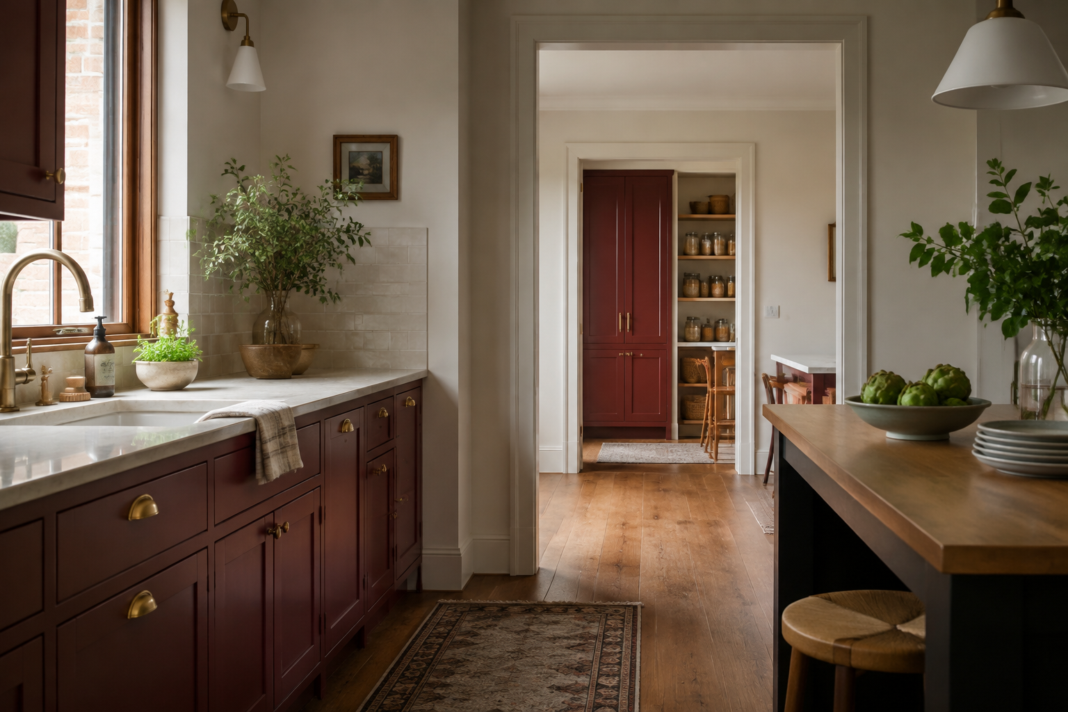
In an open plan, the cabinet color belongs to more than the kitchen. Stand in the adjoining room and mark every painted surface visible at once. Repeating burgundy once on a pantry door or distant built-in can create continuity, but it is not required. The mistake is matching every connected room so thoroughly that none has a clear identity. Use neutral walls, repeated wood, or consistent metal to carry the palette between spaces, then add a red echo only where it improves the view.
10. Keep the practical kitchen in charge
Bold color cannot fix a blocked walkway, an undersized preparation area, or cabinet doors that collide. Measure the room, place the appliances and storage, and identify the cabinet runs before assigning the red finish. A frequent mistake is extending the statement color onto an extra pantry wall or island that the kitchen does not really need. Let the layout solve daily life first. Then confirm the current paint, door material, sheen, and care requirements with the cabinet supplier so the finished red is as practical as the plan behind it.
See how the neighboring colors behave
Purple offers a cooler route to depth, while yellow brings more daylight and lift. Compare all three with the same wood, stone, and room photos. The best choice is the one that keeps working after the first dramatic impression.
Explore Purple Kitchen Ideas Explore Yellow Kitchen IdeasBuild the kitchen plan beneath the color
Use StilePath to organize the cabinet runs, appliances, and movement before the burgundy finish becomes expensive to change. Keep the palette samples beside the plan and make each bold surface earn its place.
Start Planning Free