
Two-tone cabinetry works best when every change has a reason
Two cabinet finishes can organize a kitchen, lighten a wall, or make an island feel like furniture. They can also divide the room into unrelated pieces when the boundary is chosen after the layout. Start with the cabinet locations and work zones, then give each finish a clear job. Gather large painted and wood samples and compare them beside the actual floor, counter, backsplash, and wall color. You do not need a perfect design vocabulary. Notice which sample feels heavy, which turns unexpectedly cool, and where your eye stops. These ten approaches will help you build a two-tone plan that remains understandable from every doorway.
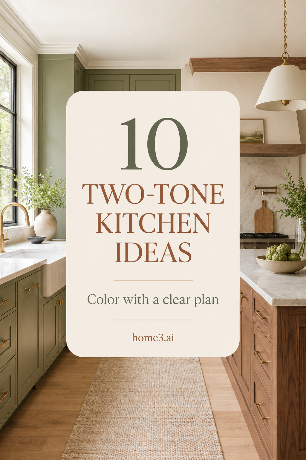
1. Let the island be one complete focal block
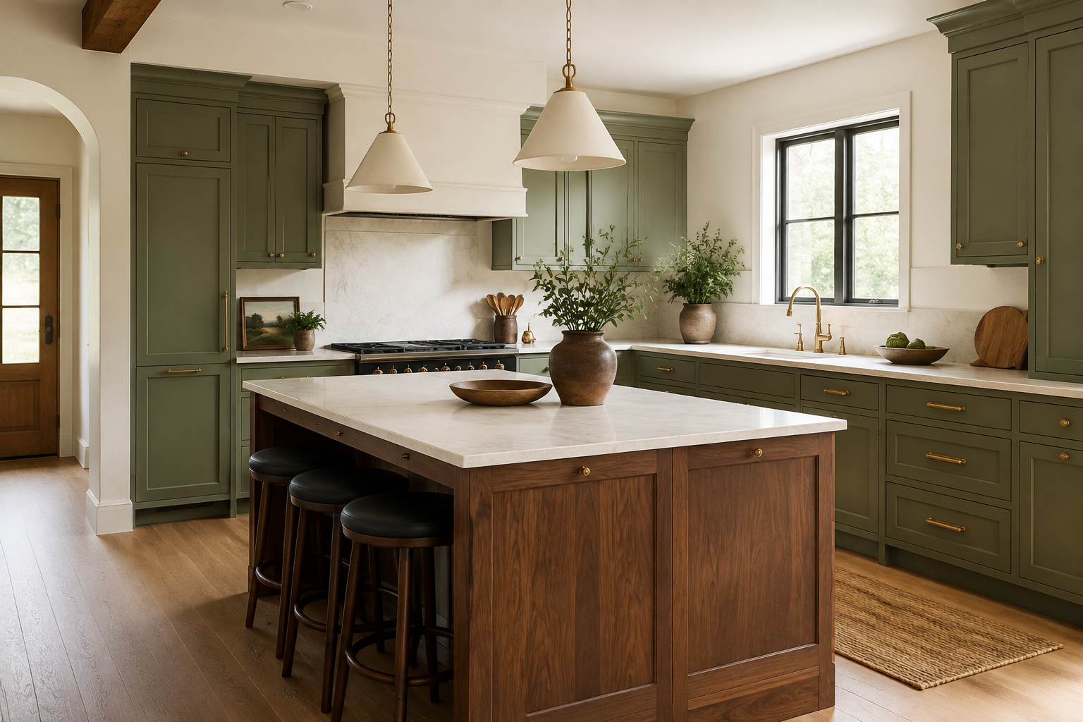
Changing the island is the clearest two-tone move because the cabinet finish begins and ends with one object. Wood can warm painted perimeter cabinets, while a deeper painted island can anchor a pale room. A common mistake is selecting the island color before confirming that an island actually fits. Do not add one merely to create contrast. Check the room's circulation, appliance openings, seating, and preparation needs first. If the island earns its place, treat the entire visible base—including finished ends and seating panels—as one coordinated block so the color does not appear to stop at random corners.
2. Ground the room with darker lower cabinets
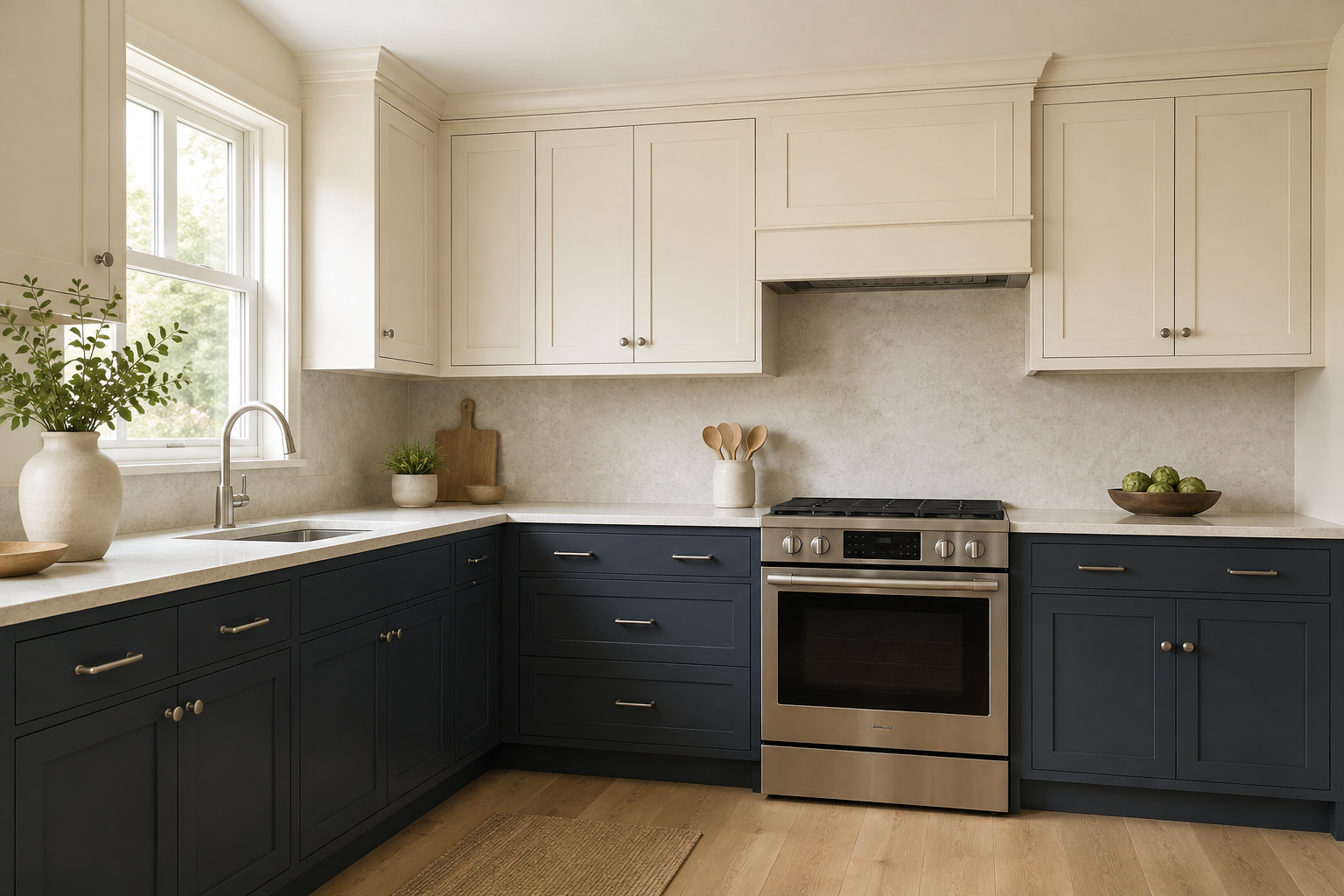
Dark lowers and light uppers can keep visual weight near the floor while allowing the wall cabinets to recede. This is useful in a compact kitchen with plenty of upper storage. The familiar mistake is choosing the two colors independently: a stark cool white may make a warm blue-gray look muddy, or a creamy upper may turn yellow beside a cool charcoal. Put the samples directly together and view them vertically. Also mark where tall cabinets land, because a floor-to-ceiling pantry interrupts the horizontal rule. Decide which finish the tall unit belongs to before the painter or cabinet order has to guess.
3. Give the tall pantry bank its own finish
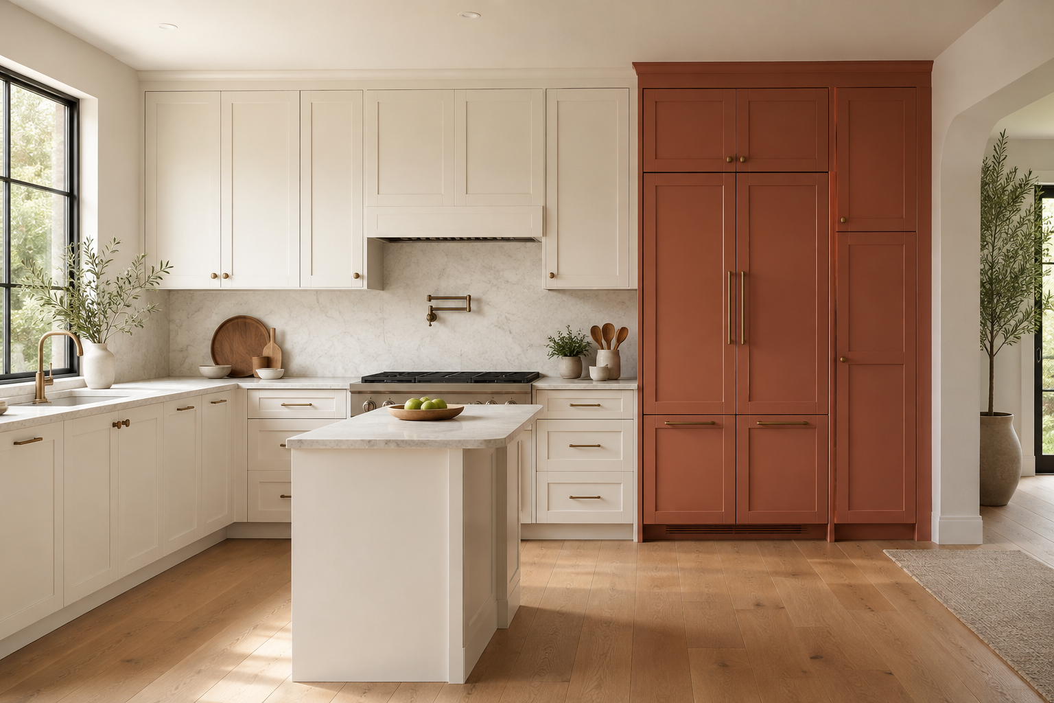
A tall pantry and refrigerator wall already reads as a large architectural mass. Giving that complete bank a deeper color can make it feel deliberate while the working cabinets stay light. A common mistake is ending the accent halfway through the group—coloring the pantry but not the refrigerator panels, or changing the cabinet above the appliance without a visual reason. Draw the entire elevation and shade the finish areas with a pencil. If the block cannot be explained in one sentence, simplify it. The strongest color boundaries usually follow real cabinet groups rather than individual doors.
4. Pair wood and paint by undertone, not label
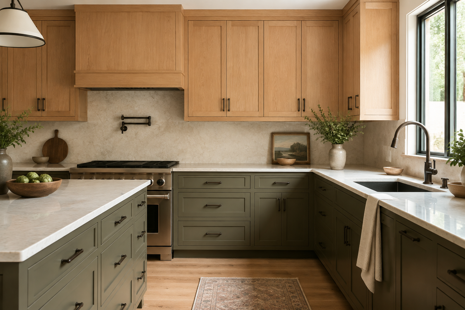
Wood gives a painted kitchen movement and warmth, but its undertone changes with species, cut, stain, and finish. Pale oak may look pink beside one olive and honeyed beside another. The mistake is approving a paint chip and a small wood block under different lights. Ask for the largest current samples available, place them beside each other, and rotate the wood so the grain catches light as it will on a vertical door. Include the floor in the group. Two wood tones can coexist, but they should look intentionally related rather than like one was selected before the other arrived.
5. Change color at an architectural boundary
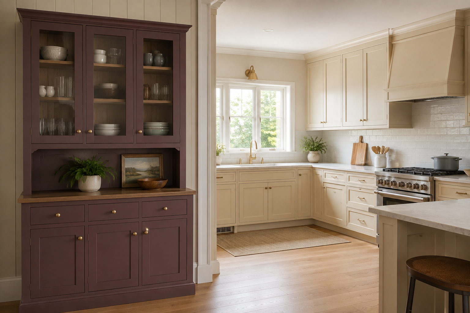
A doorway, wall return, recessed niche, or freestanding hutch gives color a natural stopping point. This is especially helpful when you love a bold finish but do not want it around the entire room. The mistake is changing color in the middle of one continuous run because the cabinet count happened to divide evenly. Walk through the connected rooms and note where the accent first becomes visible. A boundary that makes sense from the kitchen may look arbitrary from the dining area. Use photos from each approach and draw the proposed color block over them before choosing the final location.
6. Let the surrounding surfaces stay quiet
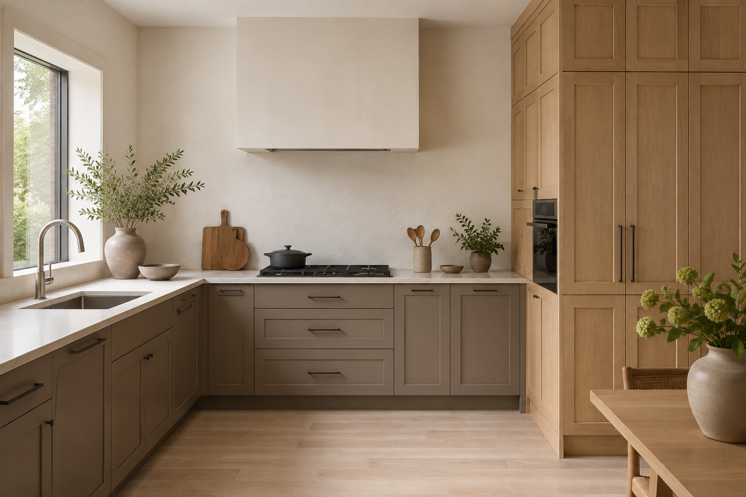
Two cabinet finishes already create contrast, so the counter, backsplash, floor, and walls do not all need competing patterns. A restrained background often makes both cabinet materials look richer. The common mistake is selecting each surface because it is interesting alone, then discovering that the full sample group has no place for the eye to rest. Arrange the materials in rough visual proportions: a large field for cabinet colors, long strip for the counter, smaller strip for the backsplash, and broad floor sample. Remove one assertive pattern at a time and photograph the difference. Calm is not the same as plain.
7. Look for a shared temperature
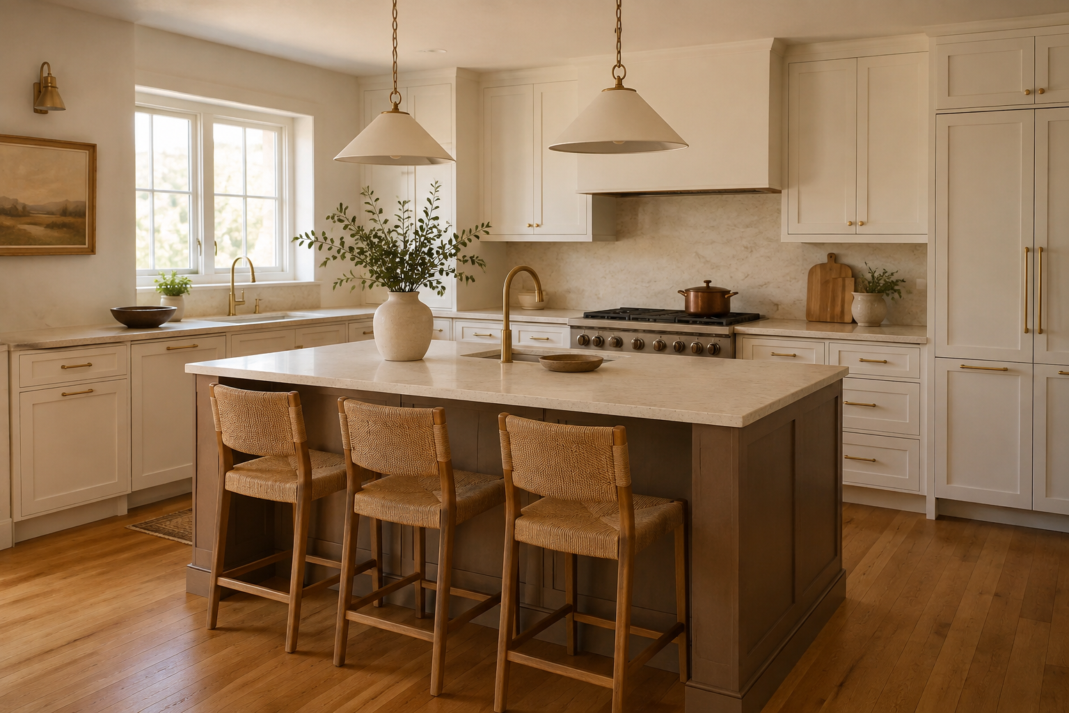
The two colors do not need to match, but they should be comfortable in the same light. Warm white and clay brown may share a softness; blue-gray and pale oak may share a cooler restraint. A common mistake is using the word neutral as proof that two samples belong together. Neutrals carry pink, green, yellow, violet, or gray undertones that become obvious only in company. Place a plain white card between the samples, then separate them and look again. Test them beside the fixed floor or stone, because that existing material may decide which temperature feels settled.
8. Use hardware and appliances as a bridge
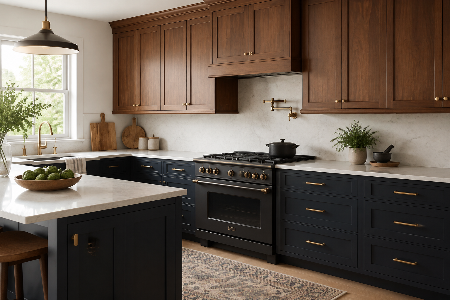
Repeating one hardware finish across both cabinet colors can make the palette read as a single plan. An appliance finish, faucet, light fixture, or small wood detail can reinforce that connection. The mistake is asking metal finishes to rescue colors that do not work together, then adding several more metals for variety. First settle the cabinet pair and large surfaces. Then use hardware as punctuation. Place the exact pull or knob against both door samples and check the contrast, grip, and scale. A finish that disappears on one color and shouts on the other may need a different shape or tone.
9. Move the samples through the day
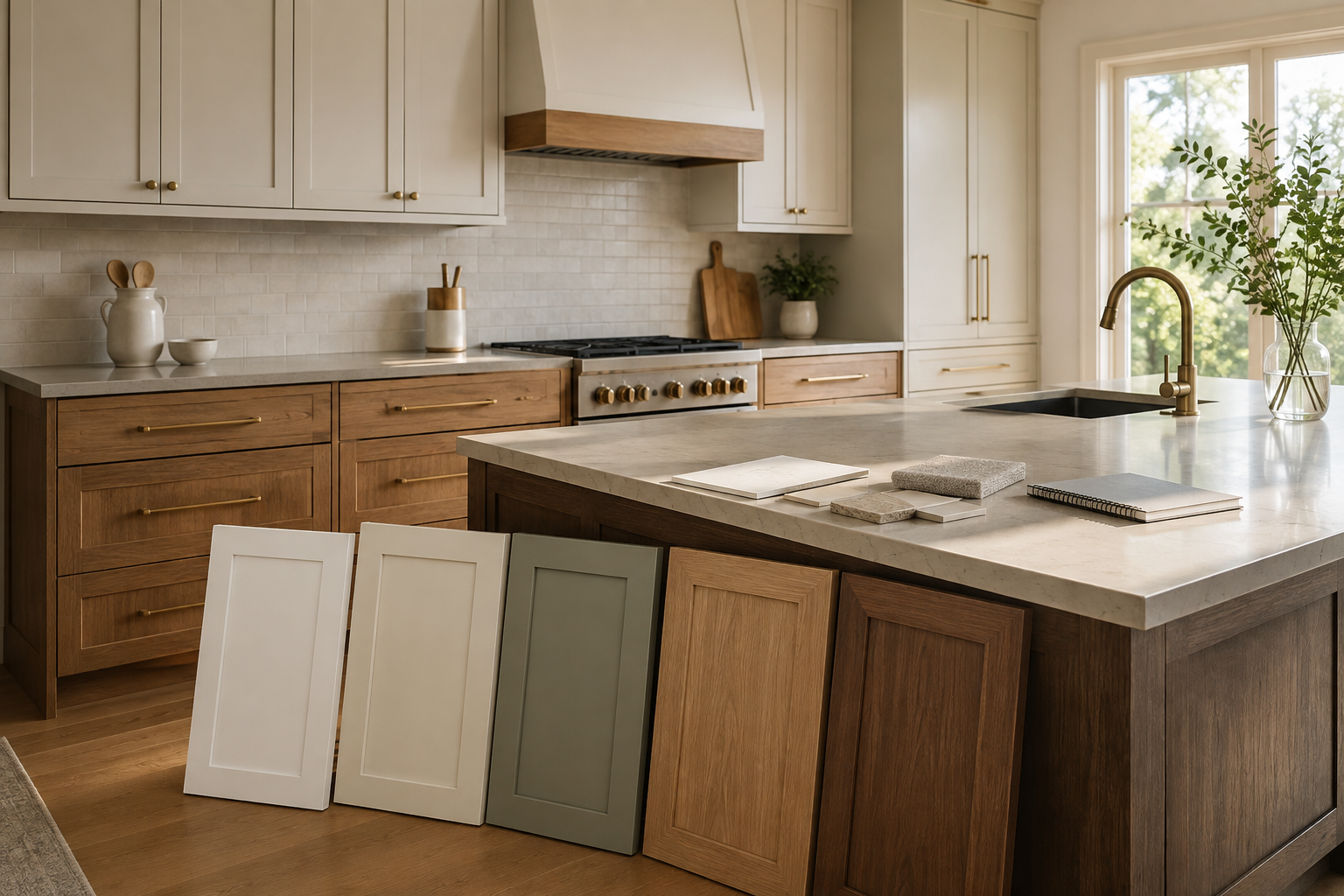
Two-tone schemes are sensitive to changing light because each finish also changes the way its partner appears. Set large samples at upper, lower, island, and tall-cabinet heights. Look on a gray morning, in direct afternoon light, and under the lamps you use after dinner. The common mistake is comparing every option edge to edge until your eyes adapt and the differences disappear. Test one pair at a time with a neutral gap between alternatives. Take plain notes—warmer, flatter, greener, darker—rather than trying to sound technical. Consistent observations are more useful than perfect color names.
10. Make the color split follow the work zones
Finalize the cabinet layout before the two-tone finish map. A wood beverage hutch, dark cleanup run, or painted island works best when the area already has a coherent function. The mistake is moving cabinets or adding storage only to make the color composition look more balanced in an elevation. Daily movement, preparation space, appliance openings, and useful storage remain the first test. Once the plan works, mark every exposed end, back panel, filler, crown, toe kick, and appliance panel by finish. Ask the cabinet supplier to confirm the current finish schedule and sample approval so no boundary is left to assumption.
Choose the profile that carries both finishes
Color is only one layer. The cabinet door profile controls the shadows and repetition across both finishes, while the broader color guides can help you compare a bolder palette with a quieter one.
Compare Cabinet Door Styles Explore Livable Kitchen ColorGive both finishes one working layout
Use StilePath to arrange the cabinet groups, appliances, and circulation before assigning each finish. Keep your physical sample notes beside the plan so every color change follows a useful part of the kitchen.
Start Planning Free