
Cabinet door style changes more than the cabinet front
A door sample may fit in one hand, but repeating that profile across an entire kitchen changes the room's light, shadow, cleaning routine, and sense of scale. Begin with the cabinets your layout actually needs, then compare full-size door samples beside the floor, counter, backsplash, and hardware you are considering. You do not need formal design training to notice what feels calm or busy. Stand back, photograph the group, open and close the sample if it is mounted, and write down what catches dust or creates glare. These ten options will help you compare the look and the everyday tradeoffs before the order becomes expensive to change.
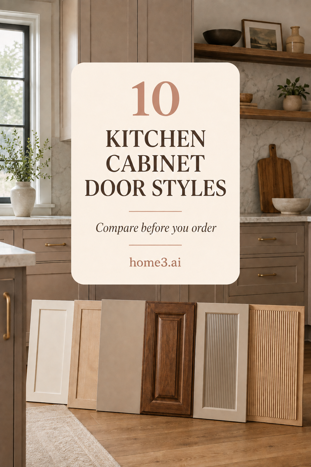
1. Start with the familiar Shaker door
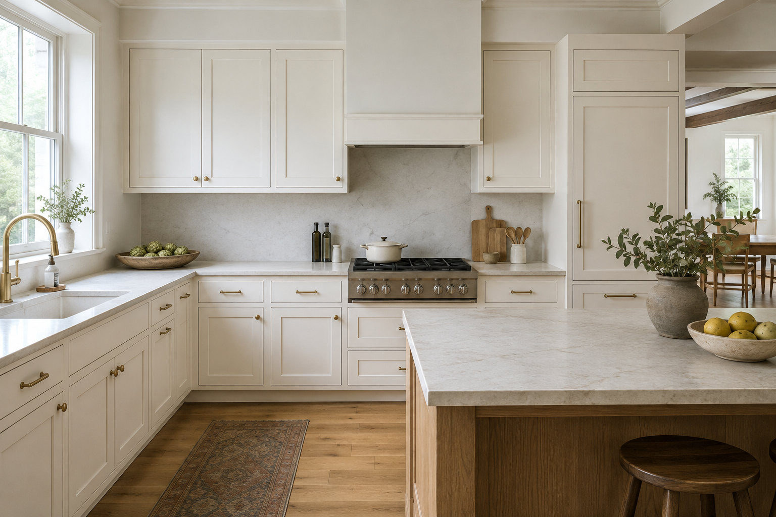
A classic Shaker door uses a flat center panel framed by straightforward rails and stiles. It works in many homes because the profile gives the cabinetry enough shadow to feel finished without demanding attention. The common mistake is assuming every Shaker door is interchangeable. Rail width, inside-edge detail, panel depth, and paint sheen can make one sample feel crisp and another feel heavy. Compare the actual door from the cabinet line you may buy, not a generic inspiration photo. Look at several doors side by side so you can judge the rhythm the profile creates across a full run.
2. Use slim Shaker when you want a quieter frame
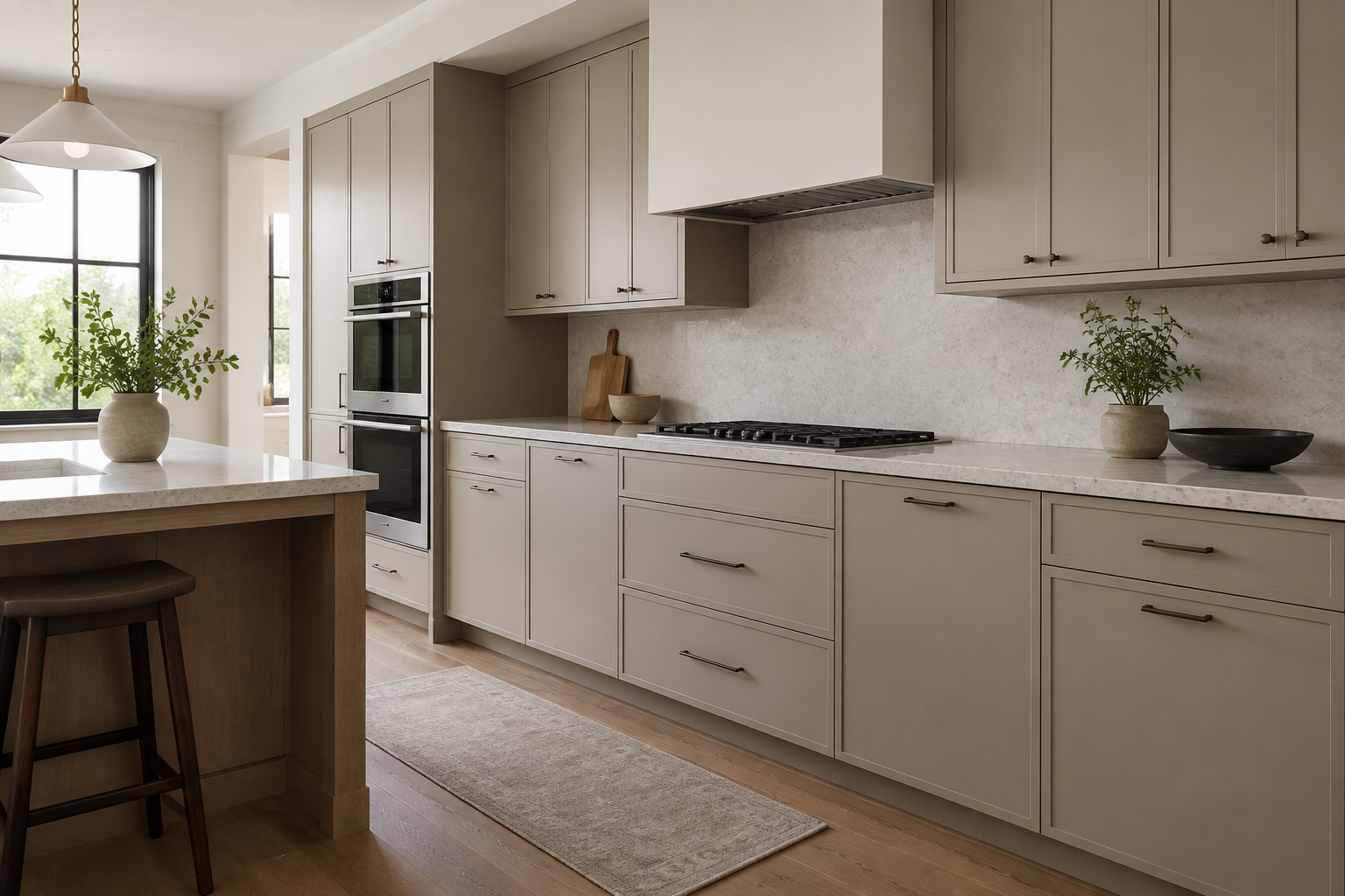
Slim-Shaker doors narrow the frame and reduce the amount of visual line around each panel. That can suit a smaller kitchen or a long bank of tall cabinets where a wider profile begins to feel repetitive. A frequent mistake is choosing an extremely thin frame from a photograph without checking how the corners, center panel, and hardware are built in the real product. Ask to see the back and edge as well as the front. Then place the pull or knob on the sample. Delicate proportions can look elegant, but they still need a hardware location that feels comfortable and intentional.
3. Let a slab door make the material the feature
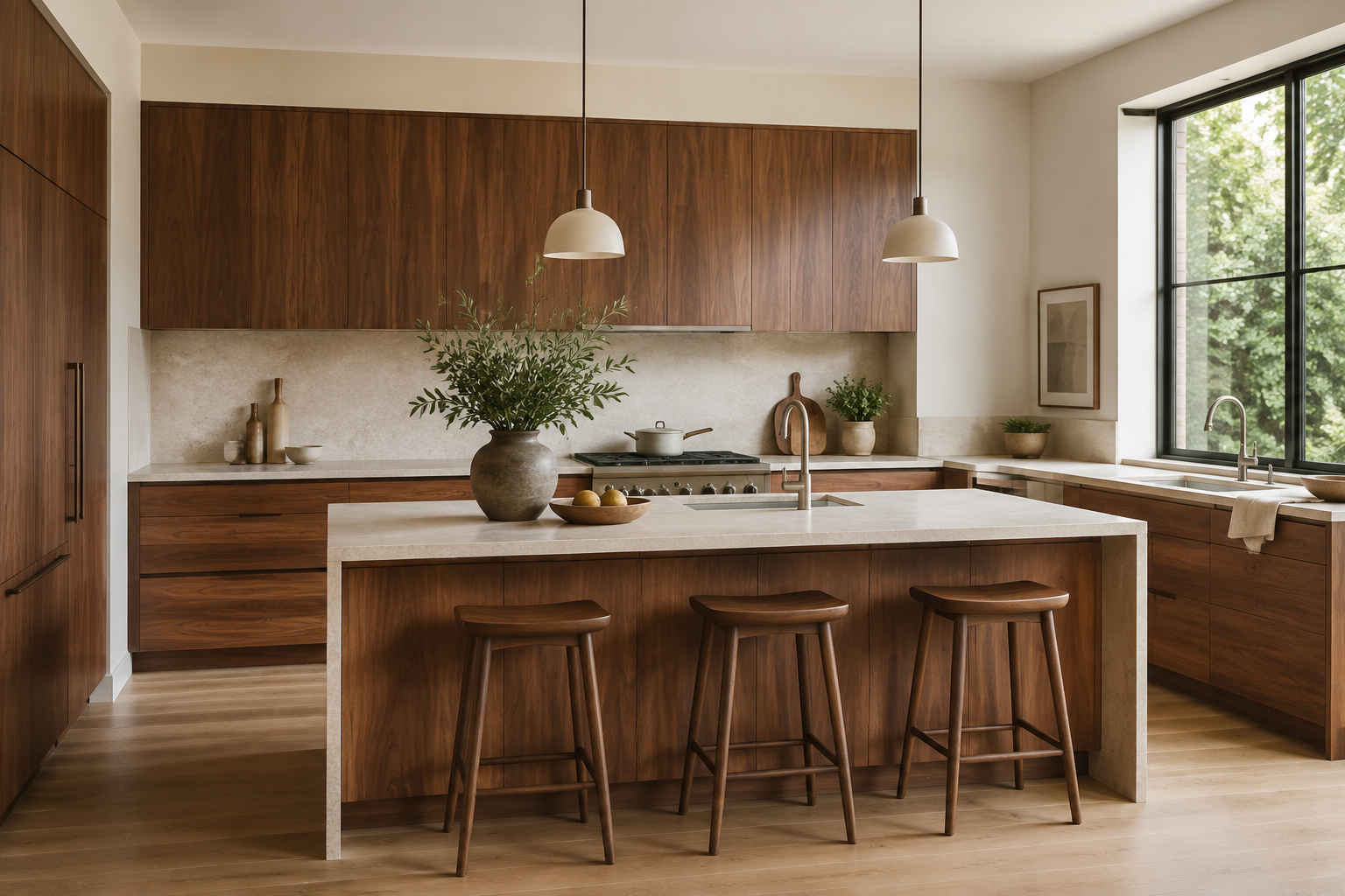
A flat slab door removes the frame, so color, wood grain, edge treatment, and alignment become the design. It can make a kitchen feel calm and modern, especially when the drawer lines are planned carefully. The easy mistake is treating slab cabinetry as visually simple and overlooking how unforgiving uneven reveals or random grain changes may look. Ask how the manufacturer handles grain direction and sequence, particularly across wide drawer stacks or paired doors. If the finish is painted, test fingerprints and reflected light. Fewer decorative details do not mean fewer decisions; they make the remaining decisions easier to see.
4. Keep raised-panel detail in proportion
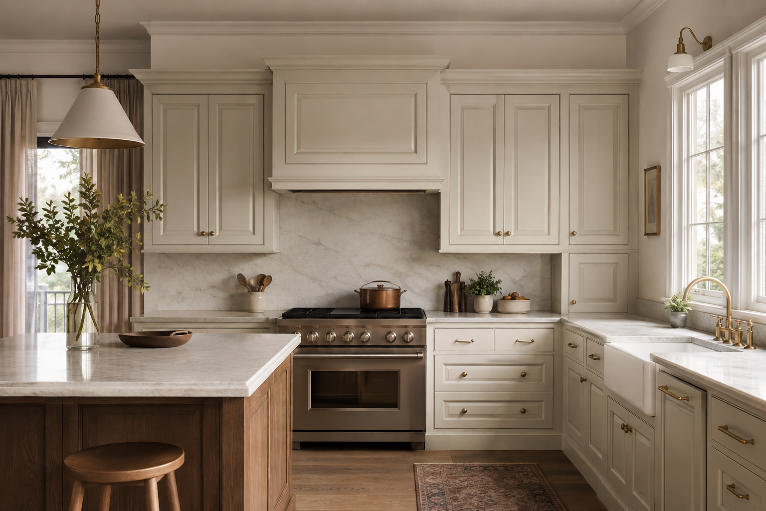
Raised-panel doors bring more depth and shadow, which can make a larger kitchen or furniture-style hutch feel settled and substantial. They are not automatically old-fashioned; the paint, edge profile, hardware, and surrounding architecture decide that. A common mistake is choosing the most detailed sample because it looks impressive by itself, then repeating it across every small drawer front and narrow cabinet. Review a complete elevation, not one door. If the room already has strong trim, patterned stone, or many cabinet breaks, a restrained raised panel may support the architecture better than the busiest option.
5. Add applied molding for one extra shadow line
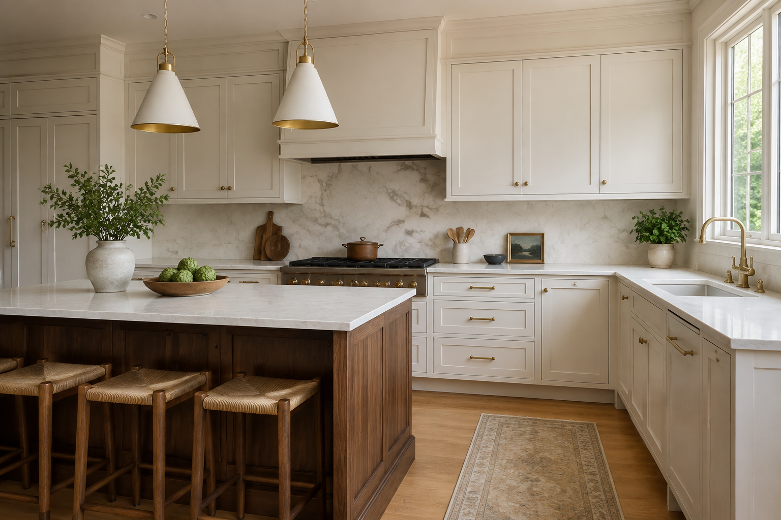
A narrow applied molding can sit between plain Shaker and a fuller raised-panel look. It adds a small layer of depth that works well when the room needs warmth but not much ornament. The mistake is approving the profile under flat showroom light, where the extra detail almost disappears, then being surprised by stronger shadows near windows or under-cabinet lighting. Hold the sample vertically and turn it toward and away from the light. Also notice the inside corners, because that is where wiping takes more attention. A detail is worthwhile when you enjoy it in ordinary conditions, not only when someone points it out.
6. Confine beadboard to a useful feature area
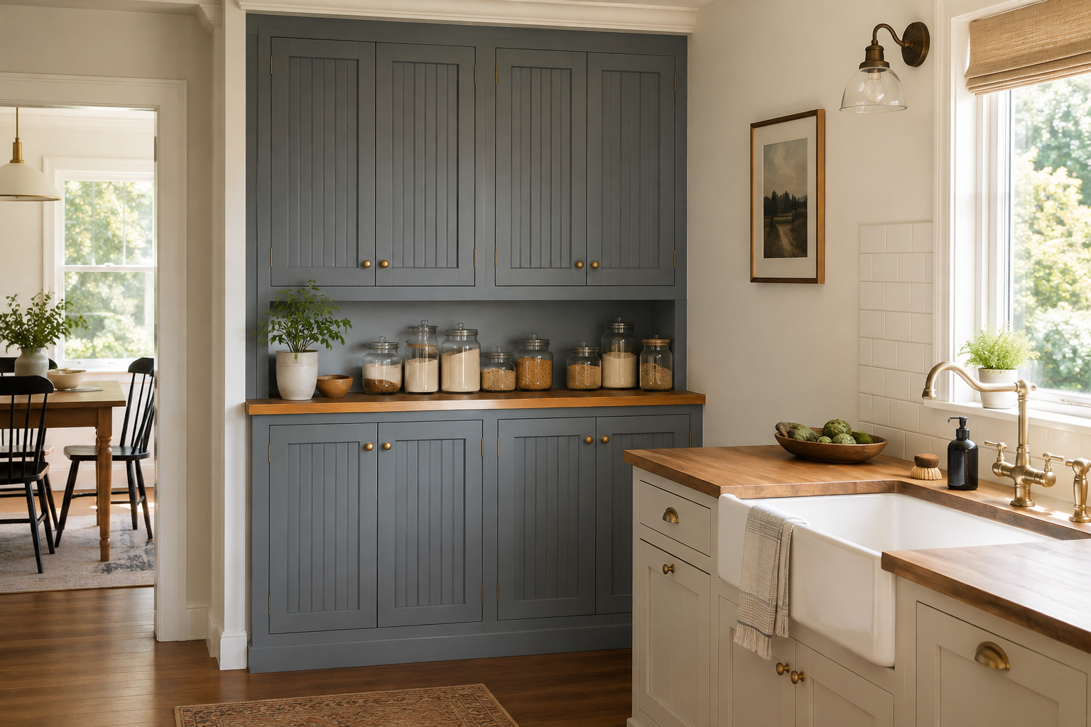
Beadboard introduces repeated vertical grooves that can make a pantry, breakfast hutch, or small cottage kitchen feel friendly and crafted. Those same grooves create visual activity and more edges to clean. A familiar mistake is spreading beadboard across every door because the single sample feels charming. Try it first on one clearly bounded run and let surrounding doors stay quieter. Check the scale of the beads against the width of the doors; narrow doors can become crowded quickly. Ask how the center panel is finished and cleaned, especially in a hard-working food-preparation area.
7. Put glass fronts where the contents can cooperate
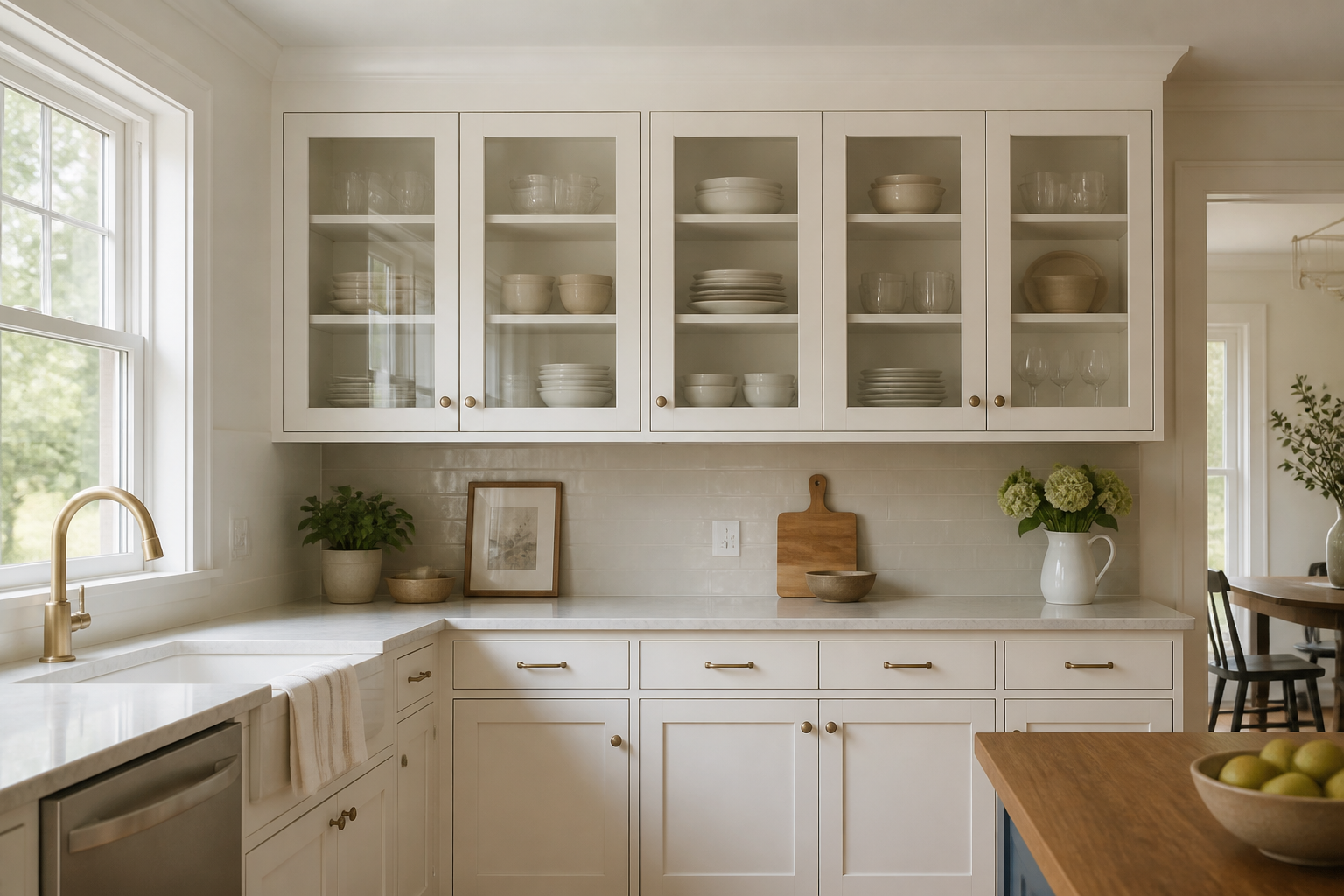
Glass-front doors can lighten a wall of upper cabinets and help a smaller collection of dishes become part of the room. They also show shelf spacing, hinges, and whatever is stored behind them. The mistake is planning glass from the outside only. Empty the dishes you would actually place there onto a table and see whether the group feels calm enough to keep visible. Consider clear, lightly textured, or reeded glass with a real sample, because each changes how much detail shows. One or two glass cabinets often create the effect without turning every shelf into a display obligation.
8. Treat reeded wood as a focal texture
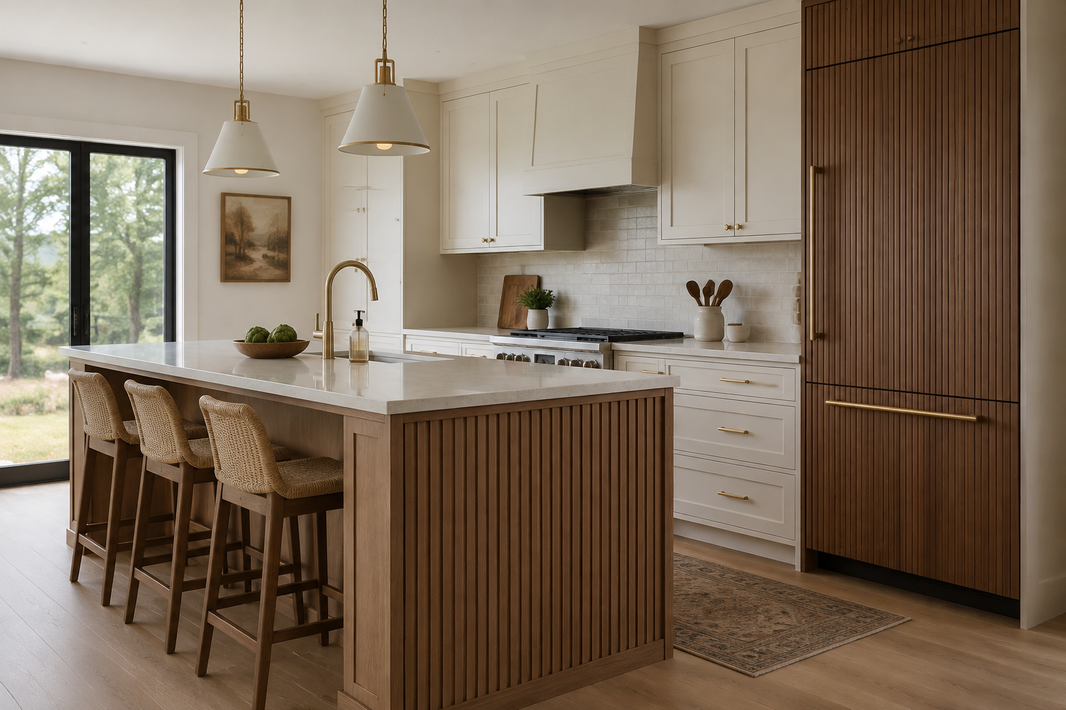
Reeded or fluted cabinet fronts catch light in many small vertical shadows. That texture can give an appliance cabinet, island end, or furniture-like hutch a strong identity. A common mistake is using it on every surface because the material photograph looks rich. Repetition across drawers, doors, and tall cabinets can become busy and may complicate hardware placement. Give the texture one clear job and review how its grooves meet adjacent panels and finished ends. Run a hand over the sample and ask about cleaning. A tactile surface should still suit the way the kitchen is used.
9. Use an arched door with a clear reason
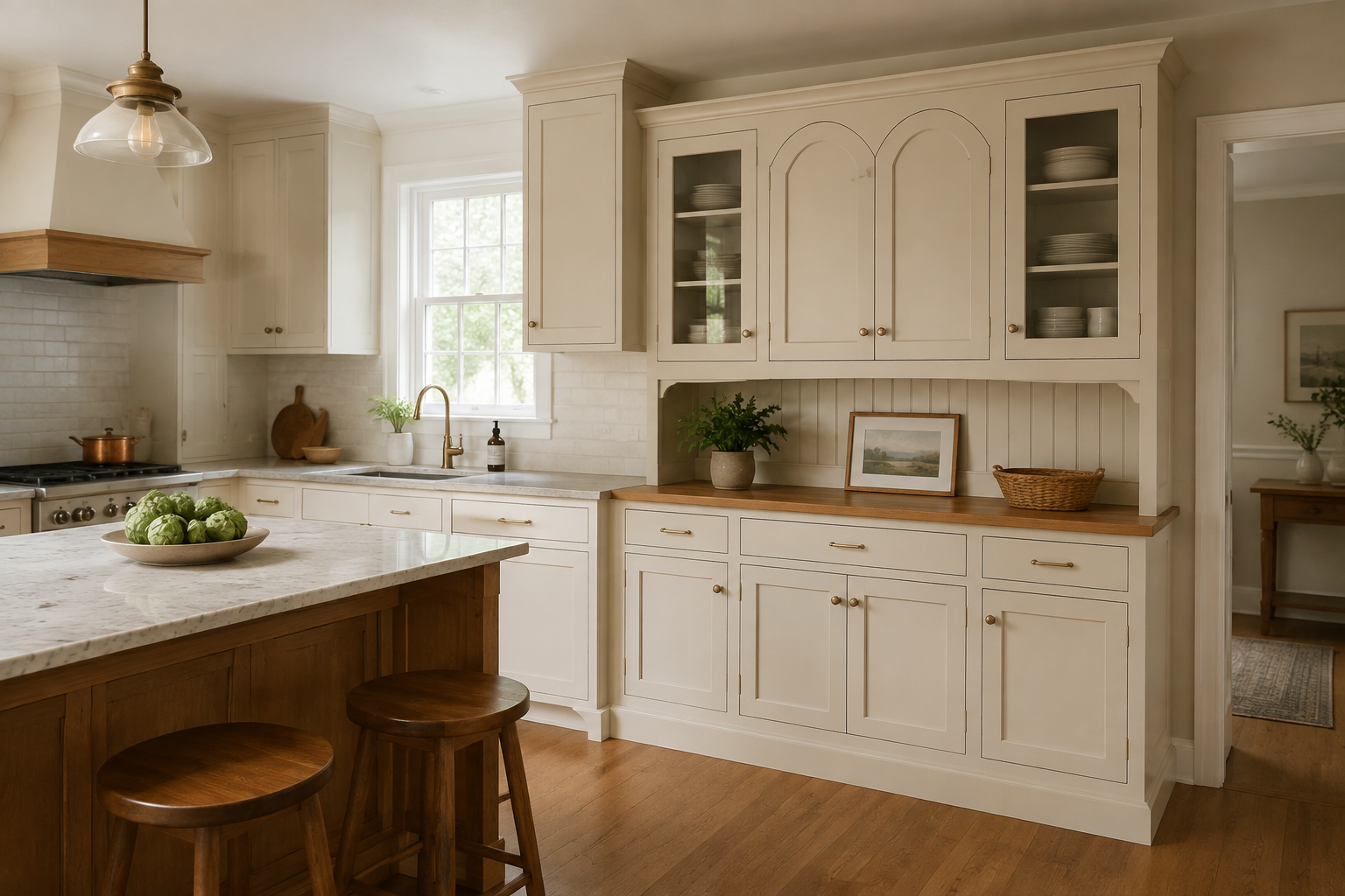
An arched or cathedral panel can echo a real curve in the house, such as a doorway, window, or furniture piece. Used in one hutch-style run, it can feel deliberate instead of dated. The mistake is adding arches only to selected upper doors without checking the entire elevation; the alternating curves and rectangles may create a rhythm you did not expect. Sketch or request the full cabinet view and count where each shape appears. If the room has no other curves, a simpler door may age more comfortably. If it does, one restrained repetition can connect the cabinetry to the architecture.
10. Approve a full-size sample in the real room
Your final comparison should include the actual door profile, finish, sheen, edge, and hardware—not separate approximations. Hold it beside the materials, view it from the entry, and check it in morning, afternoon, and evening light. A small finish chip cannot show the shadows of the profile or the scale of the hardware. People often feel pressure to identify a favorite immediately, but careful comparison is not indecision. It is the inexpensive part of the process. Record the exact manufacturer description and sample approval, then have the cabinet supplier confirm current construction, availability, care guidance, and order details before you commit.
Carry the door decision into the whole cabinet plan
A door style looks different when it repeats across a tall pantry, an island, or a long wall of drawers. Compare it with a two-tone strategy, then make sure the cabinet plan is settled before the finish order begins.
Explore Two-Tone Kitchen Ideas Review Cabinet Decisions Before You BuyPlan the cabinets before you repeat the door
Use StilePath to arrange the cabinet runs, appliance locations, storage, and circulation first. Keep the approved door and material samples beside that plan so the style you love belongs to a kitchen that works.
Start Planning Free