
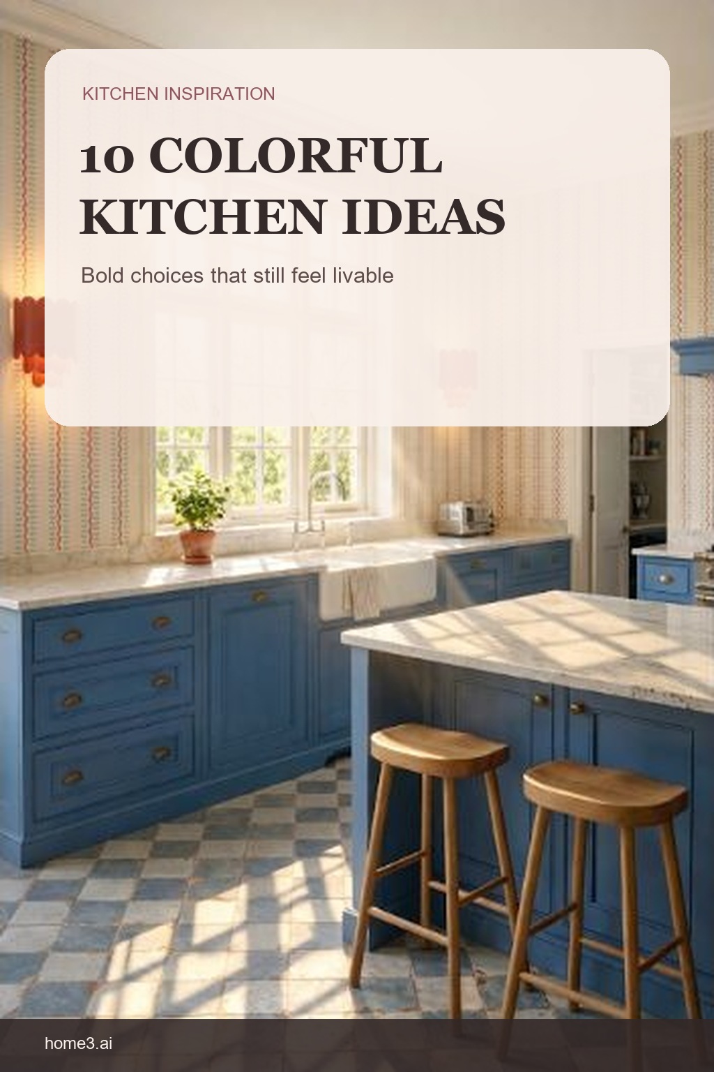
A colorful kitchen can be bold without becoming exhausting
Color works best when it has a clear job. Start with the feeling you want, decide which surface will carry the strongest color, and give the eye enough quieter material to notice the room rather than every finish at once. These ten kitchens show very different directions, but each one offers a useful planning lesson.
1. Start with one anchor color
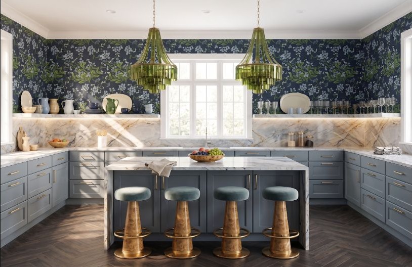
Blue-gray cabinetry gives this room a steady base while green lighting and botanical walls add energy. When several colors are present, make one of them the anchor and let the others appear in smaller, repeated moments. The common mistake is giving every favorite color the same amount of space; choose the largest field first, then test the accents one at a time so the room keeps a clear visual order.
2. Let warm wood calm cool aqua
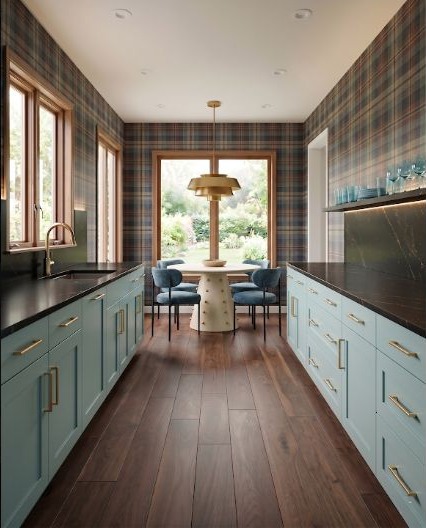
Aqua cabinets can feel crisper beside stained window trim and other warm wood details. That temperature contrast keeps the color lively while giving it a familiar material counterpoint. Watch for an aqua that turns icy beside a cool gray floor or blue-white counter. Place the real samples together in the room and add warmth only where the combination needs it.
3. Repeat a bright accent with restraint
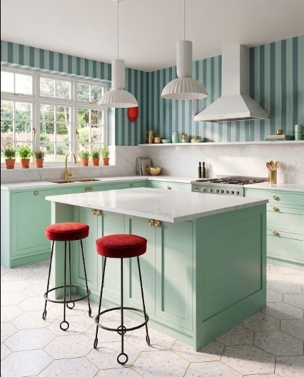
Red stands out sharply against aqua. A few deliberate red elements create a rhythm; scattering many unrelated red objects would weaken the effect. Choose where the accent begins and where it stops, then repeat it at two or three visible heights. The easy mistake is buying small accents independently until punctuation becomes clutter.
4. Give beige a point of view
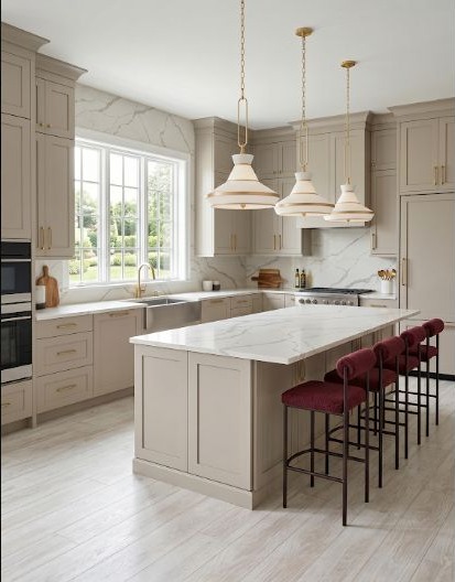
Warm beige becomes more memorable when it supports a concentrated berry tone. Neutrals do not have to disappear—they can frame a stronger color and make it easier to live with across a larger surface. A common mistake is choosing beige last as a safe filler, which can leave it unrelated to the stronger hue. Compare their undertones together and make sure the neutral actually supports the color.
5. Make saturated color feel familiar
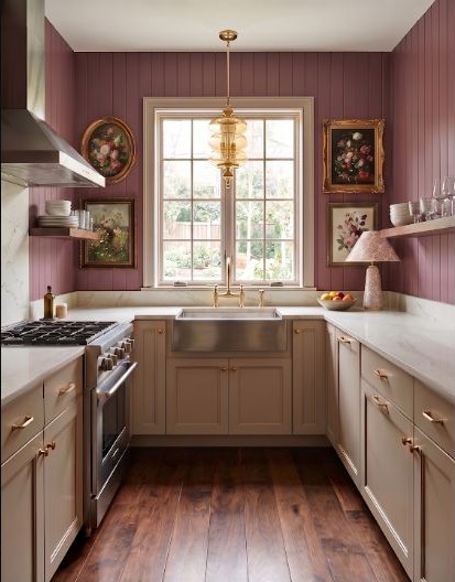
Berry cabinetry feels softer when paired with cottage details and a related rose wall. Repeating a color family in different strengths can be calmer than jumping between several unrelated hues. Keep enough difference between the cabinet and wall values that the cabinet shape stays visible. If every surface lands at the same intensity, a rich palette can become a flat block instead of a layered room.
6. Use black to hold a botanical palette together
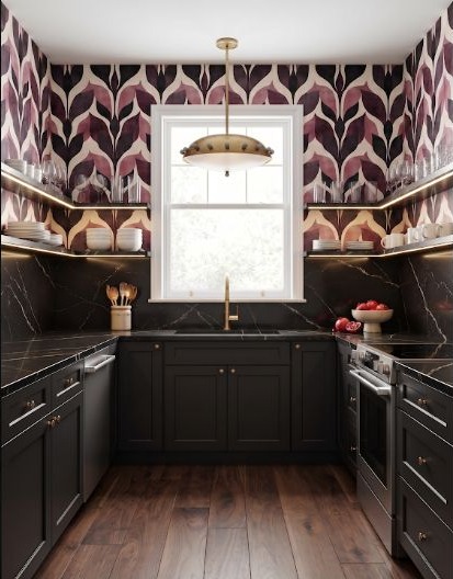
Large-scale berry leaves bring plenty of movement. Black cabinetry and counters create a strong visual boundary, so the pattern reads as a feature instead of spilling into every part of the room. The common mistake is adding several more dark or patterned surfaces because each looks good alone. Preserve one quiet plane and check the whole wall from the doorway before adding another statement.
7. Ground cheerful yellow with black
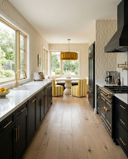
Yellow feels brightest next to black, but the contrast can still feel composed when the dark finish stays on substantial elements and the yellow is allowed to remain the optimistic note. Test the yellow at room scale; a small cheerful chip can become much stronger across cabinetry. The easy mistake is judging it only in daylight, so look again under the evening lighting you will actually use.
8. Warm up blue with a small hit of orange
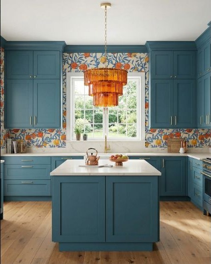
Blue-green cabinets become warmer and more playful beside orange. Keep the orange focused in lighting, pattern, or a small object so it works as punctuation rather than a competing field of color. A common mistake is repeating the accent in every accessory once the combination feels exciting. Add it slowly, step back, and stop when the eye can already follow it through the room.
9. Separate bold blue and red with quieter surfaces
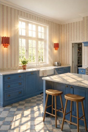
Blue and red both demand attention. A neutral counter, wall, or floor between them gives each color a readable edge and prevents the palette from collapsing into one loud block. Do not rely on tiny finish samples to judge this balance. Block the colors into their approximate room-size areas and make sure one leads while the other supports it.
10. Test forest green in the real light
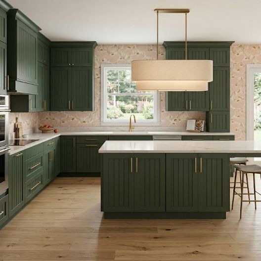
Forest green can look grounded in daylight and nearly black at night. Sample it on the actual cabinet plane, then look at it in morning, afternoon, and evening light before treating the color as decided. The common mistake is holding the sample flat on a table, where it catches light differently from a vertical door. Move a larger sample around the room and let several ordinary days inform the choice.
Choose the color after you know where it will live
A cabinet color changes with the room's orientation, window size, artificial lighting, counter, floor, and nearby walls. Put the larger layout decisions in place first, then compare a few complete palettes in the same view. You do not need to commit simply because one sample looked good by itself.
Read the Function-First GuideCurious how a direction might feel in your room?
StilePath can help you sketch the room and compare ideas before any finish becomes a commitment.
Explore a Kitchen Direction