
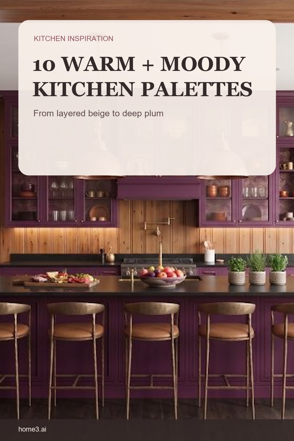
Warm and moody does not have to mean dark everywhere
A moody palette is usually about depth, contrast, and light—not simply choosing the darkest paint. These ten kitchens move from soft neutrals to plum, yellow, pink, red, and black. Use them as complete color relationships to study, not as isolated swatches to copy.
1. Layer neutrals so beige is not flat
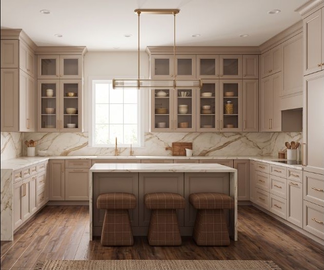
Cream, sand, taupe, and wood can create depth without a dramatic hue. Vary the value and texture enough that cabinets, walls, counters, and floor remain distinct. A common mistake is choosing every neutral from separate samples and discovering that one turns pink, green, or gray beside the others. Build one material board and judge the whole group in the room rather than trusting the color names.
2. Treat plum as a grounded cabinet color
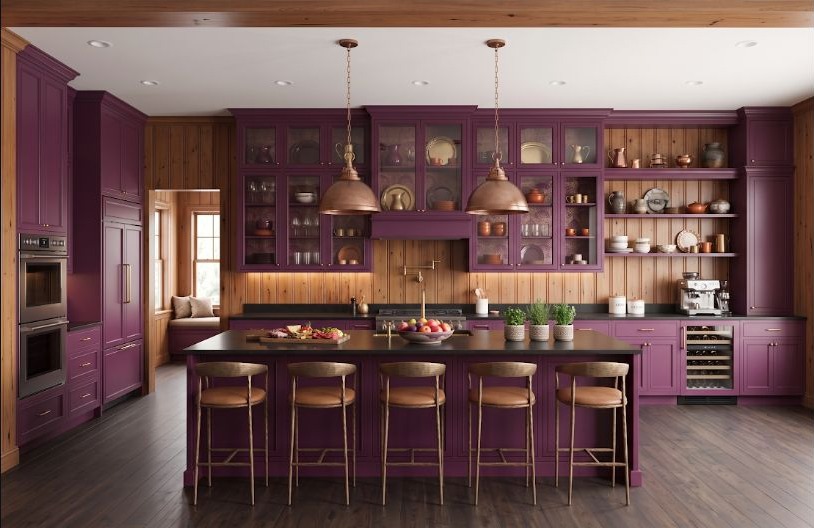
Deep plum brings warmth that navy or charcoal cannot. Pair it with lighter stone, warm metal, or restrained walls so the cabinetry keeps its shape in lower light. The easy mistake is sampling it in bright showroom light and missing how quickly it darkens at home. Paint a larger vertical sample and check whether edges, hardware, and neighboring surfaces remain readable after sunset.
3. Use earthy yellow instead of a bright primary
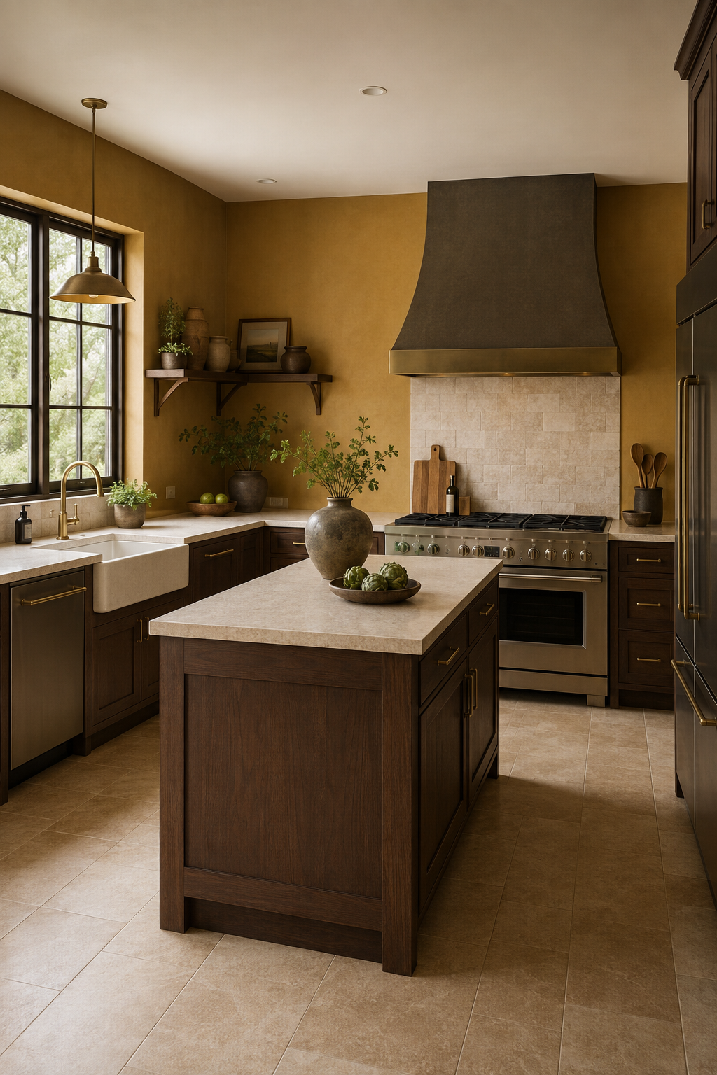
Ochre and mustard carry more brown than a clear yellow, which makes them easier to combine with wood, black, cream, and aged metal. They still bring light, but with a softer edge. A common mistake is surrounding an earthy yellow with equally warm finishes until everything merges. Include one cooler or darker boundary so the cabinetry and counter retain their shape.
4. Build a 1970s palette from earth tones
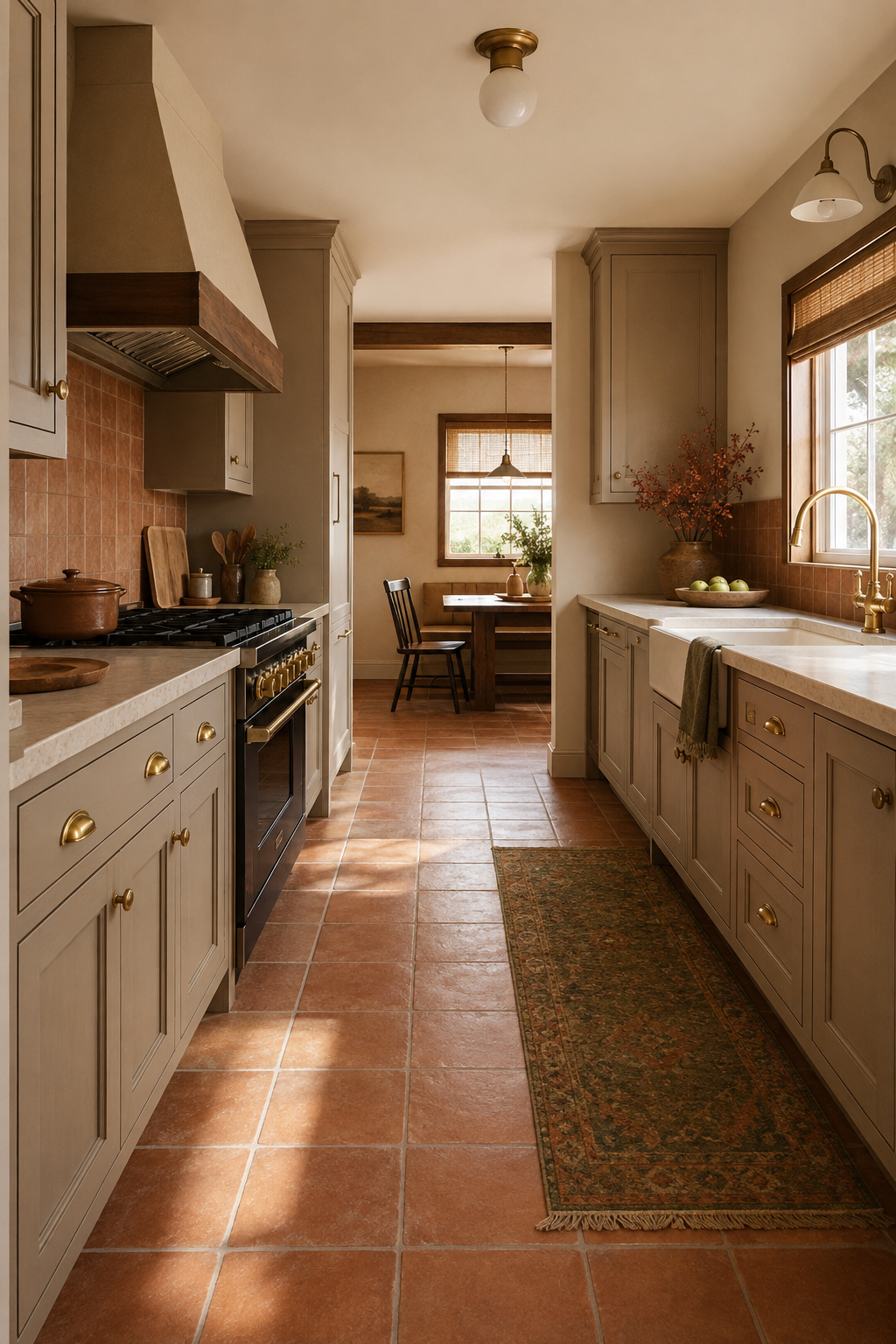
Olive, tobacco, clay, amber, and dark wood can feel current when the room uses clean lines and a limited set of materials. Borrow the warmth of the era without reproducing every period detail. The common mistake is adding one more nostalgic finish whenever the room feels incomplete. Choose the palette first, then use modern proportions or simple cabinet fronts to give those colors room to breathe.
5. Let a narrow pink kitchen feel intentional
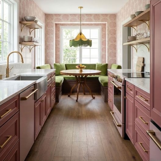
In a galley, the same color appears on several close surfaces at once. Choose a pink with enough gray or brown to hold up across walls and cabinets, then preserve contrast at the floor and work surface. A small sample can underestimate how much reflected color the narrow room creates. Mock up both facing runs and check whether the palette still feels comfortable when you stand between them.
6. Use red as light inside a black palette
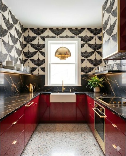
Red can warm black cabinetry and dark surfaces when it appears in a focused plane or feature. Keep reflection and artificial lighting in mind; glossy red and matte red behave very differently at night. The common mistake is spreading small red accents everywhere instead of giving the color one clear home. Test one concentrated area first and let the black frame it.
7. Make cream feel refined through contrast
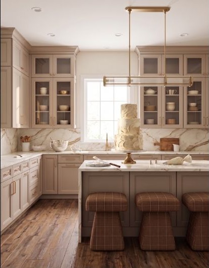
A classic cream kitchen gains depth from darker hardware, a defined worktop edge, and a few warm shadows. Without contrast, several cream materials can blur together. People often assume matching every cream creates harmony, but slight mismatches can look accidental. Either coordinate the undertones carefully or create enough deliberate contrast that the difference reads as a choice.
8. Pair powder blue with warm beige
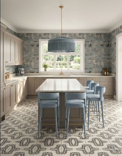
Powder blue cools a beige room without making it feel icy. Repeat the blue in only a few places and let the beige connect larger surfaces for a quieter result. A common mistake is adding cool gray beside the blue and losing the warmth that made the pairing inviting. Compare the floor, counter, and wall together, and keep at least one substantial warm material in view.
9. Use texture to make a soft beige memorable
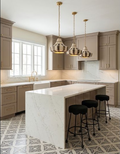
When the palette stays close in value, texture does more of the work. Wood grain, honed stone, handmade tile, woven light, and subtle sheen can create distinction without adding another color. The easy mistake is judging those textures from flat photos, where shadow and reflection disappear. Place real samples vertically and horizontally under the room's lighting so you can see how each surface changes through the day.
10. Soften black cabinetry with dark wood
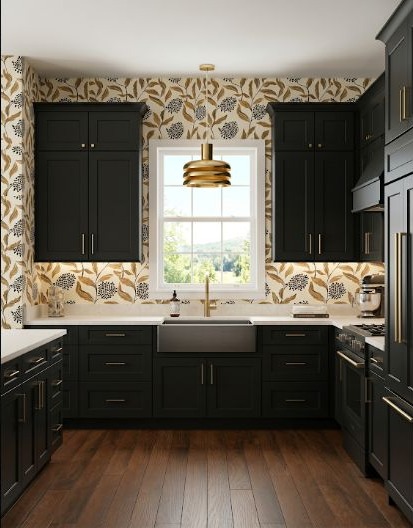
Dark wood adds warmth and visible grain to a black kitchen. Use it where the eye naturally lands—an island, open shelf, table, or tall panel—so the room has a readable material rhythm. A common mistake is choosing wood so dark that it disappears into the cabinetry. Compare them in the dimmest ordinary light and make sure the grain and boundary remain visible.
Compare palettes in the same conditions
Keep the room view, cabinet arrangement, counter, and lighting consistent while you compare color directions. That makes it easier to notice what the palette changes instead of confusing a better photograph with a better decision.
Read the Small-Kitchen GuideWant to compare a few directions without rushing the choice?
Use StilePath to shape the room first, then come back to the palette with a clearer plan.
Compare Kitchen Ideas