
Pattern can belong in a kitchen without taking over the room
Pattern changes how a kitchen feels from across the room as much as it changes the close-up view. The useful questions are not only which print you like, but where it begins, how often it repeats, what competes with it, and whether the room still has a calm place for the eye to rest.
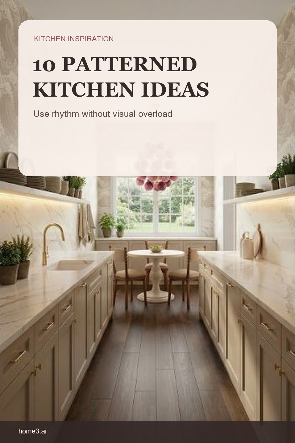
1. Choose a pattern era on purpose
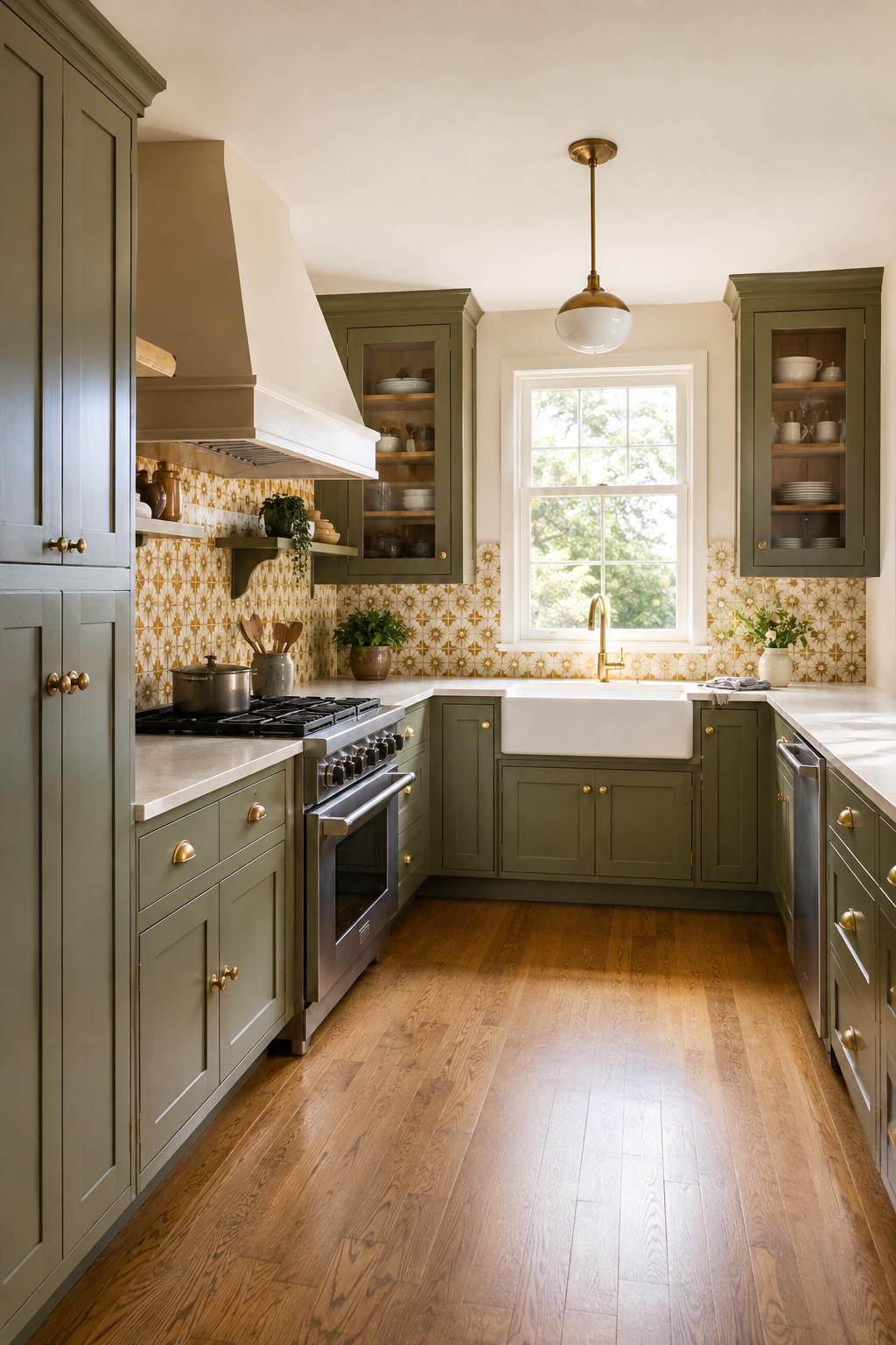
Retro color and farmhouse forms can work together when the mix is deliberate. Repeat a few period cues instead of adding one novelty surface to an otherwise unrelated room. A common mistake is combining recognizable features without a shared color, material, or shape to connect them. Name the two or three cues carrying the story and let the rest of the kitchen stay supportive.
2. Let one repeat lead
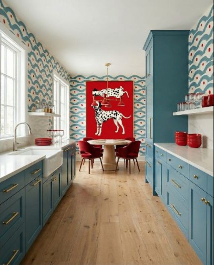
When a wall pattern is the main event, keep cabinet shapes and nearby materials easier to read. The repeated motif should have a clear supporting cast rather than several rivals. Before adding patterned flooring or strongly veined stone, cover those areas with plain paper in your mockup and compare both versions. The common mistake is assuming several interesting surfaces will automatically become an interesting room.
3. Check the view through every doorway
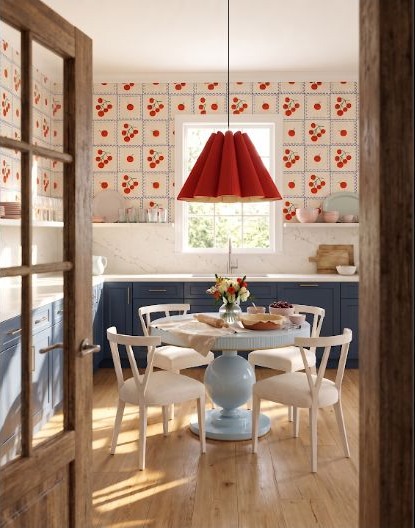
A patterned kitchen is often seen from a hall, dining room, or back door. Frame those long views in the plan so the strongest repeat lands where it looks intentional from adjoining spaces. People often choose placement while standing close to the sample and forget the view they will see most. Photograph the empty wall from each entrance and sketch the pattern boundary onto those views before deciding.
4. Contain pattern within a work zone
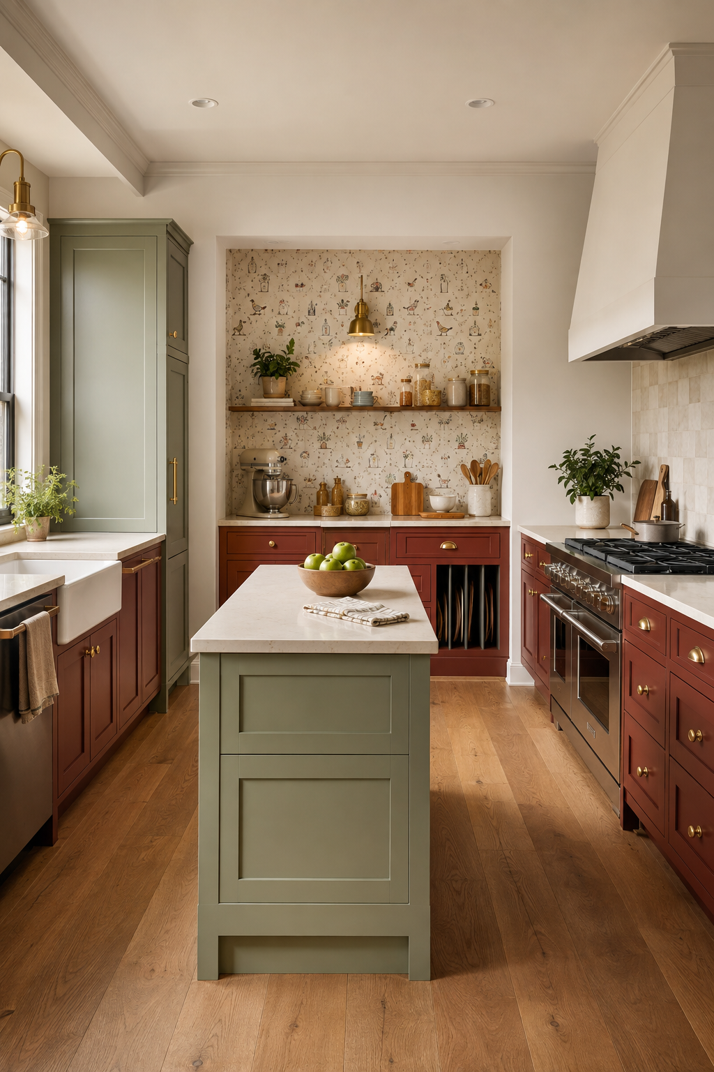
A baking or preparation zone is a natural place for a playful surface. Giving the pattern a functional boundary can make it feel more purposeful than wrapping every wall by default. Use cabinet edges, a recess, or a clear change in task as the stopping point. A common mistake is ending the pattern at an arbitrary seam, which can make even a beautiful material feel unfinished.
5. Give bright yellow a simple counterpoint
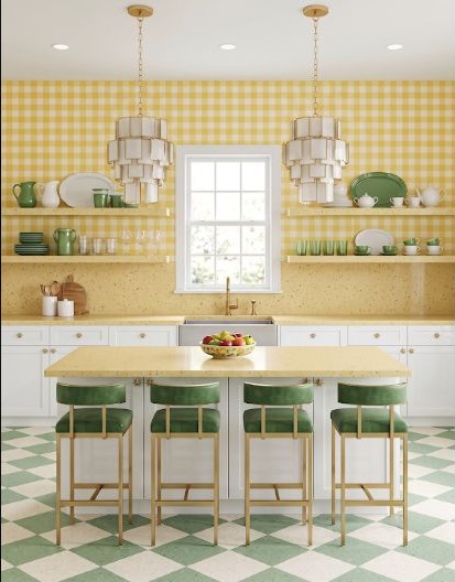
Yellow and an expressive repeat already bring plenty of movement. Simple counters, straightforward cabinet fronts, or a limited hardware finish help the combination stay readable. The easy mistake is trying to calm the room with several different neutrals, which introduces more decisions instead of fewer. Choose one quiet supporting family and repeat it consistently.
6. Match the scale to the room
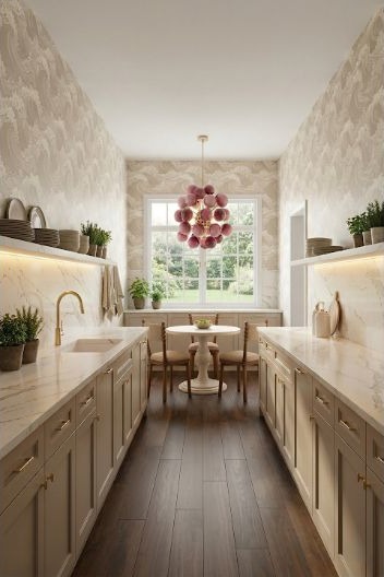
Broad waves read differently from tiny repeats. Mock up a full-width section at the distance where you will usually see it; a small sample cannot show the rhythm across an entire wall. A common mistake is checking scale only against the room size and not against cabinets, windows, and tile cuts. Include those fixed divisions so you can see where the repeat will be interrupted.
7. Limit a high-contrast palette
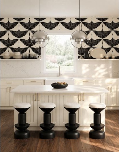
Black-and-white pattern can carry more detail because its palette is already constrained. Repeating the same two colors in cabinets, lighting, or trim helps the graphic surface belong. Watch the amount of contrast under real light, especially on a large floor or wall. The common mistake is assuming a two-color palette is automatically quiet; at room scale, a tight high-contrast repeat can be one of the strongest elements present.
8. Put playful motifs where wear is manageable
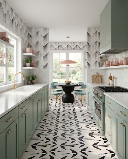
A bird or figure motif can be charming on a floor or lower surface, but placement matters. Consider cleaning, abrasion, seams, and how the repeat will be interrupted by islands and cabinet runs. The easy mistake is centering one favorite figure without checking where the rest of the repeat lands. Lay out a larger area on the plan and review both the open floor and the cuts hidden beneath cabinetry.
9. Break up dense geometry
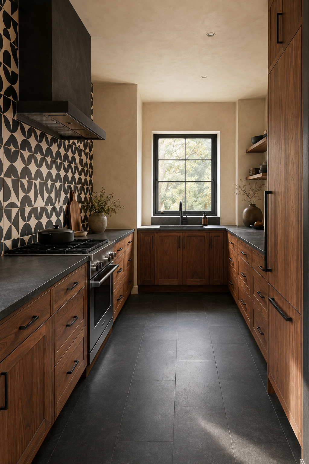
A tight grid or block repeat benefits from uninterrupted areas nearby. Solid cabinet fronts, a plain ceiling, and fewer small accessories give the geometry room to work. A common mistake is repeating the grid again in open shelving, many small cabinet doors, and busy hardware. Count the visible lines in the whole elevation and simplify one layer when they begin competing.
10. Let material texture absorb some energy
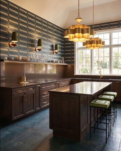
Brown counters and warm wood can soften an animated wall because their variation feels natural rather than graphic. Texture can act as a bridge between a bold repeat and the functional parts of the kitchen. Do not assume every wood will calm every pattern; a strong grain can become another competing repeat. Compare a broad sample and choose the material whose movement supports rather than fights the wall.
Mock up pattern at room scale
Before ordering, place a large repeat beside the cabinet, counter, floor, and lighting choices. Then look from the room's entrances and primary work positions. The goal is not to make the pattern disappear; it is to decide exactly how much visual space you want it to occupy.
Review the Kitchen Layout GuideStart with the room, then layer in the pattern
If you want a clearer canvas for comparing directions, sketch the kitchen and protect the work zones first.
Sketch Your Room in StilePath