
10 Kitchen Wallpaper Ideas That Feel Bold but Livable
Wallpaper can make a kitchen feel personal before you change a single cabinet, but the pattern has to live with counters, floors, hardware, windows, and everyday clutter. Start with a tape measure, pencil, and paper. Mark the walls you can actually see, the interruptions in each wall, and the view from the next room. You do not need to be a designer to compare those facts with a sample. These concept kitchens are prompts rather than finished-client rooms, so borrow the idea, test it in your own light, and give yourself permission to adjust it until it feels natural at home.
1. Let one generous pattern set the mood
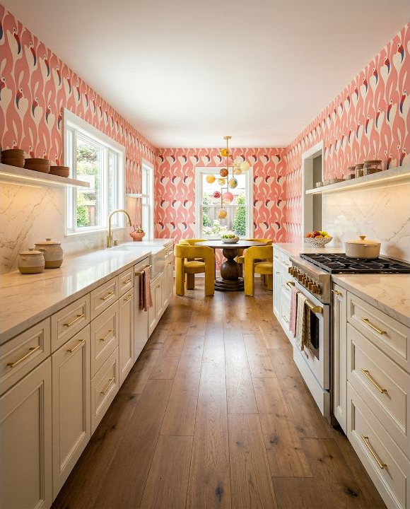
A large coral-and-cream repeat can carry a long galley because the cabinetry and counters stay quiet. Measure the uninterrupted wall areas, then tape up the largest sample you can obtain near a window and beneath the evening lights. The common mistake is choosing from a phone screen or a tiny swatch, where a broad repeat looks much calmer than it will across several walls. Step back to the doorway, photograph the sample with the cabinet finish, and decide whether the pattern feels welcoming from the distance where you will see it most.
2. Decide which patterned surface gets to lead
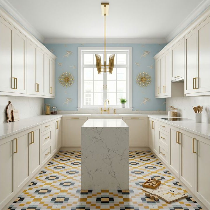
Wallpaper and a patterned floor can coexist when one reads as the background and the other carries the sharper contrast. Lay the wall sample beside a real floor sample and squint at them together; the surface that still commands attention is the visual lead. A frequent mistake is selecting both patterns separately because each looks beautiful alone, then discovering that they compete at full scale. You can keep both by softening the colors, changing the repeat size, or limiting one pattern to a smaller area. The goal is not timid design—it is a clear place for the eye to rest.
3. Pull supporting colors from the pattern, not exact matches
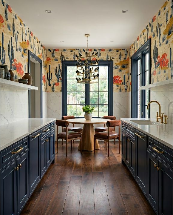
A detailed print often gives you several usable color directions: one for cabinets, one for upholstery, and one for a small accent. Choose the relationship you like instead of chasing a perfect paint match, because texture and light will make exact colors look different anyway. The usual mistake is lifting every color from the wallpaper and repeating all of them around the room. Pick two or three supporting notes, let neutral surfaces create breathing room, and keep the remaining colors inside the print. A simple sample board will tell you quickly whether the room feels layered or merely busy.
4. Put the strongest print where it creates a moment
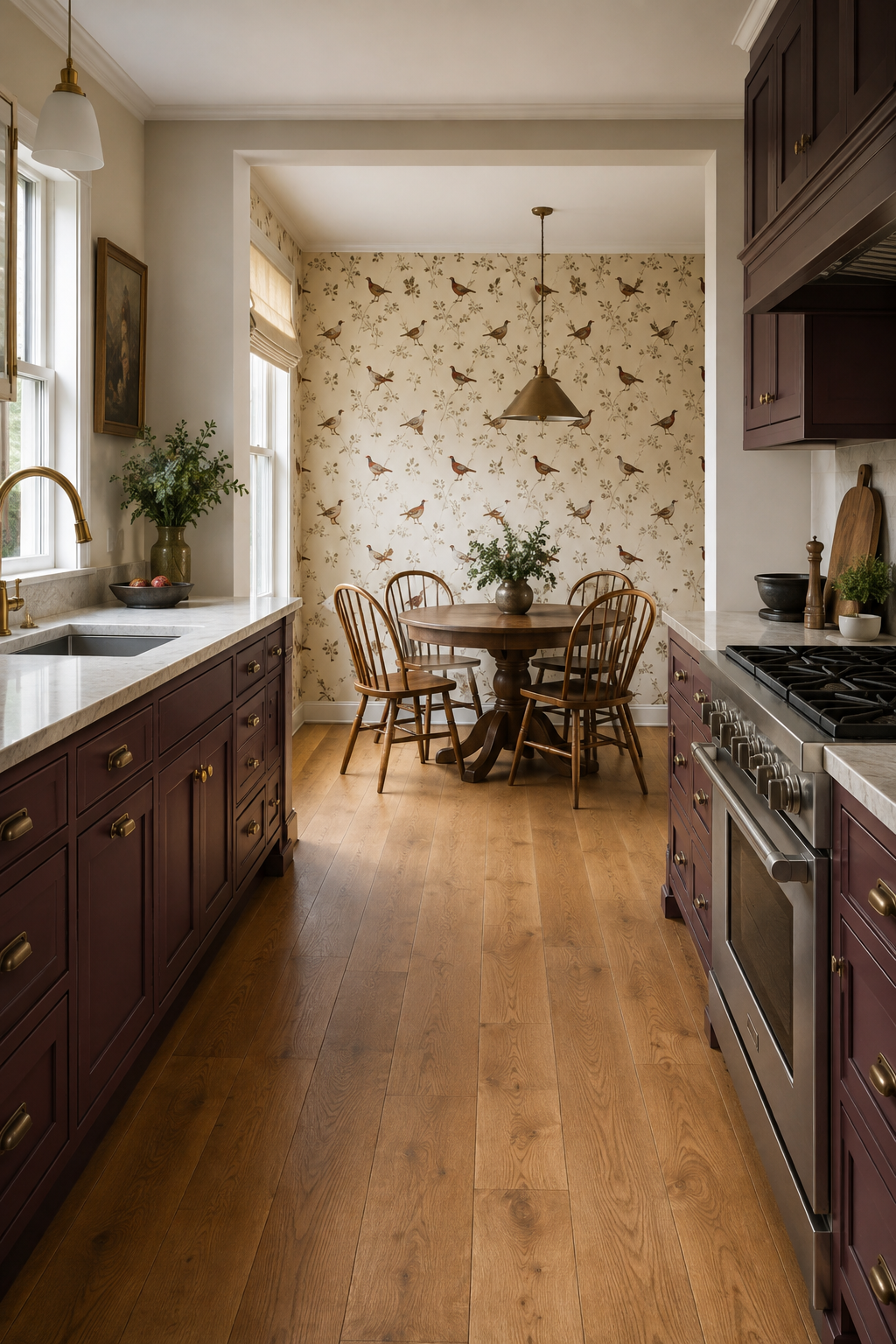
A dining nook, breakfast wall, pantry entrance, or the wall seen beyond an island can give a narrative print a defined job. Sketch the room and shade only the walls visible from the main approach before you price material. People often assume wallpaper must wrap every available surface, which can increase cost and make a special pattern feel relentless. Beginning with one intentional zone is not a compromise; it lets the motif mark a destination. Check where cabinets, art, and backsplashes interrupt the repeat so the most recognizable part of the design does not disappear behind them.
5. Test dark wallpaper in the room's real light
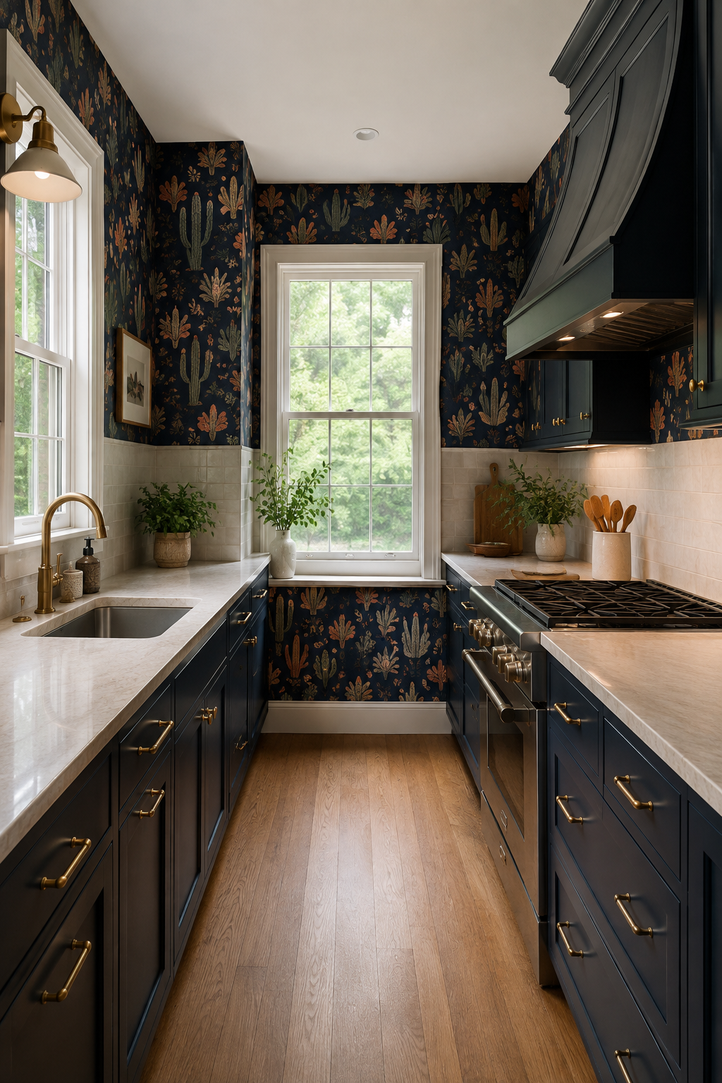
A navy ground can make a colorful motif feel crisp and surprisingly cozy, especially when windows and pale counters keep the working surfaces bright. Tape the sample into a shadowed corner as well as the sunniest wall and look at it morning, afternoon, and night. The common mistake is approving dark paper under showroom lighting, then blaming the color when the room feels flatter at home. If it loses too much detail after sunset, improve the lighting plan, reduce the covered area, or choose a lighter ground. Dark is workable when you test it honestly.
6. Use a simple grid to calm an energetic color
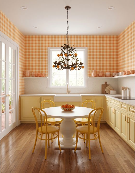
Gingham gives a strong orange a predictable rhythm, which can feel friendlier than a large pictorial print. Measure above windows, beside doors, and across corners so you understand where the grid will start and stop. A frequent mistake is ignoring alignment around highly visible openings; a slightly drifting line can be more noticeable than a color difference. Ask the installer how the repeat and seams will be handled, or map the first drop carefully if you are doing the work yourself. You can absolutely evaluate the layout before anyone opens a roll.
7. Repeat the darkest note in two or three places
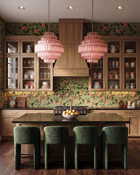
A print containing black or another very dark color feels connected when that note appears again in hardware, a window frame, stool, or light fixture. Keep the repetition selective; it is a visual thread, not a requirement to replace every metal finish. The common mistake is adding isolated dark accents after the fact, which can make them look accidental beside a lively wall. Set the wallpaper, cabinet sample, hardware, and one movable item together. If your eye travels around the group instead of stopping at one harsh spot, the balance is probably heading in the right direction.
8. Give a playful motif a practical boundary
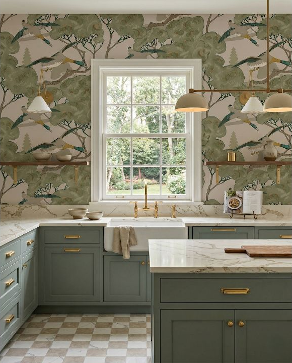
Birds, ducks, fruit, and other playful motifs can feel grown-up when the cabinetry is restrained and the patterned area has a clean stopping point. Use your sketch to decide whether the paper ends at a cabinet run, inside a nook, or at an architectural corner. A common mistake is stopping midway across an exposed wall because that is where the roll quantity ends. Planned boundaries look intentional; improvised boundaries look unfinished. Count the corners and outside edges, then include trimming and pattern-repeat waste when you estimate material. A professional can verify the order, but your room sketch is the right beginning.
9. Keep the large surfaces quiet around a fine repeat
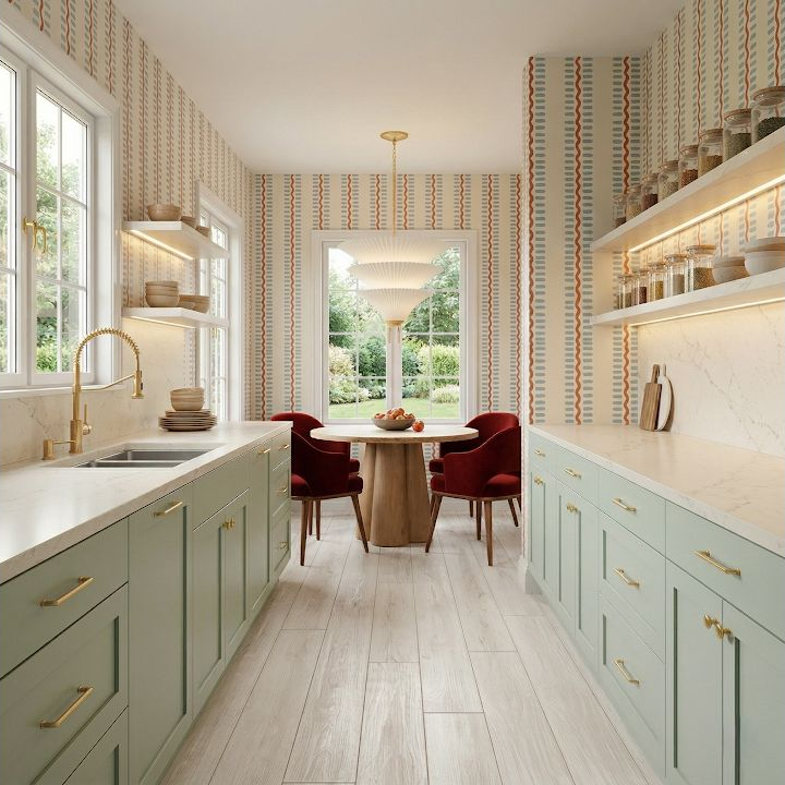
A small red-and-sage repeat can read almost like texture from across the room. That subtle effect is strongest when counters, cabinet faces, and major appliances do not introduce several more high-contrast patterns. The usual mistake is judging every finish close up, where each detail seems modest, instead of viewing the complete palette from six or ten feet away. Place the samples on a wall, move back, and take a photo in grayscale as well as color. If every surface has equal visual weight, simplify one. The wallpaper will feel richer when it is not competing to be heard.
10. Judge a scenic toile from the main sightline
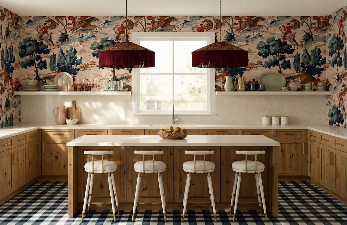
A scenic toile is meant to be read across a wider view, so test it from the doorway, adjoining room, and the seat where you spend time. Mark the cabinet and window heights on your elevation to see how much of each scene remains visible. People often fall in love with one illustration in the sample book without noticing that a shelf, hood, or pendant will cover it. Ask where the repeat can begin and whether a focal figure can be centered on the most open wall. A little planning protects the part of the pattern you chose in the first place.
Test the pattern against the entire kitchen
Wallpaper is only one layer. Compare it with the cabinet color, floor, lighting, and the view from nearby rooms before the choice feels final.
See Patterned Kitchen IdeasReady to see the room around the wallpaper?
Start with your real walls and cabinet layout, then explore the proportions in 3D before you buy the finish that depends on them. StilePath is free to try, and an early sketch is enough to begin.
Try Your Kitchen Plan Free