
10 Kitchen Floor Ideas to Test Before You Commit
The floor connects every cabinet run, doorway, island, and work aisle, so a small sample cannot tell the whole story. Get a tape measure, pencil, and paper, then mark the room edges, thresholds, fixed cabinets, and the direction you naturally walk through the kitchen. Anyone can make this first sketch; you do not need to install flooring or understand every product specification. Use these concept kitchens to decide what you want the floor to do visually, then confirm durability, water exposure, installation, care, and warranty details with the product manufacturer and your installer before you order.
1. Let natural grain warm up a quiet palette
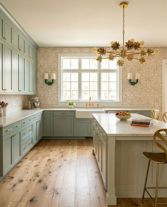
A floor with visible knots and tonal movement can keep pale green or cream cabinetry from feeling overly formal. Bring several boards or the largest sample available into the room, because one clean board may not represent the variation across the full order. A common mistake is approving the prettiest single plank and feeling surprised when darker knots repeat through the kitchen. Lay samples in the cabinet direction and across it, photograph both, and decide whether the grain should quietly support the room or become part of its personality. Neither answer is wrong; it simply needs to be intentional.
2. Use plank direction to support the room's movement
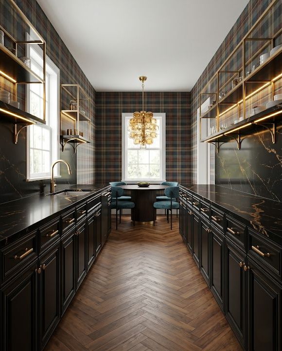
Straight boards, herringbone, and other directional layouts guide the eye differently through a galley. Draw a few simple arrows on your floor plan and notice whether they lead toward the main window, the long cabinet run, or an awkward side wall. People often choose direction by a blanket rule and forget that adjoining rooms, subfloor conditions, and installation requirements matter too. Use your sketch to describe the visual goal, then have the installer confirm what the structure and product allow. A five-minute paper test can make that technical conversation much clearer.
3. Let the floor bridge warm cabinets and pale walls
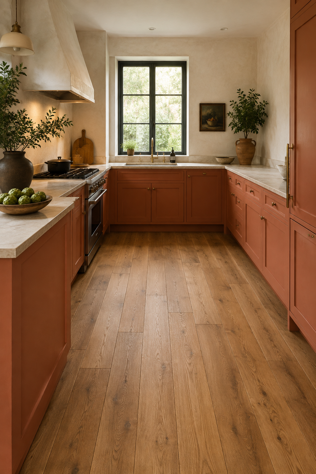
When cabinets lean peach, terracotta, or coral, a warm floor can connect them to lighter walls without requiring an exact color match. Compare the samples vertically and horizontally: cabinet color changes with light on a door, while flooring is seen under shadows and reflections. The common mistake is matching undertones under one bright lamp and assuming they will stay identical around the room. Look at the combination beside the window and under the planned evening bulbs. A floor only needs to belong in the palette; slight variation usually makes the kitchen feel more natural and forgiving.
4. Decide where one floor should stop and another begin
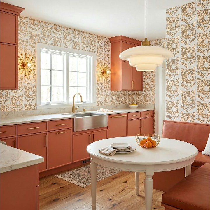
An eat-in nook can feel more generous when the kitchen floor continues through it, but an architectural threshold may offer a natural place to change material. Mark every doorway and change in room width, then stand where the transition would be visible. A frequent mistake is planning the seam wherever two product quantities happen to meet, which can leave a thin strip or an exposed edge in the main sightline. Ask the installer how the materials, heights, and movement joints will meet. You can choose the best visual location first, then adjust it to the construction reality.
5. Give a bold room a steady base
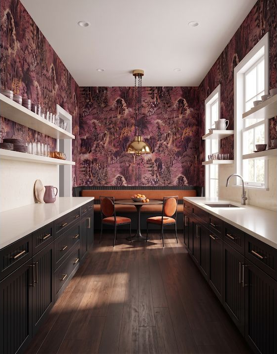
Strong wall color and dark cabinetry do not require an attention-grabbing floor. A steady wood tone or low-contrast surface can carry the visual weight while the eye enjoys the color above. The usual mistake is treating the floor as one more opportunity for a statement and ending with no calm plane in the room. Put all large-surface samples together and rank them from most to least active. If the floor, walls, counters, and cabinets all land at the top, quiet one of them. Restraint in one surface gives the bolder choices more room to feel deliberate.
6. Check the floor against every red and blue accent
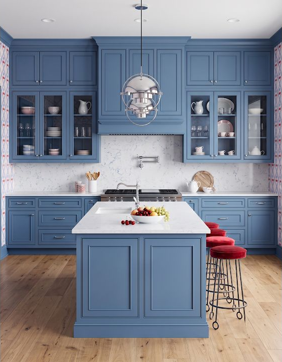
A medium wood floor can sit comfortably between cool blue cabinets and warm red accents, but undertone matters more than the color name on a product label. Place the cabinet chip, floor sample, metal finish, and one representative red object in the room together. A common mistake is evaluating the permanent floor without the movable colors that will influence it every day. You do not have to match the stools or art, but you should know whether the combination feels crisp, rustic, or visually unsettled. Small props are easy to change; the floor is not, so let it support several future versions of the room.
7. Plan runners after the working aisles
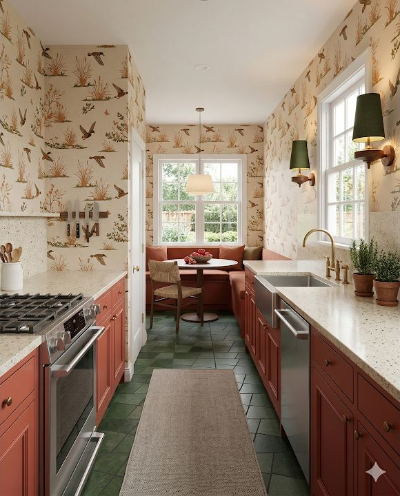
A runner can add softness, color, and comfort along a long cabinet run, but it needs to fit the clear aisle rather than the room's wall-to-wall width. Measure between cabinet fronts, then subtract the space needed to keep edges away from door swings, floor vents, and busy thresholds. The frequent mistake is buying a beautiful rug first and discovering that a corner curls under the dishwasher or creates a trip point. Check backing, cleaning, and slip resistance for your household. If a runner works, it should make the kitchen easier to stand in—not harder to move through.
8. Orient a checked floor before the cabinets hide it
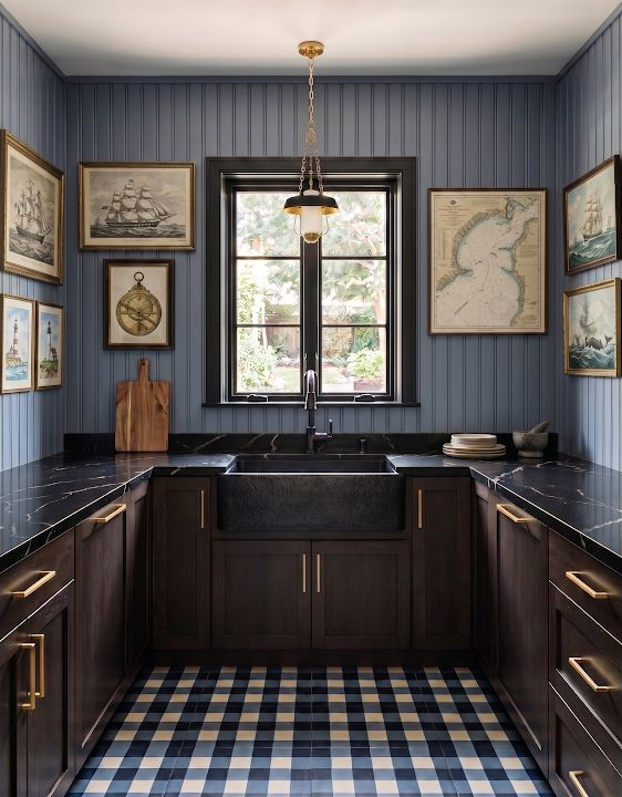
Checks, plaids, and grid-based tile layouts make alignment visible, which can be an advantage when the room is measured carefully. Draw the cabinet footprints over a rough grid and look for the centerline that matters most—often the main aisle, island, or doorway. A common mistake is centering the pattern on the bare room before accounting for cabinetry, leaving narrow slivers along the finished visible edges. Your drawing does not have to calculate every cut. It should identify the focal line so the installer can plan from the completed room rather than the empty shell.
9. Treat a bold checkerboard as a full-room pattern
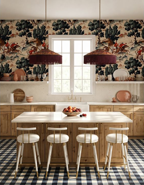
A high-contrast checkerboard can organize a wide kitchen and make simple cabinetry feel more graphic. Mock up several tile sizes on paper or with painter's tape so you can see how many repeats fit between cabinets and under an island. The common mistake is choosing the pattern from a close-up inspiration photo without noticing that scale controls the entire effect. Fewer large checks feel bold and architectural; more small checks feel busier. Also compare the darkest square with appliances, toe kicks, and adjacent flooring so the contrast looks connected rather than dropped into the room.
10. Choose a forgiving neutral by testing real mess
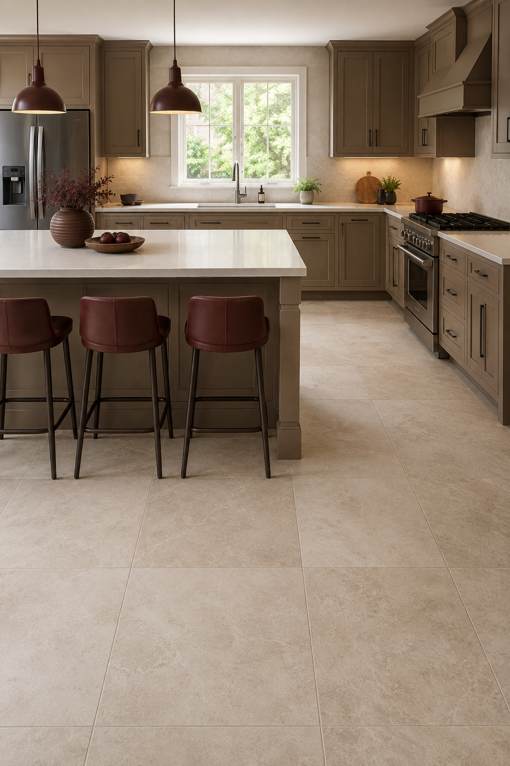
A pale neutral floor can brighten a kitchen, but the most livable version is not always the lightest or most uniform sample. Take a sample home and place a little dry dust, crumbs, pet hair, or a damp footprint on it, then clean it according to the product guidance. People often test color carefully and forget how finish, texture, grout, and pattern affect what the floor shows between cleanings. You are not trying to find a surface that never looks used. You are looking for one whose normal maintenance fits the way your household actually lives.
Check the floor against the layout
The floor will look different once cabinets, aisles, and an island divide it into visible zones. Confirm those footprints before you settle the pattern or direction.
Review Kitchen Layout OptionsReady to test the floor around your cabinets?
Map the real room, place the major cabinet runs, and see how much floor remains visible before an expensive finish is ordered. StilePath gives you a free place to begin exploring the layout in 3D.
Try Your Kitchen Plan Free