
10 Colorful Pantry Ideas That Still Feel Organized
A pantry is a good place to try color or pattern because the room is small and often seen in short bursts. The trick is giving the eye somewhere to rest while the shelves still work hard. You do not need professional design training to begin: choose one image that makes you smile, name the two or three things you like about it, and test those ideas beside the kitchen finishes you already have. These are concept images, so borrow the mood and planning lesson rather than copying details that may not fit your room.
1. Let one cheerful color lead
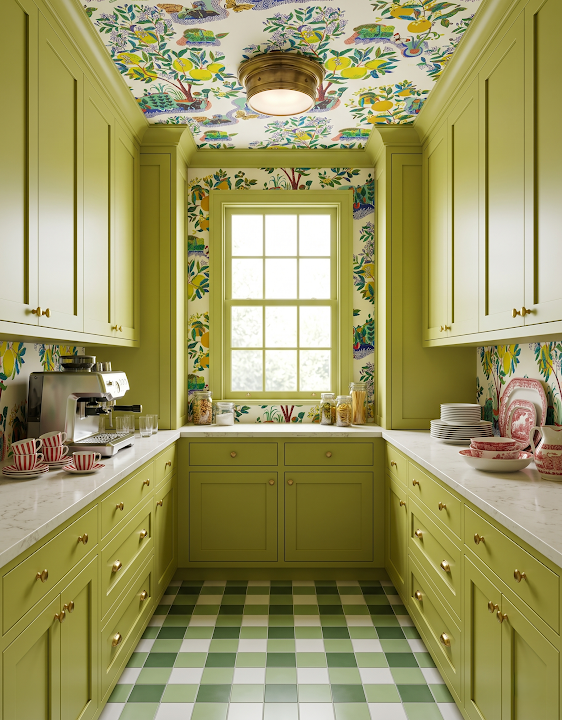
A consistent green across the cabinets, floor, and pattern creates a clear point of view because the surrounding whites and natural light keep it fresh. Start by choosing the leading color, then decide which surfaces will carry it strongly and which will only echo it. A common mistake is choosing several favorite greens independently and expecting them to blend. Put the samples together at their approximate proportions; if one shade leads and the others support it, the room can feel layered without becoming accidental.
2. Use blush as a room color, not a novelty accent
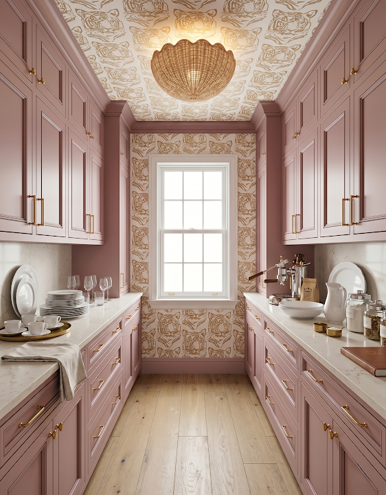
Soft pink can behave like a warm neutral when it covers a substantial cabinet field and is paired with quiet counters and flooring. Sample it in morning and evening light before deciding how saturated to go. The easy mistake is scattering small pink accents through a mostly unrelated room, which can make the color feel temporary. A larger, calmer application often feels more settled. If you love the shade, give it a real role and let the rest of the palette support it.
3. Separate red and blue with plenty of light space
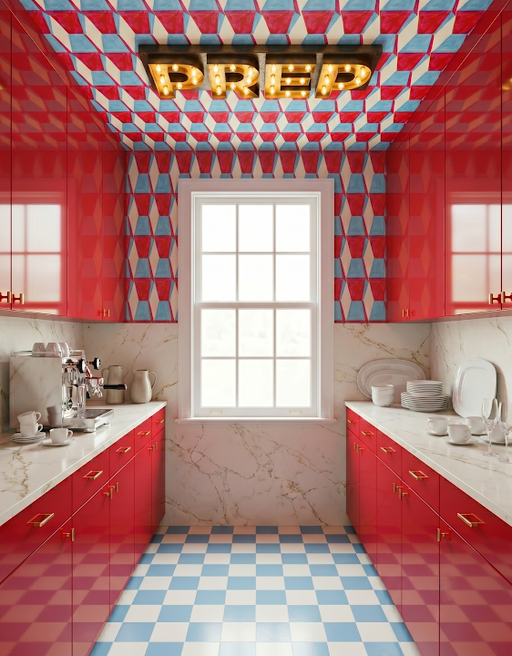
Red cabinets and a blue-red checkerboard can live together when white counters, a bright window, and open areas break up the intensity. Decide where the strongest color will stop so it does not spread across every surface. A common mistake is adding more pattern to make separate colors feel connected; that usually increases the competition. Repeat the palette in one organized motif, keep the work surface visually clear, and let practical storage provide the room's structure.
4. Pair green paint with deep wood for weight
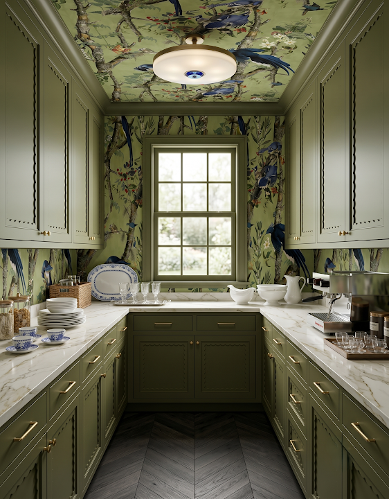
Olive paint feels grounded beside dark wood because both have visual depth, while pale counters keep the work zone readable. Compare the wood and paint undertones before buying either; warm green can turn harsh beside very cool brown. The common mistake is selecting a dramatic wood sample and a dramatic paint sample separately, then discovering that both demand attention. Choose which material should lead, use the other in a supporting amount, and preserve one light surface for balance.
5. Keep a patterned room orderly with a simple cabinet shape
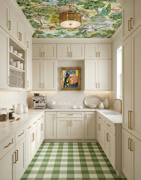
Simple door fronts and repeated cabinet lines give this lively mix a dependable framework. If the walls, floor, or ceiling already carry pattern, avoid adding fussy cabinet details just to make the storage feel special. A common mistake is treating every surface as a separate design opportunity. Pick the one or two pattern moments visible from the doorway, keep the larger cabinet shapes calm, and let jars, baskets, and groceries add the smaller-scale texture naturally.
6. Concentrate a wild print where it has a boundary
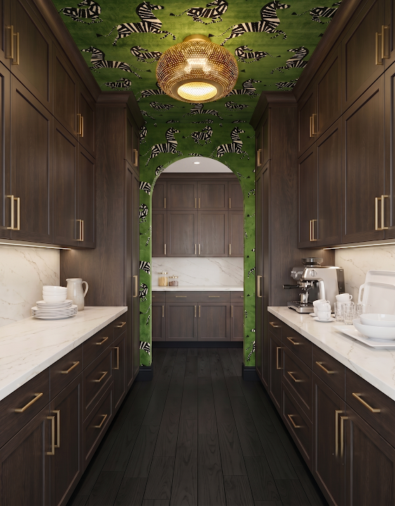
A ceiling or framed doorway can hold a spirited print because the architecture gives it a clear beginning and end. That boundary helps the rest of the room stay functional and easy to read. The frequent mistake is repeating the same bold pattern on several disconnected surfaces, which weakens the focal point. Choose one contained area, view it from outside the pantry, and make sure task lighting still reaches the counter without being absorbed by a dark or busy finish.
7. Use a graphic floor to organize the palette
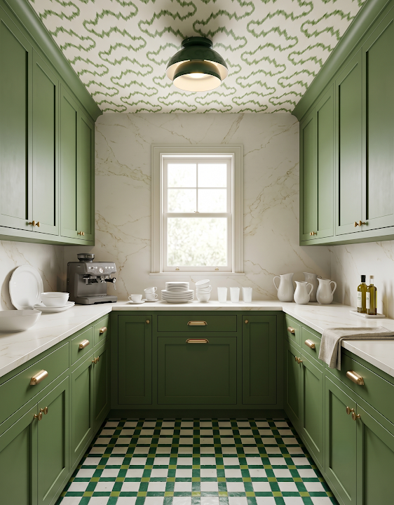
A checkerboard floor can connect a painted cabinet color to lighter walls by repeating both tones in a regular rhythm. Keep the pattern scale large enough to read as a field rather than visual confetti. A common mistake is judging one tile or one printed square without mocking up several repeats. Lay out enough of the pattern to see how it meets cabinet edges and doorways, then check that dropped crumbs and everyday wear will not make the surface frustrating to live with.
8. Repeat accent color at different heights
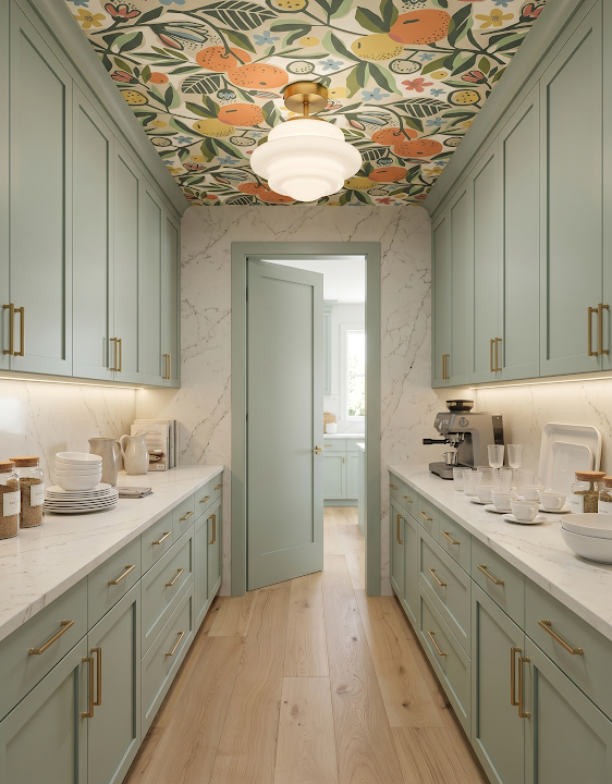
Orange appearing above the cabinets and again near the counter guides the eye through a pale blue room without covering every surface. Repetition works best when the two appearances are different in scale but clearly related. People often repeat an accent through many small accessories, creating dots of color with no visual anchor. Use one substantial accent area and one supporting echo, then pause. The pantry contents will add plenty of extra color once the room is in use.
9. Warm peach with crisp black-and-white contrast
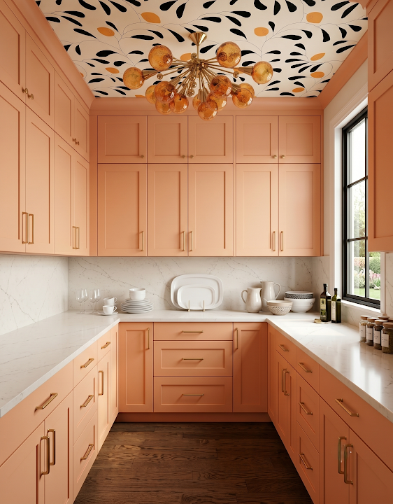
Peach cabinetry feels modern when its warmth is balanced by a crisp black-and-white pattern and a darker floor. Test the peach beside the counter and adjacent kitchen because surrounding neutrals can make it look pinker, browner, or more orange. A common mistake is choosing the color from a phone screen and assuming it will behave the same on a full cabinet wall. Use a large sample, move it around the room, and give yourself permission to adjust before ordering.
10. Let navy anchor a playful ceiling
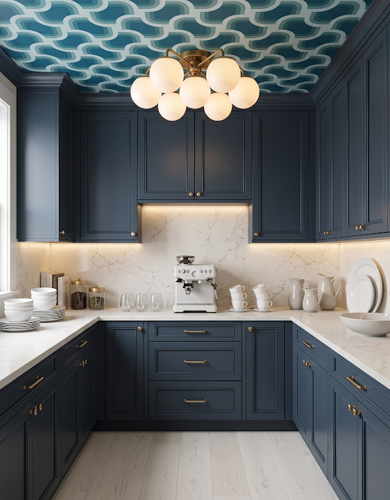
Deep navy cabinets make a light blue ceiling pattern feel purposeful because the lower half of the room has enough visual weight. Pale counters and a bright fixture keep the center from closing in. The usual mistake is using a dark color without planning enough task light, especially inside upper storage. Review both decorative and working illumination, confirm electrical details with the right professional, and make sure every frequently used shelf is easy to see before you commit to the dramatic finish.
Make the palette support the room, not replace the plan
Once you have a color direction, return to circulation, appliance needs, and the items that deserve easy reach. A beautiful pantry becomes much more satisfying when its daily routines are already solved.
Review Walk-In Pantry Layout IdeasReady to turn pantry inspiration into a workable room?
Start with the room you have, the groceries and appliances you actually store, and the path you use every day. StilePath gives you a place to explore the cabinet layout in 3D before any expensive decision is fixed.
Explore Your Pantry Plan Free