
Blue can change character without losing its calm
Blue kitchens range from airy and coastal to dark and architectural. The shade matters, but so do the materials around it: warm wood can soften blue, black can sharpen it, and red or green can turn it into a more expressive palette. Use these rooms to study how much blue the space can carry and where contrast will help.
1. Give coastal blue a tactile backdrop
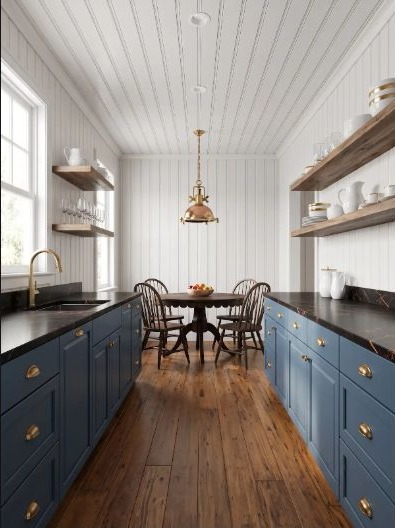
Blue lower cabinets feel crisp beneath white beadboard because the wall still has texture. Natural wood shelves and floors keep the coastal direction warm instead of overly themed. A common mistake is reinforcing the idea with too many nautical objects or several competing blues. Let material texture carry part of the character and keep the color palette disciplined.
2. Let cobalt carry a graphic pattern
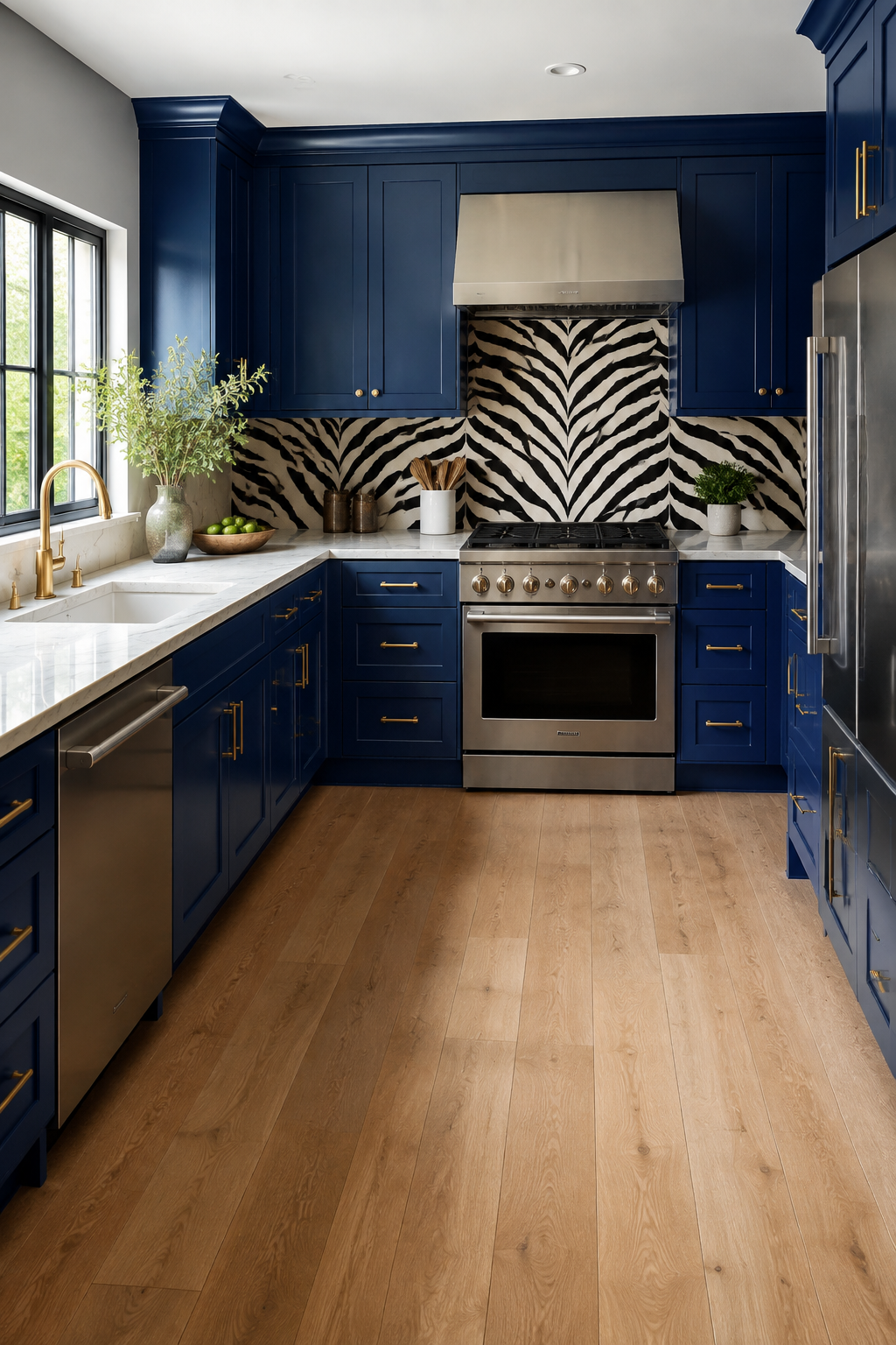
Cobalt seating and lighting can hold their own against a lively wall print. Keep the cabinet field pale and repeat the saturated blue in only a few substantial pieces. The easy mistake is sprinkling many tiny cobalt accessories around the room in search of balance. Start with two clear focal groups, step back, and add another only if the color genuinely feels disconnected.
3. Keep aqua light with warm natural details
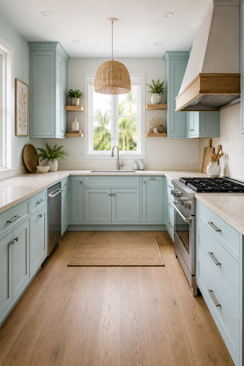
Pale aqua can drift cold beside white. A woven pendant, light wood, aged brass, or a warm green table gives the palette enough warmth while preserving its airy quality. A common mistake is choosing the white independently; a blue-white can amplify the chill. Test the aqua, white, and warm material together in the room before committing to any one of them.
4. Use red as punctuation against blue
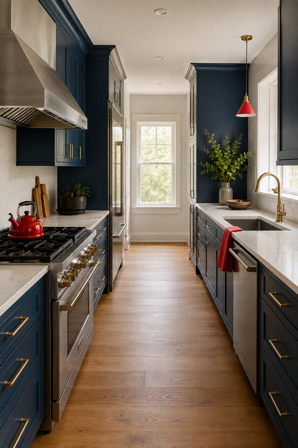
Red chairs can energize a blue kitchen without changing its foundation. Keep red to one recognizable group and let wood and pale stone separate the two strong colors. The common mistake is repeating red across appliances, art, and countertop objects until it competes with the cabinetry. Give the accent a boundary and allow ordinary household items to provide the smaller repetitions over time.
5. Separate dark blue from a bold floor
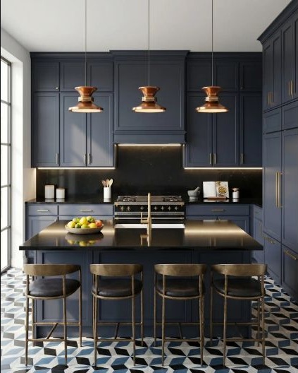
Navy cabinets and a graphic floor can coexist when the counter, backsplash, and wall stay quieter. That neutral band gives each dark surface a clean edge. A common mistake is choosing the floor while looking down at a sample and the cabinets while looking straight ahead, never viewing both in one room image. Mock up the full lower half of the kitchen to judge their combined weight.
6. Treat saturated blue as one clear statement
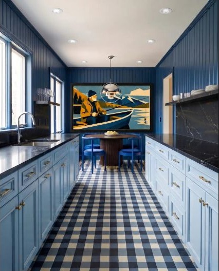
A narrow kitchen can carry saturated blue across cabinets and walls when the ceiling remains bright and the long perspective stays uncluttered. A single artwork or patterned floor can provide the counterpoint. The easy mistake is filling the long view with many small open shelves and objects, which breaks the color field into visual noise. Protect a few calm stretches so the saturation feels confident rather than crowded.
7. Make soft blue work for a social kitchen
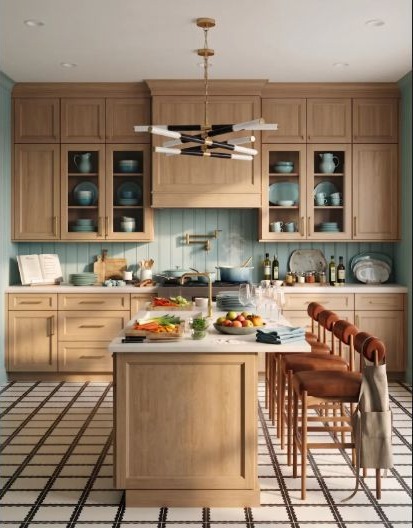
Soft blue tile can mark the working wall while warm wood cabinetry and a generous island keep the room welcoming. Plan serving, preparation, and seating zones before styling it for gatherings. A common mistake is sizing the island for the number of stools in a photograph without testing the occupied space behind them. Solve the paths and work zones first, then let the social details fit the room that remains.
8. Bridge blue and green through shared undertones
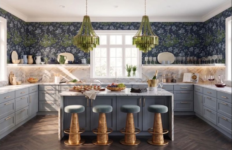
Blue-gray cabinets, green glass lighting, and a botanical wall can feel related when each color is slightly muted. Match the intensity rather than searching for identical hues. People often force an exact color match and end up making one material look artificial. Compare the group from across the room; if their strength and undertones feel balanced, small differences will add depth rather than disorder.
9. Warm blue cabinetry with beige
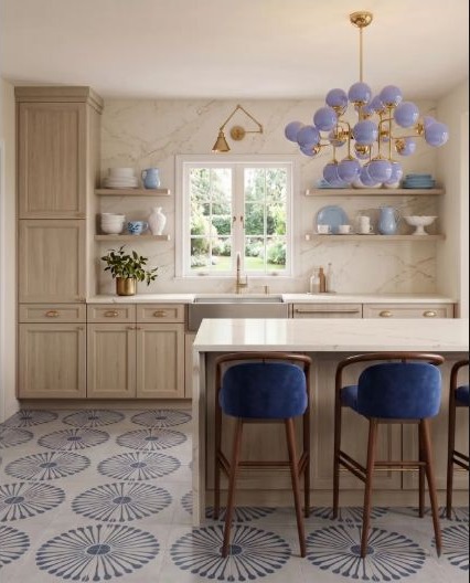
A beige cabinet field can make blue seating, lighting, and pattern feel more livable. Repeat the blue at different heights so it moves through the room without becoming the background everywhere. A common mistake is letting the beige become an afterthought with an undertone that fights the blue. Put the main neutral and blue samples side by side first, then choose accents that belong to that relationship.
10. Connect blue, green, and muted brick
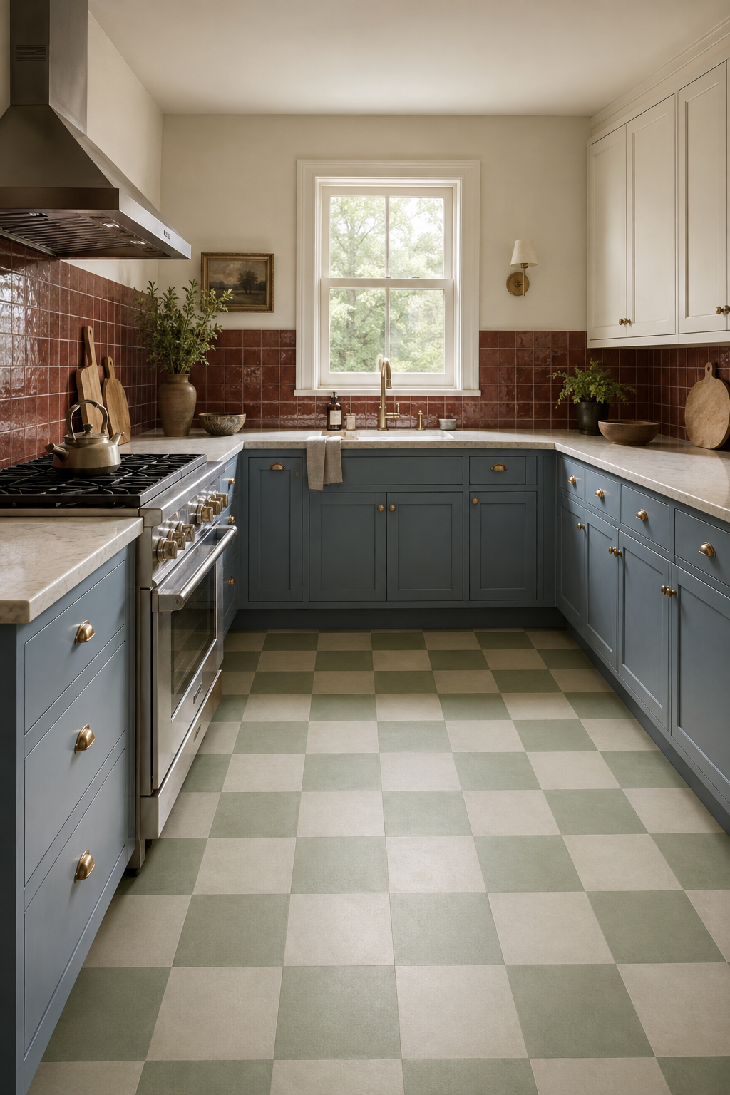
Muted brick cabinetry can support green checks and blue-gray textiles when every color carries a little gray. Use one light work surface to keep the layered palette from feeling muddy. The common mistake is evaluating each color separately and missing how quickly several muted hues reduce contrast. Group them at their approximate proportions and make sure the work surface and key edges remain easy to read.
Choose blue by testing its neighbors
Review your preferred blue beside the floor, wood tone, counter, metal finishes, and adjacent-room colors. The same swatch can feel peaceful, gray, vivid, or nearly black depending on the surrounding materials and time of day.
Compare Warm and Moody PalettesReady to compare a blue direction with the rest of the room?
Start with the kitchen shape and daily routine, then use StilePath to explore the direction at your own pace.
Compare a Blue Kitchen Direction