
10 Kitchen Wallpaper and Cabinet Color Combinations
The best part of a patterned kitchen is often the relationship between two surfaces: a graphic wallpaper and the plain cabinet color beneath it. These ten combinations pair memorable motifs with softer painted finishes, from olive and cream to dusty rose and powder blue. Look for a pairing you love, then notice which smaller details repeat its colors in lighting, furniture or dishes.
Images are AI-created design concepts from Anna's authorized collection. They illustrate decorating ideas, not completed Home3 projects or measured construction plans.
1. Olive cabinets with a cream cowboy-boot print
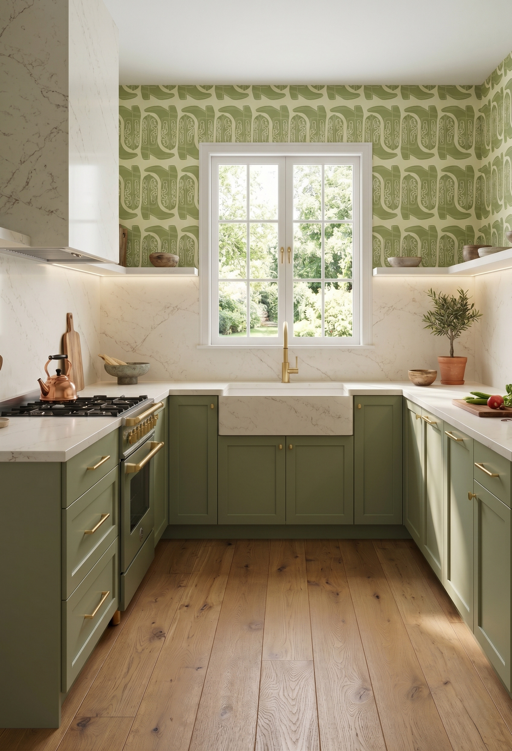
Oversized cowboy boots turn this olive kitchen into a room with a point of view. The print repeats the cabinet color against a creamy ground, while the pale counter and backsplash keep the lower half light. Try this approach when you love an unusual motif: use a familiar, earthy cabinet color beneath it, then let the illustration supply the surprise.
2. Black cabinets with a monochrome woodland scene
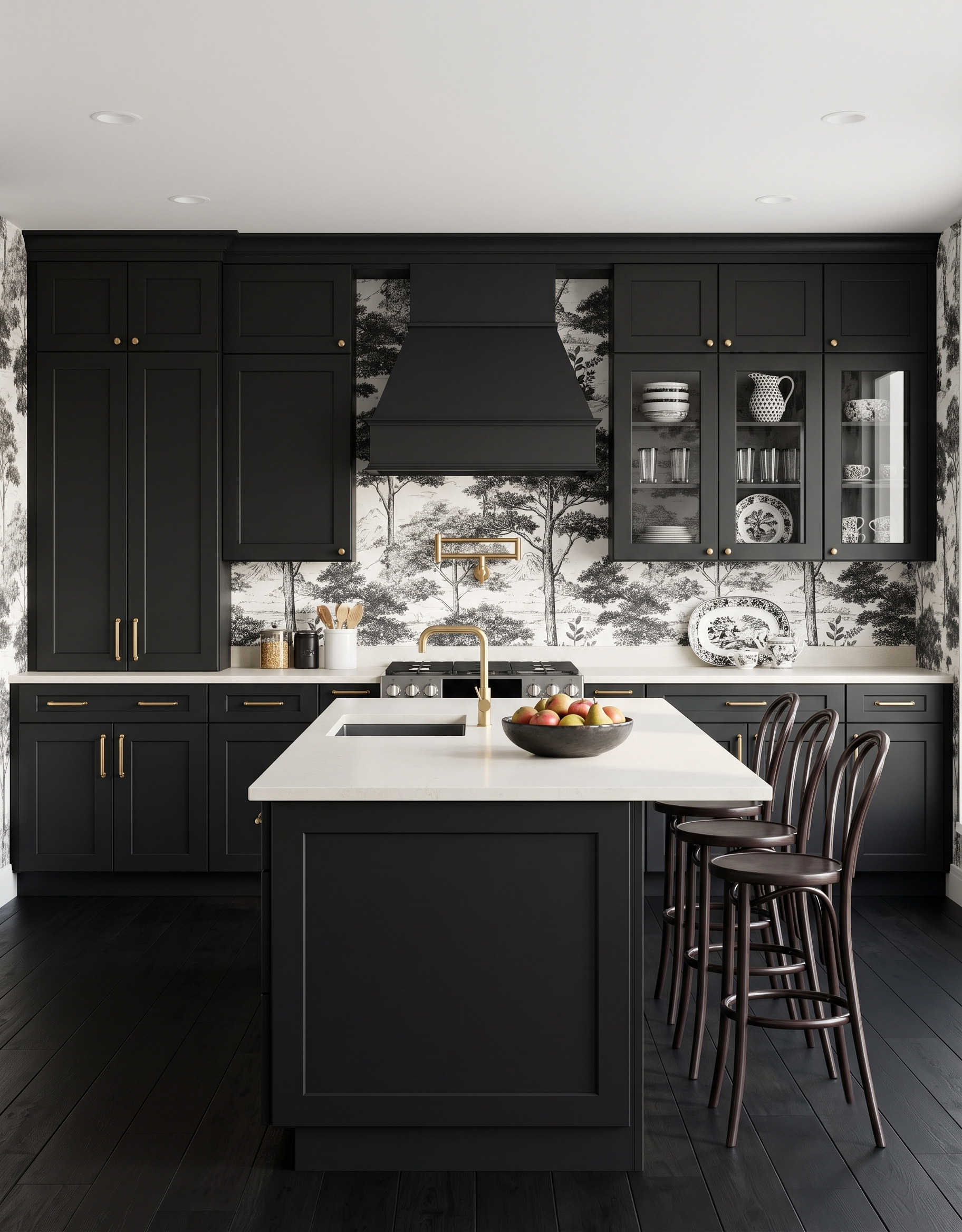
Black cabinet frames give the fine woodland drawing a firm outline. White counters repeat the wallpaper's pale ground, and the displayed black-and-white dishes echo its illustrated detail. For a similar pairing, compare the amount of black in the print with the cabinet sample. A mostly pale scene can keep its trees readable beside substantial dark cabinetry without needing another strong wall color.
3. Peach cabinets with blue-green floral stems
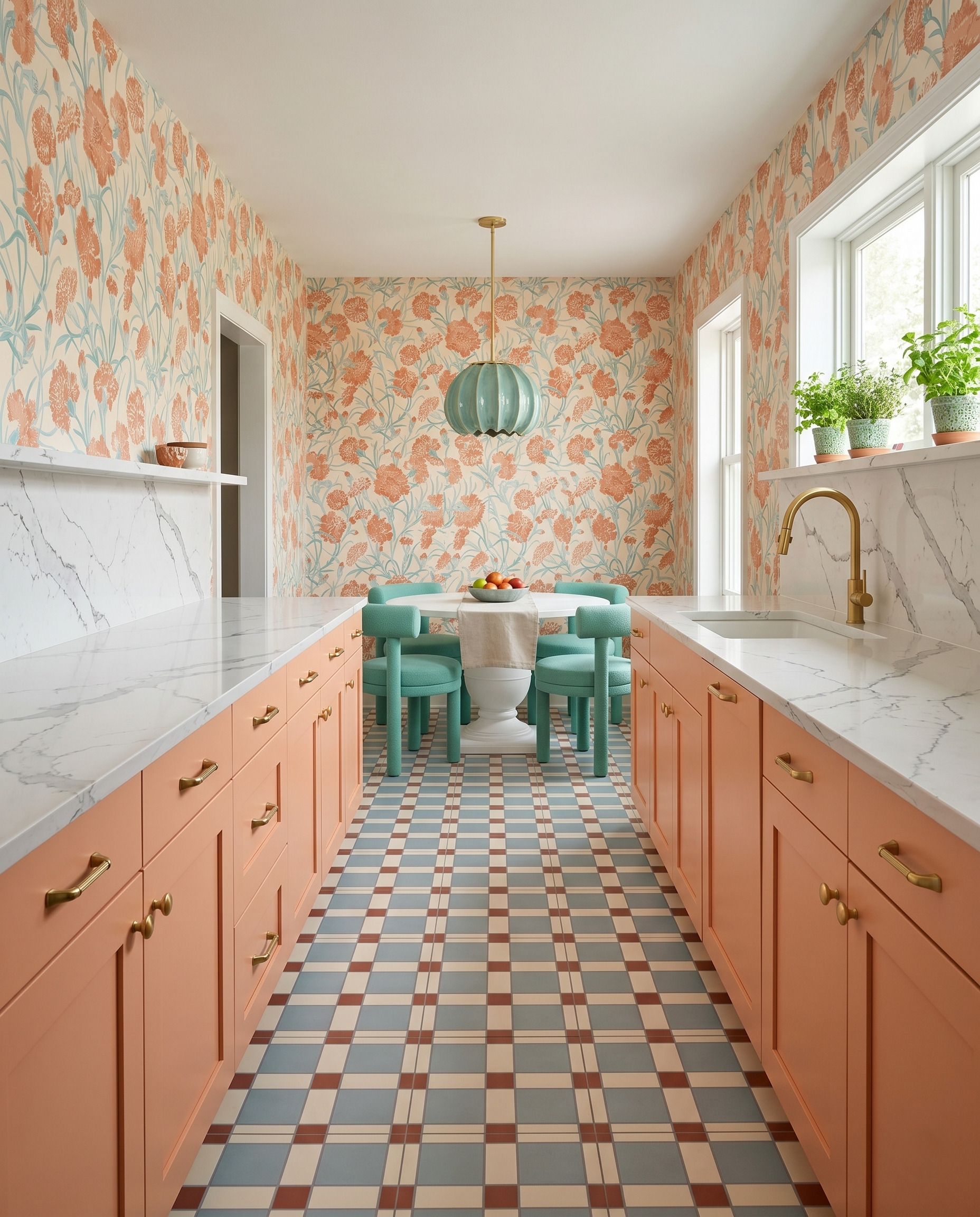
The peach flowers and blue-green stems provide two clear directions for the rest of this galley. Peach cabinetry carries the larger warm note; the pendant and upholstered chairs carry the cooler one. The floor repeats both at a smaller scale. Build a sample board around that hierarchy: cabinet finish first, a second color for furniture, then a pattern that quietly connects them.
4. Deep green cabinets with a broken-stripe wallpaper
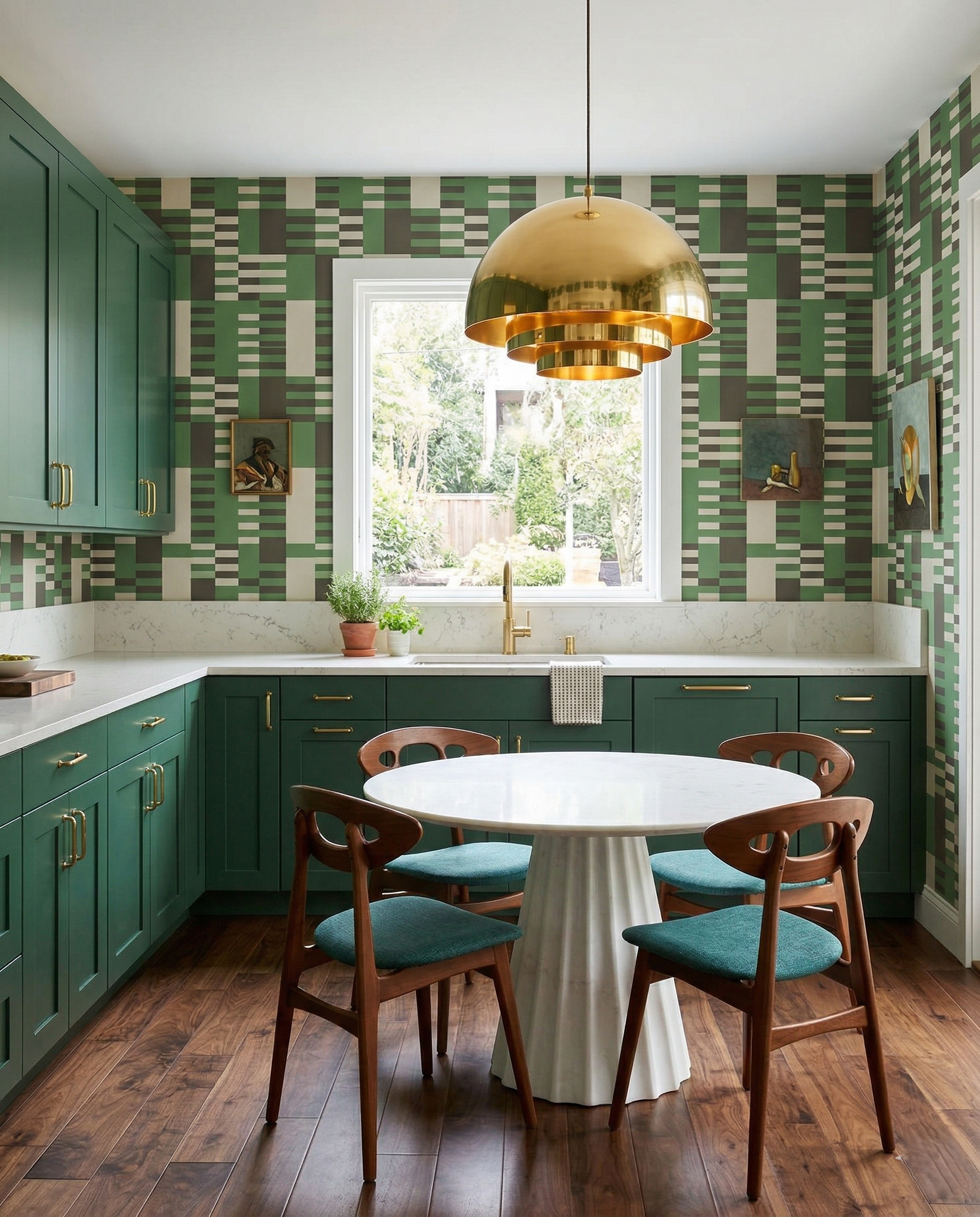
This green, charcoal and cream print has the rhythm of a plaid without using a simple square grid. Deep green cabinets give its shifting stripes a solid companion, and warm wood chairs soften the graphic effect. When comparing similar papers, look for one color that can occupy a much larger plain surface. Here, the cabinet green becomes that anchor while the narrower cream lines stay lively.
5. Dusty rose cabinets with powder-blue medallions
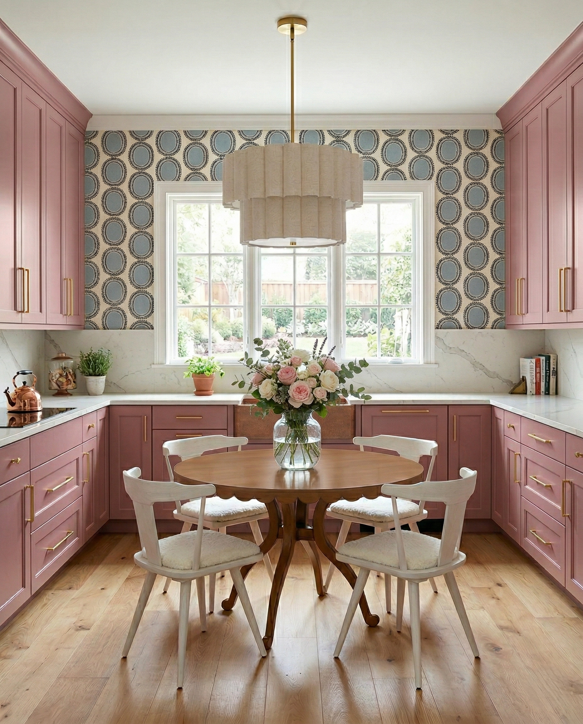
Powder-blue ovals cool the dusty rose cabinetry without making the room feel divided into competing halves. Their dark ornamental outlines add definition, while the pale tiered pendant and painted chairs repeat the wallpaper's cream background. This combination is useful if pink feels too sweet on its own: compare it with a gray-blue print, then bring in wood for another warm, textured surface.
6. Muted teal cabinets with a cheerful tomato stripe
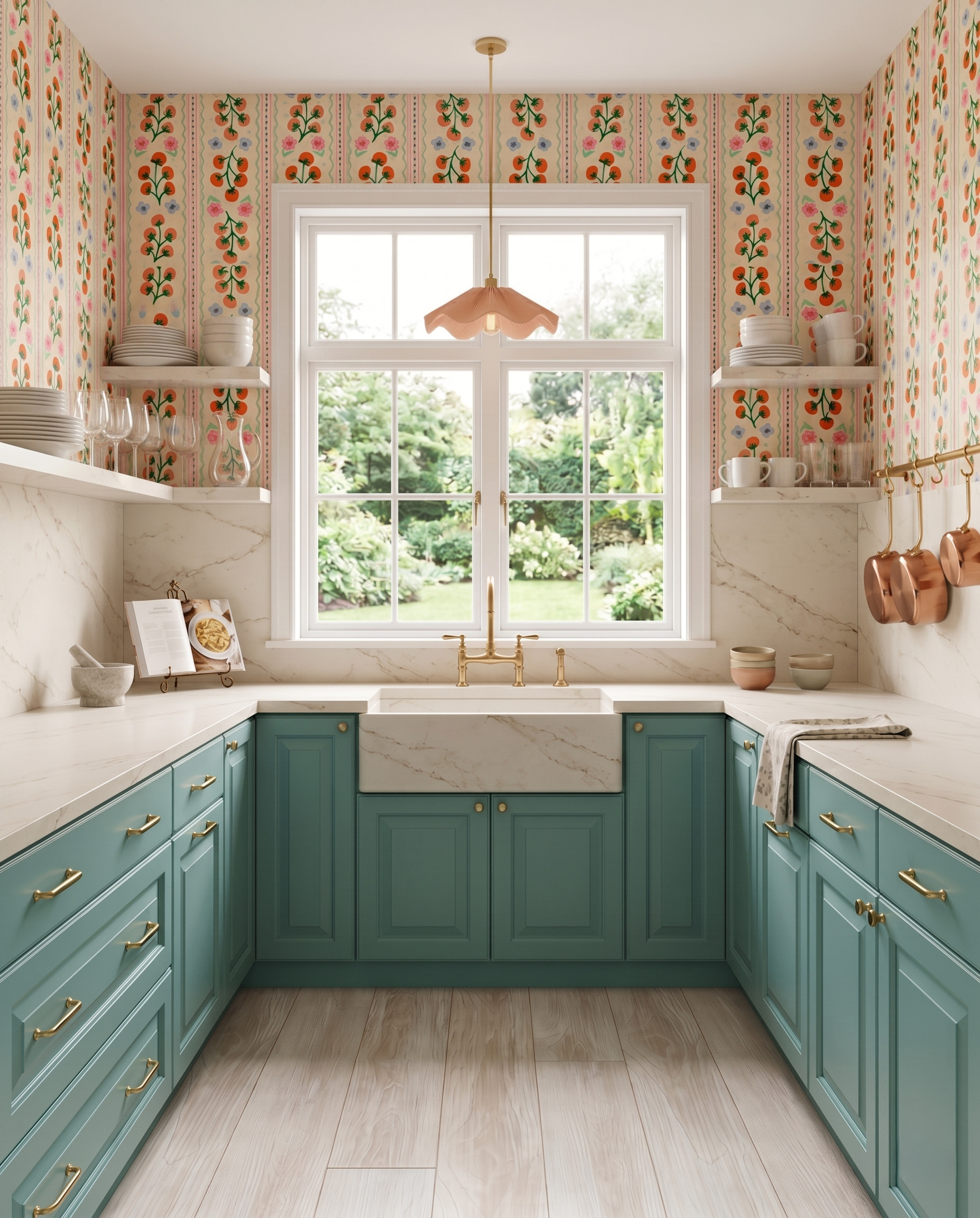
Rows of tiny tomatoes and flowers bring a kitchen theme to this wallpaper without covering the walls in large red shapes. Muted teal cabinets pick up the cooler details, while a dusty peach pendant repeats the paper's warmer background. The useful move is separating scale from saturation: a crisp, recognizable repeat can make a room feel bold even when the largest painted surface stays softened.
7. Warm beige cabinets with a playful line drawing
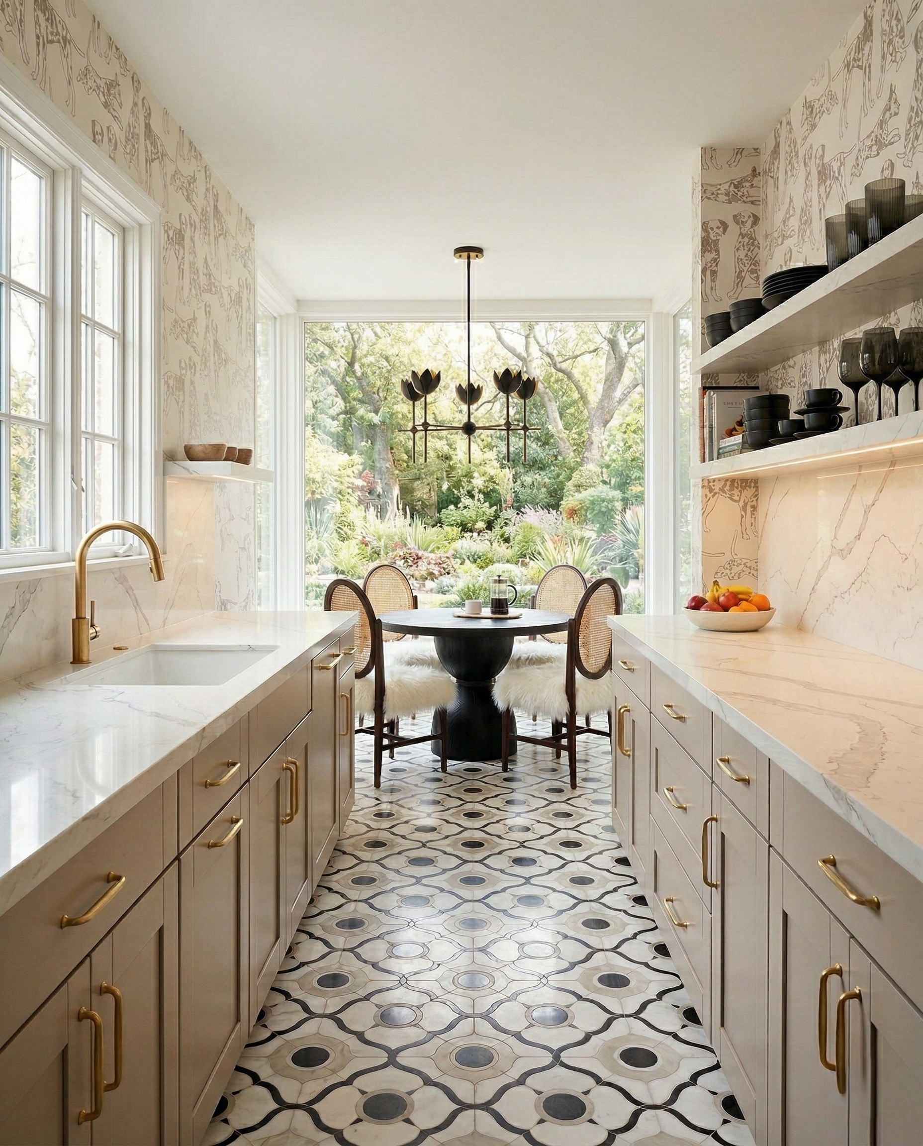
Warm beige cabinetry lets the dog illustrations read as delicate drawing, while the darker table, dishes and chandelier sharpen the room's outline. The floor adds a bolder circular repeat within the same cream-and-charcoal family. To borrow this idea, compare the darkest mark in your wallpaper with one furniture finish. Repeating that dark note can give a pale cabinet palette more presence.
8. Pale sage cabinets with yellow kitchenware illustrations
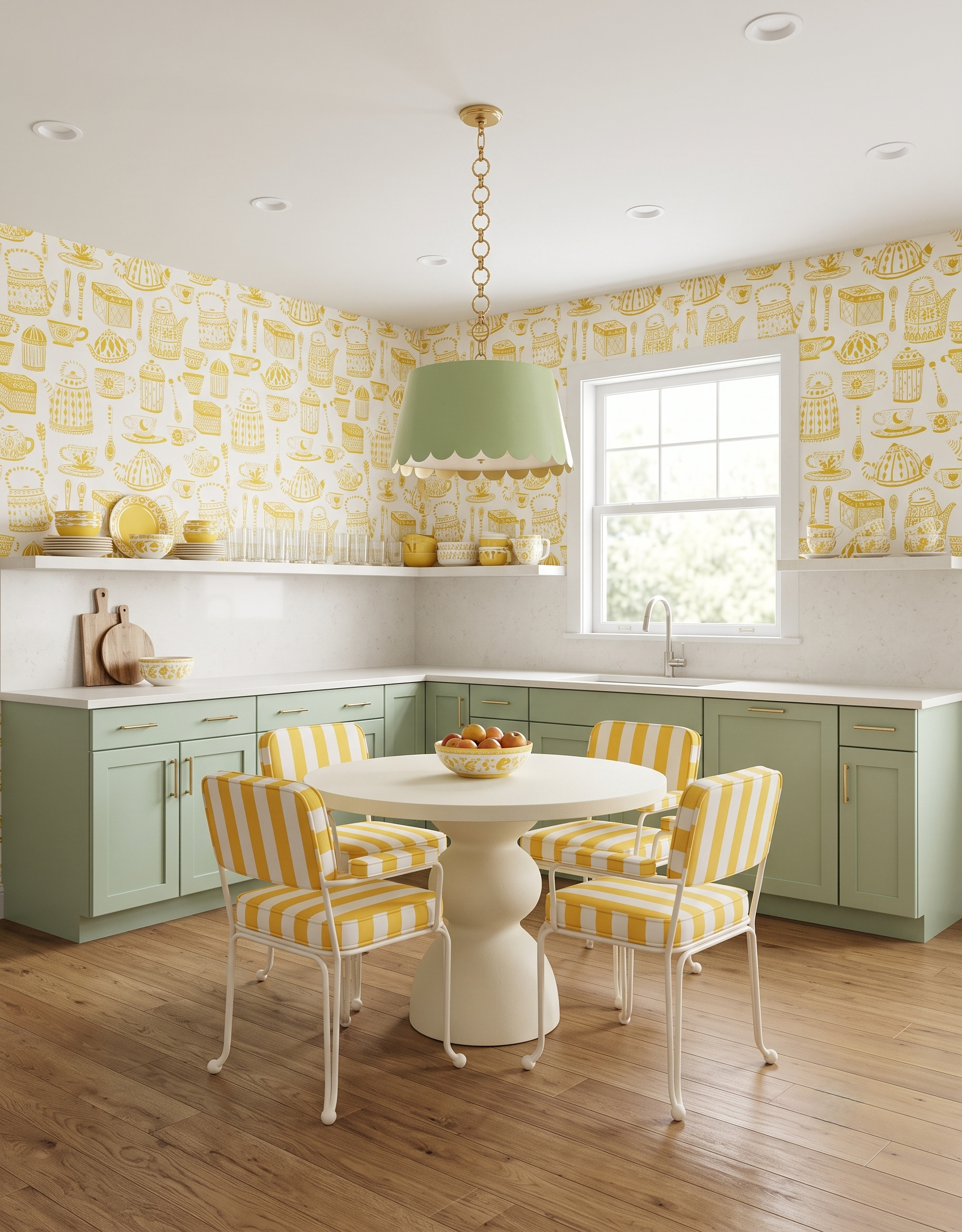
Yellow teapots, cups and serving pieces give these walls a cheerful illustrated pattern. Pale sage cabinetry and the green lampshade provide a softer counterpoint, while striped chairs repeat the yellow in broader bands. Notice how the two patterns share a color but change scale. Try placing a simple stripe beside a detailed wallpaper sample before adding another busy print to the room.
9. Soft mint cabinets with pink flowering branches
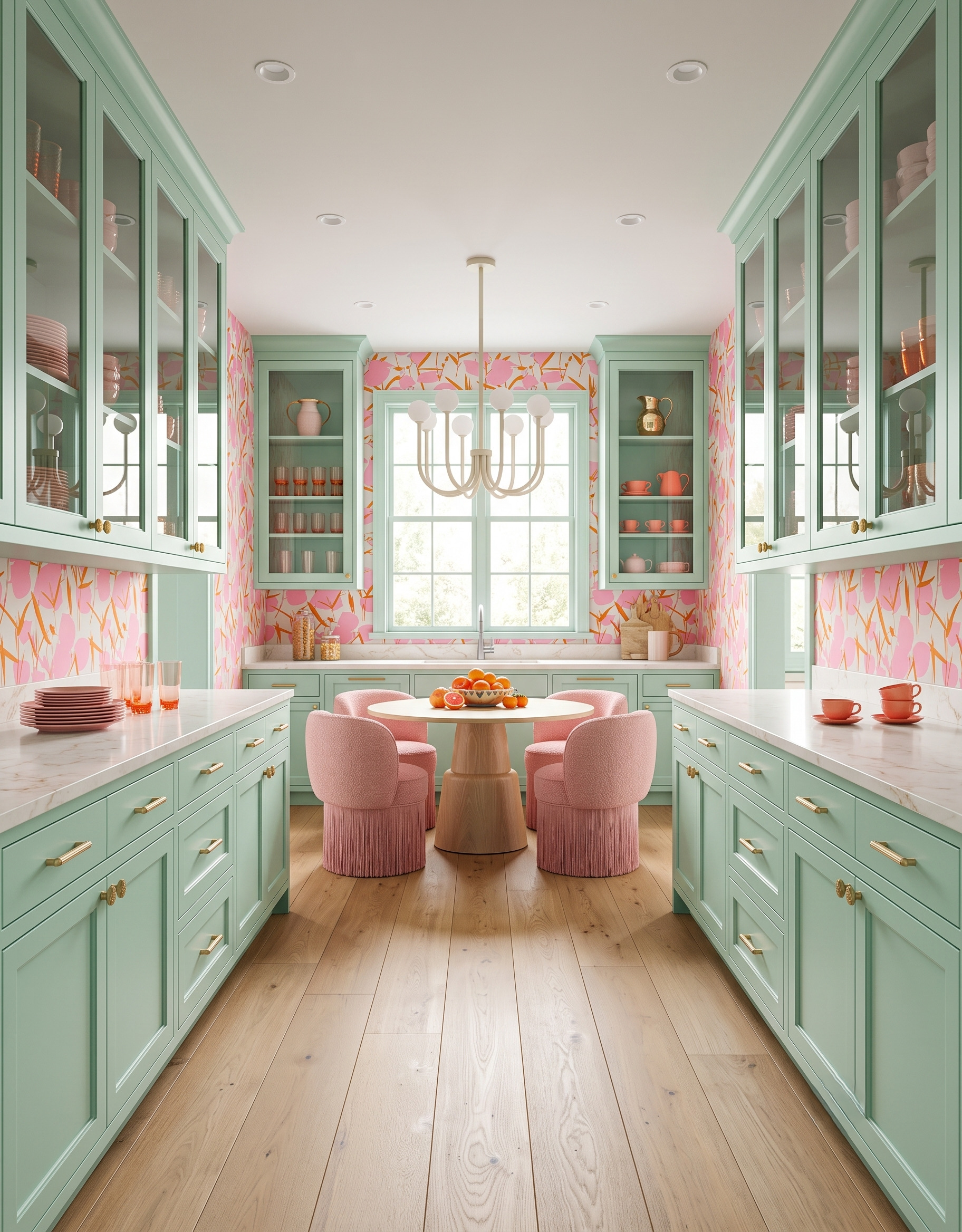
Soft mint frames the glass cupboards and window, giving the pink branching print a consistent edge wherever it appears. Pink and coral dishes continue the wallpaper palette inside the cupboards, so the display feels connected to the walls. Borrow the relationship with a small group of ceramics first. Repeating two paper colors behind glass can link the upper cabinets to the rest of the room.
10. Gray-green cabinets with a pale lemon print
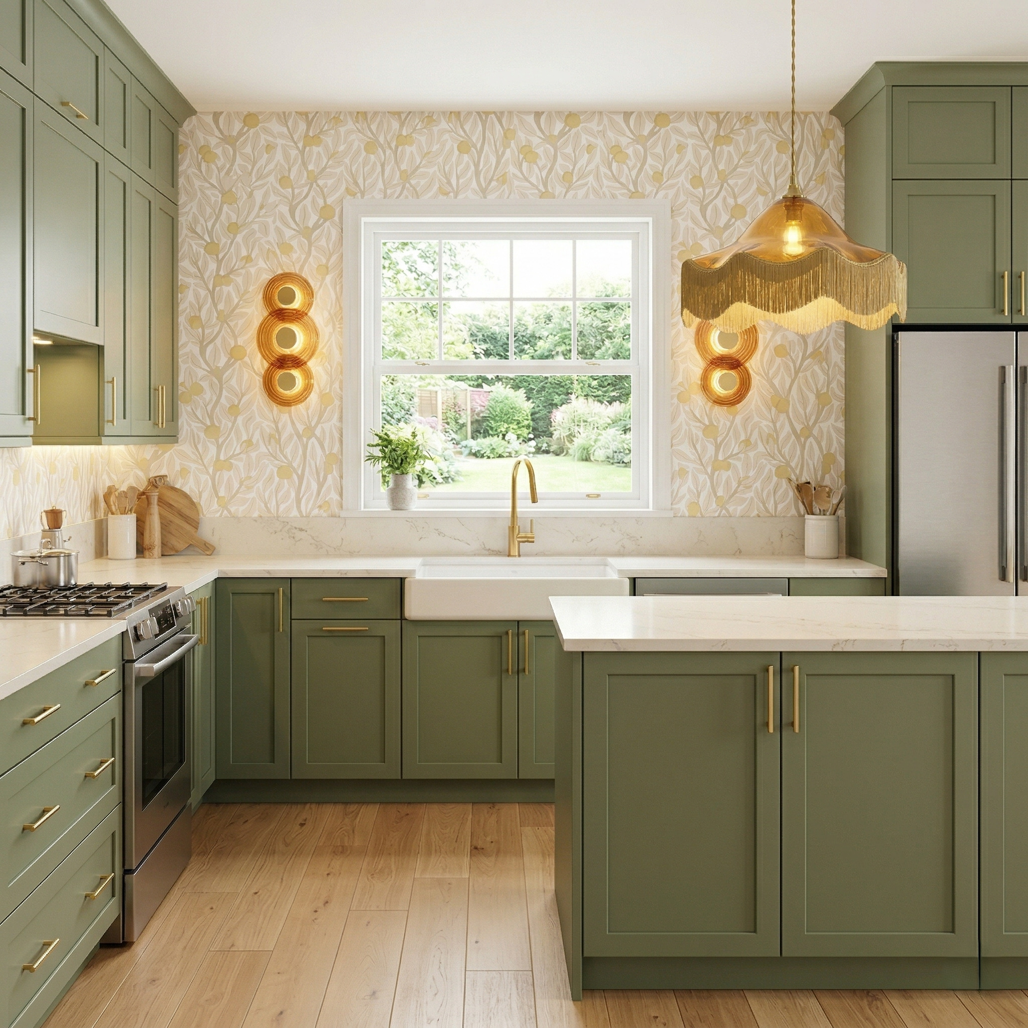
Gray-green cabinetry gives this pale lemon-and-leaf wallpaper a grounded partner. The print stays light, while amber glass and a fringed shade add the room's strongest warm accents. It is a useful combination when you want decorative walls without a dark background. Compare the paper's leaf color with your cabinet sample, then choose one warm lighting detail to repeat the fruit's golden tone.
Bring your favorite pairing into a kitchen plan
Save the combinations that appeal to you, then compare real wallpaper and cabinet samples together in your own light. Keep a note of the two or three colors doing the most work so the rest of the room can follow a clear direction.
When you are ready to work on the kitchen itself, use StilePath to start planning. Keep your favorite color-and-pattern pairing beside you as a reference while you consider the room's layout and cabinets.
Explore StilePath for your kitchen