
10 Kitchen Material Pairings with Color and Texture
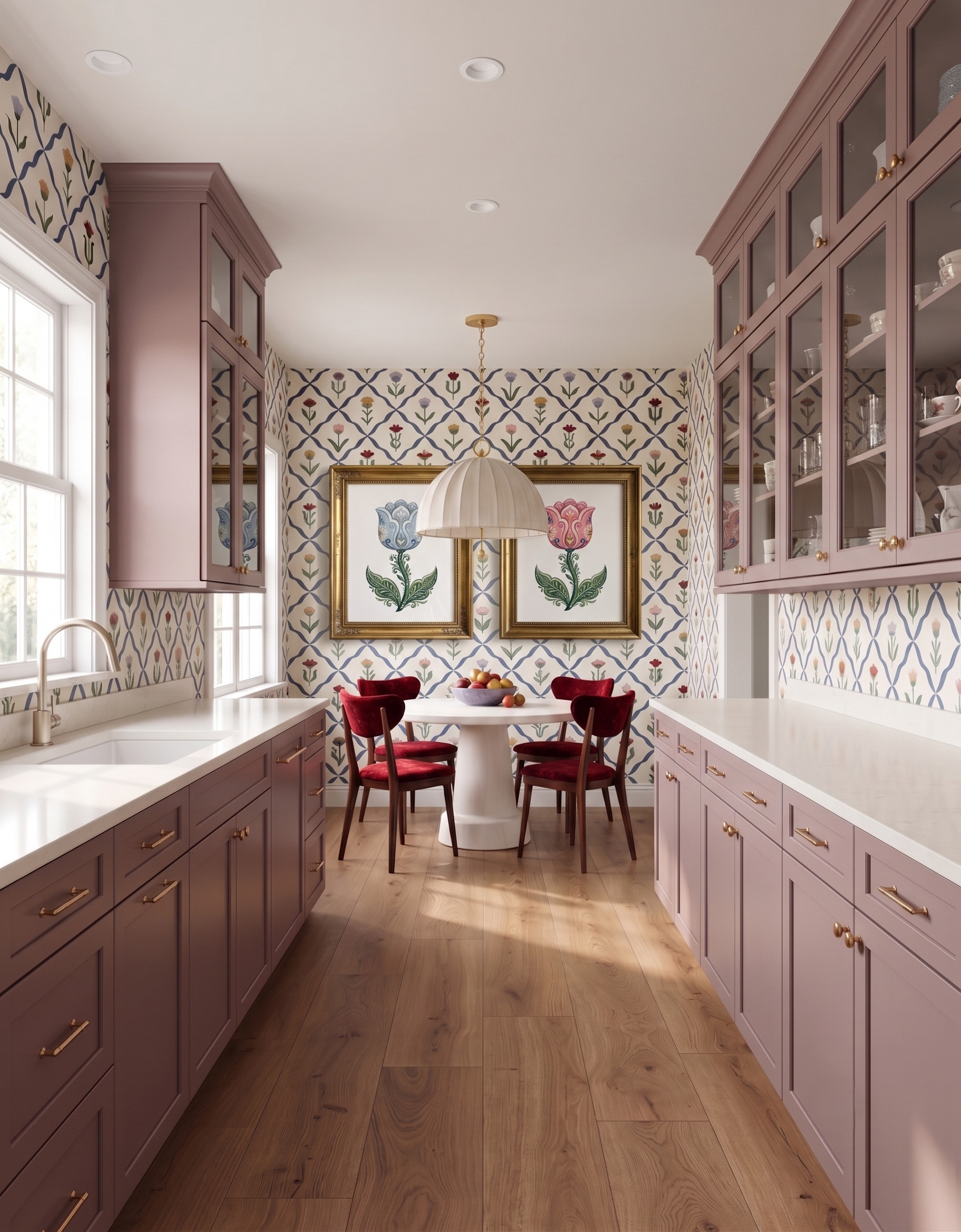
A kitchen palette is more than a cabinet paint color. Wood grain, woven chairs, smooth stone and patterned walls all change how that color feels. These ten kitchen material pairings show ways to combine those elements, from a floral breakfast nook to a blue galley with a wood ceiling. Save the relationship you like, then bring real samples together before deciding which finishes belong in your own room.
Images are AI-created design concepts from Anna’s authorized collection. They illustrate decorating ideas, not completed Home3 projects or measured construction plans.
1. Combine smoky plum, velvet and a floral repeat
The tulips appear twice: as a small repeat on the wallpaper and as oversized framed prints behind the table. That change in scale makes the breakfast nook feel intentional. Smoky-plum cabinets provide a soft backdrop for the deeper red seats. If you love a patterned wall, try one larger artwork that echoes its subject, then keep the table and pendant comparatively simple.
2. Sharpen soft mint with dark green stripes
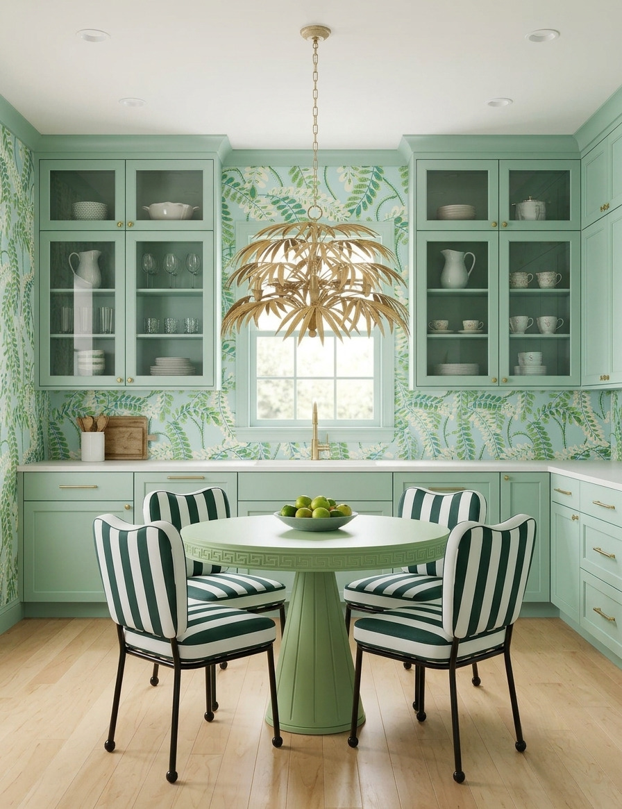
The mint cabinets and delicate botanical print are close in tone, so the dark chair stripes provide definition. A green table links the light cabinetry to the stronger upholstery, while the gold leaf chandelier repeats the wallpaper’s organic shapes. When layering greens, compare the lightest and darkest samples together. A clear difference in depth can make the combination more interesting than several almost-matching shades.
3. Balance fruit-patterned walls with green woven chairs
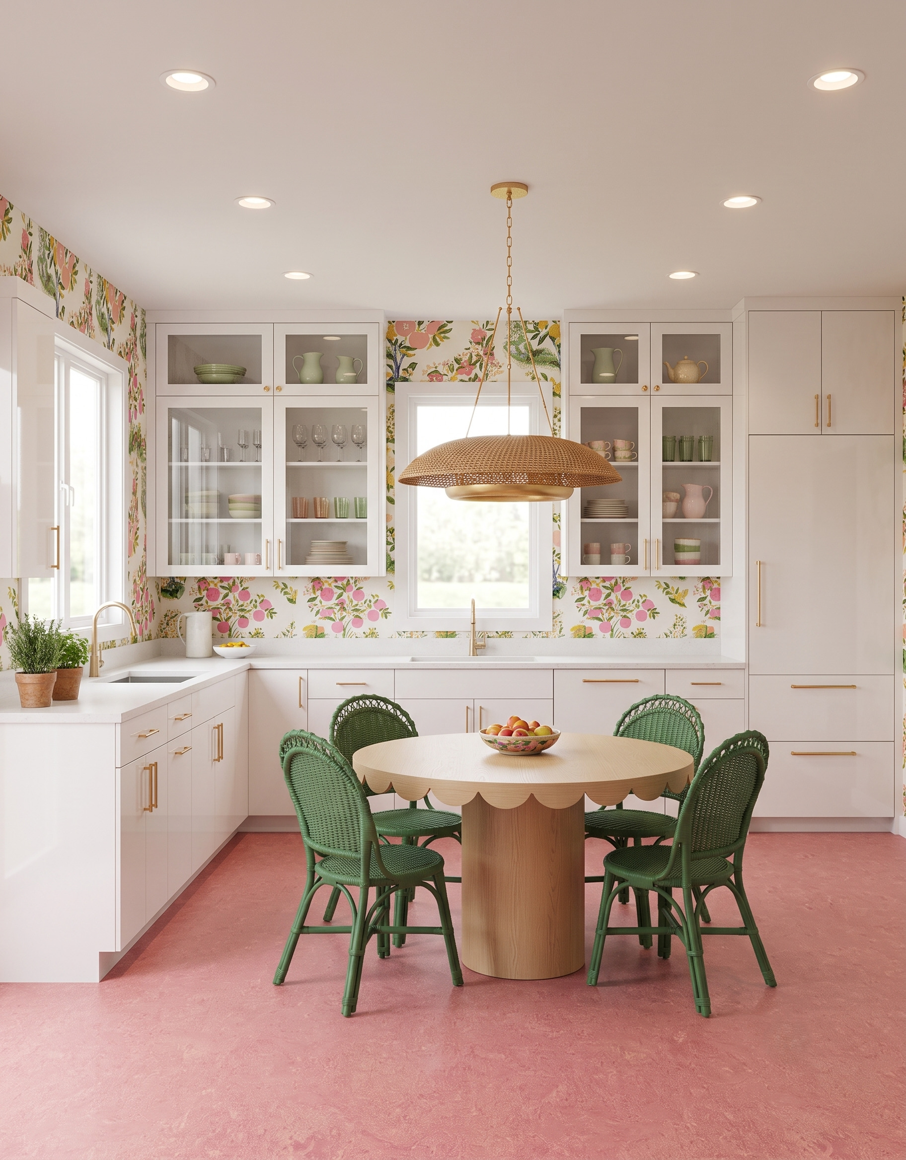
Green woven chairs bring texture and color to this pale kitchen. Their rounded backs echo the scalloped table edge, while the pendant repeats the woven material at a larger scale. The pink floor picks up the fruit print without competing with the furniture. This is a useful pairing when the cabinets are already neutral: let the chairs establish the accent and repeat it in a smaller decorative detail.
4. Layer peach, mustard and warm metal
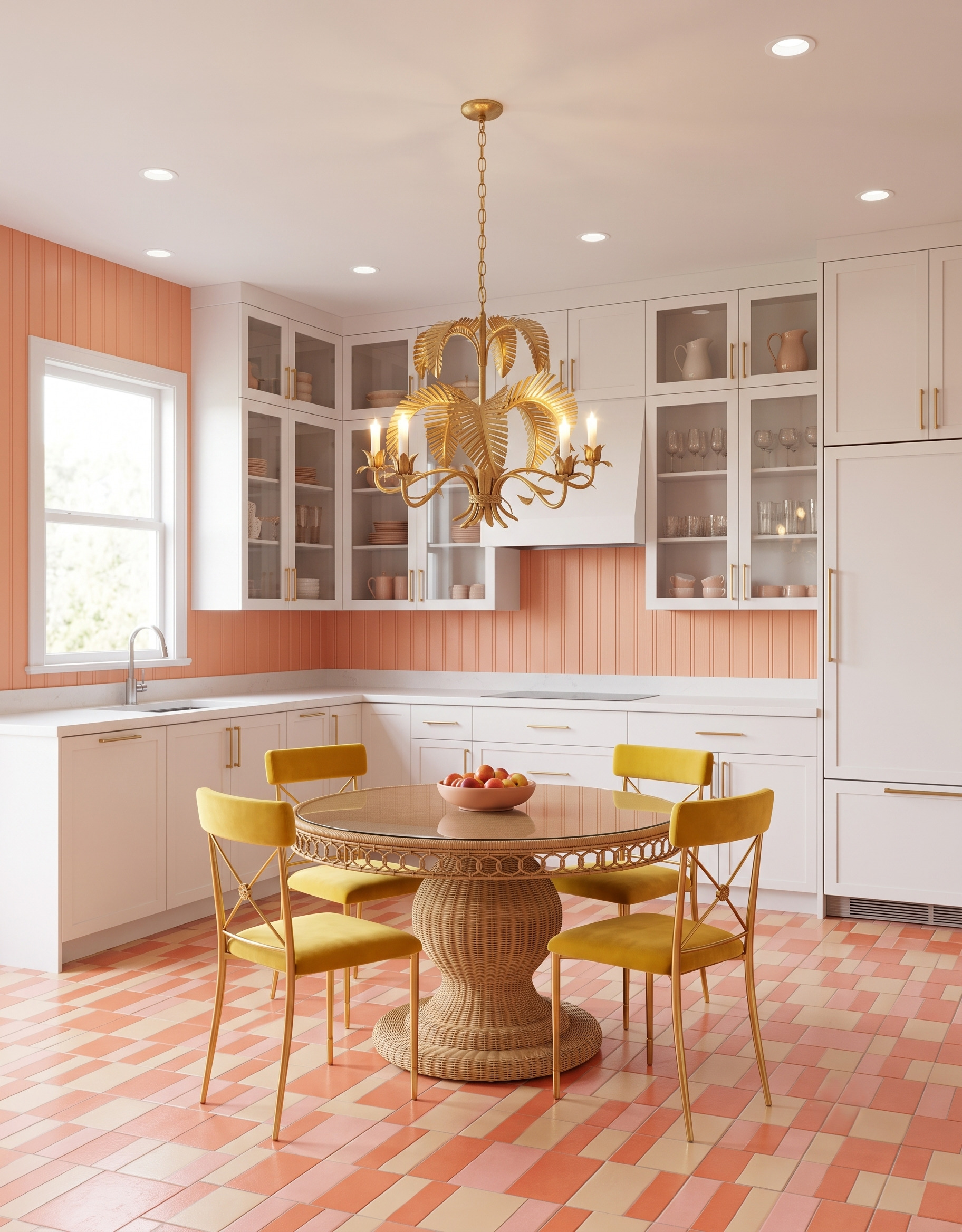
Peach walls and mustard seats create a warm combination without making every surface match. The woven table base supplies a different texture, and its glass top lets the elaborate gold chandelier remain the main feature. Keep a grouping like this focused by choosing one showpiece light. Repeat its warm metal in smaller details, then compare the upholstery with the wall color under your own daylight.
5. Put natural wood beside pale aqua and leather
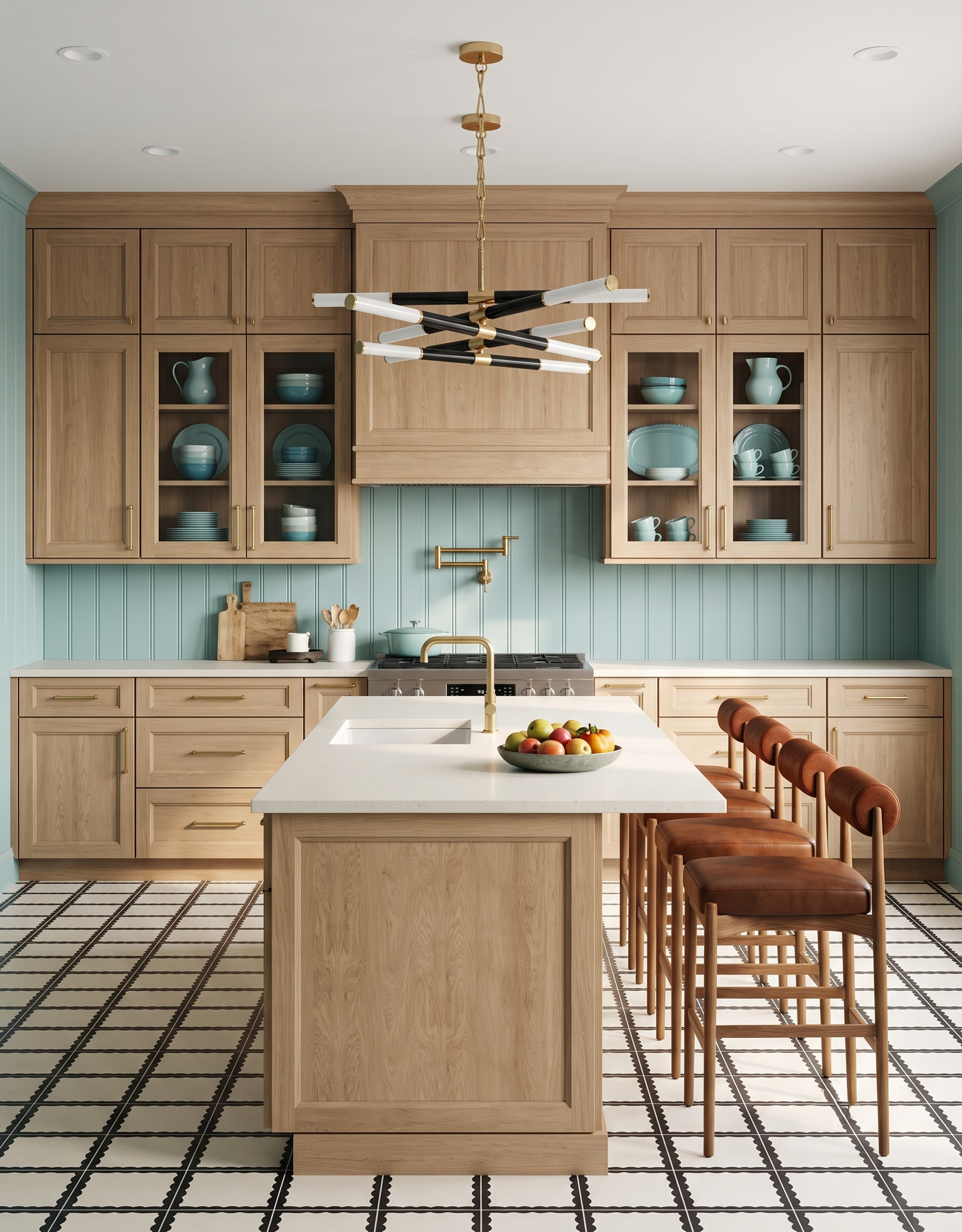
Pale aqua makes the natural wood feel fresh, while brown leather adds a deeper warm texture. The checked floor provides the room’s strongest pattern, leaving the cabinetry to show its grain. This is a useful way to work with an existing wood finish. Compare a cool painted sample and a warmer fabric beside it, then choose one graphic surface instead of adding pattern to every material.
6. Use a cherry-red accent with navy and pale blue
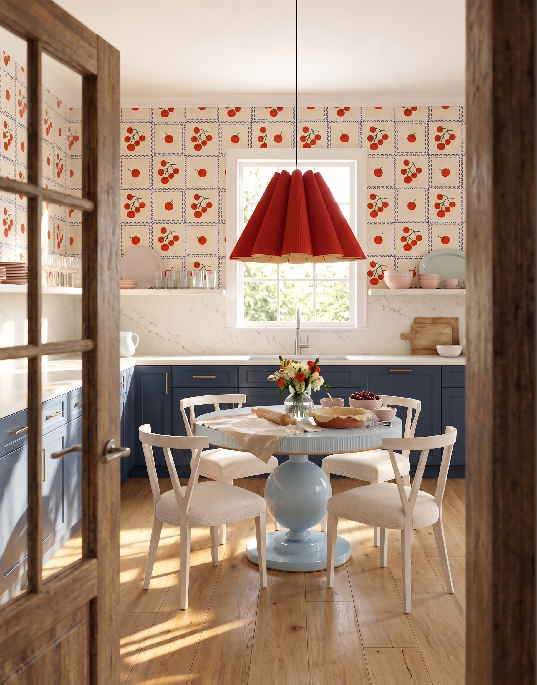
The red pendant borrows its color from the cherries on the wall. Navy cabinetry keeps the lower half grounded, while the pale-blue table introduces a softer version of the same cool palette. The white chairs leave room for those elements to stand out. Choose the wall pattern first, then test one accent color at pendant scale; a large shade will read much more strongly than a small accessory.
7. Pair sage paint with a sunny small-scale print
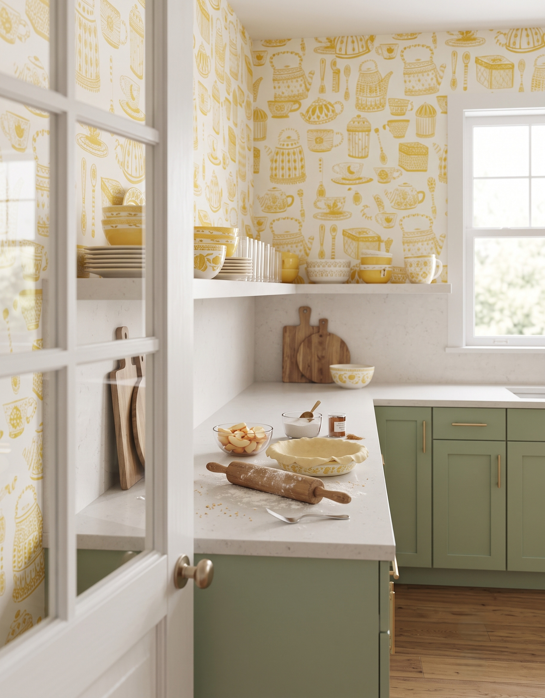
A sage cabinet finish gives this yellow-and-white print a soft green base. The pale counter separates the paint from the pattern, while wood boards and a rolling pin add a warmer texture at a small scale. You can borrow this relationship without covering a whole room. Start with the cabinet sample and a full wallpaper repeat, then check whether the counter keeps enough visual space between them.
8. Warm smoky blue with brown upholstery and wood
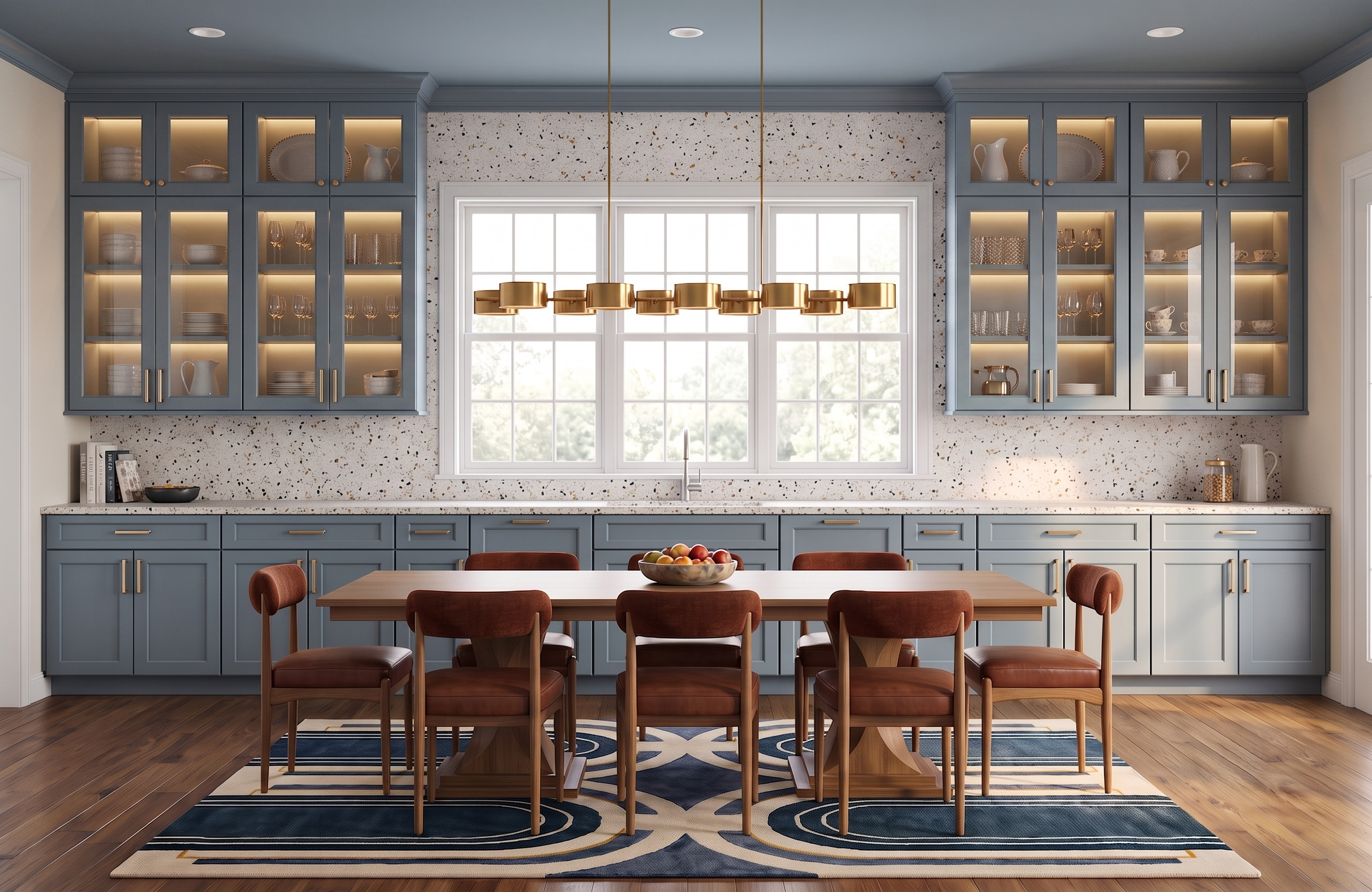
Rounded chair backs soften the long lines of the table, countertop and brass fixture. The blue rug reconnects the dining furniture to the cabinetry, while brown upholstery adds warmth beside the cool paint. This combination is helpful when a kitchen dining area feels visually separate from the cabinets. Repeat a cabinet color in the rug or chair fabric, then use the table finish to introduce contrast.
9. Pair powder blue with an overhead wood finish
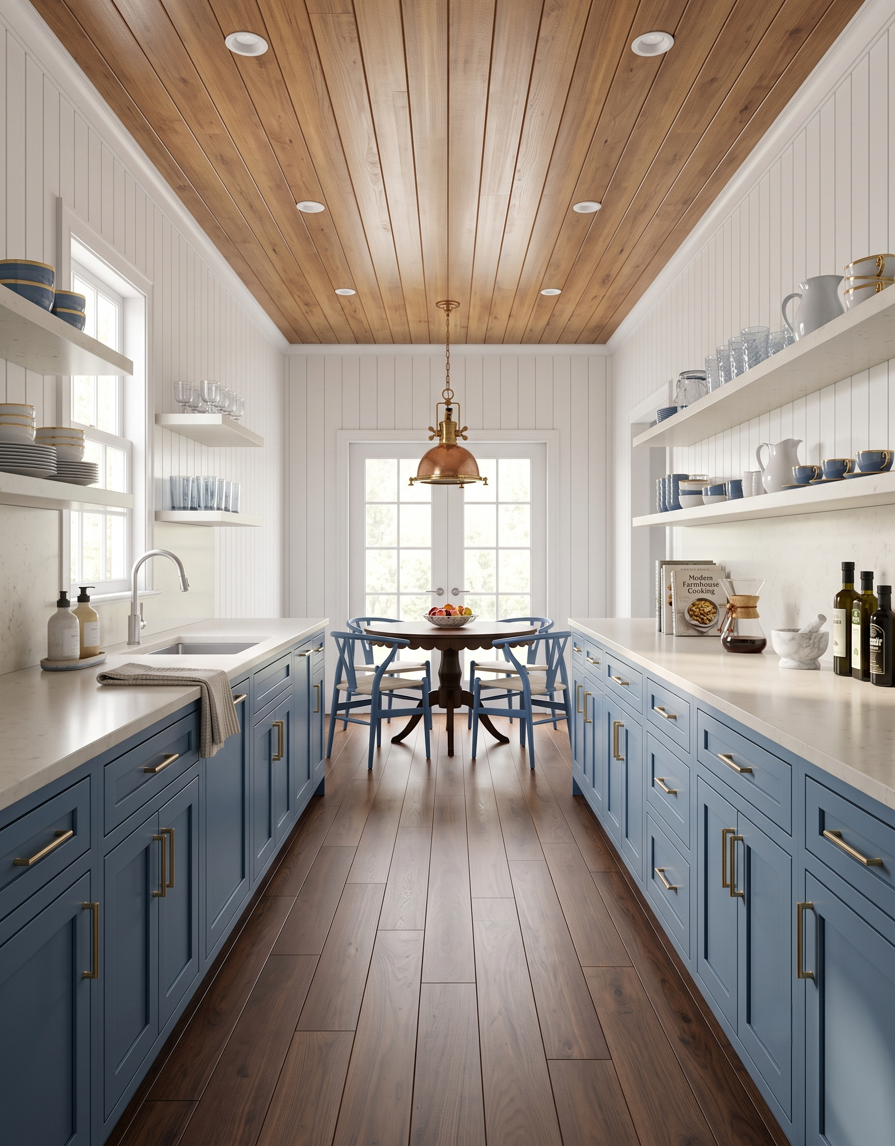
Powder-blue cabinets and dining chairs give this room a clear color thread. The wood ceiling adds warmth above the pale counters, and a darker table introduces another depth of brown. White wall paneling keeps the two broad finishes apart. Compare wood samples beside your cabinet paint before deciding where to use them; a ceiling, shelf and tabletop can carry different amounts of that same warm note.
10. Pair black cabinetry with woodland toile and pale counters
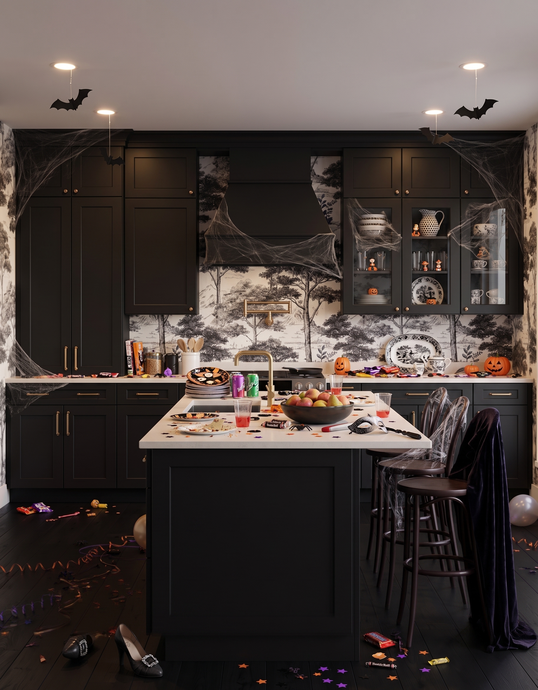
The black cabinet frames give the fine woodland pattern a solid outline. Pale counters separate that busy wall from the cabinetry, while dark wood seating and warm metal hardware add softer textures. The Halloween accents show how this permanent palette can carry a seasonal display. For the everyday room, compare a large toile sample beside your cabinet finish and counter sample so the pattern and dark paint remain distinct.
Build one complete kitchen sample palette
Bring cabinet paint, wood, upholstery, countertop and wallcovering samples together. Choose the material you most want to keep, then compare the others against it. A full wallpaper repeat and a larger counter sample will show relationships that tiny swatches can hide.
View your samples in the kitchen during daylight and under the lighting you expect to use. Keep the practical layout in the project brief too: furniture positions, appliance access and a pendant centered over the table still need to work alongside the finishes.
Ready to explore your kitchen? Use StilePath for kitchen planning and keep your favorite color and material combinations beside your project brief.
Explore StilePath for your kitchen