
10 Kitchen Floor and Cabinet Color Combinations
A floor can repeat a cabinet color, soften it, or give it a completely different backdrop. These ten concept kitchens explore that relationship through quiet wood tones, rhythmic checks and more adventurous tile patterns. Look at the broad areas of color first, then the smaller details. The most useful pairing is one you can imagine across the visible floor in your own room.
Images are AI-created design concepts from Anna's authorized collection. They illustrate decorating ideas, not completed Home3 projects or measured construction plans.
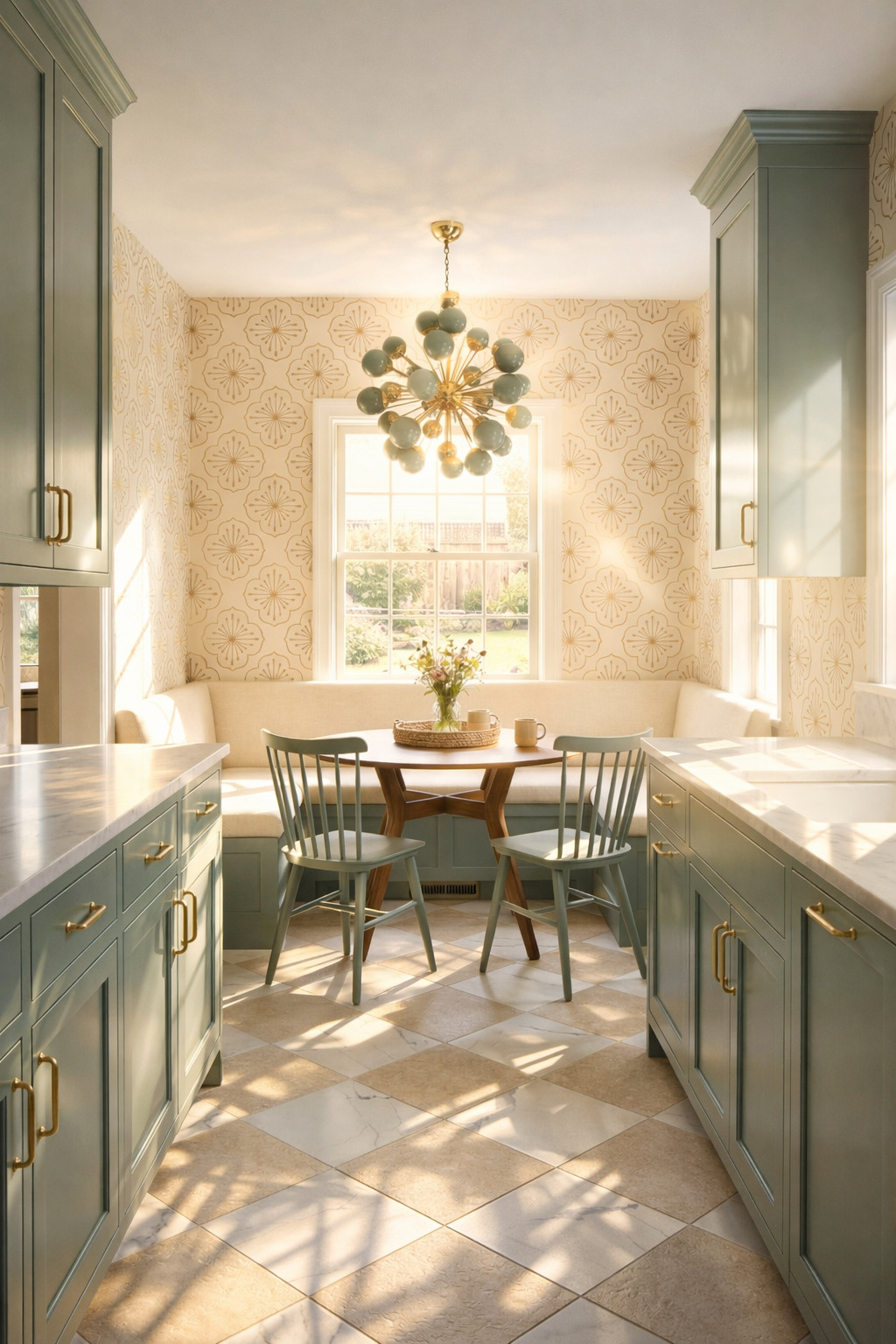
1. Soften teal cabinetry with a cream-and-sand checkerboard
Cream and sandy beige checks give this muted teal galley a gentle contrast. The floor is graphic, but its two colors sit close enough together that the cabinets remain distinct. Try a checkerboard with related light tones when black and white feels too sharp. Include the darker tile in your sample group; it sets the warmth of the whole combination.
2. Give warm wood cabinets a muted patchwork floor
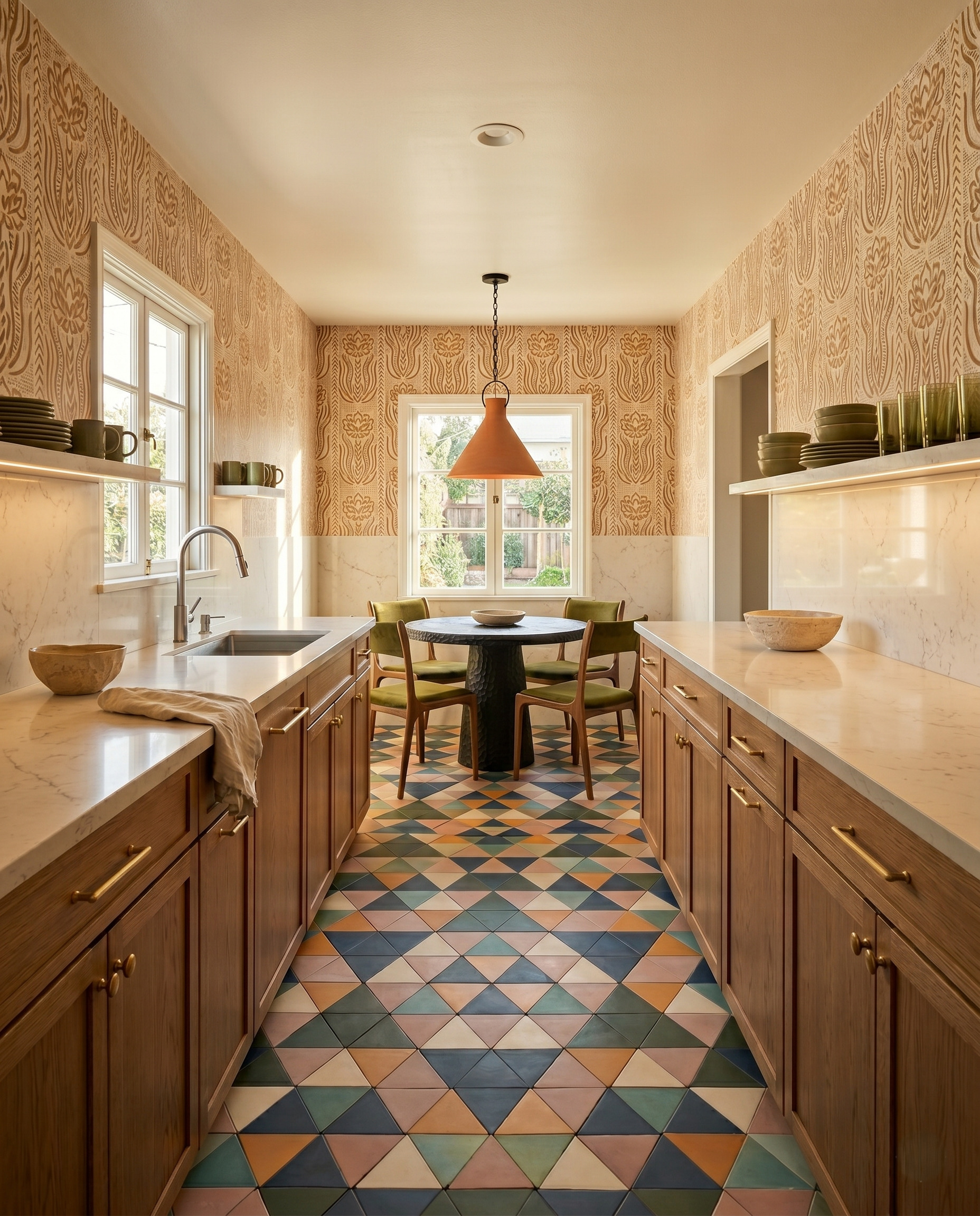
This floor brings blue, olive, clay and cream into a room of warm wood cabinetry. The triangular pieces share a restrained, earthy quality even though their colors differ. Wood provides a continuous edge around the pattern. To borrow the idea, compare several neighboring tiles together and look for a shared softness, rather than choosing every color at its brightest.
3. Echo red cabinets with a spaced floral tile motif
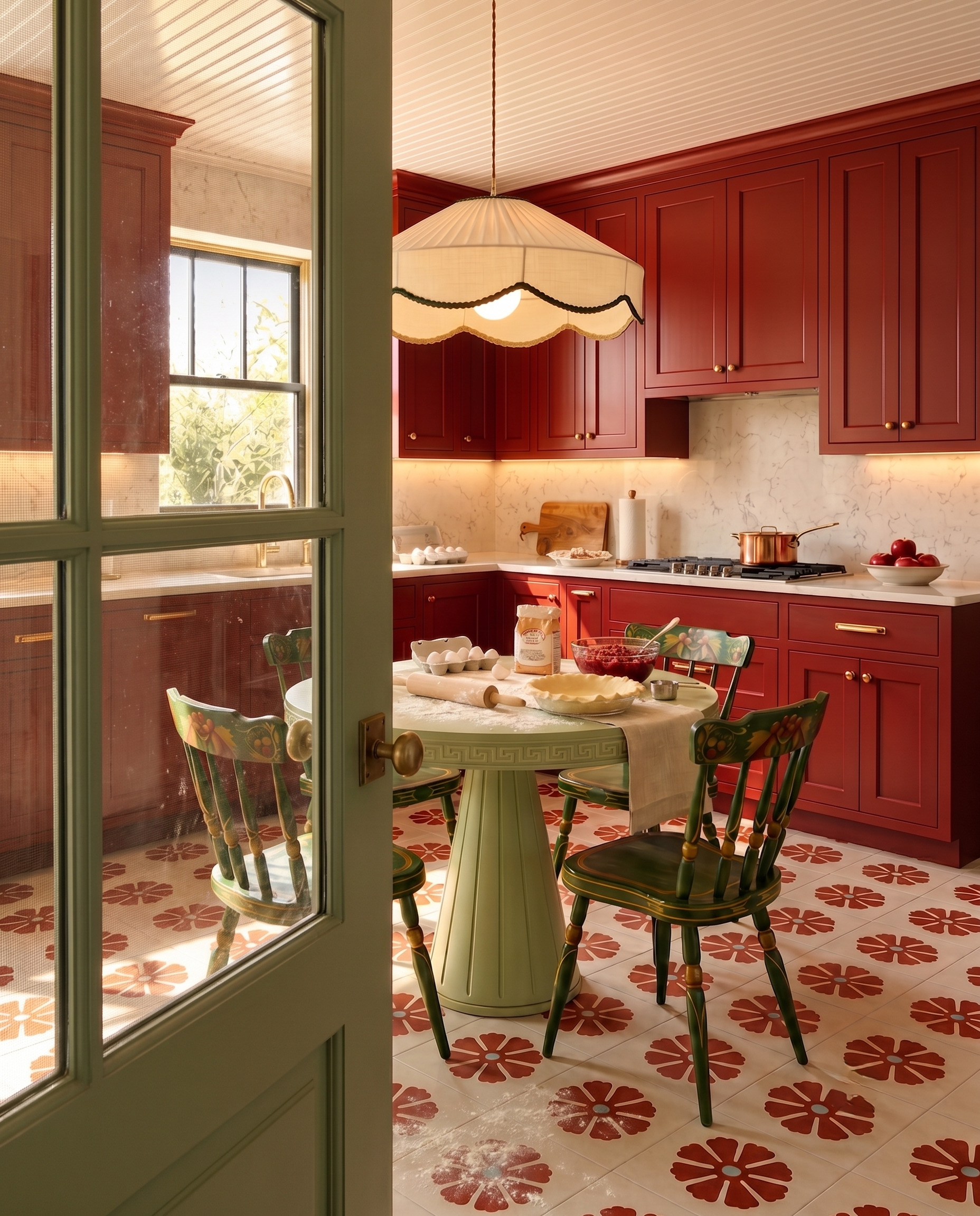
Rust-red flowers repeat the cabinet color while a cream tile background keeps the floor light. Each motif has room around it, so the pattern reads as a collection of distinct shapes. The green table adds a separate color without changing that connection. If you love a decorative floor, start with one cabinet-related color and leave generous neutral space between repeats.
4. Keep wood cabinets and a checkerboard in the same warm family
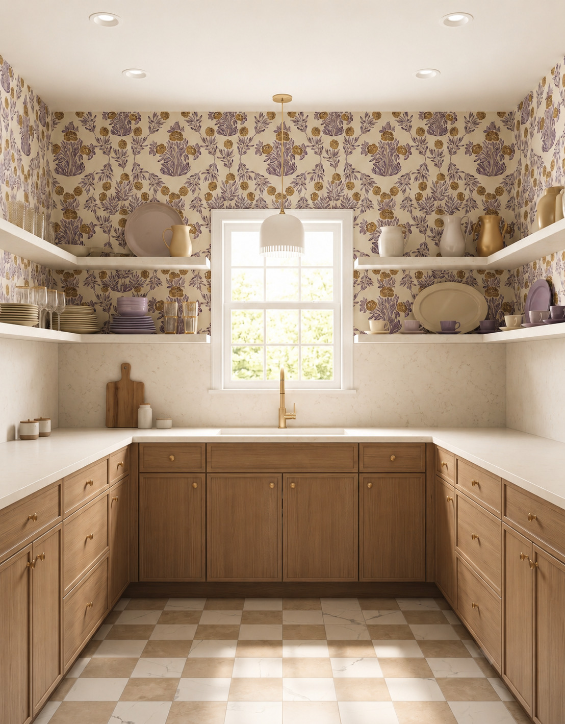
Warm beige-and-cream checks sit close to the color of these wood cabinets, so the floor adds rhythm without a hard contrast. The square grid also gives the irregular grain a simple companion. Compare the darker tile with the cabinet finish first; if those two tones feel related, the lighter tile can provide definition without turning the floor into the room's loudest pattern.
5. Let a dark circular pattern animate beige cabinetry
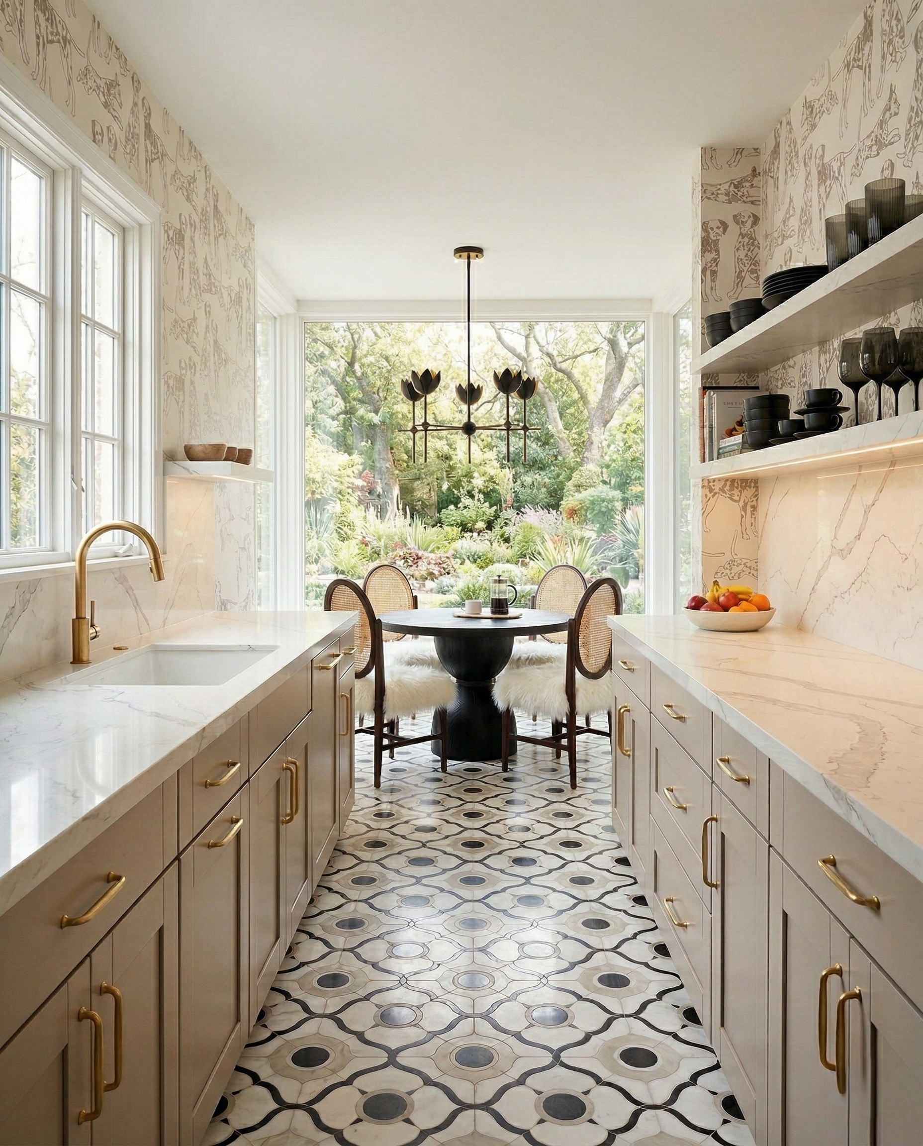
Beige cabinets do not have to lead to a plain floor. Here, dark circles and looping outlines create movement through a light galley, while the cabinet finish sits quietly beside them. The repeated curves also relate to the round table. When testing a detailed neutral pattern, compare its darkest line with the cabinet hardware and nearby furniture, not just its background.
6. Balance coral cabinets with pale, quiet boards
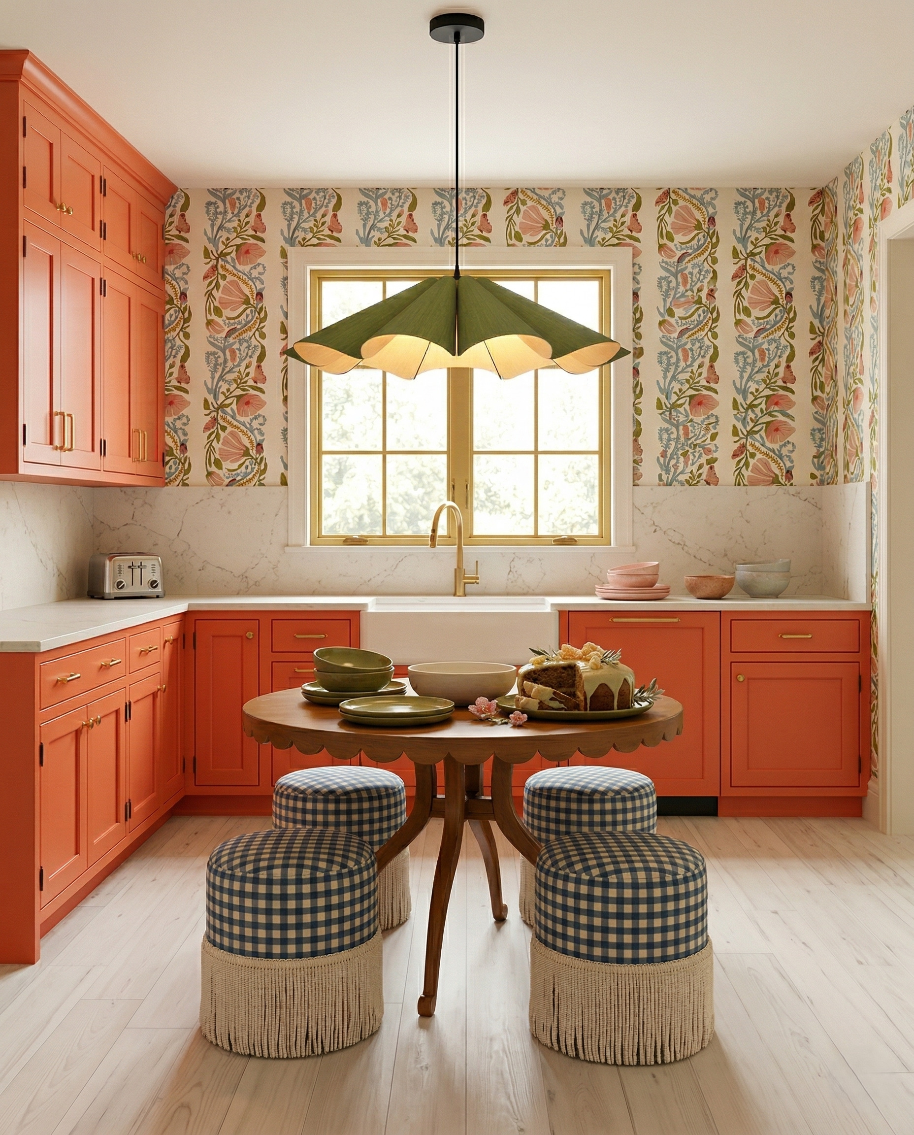
Pale wood-look boards leave room for coral cabinetry, botanical wallpaper and checked upholstery to share the spotlight. Their grain adds texture without introducing another sharply outlined pattern. Notice the floor's lighter value beside the cabinets. If you are combining several decorative elements, compare a quiet floor sample before adding another print; the calmer surface can make the colorful pieces easier to enjoy.
7. Make black cabinets and dark boards feel continuous
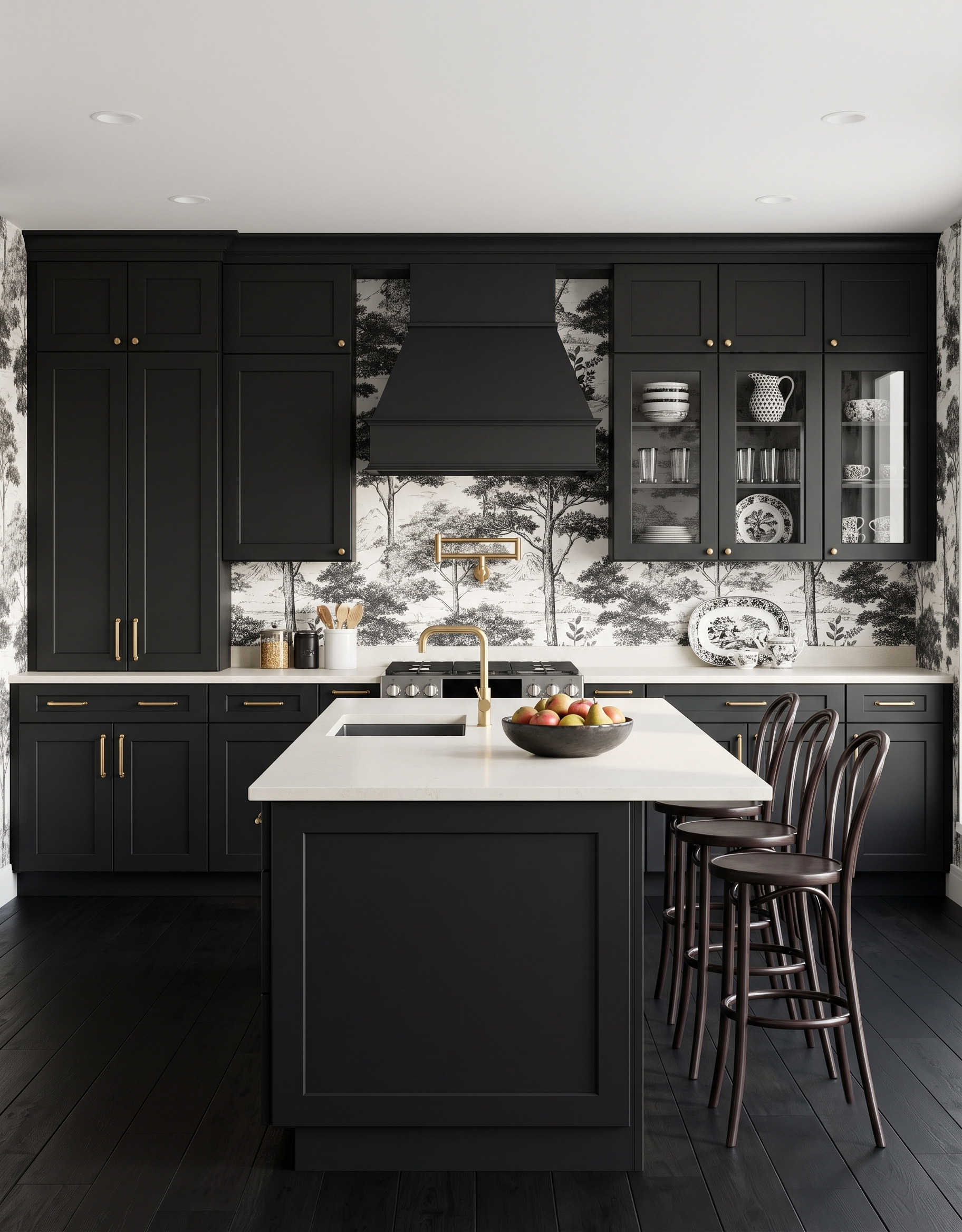
Nearly black boards extend the cabinet color across the lower half of this kitchen. White counters keep the working surfaces distinct, and pale wallpaper supplies the contrast above. Subtle grain stops the floor from reading as a flat painted field. For a similar combination, compare dark samples in your actual room light so you can still see their texture beside the cabinetry.
8. Set blue-green paint beside a pale gray-beige grain
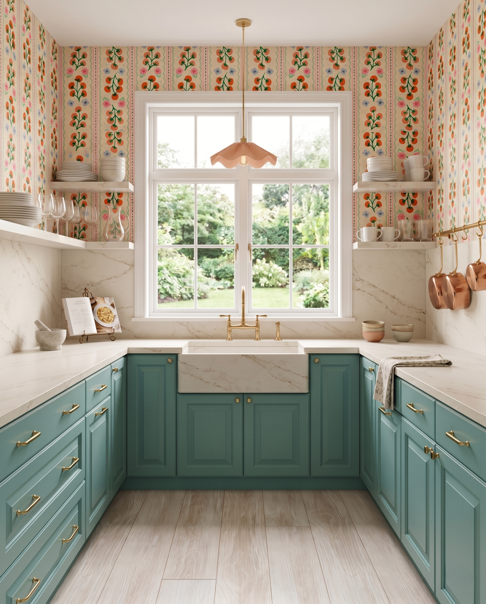
Pale gray-beige boards offer a soft counterpoint to blue-green paint. Their broad grain is visible against the smooth cabinet fronts, while the cream counter helps the cooler and warmer tones sit together. When comparing samples, place them right at the cabinet base. A floor that looks neutral alone may reveal a pink, yellow or gray cast beside a colored door.
9. Use a warm tiled palette beneath white cabinets
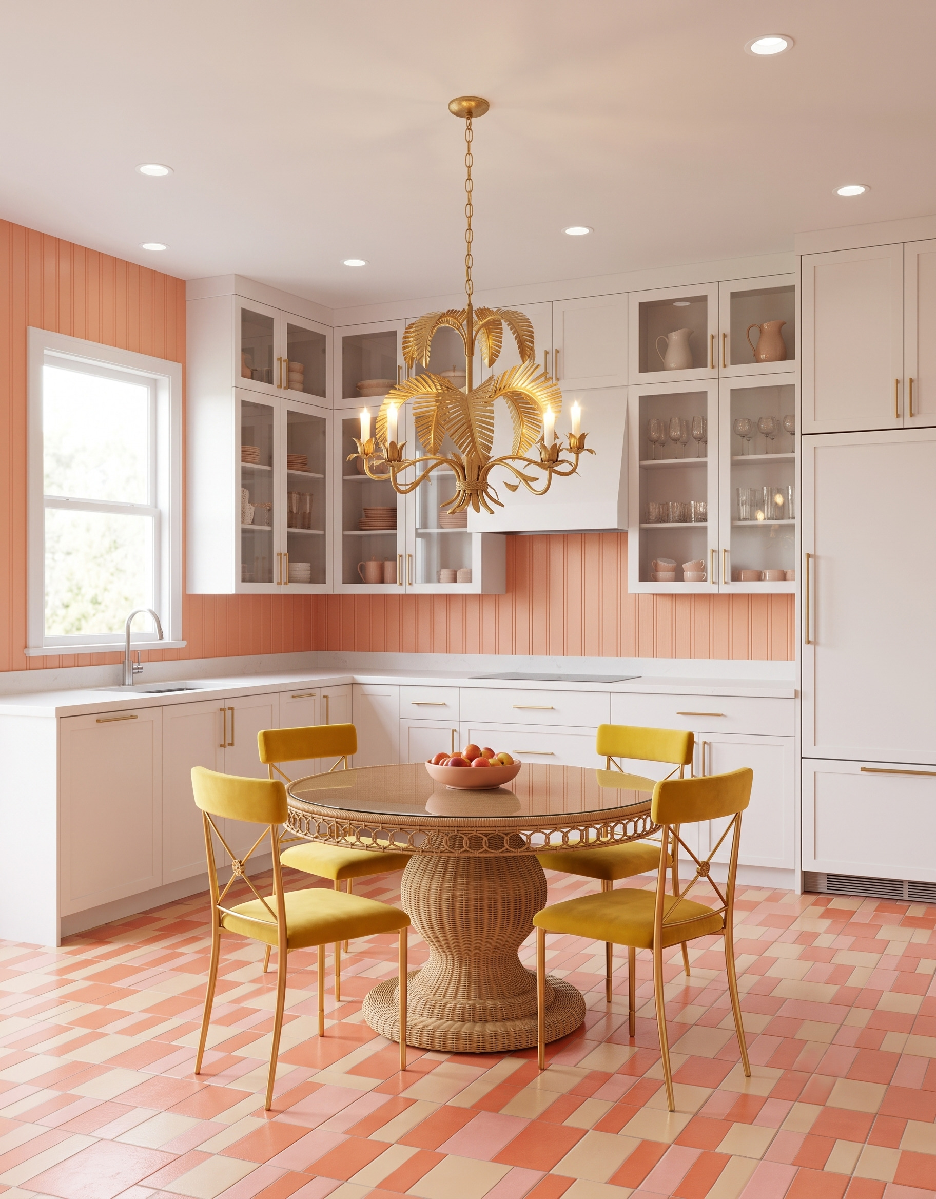
Peach, pink and cream rectangles make the floor the colorful surface in this white kitchen. The cabinet fronts give those small color changes a simple background, while the peach wall repeats one part of the palette. Mixed tile proportions add interest without requiring more colors. Try laying out several samples together to judge their overall rhythm before choosing the individual shades.
10. Pair moss-green cabinets with a light, varied grain
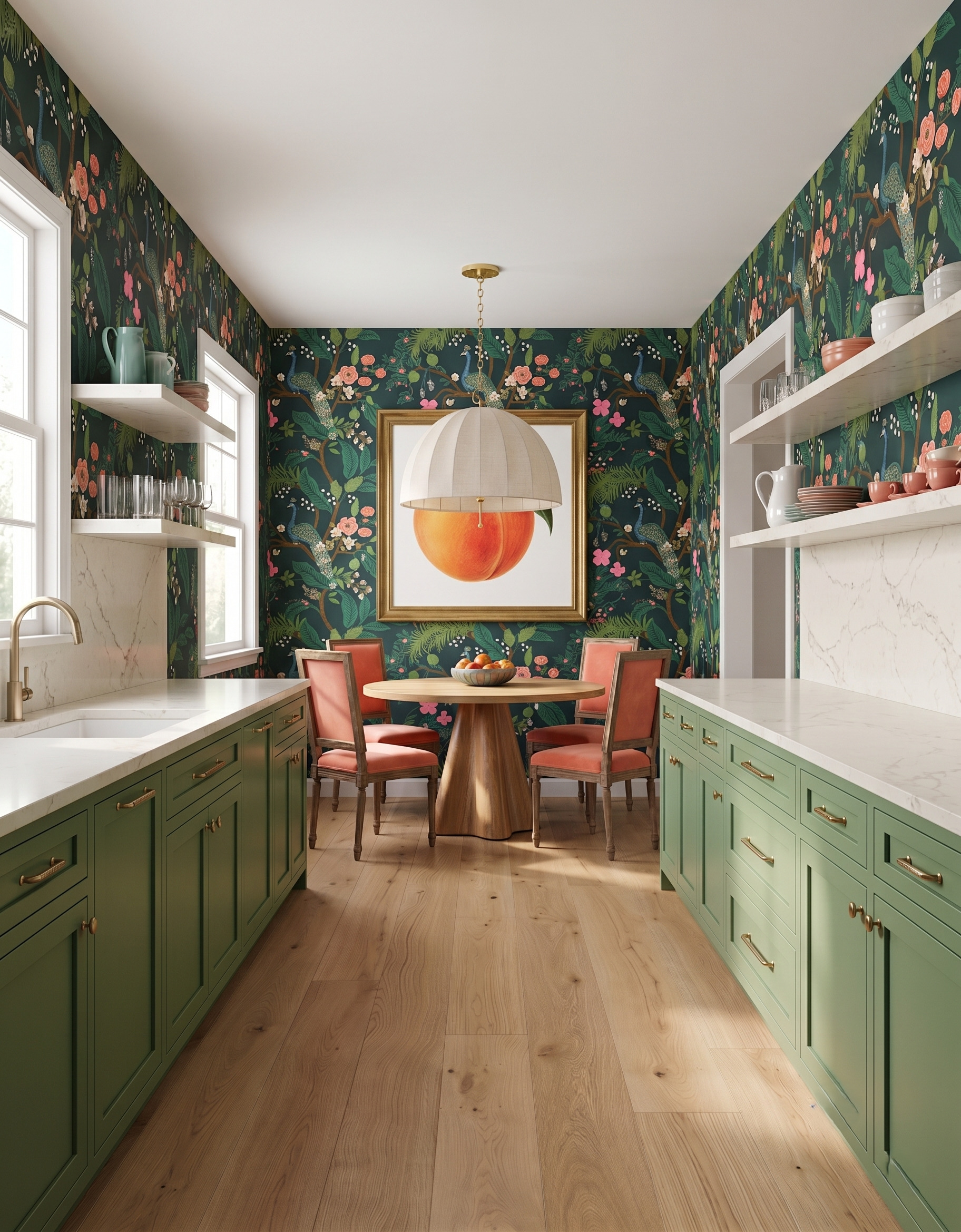
Light boards give these moss-green cabinets a warm, open-looking base. Their small knots and tonal shifts provide a different texture from the smooth painted fronts and dense wallpaper. The wood table repeats that warmth farther into the room. Compare a selection of boards with the green cabinet sample; visible variation matters more here than finding one perfectly matching plank.
Compare the floor and cabinets as one combination
Put the cabinet sample upright and the flooring samples flat beneath it. Add a counter sample and the largest wall or fabric pattern you plan to keep. Notice which surface feels warmest, darkest and busiest, then adjust the relationship that feels out of balance.
When you are ready to work on your kitchen layout, explore StilePath, Home3's kitchen planning tool. Bring the floor-and-cabinet combinations you saved as a starting point for your design conversations.
Explore StilePath for your kitchen