
10 Dressing Room Ideas with Bold Ceilings and Soft Color
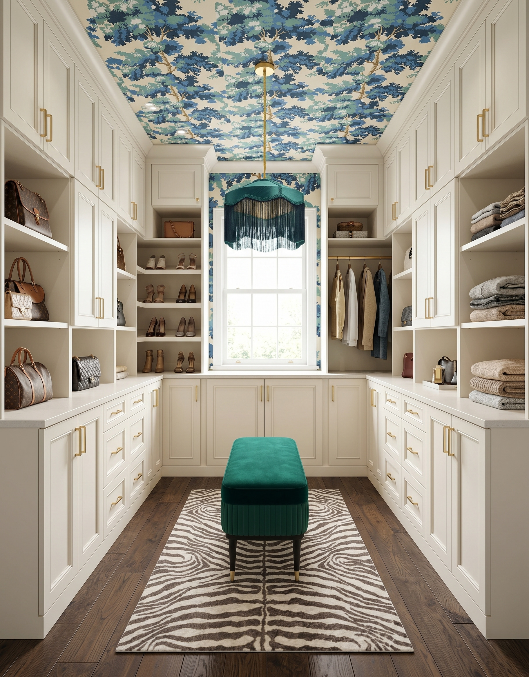
A dressing room can have plenty of personality before you add another accessory. A painted ceiling, a generous botanical print or a graphic stripe can give familiar cabinetry a different mood. These ten ideas show how soft color and strong pattern work together across several closet arrangements. Save the details you love, then build a material palette around your own wardrobe and room.
Images are AI-created design concepts from Anna’s authorized collection. They illustrate decorating ideas, not completed Home3 projects or measured construction plans.
1. Carry a botanical ceiling down to the window
The leafy print continues from the ceiling onto the window wall, giving the end of this cream closet a clear focal point. A teal bench repeats its color at a lower level. If you like this enveloping effect, compare a full wallpaper repeat beside the window trim and cabinetry. Keep the larger furniture surfaces simple so the leaves remain easy to read.
2. Let a large ceiling pattern lead a dark palette
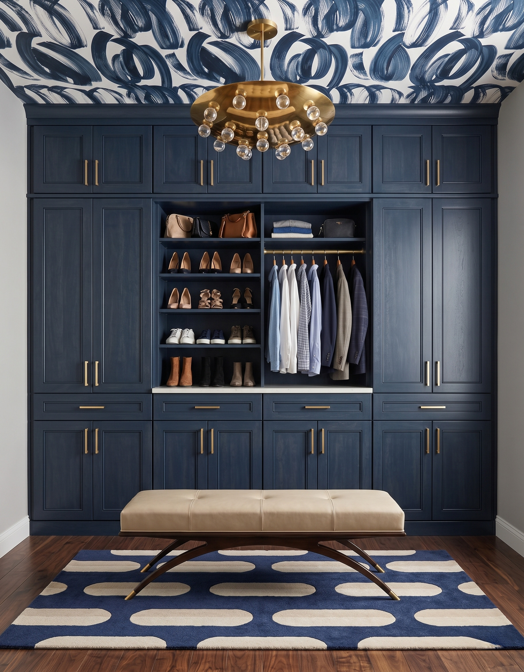
Broad blue brushstrokes give this single cabinet wall a bold overhead partner. The tan bench provides a warm pause between the dark cabinetry and patterned rug. Try this balance when you want a darker dressing room: use one large, loose pattern, then introduce a solid fabric with a different texture. Check that the cabinet grain stays visible in your room's everyday light.
3. Put the softest color above natural wood
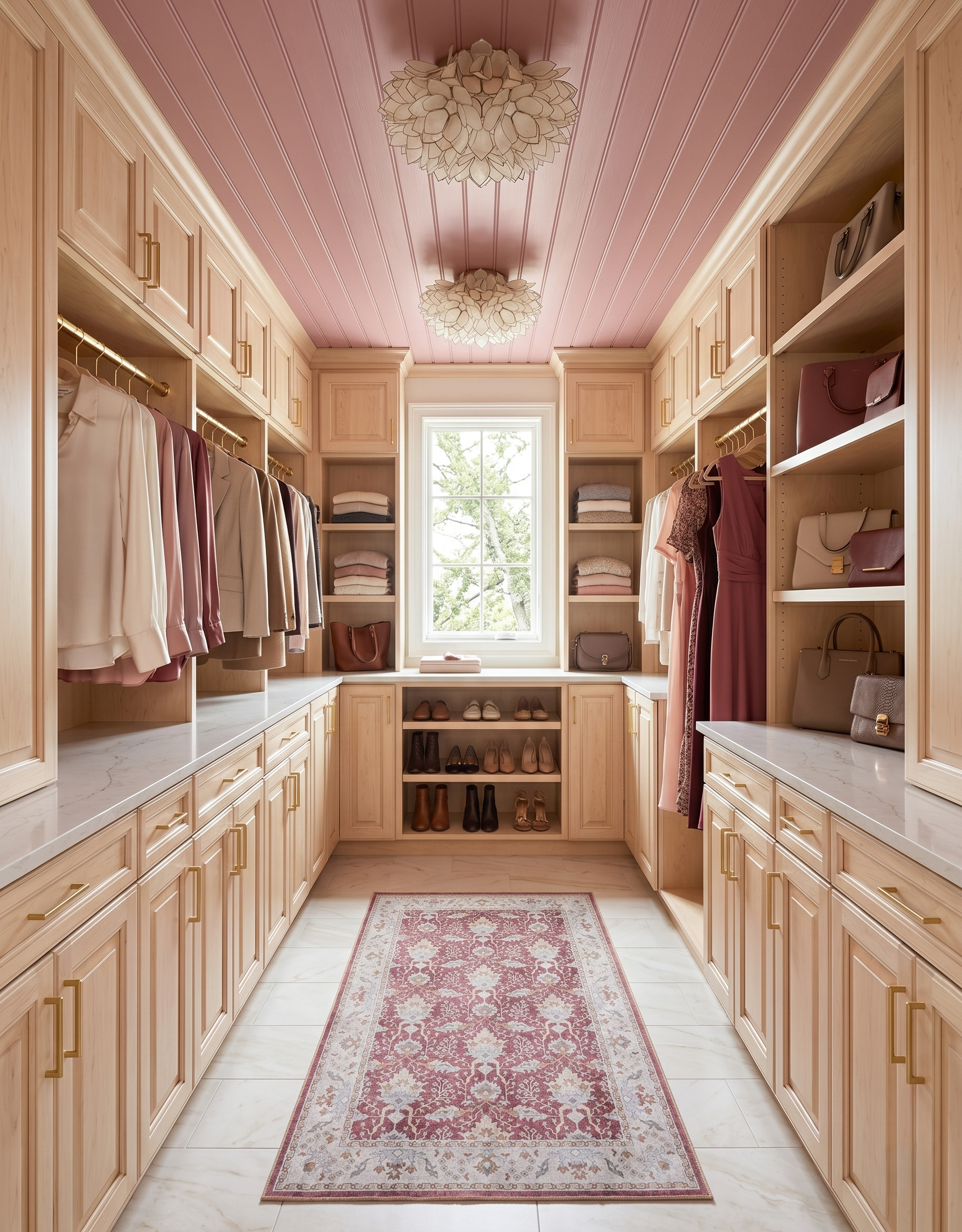
The rose ceiling brings color into this wood closet without adding another printed surface. Its paneled treatment also gives the two pale ceiling lights a simple background. Borrow the relationship between the ceiling and runner, then let the wood stay distinct. When testing a pink, place the sample beside your wood finish; a muted rose and a peach can pull the same cabinetry in different directions.
4. Use a light bench to break up a blue cabinet wall
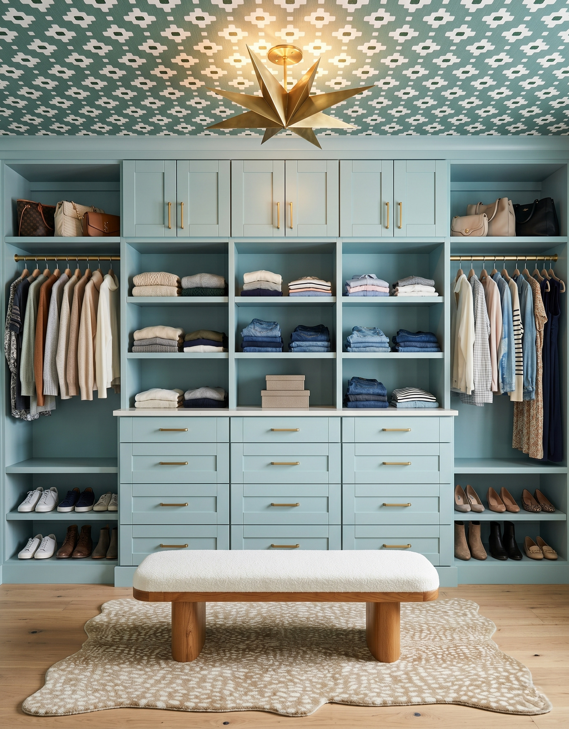
The pale bench creates a soft break in front of the blue cabinetry. Its simple upholstered form feels different from the ceiling's crisp geometry and the rug's irregular spots. When combining several patterns, compare them with a solid fabric sample in the middle. A seat does not need another print to feel connected; its color and texture can do that work.
5. Connect a pass-through closet to the next room
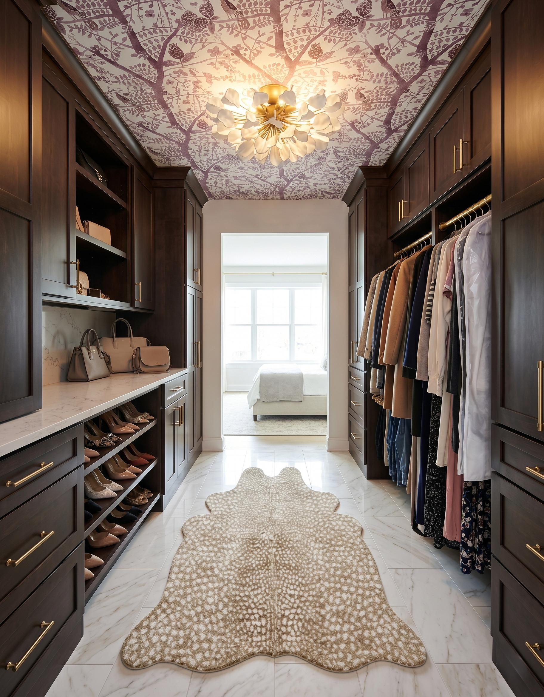
A purple botanical ceiling gives this dark-wood passage its own identity, while the pale floor connects visually to the bright bedroom beyond. The doorway is part of the composition, so consider the adjacent room when choosing your closet finishes. Lay its fabric or paint sample beside the proposed ceiling print. You can repeat an undertone without extending the same wallpaper through every room.
6. Mix broad stripes with a smaller floor pattern
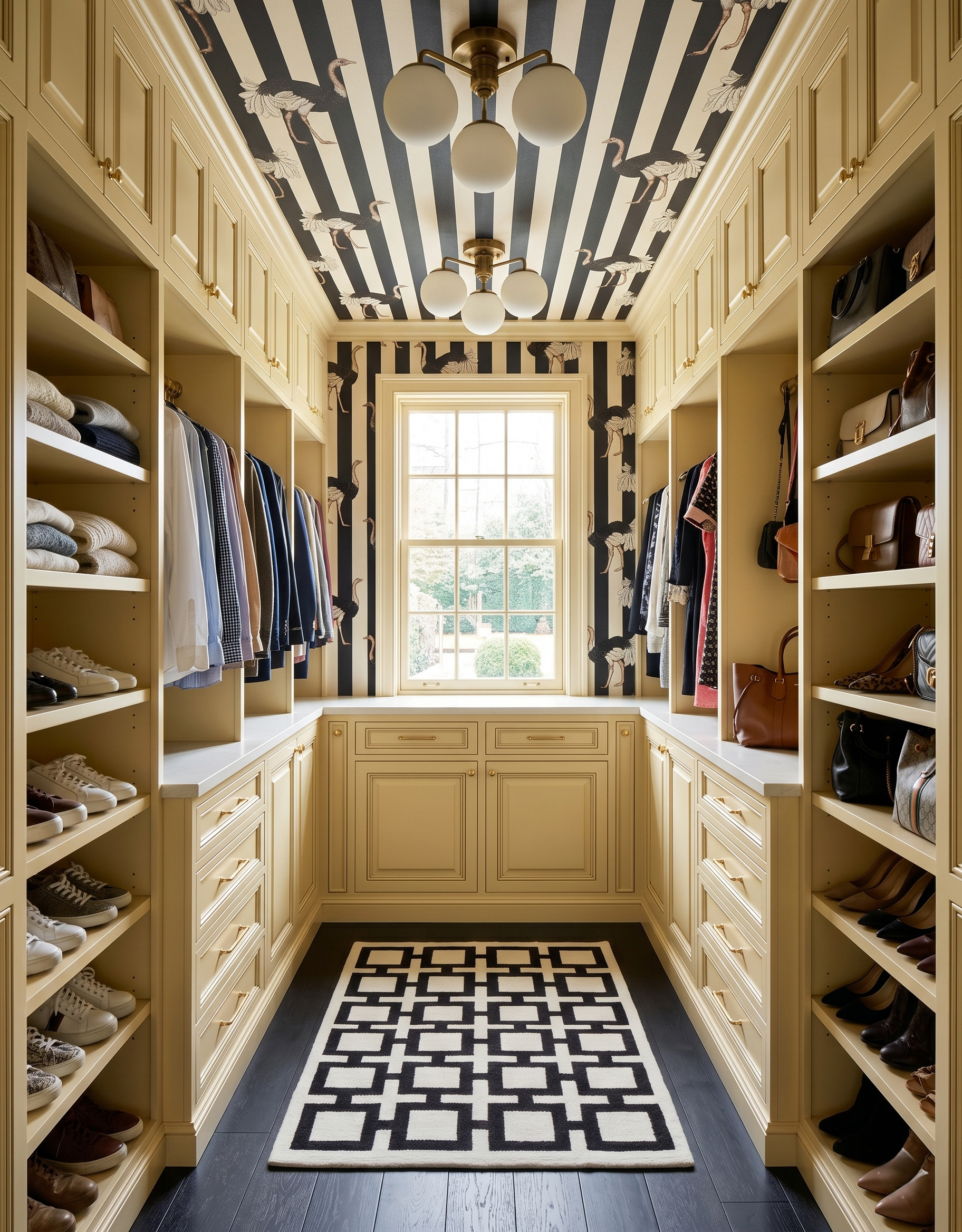
Wide stripes and a smaller geometric runner share a black-and-cream palette, but their different scales give each a separate role. Soft yellow cabinetry warms the combination, and the illustrated birds add a playful detail. Before combining two prints, view them from the doorway as well as up close. Check that their main shapes remain distinct when you see the entire room at once.
7. Frame warm wood with black and cream
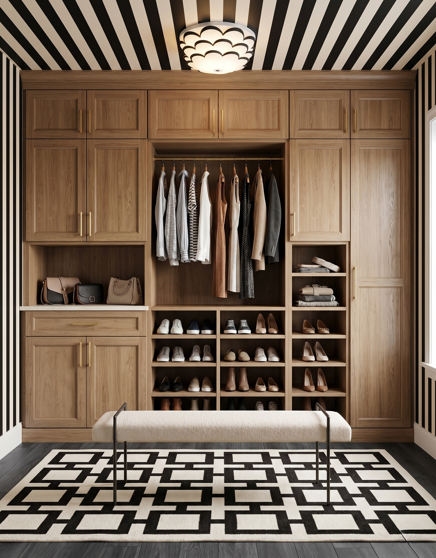
The striped walls and ceiling make a graphic frame for the warm wood cabinet wall. A pale bench keeps that frame visible, while its dark legs relate to the room's black accents. Use this idea when the cabinetry is already the finish you love. Compare the stripe's light background with your wood and upholstery; cream and bright white create noticeably different contrasts.
8. Pair quiet cabinetry with an expressive light
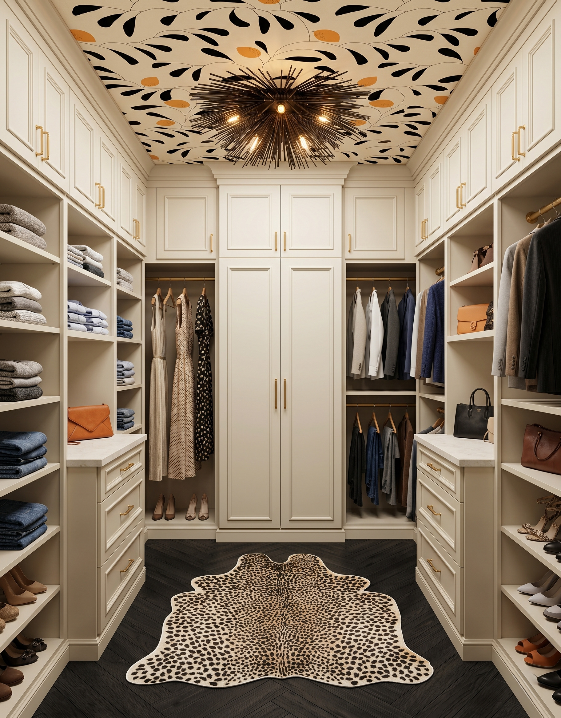
Cream cabinetry gives the dark botanical ceiling and sculptural light room to stand out. The darker floor adds weight below, while the rug introduces a separate, smaller pattern. If both a fixture and a ceiling print interest you, compare their outlines together before choosing either. Here, the pale cabinet fronts provide a steady background for two much more animated elements.
9. Repeat green through different textures
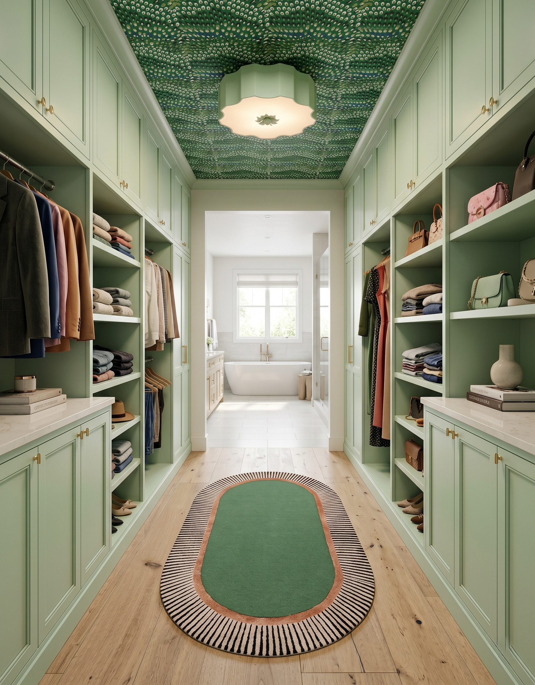
Several greens give this passage a cohesive mood without making every surface identical. The cabinetry is calm, the ceiling has a dense pattern, and the rug adds a darker field with a striped border. Try repeating a color through paint, fabric and pattern samples rather than matching all three exactly. The lighter room beyond also becomes part of the view from the closet entrance.
10. Use the ceiling print to choose one contrasting accent
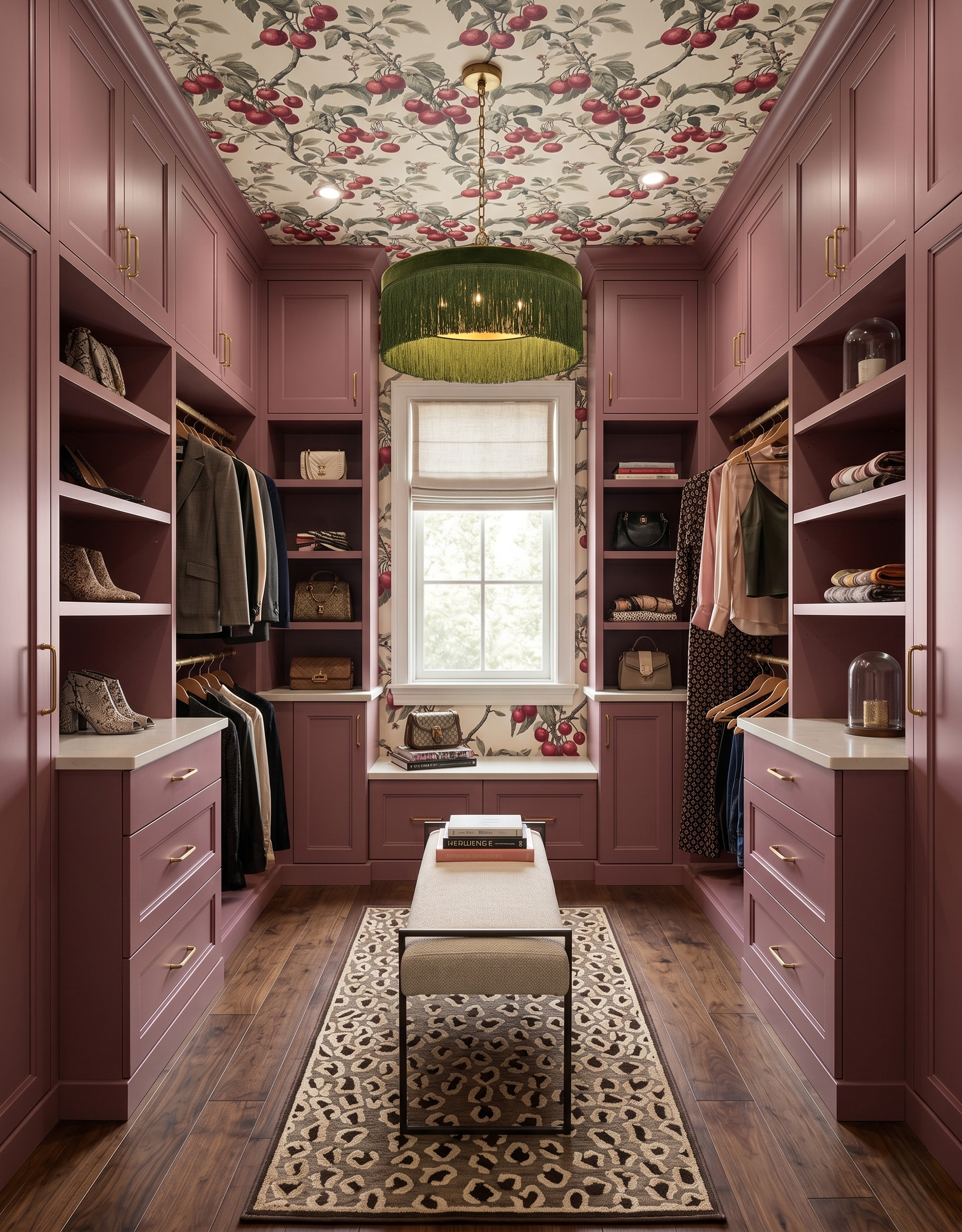
Berry cabinetry repeats the fruit in the wallpaper, while an olive pendant picks up the leaves. That small contrast keeps the room from becoming a single wash of pink. Start with the print's quieter accent when choosing one light or fabric detail. Then compare its size with the larger cabinet color; a restrained accent can be noticeable without competing with the whole room.
Bring the ceiling into your material palette
Start with the cabinet finish you want to keep, then compare a ceiling sample, one rug or fabric sample and your hardware finish. View the ceiling sample overhead as well as upright; the light and surrounding cabinetry will change how it reads.
Measure the clothes, shoes and bags you need to store before deciding on the internal arrangement. If you add a bench, check the actual space needed to walk past it and open nearby doors or drawers. Keep those measurements alongside the inspiration images.
Planning a kitchen too? Explore StilePath for the kitchen-planning part of your project, and keep these dressing room ideas as a separate material and storage brief.
Explore StilePath for your kitchen