
10 Butler's Pantry Wallpaper Ideas for Ceilings and Walls
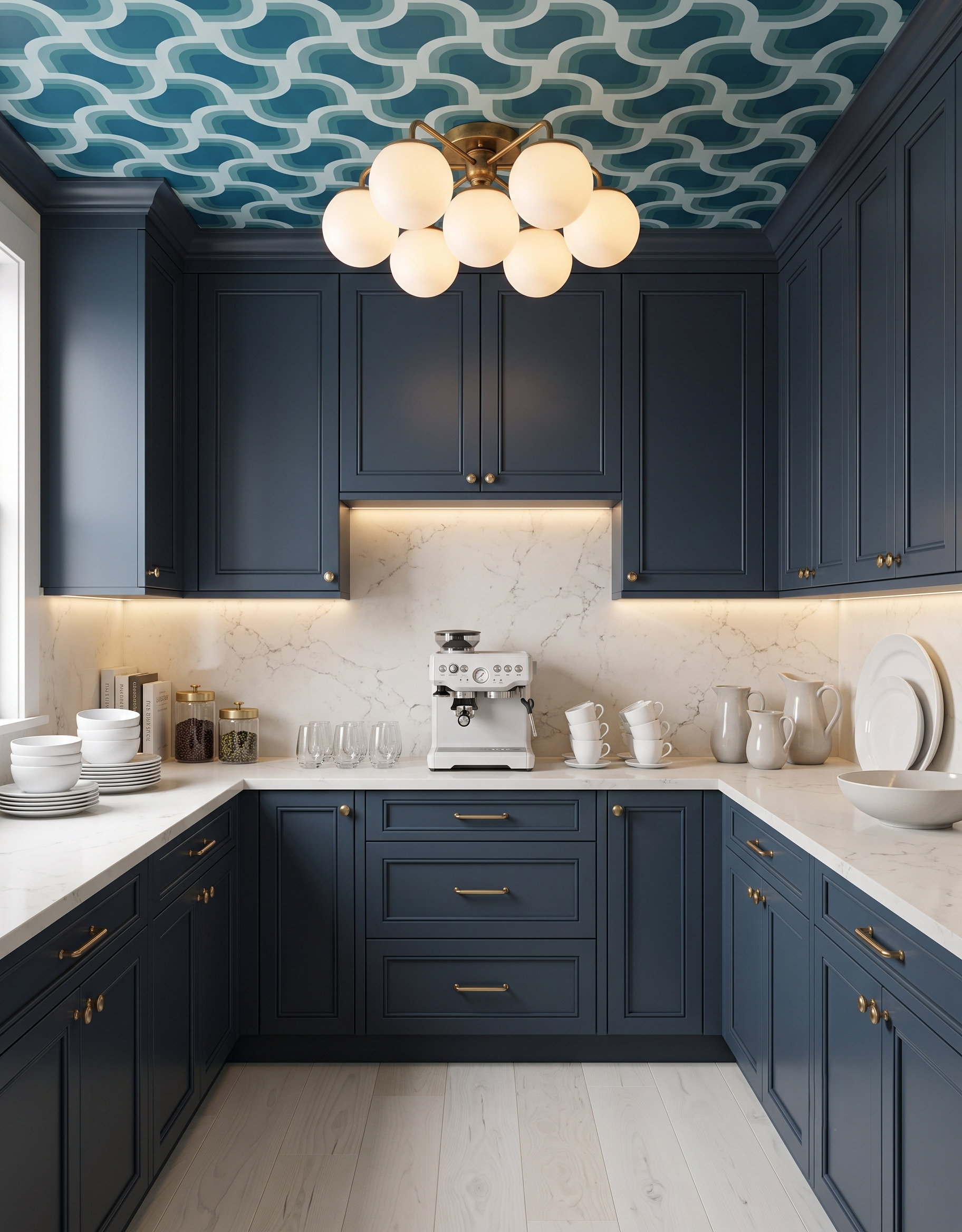
Wallpaper can change the mood of a butler's pantry without becoming the main feature in the kitchen next door. The choice is partly about pattern and partly about where it goes: above the cabinets, around a window or across the ceiling. These ten ideas explore those relationships with painted cabinetry, natural wood and serving pieces. Save a favorite pairing, then compare its pattern scale with the surfaces you actually have available.
Images are AI-created design concepts from Anna’s authorized collection. They illustrate decorating ideas, not completed Home3 projects or measured construction plans.
1. Keep the strongest pattern overhead
The teal ceiling supplies the movement while the navy cabinetry and pale backsplash create broad, quieter surfaces below. This is a useful starting point if you want a bold pantry but prefer an uninterrupted backdrop behind the counter. Compare the ceiling print with the cabinet color and countertop together. A lighter line within the pattern can connect the overhead design to the pale work surface.
2. Wrap a floral around the window
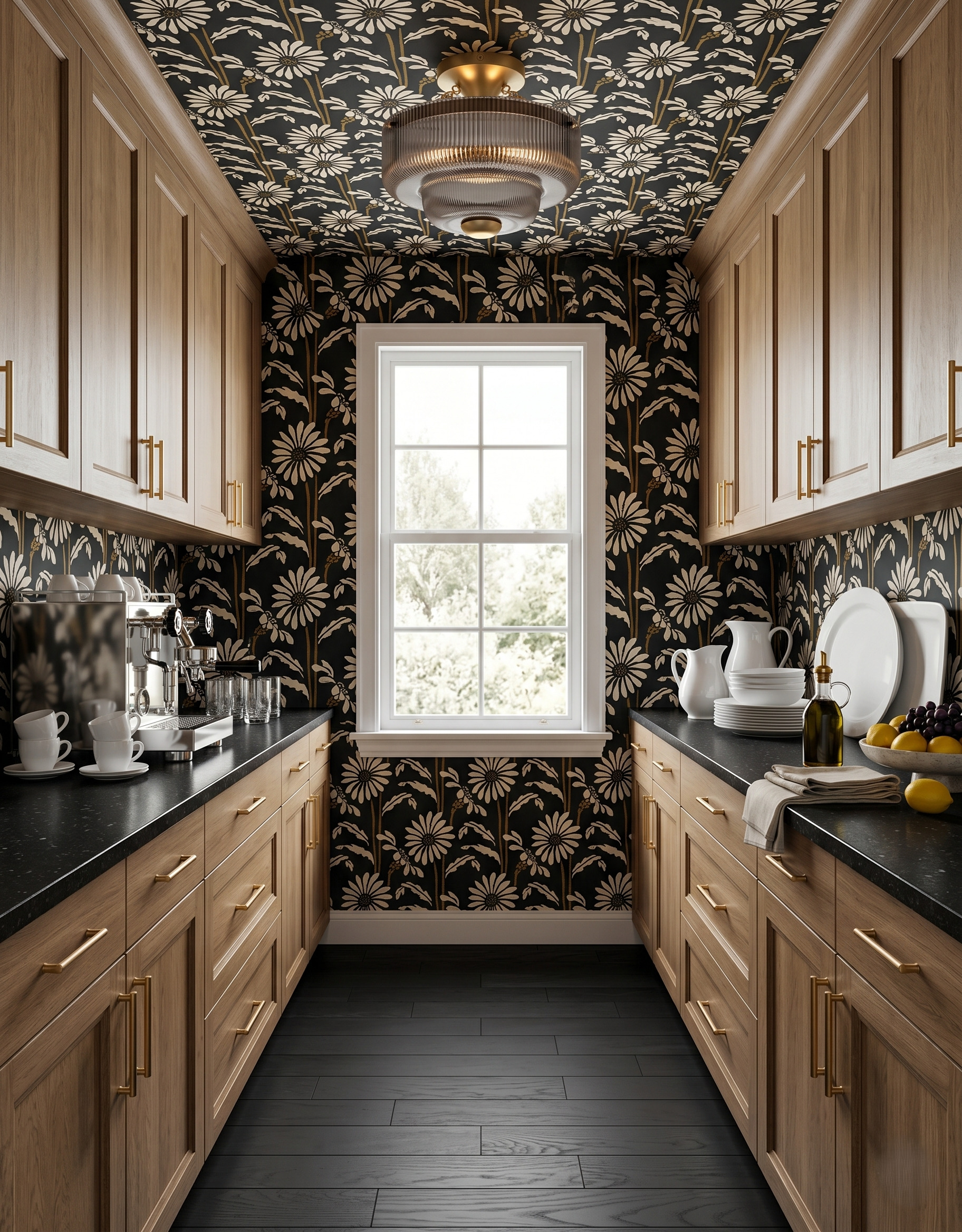
Black-and-cream flowers wrap the ceiling and window wall, with warm wood cabinetry separating the patterned areas. Dark counters repeat the wallpaper's ground and leave the white serving pieces easy to see. If you want this enclosed effect, compare the pattern beside your window casing as well as your cabinet finish. The trim color becomes a visible part of the palette when paper surrounds it.
3. Let the floor pick up a small wallpaper accent
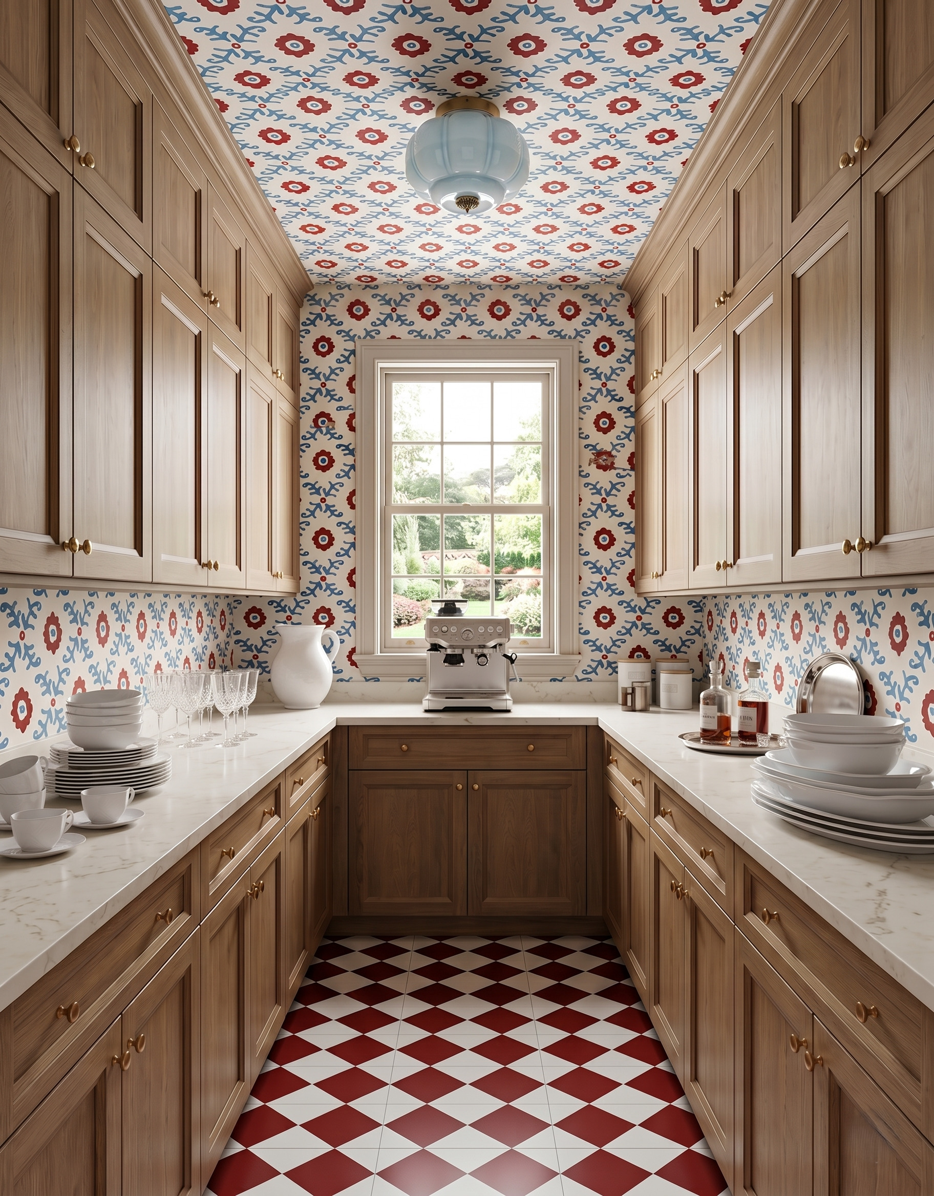
The small red flowers gain weight from the red-and-cream floor below. Blue branches and a pale-blue light provide a cooler note around the warm wood cabinetry. When pairing a patterned floor with wallpaper, compare the size of each repeat before matching colors. Here, the larger floor diamonds read separately from the smaller wall motif, so both patterns remain recognizable.
4. Give cream cabinetry a blue illustrated border
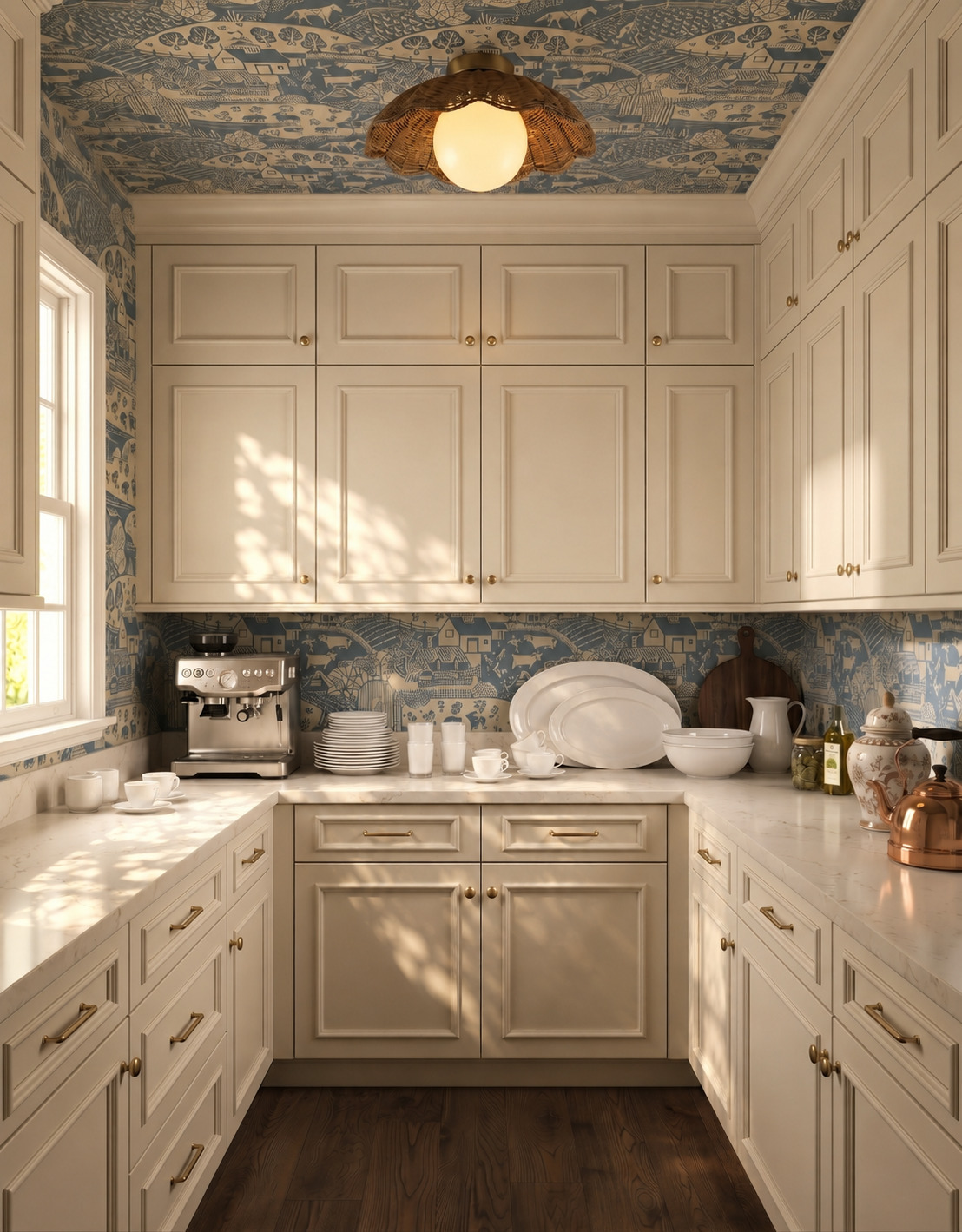
A blue pastoral print adds detail around the cream cabinet fronts without needing a second strong paint color. The woven light and wood floor bring texture into the same warm palette. This approach can work as a starting point when you already own simple white serving pieces. Compare their shade with the wallpaper background so the dishes feel related to the room when left on the counter.
5. Borrow blue from a green botanical print
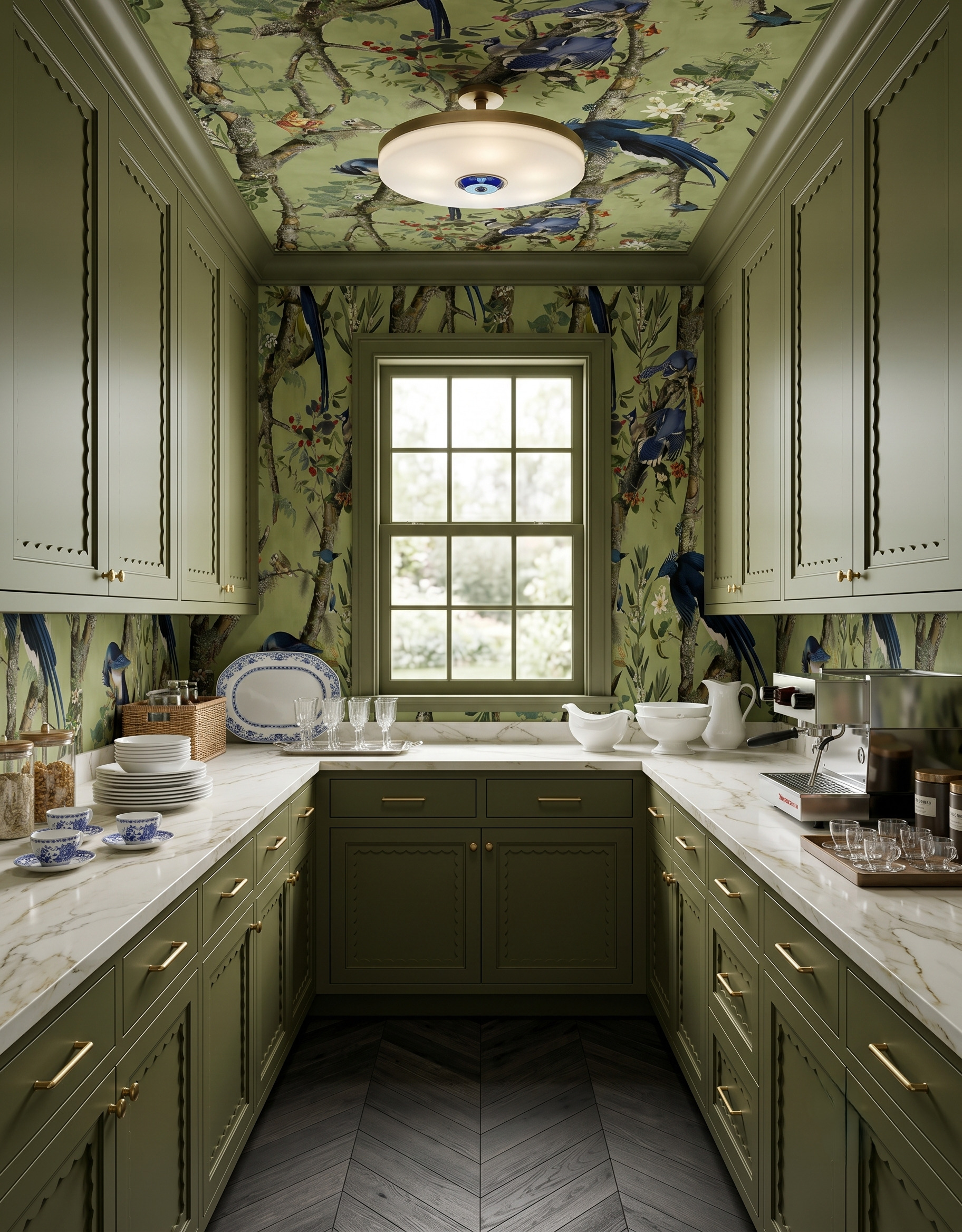
The olive cabinetry repeats the wallpaper's green ground, while blue-and-white dishes pick up the birds. That gives the serving pieces a clear relationship to the room without requiring more colorful cabinetry. Look for a quieter secondary color in the print before choosing a dish or textile accent. Compare it with pieces you already use; the connection can be loose rather than an exact match.
6. Separate a playful print from the counter backdrop
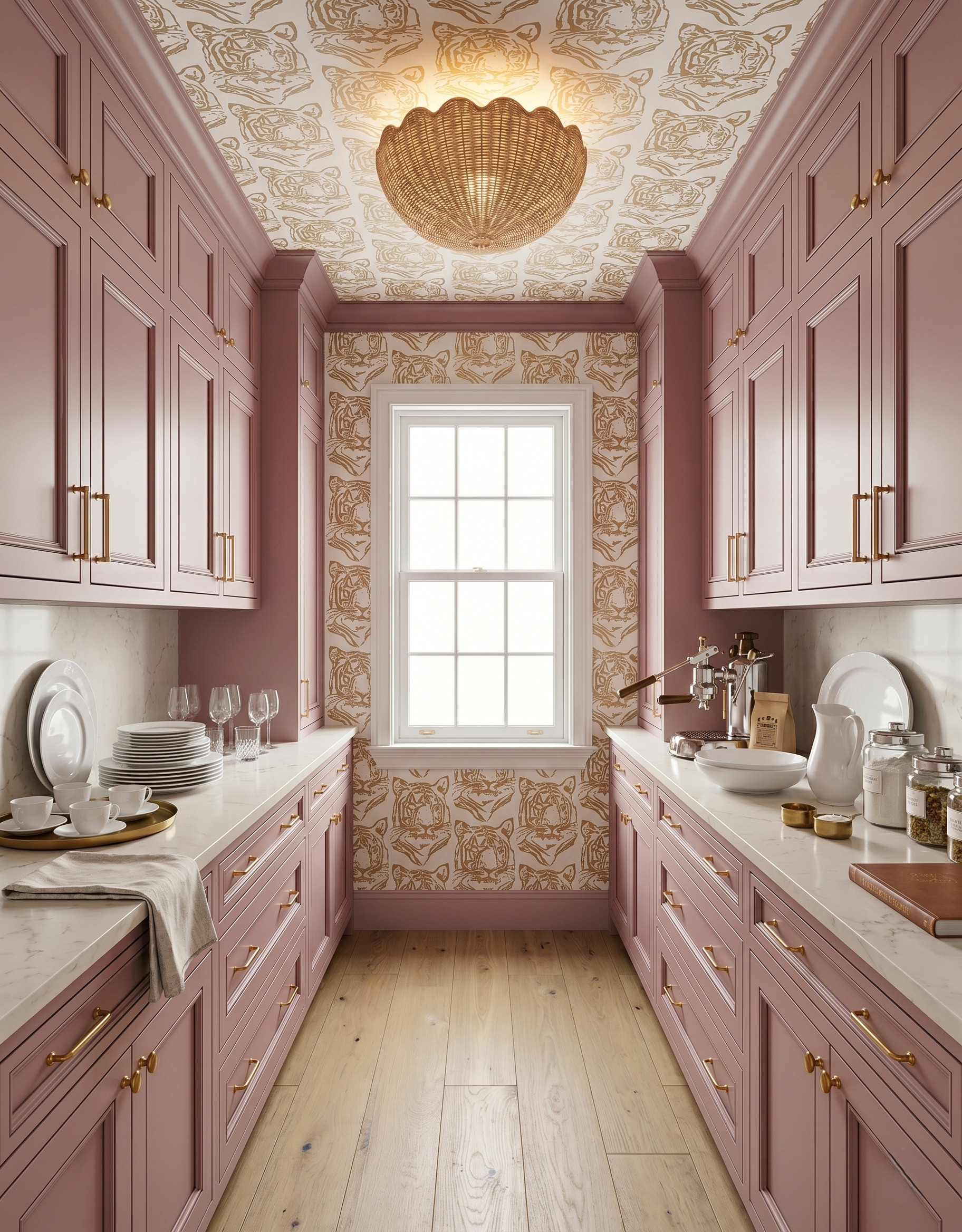
The tiger pattern stays on the ceiling and window wall, while pale backsplashes sit behind the side counters. Dusty-rose cabinetry connects those different surfaces. If a playful print appeals to you, first decide which areas will carry it and which will stay quiet. Draw the transitions around cabinets and trim on a simple elevation so the pattern ends at deliberate edges.
7. Use a dark window frame to anchor a geometric print
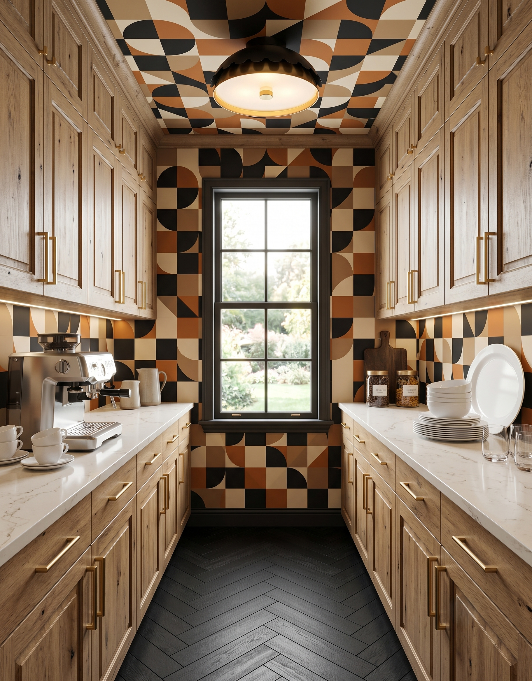
The black window frame gives the geometric wallpaper a definite center. Warm wood cabinetry repeats the print's brown notes, while pale counters create a clear horizontal break. Try this combination when you like several earth tones but want the room to feel graphic. Compare the darkest part of the pattern with your trim and floor before adding another dark finish elsewhere.
8. Pair an illustrated wall with a smaller check
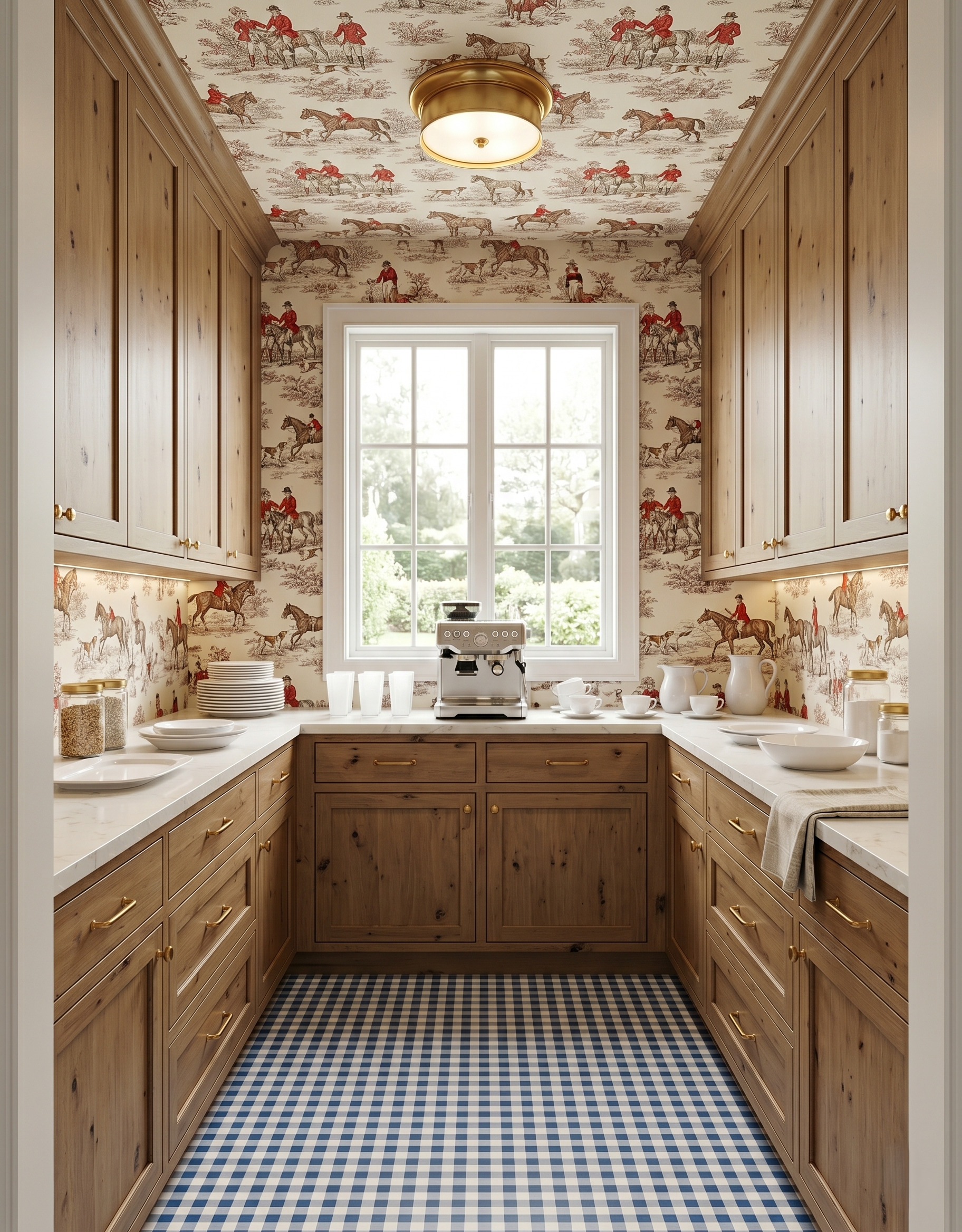
Red riders give the illustrated wallcovering small points of color, while the blue check adds a different rhythm below. The wood cabinetry and white tableware keep the palette grounded. When combining a scene print with a check, compare them from across the room. The floor can register as a simple grid while the wall remains a collection of individual figures and details.
9. Leave a pale window wall beneath a patterned ceiling
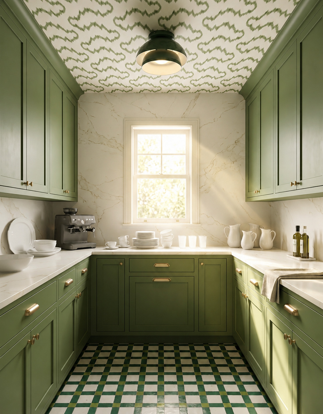
This pantry keeps the moving green pattern overhead and gives the window a pale, veined surround. Green cabinetry and a checked floor bring the color back below without extending the same wallpaper down every wall. Compare your ceiling sample with the backsplash as a pair. Both remain visible from the doorway, so their scale and amount of contrast deserve attention alongside the cabinet finish.
10. Make an arched opening part of the pattern
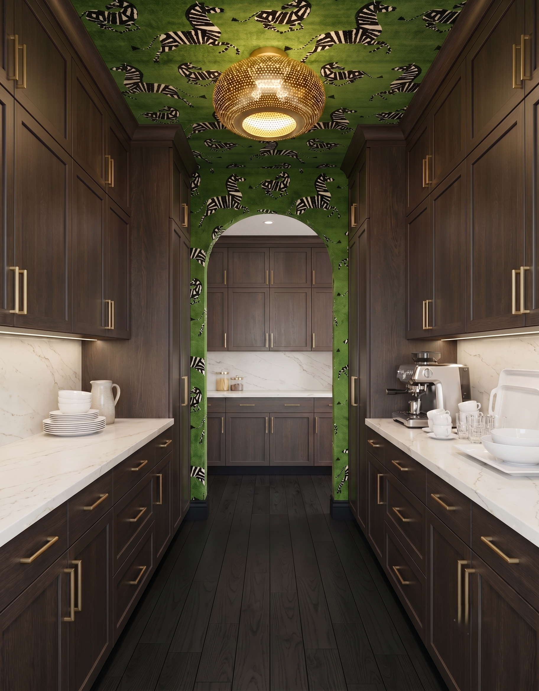
The zebra print continues across the ceiling and around the arch, making the opening part of the room's character. Dark wood and pale counters provide simpler surfaces on either side. For a shaped opening, check how a full wallpaper repeat will meet the curve and nearby cabinet edges. A motif you love on a flat sample may look quite different when only part of it remains visible.
Decide where the pattern will stop
Make a simple sketch of the visible wall areas before choosing a print. Mark cabinet edges, window trim, doorways and any backsplash so you can see where the pattern will continue and where it will end. Compare a full repeat with those spaces.
Keep your real appliance and serving requirements in the brief. Check equipment dimensions and access needs, and confirm an appropriate wall finish around areas exposed to splashes, heat or steam. The photographs are starting points for a palette, not installation specifications.
Planning a kitchen too? Explore StilePath for the kitchen-planning part of your project, and keep these pantry wallpaper ideas as a separate material brief.
Explore StilePath for your kitchen