
10 Bathroom Vanity and Wallpaper Pairings with Personality
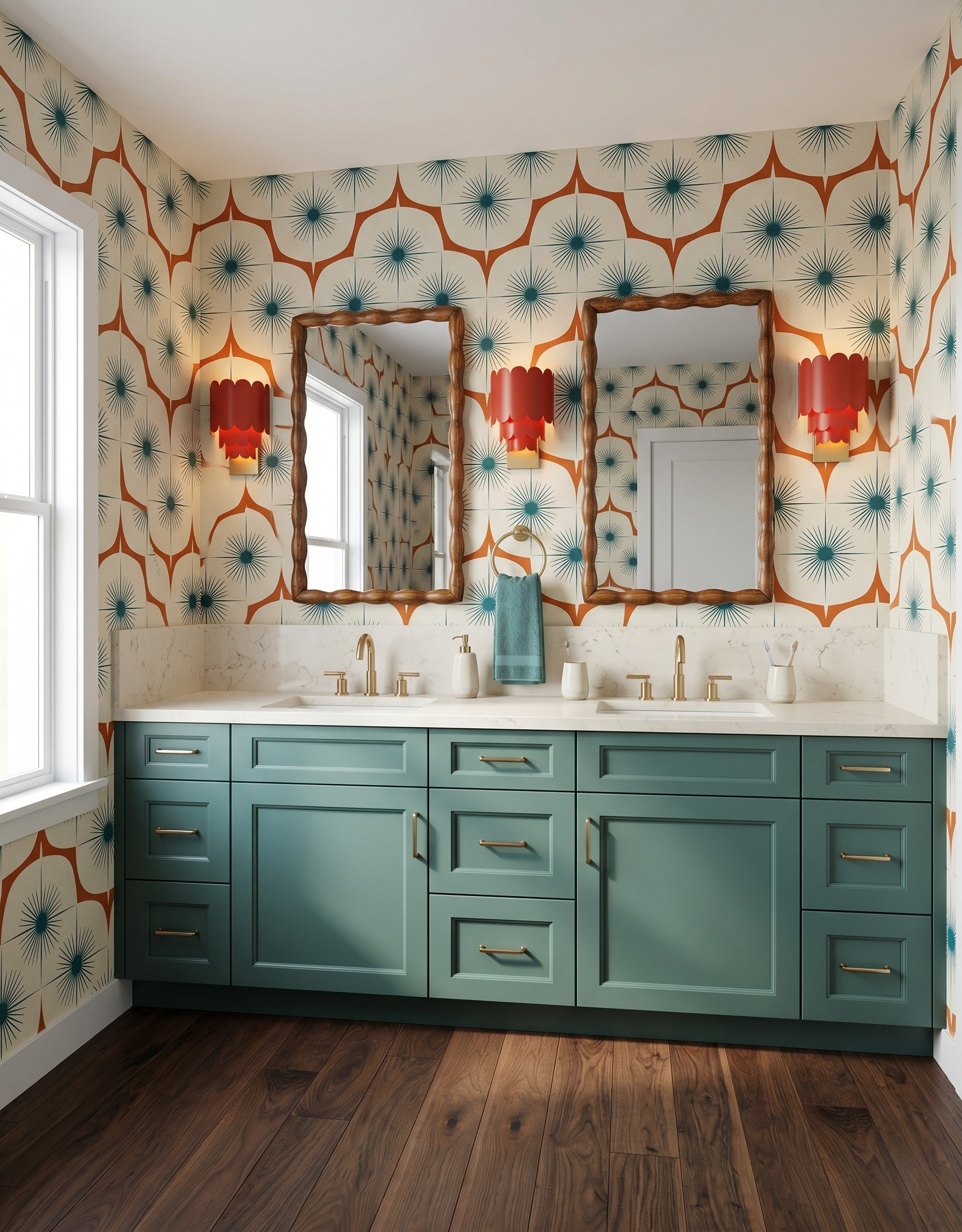
A bold bathroom starts with a pairing you love. Smoky teal can settle a lively starburst print; wine red can give a whimsical wall pattern weight. These ten vanity and wallpaper ideas show how cabinet color, mirror shape and pattern work together. Save the combination that catches your eye, then compare real samples in your own bathroom before committing to a finish.
Images are AI-created design concepts from Anna’s authorized collection. They illustrate decorating ideas, not completed Home3 projects or measured construction plans.
1. Set retro stars against smoky teal
The teal cabinetry picks up the small starbursts, while the red sconces repeat the wallpaper’s warmer accent. The result has several strong elements, but each belongs to the same palette. Start with the wallcovering and pull out two colors: one for the large cabinet surface and another for a smaller detail. Warm wood mirror frames can connect that palette to an existing wood floor.
2. Ground a playful print with wine red
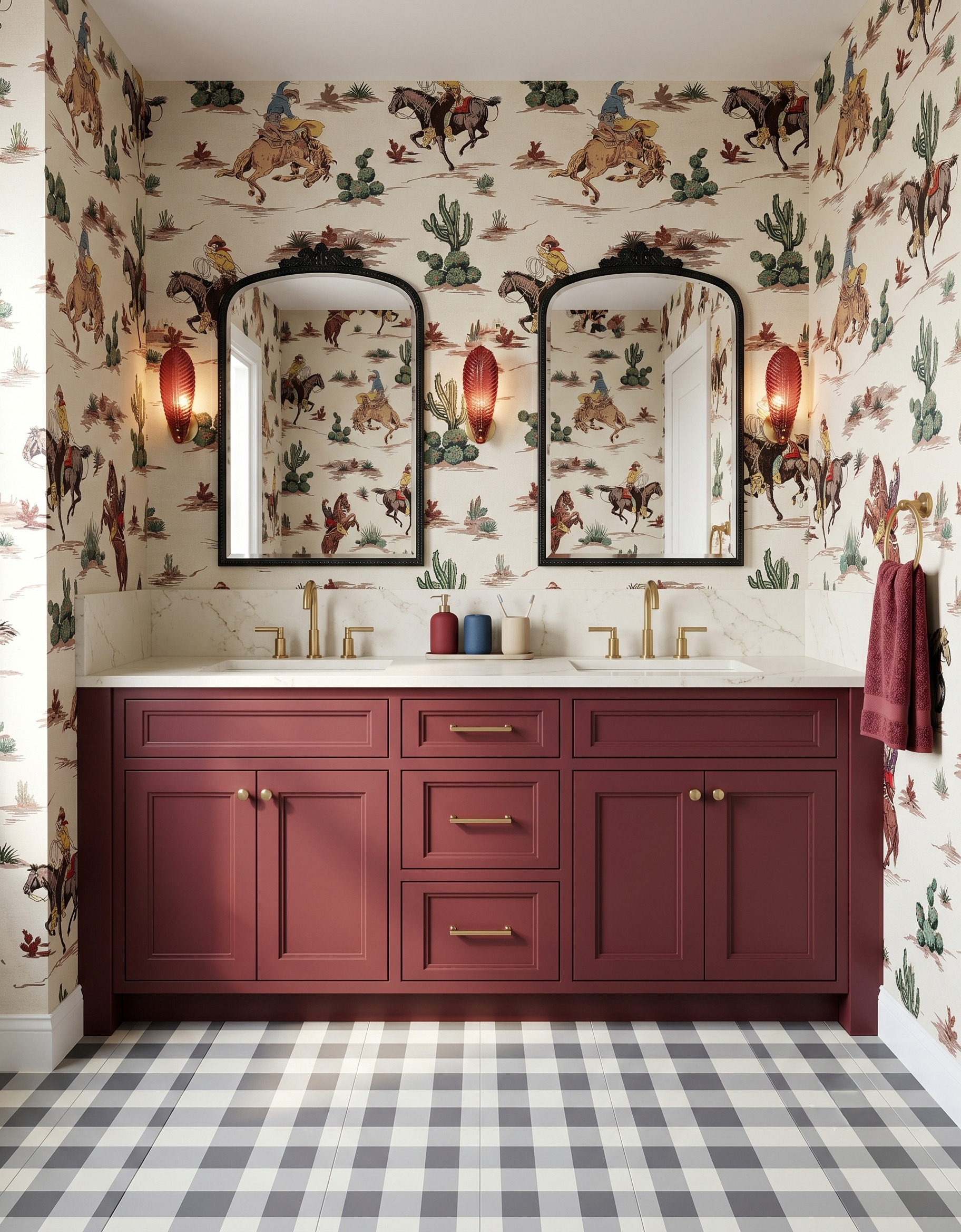
Wine red gives this playful illustrated wallpaper a substantial base. Black mirror frames tie the vanity wall to the checked floor without repeating the wallpaper’s detail. If your favorite print has a storybook quality, try a deeper cabinet color before adding more decoration. Compare the wallpaper against a large painted sample; a small swatch can understate how much visual weight a dark vanity will carry.
3. Use dark wood to frame a graphic pattern
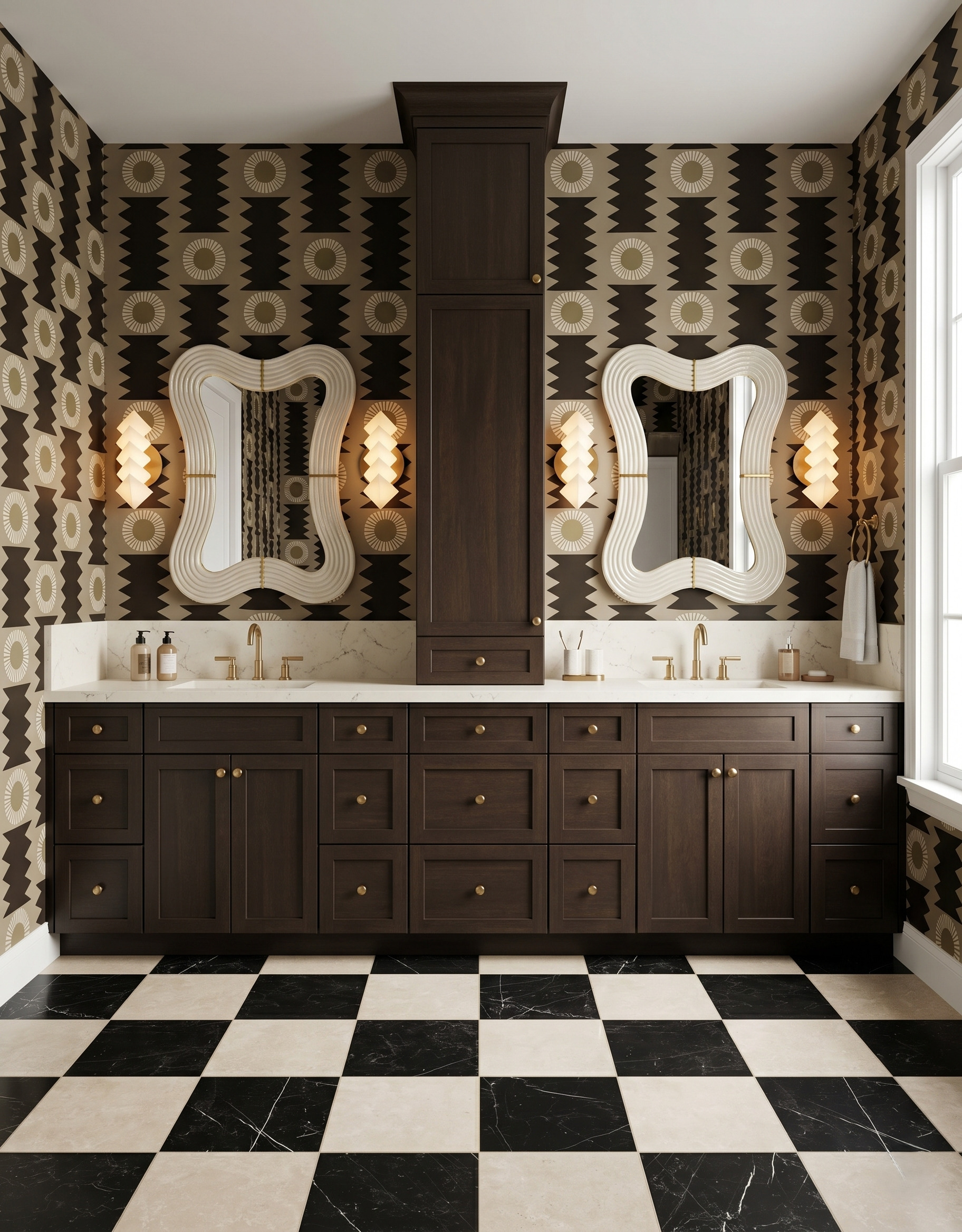
The chocolate-colored wood gives this busy wall a clear structure. Cream mirror frames and a pale countertop stand out against the brown geometric pattern, while the floor repeats the same light-dark contrast at a larger scale. This is a useful way to make a mostly neutral room feel bold. Compare the wallpaper’s brown with the wood in both daylight and evening light so their undertones work together.
4. Pair soft lavender with powder blue
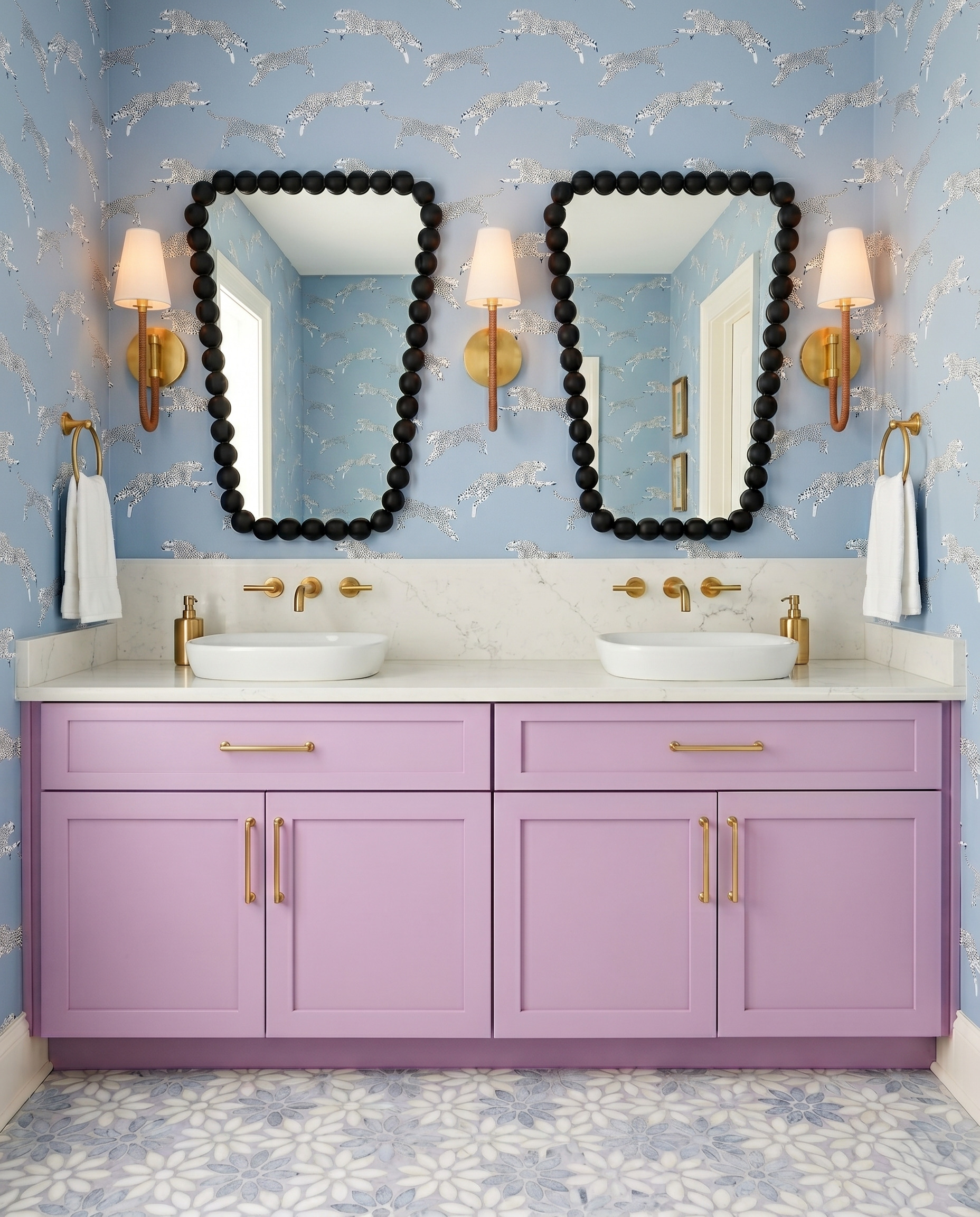
Lavender and powder blue sit close together in mood, so the black mirror frames supply the crisp contrast. The white basins and countertop leave a calm band beneath the animated wallpaper. Try this approach when you want a colorful bathroom that still feels soft. Judge the cabinet sample beside both the wallpaper’s background and its lightest marks; those relationships matter more than matching a color name.
5. Repeat a small red detail at cabinet scale
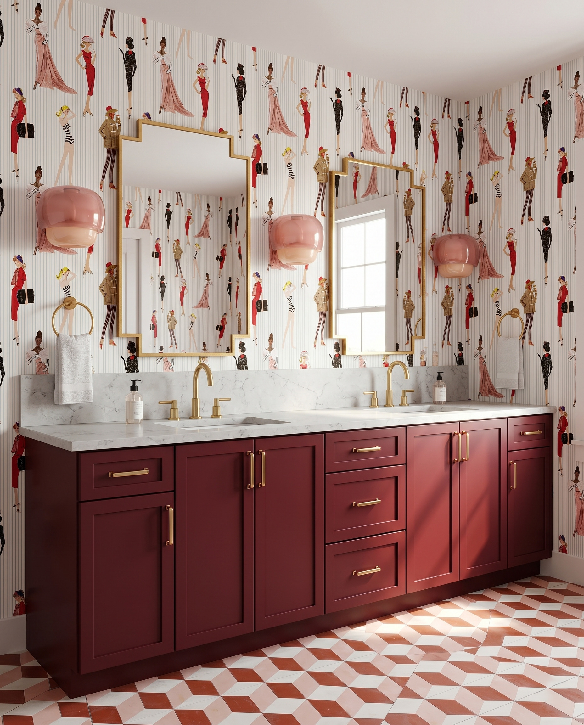
A few red garments in the wallpaper become the starting point for a much larger burgundy vanity. Pink glass lights pick up the softer figures, while the floor adds a separate geometric pattern. The cabinet color makes the illustration feel connected to the room. For your own pairing, choose one small detail in a print and test a slightly softened version on the cabinetry instead of introducing an unrelated accent.
6. Let a warm neutral support an expressive wall
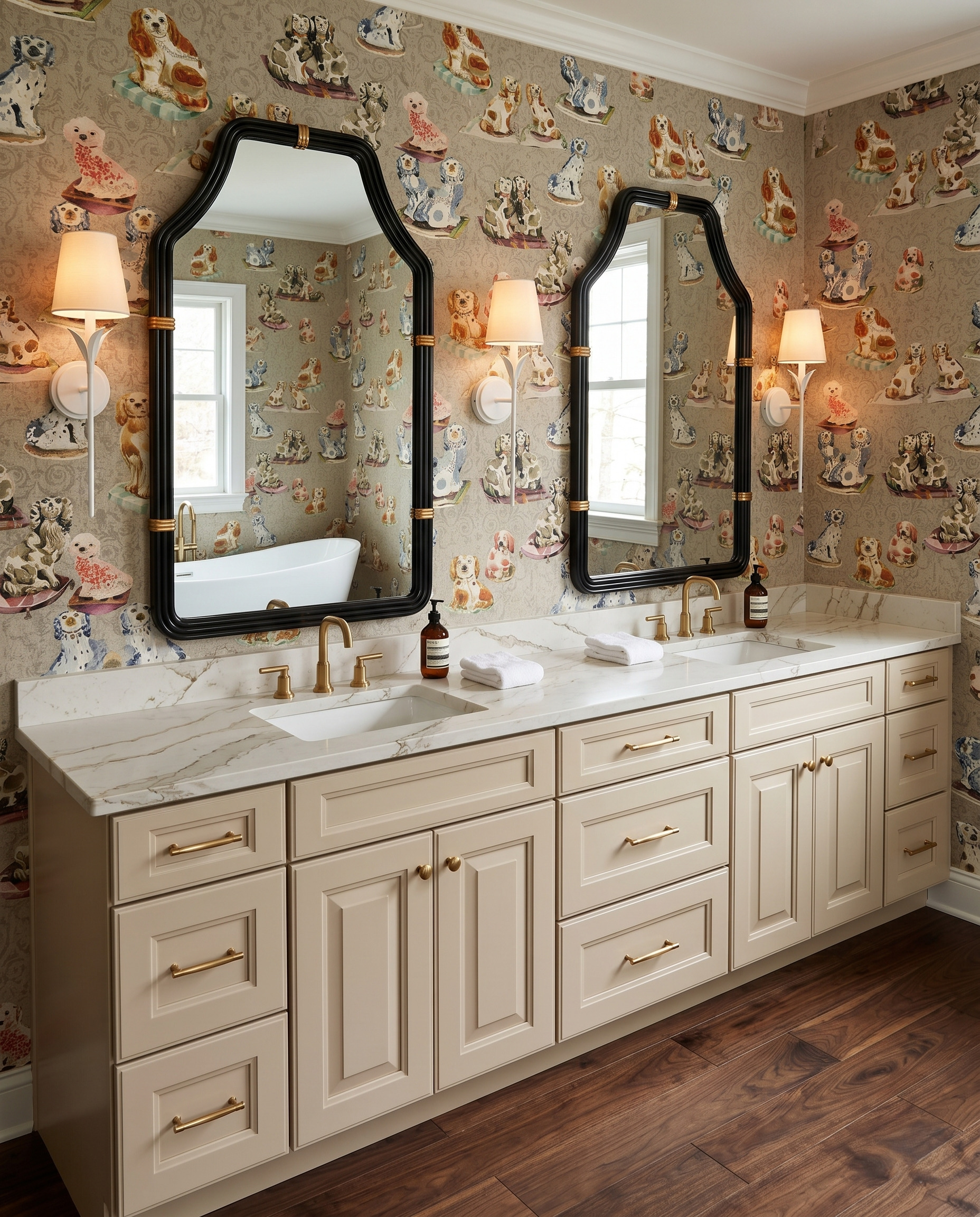
The cream vanity leaves the dog print in charge. Black mirrors give the wall definition, while white sconces connect to the countertop and towels. This is a strong option when you love an illustrated wallpaper but want the cabinetry to remain adaptable. Match the warmth of the cabinet paint to the print’s background, then use one darker accent to keep the overall composition from becoming too pale.
7. Balance barn red with a softened green
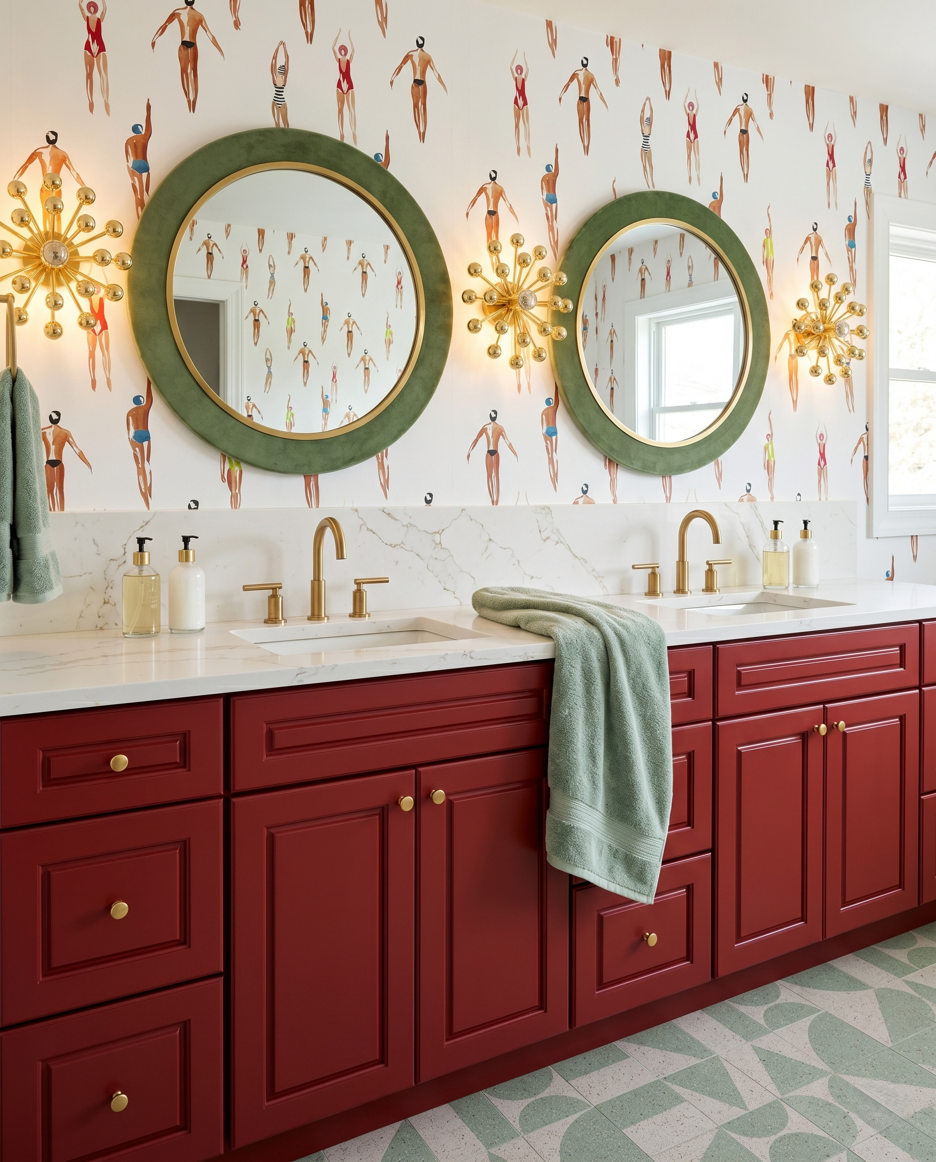
The red vanity and green mirrors create contrast without turning the room into a holiday palette. The wallpaper’s pale ground and small figures keep those broad colors separated, and the green floor reconnects them below. Try different color proportions with samples: a large red cabinet and a smaller green frame read differently from equal-sized red and green surfaces. Keep the lighter background in the comparison.
8. Bring a teal wall pattern down to navy cabinetry
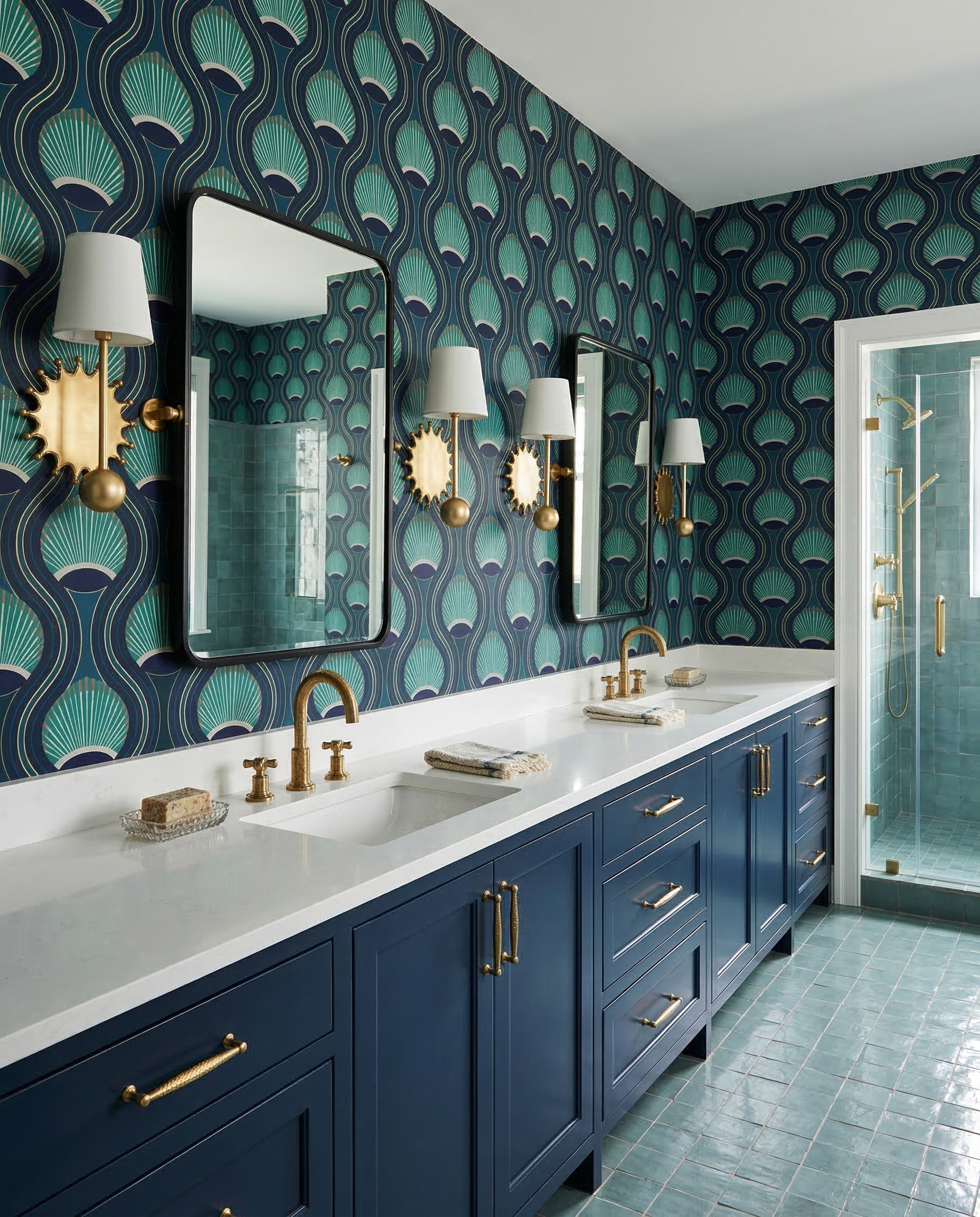
Navy cabinetry repeats the darkest ground in the wallcovering, while the teal pattern connects to the lighter tile visible nearby. A long pale countertop separates those rich colors. When a pattern contains several blues and greens, choose which one will dominate before buying accessories. Here the cabinet stays dark and relatively quiet, allowing the flowing wallpaper and sculptural lights to create the movement.
9. Make a large botanical feel gentle
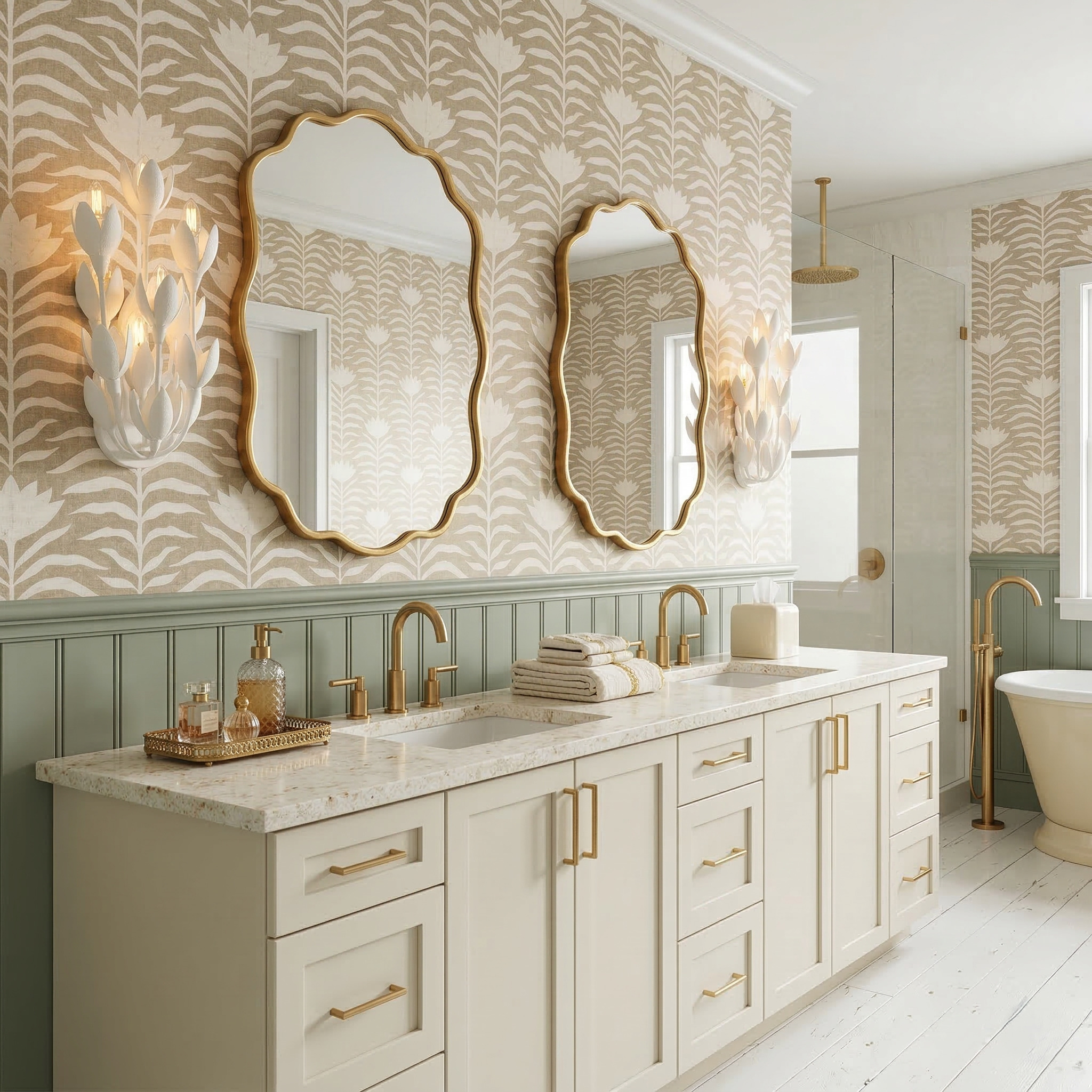
Large pattern does not require bright pigment. This botanical wallcovering has plenty of presence because the pale leaves repeat across a broad area. Sage beadboard provides a solid band beneath it, and the cream vanity keeps the lower half light. Borrow the pattern scale before copying the full room: hold up a complete repeat and check how much of the motif will remain visible around your mirrors.
10. Warm up blue florals with natural wood
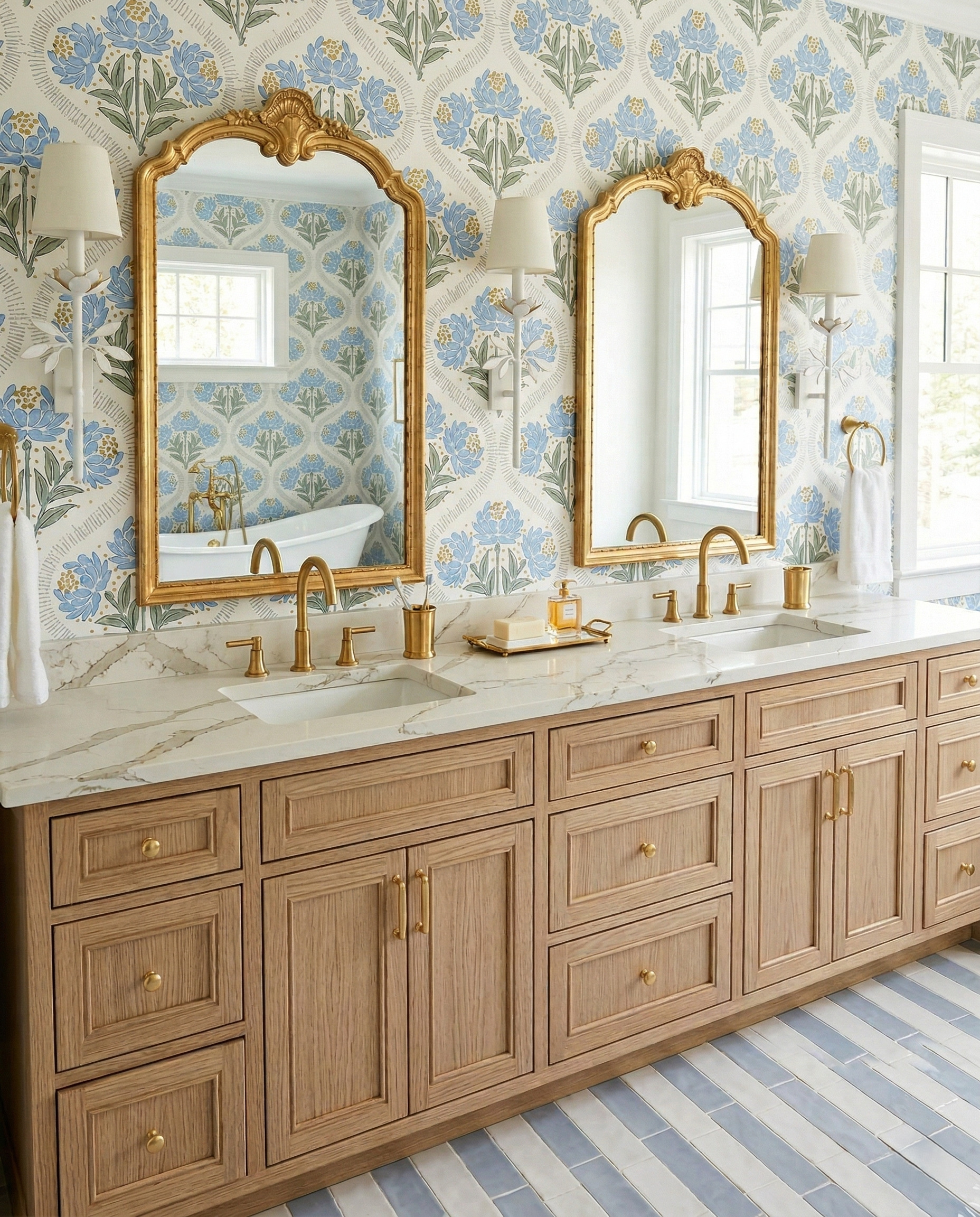
Natural wood brings warmth to the blue-and-white pattern. Gold mirror frames repeat the warm note at eye level, while the white lights sit quietly against the pale wallcovering. This pairing works as a starting point when the wood finish is the element you want to keep. Compare the wallpaper’s blue with your floor and towels, then let the wood remain visibly different rather than trying to match every surface.
Choose the pairing before the accessories
Bring the cabinet, wallpaper, countertop and floor samples together in the room. View them beside the mirror and under the lights you expect to use. A full wallpaper repeat will tell you more than a thumbnail about what remains visible between the mirrors.
Ask your installer to confirm suitable wall preparation and where the chosen wallcovering can be used. Keep the actual sink, storage and lighting requirements in your project brief; an inspiration image does not settle those installation details.
Planning a kitchen too? Explore StilePath for the kitchen-planning part of your project, and keep these bathroom pairings as a separate material brief.
Explore StilePath for your kitchen