
10 Bathroom Sconce Ideas That Give a Vanity Personality
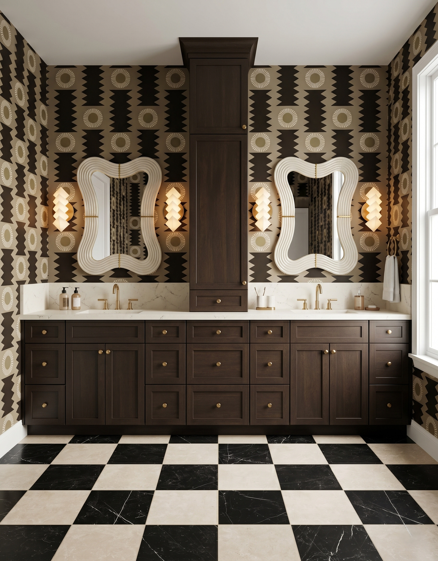
A bathroom sconce can change the character of the whole vanity wall. Its shade, arm, backplate and color each offer a different way to bring personality beside the mirror. These ten concept rooms focus on the fixture itself: sculptural shapes, tactile details and small doses of color alongside rich, restrained finishes. Save the details that appeal to you, then compare them with your own mirror, wall pattern and cabinet samples.
Images are AI-created design concepts from Anna's authorized collection. They illustrate decorating ideas, not completed Home3 projects or measured construction plans.
1. Try a sculptural stack of pale shapes
These layered diamond-shaped shades turn each sconce into a small piece of wall sculpture. Their pale finish stands out against the dark geometric wallpaper, while the brown vanity grounds the composition. Borrow the contrast between a simple light color and an expressive silhouette. When comparing fixtures, look at their unlit shape beside your wall pattern as carefully as their illuminated appearance.
2. Bring in rounded pink shades
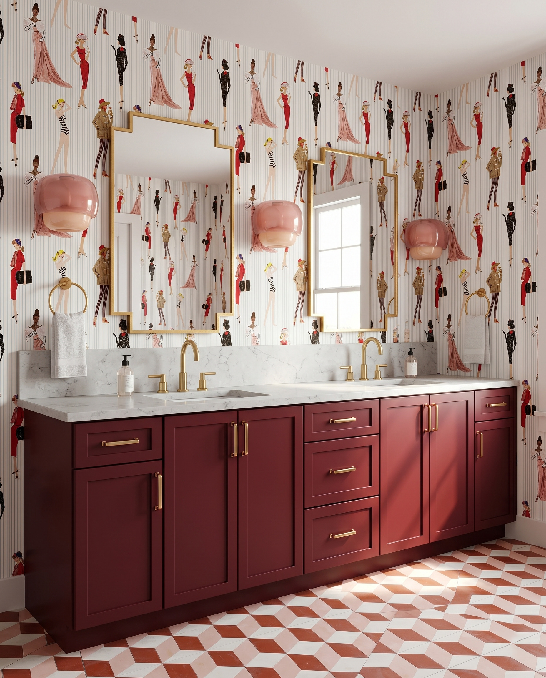
Rounded pink sconces add a softer shape to this wall of stepped gold mirrors and illustrated wallpaper. The shades have a glossy surface, but their dusty pink color stays gentle beside the wine-colored vanity. Use this idea when a room already has plenty of straight lines: one repeated curved fixture can introduce a different rhythm without requiring another large pattern.
3. Use a ribbed shade as a small color accent
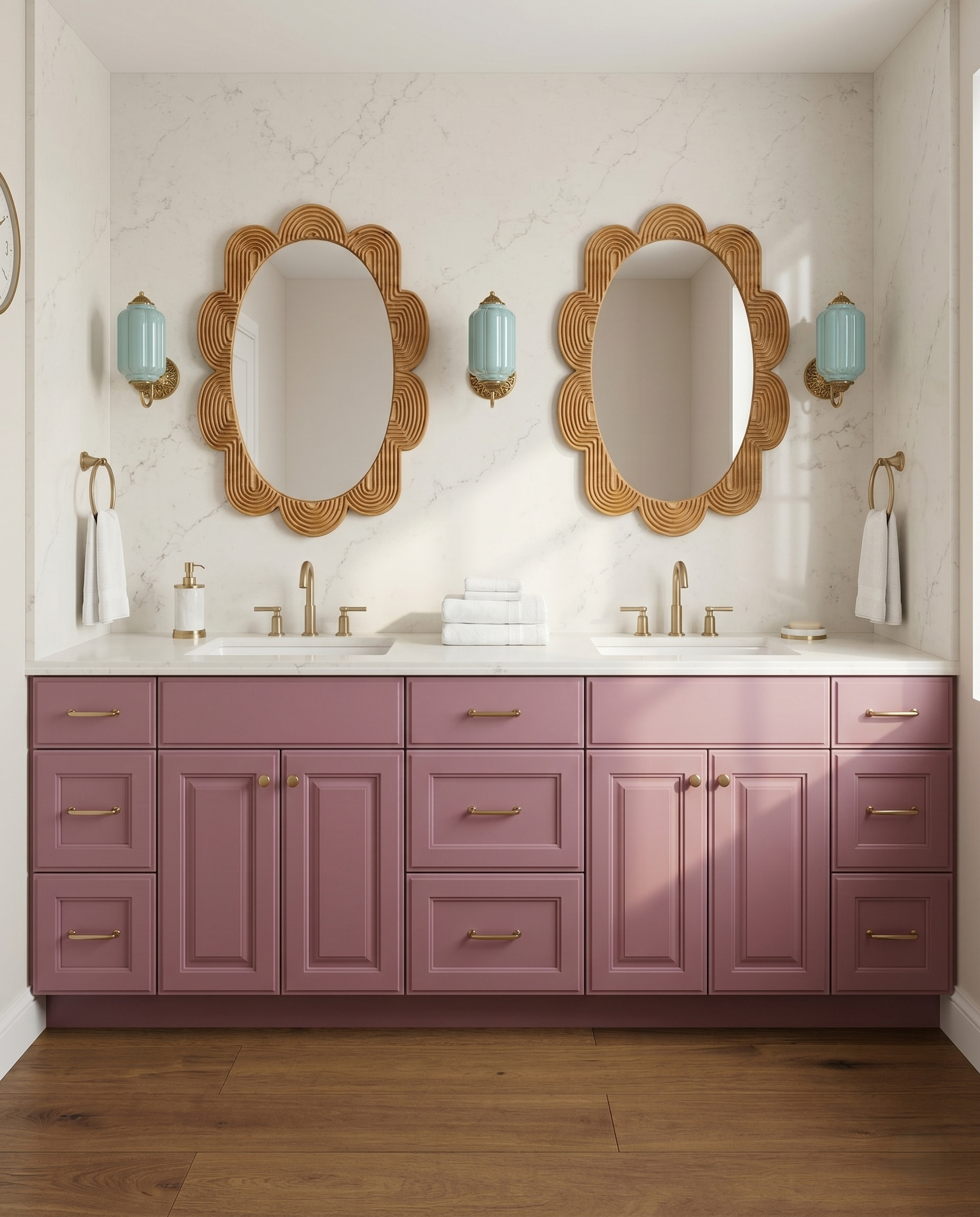
Pale aqua shades add a cool accent to this mauve-and-wood palette. Their vertical ribs and ornate gold caps give the compact fixtures enough detail to remain interesting against a plain wall. Borrow the small scale of the color move: keep the surrounding metal consistent, then let the shade carry the accent. Compare ribbed and smooth surfaces before choosing which texture you prefer.
4. Carry one color through the shade and stem
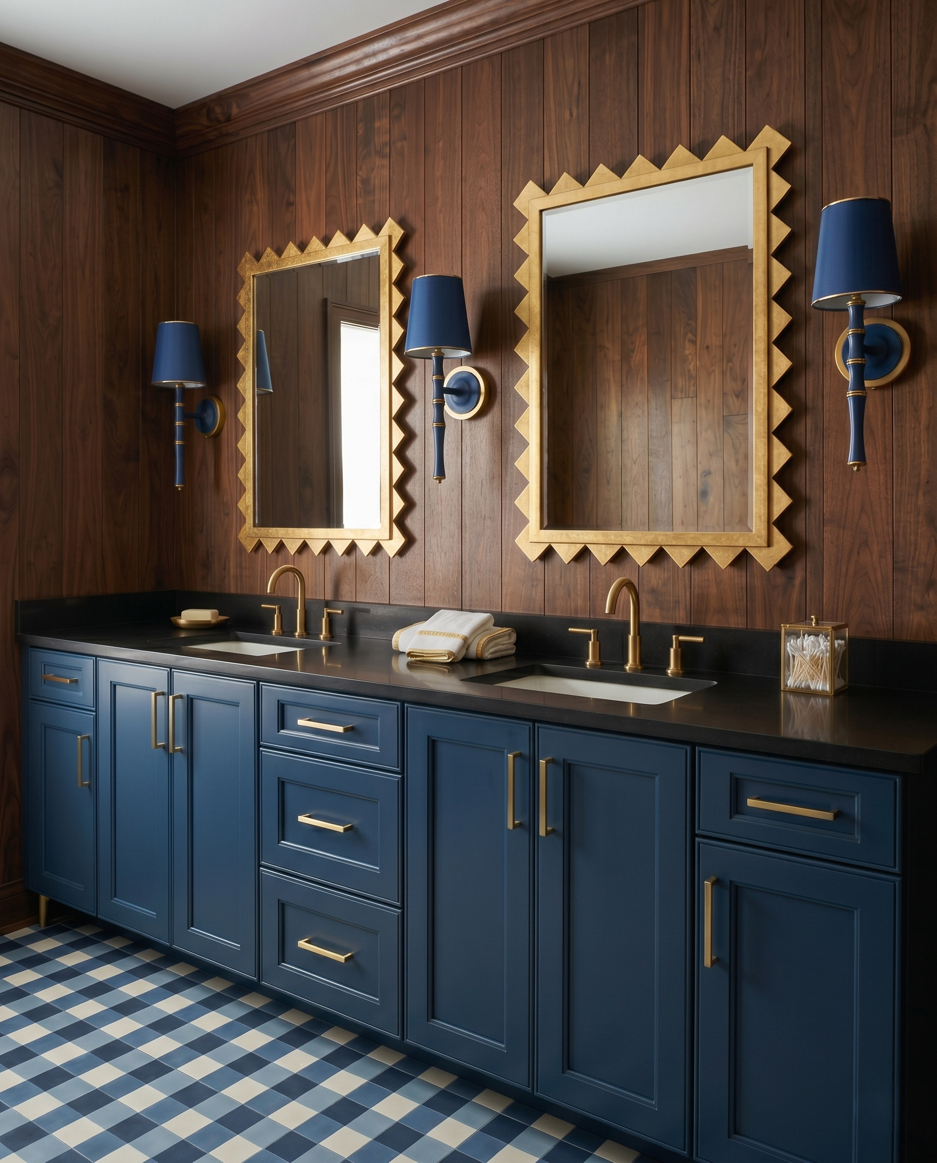
The navy shades, stems and mounting centers read as one continuous fixture against the wood paneling. Small gold bands break up the dark color and relate to the faucets without overwhelming it. This is a useful alternative to a colored shade on a fully metallic arm. Compare the complete fixture in your mood board, including the part below the shade, to judge its visual weight.
5. Repeat a scalloped shade in a warm accent color
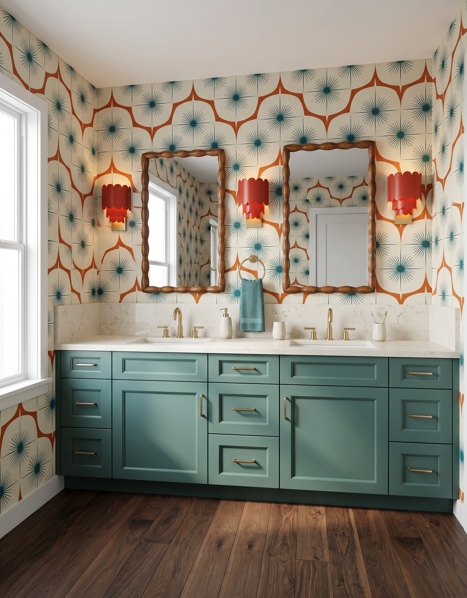
Three scalloped red shades create a clear rhythm across this muted teal vanity. Their layered edges are easy to spot because the nearby wood mirror frames stay narrow. Take the idea as a color-and-shape pairing: choose one warm accent for the sconces, then repeat it sparingly in the wall pattern. The larger cabinet surface can remain quieter without making the room feel timid.
6. Let textured colored glass become the detail
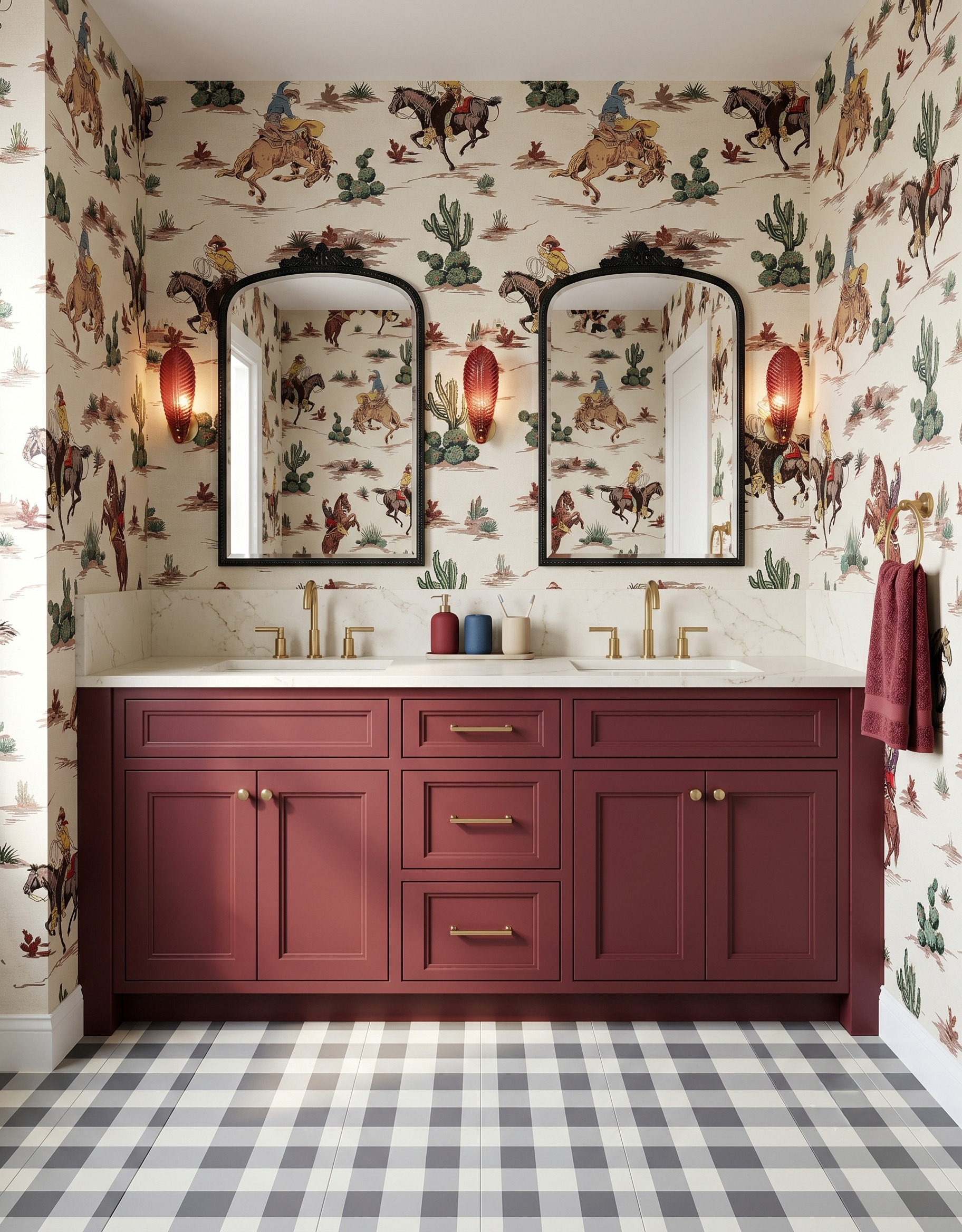
The slender red sconces have a leaf-like texture that remains visible around their warm centers. Against the illustrated wallpaper, that narrow shape gives each light a defined outline without covering much of the scene. For your own shortlist, compare smooth and textured versions of a similar shade. Surface detail can make a small fixture feel expressive even when the surrounding finishes stay restrained.
7. Balance two globes around one center
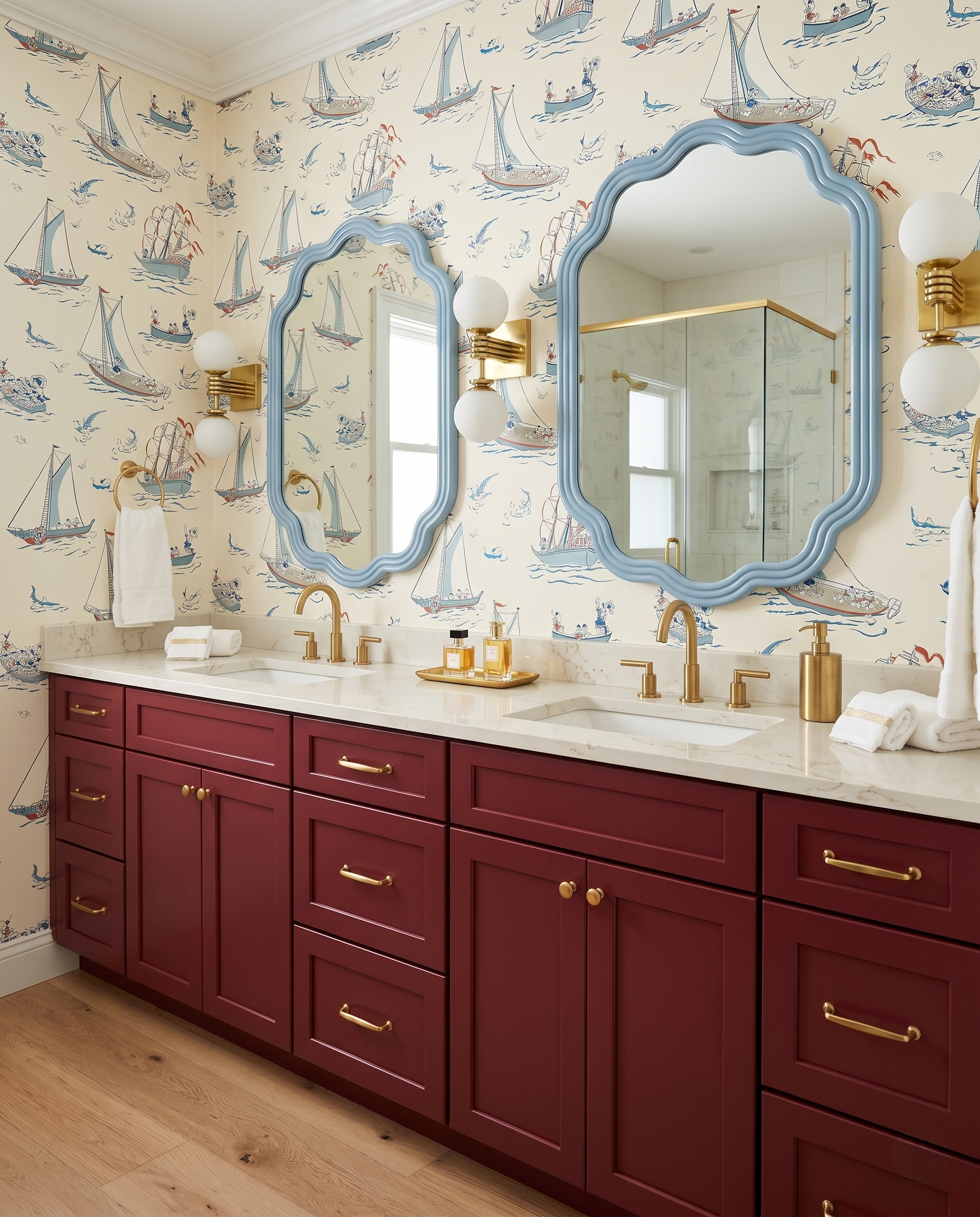
Each sconce places a white globe above and below a compact gold bracket. That repeated arrangement gives the fixture a clear center, even beside the wavy blue mirrors and illustrated wallpaper. Compare this two-part silhouette with a single shaded light when building your shortlist. Keeping both globes the same size makes the outline easy to read, while the stepped metal detail adds a second texture.
8. Make the backplate a focal point
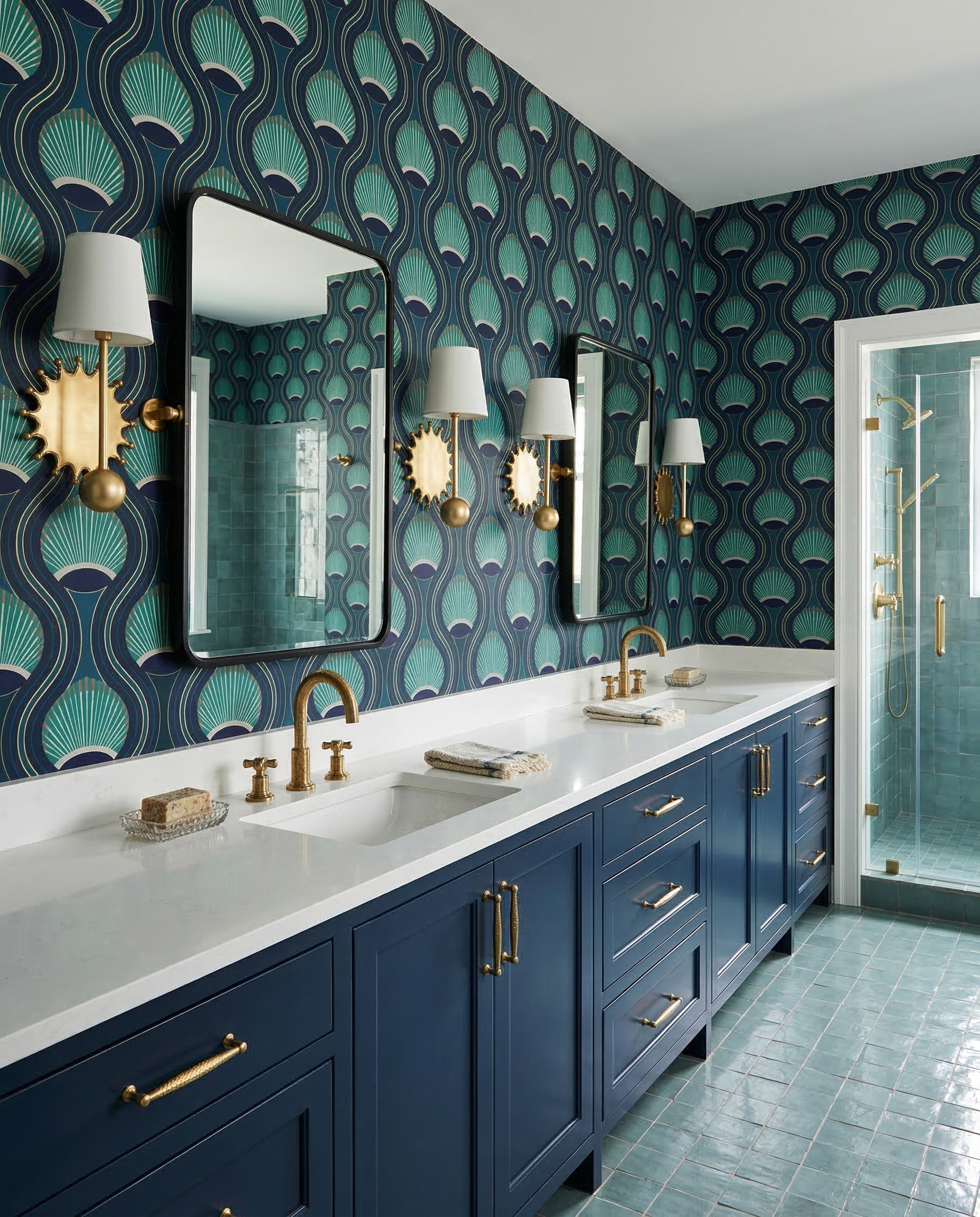
Gold sunburst backplates bring a sculptural accent to these otherwise simple shaded sconces. Their irregular outlines stand out against the flowing teal wallpaper, while black mirror frames give the wall a clean boundary. This combination suggests a useful choice: keep the shade familiar and let the mounting detail carry the personality. Repeat one metal finish elsewhere so the decorative backplate feels connected.
9. Use white fixtures against a busy wall
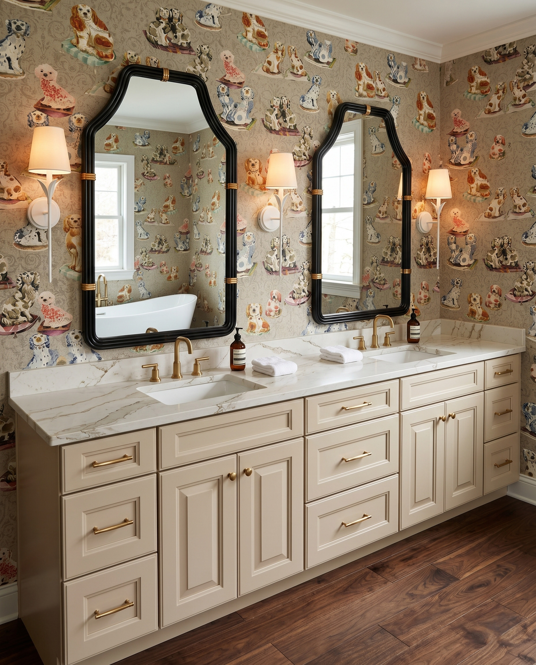
White sconces form a light outline against the patterned dog wallpaper. Their slender stems and simple shades contrast with the broad black mirror frames, giving the eye a small pause between the illustrated details. If the wallpaper is your favorite feature, compare painted white fixtures with metallic ones. A quiet finish can leave room for a more expressive stem or mounting shape.
10. Finish with a botanical statement sconce
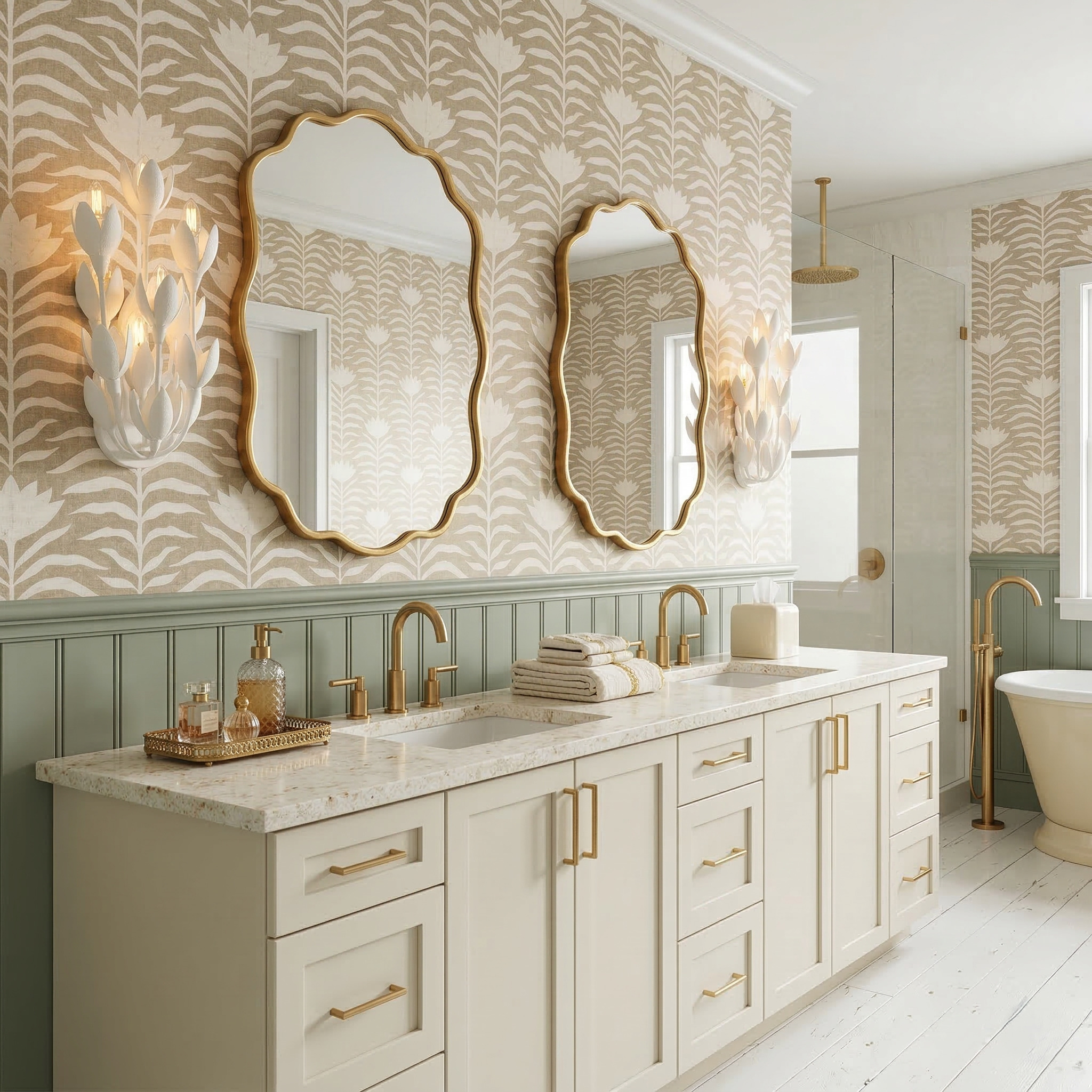
White leaf-shaped sconces turn the outer edges of this vanity wall into focal points. Their sculptural leaves echo the botanical wallpaper without copying its flat pattern, while the cream cabinetry and sage paneling keep the palette gentle. Borrow that relationship between a printed motif and a three-dimensional fixture. Let the repeated subject connect them, then vary the scale and texture to keep the room interesting.
Build a fixture shortlist around one favorite detail
Start with the sconce detail you want to notice first: its outline, surface, arm or backplate. Compare that feature with your mirror shape and one cabinet or wall sample, then decide which other elements should stay quieter.
Save a few contrasting examples so you can explain the direction clearly when planning your own room. If your next project is a kitchen, explore kitchen design ideas with StilePath at {app_url}.
Explore StilePath for your kitchen