
10 Bathroom Pattern Mixing Ideas for a Bold, Balanced Room
Pattern in a bathroom goes beyond the wallpaper. Floor grids, stone-like veining, mirror frames and cabinet lines all contribute to the composition. These ten rooms show different ways to combine them, from fruit prints with crisp checks to narrow wall tiles above a finely speckled floor. Look for the largest pattern first, then notice what supports it and where the room gives your eye a place to rest.
Images are AI-created design concepts from Anna's authorized collection. They illustrate decorating ideas, not completed Home3 projects or measured construction plans.
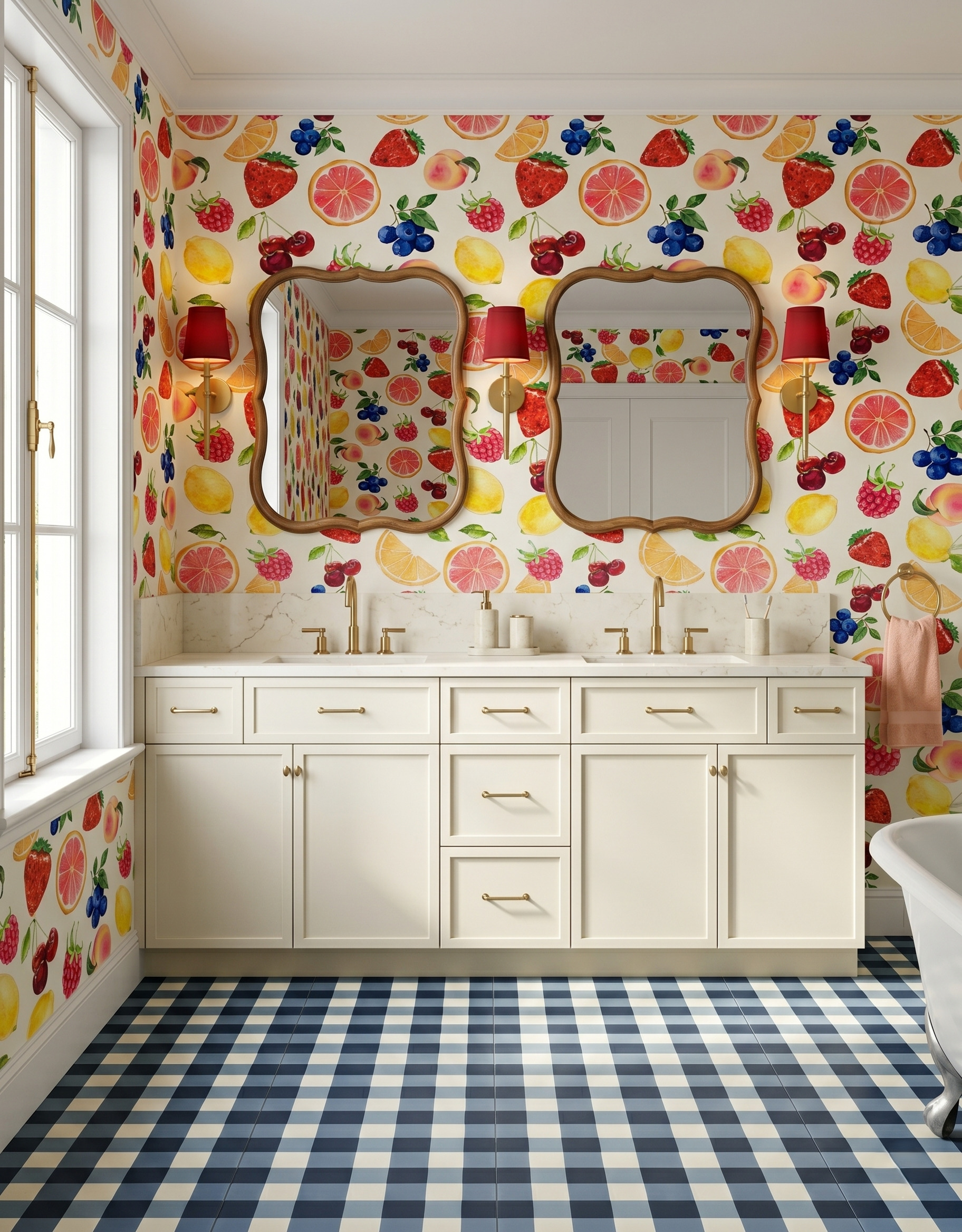
1. Give a playful print a crisp geometric partner
The fruit wallpaper is loose and colorful; the blue-and-cream checked floor is orderly. Their different shapes help each pattern stay readable. Cream cabinetry gives them a broad break between wall and floor, while blue berries connect the two. When trying a combination like this, compare the entire wallpaper repeat with several floor squares, rather than judging from two tiny swatches.
2. Use related greens to soften a checked floor
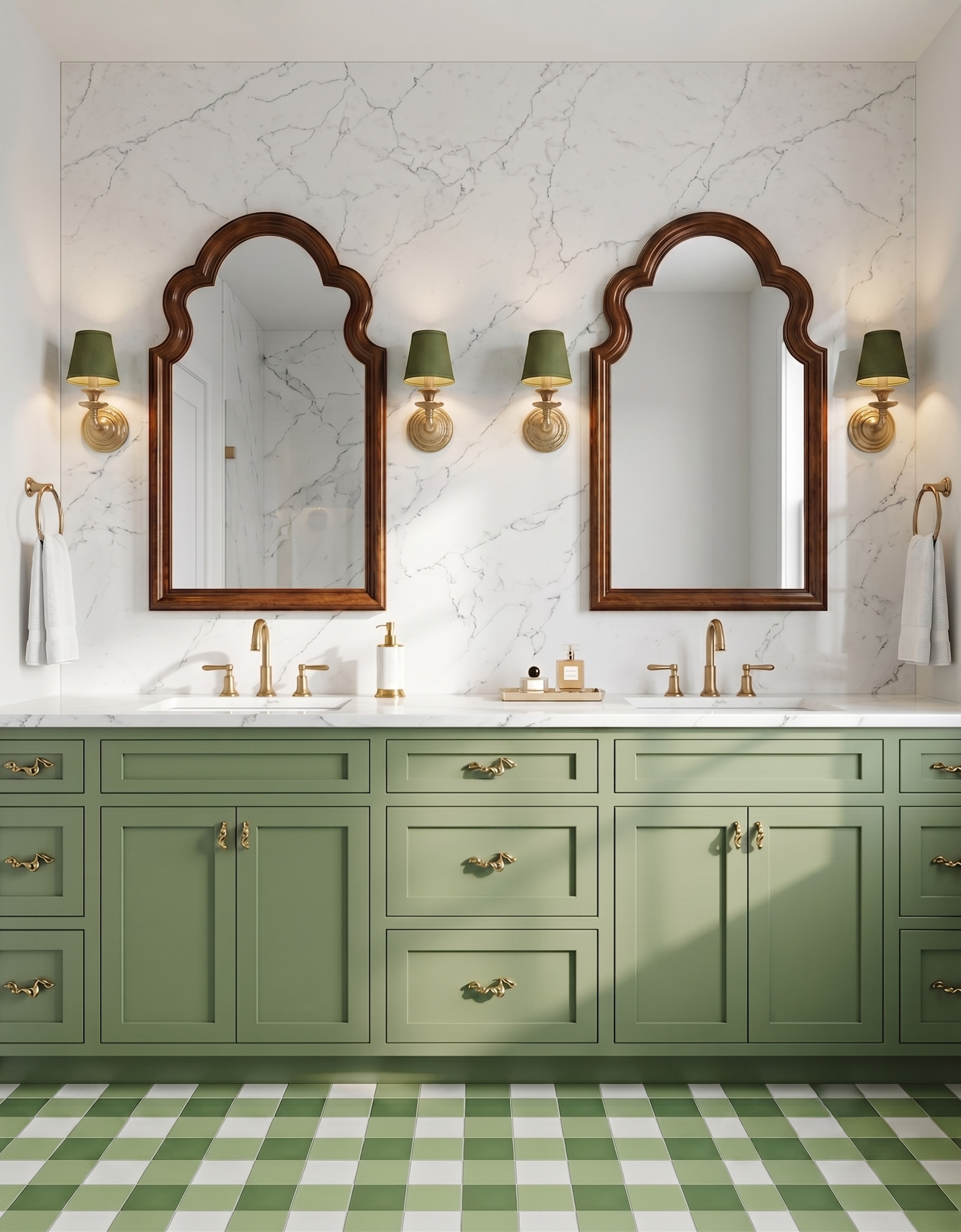
Several shades of green make this floor lively without introducing a second strong color family. The wall's fine, wandering veining contrasts with the regular grid below. Wood mirror frames add a warm outline between them. To borrow the idea, set a cabinet sample beside the lightest and darkest floor squares. The colors can feel related without matching every shade exactly.
3. Put a broad quiet surface between two strong patterns
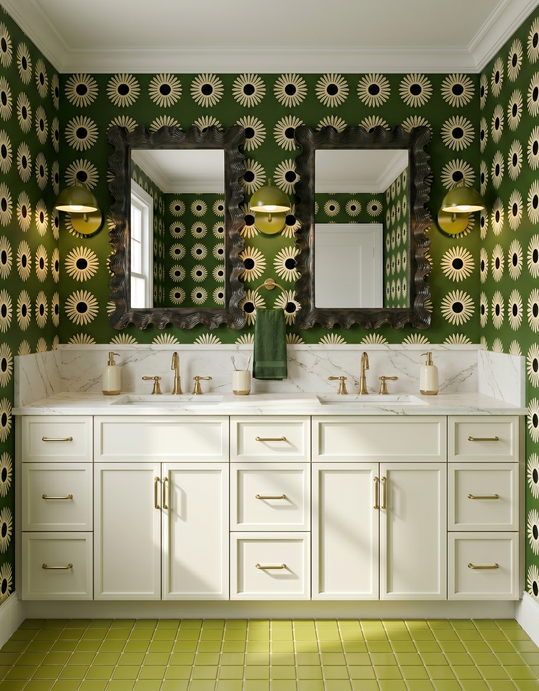
Large cream flowers stand out against a dark green wall, while the olive floor contributes a smaller square grid. The wide cream vanity separates those busy surfaces. Its pale color also repeats the flowers, so the break feels connected to the design. Try covering part of your sample arrangement with a plain cabinet swatch to see how much visual breathing room it creates.
4. Mix a narrow tile rhythm with scattered speckles
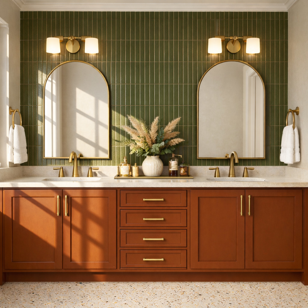
Tall green tiles create a steady vertical rhythm behind the mirrors. The floor answers with small scattered marks instead of another stripe. A rust-colored vanity gives the room a strong block of warmth without adding a third print. When comparing two patterned surfaces, look at both their direction and their scale. Different kinds of repetition can work together within a compact palette.
5. Echo a flowing print with a simple curved outline
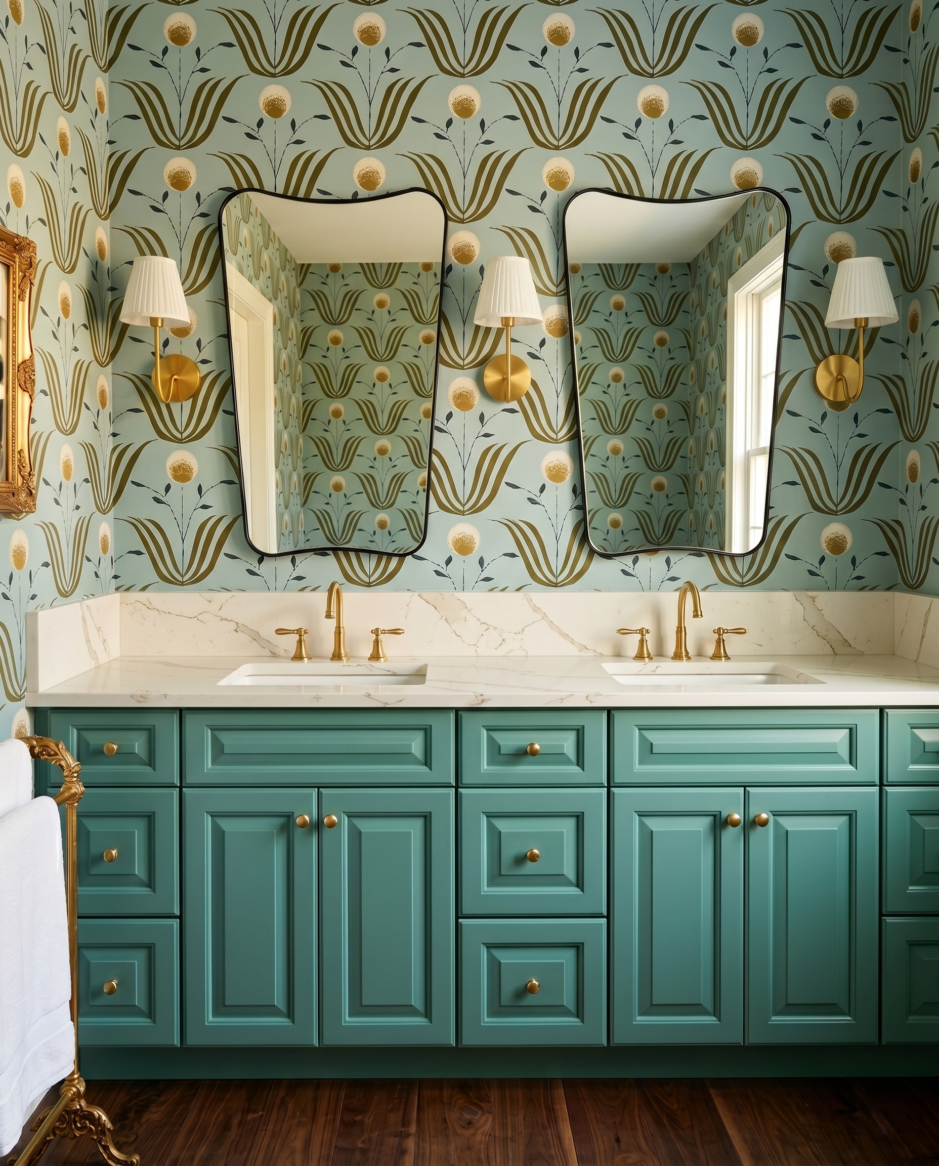
The wallpaper's sweeping leaves already create movement. Thin, gently curved mirror frames pick up that movement without copying the print or adding another intricate motif. Plain pleated shades keep the fixtures easy to read. Before combining decorative mirrors with a large botanical, compare a simple outline of the frame against the paper. Notice whether the frame supports the pattern or hides its best features.
6. Frame oversized geometry with plain cabinet planes
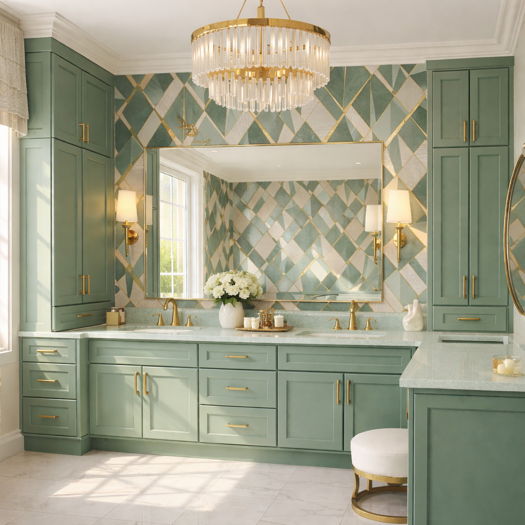
Large diagonal shapes need room to be understood. Here, green cabinet towers and a thin rectangular mirror frame define the edges of the patterned wall. The broad, mostly quiet floor lets that wall remain the focal point. When planning around an oversized repeat, sketch the mirror and cabinet outlines over a sample image so you can see which parts of the motif remain visible.
7. Let big scallops stand apart from small wall marks
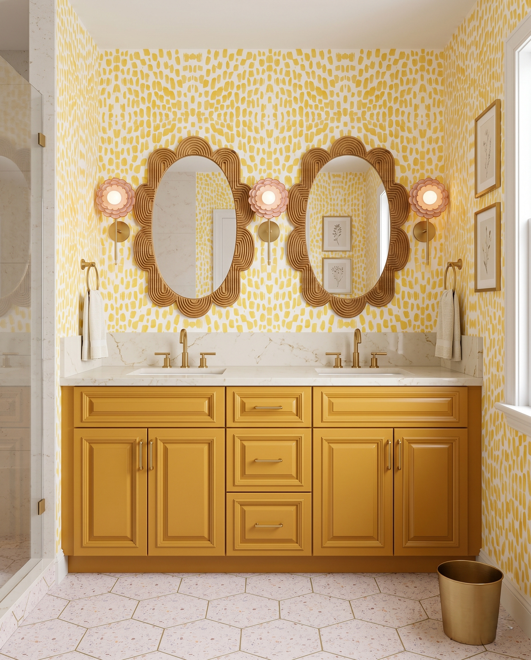
Small yellow marks cover the walls, but the mirror frames use much larger, easy-to-follow scallops. The difference in scale keeps their outlines visible. Pale hexagonal flooring adds a third shape with gentler contrast. If you want several decorative elements in one bathroom, give them different jobs: a fine background pattern, a bold frame silhouette and a quieter pattern underfoot.
8. Treat surface variation as part of the pattern
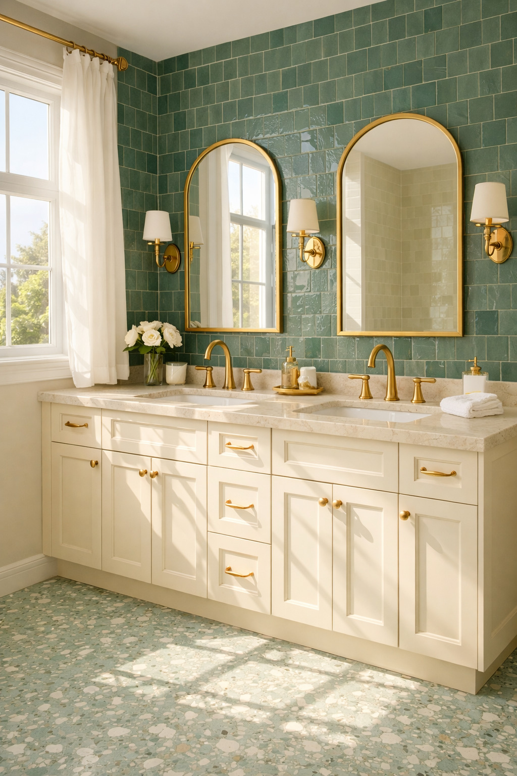
The green wall has a visible tile grid, but its uneven sheen adds another layer of interest. A pale, speckled floor continues the green family in a softer, scattered pattern. Cream cabinets and simple arched mirrors keep the combination grounded. When viewing finish samples, move them through the room's daylight: reflections and surface texture can change the balance as much as the printed pattern.
9. Use a plain vertical break through a busy wall
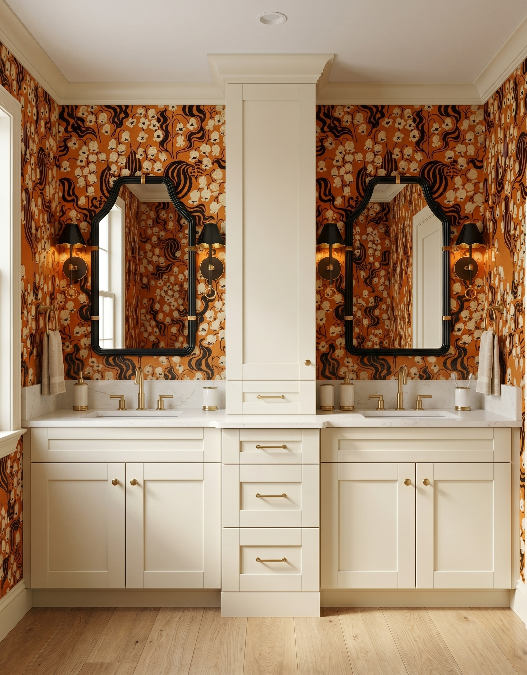
Orange-and-black curling motifs wrap around the vanity, while a cream cabinet in the center creates a clear interruption. That vertical break gives each mirror its own patterned backdrop. The plain wood-look floor avoids adding another busy field. For a similarly detailed wall, consider where existing doors, cabinets or trim already divide the pattern before choosing where the strongest repeat should land.
10. Check how mirrors repeat the wallpaper
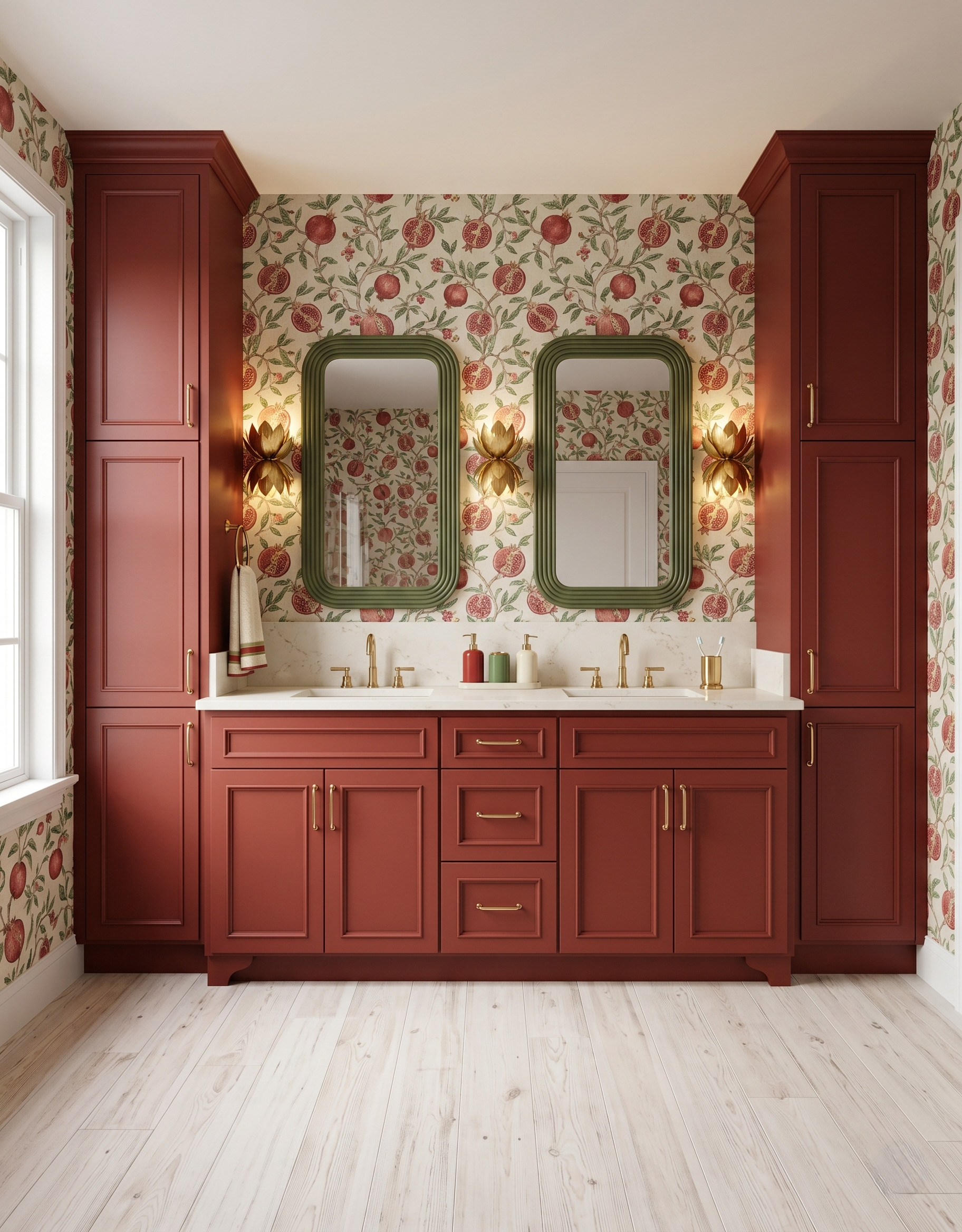
Pomegranate branches continue across the walls and appear again in both mirrors. That reflection makes the print feel more immersive, even though the room uses one main wallpaper. Solid rust-red cabinets, green frames and a pale floor keep the repeated imagery organized. When comparing a busy print, consider the opposite wall as well as the vanity wall, because both may appear in the mirror.
Compare the patterns as one composition
Choose the feature you want to notice first, then compare the size, direction and contrast of everything around it. Include the cabinet finish, mirror outline and reflected wall in your sample arrangement, not just the two most colorful surfaces.
If your next project is a kitchen, explore StilePath, Home3's kitchen planning tool. Bring along the pattern, color and cabinet relationships you want to explore in that space.
Explore StilePath for your kitchen