
Walk-in closet ideas · Fall wardrobe inspiration
10 Walk-In Closets Ready for Your Fall Wardrobe
A fall wardrobe brings back wool, denim, soft scarves and your favorite coat. A walk-in closet can make a fitting backdrop, with more personality than a row of white boxes and a forgotten ceiling.
These ten closet concepts combine cabinetry with expressive wallpaper, rugs and benches. Some are tailored, some playful and a few could improve a Monday morning before you have chosen a shirt.
Look past the carefully edited clothing in the images. Your closet has to work for your real collection, not an imaginary capsule wardrobe. Save the color relationship you love, then plan hanging space, shelves and circulation around what you own and how you get dressed.
These images are AI-created design concepts using Anna's selected prompts and material references. They are inspiration, not photographs of completed projects or installation plans.
1. Soften black cabinetry with blush ikat
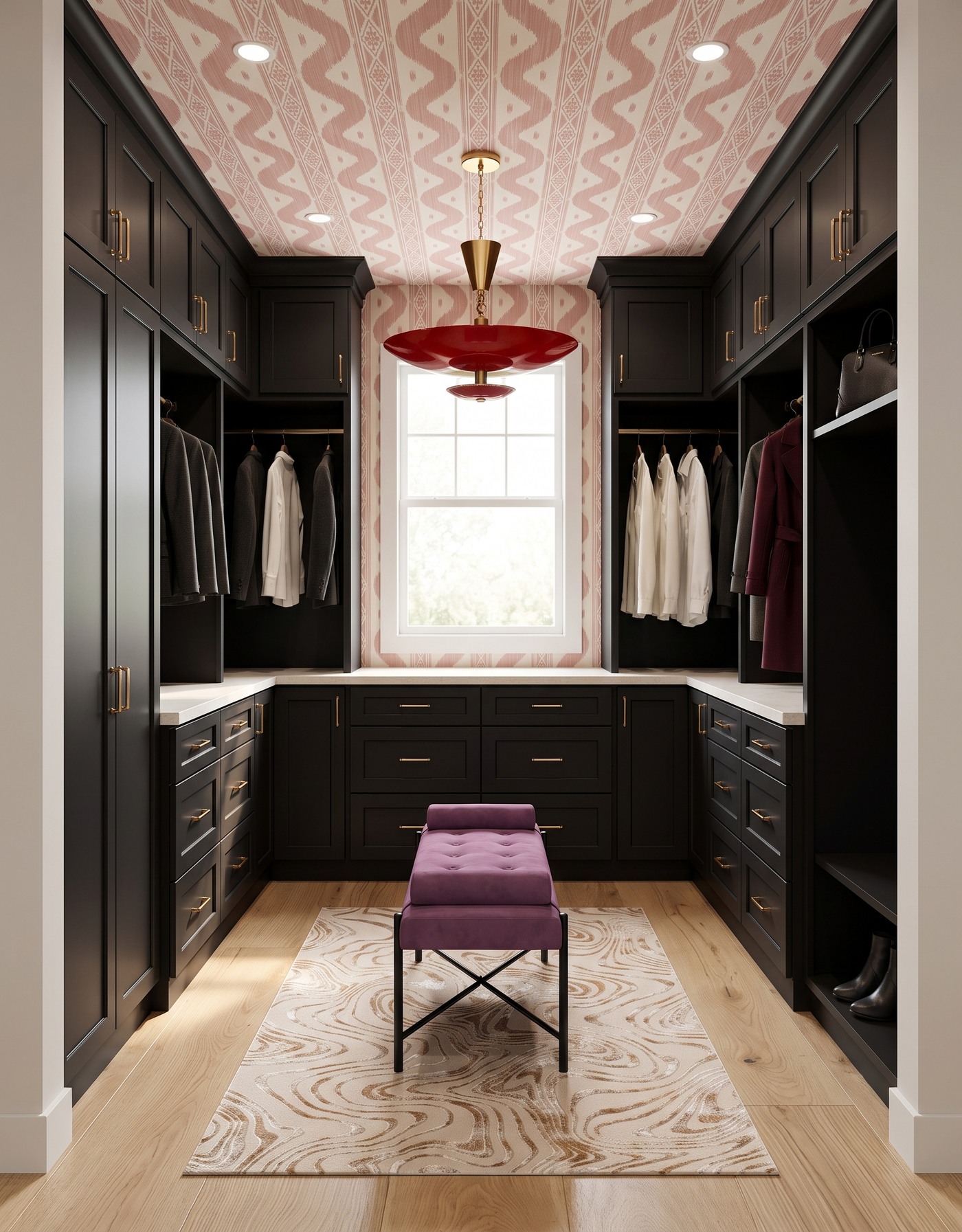
Black closet cabinetry surrounds a plum bench beneath pink ikat wallpaper and a red saucer pendant.
Black cabinetry gives this closet a strong frame, while blush ikat and plum upholstery soften it. Pale wood and a light rug keep the composition open. Drama need not mean darkness from floor to ceiling.
Let the contrast do the work instead of filling every shelf with a decorative object. A few visible bags and garments already supply texture and shape. When planning your own version, consider how the backdrop looks beside your actual clothing colors, not just the coordinated pieces used to illustrate the concept.
Try this: Balance dark storage with a lighter patterned layer and textiles that soften its edges.
2. Warm taupe with mustard stripes
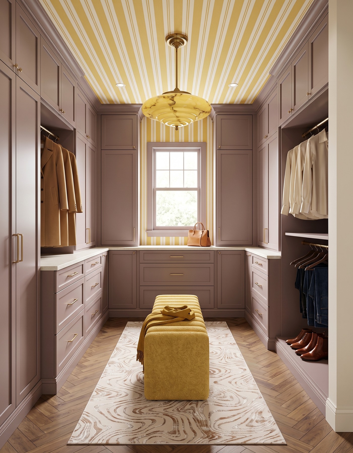
Mauve closet cabinetry pairs mustard stripes with a yellow bench and warm herringbone floor.
Taupe-mauve cabinetry becomes sunnier beside mustard-and-cream stripes. The bench carries warmth into the center, while herringbone adds movement underfoot. Quiet cabinetry lets those expressive pieces keep their distinct roles.
A neutral storage system can be a useful foundation if your taste changes faster than your cabinetry should. Pattern and upholstery introduce a point of view around it. Before choosing a bench, measure the room with storage doors and drawers in use; a beautiful center piece still has to leave you space to move.
Try this: Use neutral cabinetry as a steady backdrop for a warmer patterned and upholstered layer.
3. Layer olive like an autumn outfit
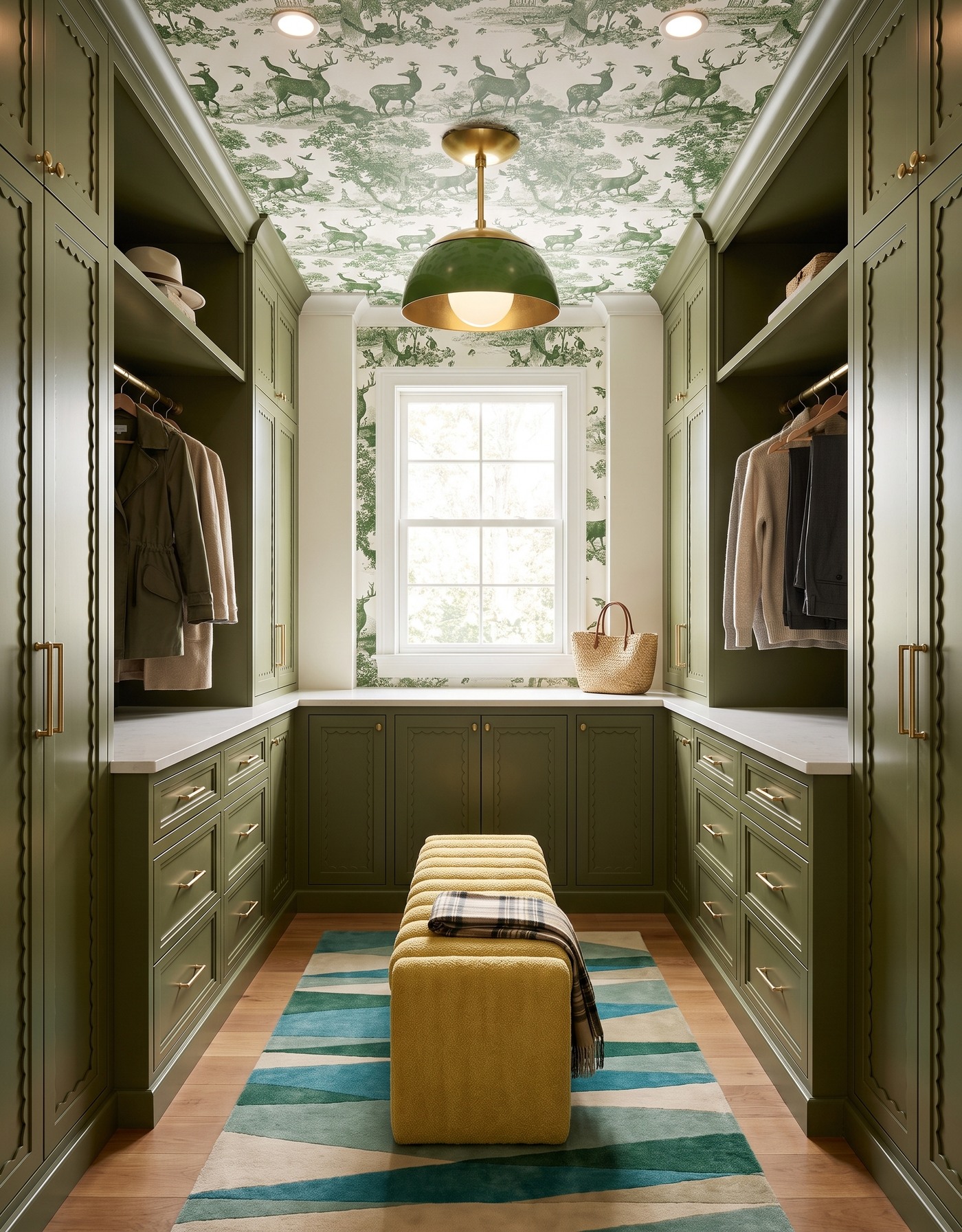
Olive scalloped storage surrounds a mustard bench beneath green woodland toile.
Olive cabinetry and woodland toile build a tonal backdrop, interrupted by golden upholstery and blue-green rug geometry. Like a good fall outfit, the related pieces have enough differences to stay interesting.
You do not have to coordinate the entire wardrobe to enjoy a green closet. Give the room its own coherent palette, then let clothing behave as the changing layer it is. In a real layout, reserve enough closed storage for the things you prefer not to display rather than expecting every shelf to look curated.
Try this: Make the room's finishes cohesive so the clothing can remain an honest, changing collection.
4. Let pale oak meet a bold red stripe
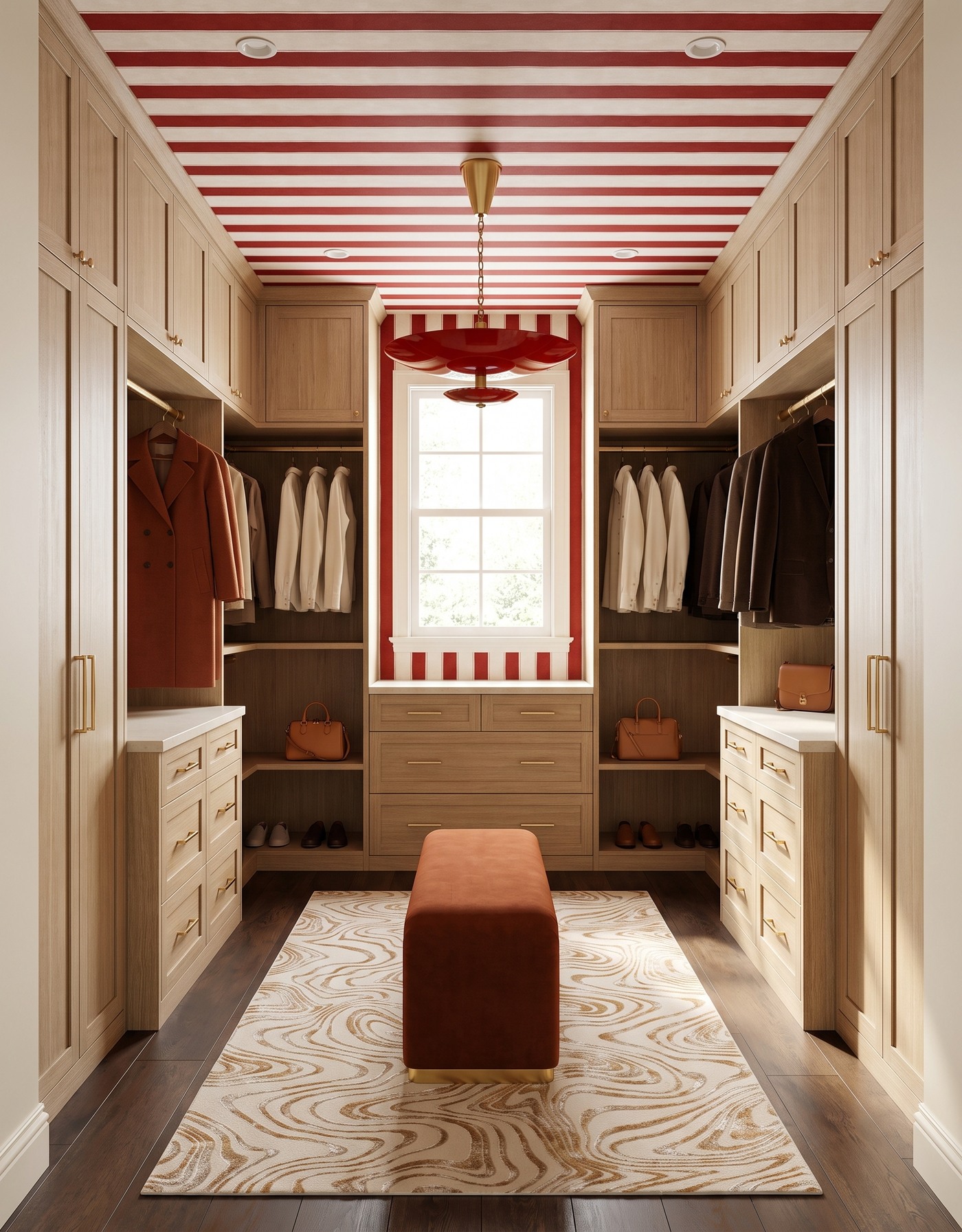
Pale-oak-toned closet cabinets balance red stripes, a red pendant and a rust bench.
Pale oak gives red-and-ivory stripes a calmer partner. Rust upholstery adds warmth without copying the wallpaper, while the dark brown floor separates the lighter storage from its surroundings. Natural-looking grain grounds the lively palette.
This is a helpful model for mixing warm colors without turning the whole room orange. Choose related reds and browns at different depths, then add a lighter or cooler surface between them. Keep accessories modest; the stripe has already made the closet memorable before a handbag arrives on a shelf.
Try this: Combine related warm colors at different depths instead of insisting on an exact match.
5. Give berry a cool blue counterpoint
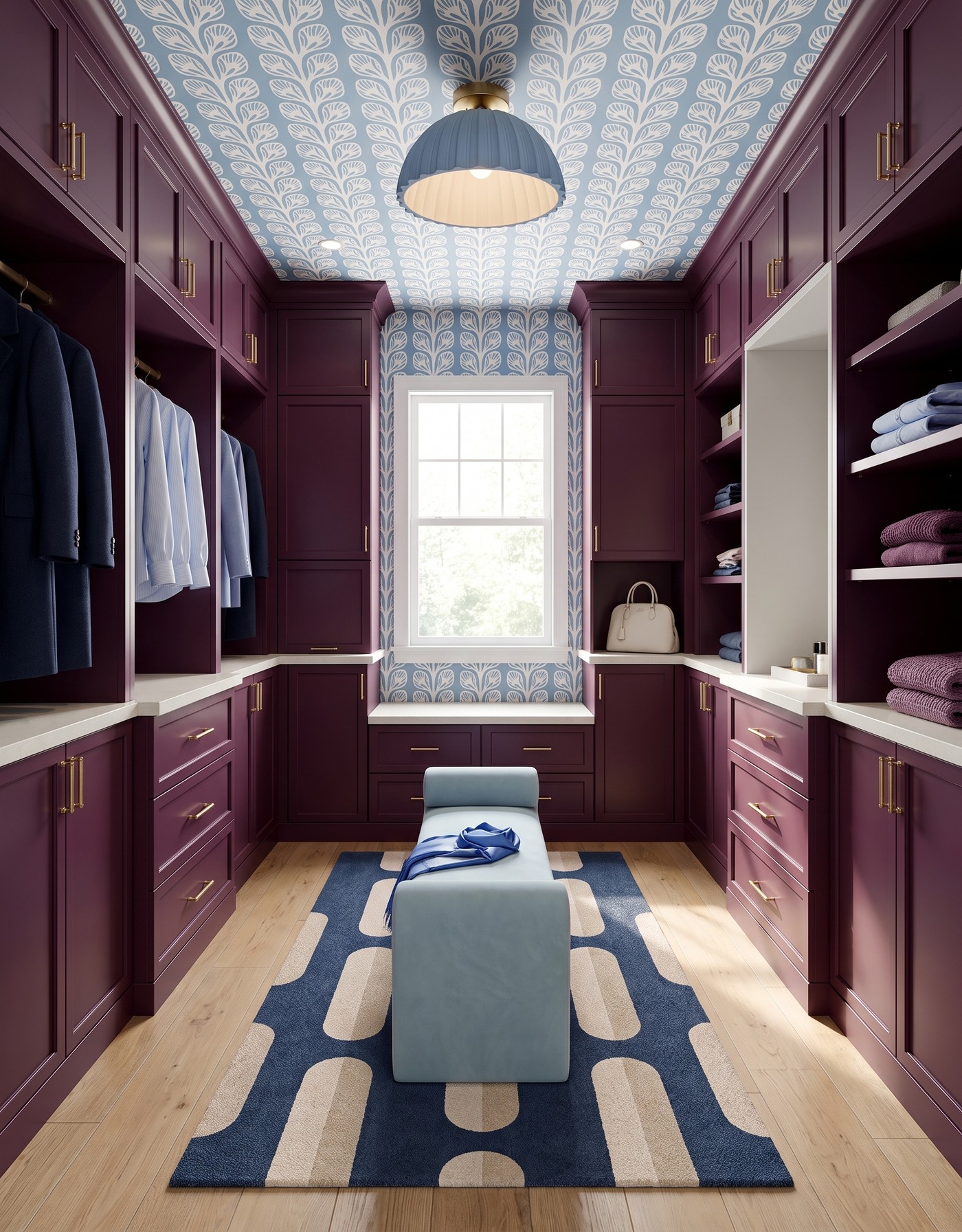
Berry closet cabinetry frames blue leaf wallpaper, a pale-blue bench and navy geometric rug.
Berry cabinetry and blue leafy wallpaper make an unexpected closet palette. Blue upholstery and a navy-and-cream rug reinforce the cooler family, while the pale floor gives the stronger colors breathing room.
When one color is this saturated, supporting elements can repeat a different shade from the pattern. That makes the whole room feel connected without becoming overly matched. Try the cabinet sample beside the largest wallpaper sample you can obtain; the balance can look very different when the pattern is seen at room scale.
Try this: Repeat a supporting wallpaper color around a strong cabinet color to build balance.
6. Dress walnut in black and gold
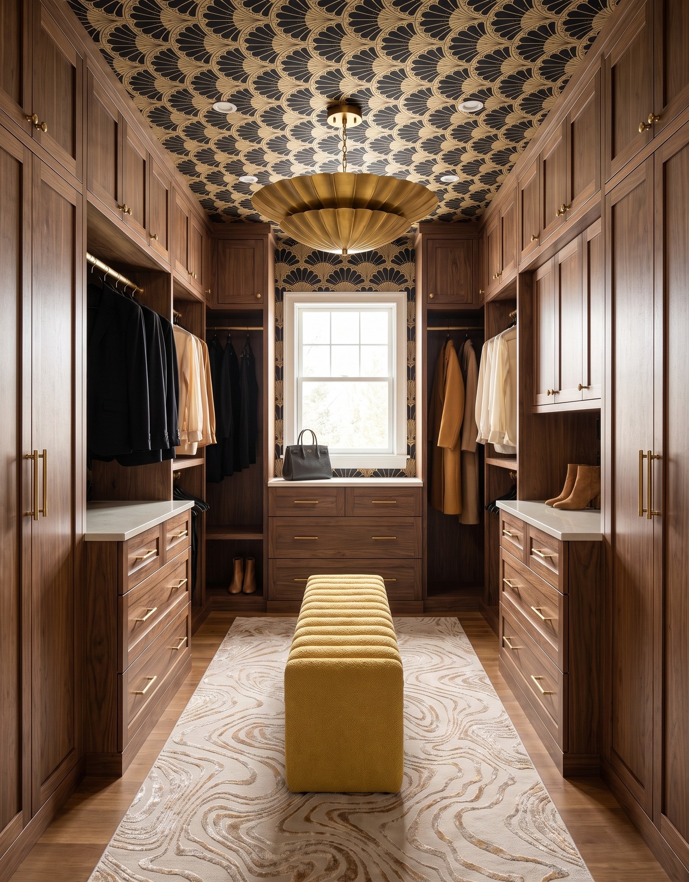
Walnut-toned closet cabinets meet black-and-gold fan wallpaper and a mustard channel bench.
Walnut-toned cabinetry and a black-and-gold fan pattern give this closet a dressed-up mood. Golden upholstery adds a softer version of the warmth, and the pale rug keeps the center from becoming too visually heavy. It has a little hotel-suite glamour without needing a shelf full of shiny objects.
Let wood grain count as decoration. If the cabinetry already has a pronounced pattern, quieter textiles can make it easier to appreciate. The goal is not to add a statement to every category; it is to decide which finishes lead and which make those leading pieces look especially good.
Try this: Treat strong wood grain as a decorative feature and give it some quieter companions.
7. Bring navy into a saffron field
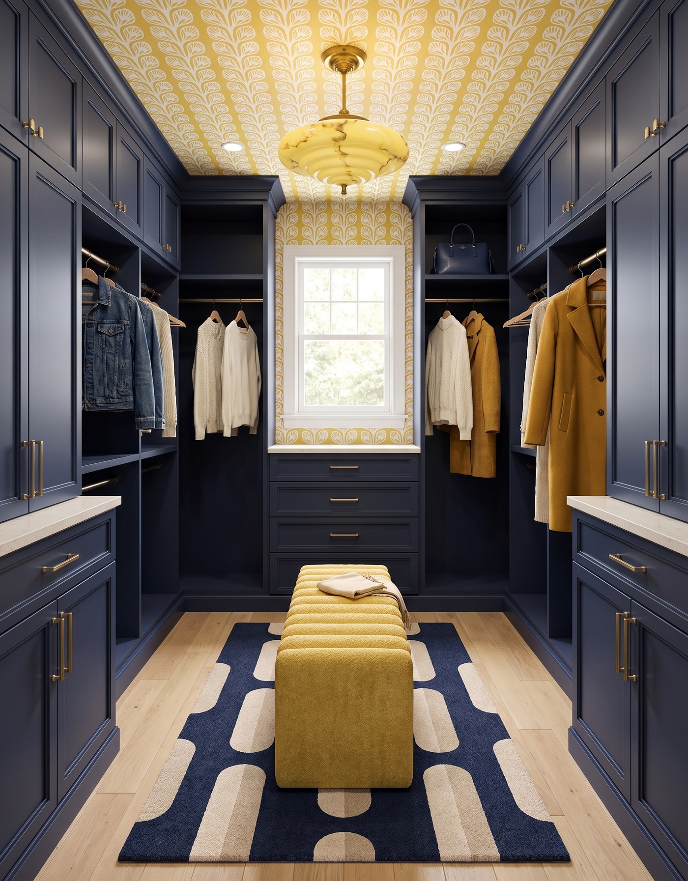
Navy closet cabinetry gives saffron leaf wallpaper and mustard seating a crisp contrast.
Navy cabinetry and saffron leafy wallpaper create a confident warm-cool contrast. The mustard bench continues the warmth; a blue-and-cream rug reconnects the room to the cabinetry. Pale flooring lightens the richer notes.
Repetition works best when it changes form. Navy in a broad cabinet surface does something different from navy in a rug pattern; mustard upholstery reads differently from mustard behind cream leaves. That variation gives the palette cohesion without making the room look as if every piece came from one matching collection.
Try this: Repeat colors through different shapes and materials to make a coordinated room feel personal.
8. Let a retro floral energize smoky blue
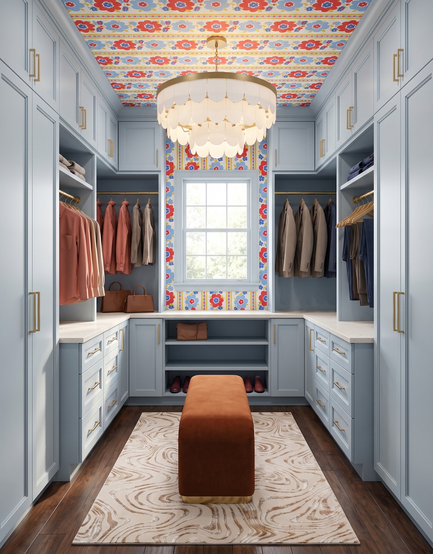
Pale-blue closet cabinets and a rust bench anchor a red-and-blue floral ceiling.
Smoky-blue cabinetry becomes playful beside a red-and-blue retro floral. Rust upholstery picks up the pattern's warmth, while the brown wood floor grounds it: an alternative to the all-dark dressing room.
Choose which part of a busy print you want to echo, then leave the other colors alone. Pulling every hue into a separate accessory can make the room feel over-explained. Clothing already introduces plenty of variety, so the permanent finishes do not have to account for every possible accent color.
Try this: Select a few useful connections from a multicolor print instead of repeating every shade.
9. Give white cabinetry an aqua-and-coral surround
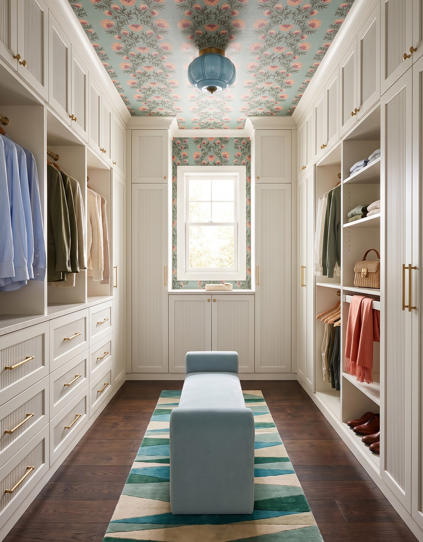
White reeded closet cabinetry pairs coral-and-aqua floral wallpaper with a blue bench and teal rug.
White cabinetry keeps this closet bright while an aqua floral, green-blue rug and pale-blue bench build a more colorful surround. The dark floor adds definition beneath the pale storage. The cabinet texture matters too: white can have depth without needing to become a different color.
A light storage system is useful when the textiles and pattern carry several hues. Let it remain the visual pause instead of covering every shelf with coordinating boxes. For an existing closet, borrowing just the rug-and-wallpaper relationship may be enough to make familiar cabinetry feel part of a new idea.
Try this: Let pale cabinetry provide the pause between several colorful patterned elements.
10. Pair soft-blue cabinetry with plum plaid
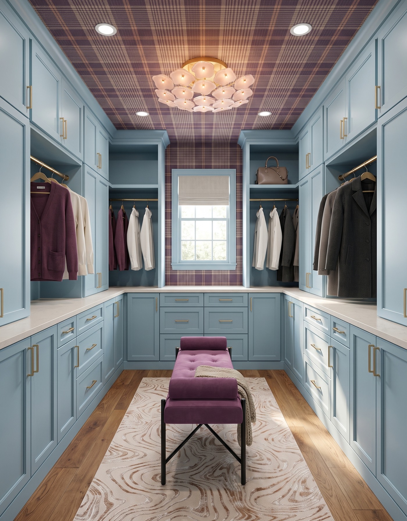
Soft-blue closet cabinets surround a plum bench beneath plaid wallpaper and a blush floral light.
Soft-blue cabinetry and plum plaid make a less expected finish to the fall wardrobe story. Plum upholstery deepens the warmer side of the scheme, while the honey-toned floor prevents the blue from taking the room too cool. The floral-shaped light loosens the otherwise tailored pattern mix.
A closet can borrow from fashion without becoming a costume. Think in relationships such as cool blue, soft plum and warm wood rather than trying to assign the room a rigid style label. Then let bags, scarves and jackets add their own variations as the season changes and the room gets used.
Try this: Describe the color relationship you love before narrowing the room to a single style label.
Plan around your actual fall wardrobe
1. Count the clothing categories you need to store and measure the longest hanging pieces.
2. Decide what belongs on display and what would be easier to live with behind a door.
3. Check circulation and storage access before adding a central bench or oversized rug.
4. View finish samples beside a few garments you wear often, in both daytime and artificial light.
5. Borrow the palette from a concept, but verify the dimensions, lighting and construction for your own room.
Save the closet that feels like you, note its color relationships and leave space for a wardrobe that is not permanently arranged for a photograph. Personality and practical storage belong in the same plan.
Considering changes beyond the closet? Get familiar with Home3's planning approach and the next steps available to you.
Explore Home3's approach