
Butler's pantry inspiration / A little hosting prep, a lot of personality
10 Serving Pantries to Inspire Your Holiday Prep
Holiday preparation can start with something smaller than a shopping list: deciding where the plates, serving bowls and trays will gather before they reach the table. A serving pantry gives that everyday collection a backdrop of its own. And it does not have to be quiet beige to feel organized. A red stripe, olive cabinet or unexpected ceiling light can bring personality without covering every counter in decorations.
These ten butler's pantry concepts offer different ways to combine expressive finishes with a manageable grouping of dishes. They are advance hosting inspiration for late October, not instructions to decorate for every holiday at once. Save a favorite color relationship, look at the pieces you already use, and think about which surface you want to keep clear when guests arrive.
These AI-generated design concepts were created using Anna's prompts and material references. They are inspiration, not completed projects, identified products or verified installation plans.
1. Red stripes turn a simple plate stack into a focal point
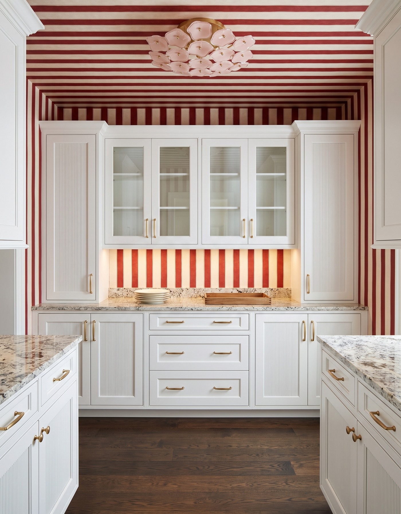
White reeded cabinetry, deep red-and-ivory stripes, pale densely speckled counter, dark brown wood floor and blush petal light. AI-generated pantry concept.
The plates and empty wooden tray are uncomplicated, but their backdrop is anything but shy. Red-and-ivory stripes continue across the walls and ceiling, while white reeded fronts bring a different kind of texture below. The pale speckled counter connects the light cabinetry to the darker wood floor.
For holiday prep, borrow the restraint of the counter arrangement rather than adding seasonal objects to every corner. A compact plate stack and a tray can make a room feel ready for service while leaving the surrounding surface visibly open. The blush ceiling light softens the straight stripes with a cluster of rounded shapes.
Try this: Keep the serving grouping small when the room's pattern already supplies the drama.
2. Rust linens belong beside warm, confident cabinetry
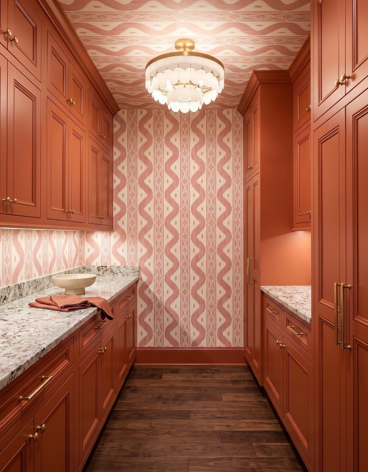
Terracotta framed cabinetry, blush-and-ivory ikat wallpaper, pale gray-black speckled counter, brown wood floor and ivory petal light. AI-generated pantry concept.
A cream serving bowl and folded rust-colored napkins give this terracotta pantry an everyday purpose. The textile relates to the cabinetry without disappearing into it, and the pale bowl is easy to pick out against the patterned counter. Blush-and-ivory wallpaper keeps the warm palette from feeling like one solid block of orange.
This is a good reminder that the linens you actually use can be part of the room's styling. Start with a bowl and a cloth rather than a complete tablescape. Leave enough of the counter visible to appreciate its material, then choose a light that introduces another shape instead of repeating the cabinet's straight lines.
Try this: Let a useful linen echo the cabinet color, with one plain bowl as a quieter companion.
3. Cream service pieces stand out against olive and plum
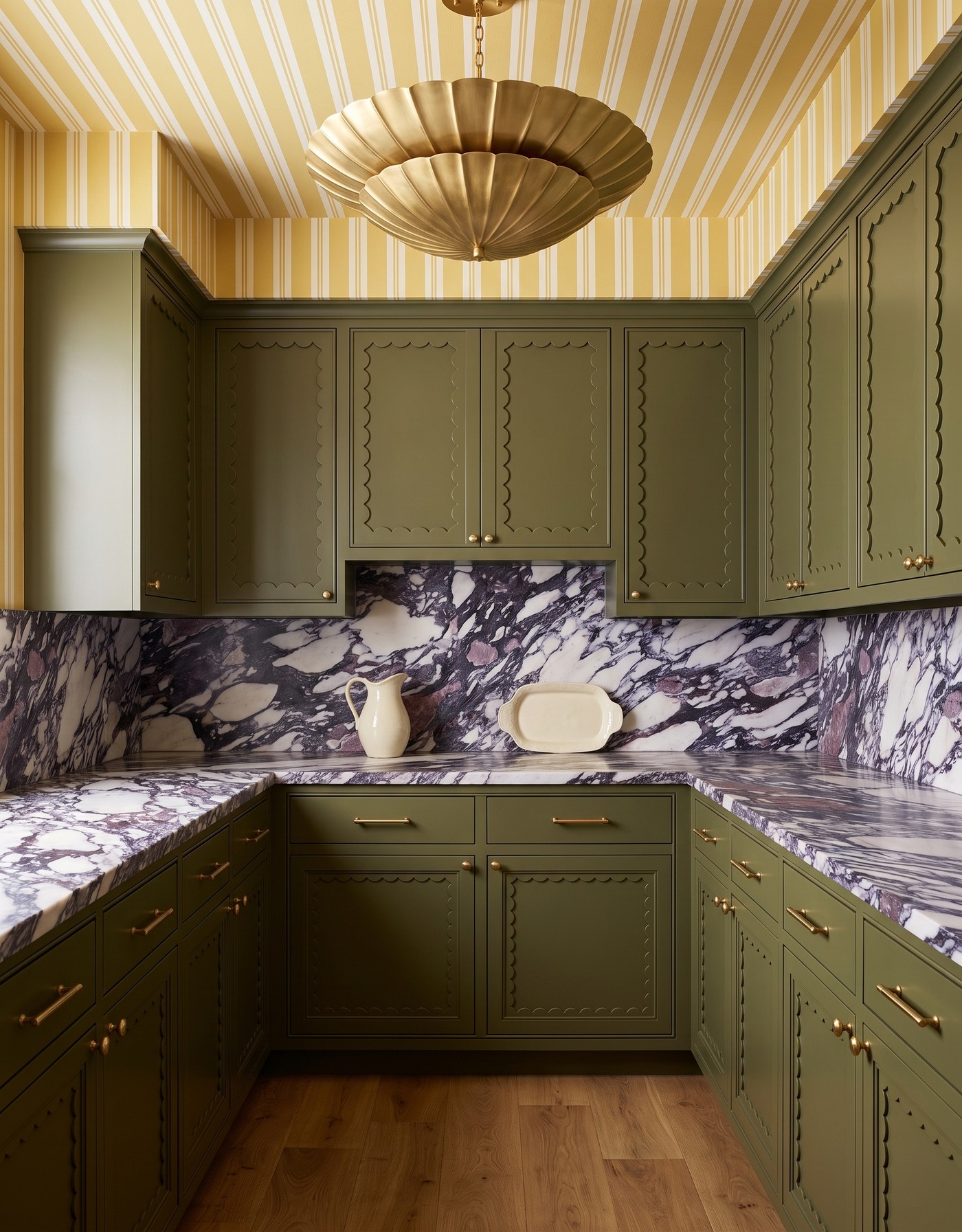
Olive scalloped-frame cabinetry, yellow-and-ivory stripes, ivory surface with dramatic plum veins, honey oak floor and gold shell-shaped light. AI-generated pantry concept.
The cream pitcher and platter stay readable in a room with several strong ideas: olive cabinetry, yellow stripes and a plum-veined counter with a matching back panel. Their simple silhouettes give the eye a pause. The scalloped cabinet detail and shell-like light add curves without requiring more counter accessories.
With this much movement in the finishes, pale everyday service pieces are a practical visual anchor. You do not need to find dishes that match each vein or stripe. Keep their color calm and their grouping compact; the room can be expressive while the items you bring to the table remain straightforward.
Try this: Use plain pale ceramics as a visual pause beside a strongly patterned surface.
4. A wooden tray gathers glassware in a tailored blue pantry
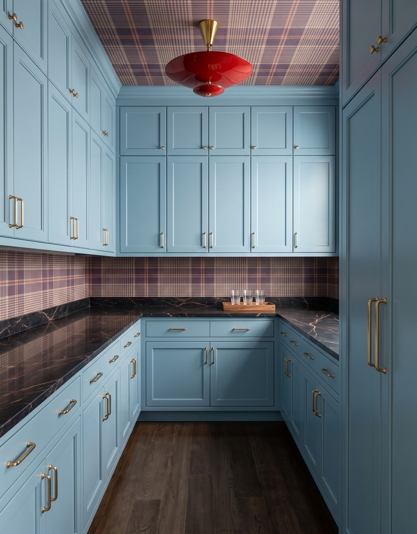
Dusty blue framed cabinetry, plum-taupe plaid wallpaper, charcoal surface with fine warm veining, dark brown wood floor and red saucer light. AI-generated pantry concept.
Three clear glasses on a wooden tray form a small service station against the dark counter. Dusty blue fronts and a fine plaid keep the room tailored, while the red ceiling fixture introduces a much bolder accent. The tray brings a warm material into the otherwise cooler cabinet palette.
Grouping glassware on a tray helps the arrangement read as one idea instead of several scattered objects. It also lets the counter remain visually calm. If you use a tray for carrying at home, check its actual handles, stability and weight capacity; this concept illustrates the grouping, not a tested serving setup.
Try this: Collect a few glasses on one tray and let the ceiling light carry the unexpected accent.
5. One ivory platter is enough beneath a botanical ceiling
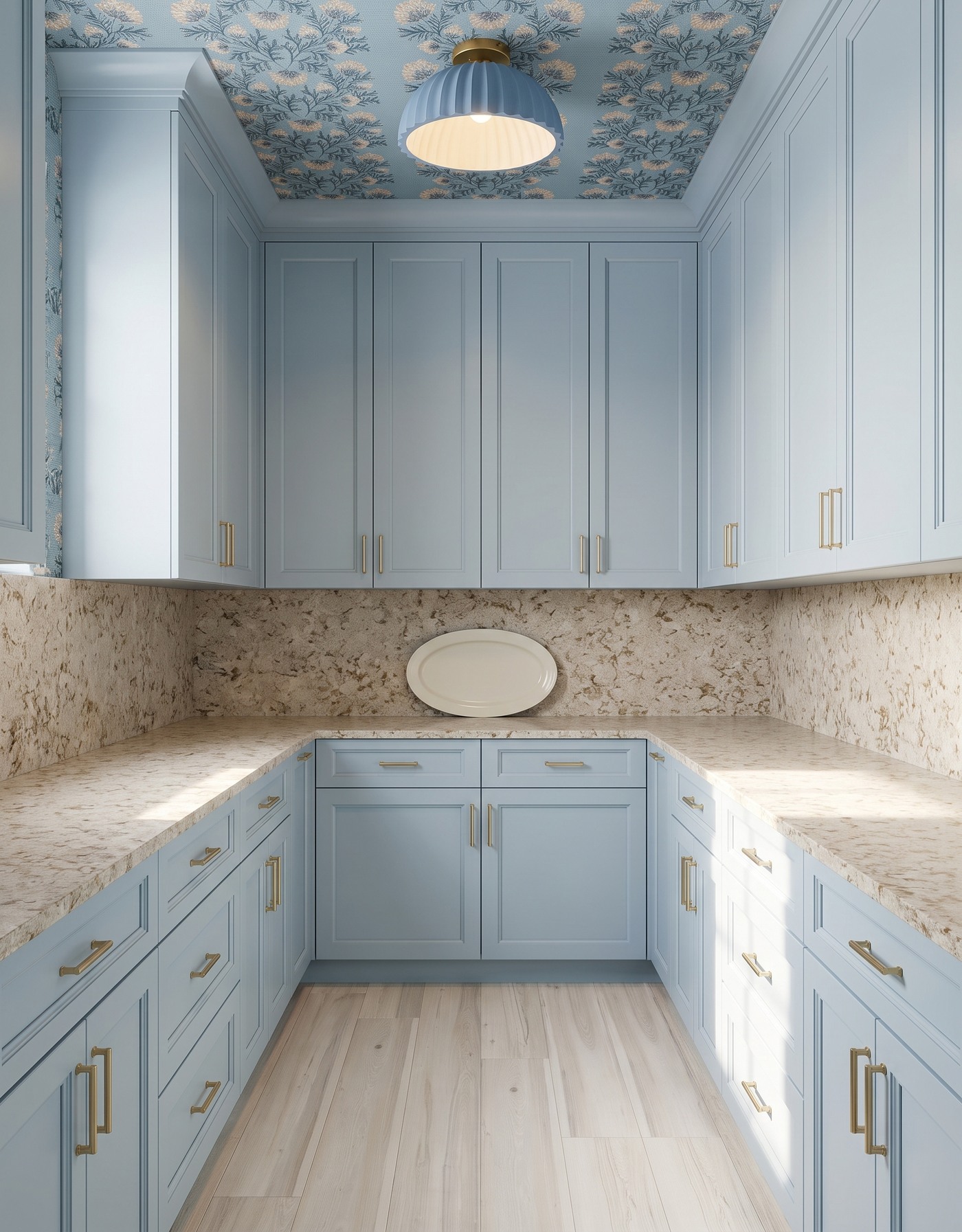
Pale blue-gray framed cabinetry, blue-and-cream botanical wallpaper, warm cream-tan mottled surface, whitewashed wood floor and blue pleated light. AI-generated pantry concept.
The ivory platter is the only visible countertop object in this pale blue-gray pantry. A warm mottled surface and matching back panel give it contrast, while the botanical print is most visible overhead. The blue pleated light repeats the cabinet color in a more sculptural form.
You can borrow this simplicity even if your pantry has no patterned ceiling. Choose one serving piece worth seeing and resist filling the space around it just because it is available. An upright display needs a suitable stable support in a real room; the image does not establish how the leaning platter is secured.
Try this: Give a favorite platter room to read, and verify any display support before using it.
6. Two bowls soften an ornate navy-and-gold backdrop
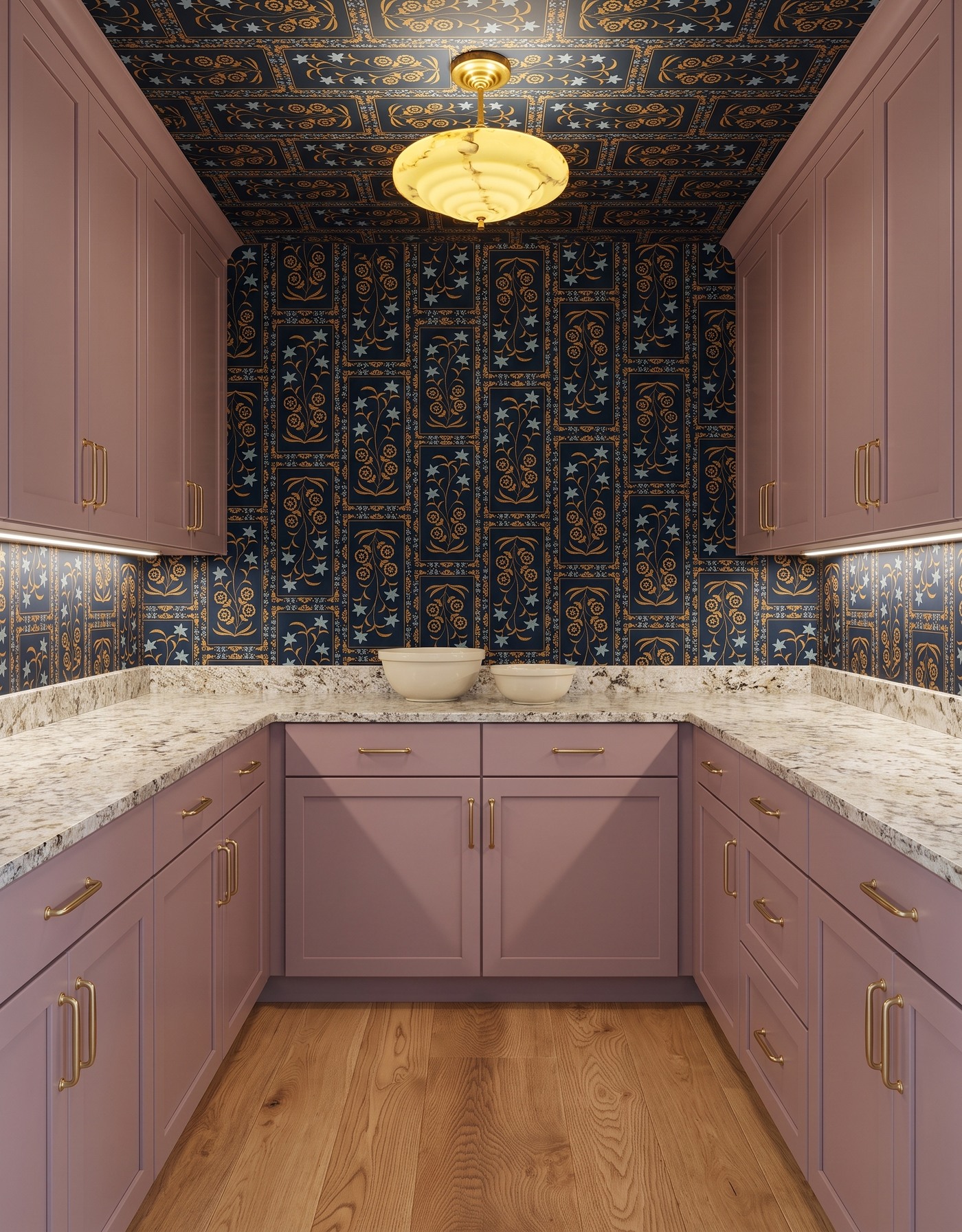
Muted mauve framed cabinetry, navy-and-gold framed botanical wallpaper with pale stars, pale speckled counter, honey wood floor and yellow marbled light. AI-generated pantry concept.
Two cream bowls of different sizes sit together on the rear counter. Their rounded, plain shapes are a useful contrast to the framed botanical wallpaper and its small star motifs. Mauve cabinets bring a softer color into the navy-and-gold room, and the yellow light adds warmth above.
When a wall pattern is intricate, vary the size of the service pieces rather than adding another print. A pair of bowls can suggest a collected set without a shelf full of decorative extras. Leave the rest of the counter quiet so the pattern and pottery remain distinct instead of merging into one busy band.
Try this: Vary bowl size while keeping the finish simple against an intricate wallpaper.
7. Glass-front storage makes the serving collection part of the room
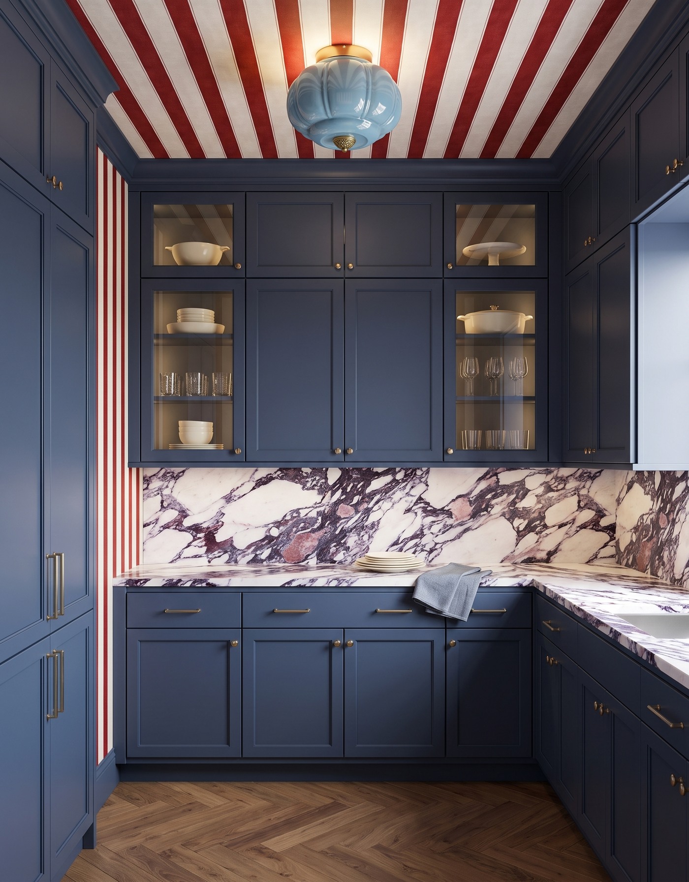
Deep navy framed cabinetry, red-and-ivory stripes, ivory surface with plum veining, brown herringbone floor and pale blue glass light. AI-generated pantry concept.
This pantry shows more of its serving collection behind glazed doors: pale bowls and dishes sit alongside clear glasses. A small plate stack and blue-gray linen remain on the counter below. Navy cabinetry frames the collection, while the red-striped ceiling and plum-veined back panel bring the playful finish combination.
The lesson is the separation between stored pieces and the counter grouping. You do not have to display the whole collection on the work surface for the room to feel personal. Keep visible storage edited, then give the counter its own smaller arrangement. Real shelf loads and glass-cabinet installation still need verification beyond an inspiration image.
Try this: Let selected dishes show behind glass while keeping the counter arrangement compact.
8. A gold tray connects everyday cups to the hardware
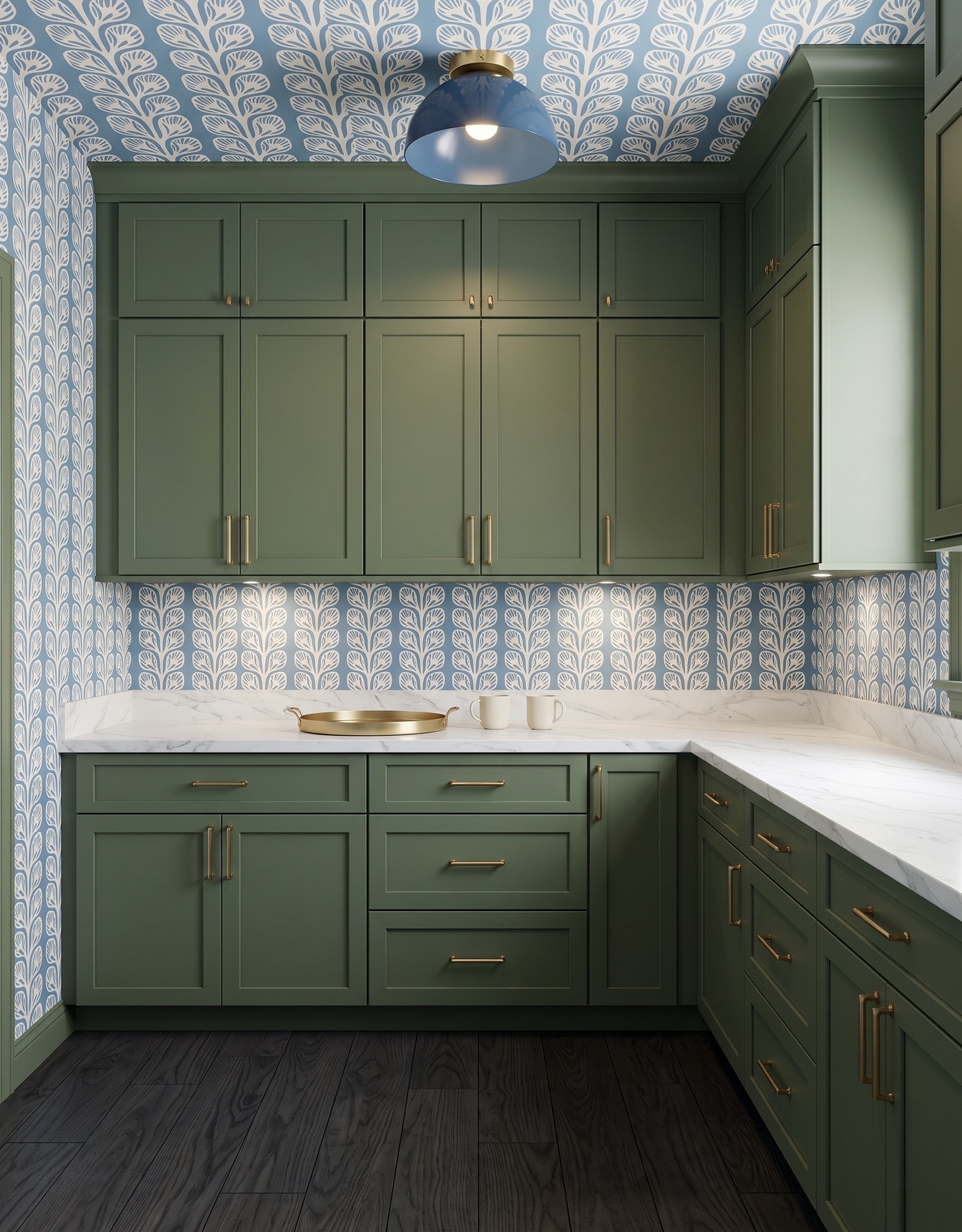
Deep green framed cabinetry, blue-and-ivory leafy wallpaper, pale fine gray-veined counter, charcoal wood floor and blue dome light. AI-generated pantry concept.
The shallow gold-colored tray relates to the cabinet hardware without making every accessory metallic. Two ivory cups sit beside it, creating a small light grouping against the green cabinetry. The blue-and-ivory print continues onto the ceiling, with a simple blue dome overhead.
A tray can echo a finish already present in the room, but the surrounding pieces do not need to match it exactly. Keep the cups plain and leave the tray empty until it has a job to do. The contrast between a warm metal note and cooler printed walls gives this pantry more personality than a perfectly matched accessory set.
Try this: Repeat one hardware tone in a tray, then keep the neighboring service pieces plain.
9. A single pitcher leaves the side counter ready for use
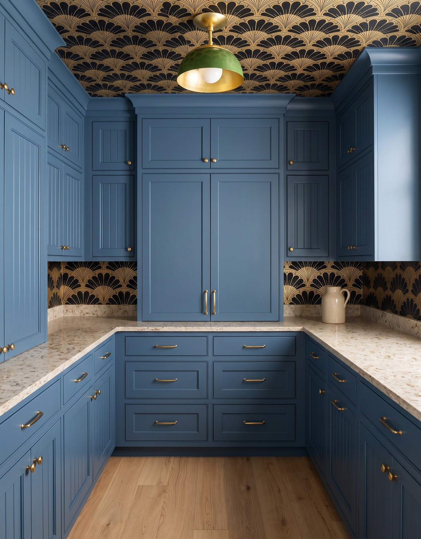
Denim blue framed and reeded cabinetry, black-and-gold fan wallpaper, pale warm mottled counter, honey oak floor and green dome light. AI-generated pantry concept.
The cream pitcher sits at the right end rather than becoming a centerpiece that spreads across the room. Blue cabinetry and black-and-gold fan shapes give the pantry its character, with a green light providing a separate accent. A large closed cabinet occupies much of the rear counter area, so the clearer side surfaces are the useful visual focus.
Borrow the idea of reserving a surface rather than assuming every pantry has one continuous preparation run. Look at your actual layout and choose the area you want available for a platter or tray. Keeping one object at the end can be enough to make that surface feel intentional without decorating away its purpose.
Try this: Choose a genuinely available counter area in your own layout and keep its center clear.
10. Everyday bowls calm a burgundy pantry with playful florals
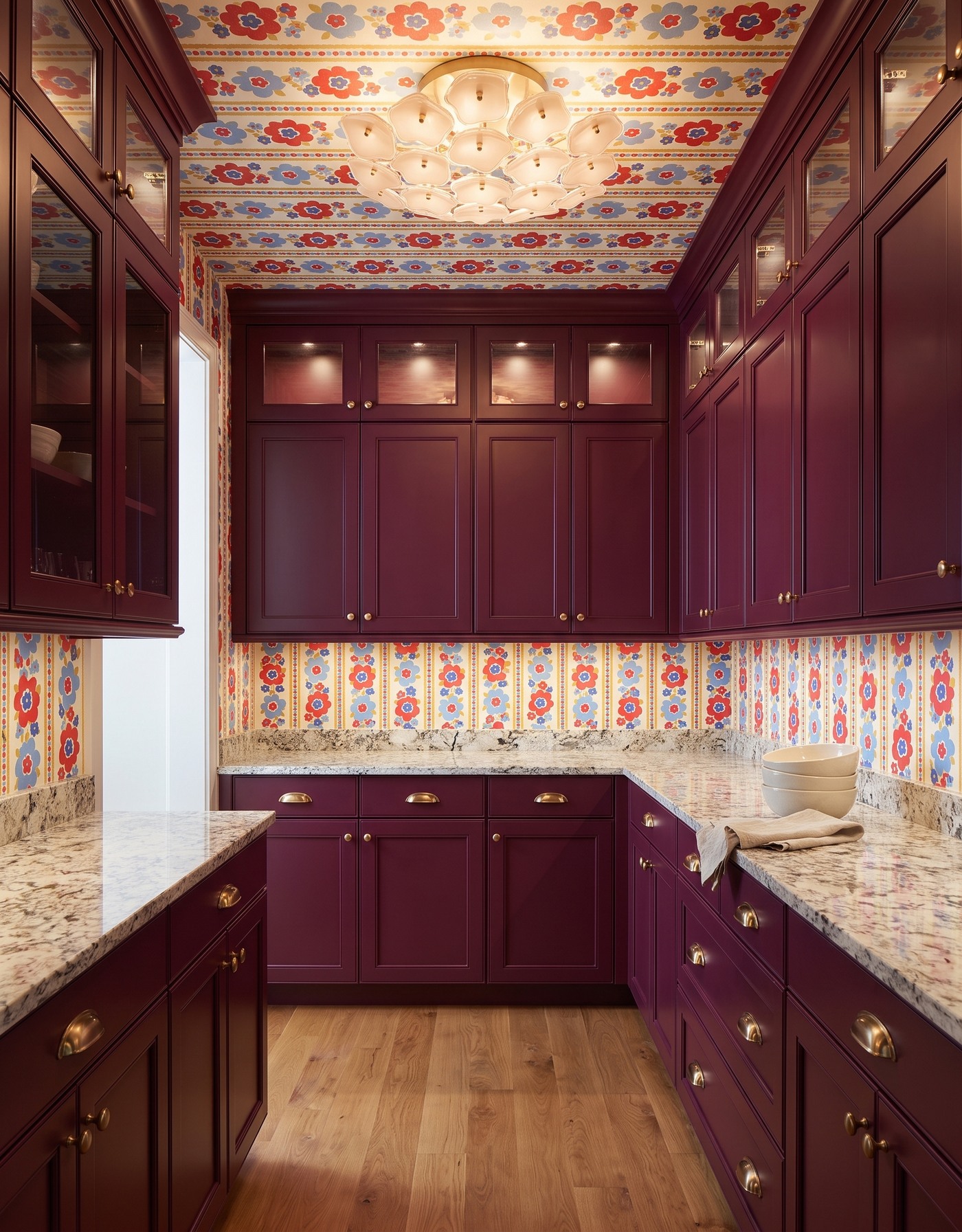
Burgundy framed cabinetry, coral-red and blue floral striped wallpaper, pale speckled counter, warm pale oak floor and blush petal light. AI-generated pantry concept.
A nested cream bowl stack and oatmeal linen sit on the right counter in this richly colored pantry. Burgundy storage gives the room depth, while the floral stripes carry coral-red, blue and warm yellow across walls and ceiling. The pale counter and wood floor keep the lower half of the room legible.
The dishes do not need to become holiday-themed to belong in a room with this much personality. Their simple shapes are the balancing detail. Keep using the service pieces you enjoy, let the permanent finishes provide the fun, and leave enough counter visible that the room still reads as a pantry rather than a decorated display.
Try this: Let bold permanent finishes frame simple service pieces you can use beyond the holidays.
Give your serving pantry a useful holiday-prep reset
1. Choose a counter area to keep clear before adding decorative objects.
2. Gather the plates, bowls, glasses or trays you actually expect to use, rather than buying props to fill space.
3. Try one compact grouping with a contrasting plain ceramic or a useful linen.
4. Let one finish or fixture be the most expressive detail; the serving pieces can stay calmer.
5. Check actual storage dimensions, shelf loads, safe display supports, material care and food-contact suitability with the relevant suppliers. These concepts do not verify installation or performance.
A serving pantry can feel prepared without looking staged for a single holiday. Start with a clear surface, a few pieces you like to use and a finish combination that makes you smile. Save the room that catches your eye, then translate its balance of pattern, color and restraint into a setup that works for your own hosting routine.
Planning a kitchen alongside your pantry refresh? Explore StilePath for kitchen planning. These serving pantry concepts do not imply that the tool verifies pantry installations or dish storage.
Explore kitchen planning