
Pantry inspiration / Everyday ceramics, extraordinary backdrops
10 Pantries Where Everyday Ceramics Steal the Show
The best pantry styling does not require a shelf full of objects bought just to fill it. A favorite pitcher, a few bowls or the plates you reach for every weekend can give the room a personal touch. The surrounding finishes help those everyday pieces feel intentional: dark cabinets behind pale pottery, a lively wall beside quiet dishes, or warm wood beneath a simple serving tray.
These ten butler's pantry concepts explore those relationships as October entertaining inspiration. Each uses a different mix of cabinetry, wallpaper, counter and light, with a small grouping rather than a decorated surface from end to end. Save the pairing that speaks to you, then adapt it to the ceramics you already own and the work your pantry needs to do.
These AI-generated design concepts were created using Anna's prompts and material references. They are inspiration, not completed projects, identified products or verified installation plans.
1. One earthy jug holds its own against woodland toile
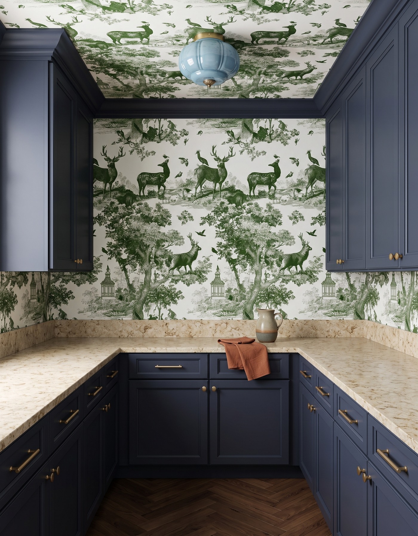
Slate navy cabinets, green-and-ivory woodland toile, warm mottled cream counters, brown herringbone floor and pale blue glass light. AI-generated pantry concept.
The little jug has an earthy two-tone finish that stands apart from the navy cabinetry and green woodland scene. A rust-colored linen gives it a warmer companion. Neither needs to compete in size with the wallpaper's deer and trees; the broad counter around them gives the small grouping room to read.
This is a useful way to make a much-loved piece feel collected rather than lost. Choose a finish background with a clear contrast, then add one textile that relates to the pottery instead of repeating every wallpaper color. The pale blue light keeps the room from settling into an entirely earthy palette.
Try this: Give one characterful jug a clear counter area and one related textile.
2. Cream bowls make a citrus pantry feel calmer
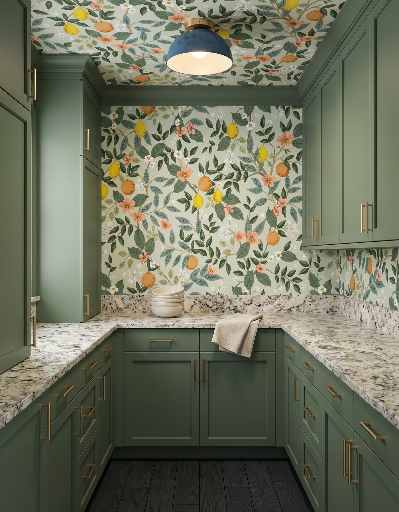
Moss green cabinets, citrus-and-floral wallpaper, pale densely speckled counters, near-black wood floor and blue dome light. AI-generated pantry concept.
Lemons, oranges and flowers already give this pantry plenty of activity. The nested cream bowls bring a plain shape into the middle of it, while the oatmeal cloth adds a softer texture. Green cabinets connect to the foliage without trying to match every leaf.
Notice the contrast in scale: small countertop pieces sit beneath a larger printed wall, and the blue dome is a simple rounded form overhead. When both wallpaper and counter have movement, keep the ceramics uncomplicated. A modest stack can be enough; you do not need another decorative fruit display to explain the citrus theme.
Try this: Balance a lively botanical print with plain nested bowls and a quiet linen.
3. Lidded jars bring everyday purpose to denim blue
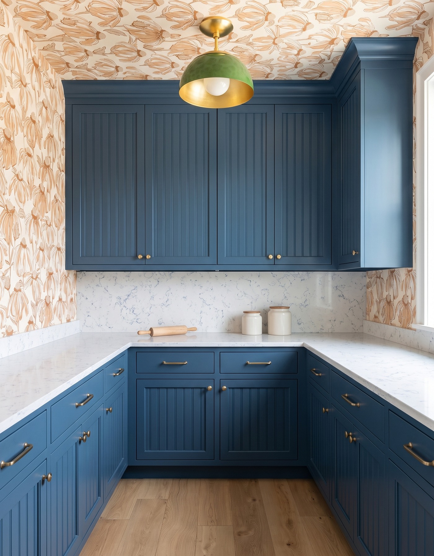
Denim blue beadboard cabinets, cream-and-camel outlined floral wallpaper, white fine blue-gray-veined counters, pale oak floor and green dome pendant. AI-generated pantry concept.
Two cream lidded jars and a wooden rolling pin make this pantry feel connected to everyday preparation rather than staged only for display. Their pale surfaces stand out against the denim fronts. The warm floral outlines above them keep the blue cabinetry from feeling too cool.
The green pendant supplies a distinct accent instead of another blue object. Borrow that separation: let the cabinetry establish the main color, use your practical jars as a calm counter grouping and choose one different accent elsewhere. The image does not identify the jars' contents or establish food-storage suitability; choose real containers for the ingredients you intend to keep.
Try this: Use practical plain jars as part of the styling, without assuming their contents from the image.
4. A small tea grouping softens burgundy storage
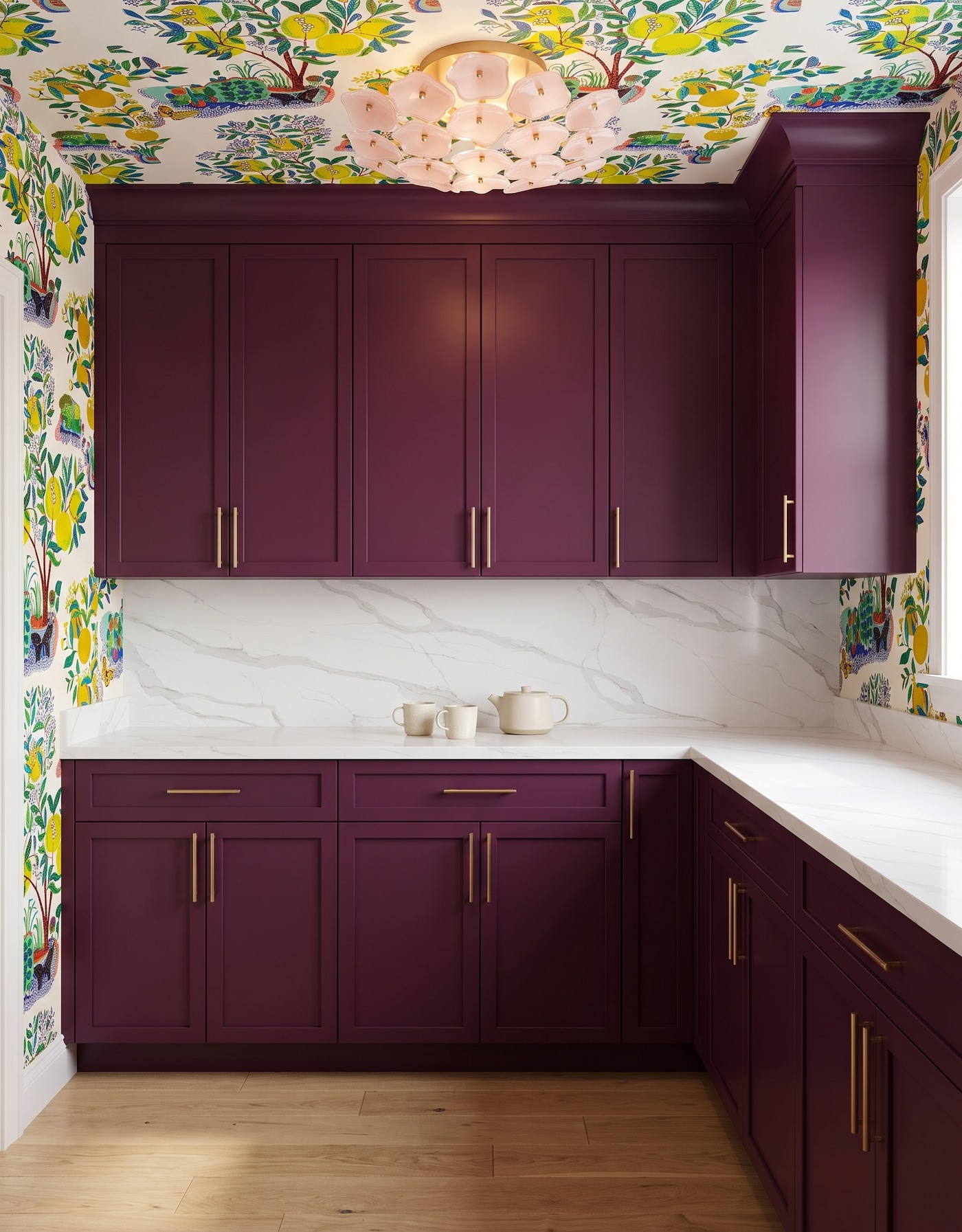
Burgundy cabinets, multicolor lemon-tree wallpaper, white diagonal gray-veined counters, honey wood floor and blush flower light. AI-generated pantry concept.
An ivory teapot and two cups sit together against the pale counter and back panel. The compact grouping is easy to notice even with burgundy cabinetry and a colorful lemon-tree print around it. Keeping the tea pieces one quiet color makes their silhouettes more important than their decoration.
The blush light adds another rounded shape overhead. This combination feels playful without needing a complete tea service spread over the counter. Set out a few pieces you enjoy using, keep their grouping tight and leave the surrounding surface clear. A bold room can support gentle objects rather than demanding equally bold accessories.
Try this: Place a small pale tea grouping against rich cabinets and leave the rest of the counter quieter.
5. A wooden tray collects dishes beneath graphic pattern
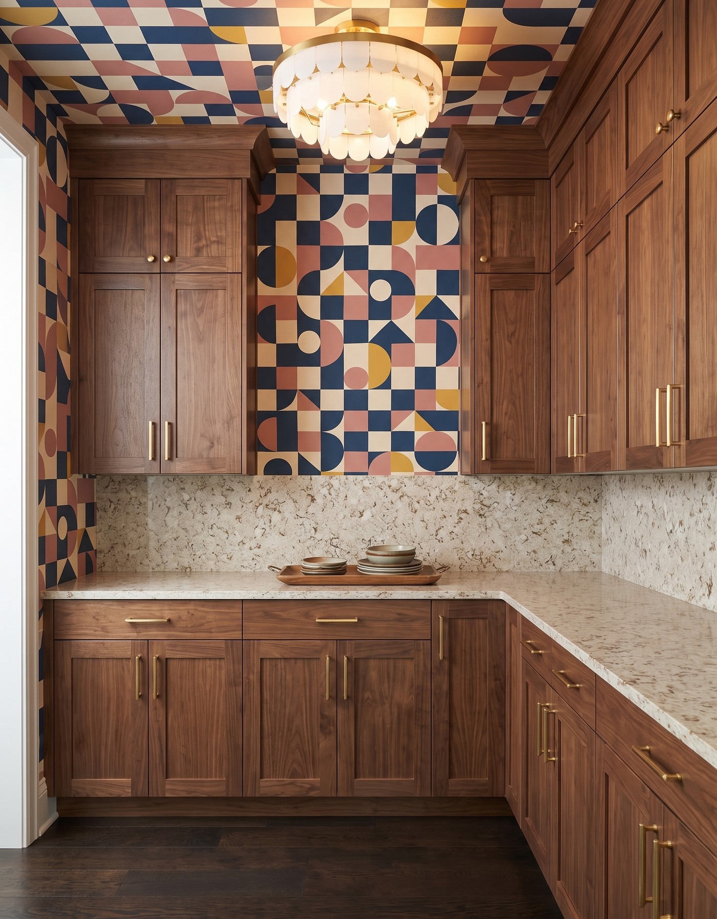
Walnut cabinets, navy-pink-mustard geometric wallpaper, warm mottled cream counters, dark brown wood floor and tiered ivory light. AI-generated pantry concept.
The wooden tray gives several little dish stacks one visual boundary. Muted cream and brown tones relate to the walnut grain without reproducing the wallpaper's squares, triangles and curves. Above, the tiered ivory light introduces a softer shape into a room with strong geometry.
If a handful of ceramics looks scattered, try grouping them on one appropriately sized tray rather than adding more objects. Here the dishes occupy only part of the counter, so the patterned wall remains visible behind them. Use the tray as a styling cue, not a reason to leave every serving piece out all the time.
Try this: Gather small dish stacks on a single tray to make the arrangement feel deliberate.
6. Pale wood turns simple dishes into a display
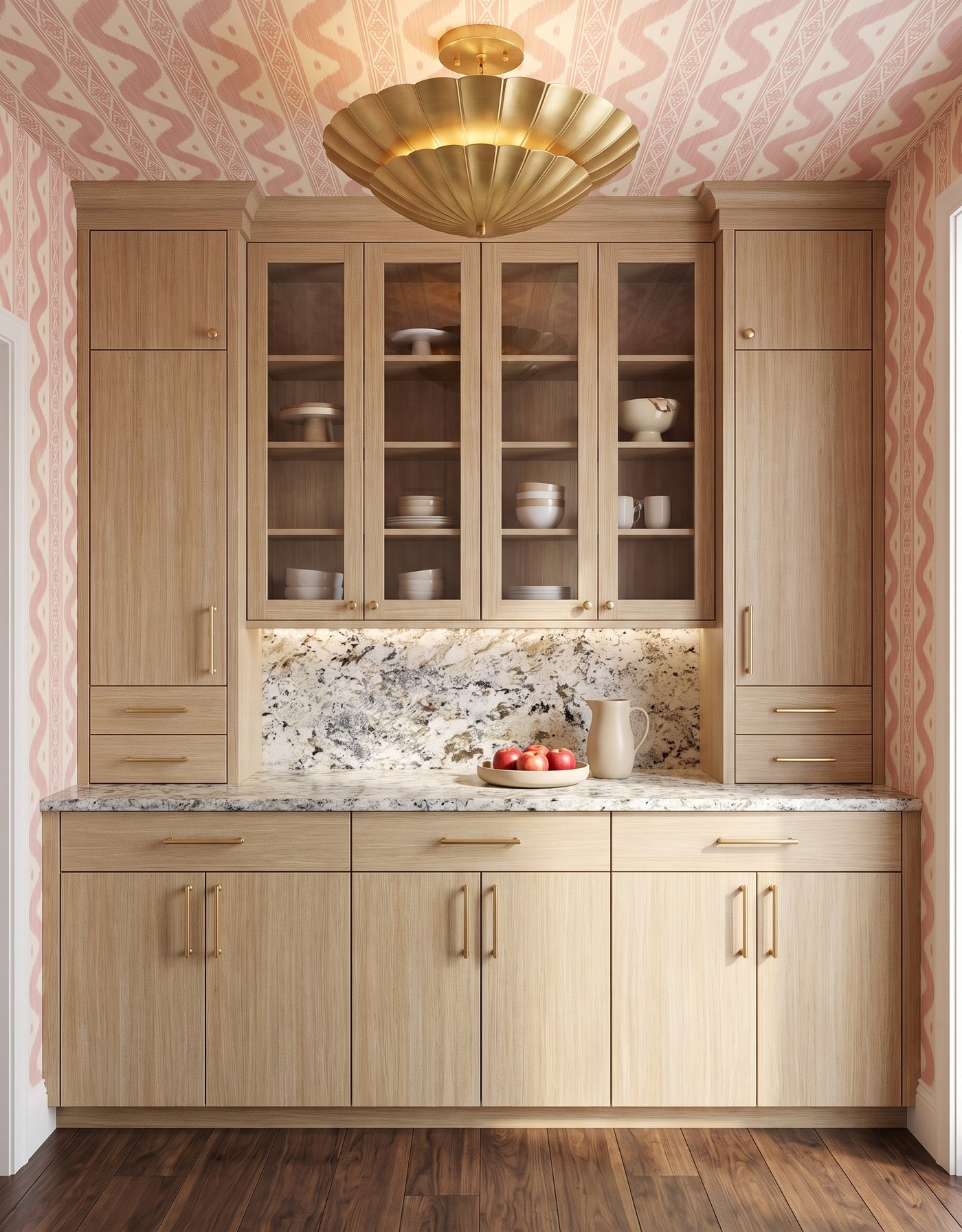
Pale oak cabinets with glazed upper doors, blush-and-ivory ikat wallpaper, pale densely speckled counters, warm brown wood floor and brass petal light. AI-generated pantry concept.
This concept goes beyond a countertop vignette: glazed upper doors reveal a varied collection of pale bowls, cups and serving pieces. The oak frames give the dishes a warm backdrop. On the counter, an ivory pitcher and shallow apple dish form a smaller everyday grouping.
The pieces behind the glass differ in height and outline, while their mostly pale colors help them read as a collection. If you like this idea, compare your actual dishes with cabinet interiors and glazing before planning a display. The image suggests a palette and arrangement, not verified shelf loads, storage capacities or a reason to convert existing solid doors.
Try this: Vary the silhouettes within a restrained ceramic palette when dishes will be visible behind glass.
7. Two vessels stay quiet beside a dramatic counter
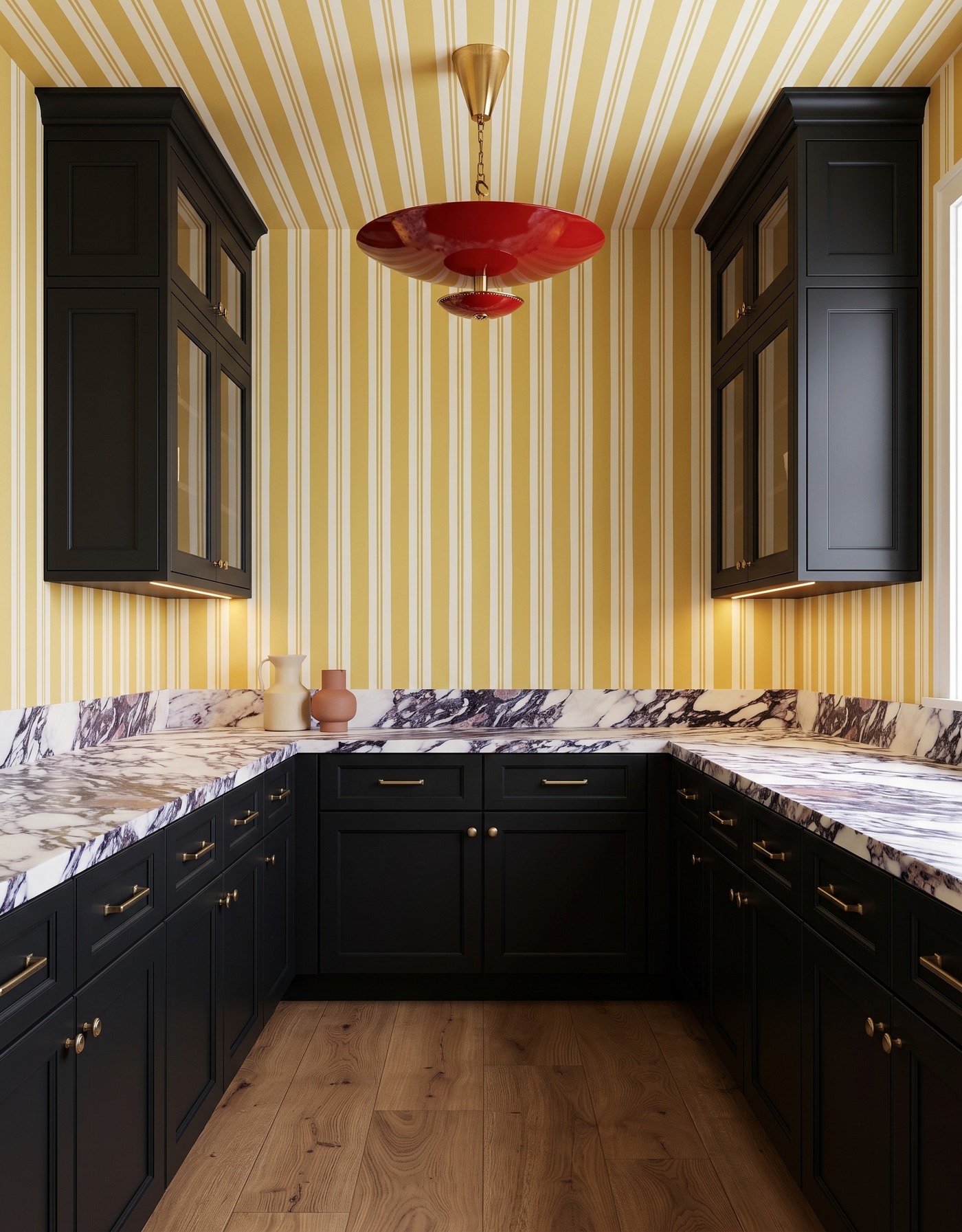
Black cabinets, mustard-and-ivory striped wallpaper, white counters with charcoal and plum veins, warm tan wood floor and red saucer pendant. AI-generated pantry concept.
A cream pitcher and a smaller terracotta vessel are grouped on the left of this patterned counter. Their rounded outlines contrast with the straight wallpaper stripes, while their quiet finishes avoid adding another elaborate pattern. Black cabinetry frames the room, and the red pendant provides the most obvious color surprise.
This is the more expressive surface pairing in the collection. Rather than styling along the entire counter, the two vessels leave a broad visual pause. Try different heights and shapes with pieces you own, then step back: the arrangement should still read as a small grouping, not a row of accessories competing with the stone pattern.
Try this: Keep ceramics plain and grouped when the counter itself has strong movement.
8. An ivory bowl shines against a dark counter
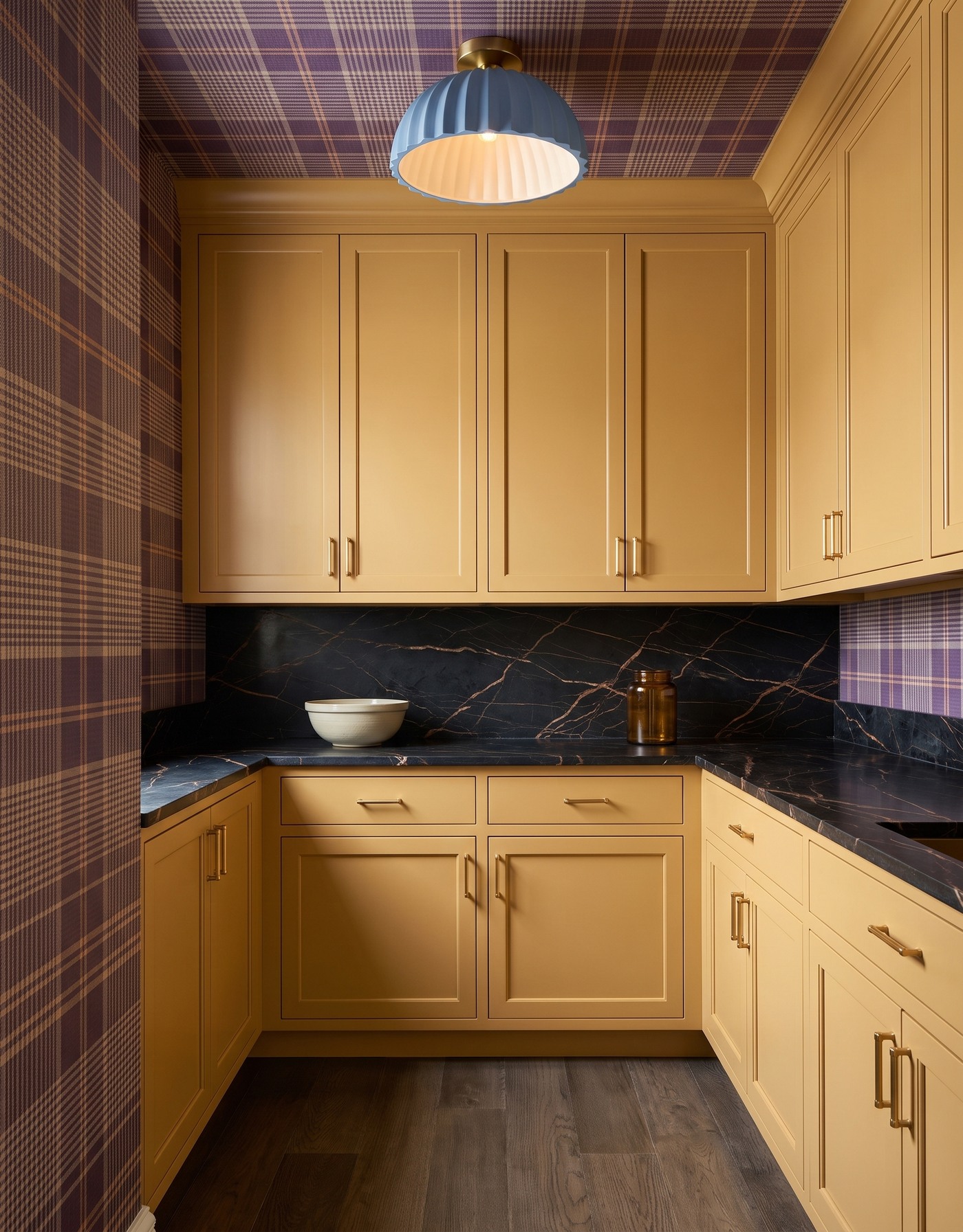
Ochre cabinets, plum-and-tan plaid wallpaper, charcoal bronze-veined counters, gray-brown wood floor and dusty blue pleated light. AI-generated pantry concept.
The ivory bowl is the lightest countertop object in this ochre pantry. A plain amber jar repeats the warmer colors without blending into the bowl. The charcoal counter and back panel make both pieces stand out, while the fine plaid introduces a more tailored pattern than the florals above.
The dusty blue light gives the palette a cooler note. For a similar arrangement, think about the value of the object against the surface it sits on, not just whether its color matches the cabinet. A dark rectangular opening appears at the right counter edge in this concept; no sink, plumbing or installation recommendation is inferred from it.
Try this: Use light ceramics against a dark counter, with one warmer companion rather than many accents.
9. Simple plate stacks let a floral ceiling speak
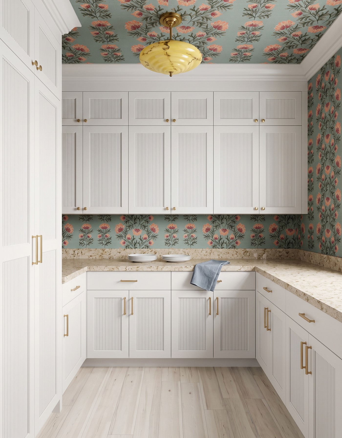
White reeded cabinets, aqua-and-coral floral wallpaper, warm mottled cream counters, whitewashed wood floor and yellow marbled-glass light. AI-generated pantry concept.
White plates connect to the cabinetry, but the warm counter gives their edges enough contrast to remain visible. A blue-gray cloth is the small everyday accent. Above them, coral flowers on an aqua ground continue onto the ceiling, so the pantry does not need extra decorative objects to gain personality.
The reeded fronts add texture without introducing another printed motif. This is an approachable version of bold pantry styling if you prefer pale storage: keep the dishes simple, put the expressive pattern on a defined surface and introduce one contrasting light. The yellow fixture is a distinct accent, not a color that has to appear in every accessory.
Try this: Let expressive wallpaper and cabinet texture frame uncomplicated white plate stacks.
10. A dark platter gives ivory bowls a strong backdrop
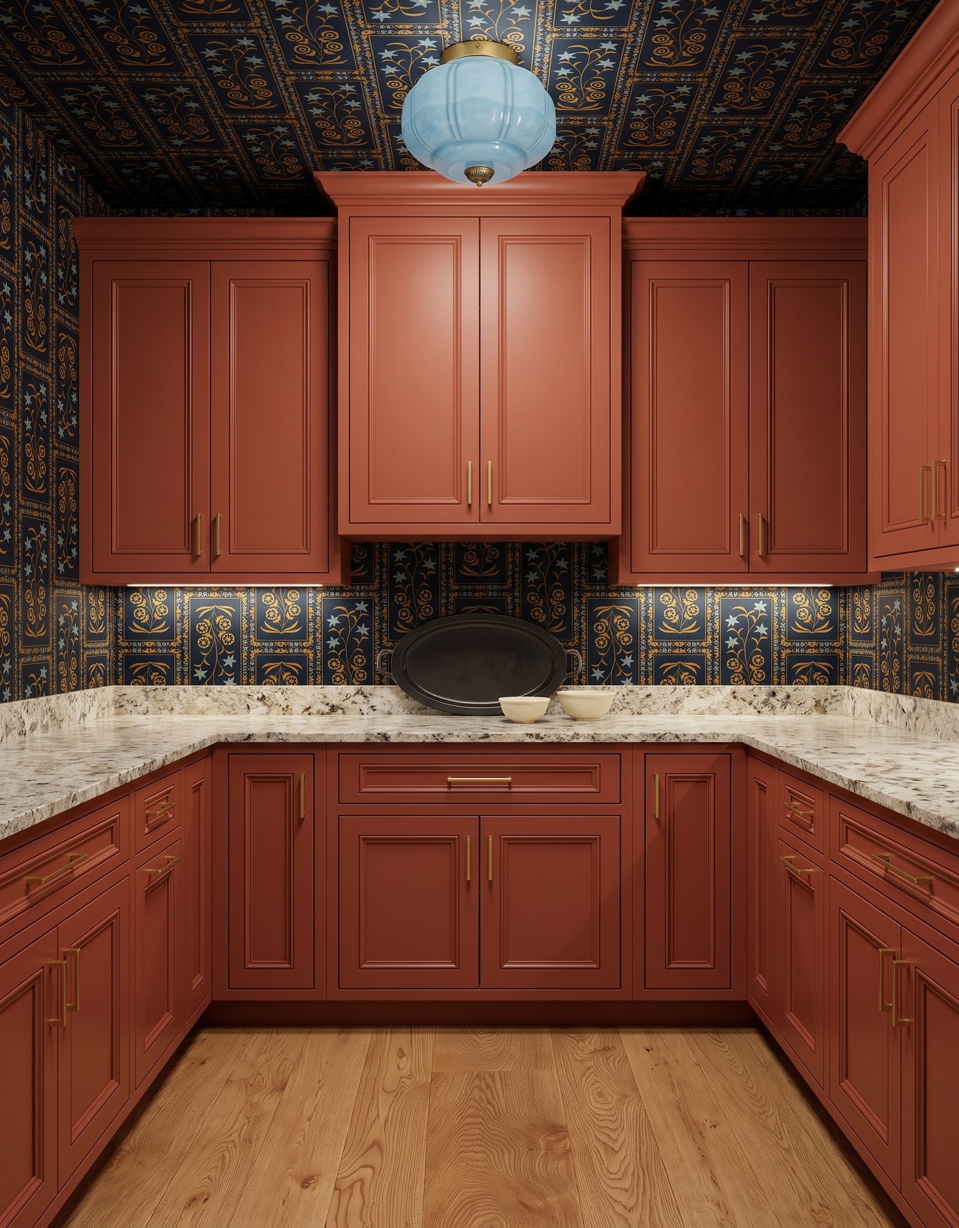
Burnt orange raised-panel cabinets, navy-and-gold framed botanical wallpaper, pale densely speckled counters, golden wood floor and pale blue glass light. AI-generated pantry concept.
The dark oval platter sits upright behind two ivory bowls, giving the pale pieces a clear backdrop. Burnt orange cabinetry supplies the warm color, while the navy-and-gold wallpaper carries a more intricate pattern. The small counter grouping does not try to repeat all that detail.
A pale blue light breaks up the warmer finishes overhead. Borrow the contrast between serving pieces rather than copying the whole room: a dark platter beside light bowls can make an existing collection feel more intentional. If you display a platter upright at home, use a suitable stable support; an inspiration image does not verify how a leaning object is secured.
Try this: Create contrast within the ceramic grouping itself, using a dark serving piece beside pale bowls.
Style a collected pantry without crowding it
1. Start with dishes you actually use or enjoy, rather than purchasing objects to fill every surface.
2. Choose one small grouping and leave the surrounding counter visually clear.
3. Vary height, silhouette or texture; avoid repeating the same arrangement in every corner.
4. Compare the ceramic color with the counter and cabinet background as well as the wallpaper.
5. Check real shelf loads, stable display supports, food-contact suitability and material care with the relevant suppliers. These concepts do not verify product performance or installation.
A pantry can be bold in its finishes and restrained in its styling. One pitcher, a nested bowl stack or a compact tray of dishes can make a room feel personal without hiding the counter. Save a favorite relationship from this collection, then make it your own with the pieces that belong to your everyday routine.
Planning a kitchen alongside your pantry refresh? Explore StilePath for kitchen planning. These ceramic styling concepts do not imply that the tool verifies pantry installations or dish storage.
Explore kitchen planning