
Pantry ideas · Color & canning storage
10 Pantries That Make You Want to Can
Rows of colorful jars can make a pantry feel like a collection worth caring for. Give them a thoughtful backdrop, some clear counter space and cabinetry with personality, and the room becomes more than the place you put the extra groceries.
These ten pantry concepts pair expressive wallpaper with coordinated cabinet colors and canning-storage details. Some feel cheerful, others more dramatic, but each keeps the idea focused: an attractive room that still has useful space for jars, tools and everyday supplies.
This is design and storage inspiration, not a guide to processing or storing preserved food. The rendered jars are styling details. Follow tested preservation guidance and the requirements of the products you actually store; an image cannot establish food safety.
These images are AI-created design concepts using Anna's pantry prompt and material references. The prompt's coffee-service props were replaced with canning-storage styling. These are not completed projects or food-preservation instructions.
1. Give natural oak a sunny daisy surround
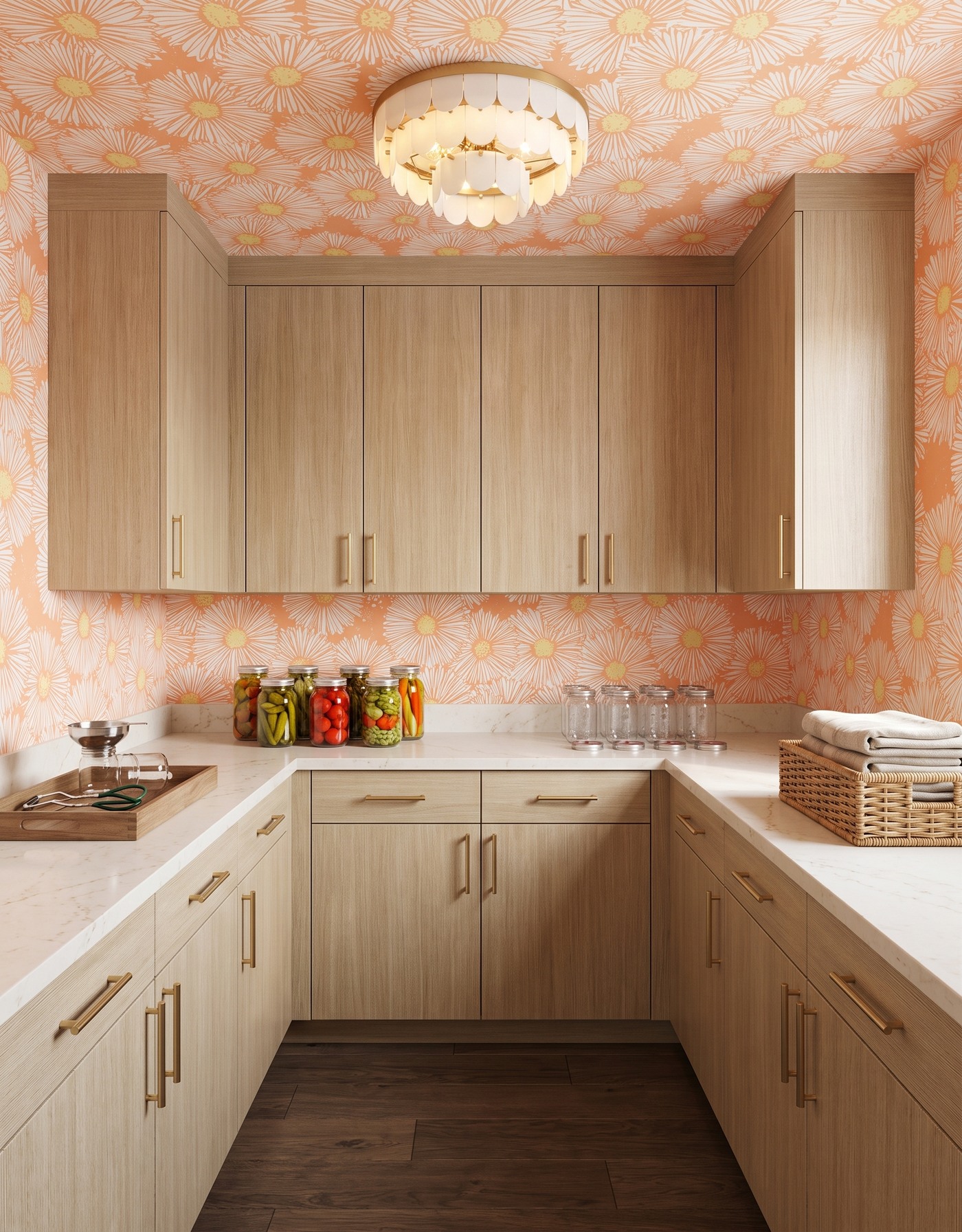
Natural-wood pantry cabinets beneath peach daisy wallpaper, with dark floors, pale counters, preserving jars and an ivory scalloped light.
Natural-oak cabinetry and a peach-toned daisy print bring warmth in two different ways: one through grain, the other through color and shape. A darker floor keeps the pale wood from blending into a single light field. The countertop remains a useful visual pause.
This is a strong option if you want a playful pantry without painting every cabinet. Choose a wallpaper with a clear, readable motif, then keep baskets and other storage pieces simple. The wood already supplies texture, so additional materials do not all need to be elaborate.
Try this: Let natural grain and one graphic floral carry the room's personality.
2. Start with a citrus-green pantry
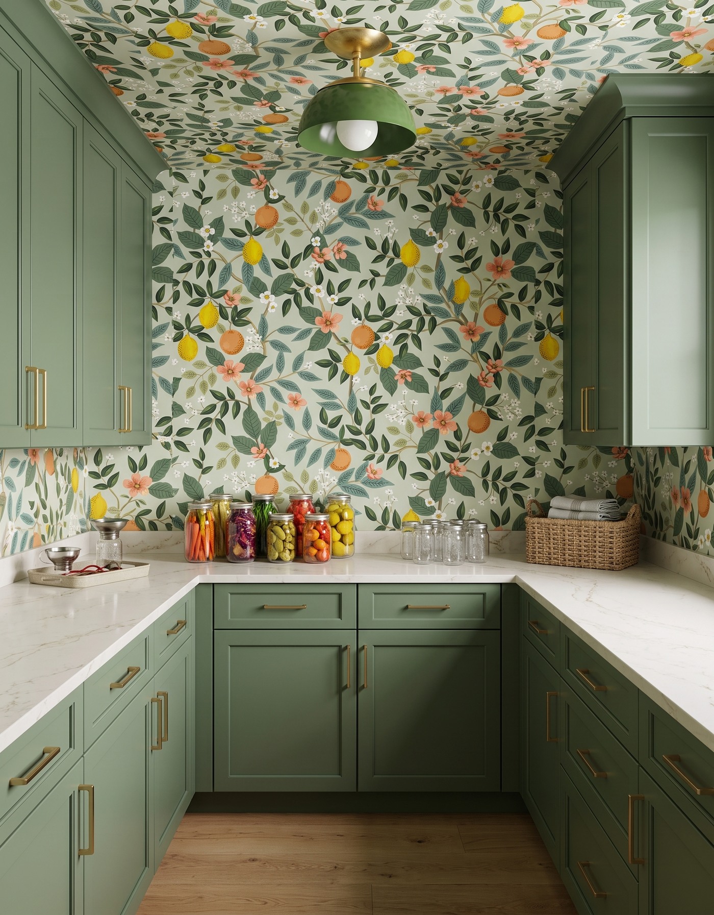
Moss-green pantry cabinets with citrus wallpaper, pale counters, preserving jars and a green dome light.
Moss-green cabinets and citrus wallpaper make this pantry feel lively without needing much on the counter. The leaves connect the wall pattern to the cabinetry, while the fruit colors echo the small collection of jars. A green light continues the palette overhead.
The useful idea is to group the small things. A tray gives tools a defined place, empty jars sit together, and the remaining countertop can still read as a surface rather than a display shelf. In your own pantry, plan that clear area before deciding how many decorative objects to add.
Try this: Group jars and tools deliberately, and protect a clear stretch of counter.
3. Frame colorful jars with aqua and coral
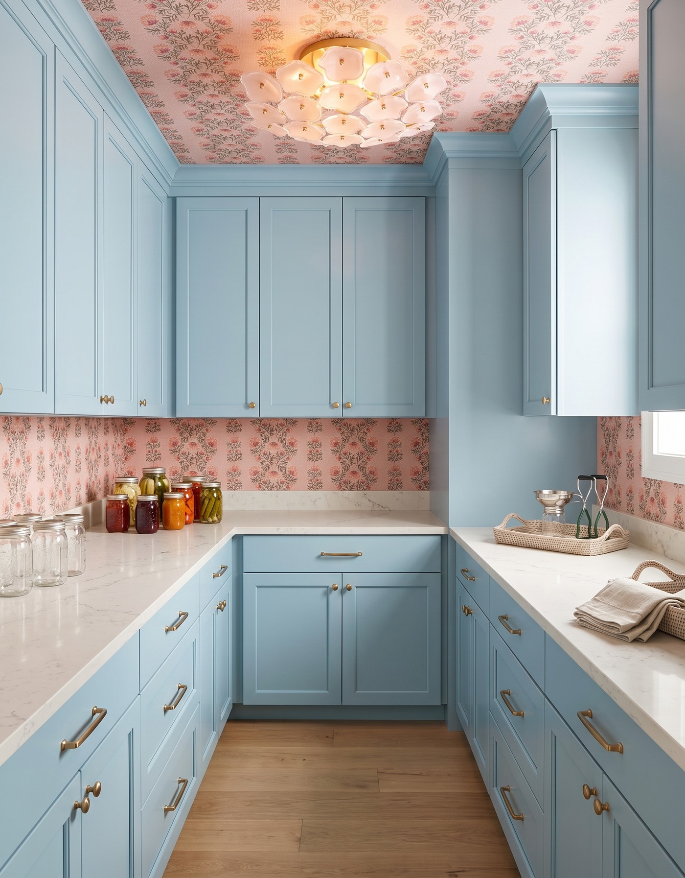
Aqua pantry cabinetry with coral flowers on pink wallpaper, pale counters, grouped glass jars and a pink flower-shaped light.
Aqua cabinetry gives the room a cool base, while coral flowers make the wallpaper feel warmer and more animated. The light counter separates the cabinets from the pattern. Glass jars add another transparent material without introducing a large new color block.
If you love a busy floral, let it do most of the decorating. Repeating similar jar shapes and keeping tools together will make the storage easier to read against the print. The goal is not to make supplies disappear, but to give them enough order to coexist with the pattern.
Try this: Use consistent container shapes to keep storage legible in front of a lively floral.
4. Make golden storage feel a little dramatic
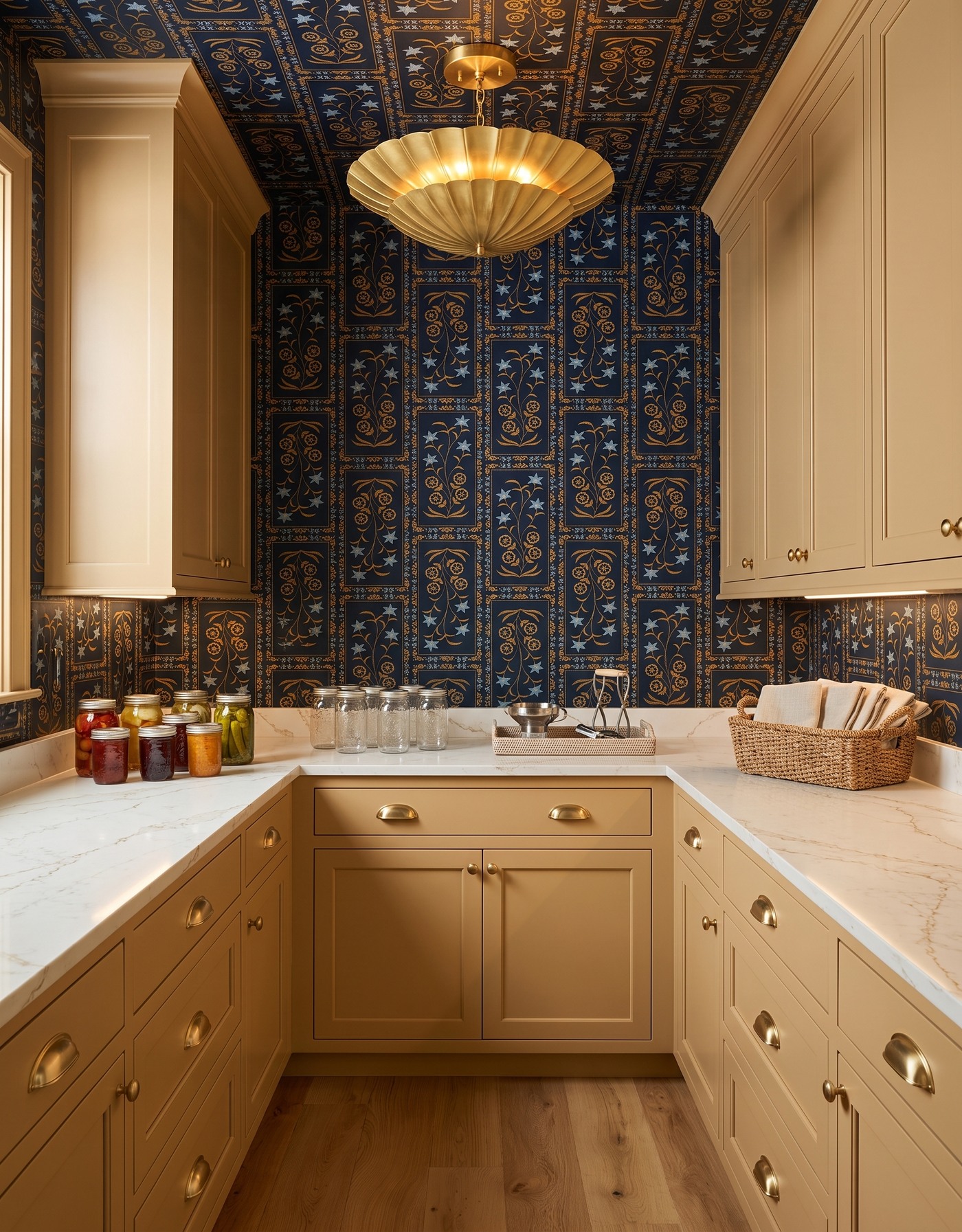
Golden pantry cabinetry framed by dark botanical wallpaper, with pale counters, grouped jars and a gold scalloped light.
Golden cabinetry looks richer against the dark ground of a botanical print. The wall and ceiling pattern gives the pantry an enveloping character, while the pale countertop provides a clear break around the room. Small glass jars are enough to finish the scene.
A dark print deserves a full-size sample review before it surrounds a small space. Look at the background color, the scale of the repeat and how much of it will remain visible around cabinetry. The overall effect matters more than a beautiful close-up of one flower.
Try this: Balance an enveloping dark print with a light, visually continuous counter.
5. Put berry cabinets beside leafy blue stripes
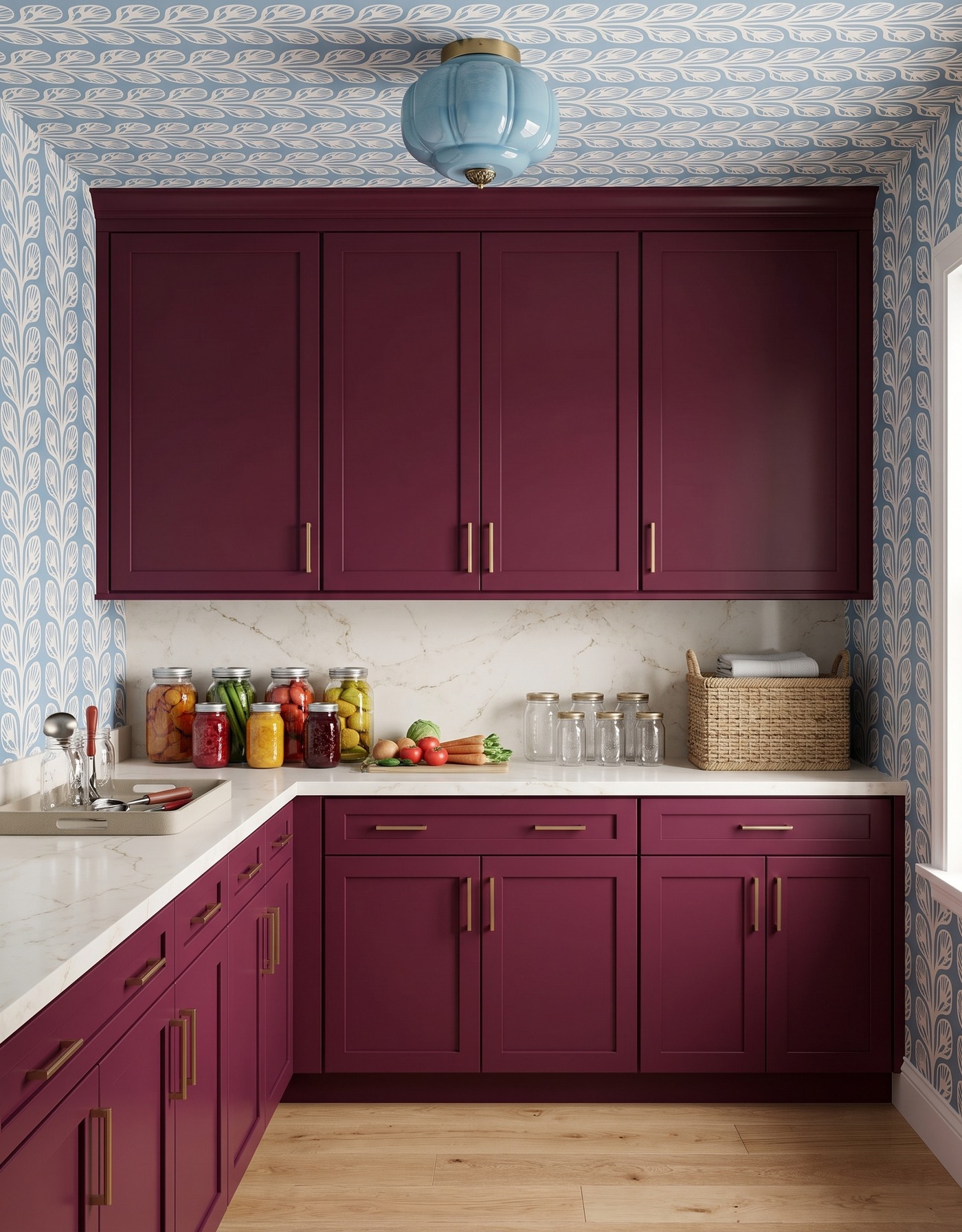
Berry pantry cabinets with blue-and-cream leafy wallpaper, pale slab backsplash, glass jars and a pale-blue light.
Berry cabinetry gives the pantry warmth and depth. Blue-and-cream leafy stripes add a cooler, more ordered pattern around it. The contrast feels a little unexpected, especially with brass-toned details connecting the stronger colors to the pale counter.
A striped rhythm can work well with grouped supplies, but do not use the image to infer shelf sizes or storage capacity. Measure the jars, baskets and tools you actually own before planning drawers or cabinets. The palette is inspiration; the storage dimensions need their own work.
Try this: Borrow the berry-and-blue relationship, then size storage around real supplies.
6. Give smoky blue a plum-plaid backdrop
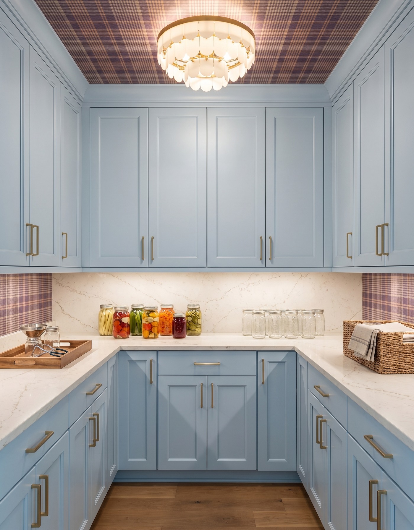
Smoky-blue pantry cabinetry with a plum plaid ceiling, pale counters, preserving jars and an ivory scalloped light.
Smoky-blue cabinets and plum plaid make this pantry feel tailored rather than sugary. The pattern has a smaller, more regular rhythm than the larger florals in this collection. A pale counter keeps a simple horizontal line between the patterned wall and the cabinetry.
For a room full of small useful objects, that visual structure can be appealing. Keep a few related storage materials instead of choosing a different basket or container for every task. A consistent approach helps the room look organized even when the shelves are not styled for a photograph.
Try this: Use a restrained group of storage materials alongside a regular plaid pattern.
7. Let burnt orange meet a graphic blue print
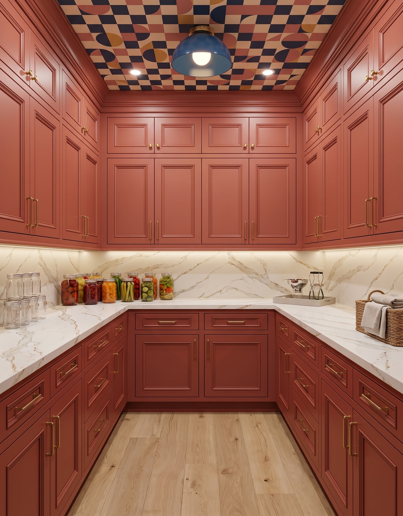
Burnt-orange pantry cabinets beneath a navy-and-ochre geometric ceiling, with pale counters, jars and a blue dome light.
Burnt-orange cabinetry and a navy, cream and ochre geometric pattern give this pantry a confident retro edge. The warm cabinet finish connects to the warmer blocks in the wallpaper, while blue provides the counterpoint. The room does not need a novelty sign to have character.
Keep the work surface simpler than the walls. A compact group of jars, a tool tray and one basket can be enough. When the pattern is already assertive, clear space becomes part of the design rather than something that needs filling.
Try this: Treat empty counter space as a useful contrast to bold geometric wallpaper.
8. Soften a retro floral with mauve cabinetry
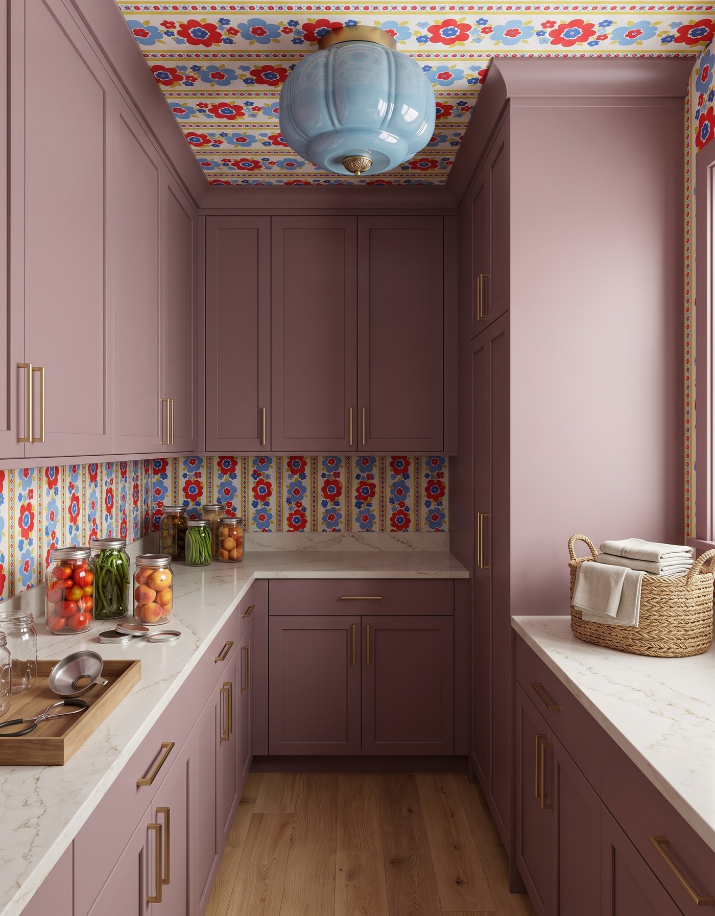
Mauve pantry cabinets with red-and-blue floral wallpaper, glass jars, a towel basket and a pale-blue light.
Mauve cabinets bring a quiet, dusty color beneath a brighter floral stripe. Red, blue and yellow details make the print energetic, while the larger cabinet surfaces stop the room feeling like a collection of tiny competing accents. The pale counter gives the eye another place to rest.
This is a helpful way to use a wallpaper you love but find a little loud on its own. Pair it with a muted color from the same general mood, not necessarily the brightest color in the print. Then test the combination under the pantry's actual light.
Try this: Choose a muted cabinet partner for a multicolor print instead of repeating its brightest accent everywhere.
9. Warm up an ink-black pantry
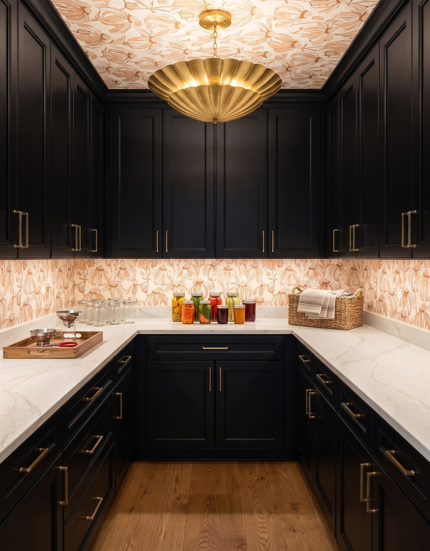
Black pantry cabinets beneath a warm cream botanical ceiling, with pale counters, preserving jars and a gold scalloped light.
Ink-black cabinetry gives a warm botanical print a strong frame. The cream and camel tones in the pattern keep the room from feeling stark, and the light counter makes the jars and small tools easier to distinguish. The result is moody without depending on dim lighting.
That distinction matters in a working pantry. Plan enough useful light to identify supplies and see the counter clearly. The decorative fixture is only one part of that decision; confirm the lighting layout and storage access for your actual room.
Try this: Pair dark cabinetry with a warm print and plan practical visibility separately from mood.
10. Make deep blue feel joyful with citrus trees
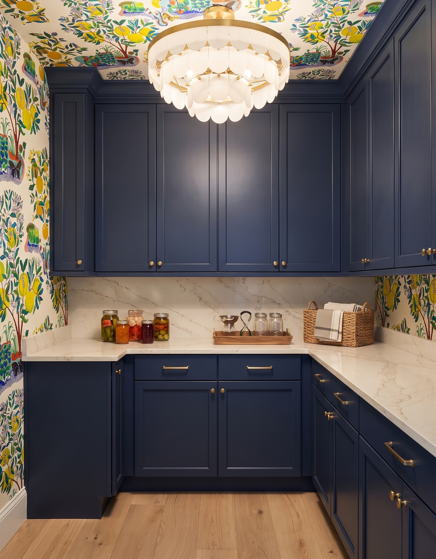
Deep-blue pantry cabinets with citrus-tree wallpaper, pale counters, preserving jars and an ivory scalloped light.
Deep-blue cabinetry anchors a playful citrus-tree pattern. Yellow fruit brings a bright detail to the walls and ceiling, while the darker cabinets give the room enough weight to keep the print from feeling overly sweet. Small jar groupings fit naturally into the palette.
If you borrow this combination, let the wallpaper remain the main decorative layer. You do not need every towel, basket and container to repeat its colors. A few quieter practical pieces will make the stronger choices feel more intentional.
Try this: Let a deep cabinet color ground a playful print, then keep everyday accessories simple.
Plan the pantry before filling it
1. Inventory the jars, tools and supplies that need a place.
2. Measure storage needs rather than estimating capacity from a concept image.
3. Reserve clear counter space for the tasks you intend to do there.
4. Check wallcovering and countertop care requirements for the intended use.
5. Plan lighting and follow appropriate preservation and storage guidance for actual food.
A pantry can be useful and have a point of view. Save the color pairing that makes you want to open the door, then build the storage plan around your own supplies. Good organization gives the bold choices room to look their best.
Planning a pantry as part of a kitchen project? Start by understanding the larger room and its layout.
See how StilePath kitchen planning works