
Home library inspiration / Deep color, lively texture, autumn reading
10 Moody Home Libraries Without the Gloom
A moody home library should make you want to pull a book off the shelf, not turn on every light just to find it. Deep cabinetry can provide the atmosphere while a pale ceiling, readable materials and a few brighter surfaces keep the room inviting. The interesting part is choosing where that contrast lives: in a plum rug, a pair of aqua glass sconces or an unapologetically cheerful wallpaper.
These ten built-in library concepts explore that balance without repeating one decorating formula. Black storage gets two very different textile partners; berry becomes tailored in one scene and floral in another; walnut moves between colorful side walls and a quieter botanical backdrop. Compare the relationships rather than shopping for a room by the picture. The combination worth saving is the one that suits both your taste and the books you actually live with.
These AI-generated design concepts were created using Anna's prompts and material references. They are inspiration, not completed projects, identified products or verified cabinet, electrical and installation plans.
1. Black built-ins need a lighter counterpoint, not less personality
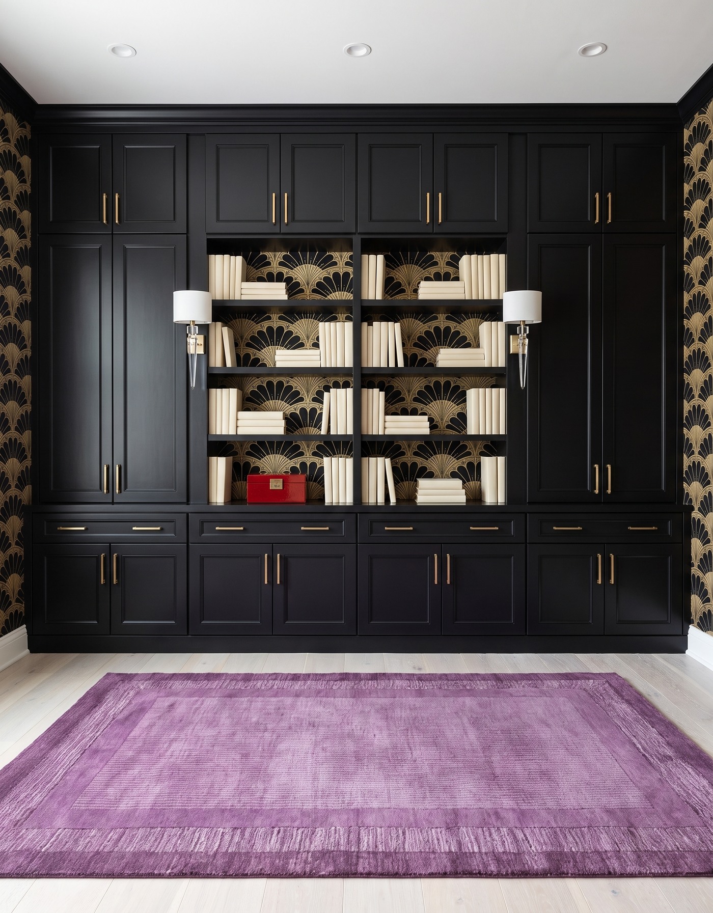
Ink-black framed cabinetry with closed side and upper storage, gold fan wallpaper on shelf backs and side walls, pale wood floor, plum tonal rectangular rug and ivory drum-and-crystal wall sconces. AI-generated library concept.
Black gives this library its architectural weight, but the cream books and ivory shades keep the open display areas easy to read. Gold fan shapes introduce a decorative rhythm between the shelves and continue onto the side walls. The patterned surface is framed by substantial closed storage rather than covering every part of the cabinet wall.
The plum rug is the softer surprise. Its broad tonal borders make a different kind of pattern from the smaller fans above, so the room feels layered rather than densely matched. A small red box adds one warmer shelf accent. Save this pairing if you want dramatic cabinetry with a textile color that is richer than beige but gentler than a bright red.
Try this: Give black storage a pale light fixture and one broad, warm textile color.
2. Berry and blue turn a dark library into a tailored color story
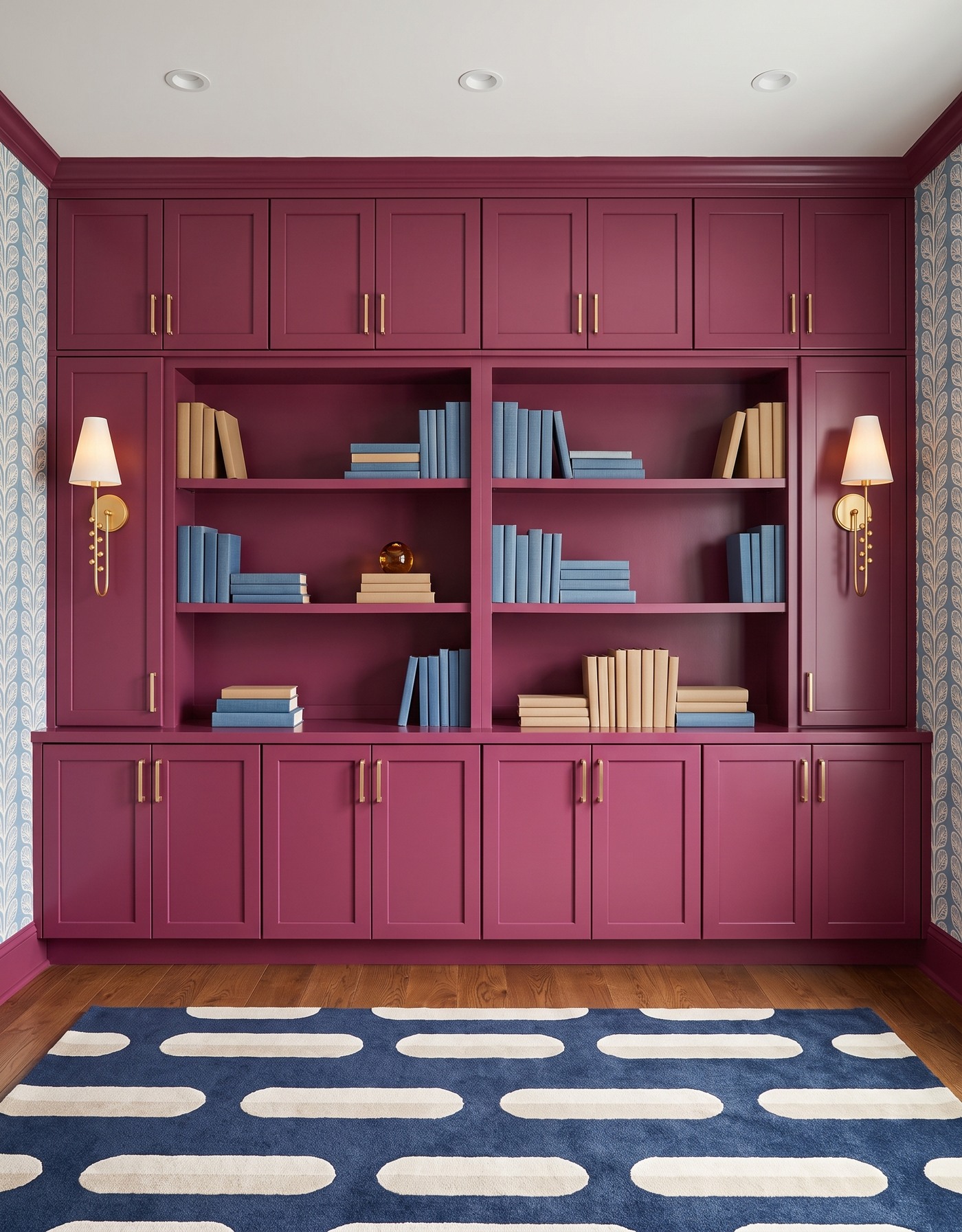
Berry framed built-ins with plain berry shelf backs, pale blue-and-cream leaf wallpaper on side walls, warm brown wood floor, navy-and-cream capsule-pattern rug and tall ivory-shaded brass sconces. AI-generated library concept.
Berry cabinetry feels especially expressive beside cooler blue. Here the wallpaper stays at the sides while the plain cabinet backs give the blue and tan books a calmer setting. The tall cream shades bring light areas onto the cabinet wall, and the slim brass stems keep the fixture silhouette delicate.
The rug makes the larger graphic statement: rounded cream capsules across a navy ground. That contrast in scale lets the leafy walls remain decorative without competing for the same attention. An amber paperweight is the small warm accent on a shelf. This is a useful pairing to compare with the black library if you want depth that feels colorful rather than nearly monochrome.
Try this: Pair a rich berry cabinet finish with cooler blue patterns at two different scales.
3. A yellow rug gives navy shelving a sunny edge
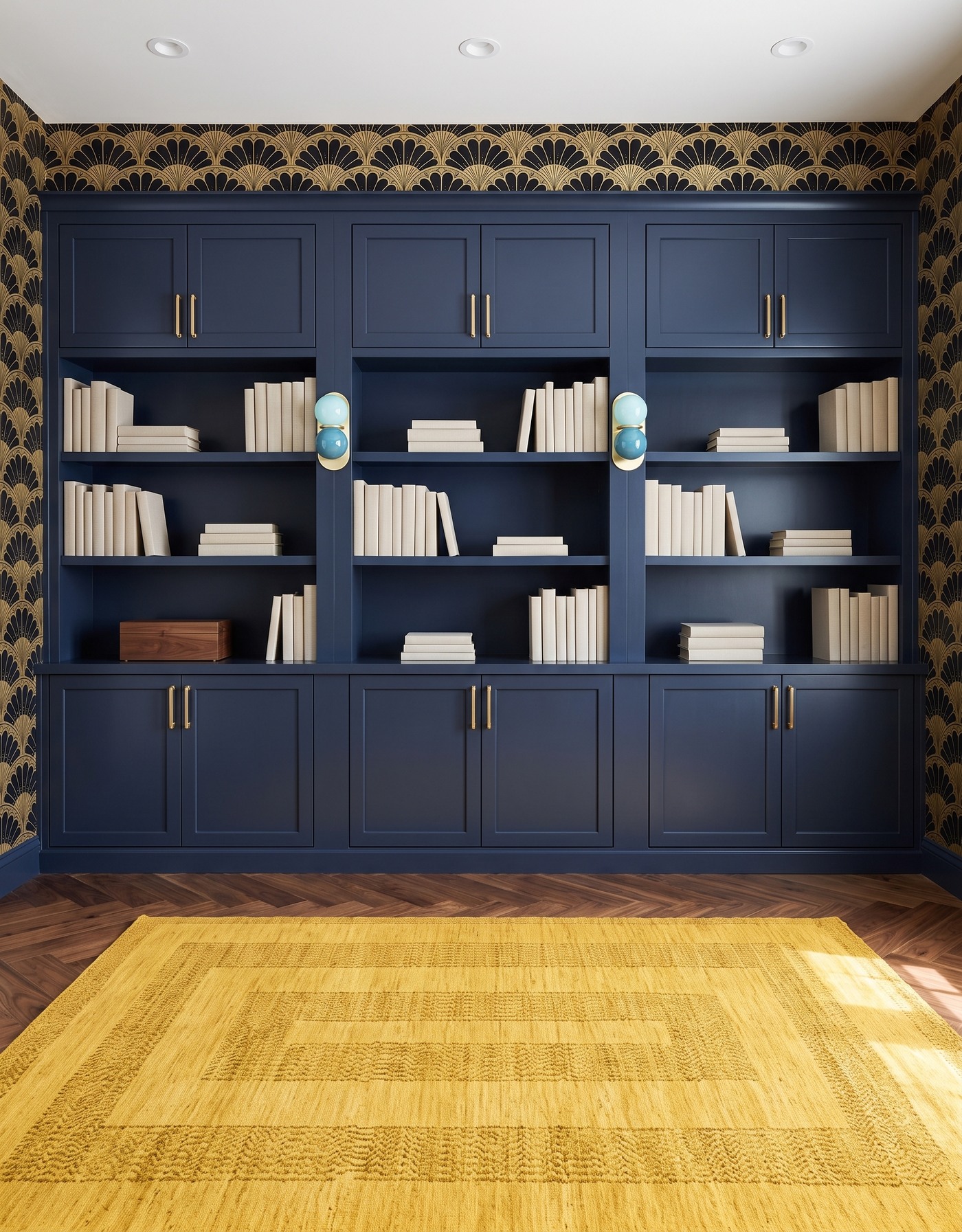
Navy framed cabinetry with closed upper cupboards and plain navy shelf backs, black-and-gold fan wallpaper on surrounding walls, warm brown herringbone floor, yellow tonal rectangular rug and paired aqua glass globe sconces. AI-generated library concept.
Navy shelving makes the pale books stand out, while a yellow rug gives the floor a brighter focal area. The cabinet wall stops below the ceiling in this concept, leaving a patterned strip above it. That visible separation is part of this particular composition, not an example of cabinetry extending all the way to the ceiling.
The two-tone aqua glass sconces are a playful partner for the more formal fan wallpaper. A simple walnut box gives the shelves one wood accent, and the herringbone boards add another geometric rhythm below. Notice that the books sit against navy backs, not wallpaper: keeping one broad surface plain gives these different patterns room to coexist.
Try this: Use a warm yellow textile and a cooler glass light to loosen up formal navy storage.
4. Walnut grain can carry the mood while flowers bring the fun
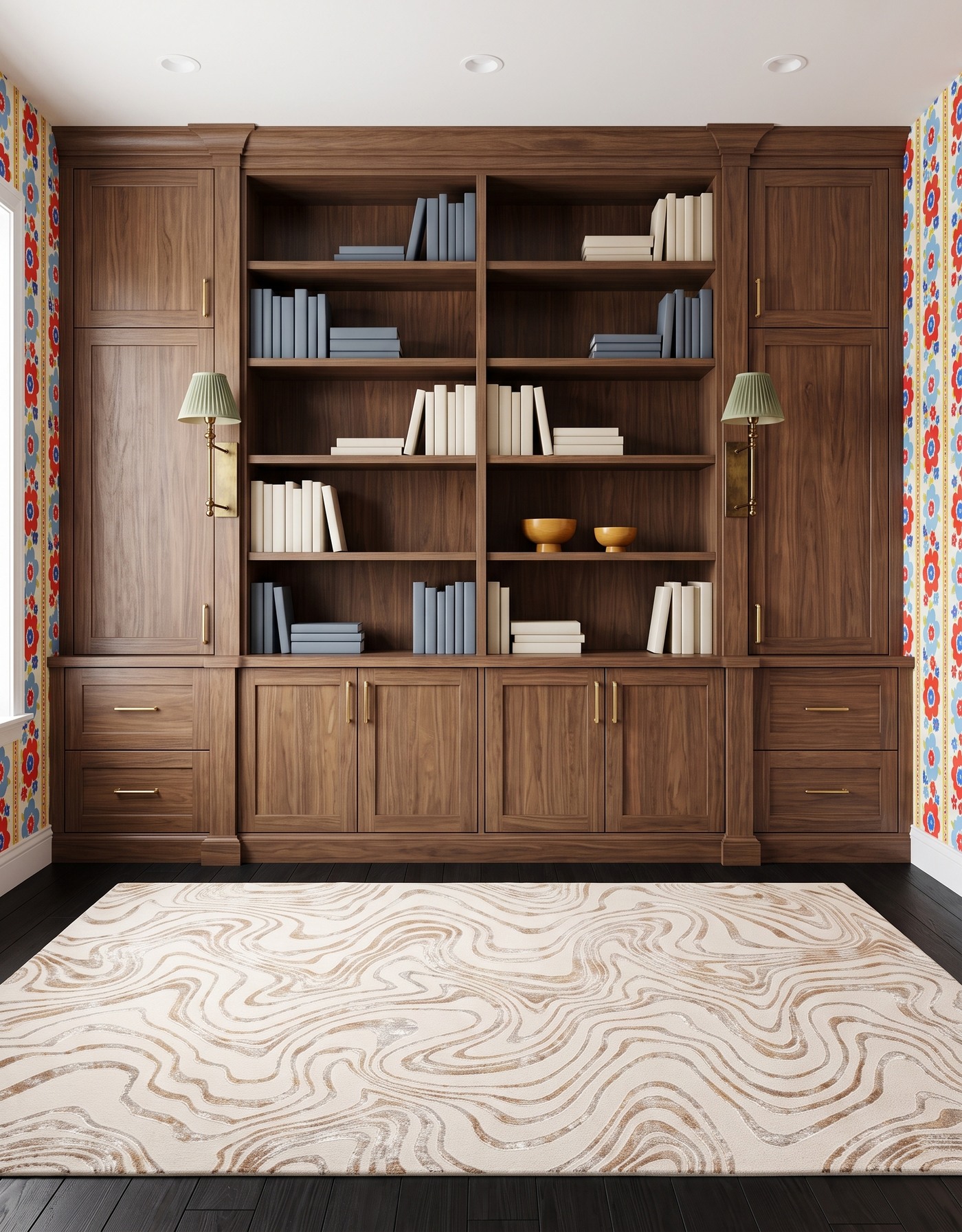
Walnut framed built-ins with plain wood shelf backs, red-and-blue floral wallpaper on side walls, dark wood floor, cream-and-tan contour-pattern rug and sage pleated wall sconces. AI-generated library concept.
This library does not rely on painted cabinetry for its depth. Walnut grain is the broad foundation, with a darker floor and a lighter rug creating a clear change in value underfoot. The central shelf backs remain wood, so the floral paper at the sides feels like a cheerful frame rather than an all-over backdrop.
Sage pleated shades soften the colorful walls, while blue-gray and ivory books echo the cooler and lighter notes. Two small ochre bowls add warmth without filling every empty shelf. The useful idea is restraint around one lively pattern: the wood, contour rug and simple book groups all give the flowers somewhere to settle.
Try this: Let warm grain lead and keep the strongest floral pattern at the room's edges.
5. Olive scallops and red sconces make traditional details feel mischievous
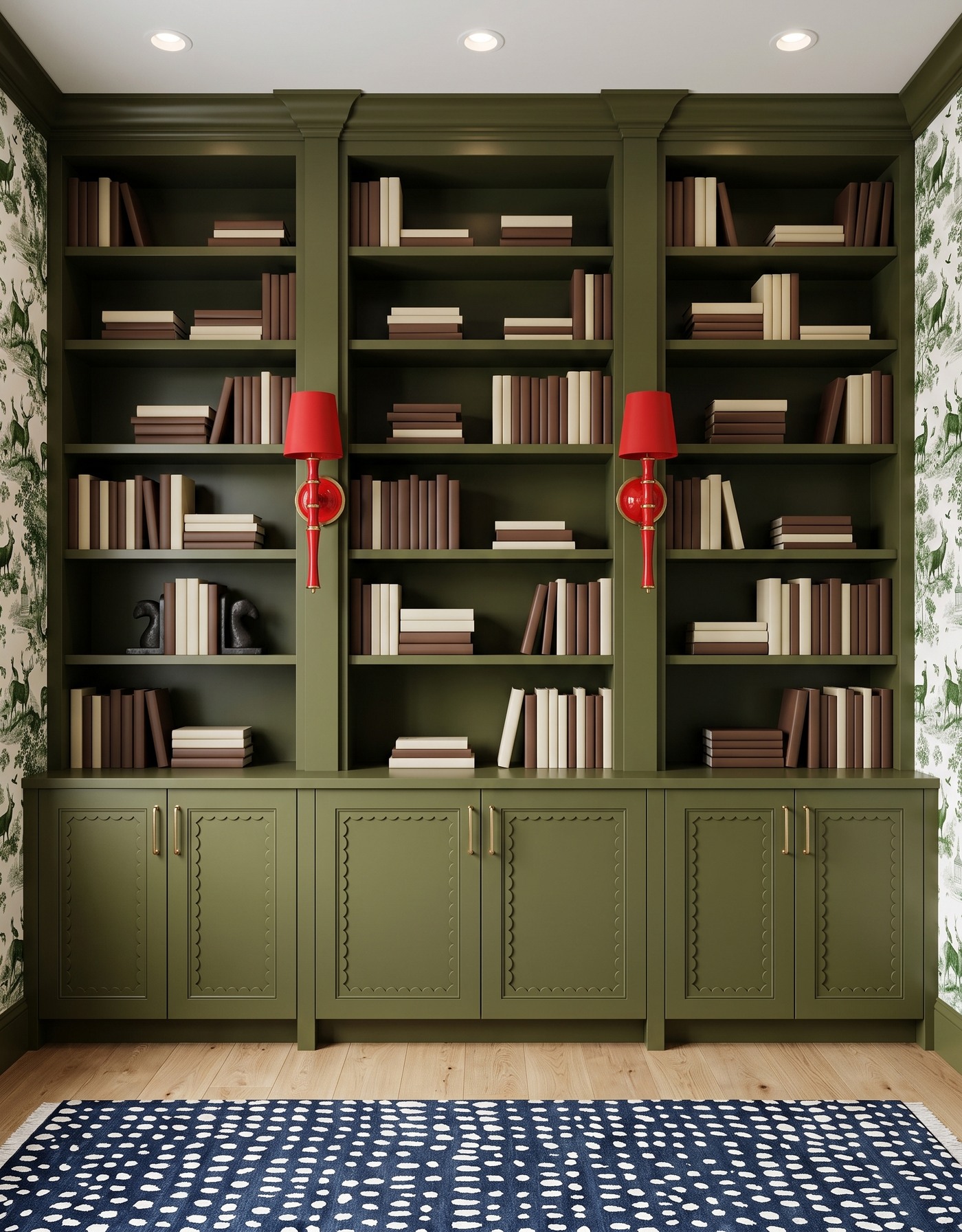
Olive built-ins with scalloped lower cabinet panels and plain olive shelf backs, green-and-cream toile side walls, pale wood floor, navy-and-ivory dotted rug and red bamboo-style wall sconces. AI-generated library concept.
The scalloped lower panels give this olive cabinet wall a decorative character before any accessories are added. Green toile extends the quieter color story onto the side walls, while the navy dotted rug shifts the pattern language from illustrative to graphic. Cream and chocolate book groups stay readable against the deep shelf backs.
Red wall sconces provide the deliberately cheeky contrast. Their slender bamboo-like stems are more specific than a generic brass light, and the two dark sculptural bookends add a smaller shape on one shelf. Compare this with the walnut floral scene: both are patterned, but the olive version gets its energy from the red-and-green relationship rather than a colorful wallpaper field.
Try this: Choose one unexpected light-fixture color to give traditional cabinet details a playful edge.
6. Black and coral can feel warm without turning the room orange
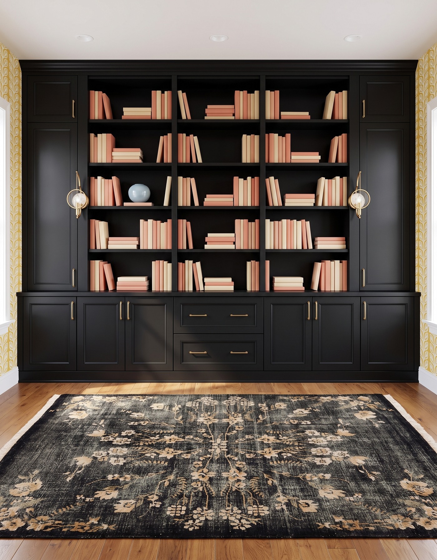
Black framed built-ins with plain black shelf backs, mustard-and-cream leaf side walls, warm brown wood floor, charcoal-and-tan floral rug and open brass-loop globe sconces. AI-generated library concept.
This second black library has a different personality from the plum-and-gold opening scene. Coral and cream books supply the warmer color at eye level, with a pale blue ceramic orb breaking up one group. The open brass loops around the lights are airy accents rather than large shaded forms.
Mustard leaf wallpaper and a tan floral rug bring warmth from opposite edges of the room. Their patterns differ in scale and treatment, and the plain black shelf backs keep the books legible. The important distinction is where the warmth comes from: finishes and objects, not an orange wash over the lighting. Save this version if black cabinetry appeals to you but a softer, collected mood suits your home.
Try this: Warm black storage with coral books and earthy pattern while preserving clear light.
7. Berry, teal and crystal flowers make a library feel collected
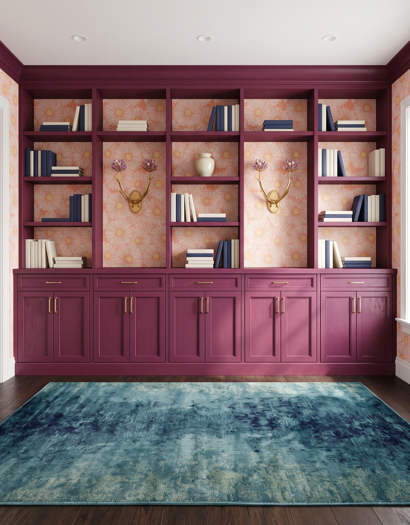
Berry framed built-ins, coral-and-cream flower wallpaper on shelf backs and side walls, dark brown wood floor, teal-and-navy distressed abstract rug and lavender crystal-flower wall sconces. AI-generated library concept.
Berry cabinetry and coral flowers give this library a warm backdrop; the teal rug introduces a cooler, less literal pattern below. Unlike the tailored berry scene, wallpaper appears behind the books here as well as at the sides. Some taller open areas are devoted to the ornate sconces, so the cabinet wall has a different rhythm from a uniform grid of book shelves.
Lavender crystal flowers echo the floral idea without matching the wallpaper exactly. Navy and ivory books create quieter groups, with one cream ceramic vessel as a shelf accent. This is the more decorative direction to save when you want a library that feels personal and a little theatrical. Let the textile texture be the counterpoint, not a third competing floral print.
Try this: Balance a warm floral backdrop with a cooler abstract rug and restrained book groups.
8. Navy lines and green lights keep botanical walls crisp
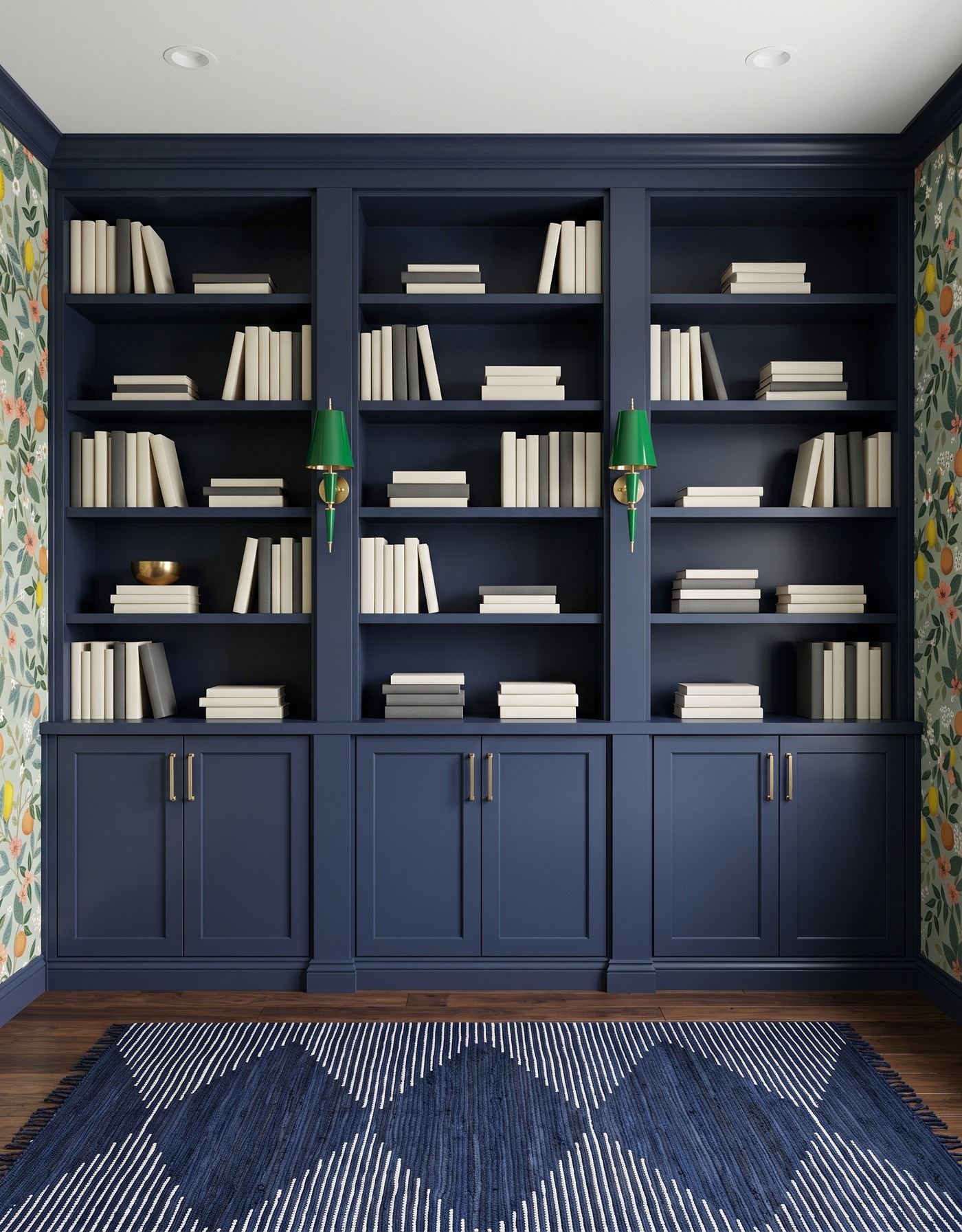
Navy built-ins with plain navy shelf backs, pale fruit-and-flower botanical side walls, dark brown wood floor, navy-and-ivory broken-line rug and green tapered metal wall sconces. AI-generated library concept.
The narrow ivory lines in the navy rug add movement without another large color field. Above, green tapered sconces pick up the foliage tones from the wallpaper at the sides. The plain navy shelf backs are useful breathing space between those decorative edges.
Ivory and charcoal books repeat the light-and-dark balance at a smaller scale, with a single brass bowl as an accent. This scene is a good comparison with the navy-and-yellow library: both have deep blue storage, but one uses a sunny block of textile color and the other uses lines and cooler lights. Save the approach that gives your own books the better backdrop.
Try this: Keep the shelf backs quiet when botanical walls and a graphic rug already provide the pattern.
9. Walnut and pale blue make a quieter kind of drama
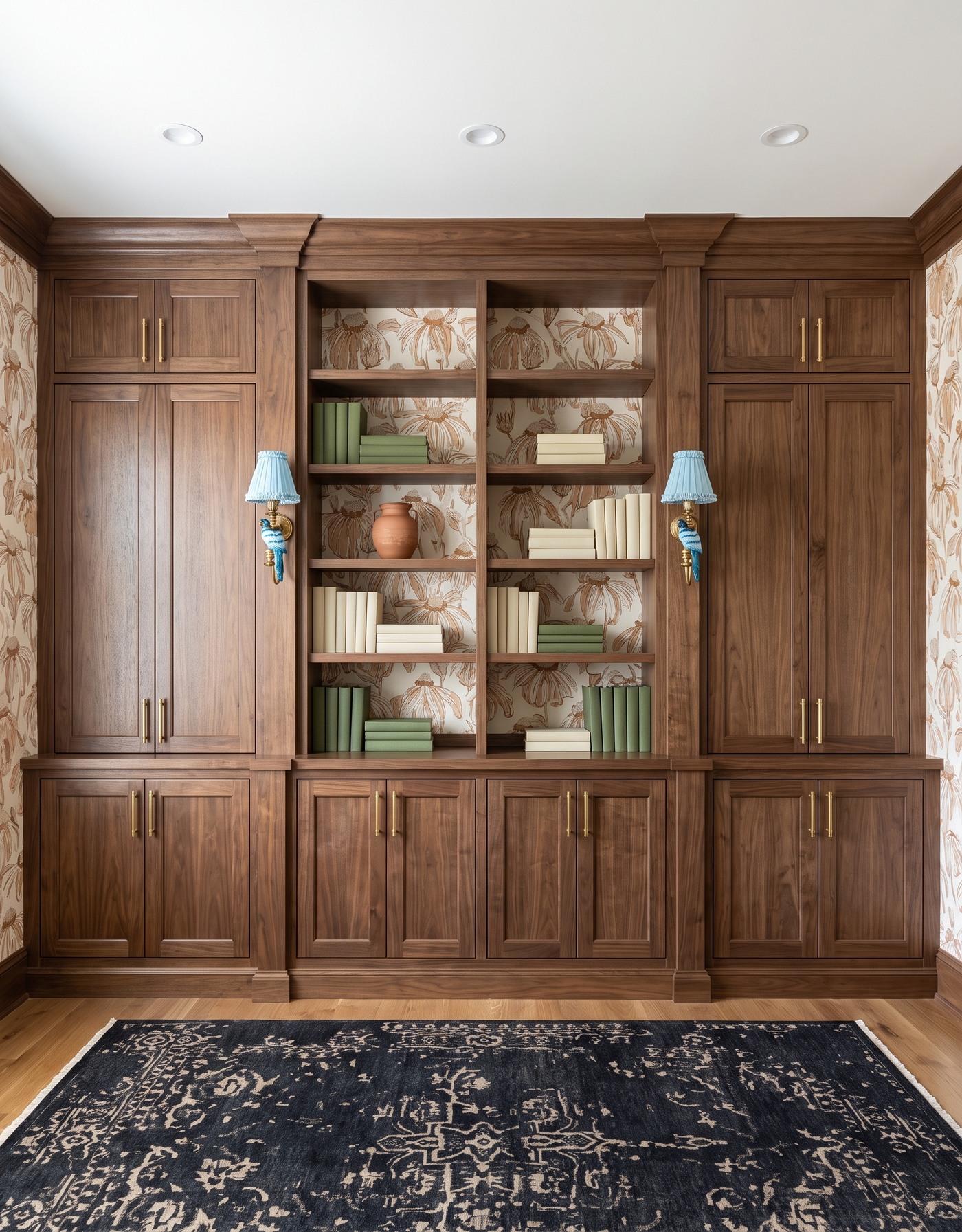
Walnut framed built-ins with closed side cupboards, tan-and-cream botanical wallpaper on central shelf backs and side walls, warm wood floor, charcoal-and-beige medallion rug and pale blue parrot wall sconces. AI-generated library concept.
A tonal botanical paper makes this walnut library calmer than the red-and-blue floral version. The dark ornamental rug supplies depth, while the cabinet grain and creamy wallpaper remain readable. Green and cream books fit the earthy palette without disappearing into the shelves.
The pale blue parrot sconces are the memorable detail. Their bird-shaped stems and small pleated shades bring a whimsical note to an otherwise restrained combination. A terracotta vessel is the warmer shelf accent. This is a helpful reminder that a statement fixture does not need to be enormous or saturated: a distinctive silhouette can give a quieter room its personality.
Try this: Let one whimsical fixture silhouette stand out against tonal wallpaper and warm wood.
10. Olive and shell-fan lights give a busy backdrop a softer frame
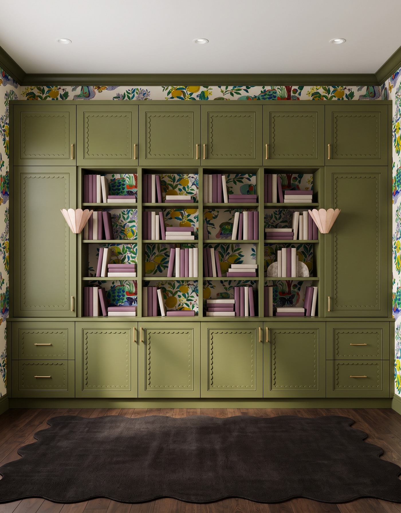
Olive scalloped cabinetry with closed upper and side cupboards, colorful botanical and fruit wallpaper on shelf backs and surrounding walls, brown wood floor, plain dark scalloped rug and pale blush shell-fan sconces. AI-generated library concept.
Olive storage frames the colorful wallpaper rather than trying to outshine it. The central open shelves show plum and oatmeal book groups against that lively backdrop, while the closed upper and side cupboards create larger areas of solid color. A rounded stone bookend is a quiet shelf detail on the right.
The rug is plain and dark, with its scalloped outline doing the decorative work. Pale shell-fan sconces repeat a softer curved shape at eye level. Compare this with the red-sconce olive library: the cabinet family is related, but the balance changes from red accents and dotted textiles to a colorful backdrop, pale lights and a quieter rug. The point is a different complete relationship, not a new color name for the same room.
Try this: Use a plain shaped rug and pale sculptural lights when the wallpaper is the strongest color layer.
Build the mood without losing the light
1. Save a complete material relationship, not just a favorite cabinet color.
2. Choose where the strongest pattern belongs: shelf backs, side walls or the rug. Leave another broad area calmer.
3. Compare large rug shapes with smaller wallpaper repeats so each pattern has a different job.
4. Use book groups and one meaningful object as accents; leave some shelf space visually open.
5. Test cabinet, wallpaper and textile samples in your room's daylight and evening light before committing.
6. Measure shelves, loads, access and circulation, and plan lighting with qualified professionals. These concepts do not verify dimensions, electrical work or installation clearances.
A moody library can be expressive without becoming a dark box. Deep cabinetry, readable books, a lighter ceiling and intentional contrasts let black, navy, berry, olive or walnut keep its character. For an autumn inspiration board, save the combination that makes you want to linger, then adapt the finishes and practical storage to your own room.
Planning a kitchen as well? Explore StilePath for kitchen planning. These library concepts are a separate inspiration brief and do not imply verified library design or shelf-planning capabilities.
Explore kitchen planning