
Laundry inspiration / Pink with a little perspective
10 Laundry Rooms With Pink, Coral and Confident Color
Pink can be a whole cabinet finish, a wallpaper ground or just one supporting detail. Coral makes a warmer cousin, while olive, navy and pale wood give either color a different character. The interesting part is not making every item pink. It is deciding what the warmer color does beside the rest of the room.
These ten laundry concepts move from blush ikat and dusty rose storage to coral daisies and contrasting floral stripes. Some put pink at the center; others show a neighboring direction for readers who want a bolder alternative. Their individual towels, baskets and hanging clothes make each scene different without filling every counter. Use them for October palette planning, not as measured laundry layouts.
These AI-generated laundry concepts use Anna's prompts and material references. They are inspiration, not completed projects, identified products or verified appliance installations and construction plans.
1. Give blush ikat a pale wood frame
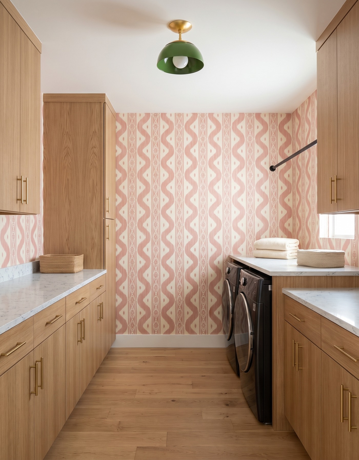
Pale oak slab cabinetry, blush-and-ivory ikat wallpaper, pale finely blue-veined counter, warm pale oak floor and green dome light. AI-generated laundry concept.
Pale oak slab fronts leave broad areas of grain beside the blush-and-ivory wallpaper. The print supplies the stronger rhythm, while the cabinetry and floor keep the warmer natural direction. A green dome light adds one separate accent overhead rather than another pink element.
Folded ivory towels and low woven baskets repeat the room's lighter, textured side. The hanging rod stays empty, so the wallpaper is easy to see. Save this combination if you like pink but do not want it on every cabinet door. Compare a full wallpaper repeat with a generous wood sample: the size of the print and the grain direction matter as much as their individual colors.
Try this: Let blush pattern lead beside simple wood fronts and one green accent.
2. Use black cabinetry to sharpen a pink floral wall
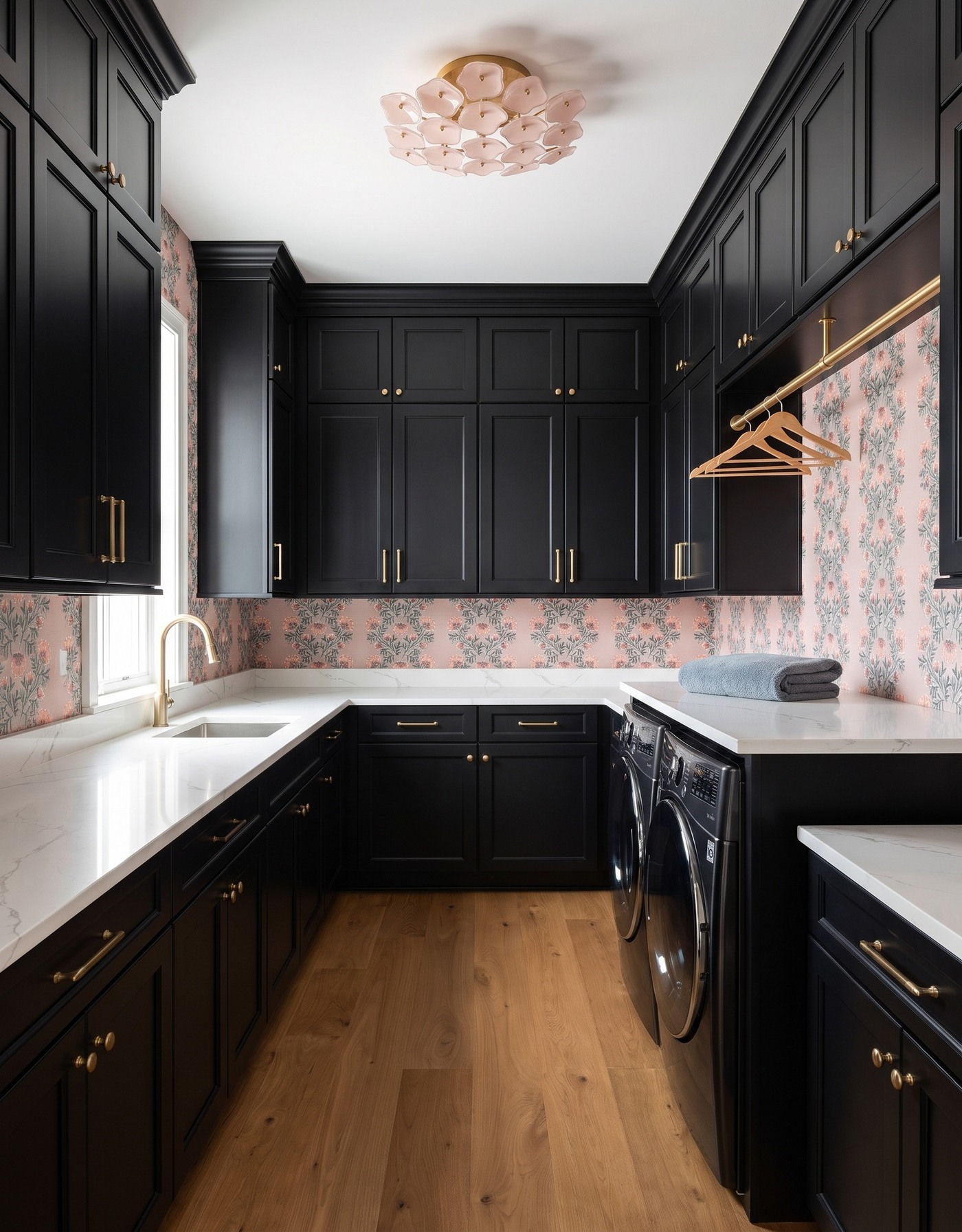
Black framed cabinetry, pink-ground botanical wallpaper with green foliage, pale gray-veined surface, warm wood floor and blush petal ceiling light. AI-generated laundry concept.
Black cabinetry gives this pink botanical wallpaper a more defined frame. Green foliage prevents the wall from reading as one uninterrupted pink field, and a pale veined surface separates the darker storage from the print. Warm wood flooring brings a different material character below the cabinets.
The blush petal ceiling light repeats the softer color in a sculptural form. A blue-gray folded towel and empty wood hangers keep the staging cooler and relatively quiet. Save the black-and-blush contrast if you want floral wallpaper without an entirely soft palette. The illustrated sink and appliance arrangement is not an installation guide; real sizes, access and utility requirements need separate checks.
Try this: Frame a soft floral wall with darker cabinetry and a pale work surface.
3. Take coral daisies in a warm ochre direction
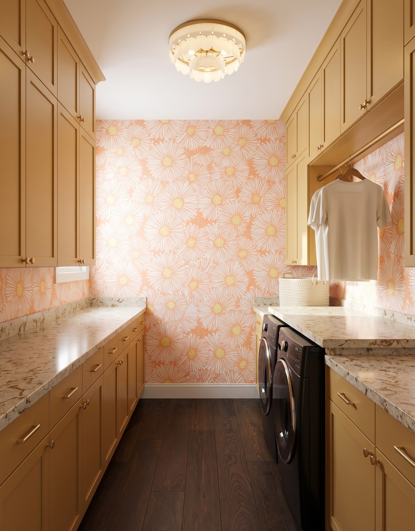
Ochre framed cabinetry, coral-and-white daisy wallpaper with yellow centers, cream-and-tan brown-mottled surface, dark wood floor and ivory petal ceiling light. AI-generated laundry concept.
This room takes the warmer alternative to blush. Ochre cabinet fronts sit beside coral daisies, with yellow centers connecting the print to the storage. The cream-and-tan mottled surface continues that warmth rather than introducing a crisp blue-white interruption.
An ivory T-shirt, cream woven basket and pale petal light give the palette some quieter areas. Dark wood flooring anchors the lighter flowers above it. Save this room if coral feels more personal than pink, then compare the warmer finishes together in your own daylight. The surface pattern is inspiration; it does not identify a particular stone or establish stain, heat or moisture performance.
Try this: Pair coral pattern with softened ochre and leave smaller accents pale.
4. Try a red-and-blue floral stripe beside ivory storage
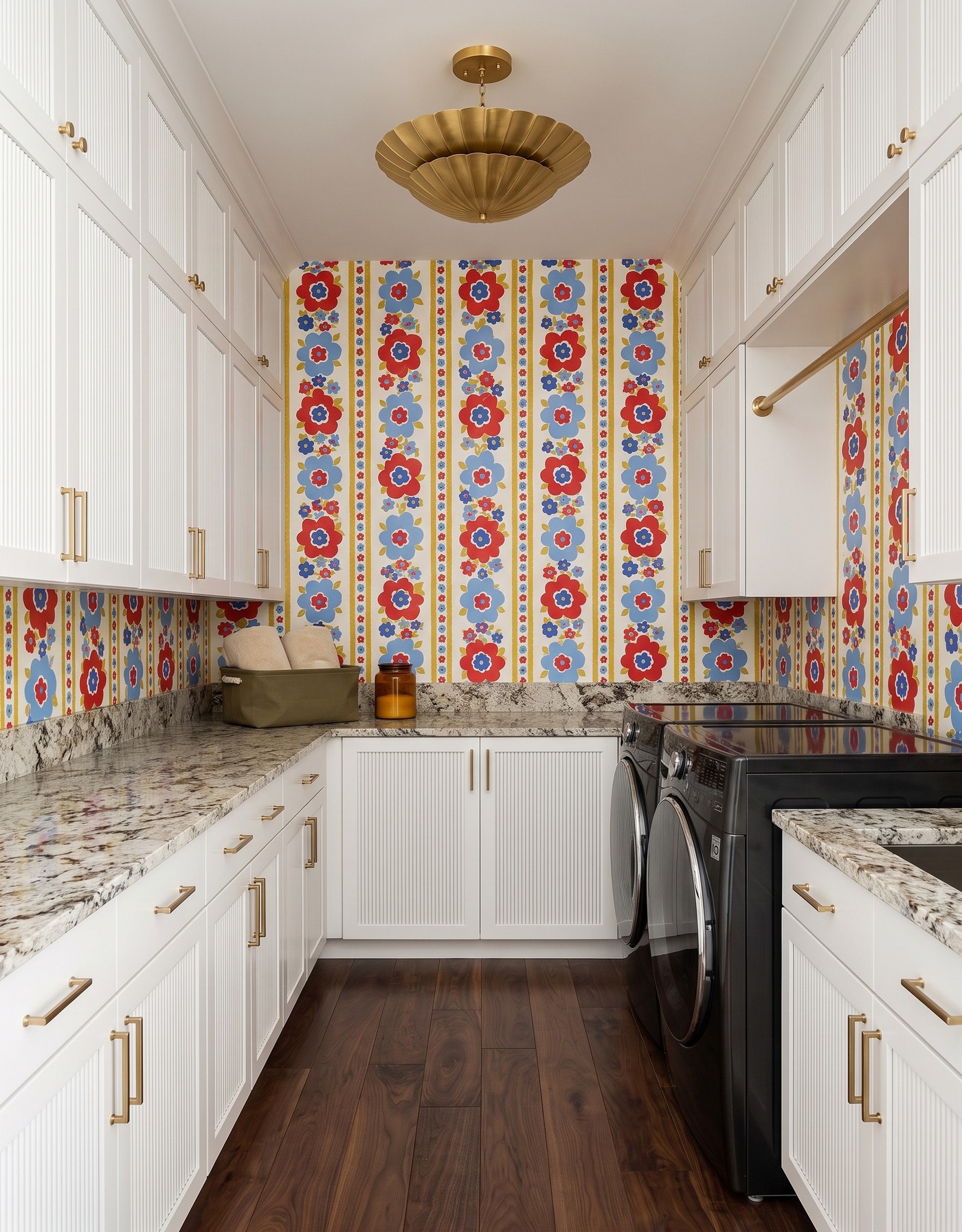
Ivory reeded cabinetry, red-and-blue floral striped wallpaper with ochre accents, pale dark-mottled surface, dark wood floor and brass fluted light. AI-generated laundry concept.
Not every bold laundry room needs a pink finish. This contrasting direction puts red and blue flowers into vertical stripes, with ivory reeded cabinetry giving the print a lighter frame. The door texture is a smaller-scale detail beside the larger flowers and bands.
An olive basket, ivory towels and a plain amber jar form a compact counter grouping. The two appliances are uncovered in this image; do not borrow it as an example of a continuous counter over a washer and dryer. Save the ivory-and-graphic-wall relationship instead. A real folding surface or appliance enclosure must follow actual equipment dimensions and the manufacturer's access and installation requirements.
Try this: Use pale textured storage to frame a confident multicolor wall.
5. Make dusty rose feel tailored with plum plaid
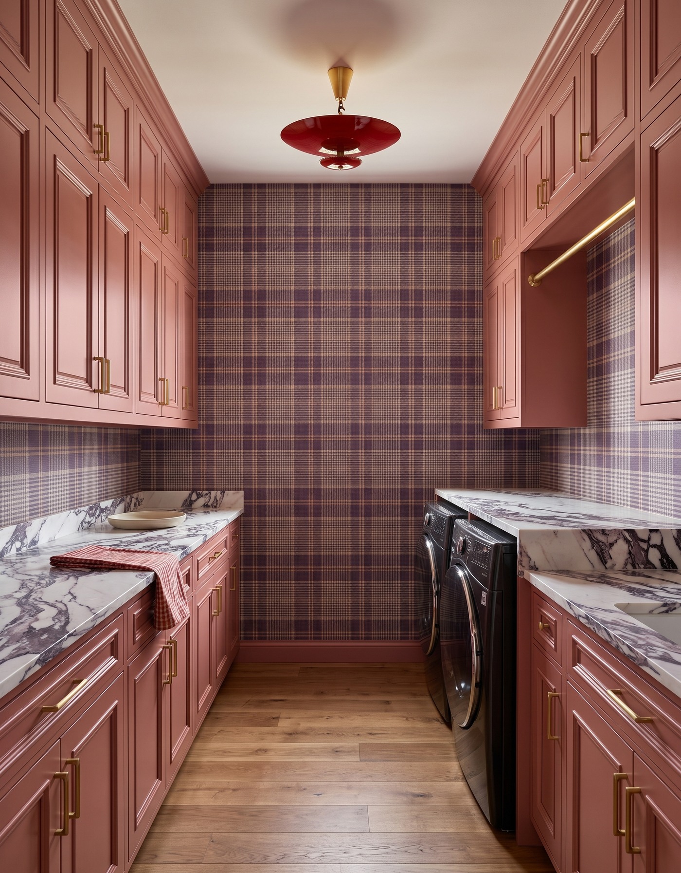
Dusty rose framed cabinetry, plum-tan-and-cream plaid wallpaper, ivory surface with dark plum veining, honey wood floor and red saucer light. AI-generated laundry concept.
Dusty rose cabinet fronts and plum plaid share a related warmer family without being the same shade. The lighter bands in the wallpaper make the check readable, while darker plum veining across the surface introduces a less regular pattern. Honey wood flooring supplies warmth without another painted color.
A red saucer light makes a more saturated accent overhead. A checked linen draped over the left counter and a low cream plate keep the styling distinct from the earlier towel stacks and baskets. Save this room for the relationship between softened pink storage and a darker tailored wall. Compare the plaid and surface veining at their actual sample scales before deciding whether both should lead.
Try this: Connect dusty rose cabinetry to deeper plum pattern, with pale areas for balance.
6. Put olive cabinetry around blush ikat
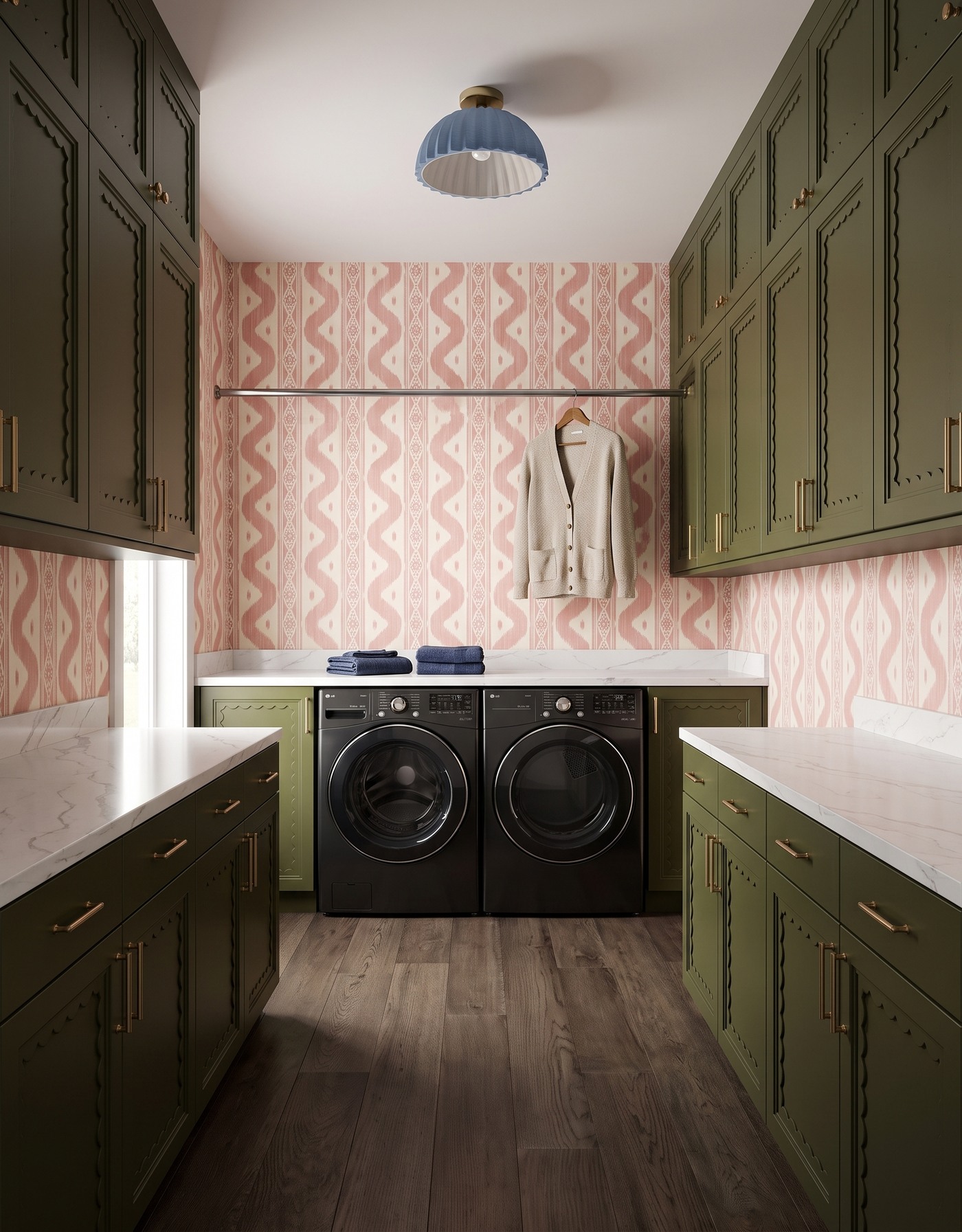
Olive scalloped-frame cabinetry, blush-and-ivory ikat wallpaper, pale gray-veined surface, gray-brown wood floor and blue pleated light. AI-generated laundry concept.
Olive cabinetry makes the blush ikat feel different from its pale oak setting. Scalloped door framing introduces another curved detail, while the wallpaper keeps its vertical rhythm. A blue pleated ceiling light adds a cooler accent above the greener storage.
An oatmeal cardigan hangs at the rear, above the two appliances, with dark blue towel groups on the surface. This rear-wall arrangement differs from the side-positioned pair in other concepts; the image does not establish clearances or a standard galley specification. Save the olive-and-blush relationship, then check the practical layout independently. The warmer garment and cooler towels show how small laundry items can support rather than copy the main finishes.
Try this: Give blush wallpaper a greener frame and repeat a cool accent in small textiles.
7. Let a pink shirt connect to a blue botanical wall
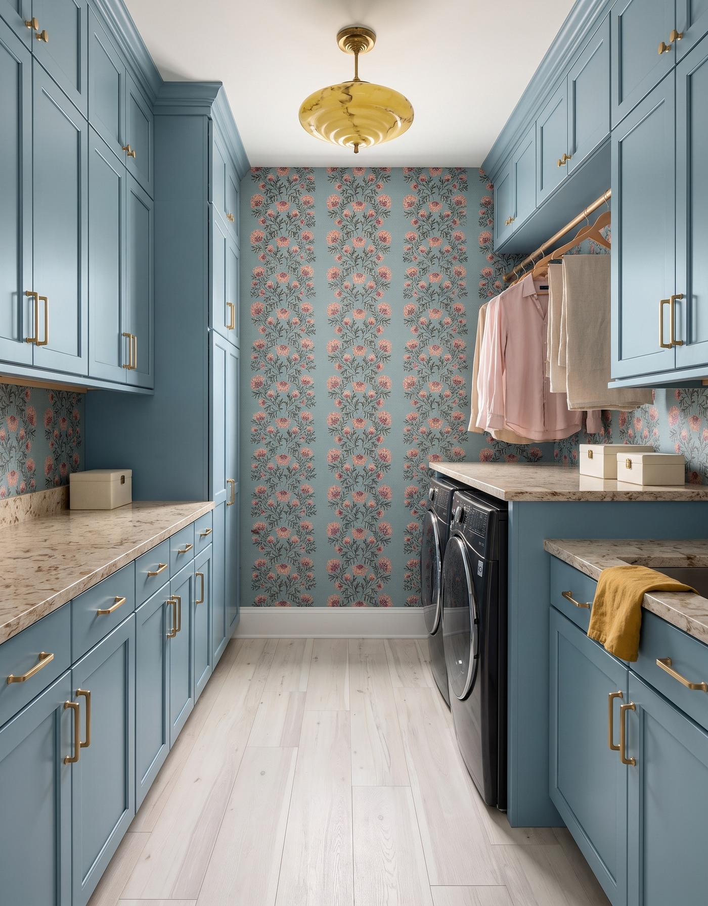
Dusty blue framed cabinetry, blue-ground botanical wallpaper with pink flowers, cream-and-tan brown-mottled surface, whitewashed wood floor and yellow marbled light. AI-generated laundry concept.
Dusty blue cabinetry connects to the wallpaper ground rather than its flowers. That makes the pink blossoms a smaller contrasting layer throughout the room. A warmer mottled surface and yellow marbled ceiling light prevent the whole palette from becoming uniformly cool.
A hanging pink shirt repeats the floral color, while ivory linen and a mustard counter textile contribute separate lighter and warmer accents. Cream storage boxes give the counter grouping a different shape from the earlier baskets. Save the idea of pulling one printed color into a practical textile. This is inspiration for color coordination, not a recommendation to hang garments at a particular height above appliances.
Try this: Repeat one wallpaper accent in a textile while keeping the cabinetry connected to its ground color.
8. Cool coral daisies with pale blue cabinetry
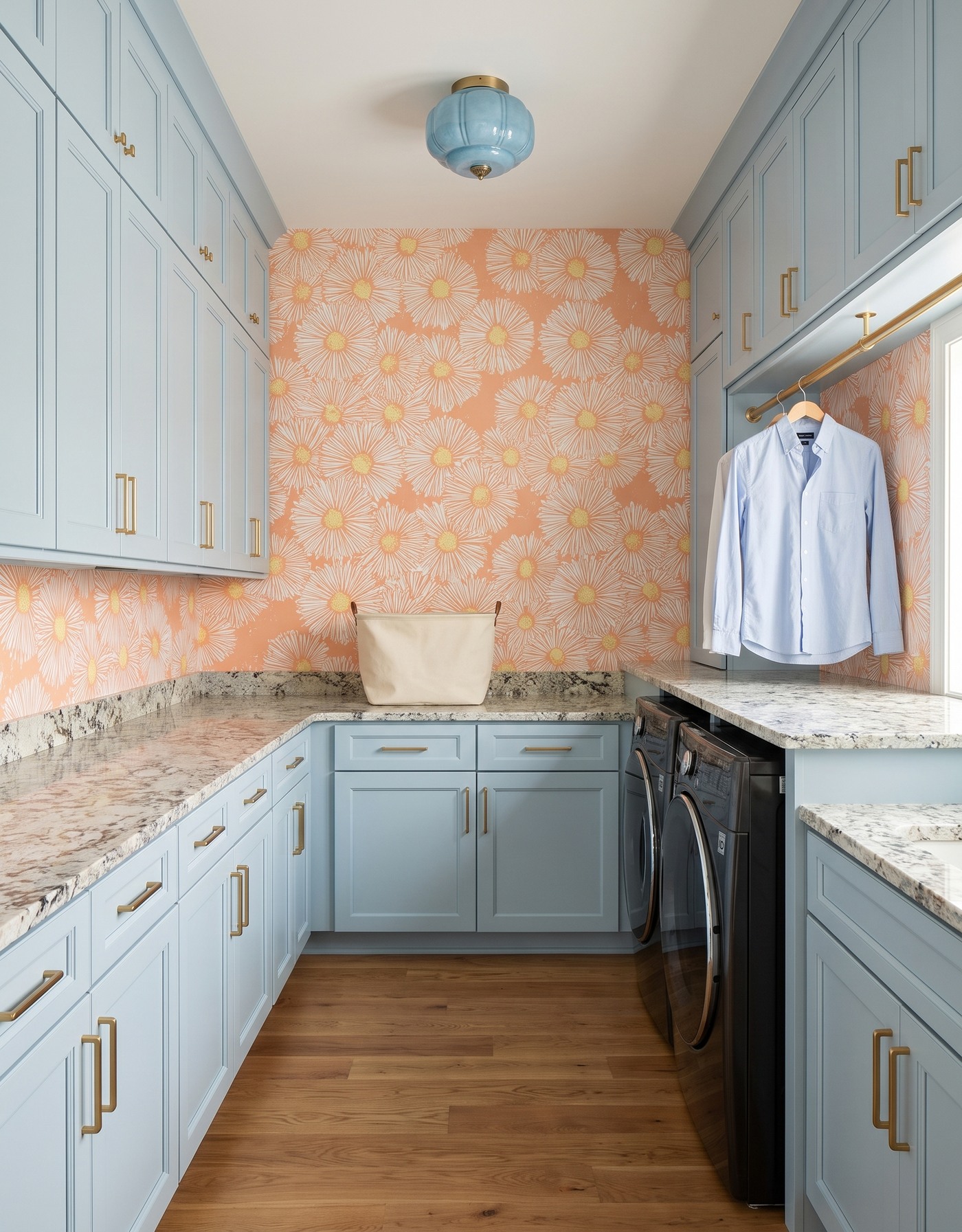
Pale blue-gray framed cabinetry, coral-and-white daisy wallpaper with yellow centers, pale dark-mottled surface, warm wood floor and pale blue lobed light. AI-generated laundry concept.
The coral daisy wallpaper returns with a cooler cabinet partner. Pale blue-gray storage and a pale blue lobed light shift the balance away from the ochre room, even though the flower colors remain warm. A pale mottled surface provides another lighter area between the cabinets and the print.
A light blue shirt and cream canvas basket keep the staging within that quieter supporting palette. Warm wood flooring connects to the coral direction without another warm painted finish. Save these two daisy rooms together to compare how cabinetry changes the feeling of the same pattern family. In a real room, check samples under both daylight and the fixtures you intend to use.
Try this: Use cooler pale cabinetry when a warmer floral print supplies the main energy.
9. Set softened mauve against a brighter floral stripe
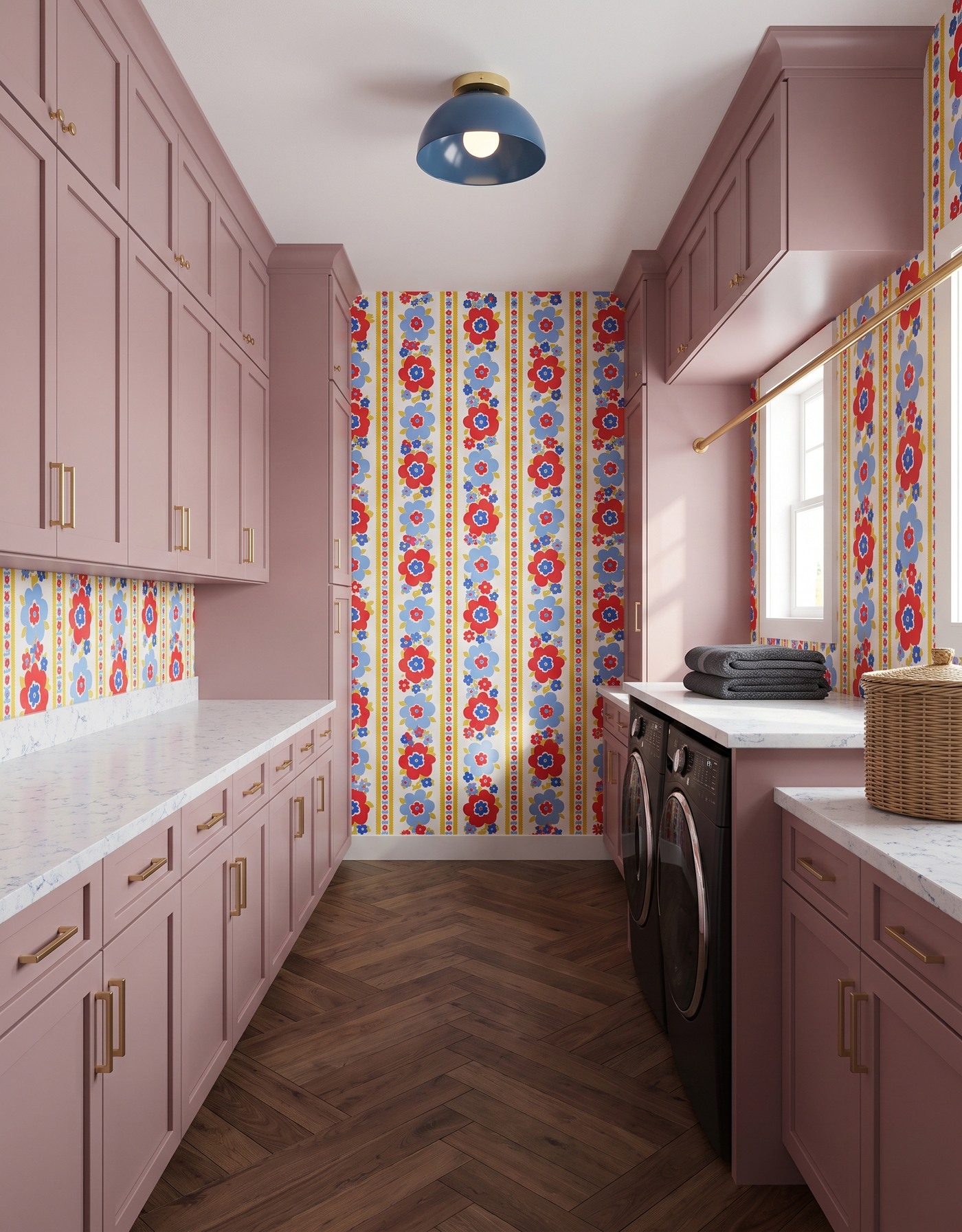
Muted mauve-pink framed cabinetry, red-and-blue floral striped wallpaper, pale finely blue-veined surface, brown herringbone floor and blue dome light. AI-generated laundry concept.
Muted mauve-pink cabinetry gives the red-and-blue floral stripe a warmer setting than ivory storage. The cabinet finish is softer than the red flowers, so the wall still carries the sharper color contrast. A blue dome light repeats part of the print's cooler palette overhead.
Charcoal folded towels and a large woven basket are simpler counter accents beside the busy wall. Brown herringbone flooring contributes a different directional pattern below it, while the pale surface separates the two. Save this look if you want pink storage without pink wallpaper. Consider both floor rhythm and wall repeat when sampling, rather than choosing them independently from cropped photos.
Try this: Let softened pink storage support sharper red-and-blue pattern.
10. Use mauve accents inside a deeper navy room
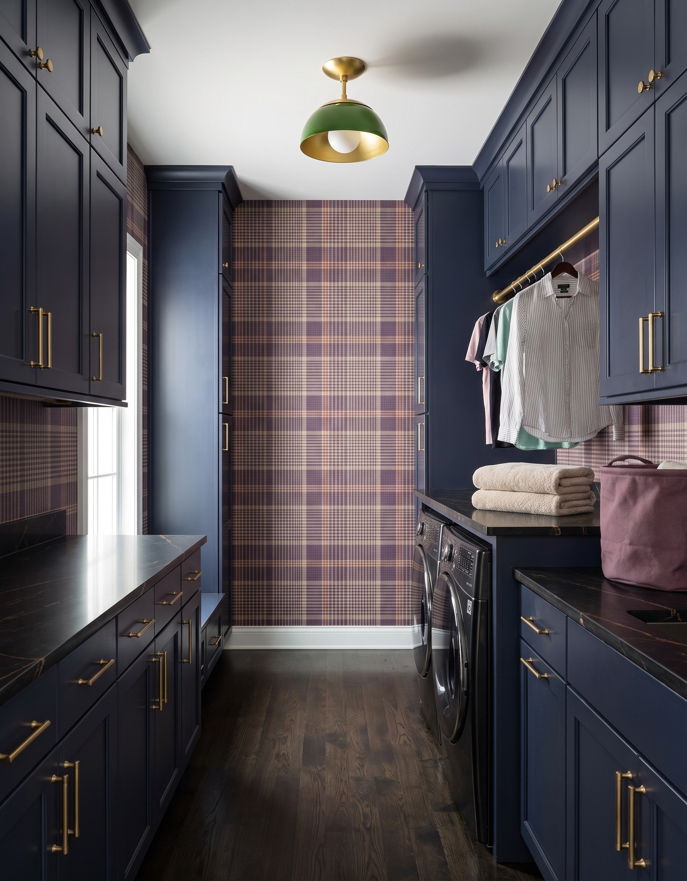
Deep navy framed cabinetry, plum-tan-and-cream plaid wallpaper, dark surface with fine warm veining, dark wood floor and green dome light. AI-generated laundry concept.
Deep navy cabinetry and a darker work surface make this the richer end of the collection. Cream and tan plaid bands give the wall some lighter areas, with plum keeping it related to the warmer pink family. A green dome light adds a separate accent rather than matching the storage.
A mauve canvas basket and hanging pastel and striped shirts introduce smaller, softer colors. Oatmeal folded towels keep one counter grouping pale. Save this room if you prefer pink as an accent inside a deeper palette, not the dominant finish. The dark surface is visible here; this is not an example of a pale folding counter, and the rendered appliance and hanging-rod arrangement still needs real-world verification.
Try this: Use softer mauve and pale textiles as accents within a deeper navy palette.
Choose the warm color's role before choosing every finish
1. Decide whether pink or coral belongs on cabinetry, wallpaper or a small textile rather than putting it everywhere.
2. Compare each wallpaper's full repeat with cabinet, floor and surface samples in your own light.
3. Use a small number of supporting textile colors; practical items can connect a palette without becoming decorative clutter.
4. Verify actual appliance dimensions, utility connections, ventilation, access and manufacturer installation requirements before planning enclosures or counters.
5. Treat every scene as a material conversation, not proof of cabinet sizes, product identities or a buildable laundry layout.
Pink feels more individual when it has a considered partner. Pale oak, black, olive and navy each give it a different character, while coral offers a warmer neighboring direction. Save the combination that catches your eye, then refine it with samples and a measured plan instead of copying an entire generated room.
Planning a kitchen as well? Explore kitchen cabinet layouts with StilePath using your actual room measurements. These laundry concepts are not a laundry-design tool or verified installation plans.
Explore kitchen planning