
Kitchen ideas · Color & gathering
10 Kitchens to Make You Want to Party
Some kitchens make you want to organize a drawer. These make you want to invite people over. Colorful cabinets, a real dining table and a little pattern can give the room the atmosphere of your favorite place to spend an evening.
The best part is that a party-ready kitchen does not need to look decorated for a party. A confident palette does the work every day. A light marks the table, chairs bring another texture into the room, and glass-front cabinets turn ordinary dishes into part of the backdrop.
These ten eat-in kitchen concepts explore the same useful idea: make the dining space feel as intentional as the cabinetry. Save the pairing you love, then adapt the table size and layout to your own room.
These images are AI-created design concepts using Anna's selected prompts and material references. They are inspiration, not photographs of completed projects or installation plans.
1. Make berry cabinets the invitation
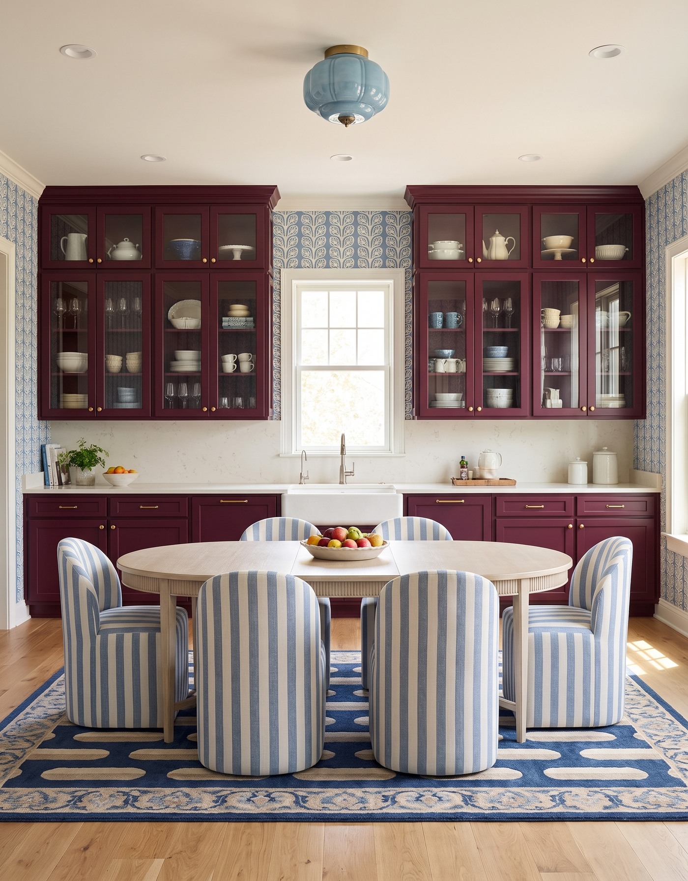
Berry kitchen cabinets with leafy blue wallpaper, blue striped chairs and a pale oval dining table.
Berry cabinetry brings depth that a tiny red accessory never could. Blue-and-cream leafy stripes create a crisp counterpoint, while striped seating adds a second, more tailored rhythm around the table. The result feels dressed for dinner without needing a formal dining room.
Two patterns can work together when they have a shared color and different jobs. Here, the wall pattern surrounds the room and the upholstery marks the seats. Before mixing prints at home, lay the samples several feet apart as well as side by side; that is closer to how they will be experienced.
Try this: Connect wall pattern and upholstery through color, while keeping their scales distinct.
2. Invite everyone into a citrus-green kitchen
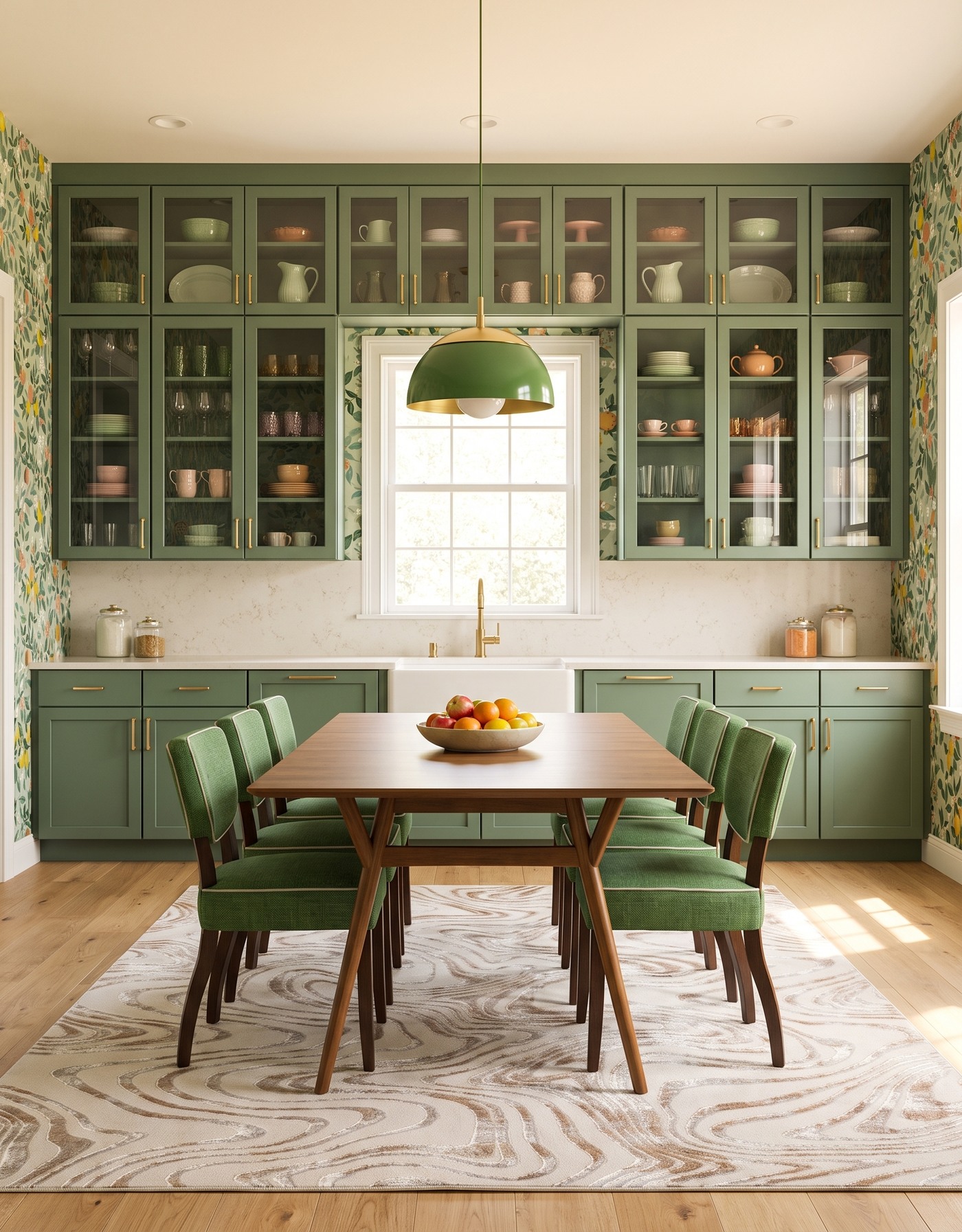
Moss-green glass-front cabinets, citrus wallpaper and green dining chairs around a warm-wood table beneath a green pendant.
Moss-green cabinets and leafy citrus wallpaper give this kitchen a garden-party mood without turning it into a themed room. Green dining chairs carry the cabinet color toward the table, while warm wood keeps the combination relaxed. The fruit print supplies the small bright accents.
Notice how the table has its own visual center beneath the green light. That is a useful planning move for an eat-in kitchen: give the dining area a deliberate place, then check how people will move around it when chairs are pulled out. A beautiful table should not become a roadblock.
Try this: Repeat the main cabinet color in the seating, then let wood and a lighter rug soften the dining zone.
3. Mix dusty aqua with coral dinner-party color
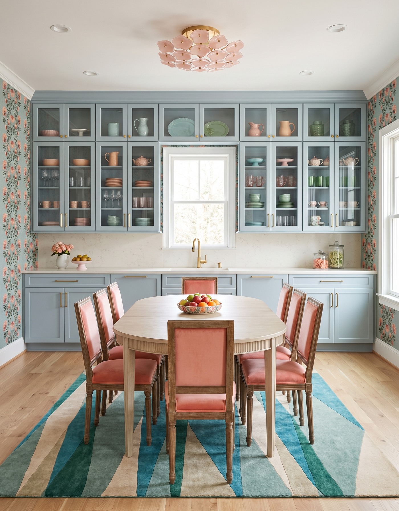
Dusty aqua glass-front kitchen cabinets with coral floral wallpaper, coral chairs, a pale-wood table and a teal geometric rug.
Dusty aqua and coral have the energy of a good conversation. The blue-green cabinetry establishes a cool background, while the warmer floral print and dining upholstery make the room feel more animated. The palette feels connected because those warm notes appear at different scales.
A pale wood table gives the stronger colors a neutral meeting point. If you borrow this combination, compare the chair fabric directly with the wallpaper. They do not need to match, but they should look related in your actual evening light as well as beside a sunny window.
Try this: Let the chairs pick up a warm accent from a cool-ground wallpaper.
4. Give natural wood a graphic daisy backdrop
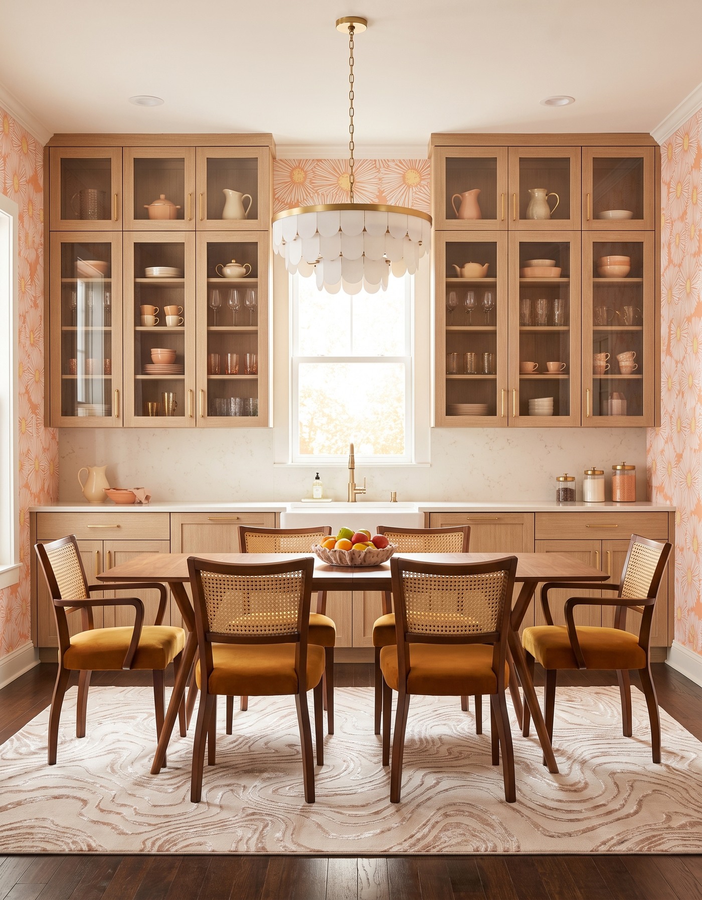
Natural-wood kitchen cabinets with peach daisy wallpaper, mustard cane-back chairs, a wood table and an ivory scalloped pendant.
Natural wood does not have to mean a kitchen that stays politely in the background. Large, outlined daisies bring a graphic edge to the room, and mustard-toned seating makes the dining area part of that sunny story. The cabinetry supplies texture without adding another painted color.
The darker floor gives the lighter wood something to stand against. When combining several wood finishes, aim for a clear relationship rather than a near-match that looks accidental. A floor that is noticeably deeper than the cabinets can make the layers easier to read.
Try this: Use a large-scale print to make natural cabinetry feel expressive, with a darker floor underneath.
5. Set golden cabinets against a moody botanical
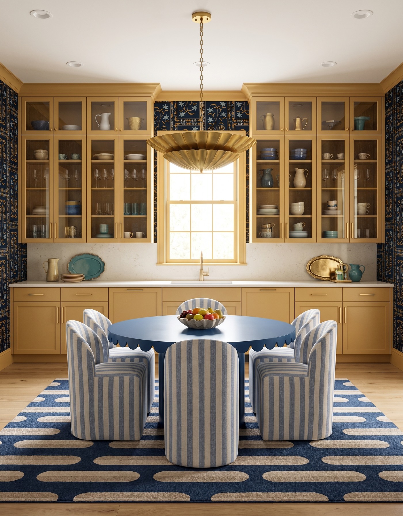
Golden kitchen cabinets with dark botanical wallpaper, a round blue table, blue striped chairs and a brass-toned pendant.
Golden cabinetry becomes more dramatic beside a dark botanical print. Blue in the surrounding palette gives the yellow warmth a cooler partner, and the dining furniture makes that contrast tangible rather than leaving it all on the walls.
This is a room where the background already brings plenty of occasion. Keep the table setting simple and let the permanent choices carry the personality. In your own plan, test a large wallpaper sample behind a cabinet sample; the amount of dark ground matters as much as the flower color.
Try this: Give a warm cabinet color a dark patterned frame and one clearly cooler companion.
6. Make smoky blue feel like an evening out
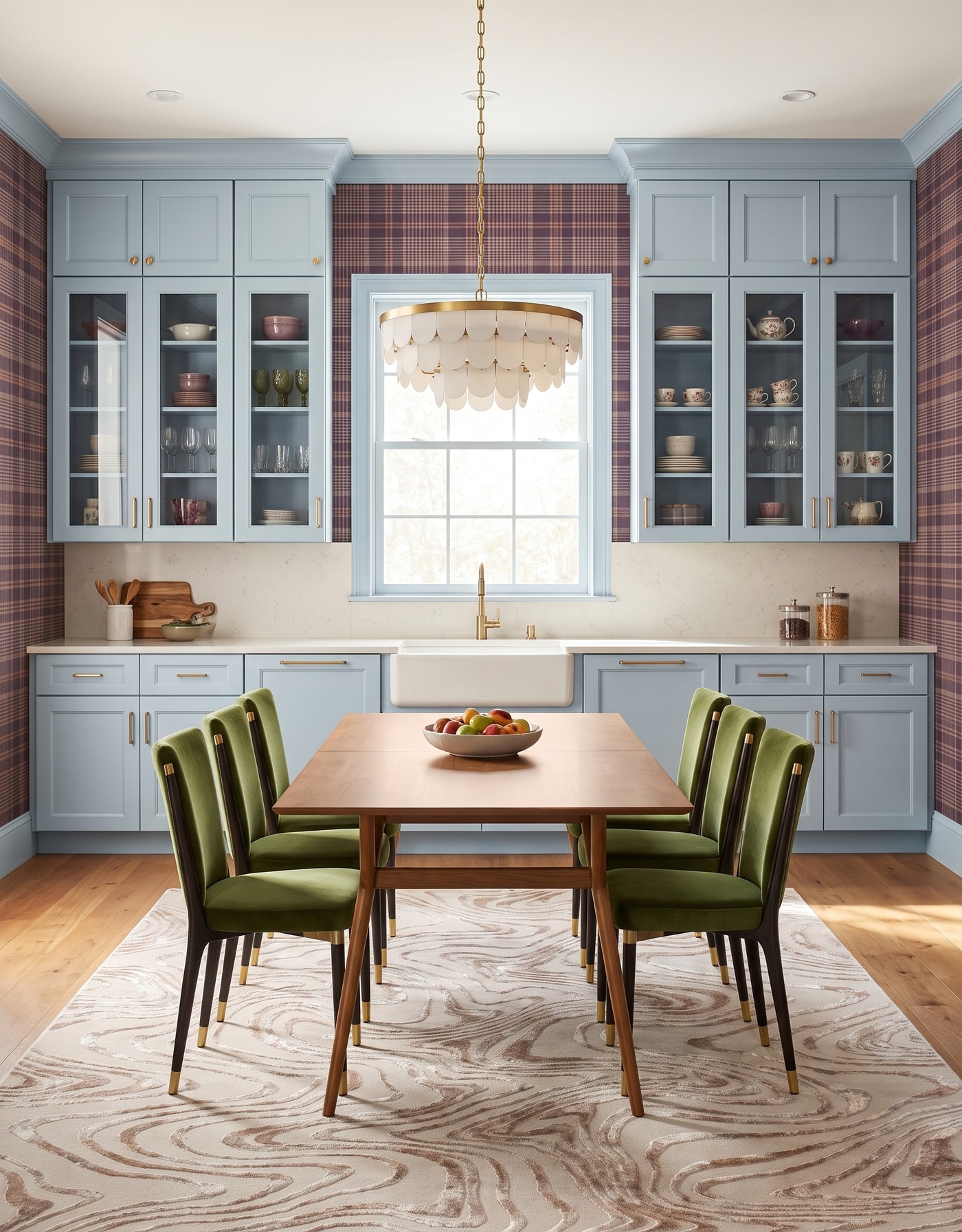
Pale smoky-blue kitchen cabinets with plum plaid wallpaper, olive dining chairs, a warm-wood table and ivory pendant.
Smoky blue cabinetry and plum-toned plaid make a quieter kind of statement. The pattern feels tailored, while darker upholstery gives the dining area depth. This is a useful direction if you want a memorable kitchen without a high-contrast floral covering every view.
Warm wood helps keep the cool cabinet color from feeling remote. Build the palette around a few tactile surfaces: cabinet finish, woven or upholstered seating, wood and a light with an interesting shape. The room can feel layered without needing more objects on the counters.
Try this: Use plaid and deep upholstery to give a cool cabinet color an intimate dining-room mood.
7. Pair burnt orange with a cool blue counterpoint
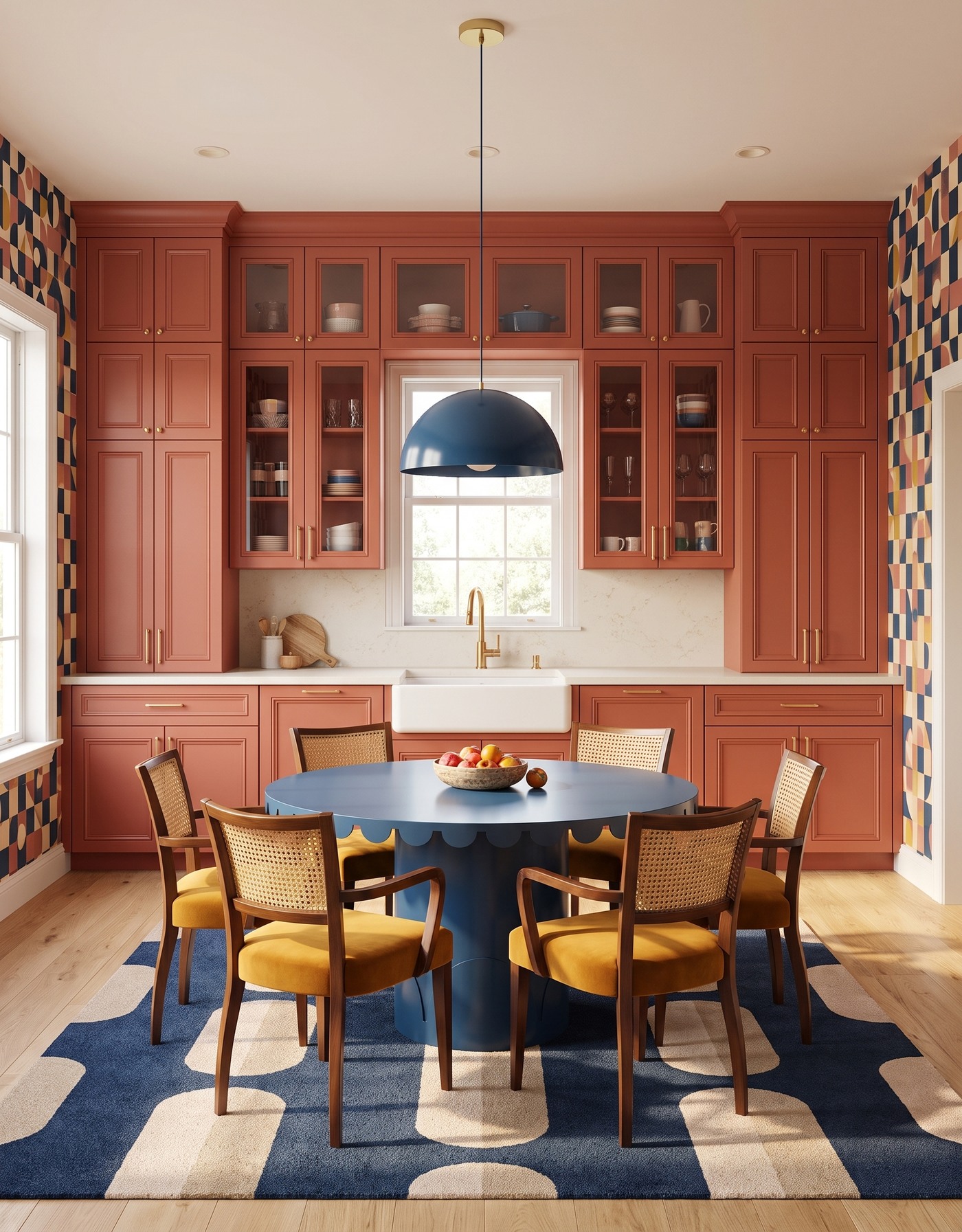
Burnt-orange kitchen cabinets with geometric wallpaper, a round blue table, mustard cane-back chairs and blue pendant.
Burnt-orange cabinetry gives this kitchen its warmth, while the geometric wallpaper introduces navy, cream and ochre. Those broad shapes feel lively without relying on tiny decorative details. A blue dining element makes the warm-and-cool relationship part of the furniture too.
The trick is to let one warm color own the largest surface. You can then echo a smaller accent in a chair, table or light without turning every object into a separate statement. A pale floor offers a useful pause beneath the stronger colors.
Try this: Choose one dominant warm color, then give its cool partner a distinct place near the table.
8. Bring a little retro rhythm to mauve
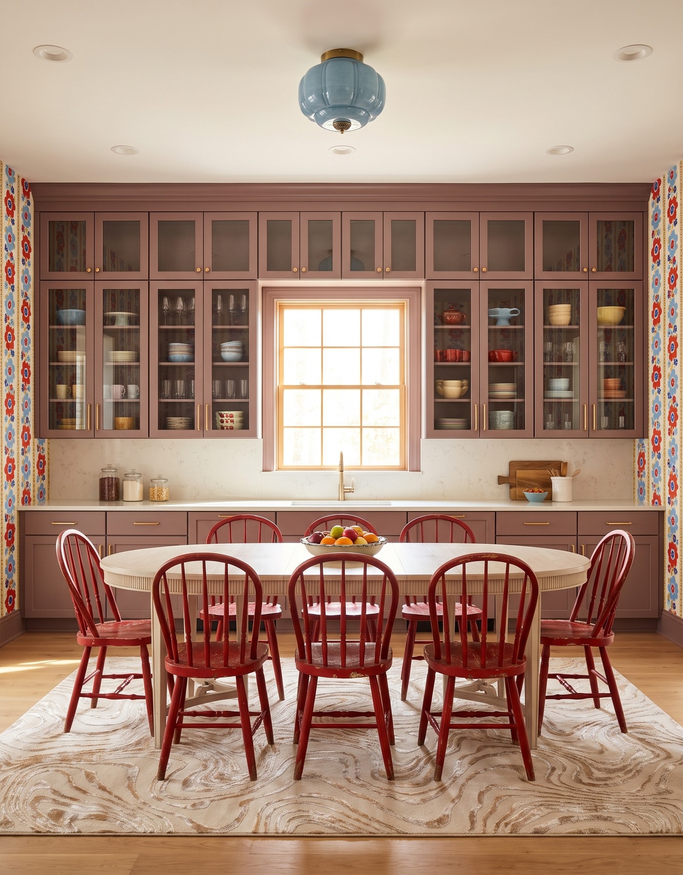
Mauve glass-front kitchen cabinets with retro floral stripes, red spindle chairs and a pale dining table beneath a blue light.
Mauve cabinetry has a soft, dusty quality that lets a brighter floral stripe feel playful rather than overwhelming. Red dining chairs sharpen the palette, picking up a color that could otherwise remain a small detail in the wallpaper.
A pale table creates breathing room between the chairs and cabinets. This is a good lesson in using a quieter central piece: the table does not have to be the boldest object in a dining area to be its gathering point. Let the seating and backdrop supply the energy.
Try this: Use a muted cabinet color as the bridge between a lively print and brighter dining chairs.
9. Warm up an ink-black cabinet wall
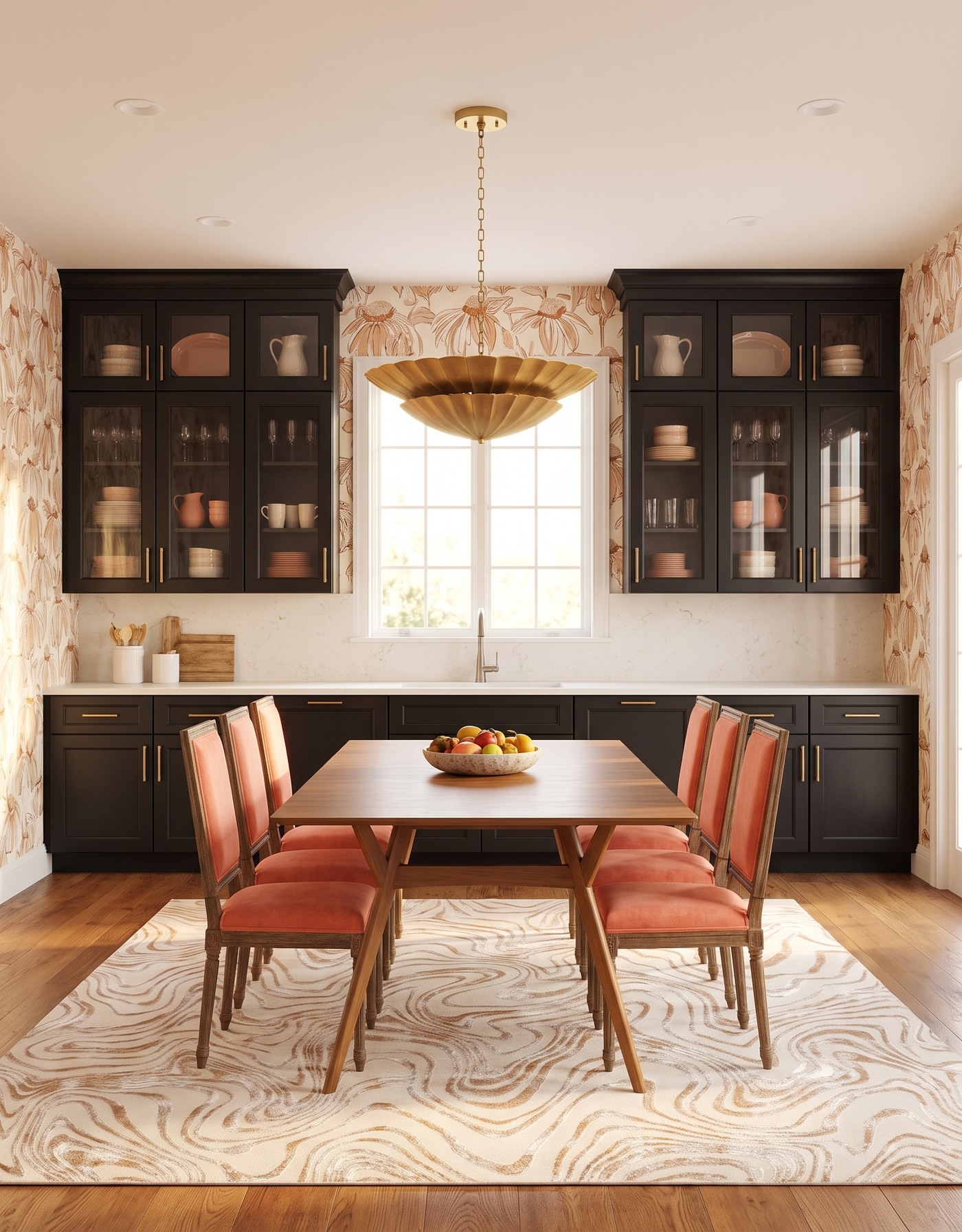
Ink-black kitchen cabinets with cream-and-camel botanical wallpaper, coral chairs, a wood table and brass-toned pendant.
Black cabinetry brings definition, but the warm botanical print keeps the room from feeling severe. Wood and coral-toned seating make the table an inviting foreground. The dark cabinet wall becomes a frame for the lighter, warmer pieces in front of it.
When you work with a large dark surface, check the edges and the lighting. You want to see the cabinet shape and hardware, not just a dark rectangle. A lighter counter, visible wood grain and a softer wall pattern can each help the room keep its depth.
Try this: Balance dark cabinetry with warmth where people sit, not only with pale walls.
10. Put deep blue beside a joyful citrus print
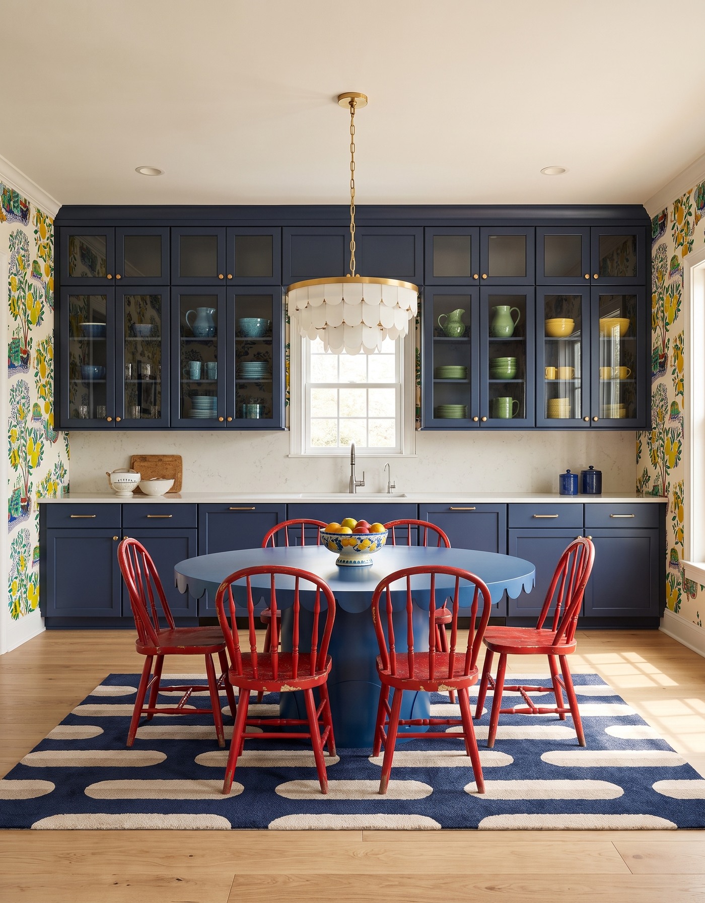
Deep-blue kitchen cabinets with citrus-tree wallpaper, a blue pedestal table, red spindle chairs and ivory pendant.
Deep blue makes a cheerful citrus-tree pattern feel a little more grown-up. Yellow fruit and red seating bring small, clear bursts of color, while the cabinetry holds the composition together. It is bold in a way that still feels organized.
You can borrow that hierarchy even if citrus wallpaper is not your style. Start with one deep cabinet color, choose a print with two accents you genuinely like, and bring only one of those accents into the furniture. The result gives guests something to notice without asking every surface to compete.
Try this: Anchor a playful print with a deep cabinet color and repeat just one bright accent in the seating.
Before you plan the guest list
1. Choose a table that leaves useful circulation space with chairs in use.
2. Decide whether the cabinetry, wallpaper or dining furniture gets the strongest color.
3. Check upholstery and wall samples together in daytime and evening light.
4. Keep everyday work surfaces useful; atmosphere does not require countertop clutter.
5. Use a measured kitchen plan before committing to furniture or cabinetry.
Save the kitchen that makes you imagine people around the table, then identify why. It may be the coral chairs, the dramatic cabinet wall or the way one light gives the dining space its own identity. That relationship is the part worth bringing into your home.
Have a palette you love? Start by working out where the kitchen and dining area belong in your room.
Explore kitchen planning with StilePath