
Home library inspiration / Bold walls, calmer shelves
10 Home Libraries That Balance Bold Pattern and Calm
A library can have a lively wallpaper and still feel like a place to settle in with a book. The balance comes from what surrounds the pattern: a clear cabinet framework, a few repeated book colors and spaces where the eye can rest. Quiet styling does not have to mean beige walls or completely empty shelves.
These ten autumn reading-room concepts explore that balance in different ways. Some show wallpaper behind the books; others keep the shelf backs solid and put the print on the side walls. Notice the whole relationship between storage, books, lighting and rug before saving your favorite. The goal is a room with personality, not a collection arranged to match every accessory.
These AI-generated design concepts were created using Anna's prompts and material references. They are inspiration, not completed projects, identified products or verified cabinetry and electrical plans.
1. Black bookcases give peach daisies a crisp frame
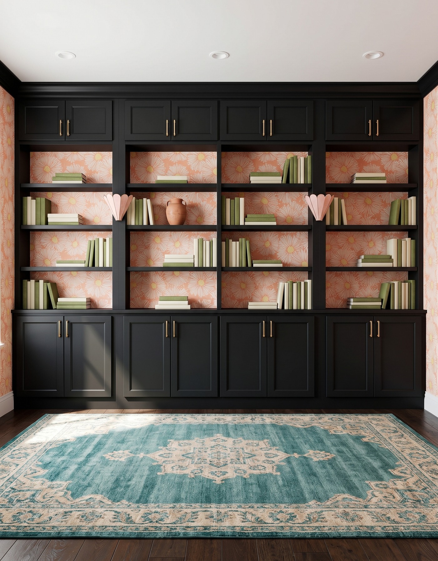
Charcoal-black framed cabinets, peach-and-ivory daisy wallpaper, dark brown wood floor, teal-and-cream ornamental rug, blush shell sconces and moss-and-cream books. AI-generated library concept.
The peach daisy print is playful, but the broad black cabinet framework gives it structure. Moss and cream books repeat just two quieter color groups. Small horizontal stacks leave portions of the patterned backs visible instead of turning every opening into a dense block of books.
A terracotta vessel introduces one warmer shelf accent, while the blush sconces relate to the flower color. The teal rug's ornamental design brings a cooler partner into the foreground. Borrow the peach-and-green relationship, then compare your own rug and wallpaper samples together rather than selecting each finish in isolation.
Try this: Frame a playful warm print with dark cabinetry and limit the shelf styling to a few related colors.
2. Ochre storage warms a tailored plum check
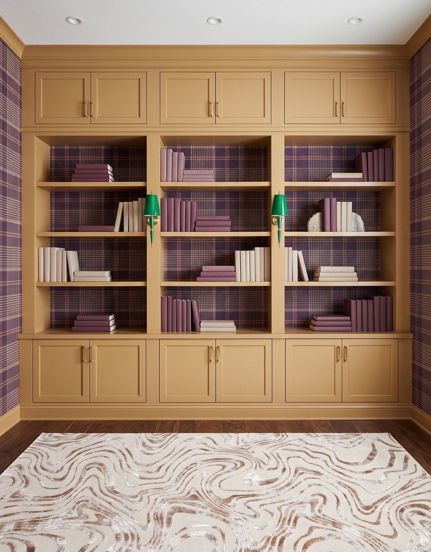
Ochre framed cabinets, plum-and-tan plaid wallpaper, warm brown wood floor, cream-and-taupe contour rug, green tapered sconces and plum-and-ivory books. AI-generated library concept.
A small check gives this library a more tailored rhythm than the large daisy. The ochre framework makes the plum background feel warmer, while plum books connect the shelf styling to the walls. Ivory groups keep the overall display from becoming one dark surface.
Pale stone-like bookends are the smaller decorative change. The contour rug adds movement without repeating a plaid, and the green sconces are an unexpected accent against the warm cabinets. Try a sample pairing like this if you enjoy a traditional-looking pattern but want a less predictable color mix; compare it in your own daylight before choosing finishes.
Try this: Pair a small check with broader solid book groups and a contrasting light fixture.
3. White grooved fronts let blue florals breathe
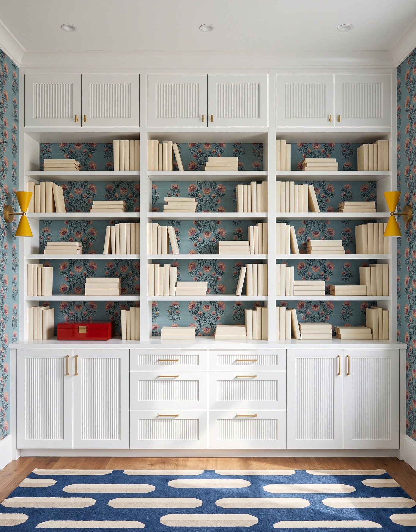
White grooved cabinet fronts, dusty blue floral wallpaper with pink-and-ochre blossoms, honey wood floor, navy-and-cream capsule-pattern rug, mustard hourglass sconces and ivory books. AI-generated library concept.
White cabinet fronts and pale books leave the blue floral wallpaper as the main color field. The print remains visible between upright rows and short stacks, giving the shelving a layered look without introducing several different book colors. Mustard sconces pick up a warmer note from the blossoms.
The red box is the one sharper shelf accent. Below, the navy rug echoes the wallpaper's blue family through a much larger geometric shape. The two patterns differ in scale and character, while the pale books give the eye somewhere quieter to settle. Try that contrast when a floral alone feels too delicate for the room you want.
Try this: Keep most books pale when a colorful floral background should remain the focus.
4. Rust cabinetry balances a dark botanical backdrop
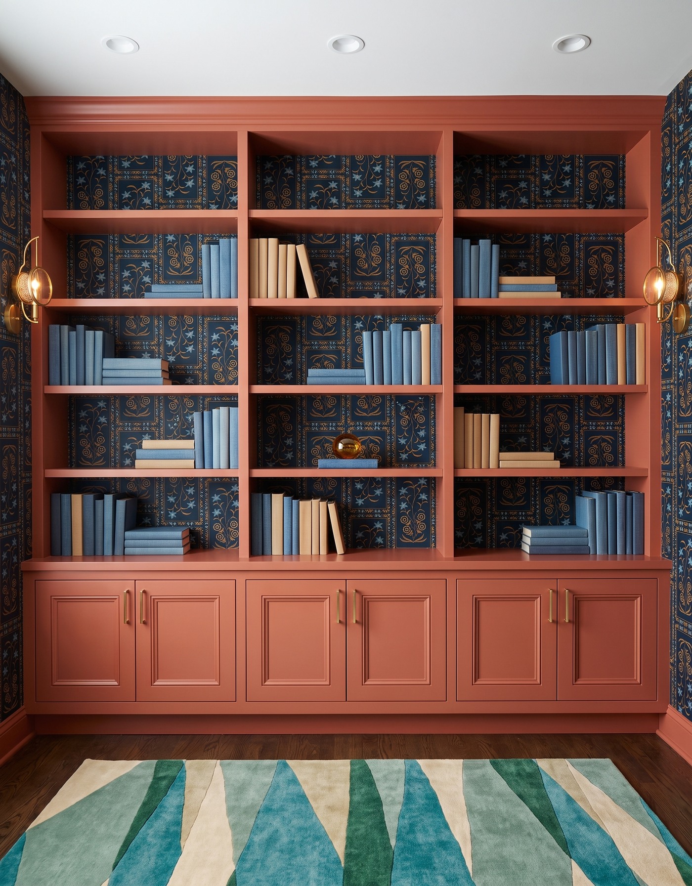
Rust framed base cabinets and shelving, navy-and-gold framed botanical wallpaper, brown wood floor, teal-and-cream angular rug, brass-and-amber circular sconces and blue-and-cream books. AI-generated library concept.
Rust storage supplies a warm frame around the navy-and-gold print. Blue books connect with the wallpaper, while cream books make lighter groups within the shelf openings. The pattern is rich enough to carry the room without a large collection of decorative objects.
An amber glass orb is the small focal piece near the middle. The rug adds teal rather than more navy, so the cooler colors have some variation. For your own library, try repeating a wallpaper color in only part of the collection, then leave some books or objects lighter; matching every shelf to the darkest wall color can make the whole composition harder to read.
Try this: Give a dark botanical a warm cabinet frame and a few clearly lighter book groups.
5. Olive shelf backs calm a confident red stripe
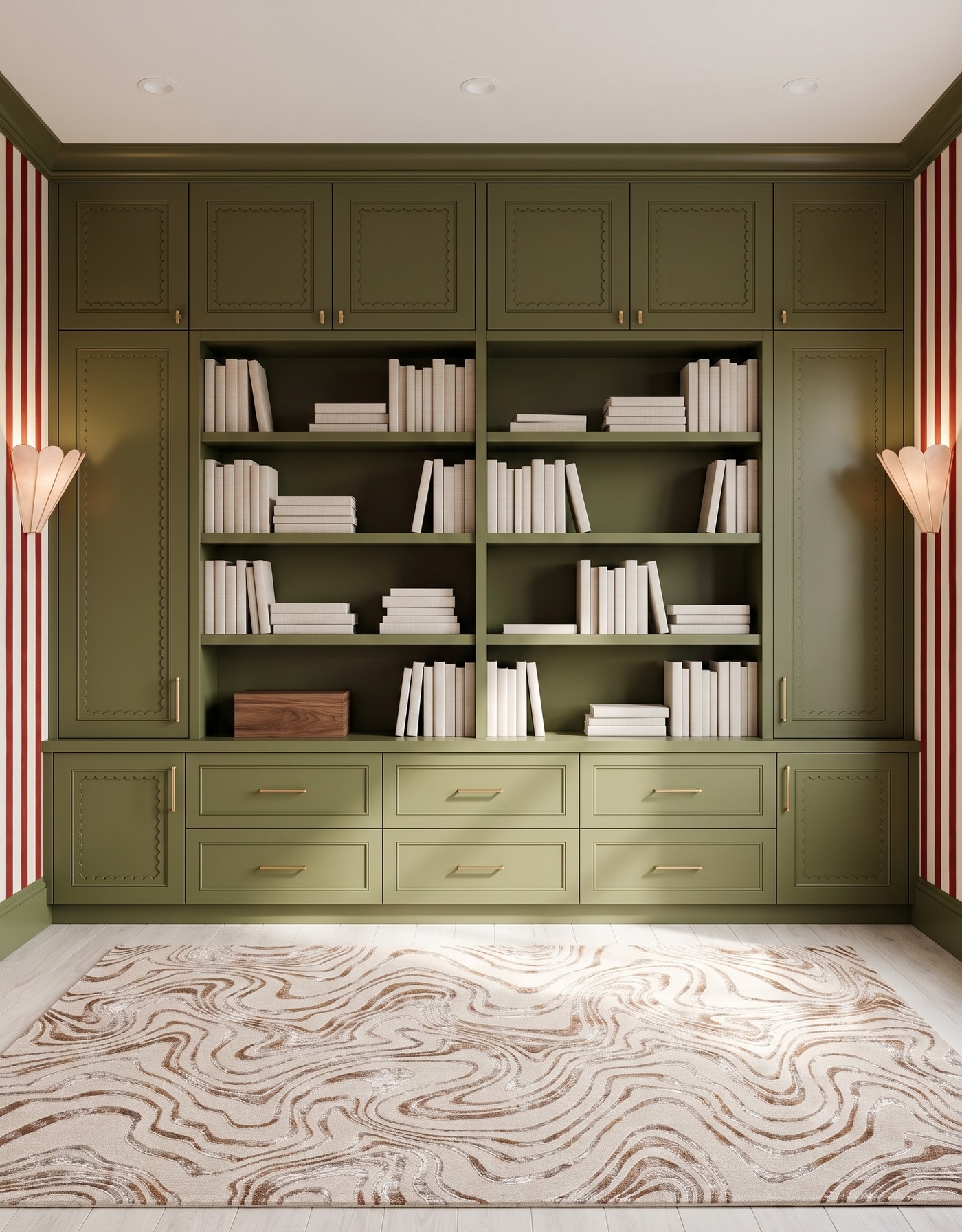
Deep olive scalloped cabinet fronts and solid shelf backs, red-and-ivory striped side walls, pale wood floor, cream-and-taupe contour rug, blush shell sconces and ivory books. AI-generated library concept.
The red stripe appears on the side walls, while the shelving itself stays olive. That division creates a quieter place for the books even though the room's edges are bold. Pale books and a cream rug keep the central display lighter than the cabinetry.
A wood box adds grain rather than another strong color. The scalloped details on the fronts bring a softer line into the otherwise straight shelving and stripes. This is a useful option if a fully patterned bookcase feels too busy: use wallpaper around the storage, and let the shelves have a solid backdrop. The concept does not establish cabinet dimensions or usable capacity.
Try this: Move a strong stripe to the surrounding walls and keep the shelf backs solid.
6. Dusty blue storage makes room for leafy side walls
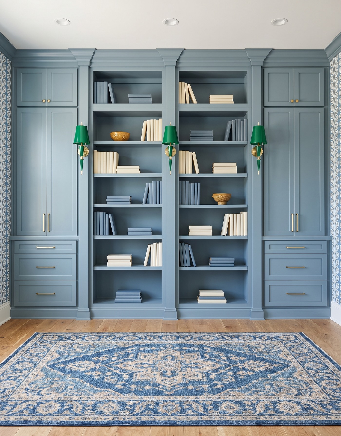
Dusty blue framed cabinets and solid shelf backs, blue-and-ivory leafy side-wall wallpaper, golden wood floor, blue-and-cream ornamental rug, green tapered sconces and blue-and-ivory books. AI-generated library concept.
This library keeps its largest surface blue, with the leafy print confined to the sides. Blue books relate to the storage but remain readable through their edges and shadows; ivory groups create the stronger contrast. The shelves leave visible gaps instead of using every opening as a display stage.
Ochre bowls add a warmer note in separate shelf positions. The green lighting is another deliberate contrast rather than an exact cabinet match. The finished rug has an ornamental blue-and-cream pattern, so this is not a plain-rug example. Its calmer quality comes from the limited shelf palette and solid backs, not from removing every pattern in the room.
Try this: Use solid shelf backs and a limited book palette to balance patterned walls and a patterned rug.
7. A gold fan print gets an earthy book collection
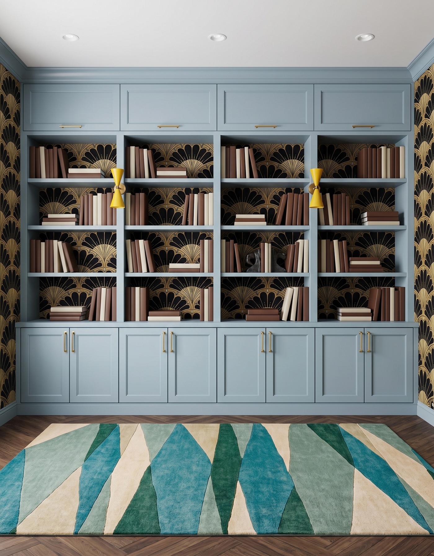
Pale blue framed cabinets, black-and-gold fan wallpaper, brown herringbone floor, teal-and-cream angular rug, mustard hourglass sconces and brown-and-cream books. AI-generated library concept.
Pale blue cabinetry gives the black-and-gold fan motif a lighter frame. Brown and cream books make the collection feel warmer than the wallpaper might suggest. Upright groups and low stacks alternate, keeping the large fan shapes visible behind them.
Dark sculptural bookends are the focal shelf accent. The teal rug is graphic rather than plain, but its broad shapes differ from the wallpaper's smaller curved repeats. Save this combination if you like an Art Deco-inspired motif with more everyday warmth; the style description refers to the visible pattern, not the historical provenance of the room or products.
Try this: Pair a dark metallic-looking fan pattern with lighter cabinetry and warmer book colors.
8. Dusty mauve softens a colorful floral stripe
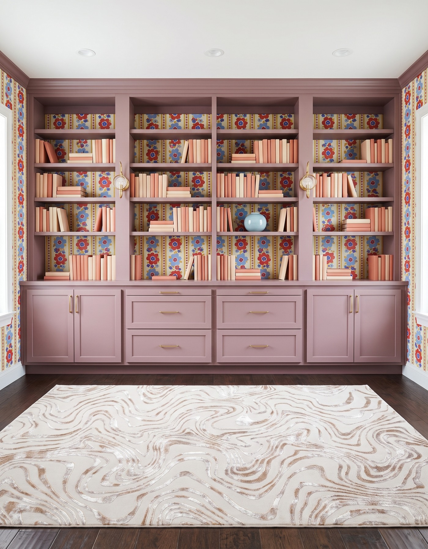
Dusty mauve framed cabinets, red-and-blue floral-striped wallpaper on cream, dark brown wood floor, cream-and-taupe contour rug, brass circular glass sconces and coral-and-cream books. AI-generated library concept.
A dusty mauve framework lets the red and blue flowers feel playful without making the cabinetry equally bright. Coral and cream books repeat the warmer part of the mix. Small gaps between groups expose the vertical pattern behind them, rather than hiding it under a continuous wall of spines.
The pale blue vessel is the smaller styling change on a middle shelf. The cream rug gives the floor a lighter area and a different kind of movement from the wallpaper. Side windows appear in this output; they are part of the concept, not a verified feature of your room. Keep the color relationship and adapt the storage layout to your actual space.
Try this: Use a softened cabinet color and pale textile to balance a lively multicolor floral.
9. Navy shelf backs give green toile a quieter center
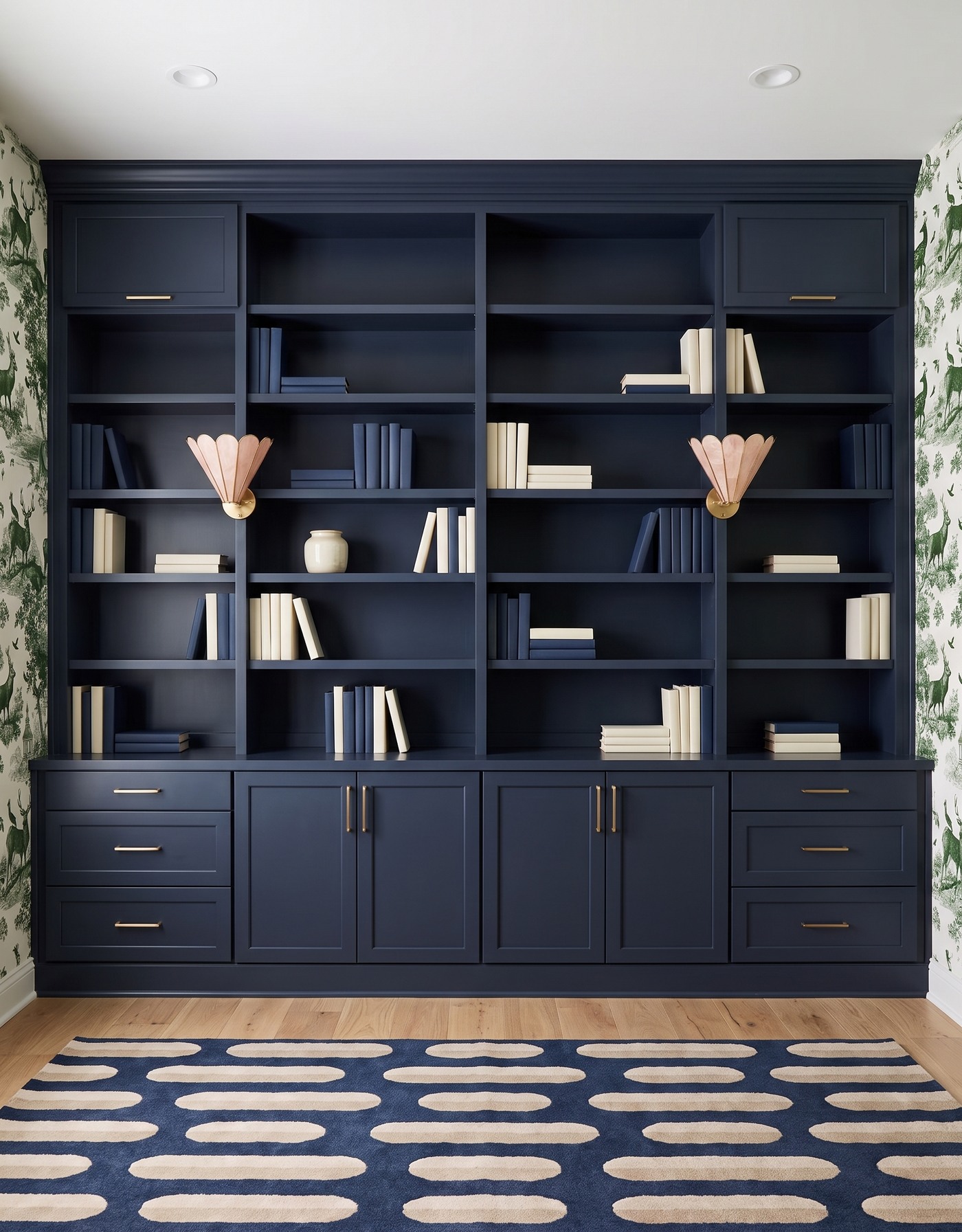
Navy framed cabinets and solid shelf backs, green-and-ivory landscape toile side walls, pale wood floor, navy-and-cream capsule-pattern rug, blush shell sconces and navy-and-ivory books. AI-generated library concept.
The landscape print stays at the sides, leaving a solid navy center for the collection. Ivory books create clear lighter groups against the darker storage, while navy volumes make subtler areas. Several shelves remain relatively open, so the composition does not depend on a decorative object in every bay.
A pale ceramic jar is the focal shelf accent. Blush sconces introduce another softer color, and the rug repeats the dark-and-light relationship at a larger scale. If you want patterned walls with a more restrained library, this solid-back approach is worth comparing with a fully wallpapered bookcase.
Try this: Keep the center solid and use pale book groups when scenic side-wall wallpaper is already expressive.
10. Sage and mustard make one brass bowl enough
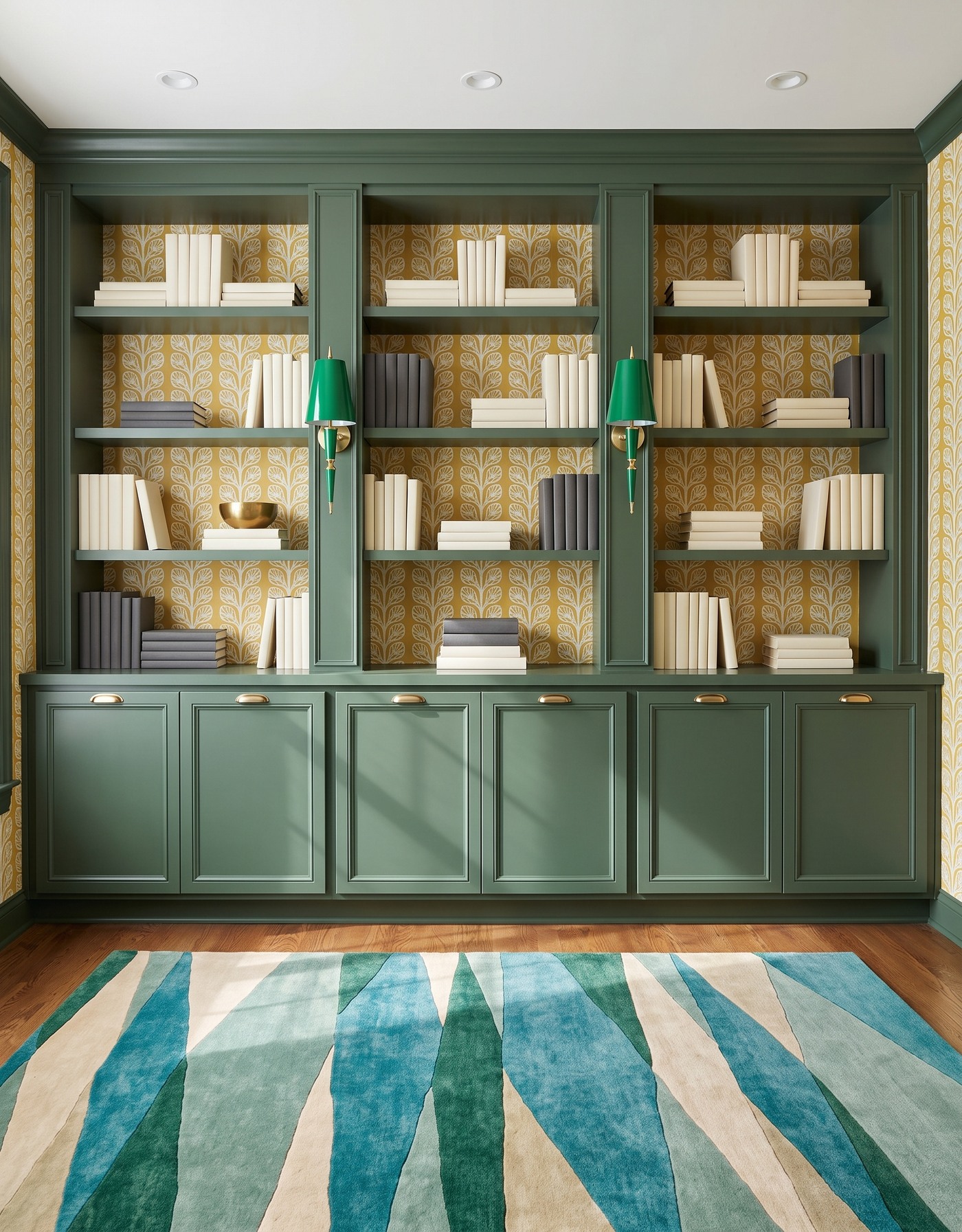
Sage green framed cabinets, mustard-and-ivory leafy wallpaper, warm wood floor, teal-and-cream angular rug, green tapered sconces and charcoal-and-ivory books. AI-generated library concept.
Sage storage and mustard leaves create a warm, slightly unexpected backdrop. Charcoal and ivory books keep the collection simpler than the walls, with horizontal stacks breaking up the upright groups. The teal rug brings a cooler family into the foreground without asking the shelves to add another color.
A brass bowl is the focal decorative piece. Its rounded shape contrasts with the cabinet grid and the wallpaper's upright rhythm. Borrow that restraint for your own library: choose one object you genuinely enjoy, give it breathing room, and let the books supply the rest of the texture. Real shelves still need a measured storage plan and appropriate support.
Try this: Give one decorative object a clear role instead of adding a different accent to every shelf.
Build a library palette with room for your books
1. Choose whether wallpaper belongs behind the shelves, on surrounding walls, or both.
2. Compare the print's scale with the size of the actual shelf openings.
3. Let a few repeated book colors or materials provide continuity; your real collection does not need to match perfectly.
4. Vary upright rows and short horizontal stacks without treating gaps as wasted display space.
5. Measure books and storage needs, verify shelf support, and plan fixtures with a qualified installer; these concepts do not certify dimensions or electrical work.
A bold library can still have a quieter center. The most useful idea may be a solid shelf back, a lighter book group or one well-chosen object, not another pattern. Save the complete combination that appeals to you, then make space for the books and belongings you actually want to keep.
Planning a kitchen too? Explore StilePath for kitchen planning. These library concepts are a separate inspiration brief and do not imply verified library design or structural capabilities.
Explore kitchen planning