
Guest bathroom ideas · Autumn color
10 Guest Bathrooms With an Unexpected Autumn Palette
A guest bathroom can be welcoming without being the most cautious room in the house. Consider a richer vanity color, wallpaper with attitude or a mirror that does more than politely reflect the towel rack.
These ten double-vanity bathroom concepts use autumn as a starting point, not a decorating theme. You will find olive, walnut, berry, saffron and a surprising amount of blue. The warmth comes from the way the surfaces work together, leaving the countertop free for the things a guest actually needs.
Use the images to explore color and pattern, then check practical decisions separately. A concept cannot establish whether particular materials, fittings or layouts suit your bathroom. Start by identifying the visual relationships you want.
These images are AI-created design concepts using Anna's selected prompts and material references. They are inspiration, not photographs of completed projects or installation plans.
1. Give woodland toile a graphic floor
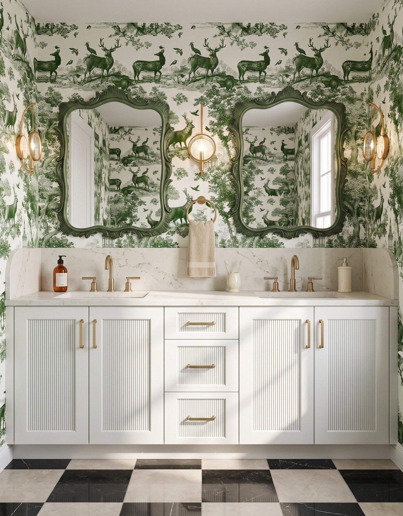
A white reeded double vanity pairs green woodland wallpaper and ornate green mirrors with a black-and-cream checker floor.
Olive woodland wallpaper and white cabinetry bring a traditional mood, but black-and-cream checkerboard keeps it from becoming too polite. Green mirror frames reinforce the botanical family. Olive and warm ivory supply autumn warmth without seasonal objects.
The useful contrast is between descriptive pattern and simple geometry. Toile gives you little scenes to discover; checkerboard reads in broad blocks. Keep the countertop accessories quieter than either one. You can introduce plenty of personality through permanent surfaces without making the everyday washing area feel like a decorated shelf.
Try this: Pair an intricate wall pattern with a simpler, larger floor geometry.
2. Let olive and mustard share the spotlight
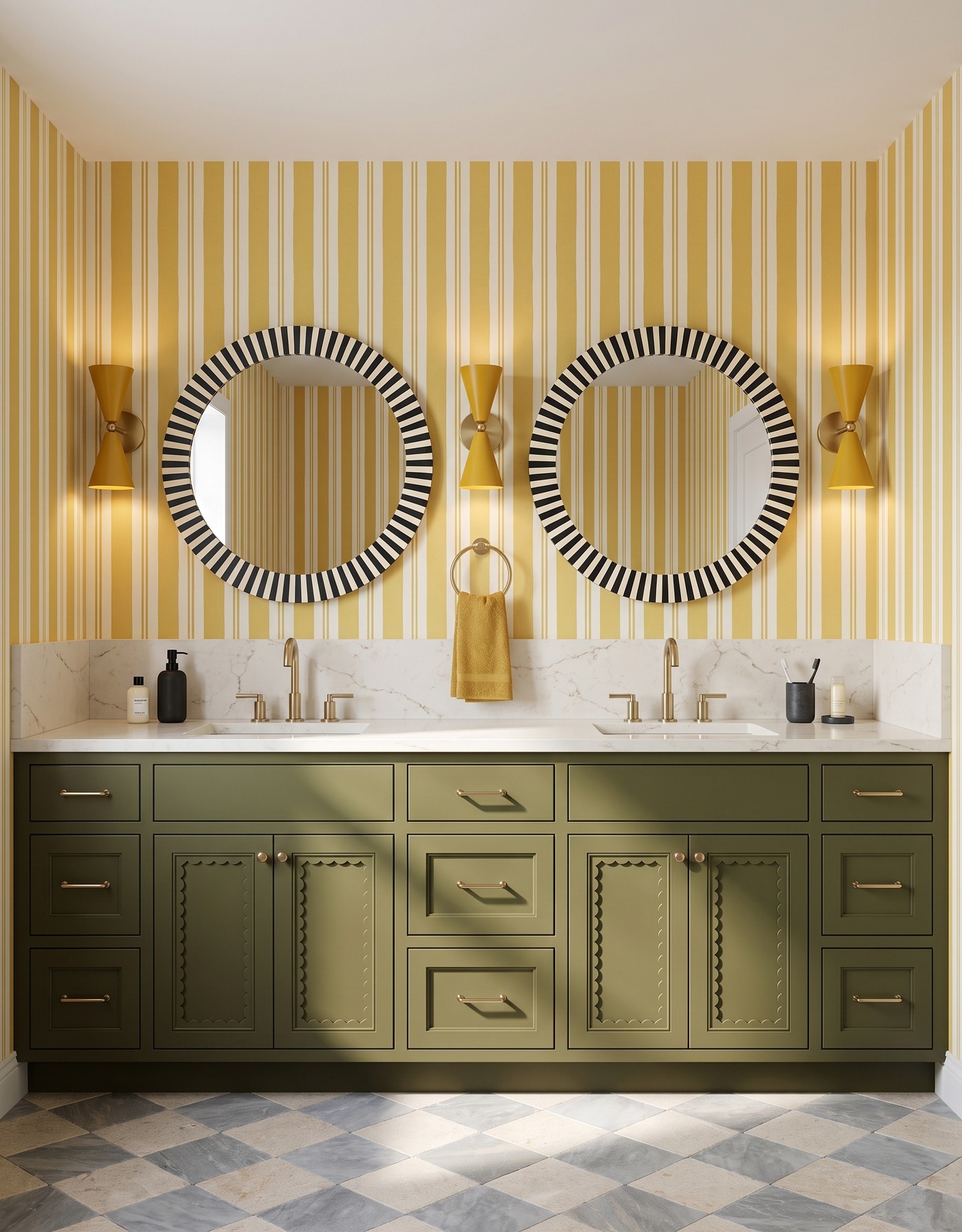
Olive scalloped vanity doors sit below mustard-striped walls, round striped mirrors and yellow sconces.
Olive cabinetry and mustard stripes have the depth of an autumn wardrobe. The mirror's black-and-ivory frame adds a sharper accent, while the softer checkerboard floor keeps the patterns from competing at full volume.
When you try a combination this layered, compare contrast before counting colors. A pale, cloudy floor behaves differently from a crisp black-and-white one, even if both are checkerboards. Giving one patterned surface a lower contrast allows the stronger wall and mirror details to retain their character without crowding each other.
Try this: Control a layered palette by varying contrast, not by removing every pattern.
3. Give dusty pink a graphic edge
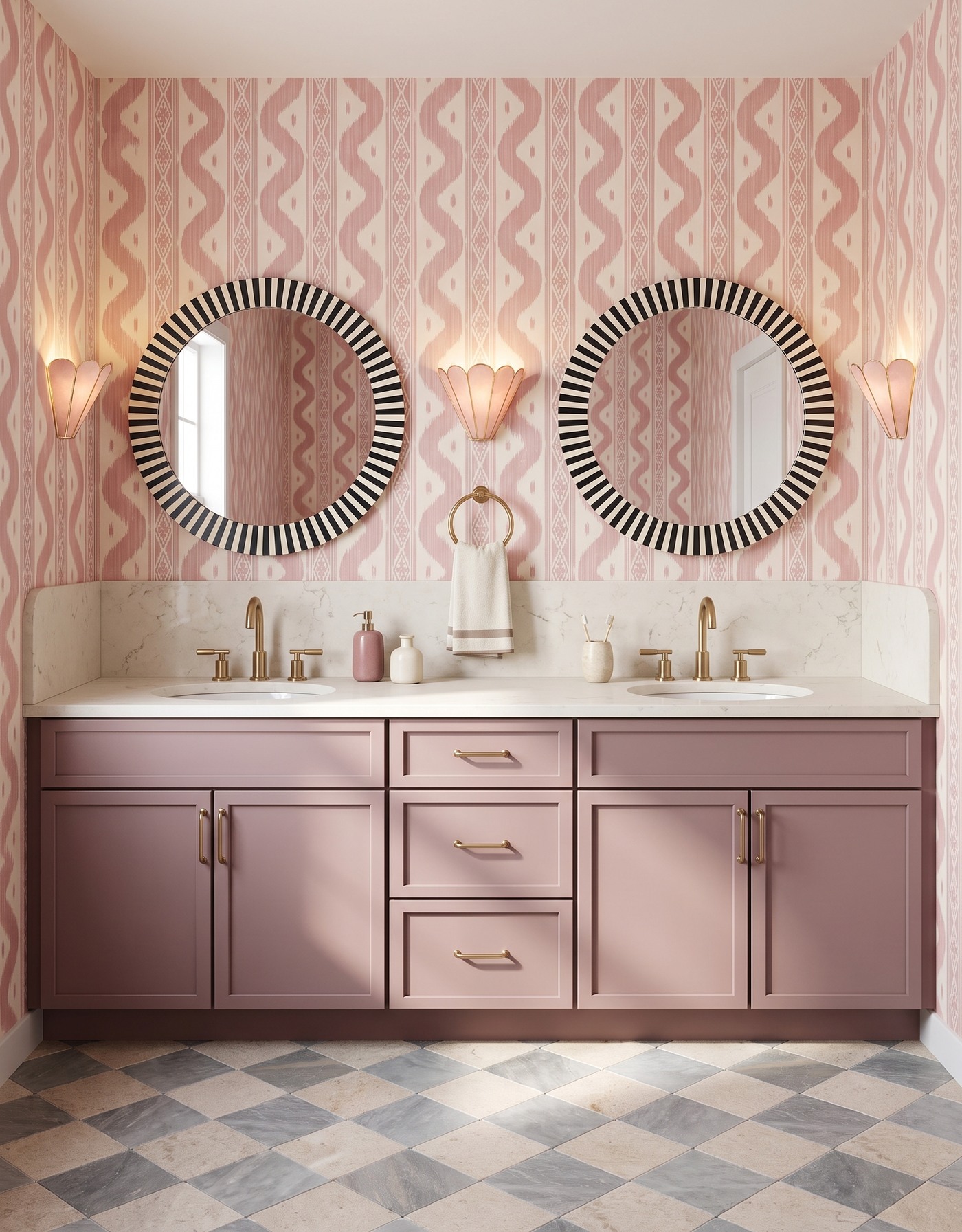
A dusty-pink double vanity and blush ikat wallpaper are grounded by black-and-ivory striped mirrors.
Dusty-pink cabinetry and blush ikat make a softer guest bathroom, but the graphic mirror keeps it from becoming sugary. A gray-and-cream floor supplies another muted layer, without the usual orange leaves announcing the season.
Look for a shared softness rather than an exact pink match. A dusty cabinet color can sit happily beside a warmer blush when both have some gray or brown in them. A darker accent then gives the eye a clear stopping point, making the gentler colors feel chosen rather than washed out.
Try this: Give a soft tonal palette one crisp dark accent so its subtleties stay visible.
4. Put smoky blue next to a confident red stripe
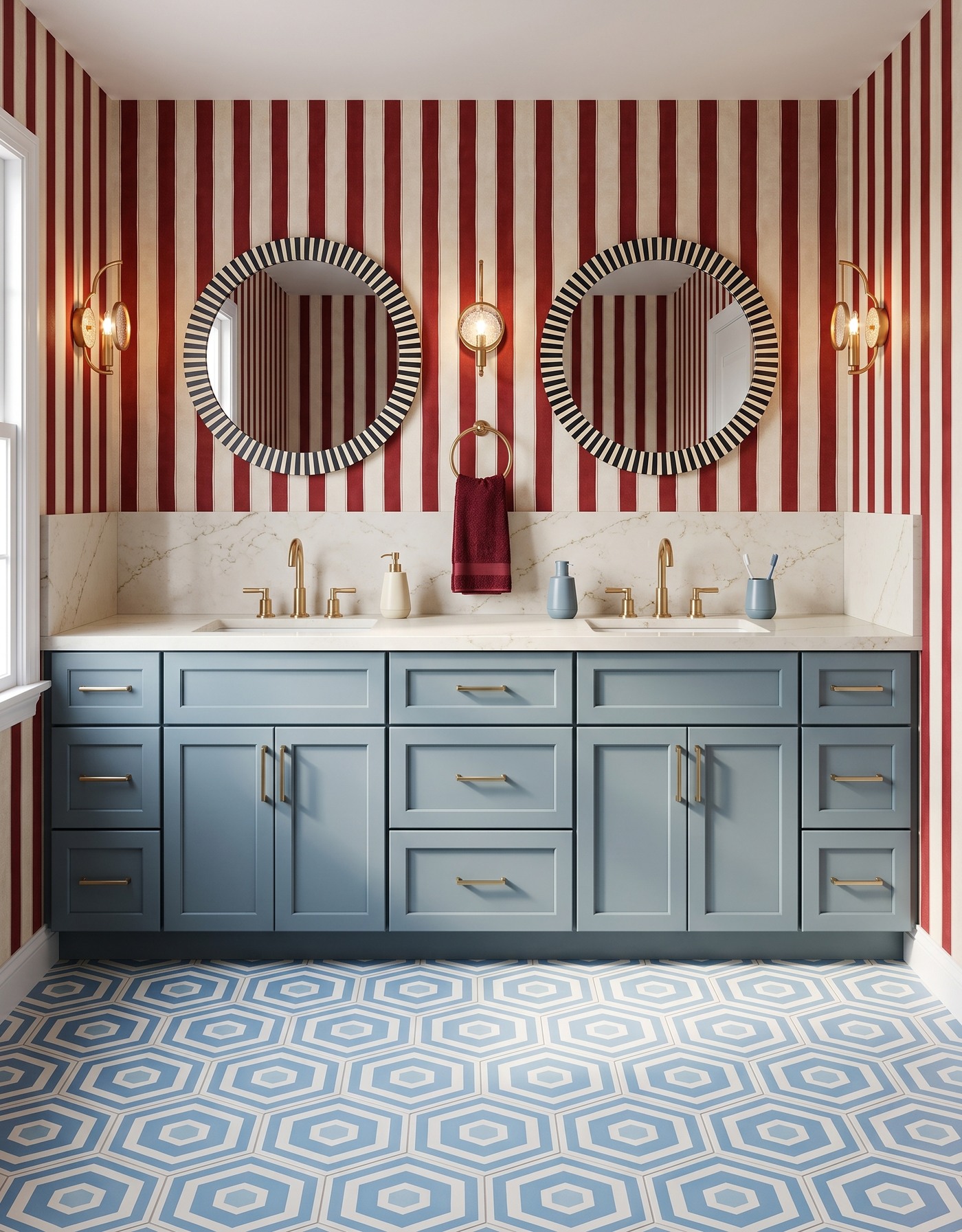
Smoky-blue vanity cabinets balance red-striped wallpaper, blue hexagon tile and round striped mirrors.
Smoky-blue cabinetry and vermilion stripes make a deliberately lively pairing, with blue-and-ivory tile carrying the cooler color toward the floor. Think of an excellent red scarf worn with a favorite faded-blue shirt.
For a room with several graphic surfaces, continuity can come from color rather than identical shapes. The cabinet and tile relate through blue; the wall supplies the warm interruption. Keep the small accessories simple and let a towel echo one existing shade instead of introducing a fourth design conversation beside the sink.
Try this: Connect the floor and cabinetry through color, then let the wall provide the surprise.
5. Try black, gold and a little evening drama
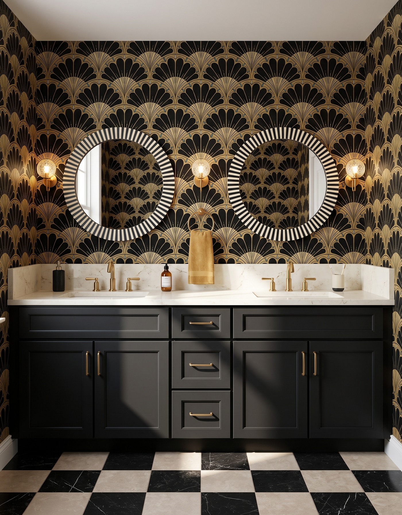
Black cabinetry and gold fan wallpaper make a graphic pair with striped mirrors and checkerboard flooring.
Black cabinetry and a gold fan pattern create a dressed-up bathroom with an Art Deco inflection. The pale counter and cream portions of the floor are important: they interrupt the dark surfaces and keep the room readable. The wallpaper supplies decoration without requiring a collection of decorative objects around it.
Do not mistake a dark palette for permission to make everything dark. Compare the amount of light area as carefully as the black and gold. For a real project, review the finishes under the lighting you intend to use; an attractive concept image is not a substitute for checking how faces and surfaces appear in person.
Try this: Give a dark bathroom generous light surfaces instead of relying on metallic accents alone.
6. Warm smoky blue with saffron leaves
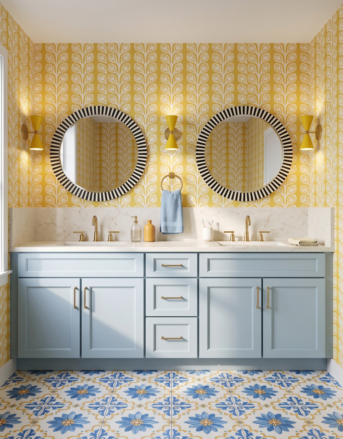
Pale-blue cabinets and saffron leaf wallpaper pick up the colors in a blue-and-yellow floral tile floor.
Smoky-blue cabinetry gets a warm companion in saffron wallpaper. Blue floral tile connects the colors below, while the pale countertop separates the wall and cabinet fronts. It is a cheerful alternative to burgundy and brown.
Two botanical patterns can work together when their roles are clear. Here, the wall has a taller, more linear movement and the floor reads as a repeating field. Before choosing actual products, lay the samples beside the cabinet finish and step back; relationships that disappear at room distance will not do much decorating work.
Try this: Use a connecting color to unite different botanical patterns across wall and floor.
7. Let ochre cabinetry be the warm center
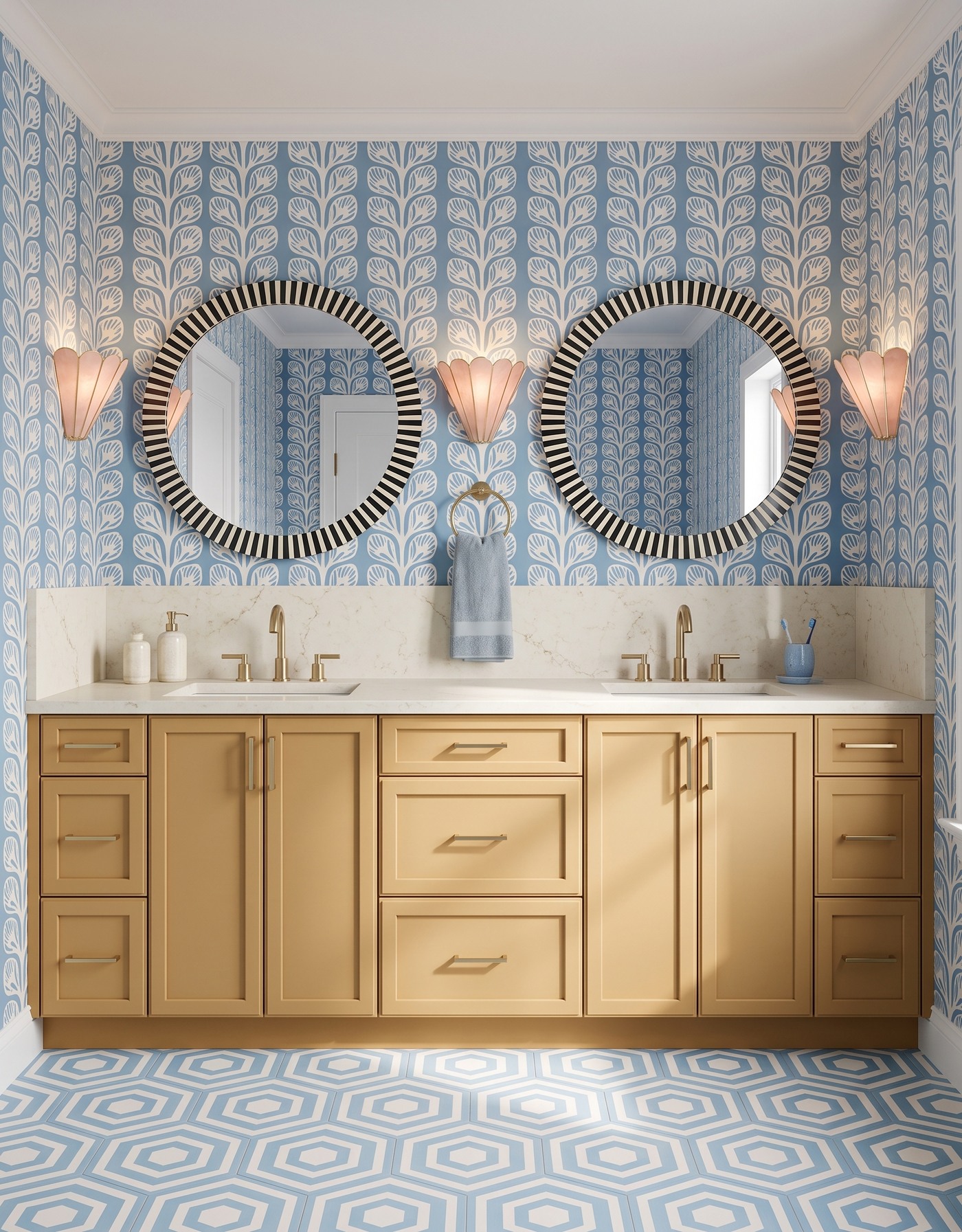
Ochre vanity cabinetry warms dusty-blue leaf wallpaper and blue geometric floor tile.
Golden cabinetry sits between blue leafy wallpaper and blue-and-ivory tile. Concentrating the warmth in the vanity gives the room a clear center of gravity, allowing the cooler surroundings to feel fresh instead of chilly.
This is a useful way to use a cabinet color you love without making the whole room that color. Choose surrounding patterns that share a calmer family, then keep the counter relatively quiet. A few ordinary essentials are enough; the golden cabinetry has already done the work of making the room feel special.
Try this: Concentrate your warmest color in one major surface and let cooler partners surround it.
8. Bring walnut into a green botanical mix
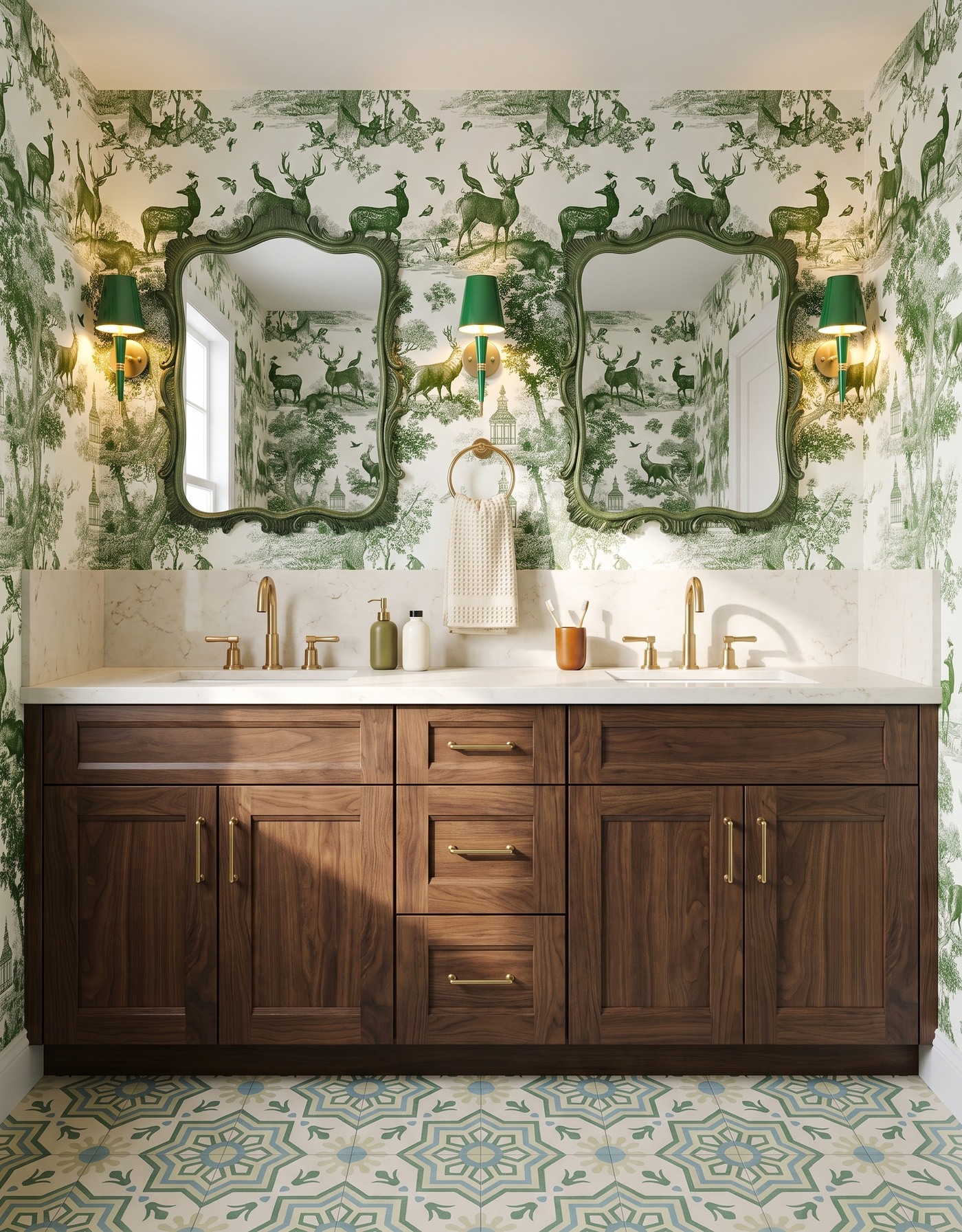
Walnut-toned cabinets, green woodland toile and ornate green mirrors create a layered guest vanity.
Walnut-colored cabinetry gives woodland toile a deeper, more grounded partner. Green mirror frames and the sage-toned tile continue the botanical family, while the wood grain keeps the room from feeling like a collection of printed surfaces. The autumn mood comes through as earthy rather than overtly seasonal.
Wood is not automatically a neutral when the grain is strong. Treat it as another visible pattern and consider what sits immediately beside it. A quieter counter can create a buffer between the cabinet fronts and detailed wallpaper, allowing the warmth of the wood to register without visual competition at every edge.
Try this: Count expressive wood grain as part of the pattern mix, not as an invisible background.
9. Pair burnt orange with tailored plum plaid
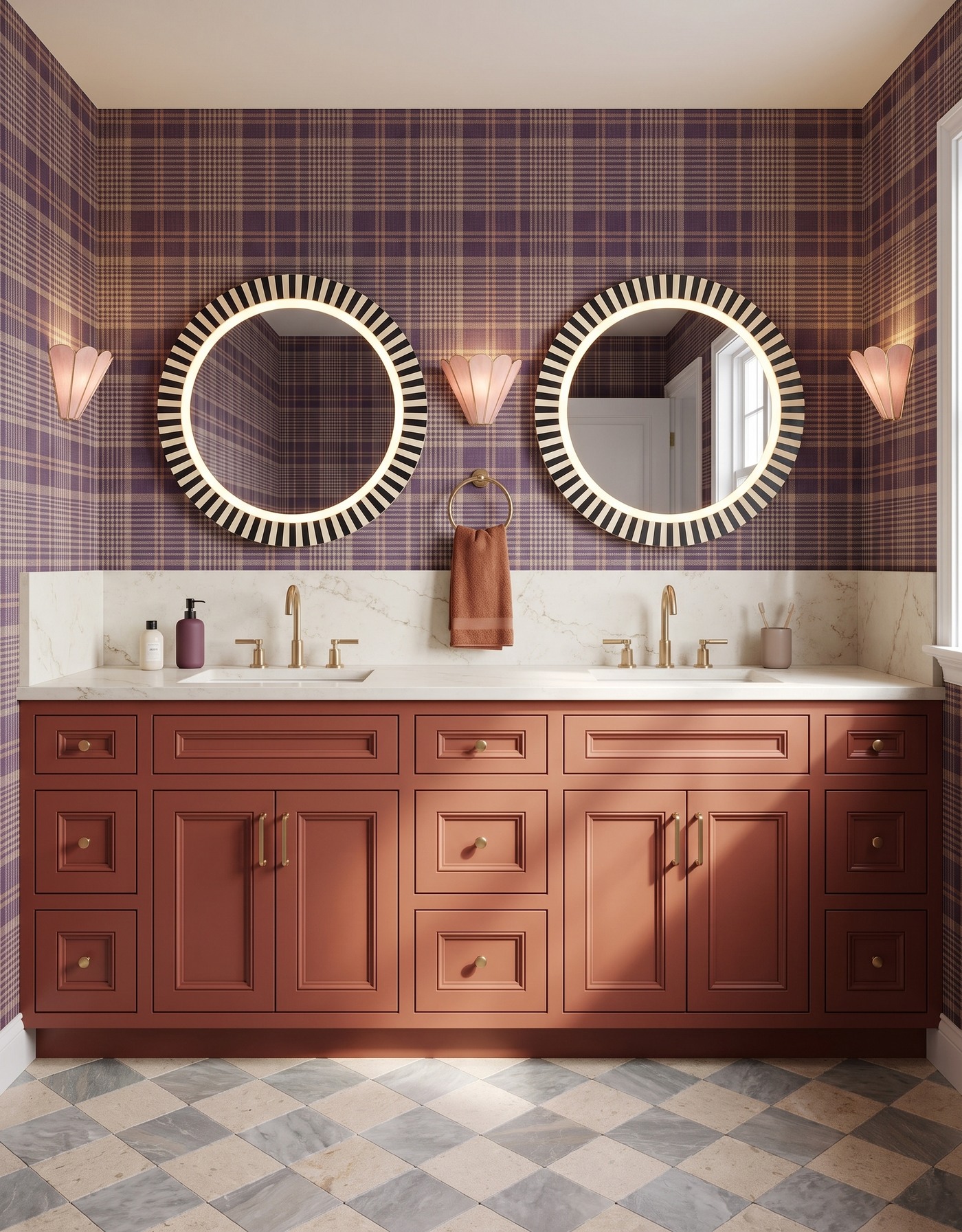
Rust-colored vanity cabinets pair plum plaid with striped circular mirrors and a terracotta towel.
Burnt-orange cabinetry and plum plaid offer a less obvious version of fall color. The cabinet profile gives the orange a traditional structure, while the wallpaper keeps the surrounding detail small and orderly. A softened checkerboard floor supports the pairing without adding another intense hue.
Orange does not have to be bright to be the most noticeable color in a room. Test a muted version beside the actual plum and taupe you like before deciding it needs toning down further. Simple towels and restrained counter pieces let the relationship feel welcoming rather than staged for a holiday display.
Try this: Let a muted orange do the bold work while smaller, cooler pattern keeps it tailored.
10. Ground aqua florals with pale oak
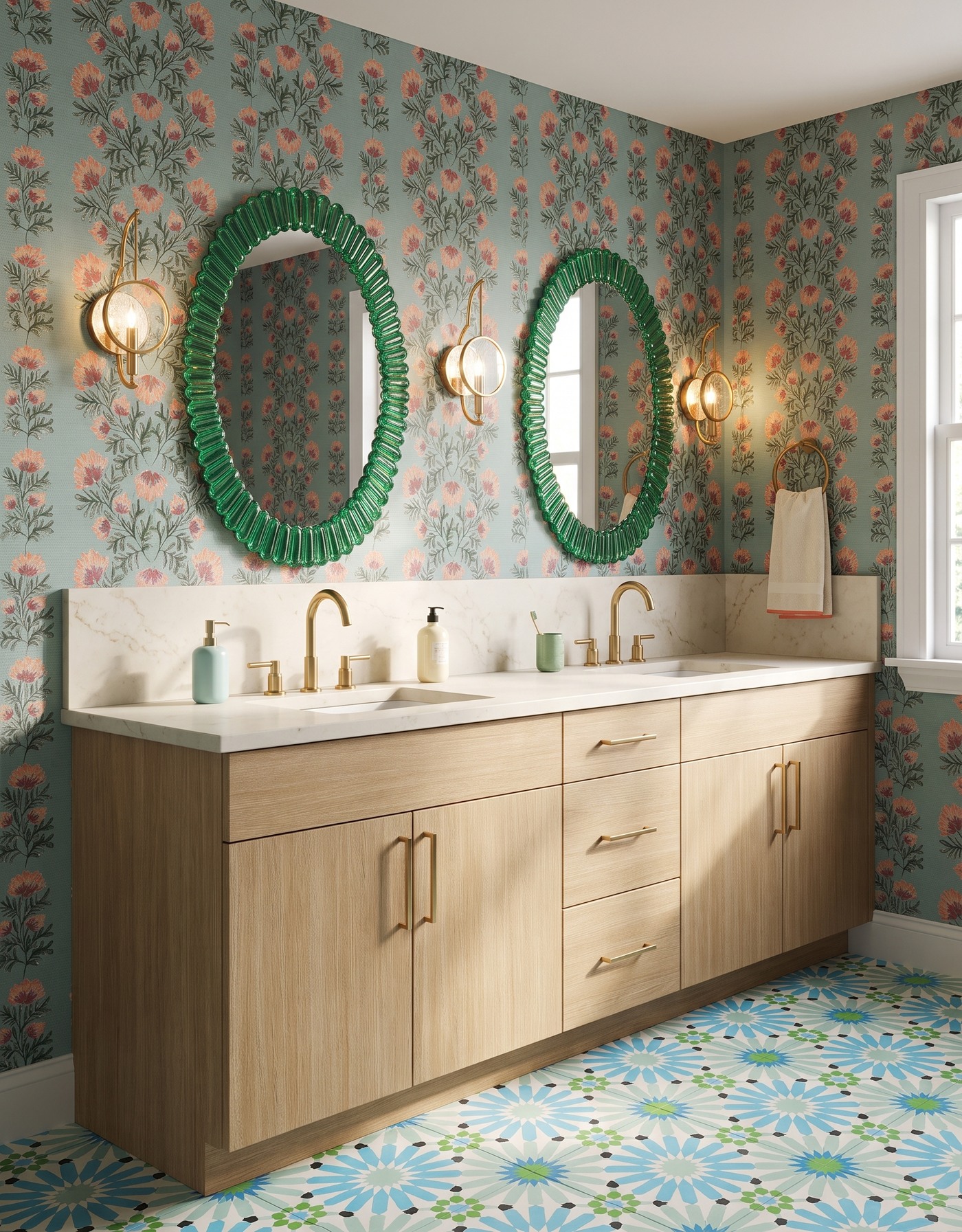
A light-oak-toned vanity sits beneath green glass-look oval mirrors and coral floral wallpaper.
Pale oak cabinetry gives an aqua-and-coral floral a steady base. Green mirror frames and colorful geometric tile create a fuller palette, but the natural-looking wood introduces a simpler rhythm: autumn beyond dark jewel tones.
When a scheme has this much color, identify the surface you want to stay calm. Here, the cabinet fronts perform that role. Borrowing the idea might mean keeping your existing wood vanity and changing only the surrounding palette, rather than replacing every finish because one inspiration image contains several exciting ones.
Try this: Keep one substantial surface simple when the mirrors, walls and floor are expressive.
Make a guest bathroom palette work beyond the picture
1. Choose the leading surface before buying a collection of equally bold finishes.
2. Compare full samples of the wallpaper, tile and vanity finish, including their pattern scale.
3. Check product suitability for the actual bathroom conditions with the manufacturer or project professional.
4. Plan lighting, mirror placement, storage and clear counter space around real daily use.
5. Finish with useful guest essentials; decorative objects do not need to occupy every available surface.
Start with a palette that feels warm, a contrast that makes you smile and space for everyday use. Save the combination you would still love after the fall guests have gone home.
Gathering ideas for changes around the house? Explore Home3's planning approach to understand the available next steps.
See Home3's planning approach