
Kitchen materials · Floors & countertops
10 Floors to Make Your Countertops the Star
A countertop does not become the focal point on its own. What sits beneath it changes how bright, warm and substantial it looks. The floor is one of the largest surfaces in the kitchen, so its color and grain deserve a place in the countertop conversation.
These ten concepts keep the countertop direction consistent: light, softly veined quartz. The floor changes from pale oak tones to dark planks, warm honey and herringbone. That makes it easier to see different ways of supporting a light counter without covering the kitchen in competing patterns.
Treat the images as palette studies, not product specifications. A rendered wood look does not identify a species, finish or flooring construction. Use the relationships you like to narrow your choices, then compare real samples in the room.
These images are AI-created design concepts using Anna's selected prompts and material references. They are inspiration, not photographs of completed projects or installation plans.
1. Outline the countertop with a dark floor
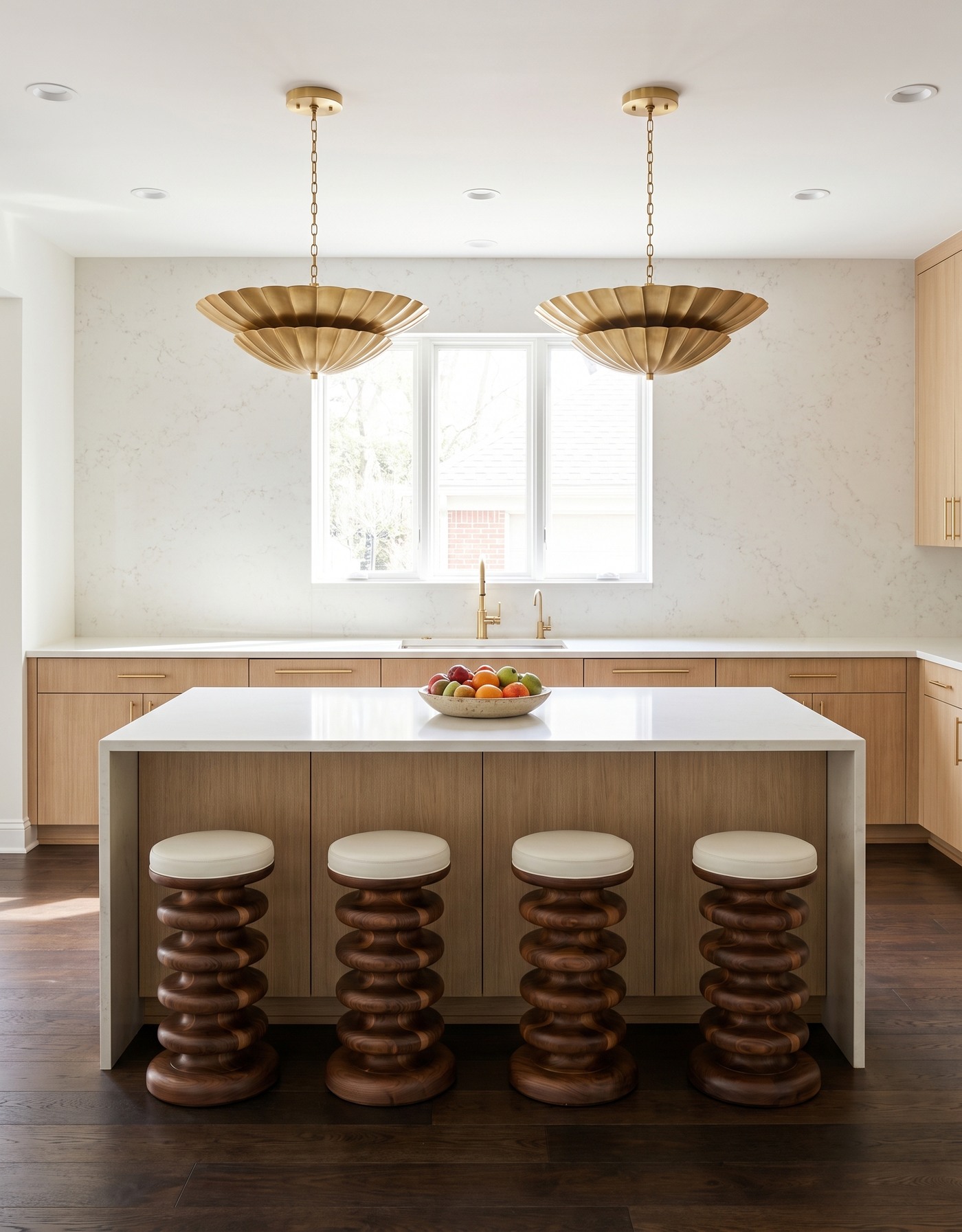
Dark brown wood planks beneath natural-wood cabinets and a pale waterfall island with sculptural wooden stools.
A deep brown floor gives light quartz a more obvious contrast partner. The eye reads the pale counter against a darker lower layer, while natural-wood cabinetry makes the transition feel less abrupt. You get definition without needing a heavily patterned stone.
Dark flooring can vary from warm brown to nearly charcoal. Bring a large enough sample to see both the base color and the grain. The right choice should connect to the cabinetry as well as contrast with the counter; darkness alone is not the whole decision.
Try this: Use a deeper floor to emphasize a light countertop, with cabinetry that connects the two.
2. Give light quartz a quiet pale-oak base
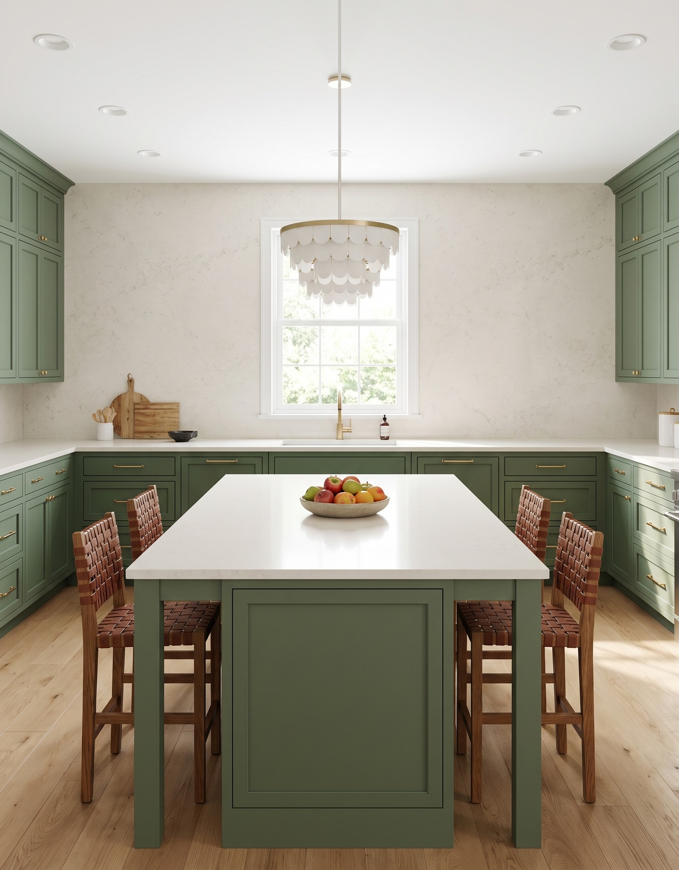
Pale wood planks beneath green kitchen cabinets and a white-topped island with woven stools and an ivory pendant.
Pale wood tones keep the lower half of this kitchen light without trying to match the countertop exactly. Green cabinetry supplies the stronger color boundary, so the pale counter still reads as a distinct horizontal surface. The wood adds warmth and grain beneath it.
This is a useful approach when you like a bright kitchen but do not want every material to feel white. Look for a floor sample with enough warmth to soften the counter, then check whether that warmth turns yellow beside your actual quartz sample.
Try this: Let pale flooring provide warmth while cabinet color separates it from the light countertop.
3. Add honey warmth beneath cool cabinetry
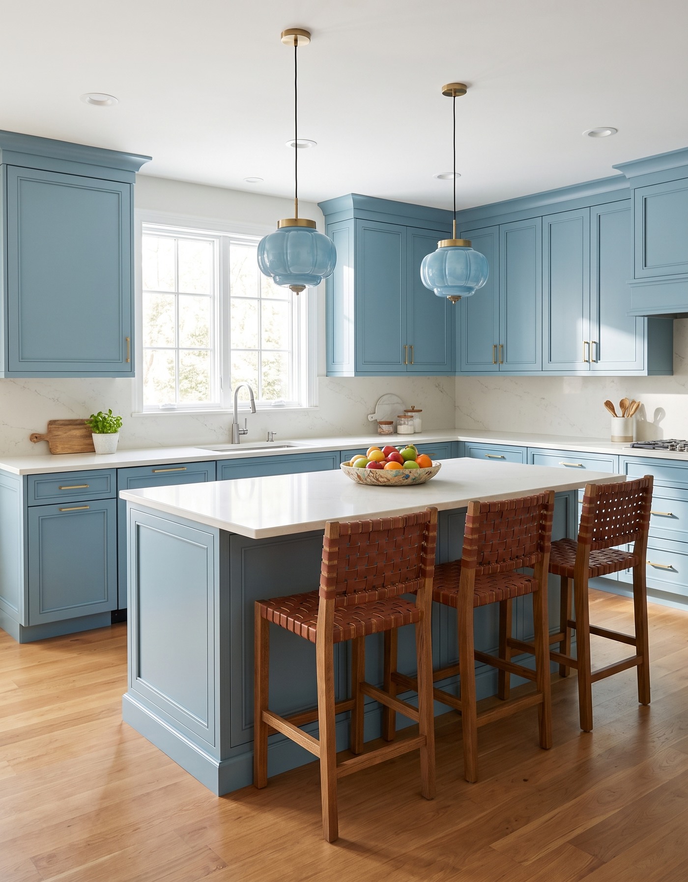
Honey-toned wood flooring beside aqua kitchen cabinets, a pale island counter and woven leather-look stools.
Honey-toned planks introduce a warm lower layer beside aqua cabinetry and a pale counter. The floor does not need to repeat the cabinet color. Its role is to make the cool palette feel more balanced and give the white surfaces something warmer to sit above.
The important distinction is warmth versus orange. A honey floor that feels gentle in isolation may look much stronger beside a cool cabinet sample. Put all three materials together before deciding; the relationship is more informative than any one swatch.
Try this: Test honey-toned flooring beside the actual cabinet finish, not just beside the countertop.
4. Let golden grain support deep blue
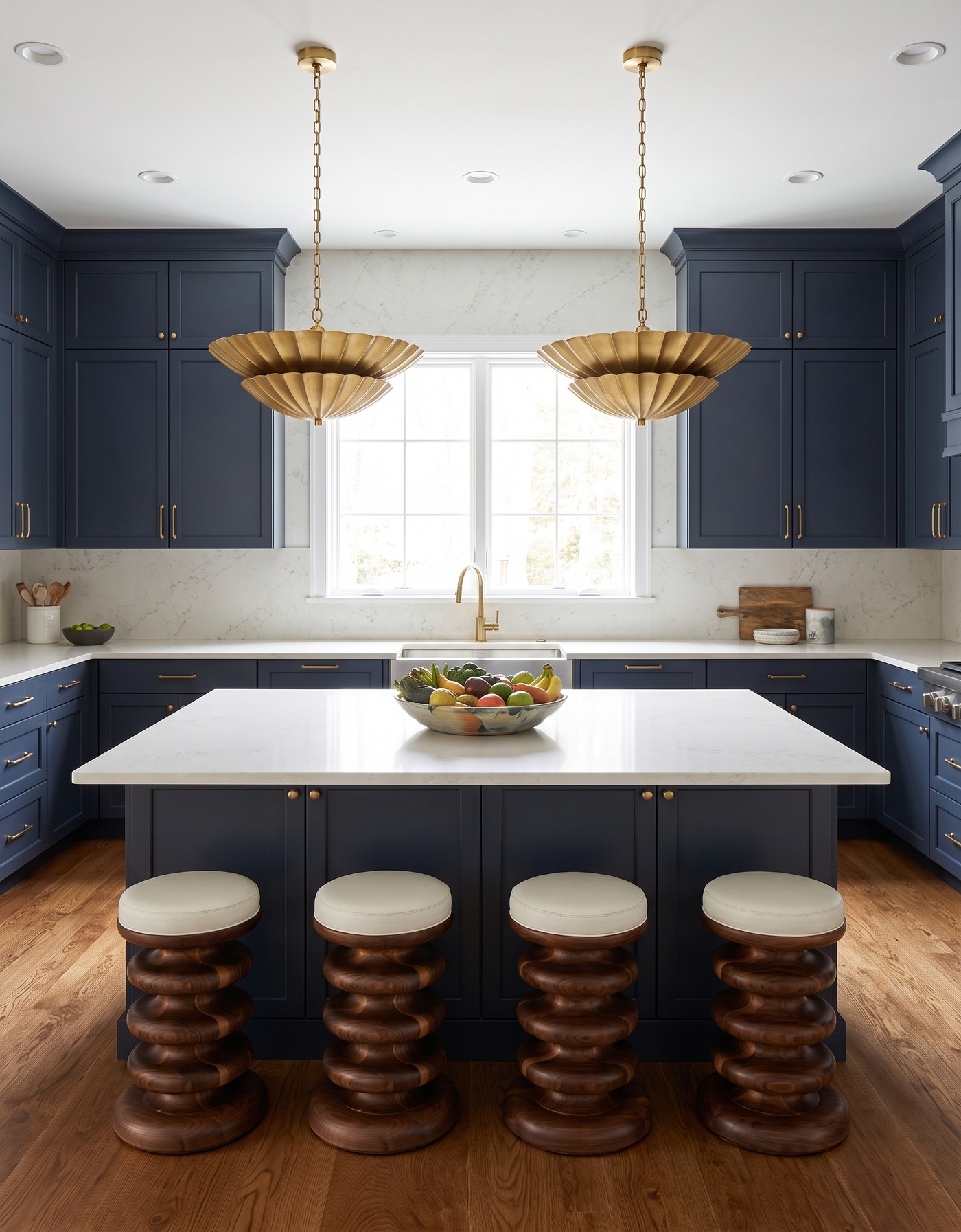
Golden-grained wood flooring beneath deep-blue cabinets, a light island counter and two brass-toned pendants.
Golden wood tones and deep-blue cabinetry create a clear warm-and-cool contrast. Light quartz makes a calm dividing line between them. The floor contributes grain and movement, while the counter keeps a simpler, brighter surface at working height.
If the floor has pronounced grain, resist the urge to choose a countertop with equally strong movement just because both samples are beautiful. Decide which surface should carry the most pattern. A restrained counter can feel more prominent precisely because the materials around it have more texture.
Try this: Balance expressive floor grain with a quieter countertop pattern.
5. Choose walnut-like depth without a patterned layout
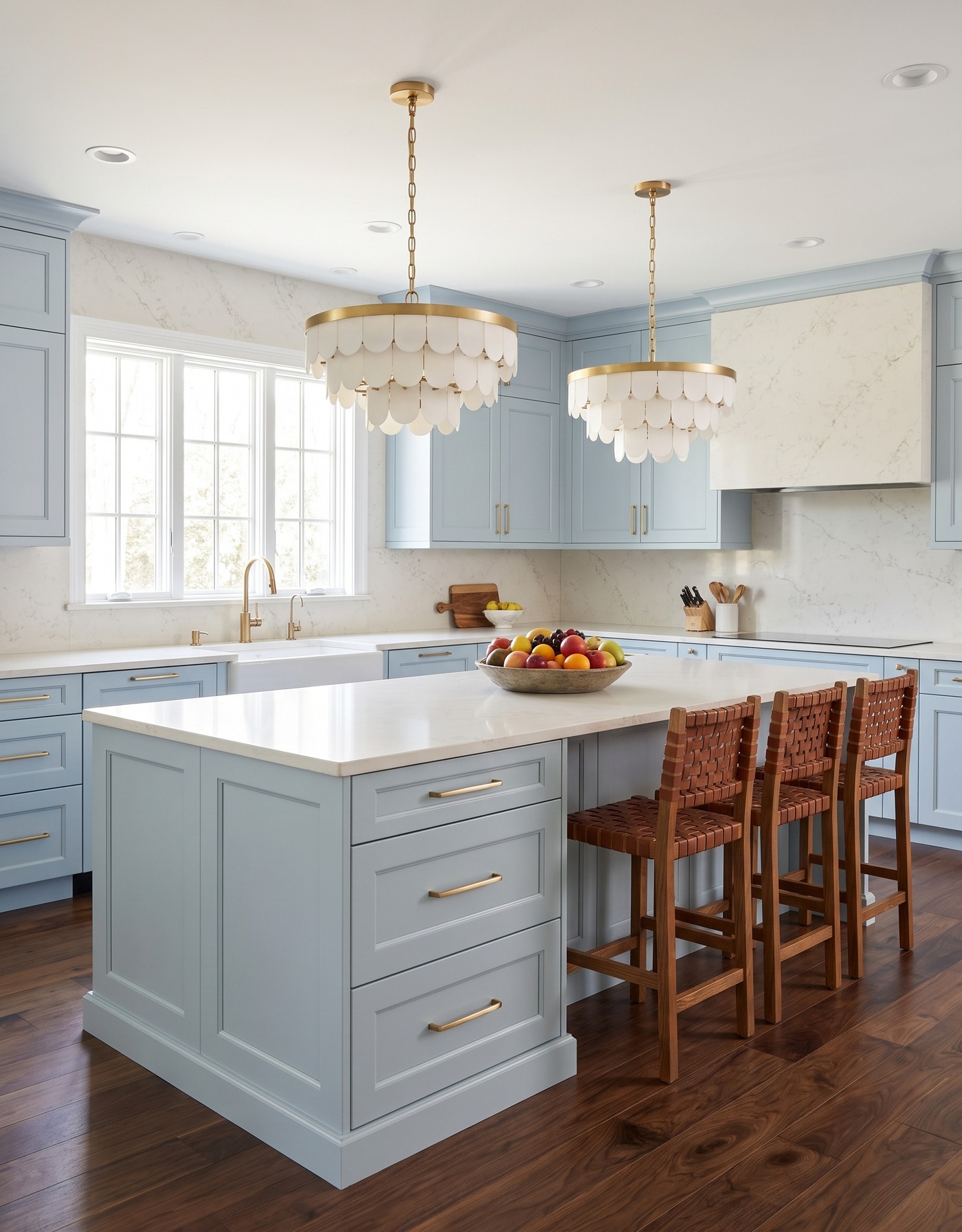
Rich brown straight-plank flooring with pale smoky-blue cabinets, a white island top and woven stools.
Brown, walnut-like tones add depth through color and grain rather than through a decorative laying pattern. Against smoky-blue cabinetry, the warmer floor helps the pale countertop feel crisp. Straight planks keep the overall direction easy to read.
This is an option worth considering when you want richer wood but already have plenty happening in the cabinet color and lighting. Compare several boards or a larger sample image: one small piece may not show the full range of light and dark grain that will fill the room.
Try this: Get richness from tone and grain when you want to keep the floor layout simple.
6. Give herringbone a quiet countertop partner
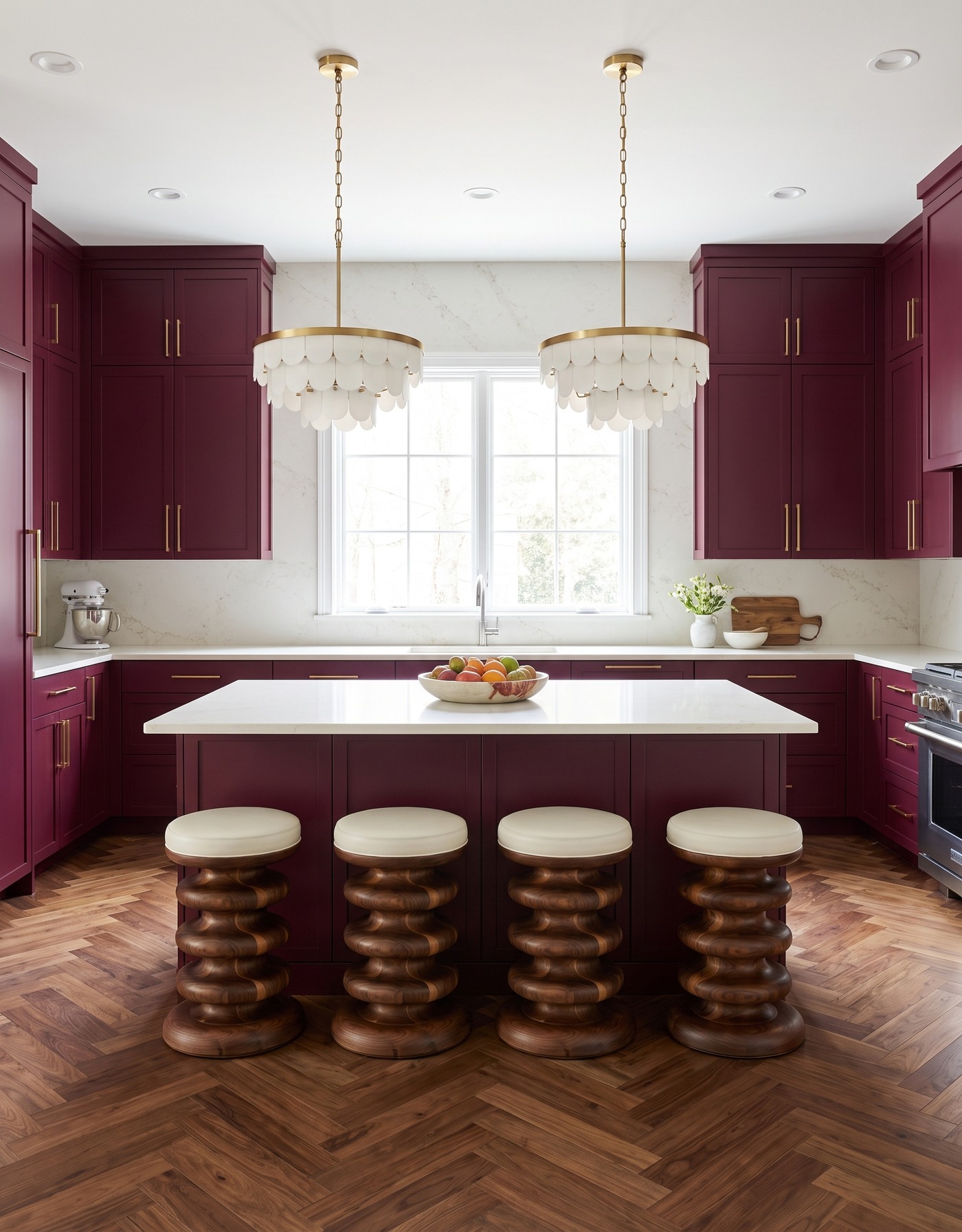
Warm brown herringbone flooring below berry kitchen cabinets, a pale island counter and ivory pendants.
Herringbone brings its own rhythm to the kitchen. The angled pieces make the floor visually active, so the light countertop works best here as a broad, calmer plane. Berry cabinetry supplies color without needing an additional wall pattern.
A patterned floor deserves to be seen in the whole layout, not only as a close-up. Think about the areas that will remain visible around the island and at doorways. Before installation, review the proposed starting point and pattern direction with the flooring professional.
Try this: Let herringbone carry the movement and keep the countertop comparatively restrained.
7. Use whitewashed tones with dark cabinetry
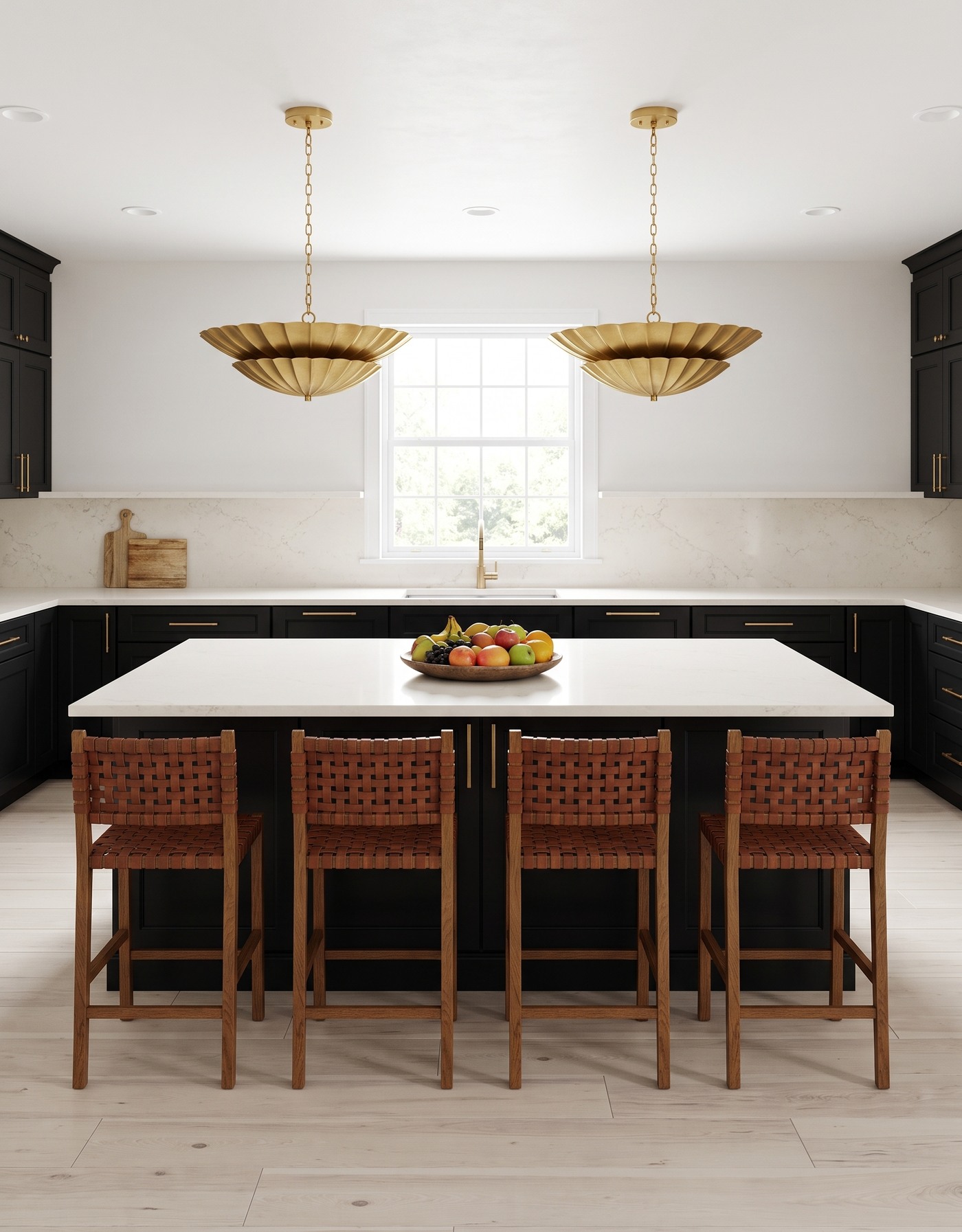
Whitewashed-looking wood planks with black kitchen cabinetry, a pale island counter and woven stools.
A very pale, whitewashed-looking floor keeps the room light beneath dark cabinet fronts. The countertop and floor are related in brightness, but the cabinets sit between them as a strong visual separator. That contrast helps the light counter retain its outline.
Pale does not mean undertone-free. Some whitewashed finishes lean gray, some pink and some cream. Compare your floor and countertop under the same light, then look at them from across the room. A subtle mismatch can become more obvious when it covers a large area.
Try this: Check the undertones of two pale surfaces even when dark cabinetry separates them.
8. Try smoky gray-brown beneath mauve
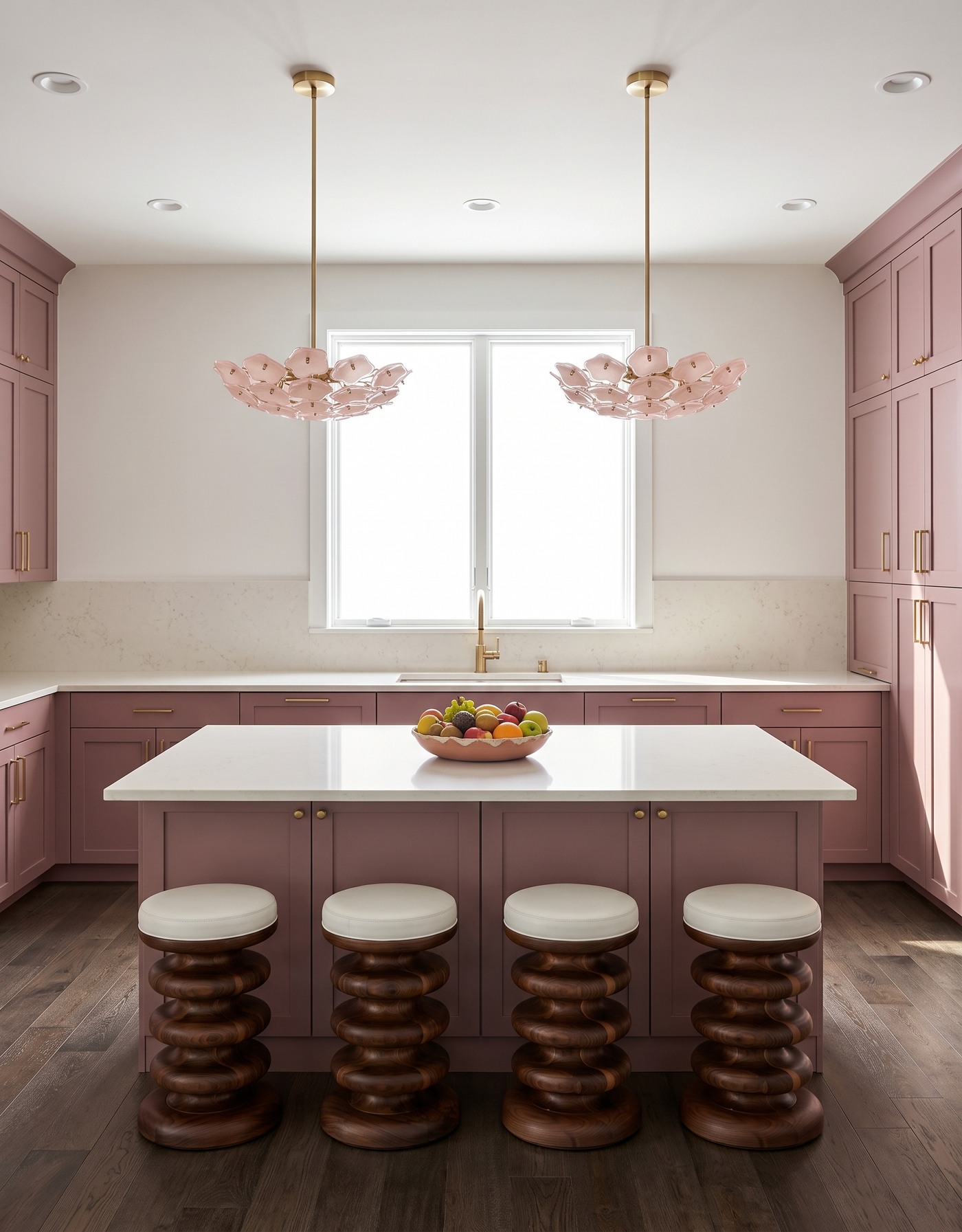
Smoky gray-brown flooring beneath mauve cabinets, a pale island and pink flower-shaped pendants.
Smoky gray-brown flooring offers a quieter partner for mauve cabinetry. It carries some warmth without becoming a strong golden note, allowing the pale counter to remain the clearest light surface. The combination has a softer contrast than a nearly black floor would.
Gray flooring is not a single color family. Look for the brown, green or violet influence in the sample and compare it directly with the cabinet finish. The goal is a deliberate relationship, not a collection of finishes that happened to be called neutral.
Try this: Read the undertone inside a gray floor before pairing it with a colored cabinet.
9. Put near-black planks beneath golden cabinets
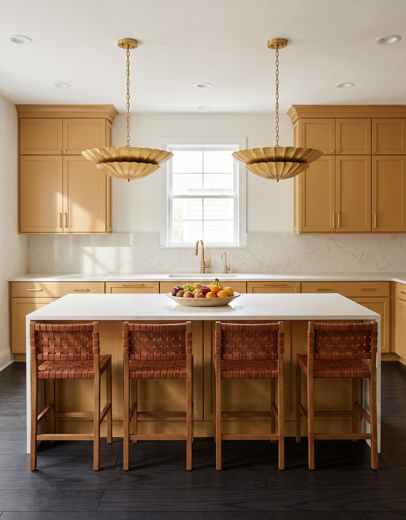
Near-black straight planks beneath golden kitchen cabinets, a pale island top and woven stools.
Near-black straight planks create the strongest lower contrast in this collection. Golden cabinetry brings warmth between the dark floor and light counter. The countertop feels bright without requiring dramatic veining to get attention.
Because the floor is so deep, its sheen and visible grain become important parts of the effect. Compare finishes in the light your kitchen actually receives. A sample viewed flat on the floor will tell you more than the same board held upright in a showroom.
Try this: Use a dark floor as a deliberate contrast choice, and evaluate its finish in place.
10. Settle the palette with soft tan planks
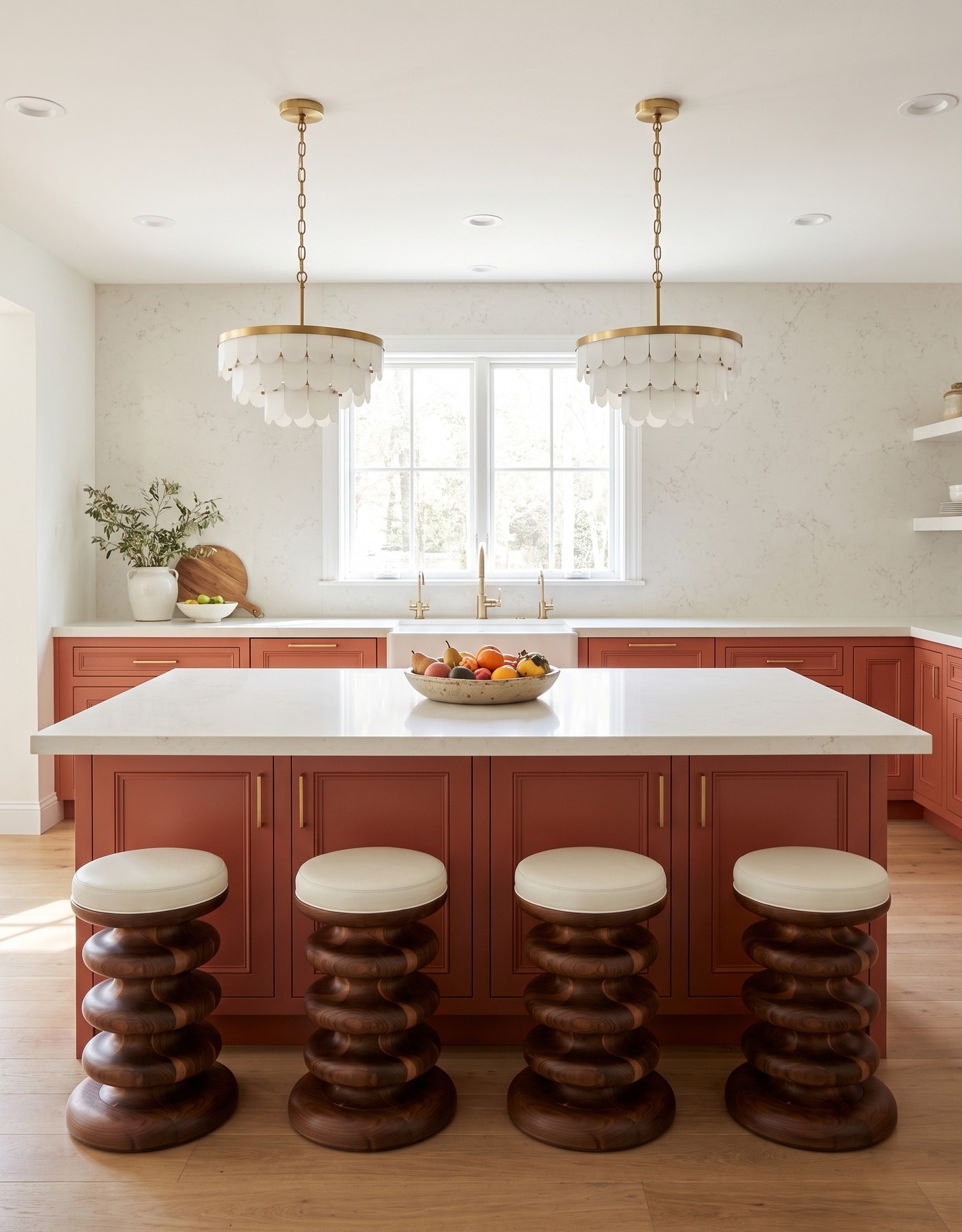
Soft tan planks beneath burnt-orange kitchen cabinets, pale counters and sculptural wooden stools.
Soft tan flooring sits between the very pale and very dark options. It gives burnt-orange cabinetry a related warm base while leaving the light countertop as the brighter surface above. The result is layered without relying on a sharp black-and-white contrast.
This middle ground is useful when you want a warm kitchen but do not want the floor to announce itself first. Compare the strength of the grain as well as the color. A quieter tan plank and a highly figured tan plank can create very different rooms.
Try this: Choose both the tone and the grain strength when you want a supportive, middle-value floor.
Compare the whole material group
1. Place countertop, cabinet and flooring samples together in the kitchen.
2. Lay the floor sample flat and view the counter sample at its intended orientation.
3. Check daylight and the lighting you use after dark.
4. Choose where the strongest pattern belongs: floor, counter or another surface.
5. Confirm the selected flooring product's suitability, care requirements and installation details with its supplier.
The best floor for your countertop is not necessarily the quietest one. It is the one with a clear job: adding warmth, creating contrast or bringing movement below a simpler surface. Save the relationship that works for you, then prove it with real materials.
Bring your preferred floor-and-counter direction into a measured kitchen layout before making final selections.
Explore kitchen planning with StilePath