
Fall kitchen ideas · Color combinations
10 Fall Kitchen Color Ideas That Feel Warm, Not Predictable
A kitchen can feel ready for fall without looking as if a seasonal aisle exploded across the counter. The warmth can come from the room itself: a honey-colored floor, a mustard seat, an inky cabinet or a wallpaper with the softness of a faded botanical print.
These ten eat-in kitchen concepts use autumn as a color direction, not a decorating deadline. They are ideas to save as the season approaches, with combinations that can stay interesting long after the last pumpkin leaves the porch.
Notice which surface does the talking in each room. Sometimes it is the cabinetry; sometimes the wallpaper or dining furniture takes the lead. You do not need every finish to announce fall at the same volume.
These images are AI-created design concepts using Anna's selected prompts and material references. They are inspiration, not photographs of completed projects or installation plans.
1. Warm up navy with camel florals and mustard seats
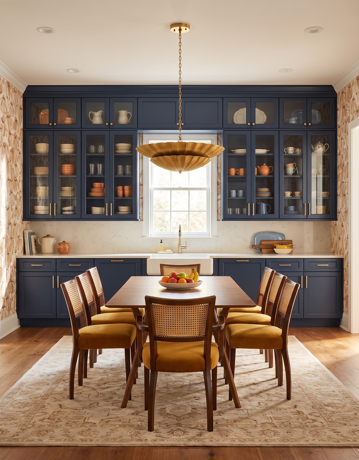
Navy eat-in kitchen with warm botanical wallpaper, mustard cane-back chairs, a wood table and a golden petal pendant.
Deep navy cabinets give this room a substantial backdrop. The creamy floral wallpaper, wood table and mustard chair seats supply the warmth around it, so the darker cabinetry feels rich instead of chilly. The brass-toned light carries that warmth upward.
Try this relationship before assuming an autumn kitchen needs orange cabinets. A cool, dark anchor can make warm accents easier to notice. Keep those accents related rather than identical: camel in the wallpaper and gold in a seat do not have to match to belong together.
Try this: Pair a cool dark cabinet with two related warm accents, then give the combination a quiet light surface.
2. Give moss green a plum-plaid companion
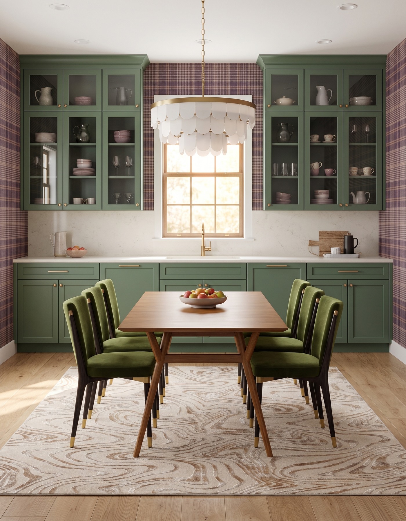
Moss-green kitchen with plum plaid wallpaper, olive upholstered dining chairs and a pale scalloped pendant.
Moss green and plum plaid have the easy familiarity of a good wool coat. The green is grounded, the plaid brings a smaller repeated detail, and pale wood keeps the room from becoming visually heavy. It is fall color without a literal leaf motif.
Use a large wallpaper sample to judge the relationship. A plaid that looks subtle in a close-up may become the strongest feature across a whole wall. Let the cabinetry remain a simple field of color so the two surfaces are not both competing through pattern.
Try this: Use plaid for detail and a softened green for the room's larger, calmer color field.
3. Make berry cabinetry feel jewel-box rich
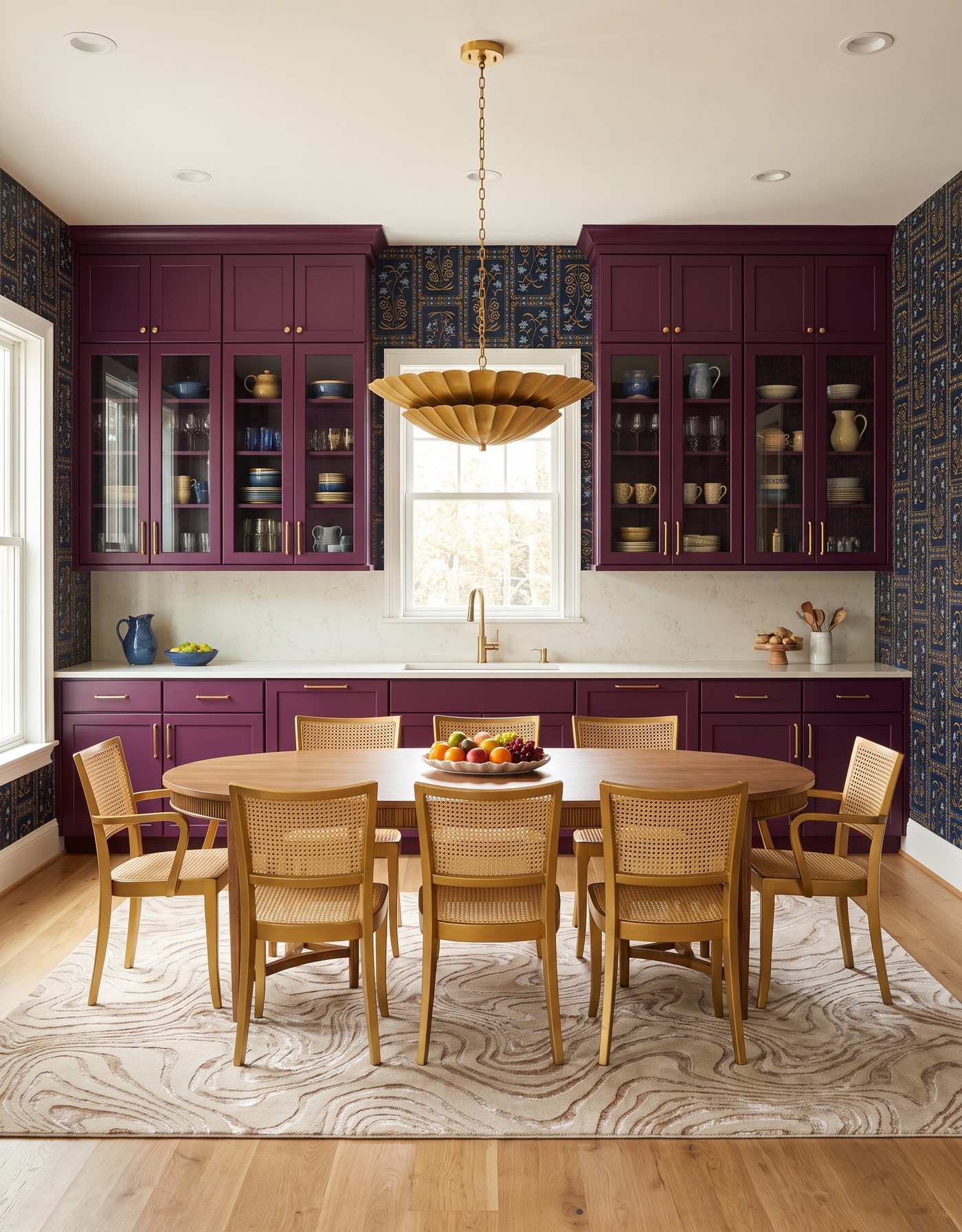
Berry kitchen cabinets against dark blue-and-gold botanical wallpaper, with cane dining chairs and a gold pendant.
Berry cabinets beside a dark botanical create a more dressed-up autumn mood. Golden details in the pattern and warm dining furniture keep the palette connected, while a pale countertop provides a useful visual pause between the larger colored surfaces.
This is a relationship to test in evening light as well as daylight. Dark red can shift dramatically with its surroundings. Compare the actual cabinet sample with the wallpaper, wood and metal finish before deciding whether you want a wine-red, purple-red or browner interpretation.
Try this: Give berry cabinetry one light supporting surface and repeat a warm note from the wallpaper.
4. Let natural oak support a bolder geometric
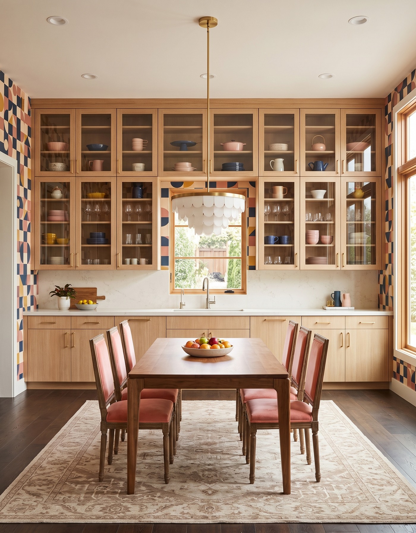
Natural-oak kitchen with geometric wallpaper, coral dining chairs, a rectangular wood table and dark flooring.
Natural oak is not the timid choice when the wallpaper has this much personality. The wood grain gives the graphic navy, terracotta and cream shapes an organic counterpoint. A darker floor separates the lighter cabinet fronts from the base of the room.
The useful lesson is contrast in both pattern and value. A straight grain does something different from a geometric repeat, and pale cabinetry does something different from a deep floor. Those differences make the combination readable without requiring another statement finish.
Try this: Let natural wood be the steady partner to a graphic print, with a clear light-dark difference underfoot.
5. Turn golden cabinets into the season's sunshine
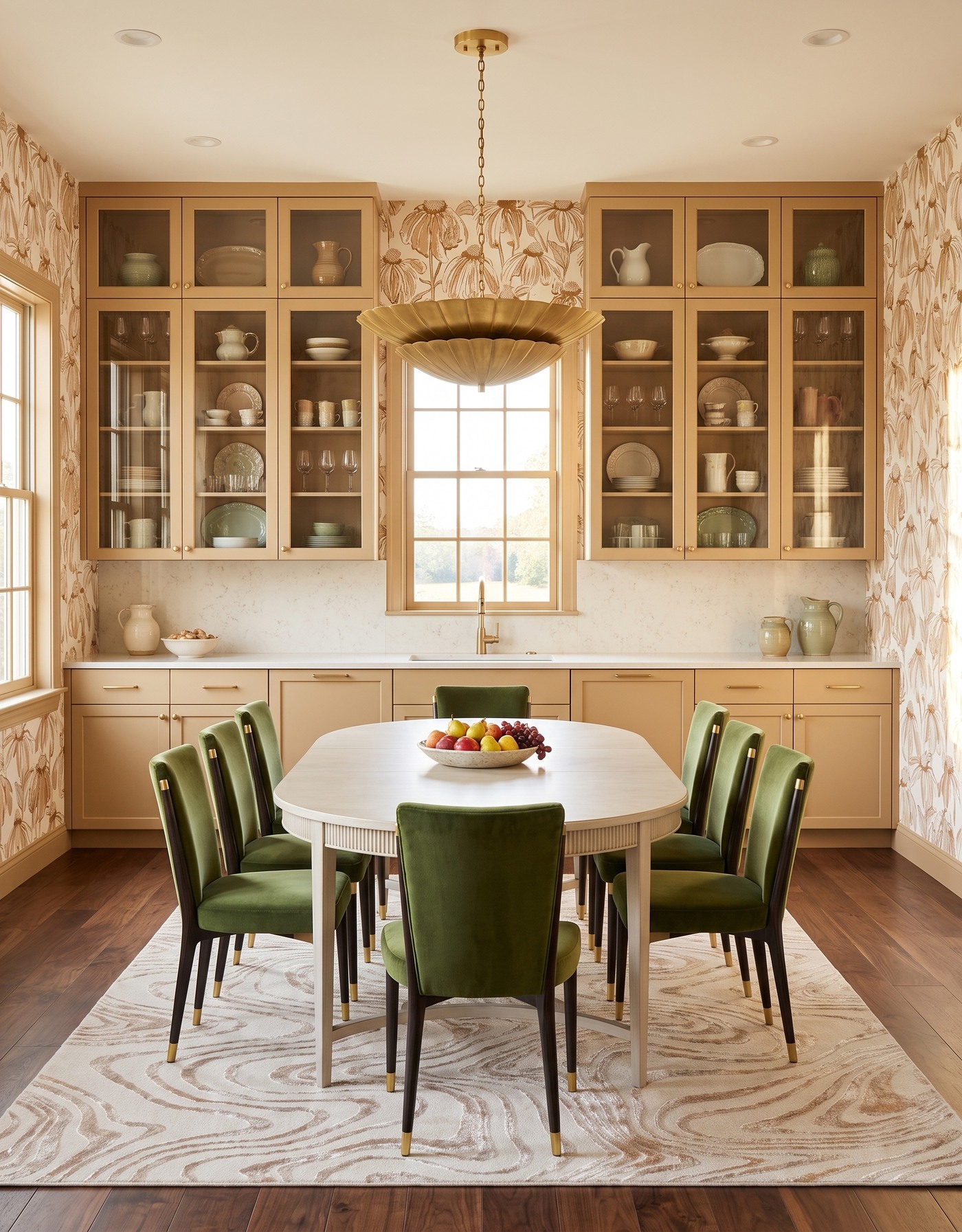
Golden kitchen cabinetry with camel floral wallpaper, olive chairs, a pale oval table and a deeper wood floor.
Golden cabinetry brings the glow that people often try to add with decorative accessories. A warm cream botanical makes the color feel connected to the walls, while the wood floor adds a deeper note underneath the softer pattern.
The risk with several warm finishes is that they can blur together. Compare their values as well as their names. You want enough separation to read the cabinet edge, table and floor clearly, even when each belongs to the same warm family.
Try this: Build a warm palette with different lightness levels, not several nearly identical yellows and browns.
6. Give burnt orange a blue counterpoint
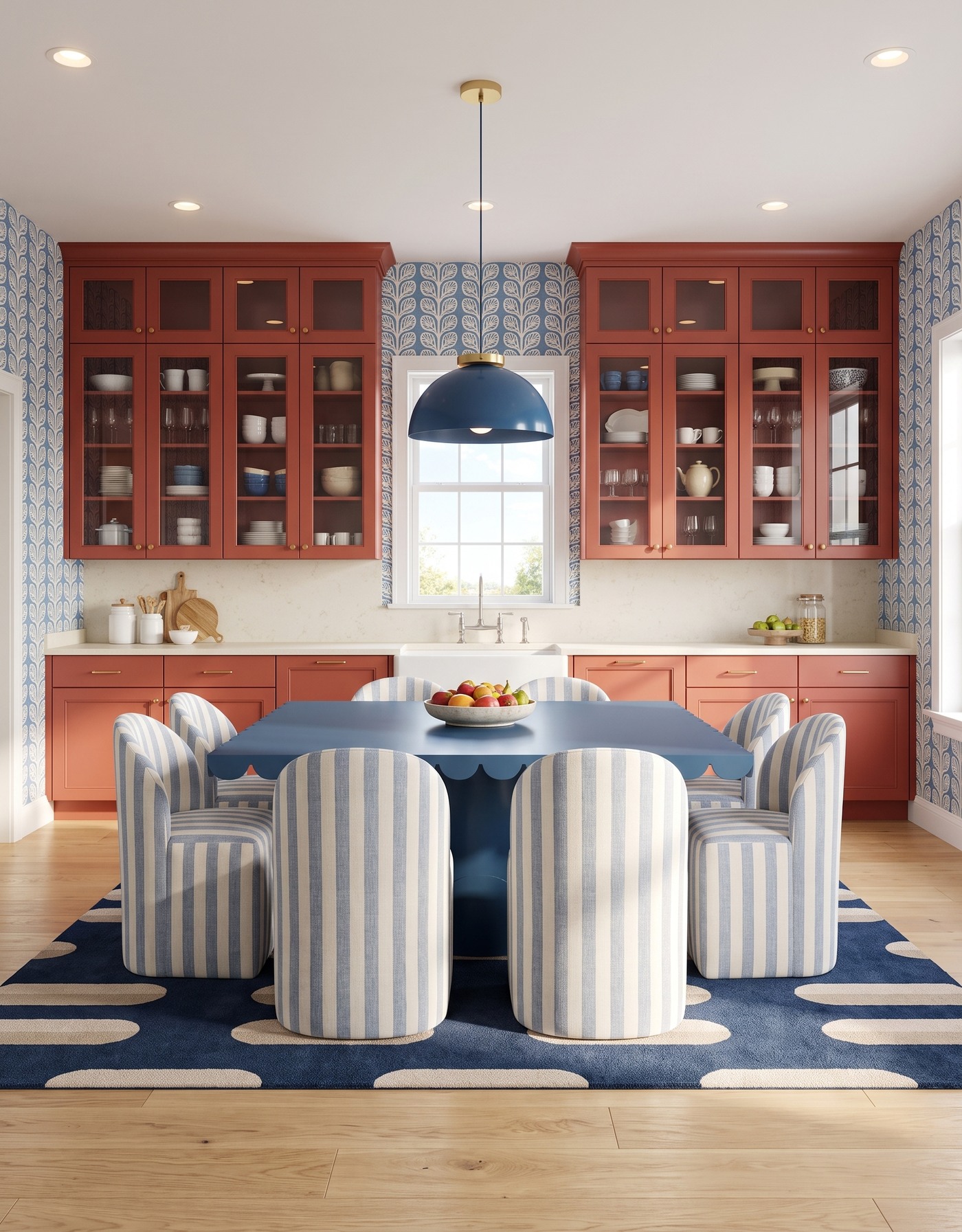
Burnt-orange kitchen with blue leafy wallpaper, blue-and-cream striped chairs and a scalloped blue table.
Burnt orange cabinets and blue leafy wallpaper make autumn color feel a little less expected. The warmth of the cabinetry meets the cool pattern, and blue dining details reinforce the connection instead of introducing a completely unrelated accent.
This pairing benefits from restraint in the remaining finishes. Let the orange-blue relationship be the memorable part. A pale counter and a quieter wood floor leave enough breathing room for both colors to feel deliberate rather than crowded.
Try this: Choose one warm-cool pairing and repeat it selectively instead of adding more competing colors.
7. Soften plum plaid with dusty mauve
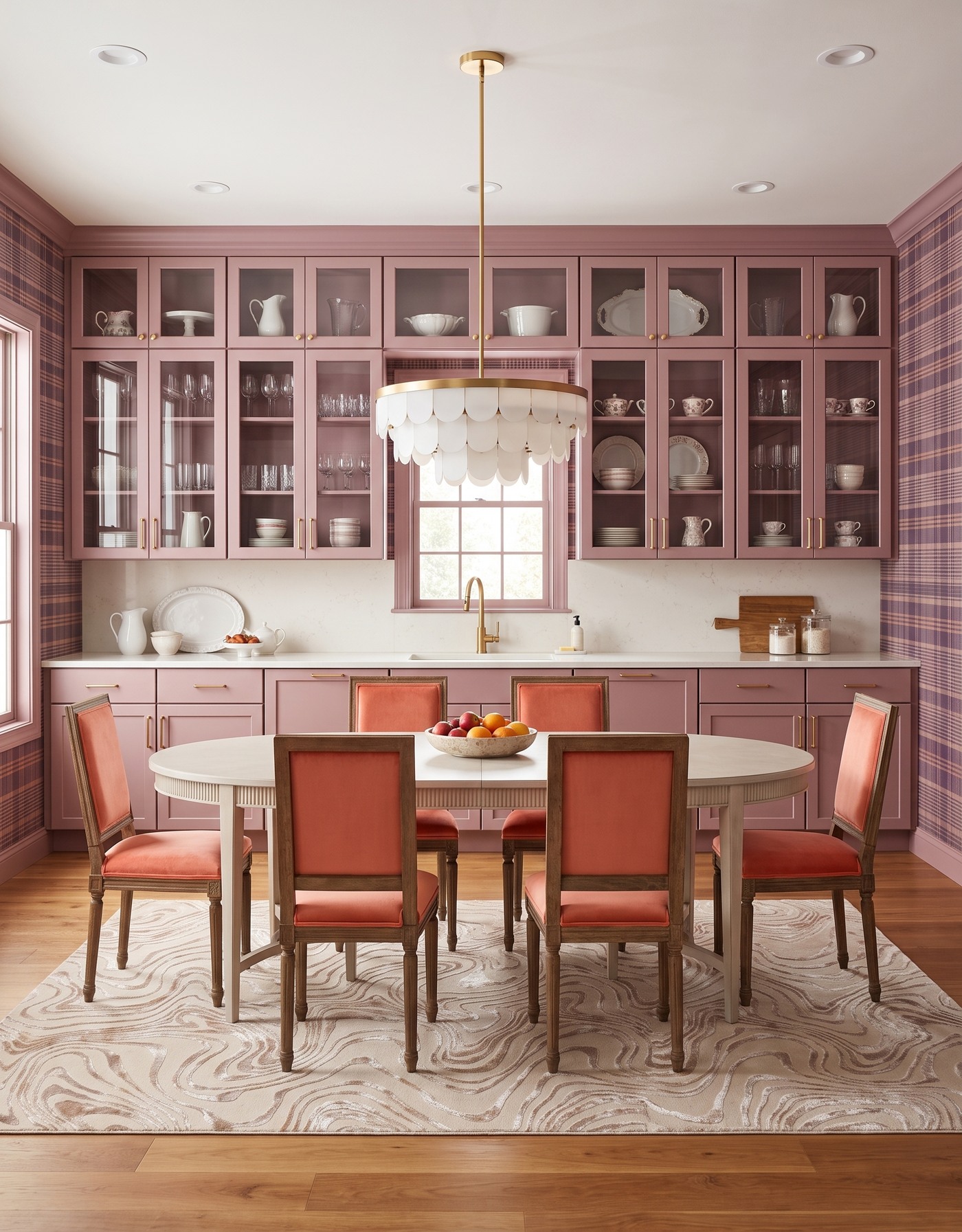
Dusty-mauve cabinets and plum plaid wallpaper around a pale dining table with coral upholstered chairs.
Dusty mauve cabinetry makes plum plaid feel softer and more tonal. The combination has depth without the hard contrast of black and white, and warm wood keeps the pink-purple family from reading as overly sweet.
Tonal does not mean every surface should be the same color. Keep a pale counter or another clear light element in the composition. It gives your eye a place to reset and makes the small differences between the cabinet tone and wallpaper easier to appreciate.
Try this: Use a light neutral to separate closely related cabinet and wallpaper colors.
8. Make black cabinets feel cheerful with peach daisies
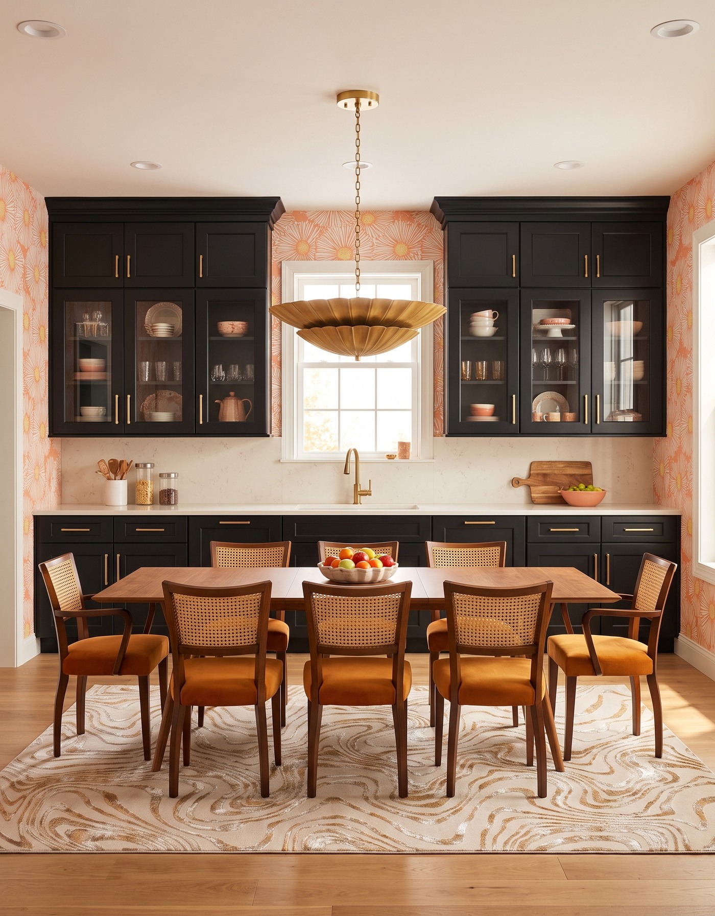
Black kitchen cabinets with peach daisy wallpaper, mustard seats, warm wood and a golden pendant.
Black cabinetry is the outline; peach daisies are the surprise. The loose floral shapes soften the broad dark cabinet surfaces, while warm wood and golden accents keep the room from feeling stark. It is a confident alternative to a purely rustic fall palette.
You can borrow the balance without copying the entire room. Start with one dark anchor and one warm, optimistic pattern. Then resist the urge to add several other high-contrast finishes just because the first contrast worked so well.
Try this: Balance one strong dark surface with a warm print that has a noticeably softer shape.
9. Keep smoky blue grounded with a dark botanical
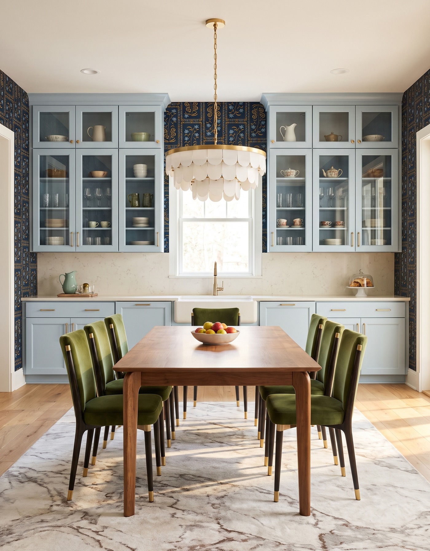
Smoky-blue cabinetry against a dark botanical, with olive chairs, a wood table and a cream pendant.
Pale smoky-blue cabinets take the intensity down a notch while the dark botanical keeps the room interesting. The pattern's blue details help connect the surfaces, and its warmer notes prevent the cooler cabinetry from dominating the mood.
This is a good direction when you like moody wallpaper but do not want dark cabinets too. Look for the connecting color inside the print rather than matching its background. That small change in approach opens up a much lighter version of the same idea.
Try this: Pull the cabinet color from a lighter detail in a dark wallpaper instead of matching its ground.
10. Finish with berry and a graphic autumn palette
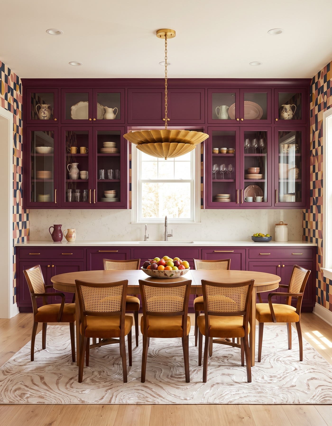
Berry cabinets with navy, terracotta and ochre geometric wallpaper, cane-back chairs and a gold pendant.
Berry cabinetry beside navy, terracotta and ochre geometric shapes gives fall a more playful ending. The palette is full, but the repeated blocks bring structure. Pale supporting surfaces allow the wallpaper and cabinetry to keep their separate roles.
When you save a room like this, write down the relationship you want to borrow. 'Berry plus navy and warm ochre' is a useful design note. 'Buy everything in this picture' is not. Real samples and your room's light should decide the final combination.
Try this: Translate a bold room into a short color recipe before shopping for individual finishes.
Build a fall palette that lasts beyond the season
1. Pick one anchor: the cabinet color, wallpaper or dining furniture.
2. Choose one warm accent and repeat it in two places, rather than everywhere.
3. Compare real samples in daylight and under the lights you use at dinner.
4. Keep room layout, appliance access and table circulation ahead of decorative choices.
5. Use small seasonal objects as the final layer, not the foundation of the design.
Save the palette that makes you want to stay at the table a little longer. The strongest fall kitchen is not necessarily the most orange one; it is the one where color, wood and pattern feel comfortable together, with enough personality to make the room your own.
Ready to connect your favorite color idea to a kitchen plan? Explore Home3's planning approach before choosing the final finishes.
Explore kitchen planning