
Coffee pantry ideas · Fall morning rituals
10 Coffee Pantries for Crisp Fall Mornings
The first cup of coffee deserves a good backdrop. A coffee pantry can give the ritual a sense of place: a color you love, expressive pattern and enough clear counter to make the morning feel less negotiated.
These ten butler's pantry concepts focus on coffee preparation. Walnut, ochre, berry and layered pattern bring the fall feeling without permanent pumpkins. Each scene varies the small objects that make a room feel used.
An existing coffee corner can borrow these same color relationships. Start with the routine you want to support, then decide which finishes make it feel inviting.
These images are AI-created design concepts using Anna's selected prompts and material references. They are inspiration, not photographs of completed projects or installation plans.
1. Wake up walnut with vermilion stripes
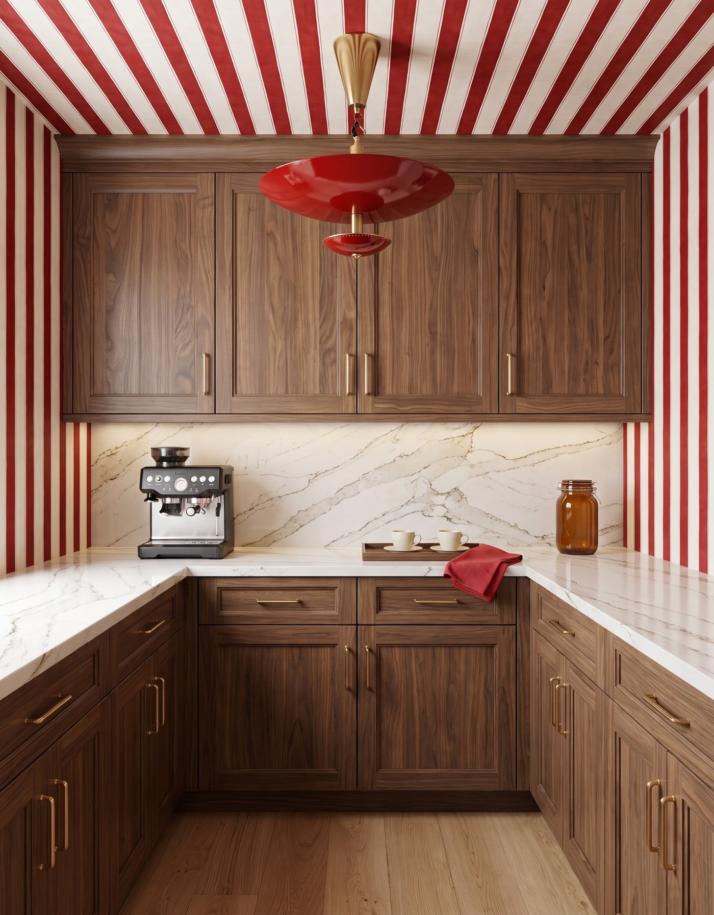
Walnut-toned pantry cabinets pair red-and-ivory stripes with a red pendant and pale coffee-counter surfaces.
Walnut-colored cabinetry and red-and-ivory stripes make a lively start to the day. Wood grain interrupts the repeated pattern, a deeper red light carries the accent overhead and a pale counter separates the stronger surfaces.
Keep the serving pieces simpler than the room. Ivory cups and a modest tray can look collected without competing with the stripe. For your own coffee corner, identify the area you need for preparation first; a beautiful tray is only helpful if it gathers the right things rather than occupying the whole working surface.
Try this: Let strong walls and cabinetry surround a quieter, genuinely useful preparation area.
2. Put golden cabinetry beside woodland green
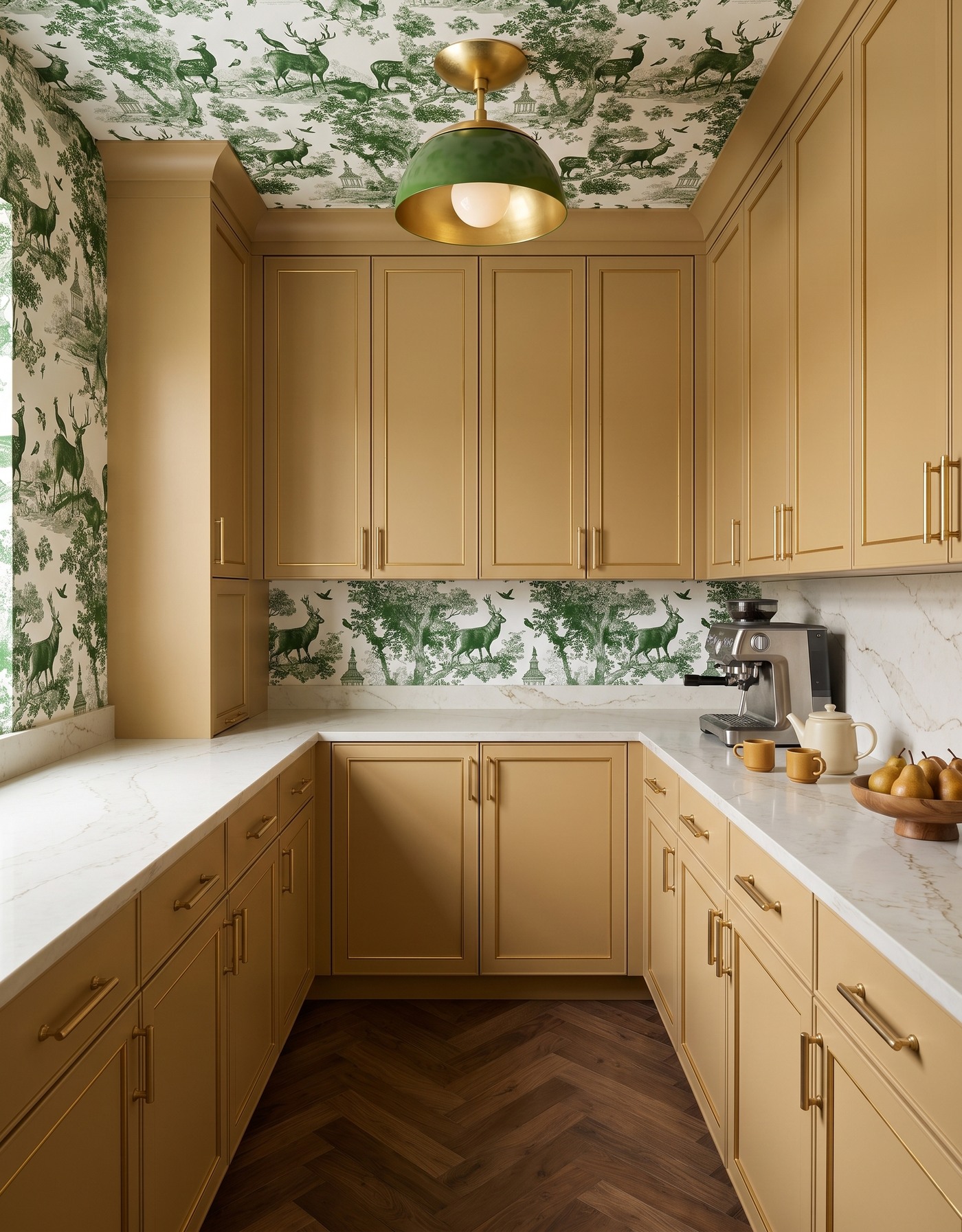
Ochre pantry cabinets pair green woodland toile with a green dome light and warm herringbone floor.
Ochre cabinetry gives woodland toile a sunny partner, supported by a green fixture and warm floor. This autumn pantry has a generous mood: more country breakfast than elaborate seasonal display.
Coffee storage does not have to exclude the rest of your morning habits. A teapot or a favorite serving bowl can belong in the same space when it has a real use. Group related pieces loosely and keep the remainder of the counter open, so the arrangement feels ready for breakfast rather than ready for inspection.
Try this: Build the coffee corner around your actual morning habits, not a decorative checklist.
3. Give denim blue a mustard-striped companion
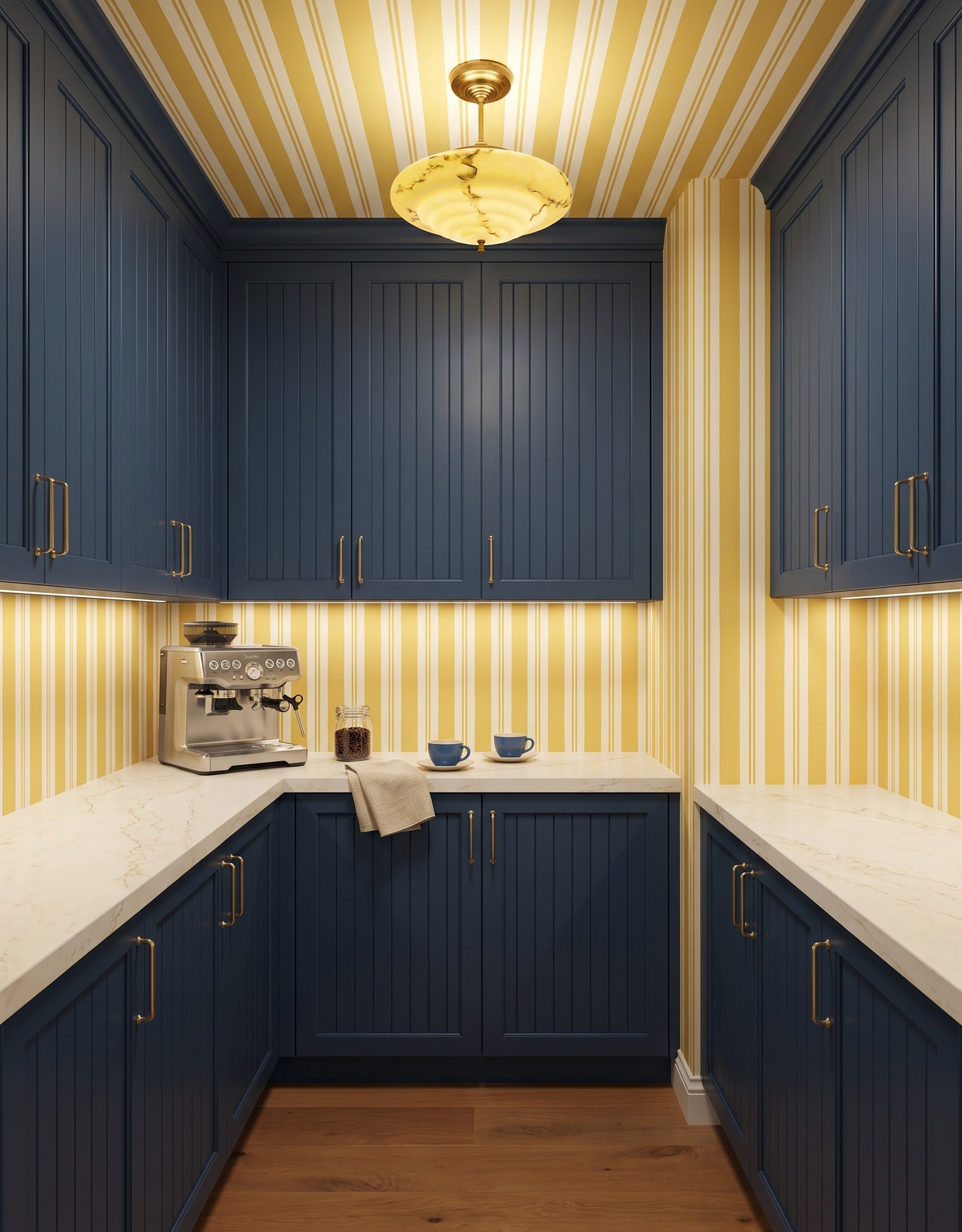
Denim-blue beadboard cabinets balance mustard-striped walls and a marbled yellow light.
Denim-blue cabinetry and mustard stripes create an easy warm-cool balance. Cabinet grooves bring smaller linear detail, while the amber-toned fixture adds a fluid shape. Warm wood helps the blue feel autumnal.
Notice how a limited palette can still contain several kinds of movement. The stripe, cabinet detail and marbled light are not identical patterns, yet they share enough color to make sense together. Plain cups and a folded textile are sufficient at counter level; the finishes have already supplied the visual variety.
Try this: Keep the palette tight while allowing the shapes and textures to vary.
4. Make berry cabinetry feel softer with blush
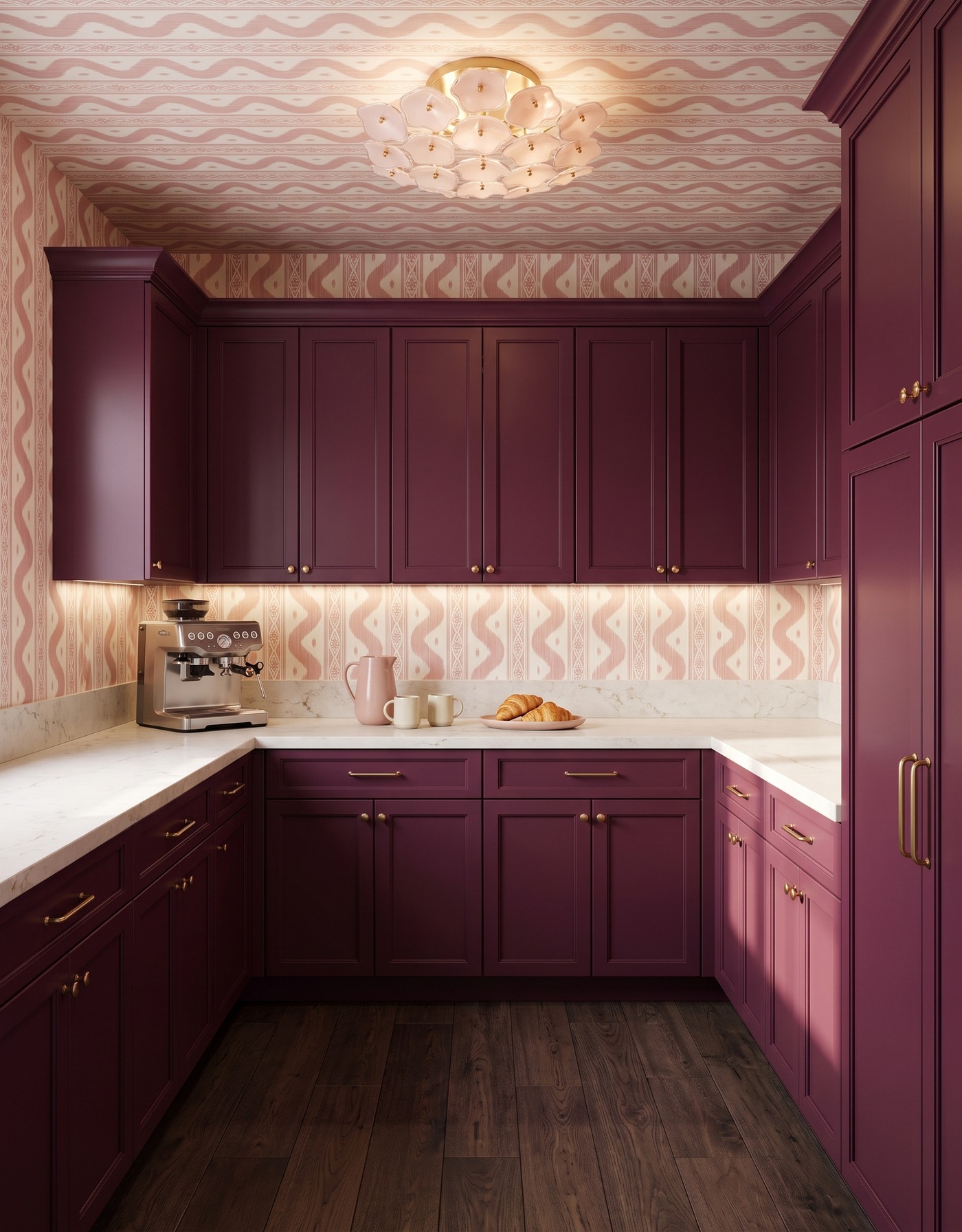
Berry pantry cabinets and blush ikat frame a pale counter with cream cups and pastries.
Berry cabinetry and blush ikat make a rich pantry with a softer edge. The deep brown floor provides a grounded base. It feels slightly indulgent, which is not the worst quality for a morning ritual.
A related color family does not require identical finishes. Let the dark cabinet color and pale patterned wall remain noticeably different, then choose everyday ceramics that sit comfortably between them. A small serving moment can be enough; filling the counter with coordinated objects would make this tonal palette feel less relaxed.
Try this: Use differences in lightness to keep a closely related color family from blending into one surface.
5. Bring burnt orange into a black-and-gold scheme
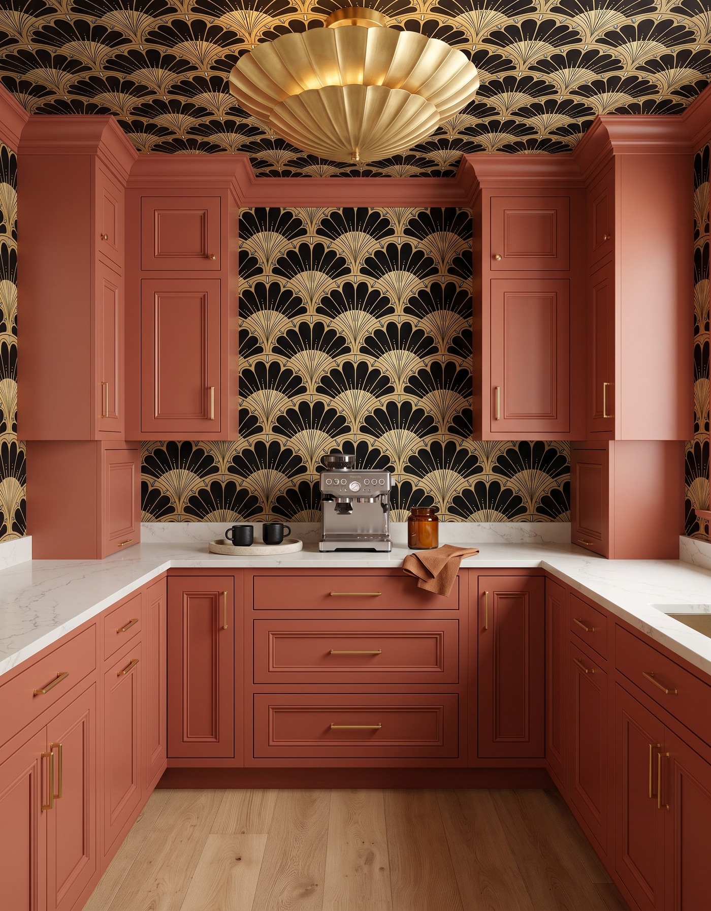
Terracotta pantry cabinetry meets black-and-gold fan wallpaper and a sculptural gold light.
Burnt-orange cabinetry warms a black-and-gold fan pattern, giving the pantry a dressed-up mood. Pale flooring and counter interrupt the rich finishes. The sculptural light adds shape instead of an unrelated accent color.
Let the small serving pieces reflect the scheme without reenacting the whole room. A dark cup, a pale tray or a warm linen can make the connection in miniature. Choose the pieces you enjoy using, and leave enough space around them for the ordinary steps of making and serving a drink.
Try this: Echo a bold palette through a few useful objects, not a counter full of matching props.
6. Give moss green a cheerful retro floral
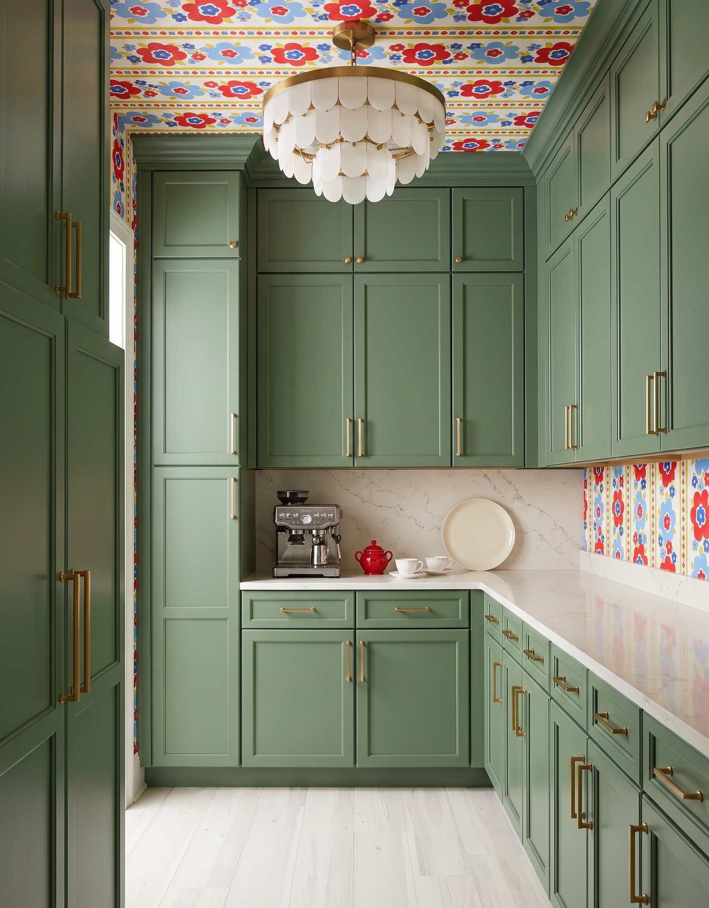
Moss-green pantry cabinets anchor a retro red-and-blue floral ceiling and cream tiered light.
Moss cabinetry grounds a red-and-blue floral that could otherwise feel quite exuberant. The pale floor and light fixture brighten the surrounding composition, leaving the wallpaper to supply most of the playful energy. It is the coffee pantry equivalent of being the cheerful person at breakfast without raising your voice.
A multicolor print offers several possible accent directions, but you do not need to choose all of them. One red ceramic piece can make the counter feel connected; ordinary white cups can do the rest. That selective approach leaves room for the real mugs and dishes that inevitably arrive from elsewhere in the kitchen.
Try this: Choose one small accent from a busy print and let everyday white pieces fill in naturally.
7. Let pale oak steady an aqua floral
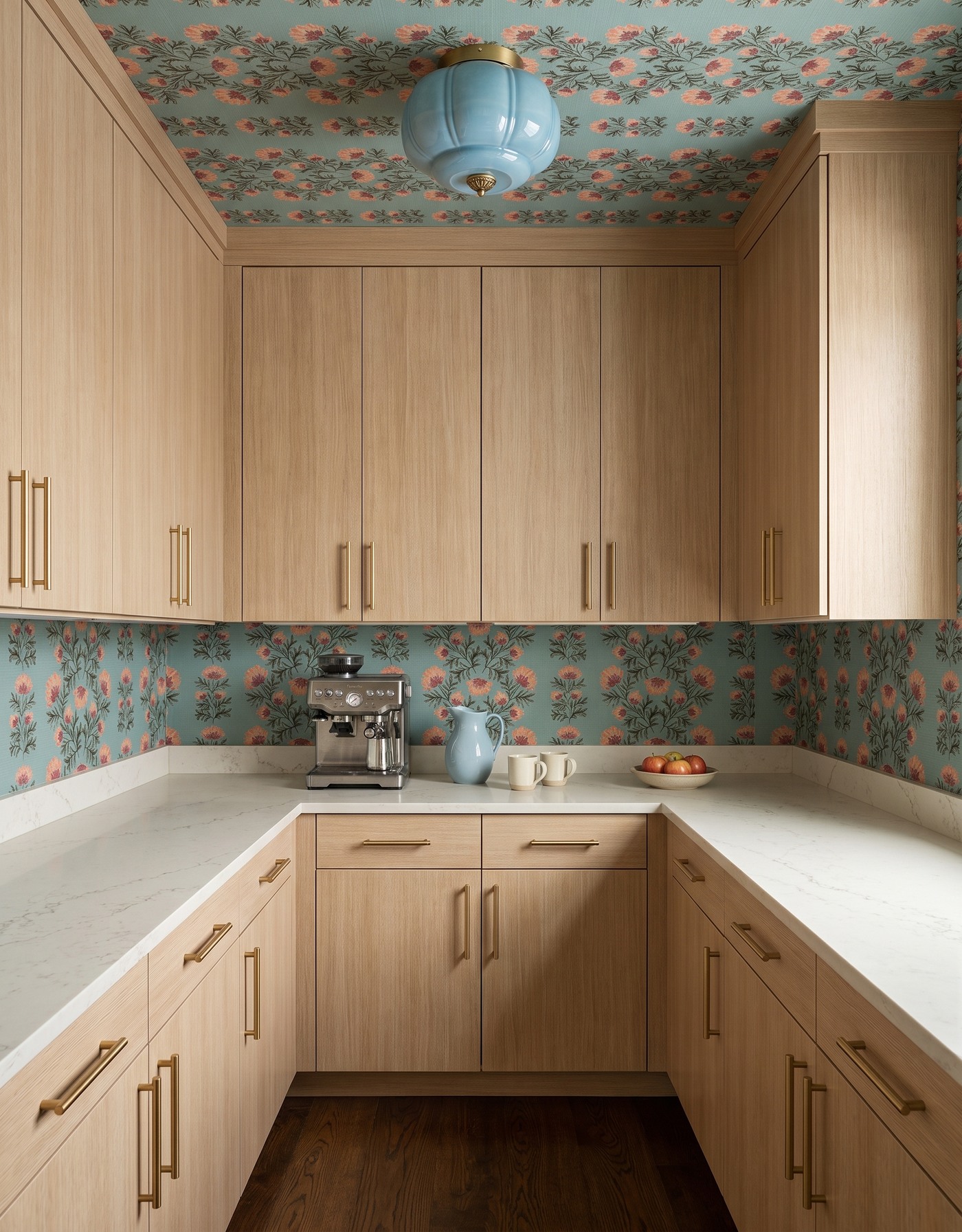
Pale-oak-toned pantry cabinets surround aqua-and-coral floral wallpaper and a blue light.
Pale oak cabinetry gives aqua-and-coral wallpaper a calmer partner. The dark floor adds a clear base, while the blue fixture continues the cooler family without matching the wall exactly. The wood keeps the room from feeling entirely made of color and pattern, giving the eye a different texture to follow.
Natural-looking finishes are especially useful when the wallpaper has several hues. You can enjoy the whole print without needing to pull each color into the cabinetry. Keep countertop styling equally relaxed: a favorite pitcher or a simple bowl can belong because you use it, not because its color passed a matching test.
Try this: Use a natural-looking cabinet finish to support a multicolor wallpaper without competing with it.
8. Warm navy with saffron leaves
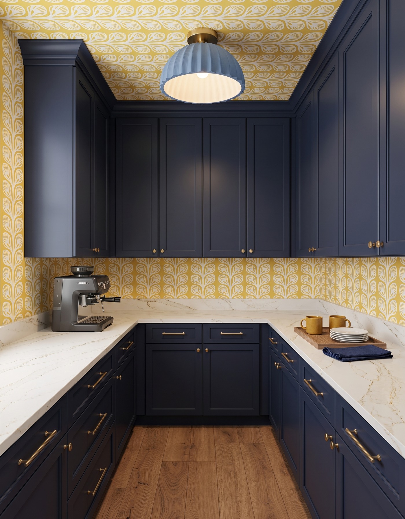
Navy pantry cabinetry pairs saffron leaf wallpaper with a blue pleated light and warm wood flooring.
Navy cabinetry and saffron leafy wallpaper bring strong warm-cool contrast. A dusty-blue light softens the connection to the cabinets, while tan flooring adds an intermediate tone. The finishes supply the season's richness.
Repeat the colors through objects that have different shapes and purposes. A cup, a textile and a cabinet surface should not read as the same kind of accent. That variation makes the palette feel established. For an existing coffee corner, even one warm ceramic note beside navy storage can borrow part of the relationship.
Try this: Repeat colors across different forms so the room feels coordinated rather than uniform.
9. Pair dusty mauve with a small plum plaid
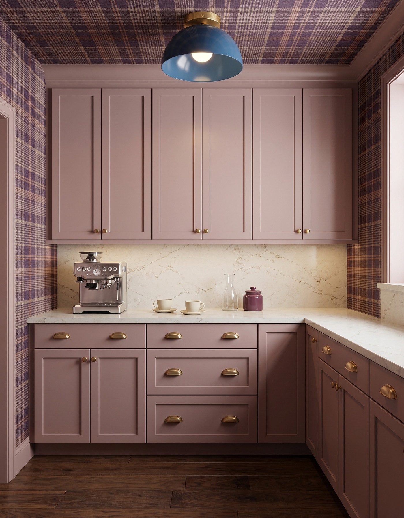
Dusty-mauve pantry cabinets sit against plum plaid with a blue dome light and dark wood flooring.
Dusty-mauve cabinetry and plum plaid create a quieter coffee pantry without losing personality. The walnut-toned floor adds a broader organic pattern beneath the tailored wall, while the blue fixture introduces a cooler note. It is a comfortable palette for someone who likes fall color at a conversational volume.
A small repeat often looks busier across a whole room than it does on a sample card. Keep larger neighboring surfaces calmer and allow some clear counter to remain visible. A glass carafe or a plain cup can add a different texture without asking the room to accommodate yet another printed design.
Try this: Balance a small repeated print with broader, quieter surfaces and simple serving shapes.
10. Make white cabinetry warm with blue leaves and oak
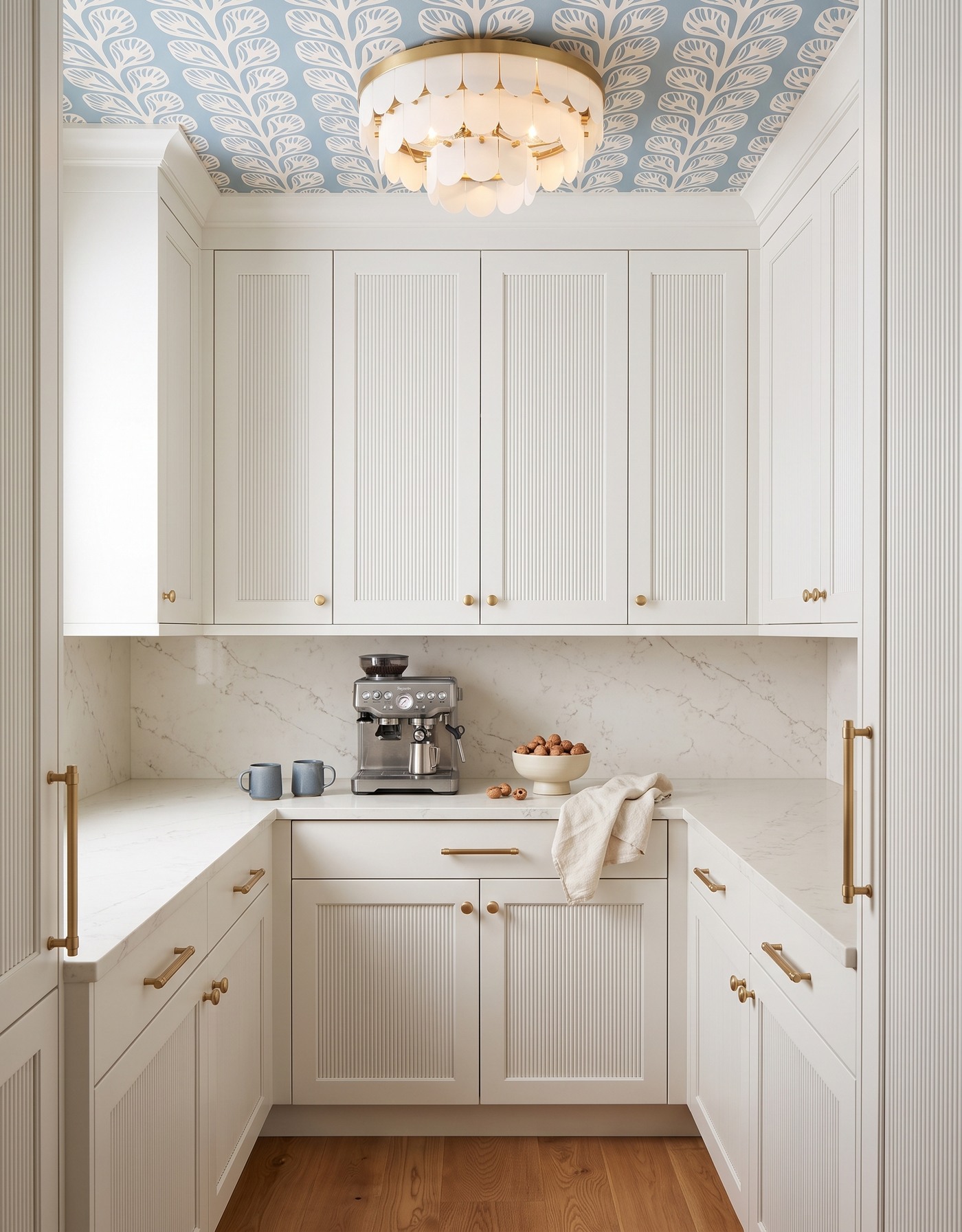
White reeded pantry cabinetry frames blue leaf wallpaper, a cream tiered light and honey-toned flooring.
White cabinetry and blue leafy wallpaper offer a brighter ending to the fall coffee story. Warm wood underfoot keeps the blue-and-white family from feeling chilly, while the cabinet texture adds interest without another color. The room has a gentle rhythm that leaves space for the everyday objects to feel personal.
White is most interesting when it has thoughtful neighbors. Compare the warmth of your chosen white with the wallpaper ground and counter, then use the floor to connect them to the rest of the home. Small blue-gray ceramics can reinforce the scheme, but the room should still feel complete when the cups are in the dishwasher.
Try this: Choose a white by its relationships with nearby finishes, not by its name alone.
Plan a coffee pantry around the morning you actually have
1. List the equipment, cups and ingredients you use regularly before assigning storage space.
2. Reserve a clear preparation area instead of letting decorative trays cover every surface.
3. Check equipment dimensions, power, water needs, access and manufacturer clearances for the real layout.
4. Compare cabinet, wallpaper, counter and floor samples under the lighting your pantry will actually have.
5. Finish with a few useful, personal pieces; small changes in textiles and serving objects can keep the room feeling lived in.
Save the palette you would enjoy before the first sip, keep room for the routine and let the styling change from day to day. That small imperfection is part of what makes the space yours.
Ready to think beyond the inspiration board? Explore Home3's planning approach before deciding the next step for your home.
See how Home3 approaches planning