
Laundry room ideas · Color & wallpaper
10 Bold Laundry Rooms
The laundry room gets plenty of your time. It deserves something better than being the place where all the leftover design decisions land. A good wallpaper, an unexpected cabinet color or a light with a little personality can make an everyday room feel considered.
These ten laundry room concepts start with coordinated materials, not a shopping cart full of unrelated statements. Each gives the pattern, cabinetry and floor a different job. Some are cheerful, some are moody, and a few have the confidence of a very good vintage outfit.
Look for the relationship you love rather than trying to copy an entire room. You might borrow the berry-and-blue pairing, the warm wood beneath a dark cabinet or the way a sculptural light repeats a flower shape.
These images are AI-created design concepts using Anna's selected prompts and material references. They are inspiration, not photographs of completed projects or installation plans.
1. Frame warm florals with ink-black cabinetry
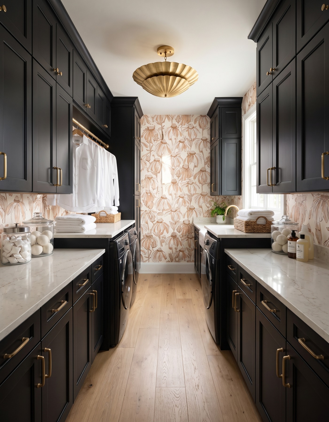
Ink-black laundry cabinets with warm cream-and-camel botanical wallpaper, pale counters and a brass-toned light.
Black cabinetry gives the loose, warm botanical pattern a strong outline. The contrast makes the flowers feel more graphic, while wood and creamy surfaces prevent the palette from becoming stark.
Treat the black as a material, not an empty shadow. In a real project, compare finish samples under daylight and the room's evening lighting. The cabinet edges and surface texture should still be readable; a dramatic color is most convincing when its details remain visible.
Try this: Balance black with warm cream and wood, and check that the finish keeps its detail in lower light.
2. Let citrus wallpaper lead the palette
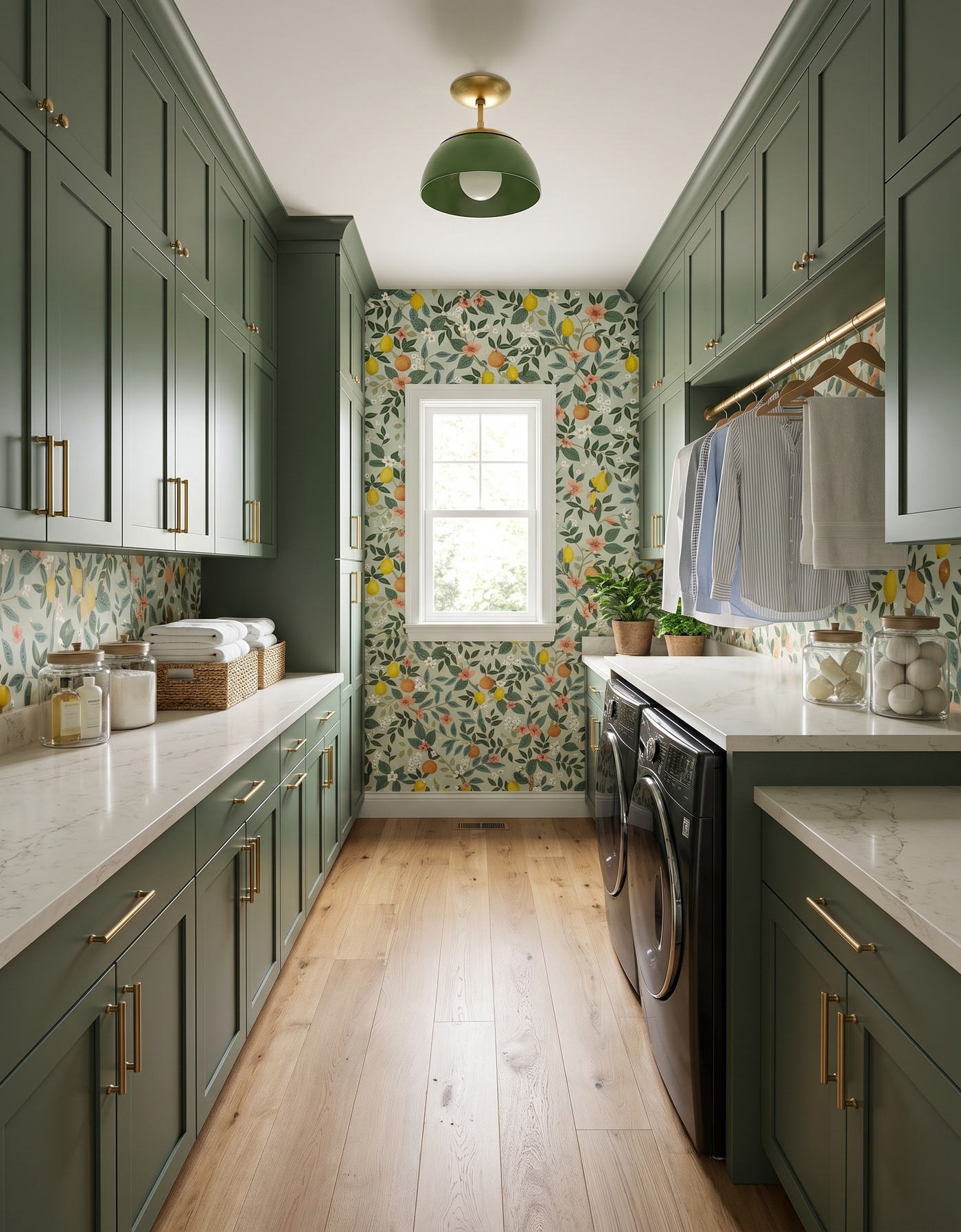
Moss-green cabinets, citrus wallpaper, pale wood floor, green dome light and black laundry appliances along the right wall.
Moss-green cabinetry gives the citrus print a grounded companion. The leaves connect the large green surfaces to the smaller details in the wallpaper, while yellow fruit and coral flowers supply the playful moments. It is a useful way to work with a busy pattern: choose one of its quieter colors for the cabinetry.
A pale wood floor gives the room somewhere to breathe. The lesson is not to match every green exactly. Related greens can feel more interesting when their undertones work together and the wood stays warm and natural.
Try this: Pull a cabinet color from the wallpaper's leaves, then let its brighter accents remain mostly in the print.
3. Pair dusty aqua with coral flowers
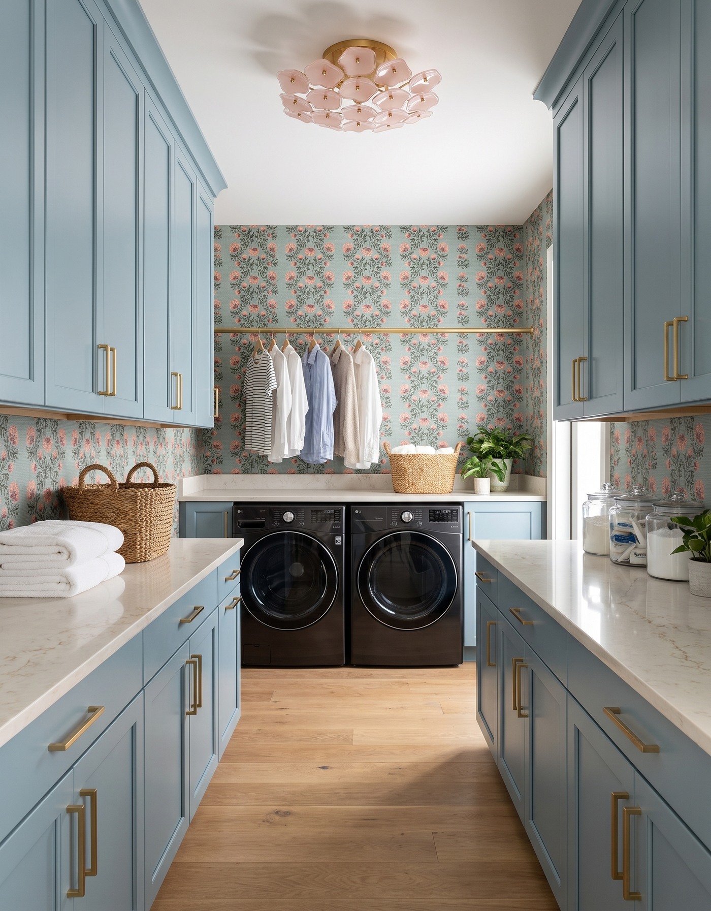
Dusty aqua laundry cabinets with coral floral wallpaper, a pink flower-shaped light and black front-loading machines beneath a hanging rail.
Dusty aqua has enough color to feel intentional without turning the laundry room into a novelty. Coral flowers bring warmth to the cool cabinet tone, and the climbing pattern supplies a softer rhythm than another grid or stripe.
Keep the large supporting finishes comparatively quiet. When the wallpaper already carries several colors, a wood floor and pale counter can connect the scheme without introducing a fourth competing pattern. This is a good direction if you want a cheerful room that still feels relaxed.
Try this: Balance a cool cabinet color with one warm accent repeated in the wallpaper.
4. Give natural oak a graphic daisy backdrop
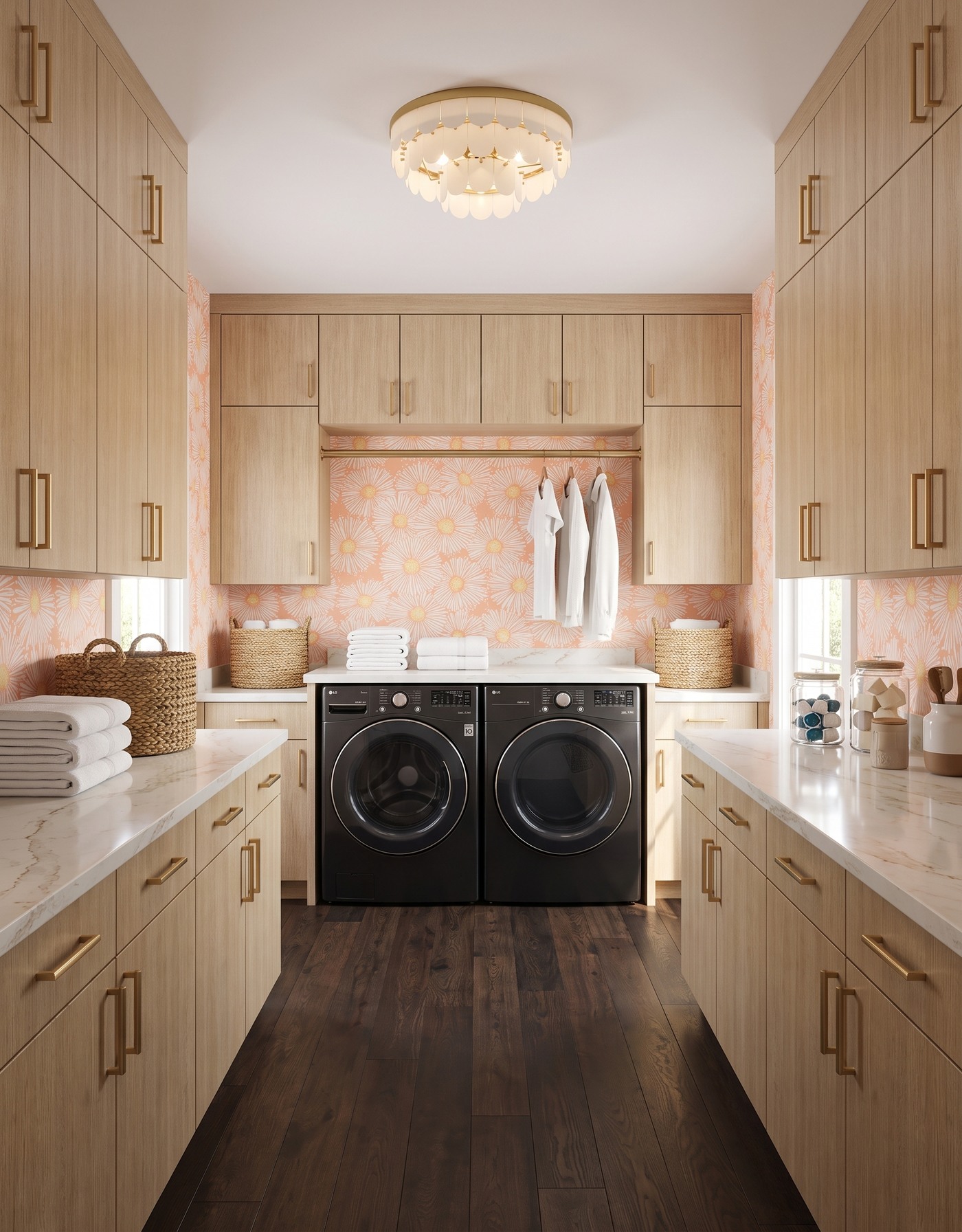
Natural-wood laundry cabinets, peach daisy wallpaper, dark wood flooring and an ivory scalloped light above black machines.
Bold does not have to begin with painted cabinets. Natural oak beside an oversized daisy print creates a different kind of confidence: the cabinet surface stays simple while the wall supplies the attitude.
The darker floor adds definition beneath the lighter wood cabinetry. That separation matters. If every wood surface were nearly the same color, the room could feel less deliberate; a clearer difference lets the cabinet grain and the flower pattern each keep their identity.
Try this: Use contrasting wood values so a natural-wood room does not become one continuous beige surface.
5. Put golden cabinets against a dark botanical
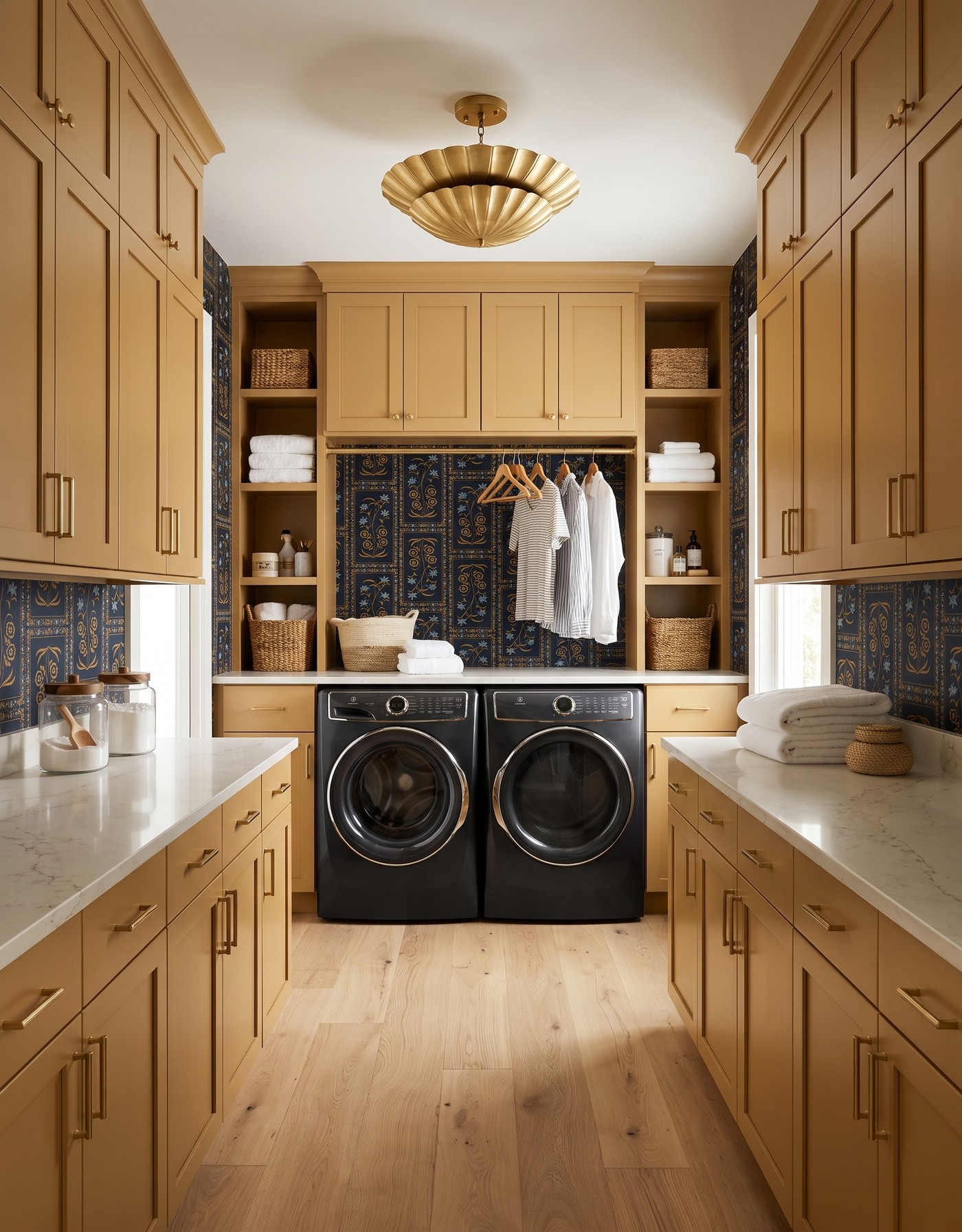
Golden laundry cabinets with a dark framed botanical print, brass-toned scalloped light and pale wood floor.
Golden cabinetry and an inky botanical print make a laundry room feel like a small jewel box. The wallpaper's ochre details connect to the cabinet color, while its darker ground provides the contrast that makes the combination memorable.
This pairing needs light surfaces and good illumination as part of the plan, not as an afterthought. Look at the wallpaper and cabinet sample together in the actual room. The aim is rich color with readable detail, not a dark corner where the pattern disappears.
Try this: Let one dark patterned surface frame a warmer cabinet color, then check the combination in your own light.
6. Try berry cabinets with blue leafy stripes
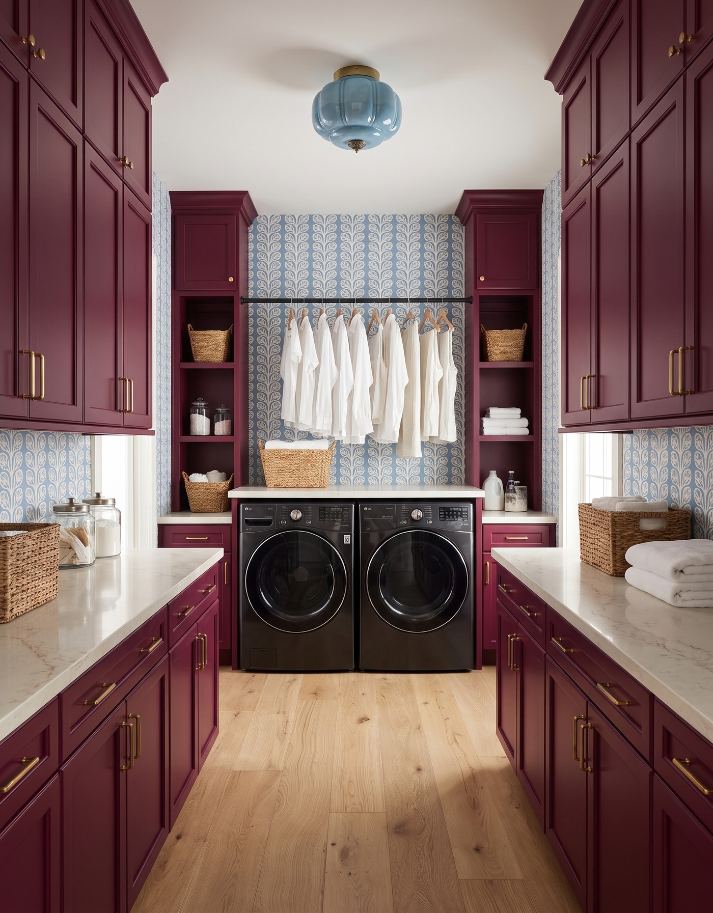
Berry laundry cabinets, blue-and-cream leafy wallpaper and a pale-blue glass light above black front-loading machines.
Berry cabinetry is the unexpected choice here. The blue-and-cream leaf pattern gives it a cooler partner, and the repeated vertical shapes make the walls feel orderly even though the palette is adventurous.
Think of berry as the main color and blue as its counterpoint. Keeping the counter pale prevents the room from becoming a collection of equally loud surfaces. You get the personality of a strong color combination without needing decorative objects on every available inch.
Try this: Make the cabinet color the statement; use the wallpaper's repeat to bring order around it.
7. Make smoky blue feel tailored with plum plaid
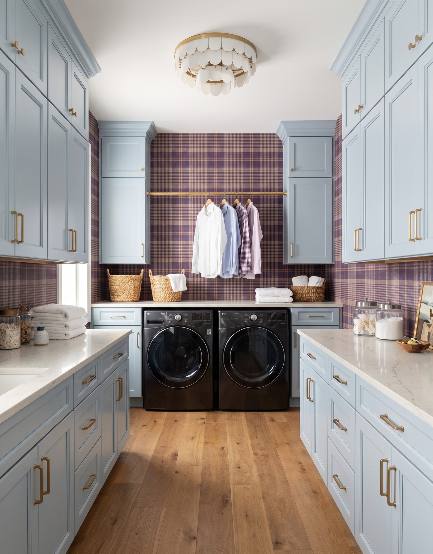
Pale smoky-blue laundry cabinets with plum plaid wallpaper, an ivory scalloped light and warm wood flooring.
Plaid gives this laundry room a more tailored mood than a floral would. The smoky blue cabinets keep the composition light, while plum and cream in the wallpaper introduce depth and a touch of dressing-room character.
Pattern scale is the decision to test. A small plaid may look quiet from the doorway and detailed up close. Before committing, tape up a generous sample and stand where you will usually see the room; a tiny swatch cannot show you how the repeat behaves across a wall.
Try this: Judge a small repeat from both doorway distance and normal working distance.
8. Give burnt orange a cool geometric partner
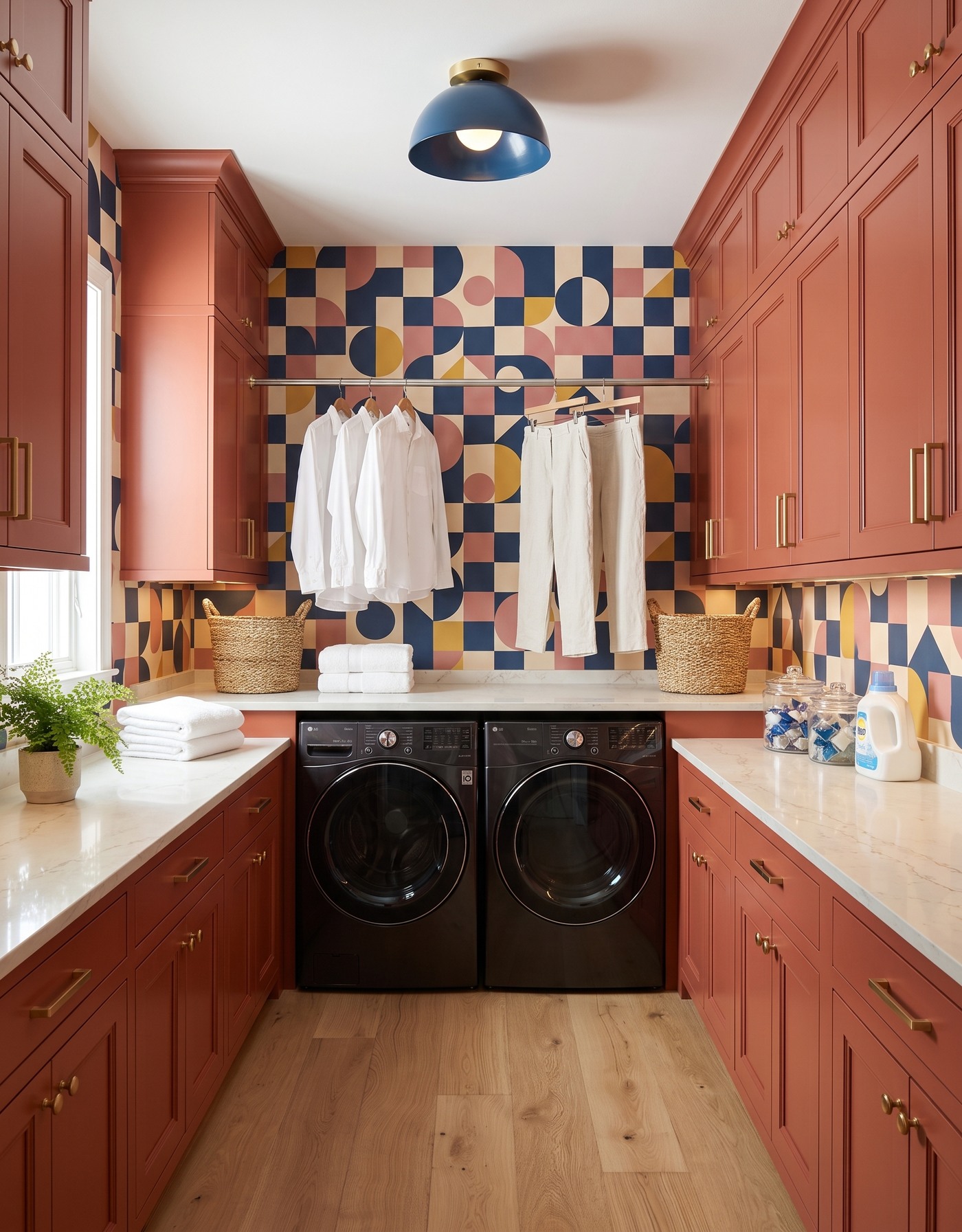
Burnt-orange laundry cabinets with navy, cream and ochre geometric wallpaper and a blue dome light.
Burnt orange cabinetry already has warmth and presence. Navy and cream geometric shapes give it a crisp counterweight, with smaller warm notes in the wallpaper helping the two surfaces belong together.
The framed cabinet fronts add another layer beside the modern graphic pattern. Their simple borders provide a steady rhythm against the wallpaper's changing shapes. Keep the contrast intentional: the connecting colors do the work, so the cabinet and wallpaper patterns do not need to repeat each other.
Try this: Use a shared color relationship to connect framed cabinet fronts with a modern geometric print.
9. Use mauve to soften a retro floral
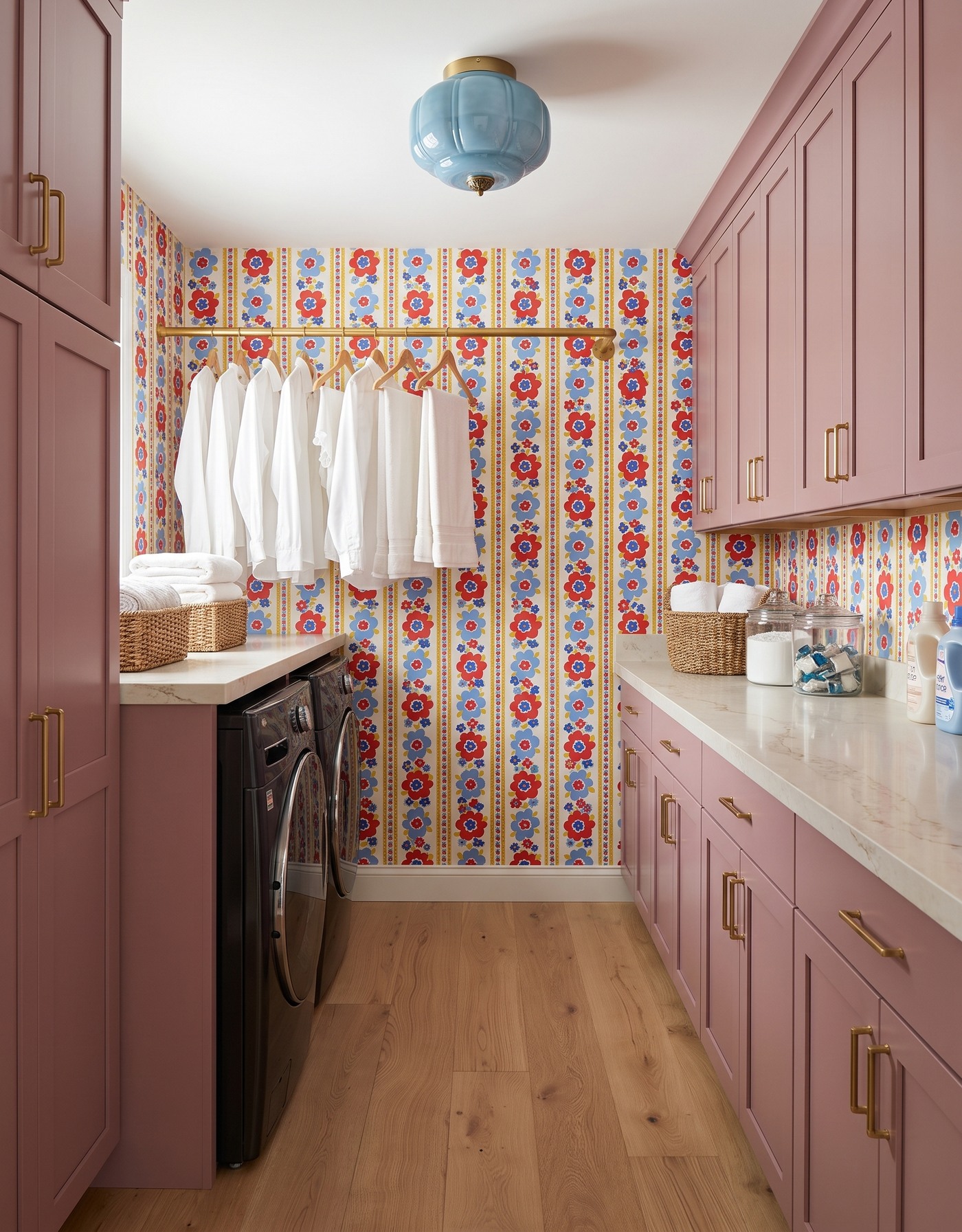
Mauve laundry cabinets, red-and-blue floral stripes, a pale-blue light and black machines along the left wall.
Red, blue and yellow flowers bring a lively, nostalgic energy. Dusty mauve cabinets give the print a more grown-up setting than a bright white backdrop would, without draining away its fun.
A quieter floor is especially useful with this much pattern. Let the wall carry the small, busy details and the cabinetry carry the calmer color field. The room can be playful without every surface asking for attention at once.
Try this: Pair an exuberant print with a softened cabinet color instead of trying to make every finish equally bright.
10. Make deep blue feel joyful with citrus trees
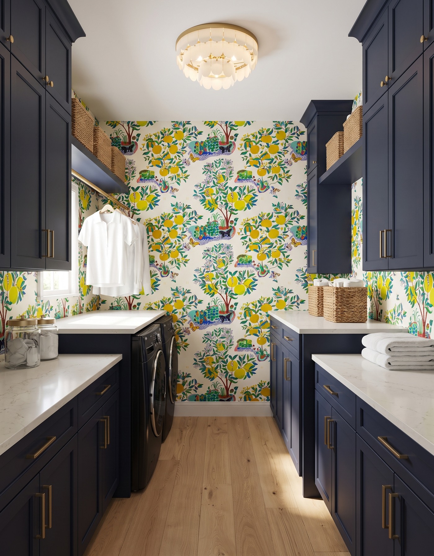
Deep-blue laundry cabinets with citrus-tree wallpaper, pale counters, an ivory scalloped light and warm wood planks.
Deep blue cabinets give a playful citrus-tree print a substantial base. Yellow fruit and green foliage feel brighter against the darker cabinetry, while the wallpaper's blue details pull the scheme back together.
This is a useful reminder that a serious cabinet color can support a less serious print. You do not need to choose between sophisticated and cheerful. The relationship between them is often what makes a room worth saving.
Try this: Anchor a whimsical wallpaper with one substantial cabinet color.
Before you bring a bold laundry palette home
1. Choose the wallpaper or cabinet finish you feel most strongly about, then build around it.
2. Compare real cabinet, wallpaper, floor and countertop samples together in the room.
3. Test wallpaper repeat scale on a large sample, not only a screen.
4. Plan appliance access, usable counter space and hanging clearance before choosing decorative extras.
5. Have the appropriate professional verify countertop support, appliance requirements and material suitability.
Save the room whose color relationship feels like you. Then reduce it to a short recipe: one main cabinet color, one expressive pattern, a supporting floor and a light that belongs in the same conversation. That is a much more useful starting point than trying to buy every detail from a picture.
Planning a kitchen as part of the same project? Explore Home3's kitchen-planning approach before translating inspiration into a layout.
Explore kitchen planning